#fjkdal;ldskjfalskdf I'm the WORST at coloring
Note
Do you have any tips for beginning digital art? I absolutely adore your art!!! I can draw traditionally but coloring digitally is so flat and awkward for me, and here you are making everything look like a piece of cake!!! Srsly, I love your art so much
Hii!! Thanks so much
And omg it’s a struggle for me too haha but, one thing I’ve noticed that instantly makes digital art pOp is strong lighting, as well as playing with overlays, luminosity, as well as the filters (hue, saturation, etc). Learning how to bring life to coloring is something that you learn with time (and I’m still learning the ropes because i’m a weenie and I’m afraid of using dark contrast).
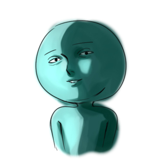
And that being said, don’t be afraid to dive into the deep end of the color wheel! Light shading works in a lot of ways, especially if you have a simple and or cute style, but there’s a big difference in mood and tone when you deepen the contrast:
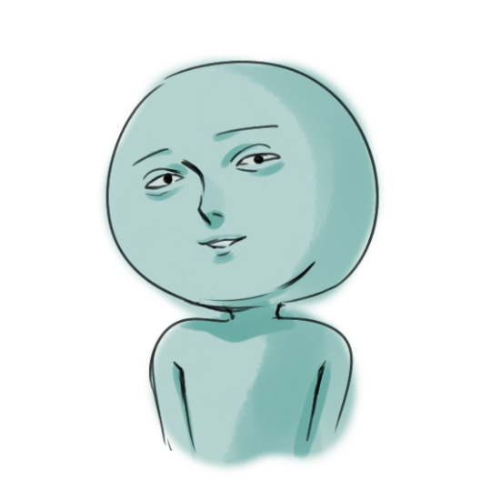
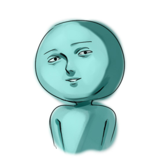

There’s a very big difference between the first and second drawing, though one isn’t necessarily better than the other. The second one gives off more of a dynamic vibe, especially since I went lighter and darker on both the shadow and light areas of the face. When I first started out, I generally stayed near the upper left color for everything, so a lot of my pieces tended to look like the first drawing. Now i’m trying to explore more out of my comfort zone and make my shadows more defined and my art more compelling (?idk words lmao)Color choice is also very important to how lively your drawing looks. Here’s an example where I used more gray hues to fill in the shadows, and it ends up looking slightly more dull. In comparison, the first two drawings seem much more lively, and perhaps even more stylized and comical.

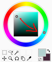
Saturated isn’t always better, but keep the effects of choosing non-saturated vs. saturated colors in mind when you’re coloring! Also, don’t be afraid to dick around with the overlays and luminosity stuff that come with your drawing program. I own SAI, so the features might not look the exact same, but the idea should be. I personally don’t have any real rules to overlays; I just scribble around them in whatever colors that end up making the piece look better lmao. But they do help with the scene of your drawing, especially if you want to convey a certain feeling/mood (like blue or purple for more depressing drawings, yellow and orange for light/happiness, etc).
Here, I just plopped some random colors that I thought would fit the turquoise of the original drawing:
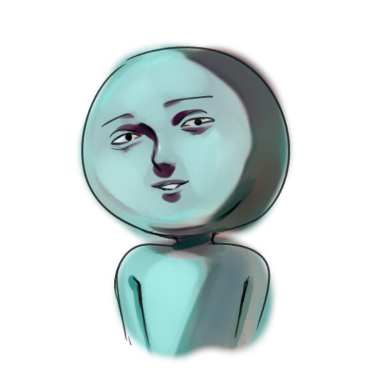
It certainly has a more woozy aura to it, and actually helps you with providing hard contrasts and letting you get a glimpse of what you could change in your coloring in the future.There’s no real formula to it—try playing around with complimentary colors, analogous colors (lowkey this drawing used those two themes for the overlays), the list goes on. LAST THING: if you really need a quick trick to get u a nice Quality drawing Fast, use this kind of lighting, or any variation of it. It’s good to understand the aspects that make up the shadows and which parts are highlighted first, but once you get it, it’s a quick sell !
This was really shittily painted but I think you get the point lol Anyways I hoped this helped at least a little bit! Don’t be afraid to ask again for further clarification, or feel free to dm me in my messages!
#fjkdal;ldskjfalskdf I'm the WORST at coloring#it wasn't until i started charcoal drawing and oil/acrylic painting that i truly realized the need for sharp contrasts#Anonymous
47 notes
·
View notes
Last Seen Blogs

mellosdrawings
Mellos

white-gerbera
VeraVera >:3

jenmariiah
Jenmariiah

roseaandthedoctor
The Doctor & Rose