#i just thought he looks good in pastel purple (^~^;)ゞ
Text

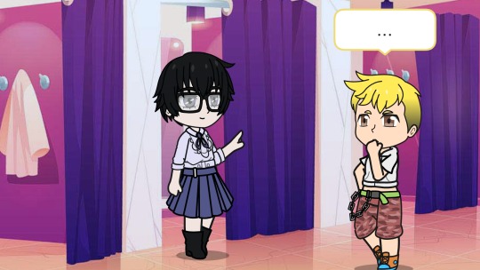
Ryuji's helping Akira pick an outfit.
He's not sure about the shirt but the boots are a definite win!
Here are the frames:


#hope akiras outfit colors are ok#i just thought he looks good in pastel purple (^~^;)ゞ#also i live for cropped hoodie ryuji 🥹#persona 5#ryuji sakamoto#akira kurusu#ren amamiya#nonbinary akira#nonbinary ryuji#maybe?#cross dressing#gacha club#fashion#houseplant unicorn post#houseplant unicorn work
3 notes
·
View notes
Note
yo i got a question, why/how are your original character designs so consistently excellent??
AAAAAAAaaaaa!! o(*≧□≦)o Thank you so much!!
I less design my OCs to look good and rather, try my best to design them around their personalities and backstories if you know what I mean? I apologize I’m probably going to go on a bit of a ramble here with little to no knowledge of design because I really love my OCs;
Edit now I’ve actually written all of this: ITS SUPER LONG IM SO SORRY
Like, for example, Neta’s design is based all around looking warm and making her look short. She’s the start of her plot, always kind and helpful. Somewhat impulsive (extremely impulsive at times really). She’s also a somewhat abstract detective too. So for her I gave her a warm palette for her personality, also a really long coat because characters wearing long drapey clothing like the trench coat that covers most their body seems to make characters look smaller to me? I went with the boots for the same reason.
On the other hand, her girlfriend Fuyu (excuse the old art I’ve not drawn her recently) is different because of this. Their colours are blue in hues because she’s like a “Cool untouchable” looking person, since her character has a job based in fame. Her outfit while it had to be something water-based for plot reasons, could of quite easily been a wetsuit. It’d of been less sexually appealing though and that’s not in her personality. She’s the type of person to exploit people she doesn’t know by using her charm, and showing off her legs (which are muscular! but i cant draw that properly yet), and having her long, flowing and glowing hair is meant to make her look enchanting too.
On the other hand! An extra point about Fuyu, I tried my best to show her casual personality in her look too, with a puffy blue jacket from her girlfriend and the way her hair hangs limp and in her face outside of water is supposed to show a sort of down-to-earth look to her too.
Hahahaha, not sure if I’ve pulled that off though.
I say the most important part of character designs is trying as much as possible to put a character’s personality and history into their design.
I give shy or cool standoffish characters mostly blues and cooler colours to show how not-fiery their personality is. The lighter the colours, like pastels, the more likely the person looks cheerful or happy or innocent (the except for this is when a character uses white and are used for bad guys, probably in an attempt to show off how ‘blank’ their feelings are). Greens are mostly kind, nurturing people, like nature. Pinks and yellows are for more happy carefree people (while writing this I realize Tokyo MewMew is a really good example of using colours to show personality)
Is your character non-confrontational? Draw their body language inwards, have them hunching their shoulders, holding their hands close to their chest and their legs closer together too. Have them avert their eyes a lot from the camera or be just-off from looking at the person.
On the opposite hand, a character with a loud boisterous personality that would confront people a lot, have them look directly at the person they’re looking at if they are, they’d almost be looming over other people. Definitely not hunching. They’d probably use their arms and body language a lot more to talk to people in order to express themselves better. Draw them with their arms more spread out too! Open, maybe even slightly claw-like unless they’re angry or intending to punch someone.
I don’t think I draw confrontational characters a lot actually.
The next thing you need to think of which is really important is their nationality.
Biologically wise and how they were raised too.
Now, I know that people say you need to add more variation in skin colour and nationalities to your OCs, but they’re your OCs. Circumstances may make them all from the same country. For example if you have something based in Japan, obviously more of your characters are going to be Japanese. You might worry this won’t give you variation, but don’t worry! If you do it right then despite them all being japanese- heck, they could all have black hair and black eyes- you could still make them completely different.
I find showing nurture is just as important as showing everything else.
My earlier OCs show a lot less of this. One of them, a character called Dannie (I can’t find her right now) I made in middle school, has a look that is different from their past, from their nurture. Her clothes show her as a tough person, a crop top with a popped collar, an exposed stomach, dirty jeans. Spiky hair done up in a ponytail. Sharp red eyes. All of this shows a somewhat rebellious child in her looks, but her personality isn’t really like that at all. I’ve hopefully improved by then!
One of my favourites of diversity and character design I did are the six main characters from my Haven story. Though they don’t have names yet (and honestly, I’m using colours for their names so often they might as well be), the most important part of them are their personality showing in their looks.
The first one, orange haired, eyes averted, wears a thick coat and a scarf in any weather is me trying to express they’re trying to hide and cover themselves up.
The second one, the white one, uses blues and whites in order to seem colder, with unnaturally yellow eyes to put the casual person off even further. They also have extremely formal wear with layers of clothing that are also rather traditional compared to everyone else. Most of her design is trying to show how anti-social everything about her is.
The third, the yellow guy is sort of portrayed to be a delinquent. In most Japanese culture that I know of, males with dyed blonde hair are seen as delinquents. His sleeveless jacket is also there to show how rebellious he is (honestly, who wears a sleeveless jacket? they’re so impractical). Actually, while I’m on about him being impractical, if you look closer everything he wears is impractical. His roots are showing, he has a turtleneck under under the shirt which is under a jacket. The heck? That’s because when you get to know him he’s actually a really awkward person who just doesn’t know how to express himself so resorts to blustering a lot.
The fourth one is honestly my favourite. Pink, despite being the prettiest, the most popular, and even a cheerleader, is actually the main fighter of the group. Her body language is supposed to show confidence and show off her muscles proudly despite being a female. I used pinks and pastely colours to attempt to show off how cheerful she normally is.
The fifth is supposed to be the opposite of her despite dressing similar. The hair is in a ponytail but it’s cut straighter and more conservative. They’re both wearing jackets but despite that one has their sleeves rolled up while the other has theirs zipped up (and if the hands were showing, they’d have long sleeves too). The darker and more purple colours are supposed to show some sort of maturity but also I was trying for some detachment.
The last one with the grey is honestly the easiest of them all, The hair is messy, their jacket is a mess, they’re wearing goggles, and feathers. Everything about them is designed to be ‘wild’ and practical but still somewhat civilized. They’re also the most confrontational of the bunch!
Ah I totally went on, and I could of gone on longer too if I thought you wanted to hear a whole essay on how much I love my characters. o(*≧□≦)o
Maybe I should draw you something sometime? (●´ω`●)ゞ Ehehehehe..
#djinndaijun#i remember seeing you a lot in my activity you're like a really loyal follower it makes me blush#not etihwsart
4 notes
·
View notes
Last Seen Blogs
cl0wnzzy
☆th3o☆

liljomarie
Lil Jomie

studiosuits
StudioSuits
survivorwakea
Celestial Survivor: Wākea