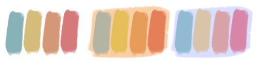
#i love desaturating blues in my edits it's the only trick i know
Text
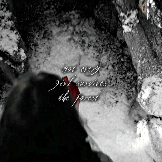

Am I the princess, or the thorns?
-Catherine Garbinsky
#yellowjackets#lottie matthews#yellowjacketsedit#yellowjacketsgifs#yellowjacketsgif#yellowjackets showtime#*#i love desaturating blues in my edits it's the only trick i know
96 notes
·
View notes
Note
I love your art so much! Do you have any of your brushes for sale, or any tutorials, especially on colour?
Hi!! Thank you so much! 💕
Honestly, my go-to brushes are all procreate brushes with slight adjustments (like stabilization, etc.) my personal preference is brushes that kind of mimic graphite pencils. The best thing you can do is find a brush that suits you & get very comfortable using it! Specific brushes won’t necessarily improve your work, it’s all about practice! (But yes, a nice brush does help!)
I do have a video on my favourite brushes:
I’ve never really made any tutorials, but I’m happy to try and relay what I know and what I’ve learned so far!
Colours are a big part of illustration! I could probably ramble on for hours, honestly—in any case, it’s always helpful to know fundamentals of colour theory. Once you learn and apply it, it becomes intuitive! I’m gonna stick to RGB colours because CMYK is it’s own thing (printing!)
There’s a handful of basic terms like hue (pure colours), shade (adding black to a colour), tint (adding white to a colour), tone (adding gray to a colour) and also opacity (transparency) that help us understand and define the complexity of colours.

My colour choices are more often than not a gut feeling—but that does come from practice! There’s loads of colour palettes available online like this one, but if you wanna come up with your own, there’s some neat ways to do that using a colour wheel! Colours can broken down into primary, secondary and tertiary colours. We can also categorize them as warm or cold. With this we can make colour schemes!
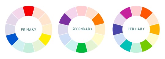
Some basic schemes!
Complimentary: two colours, opposites on the colour wheel
Analogous: three colours side-by-side
Triadic: three colours that form a triangle, evenly spaced
Monochromatic: using one colour (using different shades)
(Bonus) Monochromatic with accent colour : using one colour as a foundation and having an accent colour (similar to analogous, but one colour is used for a majority of the piece while the accent colour is used sparingly)

It’s also important to keep in mind that values (a colour’s range from dark to light) will look different on different colours. Sometimes, you’ll put two colours together and think “huh, something about this feels off” and it turns out, the colours just happen to be very close in value and melt together. Switching your piece to grayscale just to check on your values every so often can help with contrast and muddiness! A light tone on a darker tone will look brighter than it really is. Colours can also influence each other and trick your eyes.

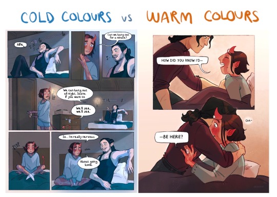
Environment is also a big part of choosing your colours for a piece. Determining what the setting is important! A sunset will make a drawing warmer, while a scene set in the night will usually have colder tones. Using only local colours (true colours, like green grass or blue sky) vs non-local colours (atmospheric perspective, accent colors that give depth, etc) can help enhance your drawing too. Don't be afraid of artistic interpretation!
Also, there’s always the option to use gradient maps (at least on procreate & photoshop but I’m sure it’s available in csp and other programs) where you draw in grayscale & apply a gradient map. The gradient map basically applies a color to every value (e.g all the shadows become blue and the highlights become orange) it can look really nice (and help out if colours just aren’t working that day yk)

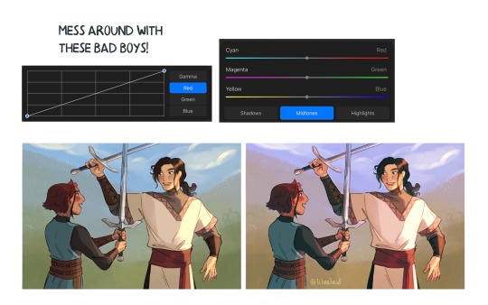
Another thing, when I’m drawing (and this is specific to me!) I tend to start with pretty desaturated colours. Once my illustration is done, I’ll duplicate & merge my layers to do colour edits. Most programs give you the option to play with curves or colour balance—menus that allow you to play around with the hue of the shadows, midtones and highlights. I tend to make my shadows more cyan-blue, my midtones a little warmer and my highlights warmer as well. Of course, this depends on the mood of the piece, whether it’s warm or cold, lighter or darker, etc!
You can always make adjustment layers on top of your work; a low opacity yellow, magenta or blue (or anything your heart desires) overlay to tie all the colours together.
I hope this helps a bit!! Happy to answer more questions to the best of my knowledge :^)
99 notes
·
View notes
Photo
hugatyourownrisk replied to your photo: “dumpin some stuff from twitter. mafia!luke alllmost resemblin the...”
God damn it, what kind of markers do you use??
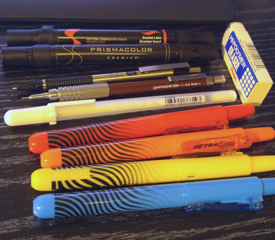
I’LL GLADLY TELL YA. Bulk of the work is done by cheapo stuff cos that’s the life I’m about. I believe this is everything used in that post... save maybe some minor liner pens. Pictured:
Prismacolor Premier dual-tipped markers (fine/brush) in Black, and Scarlet Lake. The black (and cool grey) prismas I picked up are just, star eyes, my favorite thing I’ve used since I ditched pencils for ballpoint pens. I use the brush end exclusively. My only wish is that it left a stronger, fuller black on the regular ol’ copy paper I’m using. It gets a bit patchy when stretched too far. (i picked up some plain sharpies and fat chisel tip no-name markers to combat this in the future). I wasn’t satisfied with the Scarlet Lake in this picture - probably because the red was of a different.. tone than the hightlighter’s red. Worked to help make the sharp shadows on the tie and lapels in a pinch.
Definitely gonna grab a darker grey to complement the 30% I picked up and also adore.
Zebra M301 .5mm mech pencil // Pentel Graphgear 500 (PG523) .3mm mech pencil -- i’m used to .7 so the smaller sized leads are caaandy to work with. Pencil in general is a bit annoying to me, I can tell I Use It Differently compared to fine n fancy free like with ballpoints. Plus, the smudging. UGH. The Pentel high polymer eraser, often found nearby the zebra pens, is a godsend. It gets into the lil grooves in your strokes and digs out graphite so much better than the plain cap erasers I’m used to. I’d like to pick up something similar in a stick form, might do better to get into real tiny spaces when you wanna keep pencil lines.
Gelly Roll 08 Sakura white gel pen, picked up at Hobby Lobby in a pack of three. So worth it, I’ve wanted a white gel pen for shines n stuff for yearsssss. It’s not great at laying down perfect white on bold color, unfortunate, but works alright if you let layers dry and go back over em. One of my fave tricks in that pic, most visible on the tie/lapels, was to cut a highlight in with this pen and then color over top of the white with yellow. That’s also how I got the colored lines in the wings.
Would happily listen to reccs for a “better” white gel pen if anybody knows any.
Pen Gear / WalMart Retractable highlighters - these make up the bulk of the color, found em in the back to school area in the past month, in a square-prism shaped package. they have a very weird habit of scraping up their own ink if you try and do a second layer while the paper’s wet??? Smell terrible. I love them. (the grey BG circle in the luke pic was originally blue, but came out a weird.. kinda nasty teal in the photo so I just used Color Splash in my editing app to desaturate it.)
PHEW. gush over. thanks for the interest!
#hugatyourownrisk#is this blogging#im just trying to recreate my high school self - pockets brimming with pens and markers apparently#its just s s o o o satisfyin when the mojo flows and everythin's goin down BRIGHT AND LOUD#that um#i mean art-wise. obviously.
9 notes
·
View notes
Last Seen Blogs

rentnhop
RentnHop

dogtrainingscoop
Dog Training Scoop

globaleducationmagazine
Global Education Magazine
moondragoness
MoonDragoness