#i spent some time tweaking the colours on some of these but like. they dont have to perfectly match
Text


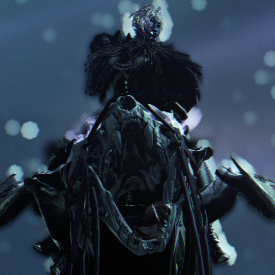
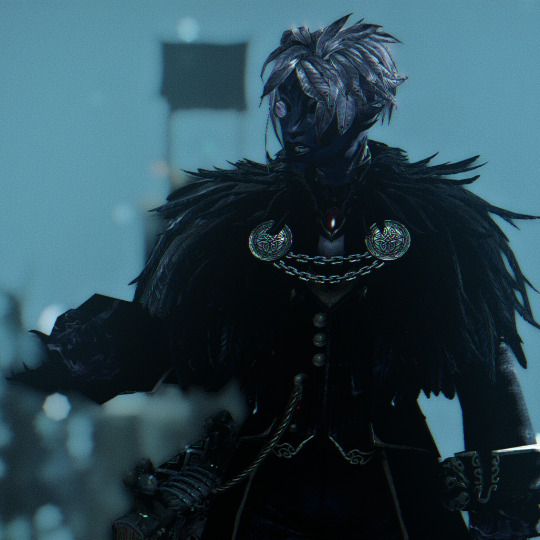

horrible man and his horrible cats (affectionate)
feat. Nerinyth (he/him)
#gw2 fan submission#guild wars 2#gw2#sylvari#gw2 screenshots#my characters#my screenshots#character pics#nerinyth#nerinythimages#necromancer#i love him <3 <3 <3#he looks like a bloodborne PC#i spent some time tweaking the colours on some of these but like. they dont have to perfectly match#i was just concenred the colour disparity would unbalance the set.. because day/night lighting but i think they're fine here#i love how the nightfang griffon's skull comes out at night <3#god i wanna take more pics of him with it#and sinister feline springer too#they're so perfect for him <3#mine
67 notes
·
View notes
Text
how to make weirdcore on photoshop!! :D
i got a great ask from @demonic-screeching about how i do my shit, so i thought id make a more detailed post here! ive been making wierdcore on this blog since january 2021, so ive learnt a lot! more under the cut.
1. find a base image!! i use imgur and pinterest. imgur is especially great because its full of old ass images of the most random shit. you dont even need an account, just hop in and search for mundane stuff like 'hallway', 'field', 'house', etc! explore! screenshot/save any images you think would be cool in an edit- make your own personal archive!! they could even be stills from videos, memes, etc!
2. cropping! this is important. cropping determines the amount of context an image has, as well as focusing on a main point. weirdcore is about removing context, which makes images seem familiar yet unfamiliar at the same time. it also adds to the amateur quality of the aesthetic- "why has this person taken this weirdly specific photo?" 99% of the time they didnt! i just cropped the shit out of it!
lets use an example of one of my old edits :) cool concept, cool base image. but it seems like its missing something.... what if we........
cropped it all out????
it is now....... free of context! where are we? where are we going???? who fuckin knows man...... we just gotta gtfo real quick by the sounds of it. the cropping has also compressed the image, which makes it feel even more weird and nostalgic! which brings me to my next point:
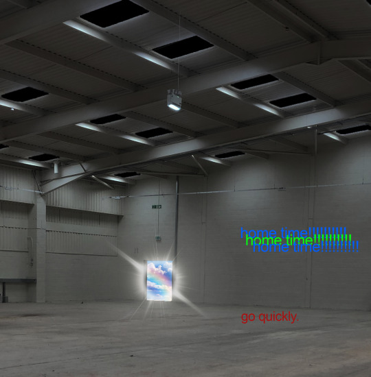
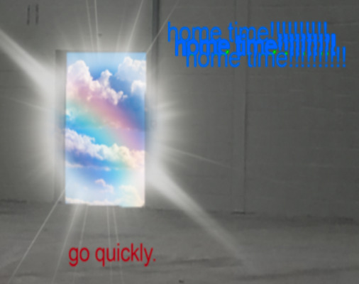
3. compression. make sure ur edits are lookin cRUNCHY! weirdcore is about amateurism and nostalgia, so use any means to make ur photos look like theyre from 2003! my personal method is zooming out of the image on photoshop so it gets smaller, then screensotting just the image, then opening the screenshot up in another document and zooming in again to reveal the compression.
4. fonts and captions! these are not necessary, but add to an edit a great deal! common fonts in weirdcore are Helvetica, Arial, and Times New Roman because theyre Normal And Boring, which really adds to the amateur aspect of weirdcore. i like to experiment with gothic and 3D fonts which can give a more webcore-y feel. this site is great for making free 3D text that you can download and add to your edits in photoshop!
as for captions, experiment! use random phrases that are stuck in your head, the more abstract the better! weirdcore is a surprisingly good way to express weird and abstract feelings. keep things vague and intriguing. ask questions!

5. editing. again, experiment! i normally fiddle with the saturation, brightness, and contrast. don't max out every setting- try and think about how you want the image to look! light or dark? bright or dull? you dont always have to tweak things if you think theyre fine as they are. other good tools include liquify, bevel/emboss, smart sharpen, gaussian blur, and warp! liquify is my favourite because you can squish and stretch the image! you can also try warping your captions too! the blemish tool is also rlly good! it can give u some weird trippy blurred out effects.
clone stamping can also help you to morph and duplicate parts of the image too! its very cool
6. go insane!!!!!!!! throw all basic design principles out the window. ignore the rule of thirds. stretch things. make them crunchy ass jpgs. use horrible colours. think about what youd do if you were a child with access to photoshop in 1997, or a middle aged conspiracy theorist making images for their cryptid blog. or like idk some weirdo on myspace.
7. orbs. use the brush tool to make orbs! theyre really good for blocking parts of an image, adding an ominous presence, making shadows, or adding bright lights! shape them, stretch them, make them funny colours. you could also use rectangles, circles, stars, etc... any shapes are cool!
8. inspiration! follow weirdcore blogs on tumblr! ask questions! learn! other resources include the weirdcore wiki and the weirdcord discord server! its where i learned a lot of what i know now, its very active, and has tons more resources there!!
overall, just experiment. you never know until you try, and its fun to develop your personal weirdcore style! its a very broad aesthetic that everyone can contribute to, and a cool outlet!
and lastly, dont worry about followers and likes! online, weirdcore is very random. some of my edits i spent 4378294 years on get like 5 notes, while i can shit something out in 5 minutes that ends up becoming my top post. popularity is pretty irrelevant here. just have fun and do things your own way!
#bonesposting#long post#weirdcore help#sorry this is long i just love infodumping about this :D#weirdcore#aesthetic#liminal spaces
54 notes
·
View notes
Photo


Approaches for an ‘ugly living room’ kinda scene, more to it than that but ill go into that later.
I’m trying to figure out and optimise my approach for doing interiors, how I did them on Bradwell used a method which is slightly different, not yet represented here.
First is my initial thumbnail, one of 4 for this particular idea. My temptation would be to just take that scene and clean up the lines/perspective a little then put some colour on there, then boom done, but I wanna explore more options.
Second pass actually uses a slightly different thumbnail as a base, as people who follow me on twitter may have seen earlier, I was getting a bit frustrated with this method because photobashing only really works for me to a point.
It took me ages to find that TV, its a good ref for the kinda TV I want but the angle is obviously all wrong. The image overall does have some value as a ref for textures I guess, but would need some tweaking still as the stones werent even what I wanted, they were just what I could find quickly.
I gave up in frustration in the end as hunting for photographs was frustrating me. I guess if you use this method more regularly you have tricks, I’ve done it before for props etc and it’s useful for creating household objects or trinkets but anything more complex than that it becomes a perspective nightmare.
Maybes I’m being too obvious by trying to find specific objects instead of just painting a scene and adding textures or something, but at what point is that basically the same as taking a straight drawing/painting illustration approach? When I’ve seen tutorials on this stuff in the past its always stuff that’s slightly more generic - like making sci fi control rooms out of a photograph from an irl nuclear plant or whatever, painting it over to make it look more flashy.
I guess I could’ve looked harder for a picture of a chair and a vintage TV to use as a base, but it’s all a similar problem, just so much time spent hunting when I already spent a lot of time hunting for my initial refs to set the direction for my thumbnails.
So then we have the third pass, or the ‘ I’m so glad Blender has a gizmo now’ pass. Some basic modelling to lay out the room then importing turbosquid assets in as placeholders. This allows me to scale, rotate and lay things out as I wish and when I’m done I can set up lights and a camera and have a lot of work done for me. I’ve left it pretty blank as when I go in and do the paintover I’ll be iterating and deciding how messy or clean things will be ( have to leave space for ugly wallpaper/carpet, obviously ) but the gist is there- some weird ass late midcentury choices, the chair, the TV, and the...audience.
Some of the drawing is lost in the translation to 3D, but as a base for paintover they can be drawn back in. I guess if my intent was to go ‘realistic’ with it once the details of the concept are figured out it’d come up against the photobashing problem again, though I dont have a problem with using photo textures on a painting, like wood grain or whatever, I guess that’s something to worry about later.
1 note
·
View note
Last Seen Blogs

mikiofafrick
FAFRICK

onepiece-gotmedownbad
Run before it's too late

iconsbastille
I'm coming for you;

mikhail0milkovich-blog
شركة كشف تسربات المياه

populartractor
Popular Tractor