#idc if the tone changes just keep the original style
Note
AAAAHHHHH!! CONSIDER MY SHIT FLIPPED!! THE BLACK BUTLER LIVES! What are your thoughts on the new art style?
BRO I'm with you, flipped like that pancake I managed to throw half out the pan😩 I still can't believe. best Monday every fr.
and ooo thanks for the question, I wanna hear your thoughts after this👀 I've already said a little bit about this in the tags of some other posts, as well as touched on it in my master post of the crew, but I suppose I may give a big final answer(for now, from this teaser).
judging the art alone, not the fact that we get a new anime or anything exciting like that, just the art alone... it's very pretty!
yea this is very pretty. the kid looks great, small and good, and his hair looks feathery and neat, so I approve. I think they nailed his general proportions, I think they'll do a great job at keeping them consistent during episodes! the image to the right does looks a tiny bit like a 3d asset, which is a bit jarring compared to the previous anime style, but I'm flexible towards this change. even if he looks like a video game cutscene character, I usually love cutscenes!!
but here's the drama I'm sure you're here for. yes, unfortunately, there are some wee things that I don't love as much🤏
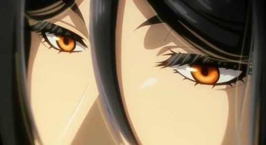
the first thing, it really doesn't matter and I should shut up about it now... but YOU asked so ajdjfksksk why did they have to shrink sebs jaw cmon my favorite art of him ever was during the Greenwitch arc so don't tell me I'll NEVER be able to see that style of him animated😫 I just like prominent features man. I know he's meant to be pretty but but but....
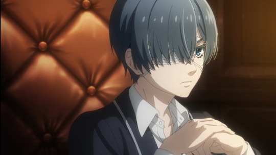
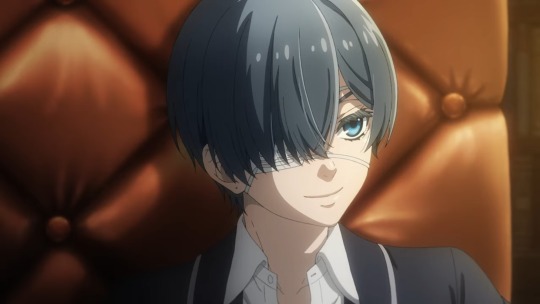
ah okay. heres the main thing that I think most people may agree with.
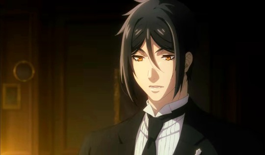
these are two screenies of sebster from the teaser. honestly, as ☆luxurious☆ as his lashes are, I'm not a fan of the left image. the airbrush on his hair feels a tad overdone. I love the attention to detail, especially in the one on the right, it shows a lot of love! but there's just something about it that's a bit off for me.
and I think after 24 hours I've finally figured it out: it's the colors.
the realization started to hit me when I saw my favorite edit so far here by @ashxketchum. the colors have been edited to be much more saturated and warm. and I think this is exactly what is missing here.
I even tried my own hand at it, and yea personally, I think slapping a saturation, tint, and just a BIT of contrast on the whole thing can do numbers on it.
already I like it(no I'm not just praising my own work, it's not the best edit out there I did it in 30 secs). I think the reason for this is because the background is very rich in contrast and warm tones, so the characters(particularly sebastian who is all black) stand out when they are muddy and low contrast. I love stylistically when contrast is high, but that's just a personal thing, and I shouldn't hold a studio to those standards.
I tried it for the poster too though, which again I felt was a bit off. official art has never been the most top tear, and the poster is GOOD, the background is awesome and the two peeps looks amazing. but my problem with it was clear once I did another color edit.
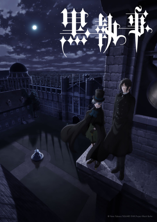
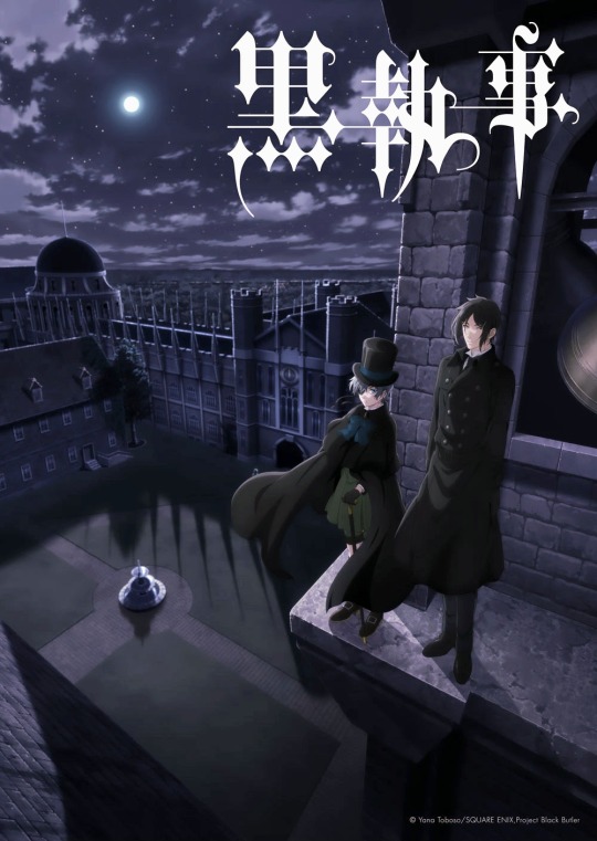
(edit on the right)
again, I feel like everything was very muted in the left original, not to mention a tad monochromatic. I really think a kick of contrast and hue could do wonders.
BUT. I know that at the end of the day, it's not a big deal. I don't really care. would it make my day or whole year if they slapped a color filter on it, or continued to work on the color grading of the scenes? probably yea! but my opinion isn't obsolete, and most of all, I look forward to and respect the artists decisions.
so no I'm not "fixing" the art😅😒.
and finally, I think this is awesome:

(I had forgotten but this gif is edited by @kilruas from this post)
GORGEOUS. could it turn some people off cause it's mostly cg? maybe. idc though. gorgeous. gimme some of that beverage.
sorry for the rant, hope it's what you wanted! I think that's everything... I like it 85%!
#my asks#thanks for the ask bud!#kuroshitsuji#black butler#kuroshitsuji 2024#2024 anime#my text posts
57 notes
·
View notes
Note
two things. one, your art is absolutely wonderful. i love the warm tones and style. two. got any like. weird art tips. like just weird things you do that work really well. or just art tips in general lol. there's something bout your style that makes me go ':D' lmao
aaaaaa tysm !!!! very glad u like my style <33 means a lot
and yeah id say i have quite a few with the way im very experimental n passionate abt art !
>> i think my weirdest one is rly just the main way i render tbh ? like, as u can pretty easily see with my main art style is that its all very crunchy n pixelated, n thats all cause i have anti-aliasing off for my brush . i render in a pretty unorthodox way but it makes things so so so much easier and more fun for me, even if its more time consuming for several reasons
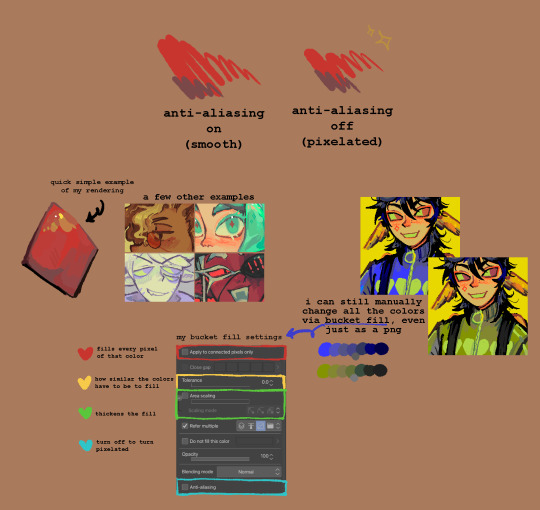
heres a little bit of an infographic ive whipped up that hopefully u can get smth out of lmao . its 6am ive been up all night drawing as usual so im having a lot of trouble doing things properly sorry sorry
and the funny thing is this is aaaaaaaaall just cause i hate blending and am scared of committing to things (esp colors) so i just decided "okay whatever im gonna be goofy and just make it all pixelated idc anymore" and it worked !! (thanks homestuck) art is sm more enjoyable since i started doing this as it fits perfectly with the way my brain works and its helped me sm with getting better at colors bc of the way i have to do every single color manually (for several reasons like how i have to keep track of every color ((which makes me recycle them a lot more making things look more united)), gradients r the most fun to do but i have to make sure all the colors "blend" together nicely, i get to change them super easily, etc etc)
however these days i HAVE been trying to get back into working with anti-aliased brushes just to get out of my comfort zone n such, but tbh the only thing its helped me with is remind me how much more fun drawing aliased is and how absolutely dogshit i am at blending FDJHJKDF
also it makes me better at minecraft skins since im so used to working with pixels !
>> another little weird thing i have that honestly just goes against basic art rules is experiment by having ur values be as close together as possible without losing contrast . this is horrible as a tip, but fun as an experiment, and for me its just fun since i already know pretty well how values work and have enough experience to break the "rules" - because lot of times good shading colors r actually lighter than the original when put under b&w
so if ur like me i would recommend trying it out ! if u dont even know what values are then this ISNT good for u, do values properly as they really help
>> if u struggle a lot with side profiles, just learn from the gorillaz demon days album art . like literally im not joking that is THE thing that made me learn to draw side profiles and id say im pretty good at them now (however the effectiveness of this probably depends on the style)
and by learn from it i mean u can just trace it with any other characters, or study it, or reference it, yadaydayada . just do wahtever with it, damon albarn dgaf
obviously this isnt gonna magically make u great at side profiles but if u want a fun art challenge or ur a big gorillaz fan like me, it could get u kickstarted !!!! especially if ur doing it with ocs or characters u like that are in a band or something
ok thats all the tips ill be giving out tonight im a little sickly victorian child rn
hope it helped . uhm . bye
13 notes
·
View notes
Last Seen Blogs
the-hensters
all you need are 5 things...

proxycrossing
🌴just a place to dump all my animal crossing stuff🌴

hana0531
HANA♥
simoneships
Simone

cat-mother-of-two
Shop Keeper Forneus