#inspo to the nth degree
Text
Every Second Counts - Part 2

Pairing: Russell Shaw x F. Reader
Summary: One date with your best friend’s brother leaves you wanting more, even though his questionable job and vagabond lifestyle make you want to guard your heart. When your brother falls into trouble, however, Russell is the one you trust to help you find him.
AN: I decided to put this chapter out a bit early due to some Father's Day stuff tomorrow. I was blown away by the response from you guys on Part 1!! Thank you so much. 🥰 I had some trepidation writing a new character, but I'm so glad you guys seem to enjoy where this little series is going so far. It makes me even more excited to bring you the next chapter of ESC! 💜
Song Inspo: “Too Late” by The Paper Kites
Word Count: 5.3K
Tags/Warnings: Shaw family feels, a bit of mystery, tinge of fluff and mutual pining, and a twist…
💜 Series Masterlist

Part 2: “Family Reunion”
The next day after he left, you finally managed to get Charlie on the phone. He implored you not to try and find him.
He claimed he was staying with a friend for now, and was picking up some odd jobs through a connection at the museum—another security guard who knew how to get extra work.
“What kind of extra work?” you asked. You sunk back into the couch in your living room and held a hand to your aching head. You had already lost sleep over this, worrying about where he was and what the hell he was doing.
“It’s better that you don’t know,” Charlie said.
He really knew how to frustrate you to the nth degree.
“Charlie, just come home. Please,” you said. Tears burned in your eyes, choking your words. “I’m sorry for what I said, okay? We’ll figure this out together, I promise.”
You heard him sigh.
“You had a right to be mad,” he said. “I’m the big brother, remember? But I’m…I’m a fucking mess. You shouldn’t have to take care of me.”
“We take care of each other, and you know that,” you said sharply, wiping at your eyes in frustration.
“Listen, I’ll come home when I can, okay? Be good.”
“Charlie! Ch—” The call ended, and you nearly tossed your phone in aggravation.
“That stubborn fucking idiot,” you muttered.

Four months later, your worry was eating you alive.
Charlie refused to come home or tell you where he was staying. The only time you got to see him was when you visited him on his night shift at the museum. You tried to talk him into coming home, but your brother remained stubborn.
“You get that from Dad,” you’d told him once, while watching him eat some leftover meatloaf you’d made for him. The two of you stood outside the museum on his break.
Charlie had smirked at you. “Yeah, well, you share the disease.”
You’d rolled your eyes at that.
But just when you thought you were starting to get through to him, now, he’d stopped answering your calls. For that matter, the museum hadn’t even seen or heard from him in a week or so.
So here you sat, in the living room of Dory’s apartment, crying into a jar of Nutella that you’d long ago stopped spreading over the strawberries she’d laid out. You had a chocolate-covered butterknife in one hand and a used Kleenex in the other.
Dory was sat next to you on the couch, rubbing your back with sympathy and concern in her own eyes.
“You should call the police,” she advised.
You’d thought of that, but if Charlie was doing something he wasn’t supposed to, then depending on what it was, you didn’t want necessarily want him locked up in a cell. He wasn’t a bad person, he was just…lost. You wanted him to get help.
You set down the butterknife beside the jar and turned to her, after drying your eyes the best you could.
“Do you think your brother would be willing to come back to Wyoming?” you said. After a beat of hesitation, you specified:
“Colter, the tracker.”
You hadn’t had a chance to meet him when he dropped in a couple of months ago, but she’d told you about his brief visit to find a graduate student who had been kidnapped, and nearly killed by a professor in the Sciences department for uncovering a flaw in the man’s research. That flaw would have costed him his entire grant, and possibly his career and reputation.
The terrible incident had caused an uproar on campus. Students were released from their classes for an entire day after the professor was arrested.
Now, Dory considered your question with a thoughtful nod. “I’ll call him.”
You were grateful, but your face became pained as something occurred to you. You held up a hand.
“Wait, I just realized I can’t pay him,” you said. You didn’t have more than a thousand dollars in your savings account, and that was for emergencies. Like the time Charlie nearly burned the house down after a lighting mishap with his bong.
“Oh, sweetie, don’t worry about that,” Dory said. She laid a comforting hand on your arm. “He’d do this as a favor to me.”
“I don’t know,” you replied, your brows furrowing. “That’s a pretty big favor.”
She’d told you what some of Colter’s fees could run up to, but she tried to quell your reservations and promised to call him regardless.
However, the more you thought about it, you already had a phone number in your cell…for the one person who would understand the part of your brother that you might never be able to.
After you left Dory’s apartment, you debated the idea in your head for the entire drive home.
And when you got to the house, you picked up your cell, and you called him. Your nerves had you pacing back and forth across the living room as it rang.
“Hey, sweetheart.”
You couldn’t help smiling just at the sound of his voice, smooth and pleased, and a hint surprised.
“Hey,” you replied, biting your lip. “How are you?”
“I’m good. You’ve got good timing too. I just came off a job,” he said.
“Oh really? Where are you?”
“Well, I’m states-side now. Just got back from South America.”
“Oh, wow,” you said, blinking incredulously.
What the hell was he doing there? you had to wonder. Maybe he was protecting some Latin American emissary. Or maybe, he was doing things you didn’t want to think about. Your brother had filled you in a bit about civilian contract jobs in recent weeks, as he’d considered going after those himself.
“They can pay very well, from what I hear,” Charlie had said. “The problem with that is, it kind of defeats the purpose of leaving the military.”
Despite that mildly troubling thought, you tried to focus on the fact that you had this man on the phone at all.
A smile formed across your lips. “Did you get yourself a nice tan?”
“Eh, not really. Was more of a night job,” he said. “But uh…how are you doing? Not gonna lie, I’m surprised to hear from you.”
“Yeah, I’m…I’m not all that good, if I’m honest,” you said.
“What’s wrong?” he asked. You heard the concern in his voice. You steeled yourself before you answered.
“Russell, I’m sorry, but I need to ask you for a big favor.”
“Hmm, this sounds serious,” he said.
“Yeah, it is,” you agreed. When you next took a breath, it came out unsteady. “My brother’s missing.”
It was a bright Saturday morning when you welcomed Russell Shaw into your house. He looked around, finding family pictures, bookshelves, paintings, candles, all things that began to shade in who you were in the comfort of your home.
“It’s nice,” he said. “It’s uh, homey.”
You smiled and closed the door behind him.
“Well, it’s the house we grew up in,” you replied.
You and Charlie had of course inherited it after your parents’ passing. Their life insurance policies had helped pay off the three-bedroom house while you two were still in school. Your grandparents helped a lot back then too, and had even moved in for a time. Now they each had plots beside your parents at Grandview Cemetery.
“You want some coffee? I know you had a long drive,” you asked.
“Sure,” Russell agreed. He followed you to the kitchen, where you put on the coffee pot. You made a discreet glance at him. He looked virtually the same, with that familiar green jacket, jeans, boots, and a Jimi Hendrix shirt. You'd had a feeling he was a classic rock guy.
“Look, not that I wasn’t glad to get your call,” Russell said, “but you do know that I’m not the tracker in the family, right?”
“Dory did offer to call Colter, but I can’t afford to pay him,” you said.
“I could help with that,” said Russell. You raised up a hand to stop him there.
“I don’t want that kind of help from you,” you said firmly. “I didn’t call you for money, Russell. I called you because you’ll probably understand where Charlie’s head’s at. Better than me, anyway.”
He hesitated, but nodded in understanding. When the coffeemaker dinged, finished percolating, you turned to make him a mug with cream and sugar, as per his request.
While he waited for the coffee to cool, he admired you for a moment. Even in a plain V-neck shirt and a pair of jeans, your hair swung up in a ponytail, you were still a sight. (Your lipstick did match your shirt though. That made him smile.)
And Russell could admit, it was good to see you again.
“Me and Colter reconnected recently. Did Dory tell you?” he said.
Your brows raised high in surprise. “Oh yeah?”
The two of you found your way back to the living room with your mugs.
“Yeah. We talked for the first time in…shit, over twenty years,” Russell laughed, raking a hand through his hair.
Not only had he been able to say his piece to Colter about their…family issues, they’d also solved a case of their own, with Colter agreeing to help him find his friend Doug, who worked for the same black ops contract agency as Russell. The Horizon Group.
The aftermath of that still left Russell with a bitter taste in his mouth when he thought of how Horizon would’ve left Doug to rot, if it hadn’t been for him and Colter pressing their luck and digging deeper into who’d taken his friend.
That whole mess had also made Russell begin to wonder if maybe he needed a new line of work after all. But, because the money was just that good, he’d ended up on a new job by the end of the month.
Your voice soon broke him from his thoughts.
“I’m glad to hear that,” you said. You reached over and touched his arm, with warmth in your eyes.
Russell gave you a smile. The closeness between you brought up memories of that dusty bar, and the taste of lime and tequila on your soft, supple lips. But you subtly cleared your throat and took your hand back. He hid a twinge of disappointment.
“So what’s going on with your brother?” Russell asked.
Get back on track, he reminded himself.
You sighed. “Damn Charlie.”
Over coffee, you explained that Charlie took off a few months ago, the night you got back from the bar. You had seen him only briefly, whenever you were able to catch him at the museum after work. He’d been keeping in touch with you on a weekly basis, but now, he hadn’t called in almost two weeks. You couldn’t get ahold of him on any of the numbers you had. They all seemed to be burner phones. Plus, he’d been let go from his job at the museum after not showing up for the past week.
“What’s he into, extracurricular-wise?” Russell asked.
“I don’t know. He wouldn’t tell me,” you said in frustration. Tears prickled at your eyes, and your lower lip trembled. “He said it was safer that way.”
Russell laid a supportive hand over yours, earning your watery gaze.
“And you haven’t gone to the police?” he asked.
“I think he’s gotten into something…dangerous. I don’t want to get him in more trouble than he might be already,” you said. “I just want him to get help for his problems. Physically and mentally.”
Russell nodded. He understood that you wanted to protect your brother. Sometimes though, getting into “trouble” was the rock bottom someone needed in order to face their problems.
“Does he have friends?” he asked. “Some kinda crowd he hangs around with?”
“Not anymore. I think he’s lost touch with his Air Force buddies,” you said, though you tried to think. Your brows furrowed as something occurred to you. “He knew someone at work, at the museum. Another security guard on his same shift. After they cut his hours down to part-time, Charlie said the guy knew how to get extra work.”
“Okay, that’s definitely where we start,” said Russell. “Let me just give Dory a call. If I don’t let her know I’m in town, I don’t even wanna know the consequences.”
You laughed through your tears and tried to brush them away.
“Yeah, do that. I wouldn’t want to get you in trouble.”
Russell took one look at you, and he tightened his hold on your hand.
“Hey,” he said.
You glanced up at him, as tears clung to your lashes. His heart couldn’t help but clench for you. He really didn’t like to see you like this.
“We’re gonna find him. You’ve got my word,” he said.
You were desperate to believe him. So you nodded, sniffling as you tried and failed to keep yourself together. You were scared, for the first time in a long time.
“All right, come ‘ere,” Russell said. When he guided you into his arms, you went willingly. You pressed your face into his chest to hide your weeping. His hold was warm and strong enough to make you feel secure. Just for this moment, you didn’t have to pretend you had everything handled.
“He’s the only family I have,” you reminded him. He nodded.
“I hear ya. We’ll get him home,” he said. “And I am going to call Colter. Don’t worry about the rest. I’ll square it up with him.”
“Russell—” you protested, but he just squeezed you playfully.
“Don’t worry about it. I’ll pull big brother rank. He’s got no choice,” he joked.
You shook your head, but you allowed him to comfort you for a bit longer. Because all too soon, you’d have to steel yourself again. You’d have to be the version of yourself that you always had to be, ever since you were fourteen years old.
You invited Dory over to your house, where the three of you were soon joined by the last of the Shaw siblings: the one you had yet to meet.
Colter made it in time for dinner that afternoon. The tall blonde took up your doorway with his broad shoulders and offered you a polite smile, along with his hand.
“Hi, I’m Colter,” he said.
You mentally tripped up a bit as you shook his hand and gave him your name. Did all the Shaw siblings have to be so damn attractive?
“Uh, yes, please come in.” You ushered him into your home and led him into the living room, where Russell stood from the couch.
“Ahh, there he is,” Russell grinned, slapping his younger brother on the shoulder.
“Here you are,” Colter gestured at him. “Where the hell did you take off to after last time?”
“Ah, you know. Argentina was fun.”
“I’m sure it was.”
You paused in the doorway, just watching the brothers in mystification. Dory shot you a questioning look as she came over from the kitchen. You met her with raised brows.
“What?” Dory asked. A smile played on her lips.
“Do all of you have to be so unbelievably pretty?” you whispered over to her. Dory smirked and bumped your shoulder, nodding at Colter.
“What, you wanna make out with him too?” she teased.
Your mouth dropped open in disbelief. Dory just laughed and moved on to say hello to the other blonde. She pulled him down into a hug, and he reciprocated warmly.
Russell then laid a hand on Colter’s shoulder, as well as Dory’s. He wore a big, proud grin.
“Hey. Look at us, huh?” he said.
Dory sniffed as tears welled up in her eyes, looking up at both of her brothers. Colter wore a more reserved smile, but he did wrap an arm around his sister and thump his older brother on the back.
You smiled. You were lingering by the kitchen doorway. If nothing else, you were glad that this whole mess had been able to bring Dory back together with her family.
You decided to give them a moment, and you wandered back into the kitchen. There you took a beat for yourself, mainly to breathe.
When you again thought of Charlie, you had to wonder just what the hell he’d gotten himself into.
Later, the four of you sat in the living room so you could explain everything you knew so far to Colter. He took all the information in with a pensive expression that didn’t reveal much to you.
“So you said he was struggling?” he said.
“Yes, after he got out of the military,” you confessed. “He had a hard time figuring himself out. I got him the job at the museum, but I don’t think it was enough for him.”
“Why is that?” Colter asked. He saw that you were reluctant to explain. “I need to know the full picture of who Charlie is if I’m going to be able to figure out his probable moves.”
You sighed. “Well, he was seeing a VA psychiatrist for a while. They wanted to put him on antidepressants, but he stopped going. He…started self-medicating instead.”
That part was hard to admit, but it was the truth. You couldn’t pretend it wasn’t any longer.
“What substances?” Colter asked.
“Alcohol, mainly,” you replied. “At his worst, there were hard drugs, but I got him to tone it down just to weed every now and then.”
You bit at your thumbnail out of habit, but you forced yourself to stop, folding your hands in your lap. You didn’t see judgment in Colter’s eyes, just him taking in the information. You couldn’t help but glance at Dory, where you found her sympathy. She knew enough about what you’d been dealing with for the past few years. Russell seemed understanding as well.
“Anything else I should know?” Colter asked. You shook your head. You felt bad about revealing Charlie’s business like this, but you knew it was the only way to help him. Still, you felt you had to defend him a little.
“Look, my brother has his problems, but he’s a good man,” you said. “He, um…he basically half raised me, after our parents died.”
Dory also knew this story. She rested a hand on your back, and you gave her what smile you could.
“How old were you?” Russell asked. He earned your attention, and you met his sympathetic gaze.
“Fourteen,” you answered. “It was a car accident.”
He took that in, nodding slowly. “I’m sorry.”
The way he met your eyes when he said it, you believed him. You subtly cleared your throat and directed the conversation back.
“So, I don’t have a lot of money. But I can give you something for your services,” you said to Colter. Both Russell and Dory met you with similar looks.
“I’ve got it,” Dory says, before Russell had the chance. Colter waved her off though.
“In this case, it’s not necessary,” he said, focusing on you again. “So Charlie was working at the local museum?”
You breathed a note of relief at his generosity. Dory, Russell, and now Colter…they were all good people in their own way. You felt emotion rise in your throat.
“Yes, it’s about ten minutes away,” you managed to reply. “It’s closed now, but his coworker could be on shift. They always have security in place.”
You grabbed your purse to go with them when Colter and Russell stood, but the former raised a placating hand.
“It’s best if you stayed here,” Colter said.
Your brows rose. “I don’t think so.”
Colter’s mouth parted, and he blinked, like he hadn’t expected you to push back quite like that; calm and matter of fact.
“Ah, well, it’s really for your safety—”
“I’m not going to sit and wait,” you said. “That’s all I’ve been doing for months. I may not be an expert tracker, or have been in the army, but I do know my brother. And we are going to find him.”
Behind you, Dory was giving Colter a warning shake of her head. She knew just how stubborn you could be. Meanwhile, Russell came up on your other side with a smile.
“What’s the harm in her coming along to the museum?” he said, sliding his brother a teasing look. “Unless the T. rex wakes up all the mummies, Ben Stiller style.”
You wanted to point out that that wasn’t exactly the plot of Night at the Museum, but you held it in with a smile. You gave Colter an expectant look.
He sighed at Russell’s antics, but he turned to you with a nod.
“Okay, let’s go,” he said.
“I’ll head home then,” said Dory. “Call me if you need anything.”
You gave her a hug after she gathered up her purse.
“Thank you,” you whispered.
“It’s going to be okay,” she said, rubbing your back. “Colter’s the best.”
“All right, fine. And what am I? Chopped liver?” Russell remarked, gesturing wide with his hands. You all filtered out of your house, and you locked the door behind you.
“Oh, you’re special, all right,” Dory quipped back, but she gave her eldest brother a warm hug as well, then patted Colter on the arm before she left.
Russell shot Colter a playful smirk. “I got the hug.”
Colter rolled his eyes and pointed over to his big pickup truck.
“Just get in the car, please.”
You had to smile at all their sibling teasing. It reminded you of how you and Charlie used to cut up, when things were good. On your way down the driveway, you hesitated by the Chevy Chevelle parked next to your own car. She was still black and sleek and beautiful.
You happened to glance up, and there was Russell, getting into his brother’s pickup. He winked at you across the driveway. You turned your face to hide your smile (and your blush) as you climbed into your car.
Colter noted the exchange when he buckled up into the driver’s seat. He watched Russell do the same on the passenger side, all while wearing a certain smile on his face. When he noticed how Colter was looking at him, his brows raised.
“What?” said Russell.
“What was that?” Colter asked.
“Nothing.”
“Yeah, right,” Colter chuckled. He began to pull the car out of the driveway after you in your car, so he could follow you. “What, do you two have a thing or something? Is that why she called you before me?”
Russell shrugged, but his smile was telling. “I don’t know what you’re talking about.”
“Mhmm. Convincing,” Colter said, but his lips tugged upward as well. His good humor diminished though, when he considered the last time he saw his brother. “How’s the arm?”
Russell gave a thumbs up with his left arm—the one that previously had a bullet run through it. It was still healing, even now.
“It’s good,” he said.
“Did you see a doctor?”
“Sure did.”
Riiiight. Another thing Colter wasn’t sure was the truth, but he’d give Russell that one.
“And that unfinished business?” Colter asked.
Russell’s smile faded, but he nodded. “Finished.”
After a moment, Colter nodded as well.
“Okay,” he said.
Something occured to him then. He paused, and he reached into his pocket. He held up a small, closed pocketknife with a wooden handle, and he gave it back to Russell. It had the man's name carved on the side.
Russell's smile returned as he flipped the old keepsake through his fingers.
"Thanks for keeping it safe for me," he said.
Colter smiled back. "Thanks for trusting me with it."
Colter parked next to you at the museum. It was closed, but the security guard, Jimmy, did know your brother.
“I haven’t seen Charlie since he quit last week,” Jimmy claimed.
“He quit?” you said. “They told me he just never came back.”
“Yeah, well, same thing,” he said.
The front doors of the museum opened, and out came Dr. Feinman, your former boss, and the Head Manager. You left Jimmy’s questioning up to Russell and Colter with a meaningful look, and you went to intercept Feinman.
“Hi, sir, how’re you doing?” you asked. Your name fell from his lips in surprise.
“My dear, it’s good to see you, but why are you here after hours?” he asked, his British accent lilting.
“I’m trying to find Charlie. He’s been missing, well, officially for about a week,” you said. “I was actually surprised to see you here so late.”
The man cleared his throat. He smoothed a hand over his tie and suit jacket.
“Yes, well, we could’ve used Charlie’s help. We’ve had to double our security efforts,” he said. “We’re currently dealing with a sensitive issue, so the museum will be closed until it is resolved.”
“You’re doubling your security efforts… Was something stolen?” you asked.
Feinman clearly didn’t want to tell you this, but you knew you’d hit the nail on the head by the look on his face.
“Please, keep that information to yourself,” he said.
“What was stolen?” you asked in concern.
“I’m afraid I cannot disclose that information. Not even for you, dear,” he said. “I do hope you find your brother though.”
“Thank you. I appreciate that, and as a matter of fact,” you began, but Feinman waved an apologetic hand.
“I’m sorry, I’m afraid I’m in a terrible rush just now. But call my office tomorrow and Brenda will help you with whatever you may need,” he said. “Good evening.”
“Wait, Dr. Feinman,” you tried, but he was already breezing past you and heading toward his Mercedes in the parking lot.
Meanwhile, Colter and Russell weren’t having much better luck with Jimmy.
“Look, I really don’t know where Charlie is,” he said. “Haven’t seen or heard from him since he took off.”
“He said you connected him with someone who could give him some work on the sly,” Russell said, leveling a hand at the man’s chest. “Who did you connect him with, and what kind of work are we talking?”
Jimmy blew out a breath, like this was really inconveniencing his day. (Or night, at this point.)
“What, you’ve got somewhere to be?” Colter said. “You’re getting paid to stand right here, and we have no problem sharing your shift all night. You might as well just tell us what we want to know.”
Jimmy rubbed the back of his neck in annoyance.
“All right,” he snapped. “I hooked him up with this guy I knew through a mutual acquaintance, who just needed some muscle. I guess you could call it private security.”
“A mutual acquaintance?” Colter repeated.
“What’re you, James Bond? Who did you connect him with?” Russell pressed.
Jimmy was reluctant to talk. You came back over to join them, and the security guard became even more tight-lipped.
“You guys should go. I don’t have to talk to you, and I’ve got a job to do,” he said.
When he tried to continue his patrol around the museum, you stepped deliberately in his way. You didn’t have the patience for this, and you would no longer be a doormat, letting the Goldsteins and the Feinmans of this world push past you.
“Look, Jimmy, if you don’t give us something we can go on to find my brother, you know where I’m going to go?” you asked. But you spoke before he could respond. “To the police. And your name is the only one I have to give them. Now, if you don’t want that to be you, then give me a different name.”
Jimmy looked down at you, and then over at your intimidating shadows, Russell and Colter. Jimmy sighed.
“Eddie,” he gave, finally.
Russell raised his hands, as if to say, Is that it?
“What, Eddie Vedder? Eddie who? Come on,” Russell said.
“Eddie Mendez,” Jimmy replied in a lowered voice. “I don’t know where he lives. I don’t have his number. And that 'mutual acquaintance' is doing some time in lockup. But Eddie hangs out at a bar called Howley’s.”
You and Russell shared a meaningful look at that. You turned back to Jimmy.
“Okay. What was stolen here at the museum?” you said. “That’s why it’s been closed, right?”
“I don’t know,” Jimmy said. “I wasn’t on shift, and Dr. Feinman keeps a tight lid on that kind of thing.”
“We’ll need to get into his office then,” Colter said.
You blinked wider at Colter. Wait, was he really suggesting you guys break into the museum?
Jimmy pointed to the black device attached to the ceiling above them.
“See the cameras?” he said. “That's not happening on my dime.”
Colter looked up, and he saw the cameras strategically installed across the front of the museum.
“Then take us where the cameras don’t see,” he said.
You, Colter, and Russell were able to break into the museum via a storage unit door, thanks to Jimmy’s texted instructions. You couldn’t believe you were actually doing this, but it was for Charlie, you reminded yourself.
You remembered where to find Feinman’s office. You paid for a lot of your undergrad expenses, namely your books and tuition, by working full-time as an office assistant here, and the occasional tour guide.
You led them to the room where the inventory records were kept. Colter gave you his gloves so you didn’t leave prints, and you were able to pinpoint what was labelled as missing from the latest shipment.
“Oh great,” you muttered.
“What was taken?” Colter asked.
“A collection of Native American weapons. Dated almost eight hundred years old,” you said, shaking your head. “The collection is valued at $1.5 million dollars.”
Russell and Colter shared a look.
“That’s some big motive,” Russell said.
“When did they go missing?” Colter asked.
“Almost two weeks ago,” you said. Your brows furrowed the more you read, as you realized something. “Just a few days before Charlie left the museum…”
The timing wasn’t lost on anyone. But if Charlie was a suspect, Feinman hadn’t let on to that at all. You checked the exact date the artifacts went missing again: a Tuesday night. Charlie didn’t typically work on Mondays or Tuesdays, you realized. And he’d left after the artifacts went missing. So maybe they hadn’t thought to question him yet. One small blessing.
You sighed. With that information gathered, the three of you put back everything you uncovered and left the building the same way you came in. Jimmy was nowhere in sight, probably patrolling the other end of the museum on purpose.
When you all made it back to the parking lot, you turned to Colter and Russell.
“Okay, what’s next?” you asked. “Howley’s right? To find Eddie.”
“Actually, I think it’s best Russell and I take it from here,” Colter said. “We don’t know what kind of character Eddie Mendez is, but from how reluctant Jimmy was to tell us, it doesn’t sound good.”
You opened your mouth to argue, but Russell drew closer and touched your arm. You could see in his face that he agreed with his brother, even though he hadn’t said anything yet.
“Look, you’ve been a huge help,” he said. “But let us work on this, okay? We’ll call you when we find something.”
Still, your lips pursed. “Russell, he’s my brother.”
“I know. Punching out drunks is one thing, but this might be a little different,” he said, grasping your arms gently. “Will you give me some peace of mind, knowing you’re home safe?”
He brushed one of his thumbs along your skin. Already you had goosebumps. From the cold chill on the air, or from him, you weren’t sure. But that simple touch, along with his earnest, imploring gaze broke you down.
“All right. I get it. I’m not the Special Ops guy,” you said. “But call me afterward so I know how it went.”
“Okay, will do,” Russell agreed. He let you go so you could go to your car. You shot the brothers one last look before you climbed in and peeled out of the parking lot.
Russell expelled a sigh of relief. He got into the passenger side of his brother’s pickup while Colter started it up.
Thanks to the late hour, and how little traffic there was on the road, it didn’t take you long to get home.
You’d debated whether you should just go to Howley’s anyway, but you didn’t want to get in the way, or make Russell worry for that matter. You smiled, despite yourself.
His touch had tingled across your arms, and whenever he absently laid a hand on the small of your back, supportive or guiding.
Thinking about him just made your heart ache. Because after this was over, he’d be gone again—on a new mysterious job, perhaps on the other side of the world.
You’d been regretting how you left things with him at the bar for months, but now you were glad you hadn’t gone any further with him that night. Your heart was too easily ensnared, it seemed, and Russell didn’t seem to be a “strings attached” kind of guy.
When you parked in front of your house, you let out a tense breath. Russell and Colter would find Charlie. You believed in them. You just hoped your brother was all right, wherever he was.
You pulled your cell out of your purse to call Dory as you headed for the front door. You wanted to give her an update and let her know that you were back at home.
The call began to ring just as you slipped your key into the lock. Unfortunately, you never got a chance to open it.
A strong pair of arms wrapped around you from behind and yanked you back, and a firm hand over your mouth smothered your scream.
AN: 🫣 *Whispers* Sorryyy. But hey! What did you think of the reader's reunion with Russell, as well as the little Shaw Family Reunion? Plus, we got a bit of the reader working with Russell and Colter on the case.
Now, the real timer starts...
Next Time:
You were led into what sounded like a warehouse. You couldn’t know for sure with this musty bag over your head and your wrists bound together with zip ties, but you clenched your teeth and tried to stop sniffling. Your fear made your heart pump fast and loud in your ears.
Voices echoed around you, arguing, yelling about shipments. You were shoved hard to the ground, and you gasped, instinctively throwing your hands out when your knees hit the hard cement.
“No…”
That voice was all too familiar.
▶️ Keep Reading: PART 3
Series Masterlist
Ko-Fi Me ☕
Russell Shaw Masterlist
Main Masterlist
Russell S. Tag List:
@kazsrm67 @letheatheodore @agothwithheavysetmakeup @jacklesbrainworms @foxyjwls007
@wincastifer @ades106 @iamsapphine @simpforbuckyb @roseblue373
@brianochka @branj19 @hazel-eye-coffee-shop-girl-blog @globetrotter28 @charmed-asylum
@waywardxwords @deanwinchestersgirl87 @this-is-me19 @rachiem4-blog @sweettimelady
@leigh70 @clinicallydepresso @xiphoidbones @skoveu @nyotamalfoy
@kmc1989 @jackles010378 @emily-winchester @waynes-multiverse @jessjad
@my-stories-vault @deans-spinster-witch @syrma-sensei @stellasfictionalworld @ultimatecin73
@jesllianaquilesrolonsworld @pieandmonsters @lhymer1995 @taehyungxjungkookistaekook @lovelystoriesaj
@nicksalchemy1 @spnwoman @onlyangel-444 @sexyvixen7 @illicithallways
@wolkenprinzessin007 @alwaystiredandconfused @carpenterswife @cheynovak @grilledcheeseandtomato

#Family Reunion#Every Second Counts#Part 2#russell shaw#tracker#russell shaw x reader#russell shaw x female reader#russell shaw x you#russell shaw fanfiction#russell shaw fanfic#dory shaw#colter shaw#jensen ackles#jensen ackles characters#tracker fanfiction#tracker cbs#russell shaw series#tracker series#zepskies writes
229 notes
·
View notes
Note
From the munday asks - 16. What do you expect from others when they want to roleplay? & 24. Where do you draw your inspiration from? :)

16. What do you expect from others when they want to roleplay?
The main thing would be collaboration! RP is by nature collaborative and I like the process of being involved, the give and take of ideas - I think it helps build chemistry and increases motivation. I must admit I get easily demotivated or confused without feedback, and like to be heard too. Doesn’t have to be complicated or extensive, it can be as simple as notes left in tags or a message every now and again.
Then the rest is pretty standard in line with my RP Rules. Be respectful, be kind, don’t come at me or people I know causing uncessary drama. That kind of thing!
And whilst I don’t expect it, I hope that people can be patient with me as I’m a slowpoke. I also hope people enjoy writing with me and are having fun! Otherwise what’s the point?
24. Where do you draw your inspiration from?
The Inspire himself :D But seriously, Reeve and Cait Sith all too easily got under my skin and stuck there. Even when I’m not actively RPing, I still get inspired by them.
I’m naturally extroverted so get energy and inspiration from others, so bascially what I’ve put above - it’s fun when my brain is actually not dead (cognitive fog sucks balls) and it pipes up like Cait Sith to go ‘Oh Oh! So what if-’ when nattering with partners.
I’m a bit of a perfectionist at times so can research stuff to the nth degree, and fall back on canon materials quite a bit. It actually hampers natural creativity if I get too caught up, but at the same time, you can’t beat looking at the source material for inspo. If only to go, you know what, that makes no bloody sense...
Music is quite a big one, I’m sure most of us get inspiration from music - when you’re listening to something and it really evokes something about your muse, about a ship or a scenario. Stuff in books, film or television series. Especially in inspiring a good old AU verse.
I love seeing people posting aesthetics / mood boards / quotes for their muses. I want to do more along the lines of that for Reeve and Cait Sith but I hardly know where to start and I’m crap at graphics. But occasionally something on my dash or in a search will catch my eye or give me inspiration.
#I wasn't expecting this but thanks so much#stingslikeabee#we don't interact as much as we should#you've been part of my tumblr experience for a long time#and I enjoy seeing you on my dash :)
4 notes
·
View notes
Text
it’s the p much copy - pasting my application to use as an intro for me . . . . . . but hennyway im iris ( they / them , pst ) , & this is matías navarro , aka matty , the eptiome of antisocial pessimist , resident dr*g dealer in chief & part - time emo .

PINTEREST | STATS | WANTED CONNECTIONS
APPLICATION
( aron piper , cismale , he/him ) — i just heard that MATÍAS ‘MATTY’ NAVARRO was at the lobby of the evergreen lodge , checking in for their four week stay ! i still can’t believe the TWENTY TWO year old JUNIOR got a free trip to vail , aren’t they just so lucky ? back at school , they’re the MISCREANT , but at the evergreen , they’re just a resident of ROOM FOUR — that is , of course , until their secret gets out … wait , you haven’t heard the rumor that they allegedly ARE THE MASTERMIND BEHIND THE CAMPUS’ DRUG TRADE ? it’s not that shocking , since they’re already known for being CHARISMATIC yet TACITURN , and they remind me of THE DEEP-TONED GREENS OF A FOREST AFTER A RAINSTORM , THE SCENT OF WEED & OVERPRICED COLOGNE MIXING INTO AN ALLURING CONCOCTION , A WICKED GRIN PAIRED WITH HONEYED YET EMPTY WORDS . i just wonder how they’ll fare at the evergreen , especially because there’s no way to leave before the four weeks are up … ( iris , they/them , 21 , pst , carol of the bells lk slaps )
BACKGROUND
matty grew up in oakland , a quiet kid who came from a large , chaotic family . the second youngest of the seven navarro children , he quickly learned to fend for himself , entertainment arising in the form of any books he could find , teaching himself tricks on his hand - me - down skateboard , & weaving his way around the city on his bike . another means of entertaining himself was doing homework to the nth degree , quickly excelling in school without displaying any real fervour for anything more than the current task at hand . while he had one or two friends , he was much more of a solitary child , preferring to read alone at recess than play with others . another effect of growing up in a chaotic household .
going to college was never a realistic thought for any of the navarro children ; his older brothers were mechanics & gang members , his sisters young mothers & equally involved in criminal activity . but as he moved into high school & excelled in english & writing courses , his english teacher pushed him to apply for his own alma mater , evergreen college . not having any idea what college was about , he applied , more to get the nagging teacher off his back than to expect a college education . he was shocked when he received an acceptance letter in response , and even moreso when he learned it came with a full academic scholarship for a degree in literature & composition .
at college , he quickly found that students were just as academically - advanced as him , & the slight ego boost from unintentionally being the top of his class quickly wore off & was replaced by a devil - may - care attitude . he still did well in his classes , but anything to do with college student life , beyond fulfilling his assignments & sleeping around , was a harsh no from him . it was only a matter of time before he realized he could make money ( more than he’d ever had in his life ) by selling weed with a steep markup price to wealthy kids whose only cares were assurances that their parents wouldn’t find out . without any attachment to wealthy social circles , matty quickly filled this role . this also gained him popularity ( or notoriety , as he likes to think of it ) & allowed him to move seamlessly between social circles as he pleased , finding uses for each group .
despite the local authorities & the college trying to do an investigation of the drug trade at evergreen , matty’s background & family ties to criminal activities made evading the investigation child’s play . there are only a handful of people involved in the scheme , with him orchestrating the entire plan in a way that ensures safety & discretion from prying eyes , while maximizing profits . while he enjoys learning , he doesn’t see a career for himself in academia & so doesn’t feel he has anything to lose . this ability to evade consequences has left him with a god complex , a narcissism that he can get whatever he wants . this makes him a nightmare in relationships , as he tends to get into them for the high of it , & once the initial excitement wears off , he remembers how much he values his independence , & withdraws from them until they eventually get tired & leave .
on the other hand , matty is thoughtful , charming , observant , & cares deeply for those he considers friends . his friends know he likes his privacy , & in return for their patience , he provides a shoulder to cry on , undying loyalty , fierce protection , & a seat at any table they so desire . his friends are his chosen family , & matty would do anything for them . still , they need to put up with his individualism , & be down for wild nights , running from the police , & general tomfoolery .
OTHER
traits : chaotic neutral , anarchistic , self - focused , grandiose , individualistic , fastidious , manipulative , charismatic , reckless , fiercely loyal , tenacious , all - or - nothing attitude , highly intelligent .
character inspos : rio ( nbc’s good girls ) , klaus hargreeves ( the umbrella academy ) , grizz visser ( the society ) , shane madej ( buzzfeed unsolved ) , noel miller .
3 notes
·
View notes
Text

woah sorry i’m late fam, it’s not my fault tho, i walked here. anyway ! i’m m and i’m straight up dying out here in the cst. i think my brain broke when i applied bc not only did i expose this bish to the nth degree by putting her middle name in the app ( how extra ) but ..... i def didn’t hit send when i first thought i sent it. i’m a disaster. anywayx2 i’ll put a little bit about little miss sunshine under the cut and all you gotta do is smash that little heart button and i’ll come to you for all of the plots
DANIELLE CAMPBELL. — OH, HAVE YOU MET ERIN TAYLOR O’SHEA? SHE IS A TWENTY-TWO YEAR OLD CISFEMALE THAT IS FEELING DUBIOUS ABOUT THE PLANET’S IMMINENT DOOM. A BARTENDER, THIS AQUARIUS IS KNOWN AROUND TOWN AS THE ICARIAN, BECAUSE SHE IS COMPELLING & EFFERVESCENT, AS WELL AS SARDONIC & AUDACIOUS. HOPEFULLY, ERIN WILL SURVIVE.
so this little spitfire is erin. your mildly unfriendly neighborhood bar wench.
she’s kind of a mess but not like….a hot mess. more like when your mom walks in your room and there’s like a sweatshirt on the ground and your sock drawer is open and shes like omg your room looks like it got hit by a tornado.
very headstrong. does not like rules.
she’s adopted bc her mom is dead and her dad is basically incarcerated sort of. it’s not something she like……advertises so i’m not going to go into deets here unless we determine it’s something your character would know about. ( sue me, i’m lazy )
all i’m gonna say is she went into therapy at a young age and as far as she’s concerned she doesn’t have any residual effects from it.
her dad’s best friend and his wife adopted her at seven and as far as everyone in the world is concerned they’re her parents.
she absolutely loves them ( me ? writing a muse who has a happy family ? the apocalypse must really be happening )
dad is former military. runs his own security company now and is lk scary af. def made sure erin knows how to handle herself. she might be like two feet tall but probably knows 12 ways to kill you with a spoon okay. and her mom is a high school guidance counselor.
spent her primitive years moving around a lot because of her dad’s job.
ended up in hawley about 5 years ago when she got into the university of scranton ( pre-med major. what a nerd. )
told herself she was not going to be that cliche girl who goes to school and falls in love and ruins her life but HAH, life is a real bitch like that. it was not the best relationship tbh, pretty dang toxic and her parents were not fans of him. (( oh hey look a connection. peep this for inspo if you wanna fill it ) actually that’s.... a bit extra ..... but it still makes me cry tears of blood every time i read it )
as most young love sob stories go, she ended up pregnant but ( probably ) never told him. took a random gap year in the middle of her college education to take off with her best friend. mostly bc she didn’t want her parents to know about the baby but also partly because she was just having one of those fuck it moments.
gave the baby up for adoption, obviously. you will not catch her doting around a toddler at the bar.
an odd combination of wine mom and vodka aunt.
she’s very tell it like it is, in your face. if you’re telling her your sob story over your seventh whiskey and coke she’s probably going to tell you to switch to well drinks before you go fucking broke.
wasn’t ever perfect but she used to be a pretty good kid. just kind of hit college and got a bit more free spirited and after the bad luck pregnancy she was like lol, ima do what i want. yolo.
part time pot baker. ( harry vc: i used to be a baker ) but seriously try the cupcakes.
if her parents wouldn’t have a stroke and die her life goal would literally be to own a food truck where everything has pot in it.
the paula deen of pot.
full time karaoke junkie.
likes the sad eyes, bad guys, mouth full of white lies.
has a little hedgehog named harvey. ( needs a roommate tho. )
as far as the apocalypse she’s kinda doubtful of it. like she’s heard the world was ending about a million times at this point and she’s pretty much walking around like jesus take the wheel.
relatively nice, just if you’re being a fucking idiot she’s going to tell you you’re being a fucking idiot.
comparatively she’s a lot like max from 2 broke girls, an odd combo of all the girls from friends, and robyn from himym. all my favs mixed into one little hurricane tbh.
i’ll stop rambling now but if you wanna plot just hmu or like this and i’ll come to you. :)
4 notes
·
View notes
Text
How We Planned The Beach House Kitchen
The beach house kitchen will be our seventh kitchen project (!!!) after redoing three of our own (this one’s our favorite), a showhouse that we did in 2014, a spec house for a local builder in 2016 (seen below – we loved that blue tile), and a local teachers’ lounge that we redid last year.
And while that sounds like a lot of kitchens to have under our belts, the process can still feel pretty daunting – probably just due to the sheer number of decisions that a kitchen reno brings. “What’s the most functional layout? Is that too many drawers or not enough? Will I live to regret the lighting? Is it all going to come in within budget?” So many questions. And decisions. And changing of minds.
But as much work as it is to plan, stress, overthink, and replan a kitchen – it can easily be one of the biggest improvements you can make to a house. And now that we’re so close to FINALLY installing the beach house kitchen (hello light at the end of the tunnel!), we thought we’d take you through the steps (and kitchen planning tools) that we used to make our plan.
That photo above is what the space looked like as of last week. The lights are hung, trim is getting painted, and the floor holes are all patched with matching reclaimed pine. Once they’re sanded and sealed we can begin the kitchen install! It’s feeling very real all of a sudden. And it’s a far cry from what it looked like when we first started planning the space last year:
I won’t rehash all of the floor planning we did (it’s in this post) but you can see where we ended up below. Well, mostly ended up (the master bath got rearranged one more time to accommodate a shower). But the important part is the kitchen, which you can see in the upper left of these schematics:
We made those initial floor plans in Photoshop (like I’m sure all the professional architects do…. right?) so it wasn’t precisely to scale and not even close to something we could rely on to order cabinets. So having made the decision to order our cabinetry from Ikea, we turned to their free 3D kitchen planning software.
It’s not my favorite interface in the world (you can read all my pros & cons in this post) but if you’re using Ikea products, it’s a great way to plan the precise items you’ll need. We also used it when ordering our laundry room cabinets and our bonus room built-ins (shown below), both of which we’ve been very happy with – so Ikea was a no-brainer for keeping the beach house kitchen looking good, without costing a fortune.
We went through a few different ideas and layouts within the software – like do we do upper cabinets or skip them? We eventually landed on no uppers, just because we’re suckers for open shelves and the cabinets were looking pretty heavy in the rendering, even in white (we want the room to feel balanced, not left-heavy with too much stuff on that wall as you walk into the room). And since this is going to be a weekly vacation rental, nobody is going to be living here for months on end, so we realized we’d have plenty of storage space for vacation goers – especially with the extra cabinets that we added to flank the back door.
One challenge with the Ikea software is that you can’t pull in products that aren’t theirs – so I couldn’t render our 40″ pink stove or the exact dimensions of the fridge we’ve had our eye on. And I can never get their shelves to look the way I want (this is reminding me that I really need to relearn Google SketchUp). So the renderings are a little imperfect, but this one is probably the closest to what it’ll be like (just add sconces, pendants, and shelves in your mind).
Before ordering, we also loosely mapped things out in real life to make sure we liked the clearance of everything. You can see our fancy stand-ins for the island. Not the big saw, just the wood scraps on the floor. Told you they were fancy.
It’s also pretty hard to get a sense of the finishes in these renderings, so we ended up making some mood boards to be sure we liked the road we were headed down. Here’s the final one, but I’ll show you how we got to this mix in a second:
1. Stove / 2. Faucet / 3. Hood / 4. Sconces / 5. Island Pendants / 6. Counter (inspo pic) / 7. Cabinet doors / 8. Fridge (inspo pic)
From the get-go, Sherry and I both agreed we wanted this kitchen to feel casual and unfussy. The beach is supposed to be relaxing, so we wanted the kitchen to feel the same way. One of our first big inspiration pictures is shown above as #7, because it just looks very chill. Still plenty nice, but not too formal or uptight (which is generally right where we’re aiming with this beach house). Sorry, I can’t find a source better than this one.
The flat-fronted cabinets really stood out to us in that picture because we’ve never been drawn to them before. They always struck us as crazy modern or too commercial (like a school cafeteria from the 90’s). But after hunting down more inspiration photos on Pinterest, we were officially flat-front converts for the beach house.
(sources: left image, right image)
You’ll also notice that 4 out of these 5 photos don’t show upper cabinets, which further confirmed our lean towards a more unfussy/casual look with lots of open space for the eye to move around.
(sources: left image, right image)
We haven’t chosen hardware yet because we’re waiting to see how everything looks once we have it installed – but the idea of leather pulls is pretty cool (and clearly they’re very popular with flat-front drawers). We’re considering a few other options, and we also might try to hunt down some wood knobs to play off of some of the old wood doorknobs in the house. We’re hoping the right choice will be much clearer once we can actually hold up some samples in the finished space, but here are a few of the ones we’re considering: 1 / 2 / 3 / 4 / 5 / 6 / 7 / 8 / 9
Another big source of inspiration for us is Orlando’s kitchen. He revealed it on Emily Henderson’s blog right around the time we were ordering ours, so it helped us lock in our decision to do butcher block counters (we actually switched our plan last minute to get the exact ones that he chose – these from Ikea). We even ordered extra butcher block so we can make our floating shelves from the same stuff.
(source)
People have mixed feeling about butcher block in a rental, but we like that it’s affordable (like 10 times more affordable than some other options) and we LOVE that we can sand and refinish any major beatings that it might take (can’t say that if someone cracks/scratches/stains an expensive stone slab). We’ve actually heard a ton of helpful info from those of you with butcher block counters about how to seal them / treat them so they look good and last, so we’ll definitely be sharing all of that once they’re in (and we’ll be honest about how they hold up too – so stay tuned for photos and stuff as they get used and abused).
Orlando’s kitchen was also reassuring because he used the exact fridge we were considering. We don’t have space for a large fridge and we worried this one might look cheap, but – phew! – it looks great.
All of these decisions were made back in April, and we happened to lock everything in right as Ikea was having their semi-annual Kitchen Event Sale (more on that in podcast episode #52). The total (for cabinets and counters) would’ve been about $3200 – but we got 20% off our entire order thanks to the sale. Which saved us about $600 and brought the total closer to $2,600. That even includes the sink, soft close drawers/doors, and a pull-out trash can!
But even with most of the big items ordered, we still had lighting to figure out. Our first challenge was actual brightness, because I, John Petersik, am a lighting over-thinker to the Nth degree. First, we nixed the idea of adding recessed can lighting because we worried it would feel too “new” for the look we wanted in this 100 year old house. We have a few recessed lights elsewhere, so we’re not totally against them for the house, but the kitchen/dining room ceiling is SUCH a large plane, we wanted to avoid having a bunch of glowing circles dotting those pretty extra-high ceilings.
In the past we’ve relied on recessed lights to provide most of the functional lighting in our own kitchens, with pendants providing task and accent lighting. But in the beach house, our kitchen lighting – two island pendants and three sconces (along with two lights over the dining table nearby) – would need to do it all. So we quickly realized we needed to nix anything with a solid shade, so that every bulb could cast light in all directions instead of just shining it down. For instance, anything like the ones in our house’s kitchen were immediately out of the running. Sorry, guys.
Even with that no-shades rule helping us narrow things down, we still had a ton of lights that we were considering. So I mocked up this graphic to get a better sense of how our options looked with the rest of the kitchen. This was a failed option we were just playing around with at first (note the solid shades on both the sconces and pendants) but it was a huge help to see things this way. The subway backsplash isn’t for sure either, just a nice simple choice that lets us focus on what lights could work best:
We considered a few multi-light pendants, but most of them got eliminated for being the wrong style (these felt too modern) or so large that they dwarfed the island (or broke the bank).
A lot of the lights we typically would choose in a heartbeat (like these guys from Ballard Designs) felt too traditional for the vibe we were going for once we saw them in the mockup. Much of that had to do with the pink stove I think. It’s really cool and old and fun, but it might not lend itself to anything too formal.
The other thing we started bumping up against was scale. For instance, we started to think these beauties were the answer to all of our problems: glass shades, vintage look, right finish…
…but I was alarmed by 6″ measurement in its description (and that was the LARGER option they offered). My rendering above wasn’t to scale, so I started making a new version that was a bit more representative of size – particularly of the light in proportion to the eight foot island. That shed A LOT of light on the situation (pun completely intended). These were definitely too small.
I’ll cut to the chase. We ended up with this, as you saw in the original mood board up top. The pendants are 15″ wide and the clear shades allow them to throw light in every direction. Oh how I wish they were still on the Internet to link to them for you (they’re even prettier in person than in photos) but they seem to be out of stock everywhere. They were Trent Austin from Wayfair, so cross your fingers they come back someday.
We love how large the glass shades are without feeling heavy. The room instantly feels a lot closer to “done” with them hung, like they’re just begging for an island to be there. And the rest of the cabinets. And the appliances.
The sconces have shades that are wire mesh, so the light passes through them just like we wanted. We actually saw them in a showhouse shortly after ordering them and they looked GREAT all lit up. You can see how they’re not solid a bit better in this shot (there’s one more across the room too, which you can see in the second picture in this post).
Okay and one last mock-up. We also did this one that included plans for the adjacent dining area, just to try to picture how that would work with everything going on in the kitchen. Of course it has a pair of capiz pendants, because it wouldn’t be a beach house without Sherry’s favorite material of all time.
We opted for two lights over the dining table so that from the couch in the living room, the kitchen lights wouldn’t intersect at an odd place (once centered fixture would have). We also thought it would be fun to try two smaller pendants instead of one large chandelier. They don’t look great in the shot above because they’re hung higher than they’ll eventually go (and there’s no table under them to ground them). Oh yeah and the capiz is all still wrapped in its plastic shipping. Mummified capiz is the new black.
So that’s where we are. We’re headed out there soon to finish restoring the tub upstairs and to see how a few last floor repairs went upstairs. There are just a few tiny things on the to-do list (like finishing a railing for the back stairs) and then floor sanding and sealing can begin! After that, we can finally get started on making this kitchen come to life… and finally get those Ikea boxes out of our garage, which I’m also pretty stoked about.
Psst- You can read all about our past progress at the beach house by clicking into Our Beach House category.
*This post contains affiliate links
The post How We Planned The Beach House Kitchen appeared first on Young House Love.
How We Planned The Beach House Kitchen published first on http://ift.tt/2qxZz2j
0 notes
Text
How We Planned The Beach House Kitchen
The beach house kitchen will be our seventh kitchen project (!!!) after redoing three of our own (this one’s our favorite), a showhouse that we did in 2014, a spec house for a local builder in 2016 (seen below – we loved that blue tile), and a local teachers’ lounge that we redid last year.
And while that sounds like a lot of kitchens to have under our belts, the process can still feel pretty daunting – probably just due to the sheer number of decisions that a kitchen reno brings. “What’s the most functional layout? Is that too many drawers or not enough? Will I live to regret the lighting? Is it all going to come in within budget?” So many questions. And decisions. And changing of minds.
But as much work as it is to plan, stress, overthink, and replan a kitchen – it can easily be one of the biggest improvements you can make to a house. And now that we’re so close to FINALLY installing the beach house kitchen (hello light at the end of the tunnel!), we thought we’d take you through the steps (and kitchen planning tools) that we used to make our plan.
That photo above is what the space looked like as of last week. The lights are hung, trim is getting painted, and the floor holes are all patched with matching reclaimed pine. Once they’re sanded and sealed we can begin the kitchen install! It’s feeling very real all of a sudden. And it’s a far cry from what it looked like when we first started planning the space last year:
I won’t rehash all of the floor planning we did (it’s in this post) but you can see where we ended up below. Well, mostly ended up (the master bath got rearranged one more time to accommodate a shower). But the important part is the kitchen, which you can see in the upper left of these schematics:
We made those initial floor plans in Photoshop (like I’m sure all the professional architects do…. right?) so it wasn’t precisely to scale and not even close to something we could rely on to order cabinets. So having made the decision to order our cabinetry from Ikea, we turned to their free 3D kitchen planning software.
It’s not my favorite interface in the world (you can read all my pros & cons in this post) but if you’re using Ikea products, it’s a great way to plan the precise items you’ll need. We also used it when ordering our laundry room cabinets and our bonus room built-ins (shown below), both of which we’ve been very happy with – so Ikea was a no-brainer for keeping the beach house kitchen looking good, without costing a fortune.
We went through a few different ideas and layouts within the software – like do we do upper cabinets or skip them? We eventually landed on no uppers, just because we’re suckers for open shelves and the cabinets were looking pretty heavy in the rendering, even in white (we want the room to feel balanced, not left-heavy with too much stuff on that wall as you walk into the room). And since this is going to be a weekly vacation rental, nobody is going to be living here for months on end, so we realized we’d have plenty of storage space for vacation goers – especially with the extra cabinets that we added to flank the back door.
One challenge with the Ikea software is that you can’t pull in products that aren’t theirs – so I couldn’t render our 40″ pink stove or the exact dimensions of the fridge we’ve had our eye on. And I can never get their shelves to look the way I want (this is reminding me that I really need to relearn Google SketchUp). So the renderings are a little imperfect, but this one is probably the closest to what it’ll be like (just add sconces, pendants, and shelves in your mind).
Before ordering, we also loosely mapped things out in real life to make sure we liked the clearance of everything. You can see our fancy stand-ins for the island. Not the big saw, just the wood scraps on the floor. Told you they were fancy.
It’s also pretty hard to get a sense of the finishes in these renderings, so we ended up making some mood boards to be sure we liked the road we were headed down. Here’s the final one, but I’ll show you how we got to this mix in a second:
1. Stove / 2. Faucet / 3. Hood / 4. Sconces / 5. Island Pendants / 6. Counter (inspo pic) / 7. Cabinet doors / 8. Fridge (inspo pic)
From the get-go, Sherry and I both agreed we wanted this kitchen to feel casual and unfussy. The beach is supposed to be relaxing, so we wanted the kitchen to feel the same way. One of our first big inspiration pictures is shown above as #7, because it just looks very chill. Still plenty nice, but not too formal or uptight (which is generally right where we’re aiming with this beach house). Sorry, I can’t find a source better than this one.
The flat-fronted cabinets really stood out to us in that picture because we’ve never been drawn to them before. They always struck us as crazy modern or too commercial (like a school cafeteria from the 90’s). But after hunting down more inspiration photos on Pinterest, we were officially flat-front converts for the beach house.
(sources: left image, right image)
You’ll also notice that 4 out of these 5 photos don’t show upper cabinets, which further confirmed our lean towards a more unfussy/casual look with lots of open space for the eye to move around.
(sources: left image, right image)
We haven’t chosen hardware yet because we’re waiting to see how everything looks once we have it installed – but the idea of leather pulls is pretty cool (and clearly they’re very popular with flat-front drawers). We’re considering a few other options, and we also might try to hunt down some wood knobs to play off of some of the old wood doorknobs in the house. We’re hoping the right choice will be much clearer once we can actually hold up some samples in the finished space, but here are a few of the ones we’re considering: 1 / 2 / 3 / 4 / 5 / 6 / 7 / 8 / 9
Another big source of inspiration for us is Orlando’s kitchen. He revealed it on Emily Henderson’s blog right around the time we were ordering ours, so it helped us lock in our decision to do butcher block counters (we actually switched our plan last minute to get the exact ones that he chose – these from Ikea). We even ordered extra butcher block so we can make our floating shelves from the same stuff.
(source)
People have mixed feeling about butcher block in a rental, but we like that it’s affordable (like 10 times more affordable than some other options) and we LOVE that we can sand and refinish any major beatings that it might take (can’t say that if someone cracks/scratches/stains an expensive stone slab). We’ve actually heard a ton of helpful info from those of you with butcher block counters about how to seal them / treat them so they look good and last, so we’ll definitely be sharing all of that once they’re in (and we’ll be honest about how they hold up too – so stay tuned for photos and stuff as they get used and abused).
Orlando’s kitchen was also reassuring because he used the exact fridge we were considering. We don’t have space for a large fridge and we worried this one might look cheap, but – phew! – it looks great.
All of these decisions were made back in April, and we happened to lock everything in right as Ikea was having their semi-annual Kitchen Event Sale (more on that in podcast episode #52). The total (for cabinets and counters) would’ve been about $3200 – but we got 20% off our entire order thanks to the sale. Which saved us about $600 and brought the total closer to $2,600. That even includes the sink, soft close drawers/doors, and a pull-out trash can!
But even with most of the big items ordered, we still had lighting to figure out. Our first challenge was actual brightness, because I, John Petersik, am a lighting over-thinker to the Nth degree. First, we nixed the idea of adding recessed can lighting because we worried it would feel too “new” for the look we wanted in this 100 year old house. We have a few recessed lights elsewhere, so we’re not totally against them for the house, but the kitchen/dining room ceiling is SUCH a large plane, we wanted to avoid having a bunch of glowing circles dotting those pretty extra-high ceilings.
In the past we’ve relied on recessed lights to provide most of the functional lighting in our own kitchens, with pendants providing task and accent lighting. But in the beach house, our kitchen lighting – two island pendants and three sconces (along with two lights over the dining table nearby) – would need to do it all. So we quickly realized we needed to nix anything with a solid shade, so that every bulb could cast light in all directions instead of just shining it down. For instance, anything like the ones in our house’s kitchen were immediately out of the running. Sorry, guys.
Even with that no-shades rule helping us narrow things down, we still had a ton of lights that we were considering. So I mocked up this graphic to get a better sense of how our options looked with the rest of the kitchen. This was a failed option we were just playing around with at first (note the solid shades on both the sconces and pendants) but it was a huge help to see things this way. The subway backsplash isn’t for sure either, just a nice simple choice that lets us focus on what lights could work best:
We considered a few multi-light pendants, but most of them got eliminated for being the wrong style (these felt too modern) or so large that they dwarfed the island (or broke the bank).
A lot of the lights we typically would choose in a heartbeat (like these guys from Ballard Designs) felt too traditional for the vibe we were going for once we saw them in the mockup. Much of that had to do with the pink stove I think. It’s really cool and old and fun, but it might not lend itself to anything too formal.
The other thing we started bumping up against was scale. For instance, we started to think these beauties were the answer to all of our problems: glass shades, vintage look, right finish…
…but I was alarmed by 6″ measurement in its description (and that was the LARGER option they offered). My rendering above wasn’t to scale, so I started making a new version that was a bit more representative of size – particularly of the light in proportion to the eight foot island. That shed A LOT of light on the situation (pun completely intended). These were definitely too small.
I’ll cut to the chase. We ended up with this, as you saw in the original mood board up top. The pendants are 15″ wide and the clear shades allow them to throw light in every direction. Oh how I wish they were still on the Internet to link to them for you (they’re even prettier in person than in photos) but they seem to be out of stock everywhere. They were Trent Austin from Wayfair, so cross your fingers they come back someday.
We love how large the glass shades are without feeling heavy. The room instantly feels a lot closer to “done” with them hung, like they’re just begging for an island to be there. And the rest of the cabinets. And the appliances.
The sconces have shades that are wire mesh, so the light passes through them just like we wanted. We actually saw them in a showhouse shortly after ordering them and they looked GREAT all lit up. You can see how they’re not solid a bit better in this shot (there’s one more across the room too, which you can see in the second picture in this post).
Okay and one last mock-up. We also did this one that included plans for the adjacent dining area, just to try to picture how that would work with everything going on in the kitchen. Of course it has a pair of capiz pendants, because it wouldn’t be a beach house without Sherry’s favorite material of all time.
We opted for two lights over the dining table so that from the couch in the living room, the kitchen lights wouldn’t intersect at an odd place (once centered fixture would have). We also thought it would be fun to try two smaller pendants instead of one large chandelier. They don’t look great in the shot above because they’re hung higher than they’ll eventually go (and there’s no table under them to ground them). Oh yeah and the capiz is all still wrapped in its plastic shipping. Mummified capiz is the new black.
So that’s where we are. We’re headed out there soon to finish restoring the tub upstairs and to see how a few last floor repairs went upstairs. There are just a few tiny things on the to-do list (like finishing a railing for the back stairs) and then floor sanding and sealing can begin! After that, we can finally get started on making this kitchen come to life… and finally get those Ikea boxes out of our garage, which I’m also pretty stoked about.
Psst- You can read all about our past progress at the beach house by clicking into Our Beach House category.
*This post contains affiliate links
The post How We Planned The Beach House Kitchen appeared first on Young House Love.
How We Planned The Beach House Kitchen published first on http://ift.tt/2r6hzQy
0 notes
Text
How We Planned The Beach House Kitchen
The beach house kitchen will be our seventh kitchen project (!!!) after redoing three of our own (this one’s our favorite), a showhouse that we did in 2014, a spec house for a local builder in 2016 (seen below – we loved that blue tile), and a local teachers’ lounge that we redid last year.
And while that sounds like a lot of kitchens to have under our belts, the process can still feel pretty daunting – probably just due to the sheer number of decisions that a kitchen reno brings. “What’s the most functional layout? Is that too many drawers or not enough? Will I live to regret the lighting? Is it all going to come in within budget?” So many questions. And decisions. And changing of minds.
But as much work as it is to plan, stress, overthink, and replan a kitchen – it can easily be one of the biggest improvements you can make to a house. And now that we’re so close to FINALLY installing the beach house kitchen (hello light at the end of the tunnel!), we thought we’d take you through the steps (and kitchen planning tools) that we used to make our plan.
That photo above is what the space looked like as of last week. The lights are hung, trim is getting painted, and the floor holes are all patched with matching reclaimed pine. Once they’re sanded and sealed we can begin the kitchen install! It’s feeling very real all of a sudden. And it’s a far cry from what it looked like when we first started planning the space last year:
I won’t rehash all of the floor planning we did (it’s in this post) but you can see where we ended up below. Well, mostly ended up (the master bath got rearranged one more time to accommodate a shower). But the important part is the kitchen, which you can see in the upper left of these schematics:
We made those initial floor plans in Photoshop (like I’m sure all the professional architects do…. right?) so it wasn’t precisely to scale and not even close to something we could rely on to order cabinets. So having made the decision to order our cabinetry from Ikea, we turned to their free 3D kitchen planning software.
It’s not my favorite interface in the world (you can read all my pros & cons in this post) but if you’re using Ikea products, it’s a great way to plan the precise items you’ll need. We also used it when ordering our laundry room cabinets and our bonus room built-ins (shown below), both of which we’ve been very happy with – so Ikea was a no-brainer for keeping the beach house kitchen looking good, without costing a fortune.
We went through a few different ideas and layouts within the software – like do we do upper cabinets or skip them? We eventually landed on no uppers, just because we’re suckers for open shelves and the cabinets were looking pretty heavy in the rendering, even in white (we want the room to feel balanced, not left-heavy with too much stuff on that wall as you walk into the room). And since this is going to be a weekly vacation rental, nobody is going to be living here for months on end, so we realized we’d have plenty of storage space for vacation goers – especially with the extra cabinets that we added to flank the back door.
One challenge with the Ikea software is that you can’t pull in products that aren’t theirs – so I couldn’t render our 40″ pink stove or the exact dimensions of the fridge we’ve had our eye on. And I can never get their shelves to look the way I want (this is reminding me that I really need to relearn Google SketchUp). So the renderings are a little imperfect, but this one is probably the closest to what it’ll be like (just add sconces, pendants, and shelves in your mind).
Before ordering, we also loosely mapped things out in real life to make sure we liked the clearance of everything. You can see our fancy stand-ins for the island. Not the big saw, just the wood scraps on the floor. Told you they were fancy.
It’s also pretty hard to get a sense of the finishes in these renderings, so we ended up making some mood boards to be sure we liked the road we were headed down. Here’s the final one, but I’ll show you how we got to this mix in a second:
1. Stove / 2. Faucet / 3. Hood / 4. Sconces / 5. Island Pendants / 6. Counter (inspo pic) / 7. Cabinet doors / 8. Fridge (inspo pic)
From the get-go, Sherry and I both agreed we wanted this kitchen to feel casual and unfussy. The beach is supposed to be relaxing, so we wanted the kitchen to feel the same way. One of our first big inspiration pictures is shown above as #7, because it just looks very chill. Still plenty nice, but not too formal or uptight (which is generally right where we’re aiming with this beach house). Sorry, I can’t find a source better than this one.
The flat-fronted cabinets really stood out to us in that picture because we’ve never been drawn to them before. They always struck us as crazy modern or too commercial (like a school cafeteria from the 90’s). But after hunting down more inspiration photos on Pinterest, we were officially flat-front converts for the beach house.
(sources: left image, right image)
You’ll also notice that 4 out of these 5 photos don’t show upper cabinets, which further confirmed our lean towards a more unfussy/casual look with lots of open space for the eye to move around.
(sources: left image, right image)
We haven’t chosen hardware yet because we’re waiting to see how everything looks once we have it installed – but the idea of leather pulls is pretty cool (and clearly they’re very popular with flat-front drawers). We’re considering a few other options, and we also might try to hunt down some wood knobs to play off of some of the old wood doorknobs in the house. We’re hoping the right choice will be much clearer once we can actually hold up some samples in the finished space, but here are a few of the ones we’re considering: 1 / 2 / 3 / 4 / 5 / 6 / 7 / 8 / 9
Another big source of inspiration for us is Orlando’s kitchen. He revealed it on Emily Henderson’s blog right around the time we were ordering ours, so it helped us lock in our decision to do butcher block counters (we actually switched our plan last minute to get the exact ones that he chose – these from Ikea). We even ordered extra butcher block so we can make our floating shelves from the same stuff.
(source)
People have mixed feeling about butcher block in a rental, but we like that it’s affordable (like 10 times more affordable than some other options) and we LOVE that we can sand and refinish any major beatings that it might take (can’t say that if someone cracks/scratches/stains an expensive stone slab). We’ve actually heard a ton of helpful info from those of you with butcher block counters about how to seal them / treat them so they look good and last, so we’ll definitely be sharing all of that once they’re in (and we’ll be honest about how they hold up too – so stay tuned for photos and stuff as they get used and abused).
Orlando’s kitchen was also reassuring because he used the exact fridge we were considering. We don’t have space for a large fridge and we worried this one might look cheap, but – phew! – it looks great.
All of these decisions were made back in April, and we happened to lock everything in right as Ikea was having their semi-annual Kitchen Event Sale (more on that in podcast episode #52). The total (for cabinets and counters) would’ve been about $3200 – but we got 20% off our entire order thanks to the sale. Which saved us about $600 and brought the total closer to $2,600. That even includes the sink, soft close drawers/doors, and a pull-out trash can!
But even with most of the big items ordered, we still had lighting to figure out. Our first challenge was actual brightness, because I, John Petersik, am a lighting over-thinker to the Nth degree. First, we nixed the idea of adding recessed can lighting because we worried it would feel too “new” for the look we wanted in this 100 year old house. We have a few recessed lights elsewhere, so we’re not totally against them for the house, but the kitchen/dining room ceiling is SUCH a large plane, we wanted to avoid having a bunch of glowing circles dotting those pretty extra-high ceilings.
In the past we’ve relied on recessed lights to provide most of the functional lighting in our own kitchens, with pendants providing task and accent lighting. But in the beach house, our kitchen lighting – two island pendants and three sconces (along with two lights over the dining table nearby) – would need to do it all. So we quickly realized we needed to nix anything with a solid shade, so that every bulb could cast light in all directions instead of just shining it down. For instance, anything like the ones in our house’s kitchen were immediately out of the running. Sorry, guys.
Even with that no-shades rule helping us narrow things down, we still had a ton of lights that we were considering. So I mocked up this graphic to get a better sense of how our options looked with the rest of the kitchen. This was a failed option we were just playing around with at first (note the solid shades on both the sconces and pendants) but it was a huge help to see things this way. The subway backsplash isn’t for sure either, just a nice simple choice that lets us focus on what lights could work best:
We considered a few multi-light pendants, but most of them got eliminated for being the wrong style (these felt too modern) or so large that they dwarfed the island (or broke the bank).
A lot of the lights we typically would choose in a heartbeat (like these guys from Ballard Designs) felt too traditional for the vibe we were going for once we saw them in the mockup. Much of that had to do with the pink stove I think. It’s really cool and old and fun, but it might not lend itself to anything too formal.
The other thing we started bumping up against was scale. For instance, we started to think these beauties were the answer to all of our problems: glass shades, vintage look, right finish…
…but I was alarmed by 6″ measurement in its description (and that was the LARGER option they offered). My rendering above wasn’t to scale, so I started making a new version that was a bit more representative of size – particularly of the light in proportion to the eight foot island. That shed A LOT of light on the situation (pun completely intended). These were definitely too small.
I’ll cut to the chase. We ended up with this, as you saw in the original mood board up top. The pendants are 15″ wide and the clear shades allow them to throw light in every direction. Oh how I wish they were still on the Internet to link to them for you (they’re even prettier in person than in photos) but they seem to be out of stock everywhere. They were Trent Austin from Wayfair, so cross your fingers they come back someday.
We love how large the glass shades are without feeling heavy. The room instantly feels a lot closer to “done” with them hung, like they’re just begging for an island to be there. And the rest of the cabinets. And the appliances.
The sconces have shades that are wire mesh, so the light passes through them just like we wanted. We actually saw them in a showhouse shortly after ordering them and they looked GREAT all lit up. You can see how they’re not solid a bit better in this shot (there’s one more across the room too, which you can see in the second picture in this post).
Okay and one last mock-up. We also did this one that included plans for the adjacent dining area, just to try to picture how that would work with everything going on in the kitchen. Of course it has a pair of capiz pendants, because it wouldn’t be a beach house without Sherry’s favorite material of all time.
We opted for two lights over the dining table so that from the couch in the living room, the kitchen lights wouldn’t intersect at an odd place (once centered fixture would have). We also thought it would be fun to try two smaller pendants instead of one large chandelier. They don’t look great in the shot above because they’re hung higher than they’ll eventually go (and there’s no table under them to ground them). Oh yeah and the capiz is all still wrapped in its plastic shipping. Mummified capiz is the new black.
So that’s where we are. We’re headed out there soon to finish restoring the tub upstairs and to see how a few last floor repairs went upstairs. There are just a few tiny things on the to-do list (like finishing a railing for the back stairs) and then floor sanding and sealing can begin! After that, we can finally get started on making this kitchen come to life… and finally get those Ikea boxes out of our garage, which I’m also pretty stoked about.
Psst- You can read all about our past progress at the beach house by clicking into Our Beach House category.
*This post contains affiliate links
The post How We Planned The Beach House Kitchen appeared first on Young House Love.
How We Planned The Beach House Kitchen published first on http://ift.tt/2qCHnUt
0 notes
Photo
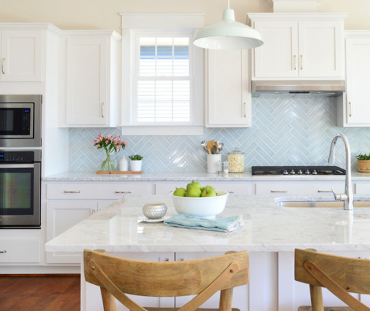
How We Planned The Beach House Kitchen http://ift.tt/2fxRI48
The beach house kitchen will be our seventh kitchen project (!!!) after redoing three of our own (this one’s our favorite), a showhouse that we did in 2014, a spec house for a local builder in 2016 (seen below – we loved that blue tile), and a local teachers’ lounge that we redid last year.
And while that sounds like a lot of kitchens to have under our belts, the process can still feel pretty daunting – probably just due to the sheer number of decisions that a kitchen reno brings. “What’s the most functional layout? Is that too many drawers or not enough? Will I live to regret the lighting? Is it all going to come in within budget?” So many questions. And decisions. And changing of minds.
But as much work as it is to plan, stress, overthink, and replan a kitchen – it can easily be one of the biggest improvements you can make to a house. And now that we’re so close to FINALLY installing the beach house kitchen (hello light at the end of the tunnel!), we thought we’d take you through the steps (and kitchen planning tools) that we used to make our plan.
That photo above is what the space looked like as of last week. The lights are hung, trim is getting painted, and the floor holes are all patched with matching reclaimed pine. Once they’re sanded and sealed we can begin the kitchen install! It’s feeling very real all of a sudden. And it’s a far cry from what it looked like when we first started planning the space last year:
I won’t rehash all of the floor planning we did (it’s in this post) but you can see where we ended up below. Well, mostly ended up (the master bath got rearranged one more time to accommodate a shower). But the important part is the kitchen, which you can see in the upper left of these schematics:
We made those initial floor plans in Photoshop (like I’m sure all the professional architects do…. right?) so it wasn’t precisely to scale and not even close to something we could rely on to order cabinets. So having made the decision to order our cabinetry from Ikea, we turned to their free 3D kitchen planning software.
It’s not my favorite interface in the world (you can read all my pros & cons in this post) but if you’re using Ikea products, it’s a great way to plan the precise items you’ll need. We also used it when ordering our laundry room cabinets and our bonus room built-ins (shown below), both of which we’ve been very happy with – so Ikea was a no-brainer for keeping the beach house kitchen looking good, without costing a fortune.
We went through a few different ideas and layouts within the software – like do we do upper cabinets or skip them? We eventually landed on no uppers, just because we’re suckers for open shelves and the cabinets were looking pretty heavy in the rendering, even in white (we want the room to feel balanced, not left-heavy with too much stuff on that wall as you walk into the room). And since this is going to be a weekly vacation rental, nobody is going to be living here for months on end, so we realized we’d have plenty of storage space for vacation goers – especially with the extra cabinets that we added to flank the back door.
One challenge with the Ikea software is that you can’t pull in products that aren’t theirs – so I couldn’t render our 40″ pink stove or the exact dimensions of the fridge we’ve had our eye on. And I can never get their shelves to look the way I want (this is reminding me that I really need to relearn Google SketchUp). So the renderings are a little imperfect, but this one is probably the closest to what it’ll be like (just add sconces, pendants, and shelves in your mind).
Before ordering, we also loosely mapped things out in real life to make sure we liked the clearance of everything. You can see our fancy stand-ins for the island. Not the big saw, just the wood scraps on the floor. Told you they were fancy.
It’s also pretty hard to get a sense of the finishes in these renderings, so we ended up making some mood boards to be sure we liked the road we were headed down. Here’s the final one, but I’ll show you how we got to this mix in a second:
1. Stove / 2. Faucet / 3. Hood / 4. Sconces / 5. Island Pendants / 6. Counter (inspo pic) / 7. Cabinet doors / 8. Fridge (inspo pic)
From the get-go, Sherry and I both agreed we wanted this kitchen to feel casual and unfussy. The beach is supposed to be relaxing, so we wanted the kitchen to feel the same way. One of our first big inspiration pictures is shown above as #7, because it just looks very chill. Still plenty nice, but not too formal or uptight (which is generally right where we’re aiming with this beach house). Sorry, I can’t find a source better than this one.
The flat-fronted cabinets really stood out to us in that picture because we’ve never been drawn to them before. They always struck us as crazy modern or too commercial (like a school cafeteria from the 90’s). But after hunting down more inspiration photos on Pinterest, we were officially flat-front converts for the beach house.
(sources: left image, right image)
You’ll also notice that 4 out of these 5 photos don’t show upper cabinets, which further confirmed our lean towards a more unfussy/casual look with lots of open space for the eye to move around.
(sources: left image, right image)
We haven’t chosen hardware yet because we’re waiting to see how everything looks once we have it installed – but the idea of leather pulls is pretty cool (and clearly they’re very popular with flat-front drawers). We’re considering a few other options, and we also might try to hunt down some wood knobs to play off of some of the old wood doorknobs in the house. We’re hoping the right choice will be much clearer once we can actually hold up some samples in the finished space, but here are a few of the ones we’re considering: 1 / 2 / 3 / 4 / 5 / 6 / 7 / 8 / 9
Another big source of inspiration for us is Orlando’s kitchen. He revealed it on Emily Henderson’s blog right around the time we were ordering ours, so it helped us lock in our decision to do butcher block counters (we actually switched our plan last minute to get the exact ones that he chose – these from Ikea). We even ordered extra butcher block so we can make our floating shelves from the same stuff.
(source)
People have mixed feeling about butcher block in a rental, but we like that it’s affordable (like 10 times more affordable than some other options) and we LOVE that we can sand and refinish any major beatings that it might take (can’t say that if someone cracks/scratches/stains an expensive stone slab). We’ve actually heard a ton of helpful info from those of you with butcher block counters about how to seal them / treat them so they look good and last, so we’ll definitely be sharing all of that once they’re in (and we’ll be honest about how they hold up too – so stay tuned for photos and stuff as they get used and abused).
Orlando’s kitchen was also reassuring because he used the exact fridge we were considering. We don’t have space for a large fridge and we worried this one might look cheap, but – phew! – it looks great.
All of these decisions were made back in April, and we happened to lock everything in right as Ikea was having their semi-annual Kitchen Event Sale (more on that in podcast episode #52). The total (for cabinets and counters) would’ve been about $3200 – but we got 20% off our entire order thanks to the sale. Which saved us about $600 and brought the total closer to $2,600. That even includes the sink, soft close drawers/doors, and a pull-out trash can!
But even with most of the big items ordered, we still had lighting to figure out. Our first challenge was actual brightness, because I, John Petersik, am a lighting over-thinker to the Nth degree. First, we nixed the idea of adding recessed can lighting because we worried it would feel too “new” for the look we wanted in this 100 year old house. We have a few recessed lights elsewhere, so we’re not totally against them for the house, but the kitchen/dining room ceiling is SUCH a large plane, we wanted to avoid having a bunch of glowing circles dotting those pretty extra-high ceilings.
In the past we’ve relied on recessed lights to provide most of the functional lighting in our own kitchens, with pendants providing task and accent lighting. But in the beach house, our kitchen lighting – two island pendants and three sconces (along with two lights over the dining table nearby) – would need to do it all. So we quickly realized we needed to nix anything with a solid shade, so that every bulb could cast light in all directions instead of just shining it down. For instance, anything like the ones in our house’s kitchen were immediately out of the running. Sorry, guys.
Even with that no-shades rule helping us narrow things down, we still had a ton of lights that we were considering. So I mocked up this graphic to get a better sense of how our options looked with the rest of the kitchen. This was a failed option we were just playing around with at first (note the solid shades on both the sconces and pendants) but it was a huge help to see things this way. The subway backsplash isn’t for sure either, just a nice simple choice that lets us focus on what lights could work best:
We considered a few multi-light pendants, but most of them got eliminated for being the wrong style (these felt too modern) or so large that they dwarfed the island (or broke the bank).
A lot of the lights we typically would choose in a heartbeat (like these guys from Ballard Designs) felt too traditional for the vibe we were going for once we saw them in the mockup. Much of that had to do with the pink stove I think. It’s really cool and old and fun, but it might not lend itself to anything too formal.
The other thing we started bumping up against was scale. For instance, we started to think these beauties were the answer to all of our problems: glass shades, vintage look, right finish…
…but I was alarmed by 6″ measurement in its description (and that was the LARGER option they offered). My rendering above wasn’t to scale, so I started making a new version that was a bit more representative of size – particularly of the light in proportion to the eight foot island. That shed A LOT of light on the situation (pun completely intended). These were definitely too small.
I’ll cut to the chase. We ended up with this, as you saw in the original mood board up top. The pendants are 15″ wide and the clear shades allow them to throw light in every direction. Oh how I wish they were still on the Internet to link to them for you (they’re even prettier in person than in photos) but they seem to be out of stock everywhere. They were Trent Austin from Wayfair, so cross your fingers they come back someday.
We love how large the glass shades are without feeling heavy. The room instantly feels a lot closer to “done” with them hung, like they’re just begging for an island to be there. And the rest of the cabinets. And the appliances.
The sconces have shades that are wire mesh, so the light passes through them just like we wanted. We actually saw them in a showhouse shortly after ordering them and they looked GREAT all lit up. You can see how they’re not solid a bit better in this shot (there’s one more across the room too, which you can see in the second picture in this post).
Okay and one last mock-up. We also did this one that included plans for the adjacent dining area, just to try to picture how that would work with everything going on in the kitchen. Of course it has a pair of capiz pendants, because it wouldn’t be a beach house without Sherry’s favorite material of all time.
We opted for two lights over the dining table so that from the couch in the living room, the kitchen lights wouldn’t intersect at an odd place (once centered fixture would have). We also thought it would be fun to try two smaller pendants instead of one large chandelier. They don’t look great in the shot above because they’re hung higher than they’ll eventually go (and there’s no table under them to ground them). Oh yeah and the capiz is all still wrapped in its plastic shipping. Mummified capiz is the new black.
So that’s where we are. We’re headed out there soon to finish restoring the tub upstairs and to see how a few last floor repairs went upstairs. There are just a few tiny things on the to-do list (like finishing a railing for the back stairs) and then floor sanding and sealing can begin! After that, we can finally get started on making this kitchen come to life… and finally get those Ikea boxes out of our garage, which I’m also pretty stoked about.
Psst- You can read all about our past progress at the beach house by clicking into Our Beach House category.
*This post contains affiliate links
The post How We Planned The Beach House Kitchen appeared first on Young House Love.
0 notes
Text
How We Planned The Beach House Kitchen
The beach house kitchen will be our seventh kitchen project (!!!) after redoing three of our own (this one’s our favorite), a showhouse that we did in 2014, a spec house for a local builder in 2016 (seen below – we loved that blue tile), and a local teachers’ lounge that we redid last year.
And while that sounds like a lot of kitchens to have under our belts, the process can still feel pretty daunting – probably just due to the sheer number of decisions that a kitchen reno brings. “What’s the most functional layout? Is that too many drawers or not enough? Will I live to regret the lighting? Is it all going to come in within budget?” So many questions. And decisions. And changing of minds.
But as much work as it is to plan, stress, overthink, and replan a kitchen – it can easily be one of the biggest improvements you can make to a house. And now that we’re so close to FINALLY installing the beach house kitchen (hello light at the end of the tunnel!), we thought we’d take you through the steps (and kitchen planning tools) that we used to make our plan.
That photo above is what the space looked like as of last week. The lights are hung, trim is getting painted, and the floor holes are all patched with matching reclaimed pine. Once they’re sanded and sealed we can begin the kitchen install! It’s feeling very real all of a sudden. And it’s a far cry from what it looked like when we first started planning the space last year:
I won’t rehash all of the floor planning we did (it’s in this post) but you can see where we ended up below. Well, mostly ended up (the master bath got rearranged one more time to accommodate a shower). But the important part is the kitchen, which you can see in the upper left of these schematics:
We made those initial floor plans in Photoshop (like I’m sure all the professional architects do…. right?) so it wasn’t precisely to scale and not even close to something we could rely on to order cabinets. So having made the decision to order our cabinetry from Ikea, we turned to their free 3D kitchen planning software.
It’s not my favorite interface in the world (you can read all my pros & cons in this post) but if you’re using Ikea products, it’s a great way to plan the precise items you’ll need. We also used it when ordering our laundry room cabinets and our bonus room built-ins (shown below), both of which we’ve been very happy with – so Ikea was a no-brainer for keeping the beach house kitchen looking good, without costing a fortune.
We went through a few different ideas and layouts within the software – like do we do upper cabinets or skip them? We eventually landed on no uppers, just because we’re suckers for open shelves and the cabinets were looking pretty heavy in the rendering, even in white (we want the room to feel balanced, not left-heavy with too much stuff on that wall as you walk into the room). And since this is going to be a weekly vacation rental, nobody is going to be living here for months on end, so we realized we’d have plenty of storage space for vacation goers – especially with the extra cabinets that we added to flank the back door.
One challenge with the Ikea software is that you can’t pull in products that aren’t theirs – so I couldn’t render our 40″ pink stove or the exact dimensions of the fridge we’ve had our eye on. And I can never get their shelves to look the way I want (this is reminding me that I really need to relearn Google SketchUp). So the renderings are a little imperfect, but this one is probably the closest to what it’ll be like (just add sconces, pendants, and shelves in your mind).
Before ordering, we also loosely mapped things out in real life to make sure we liked the clearance of everything. You can see our fancy stand-ins for the island. Not the big saw, just the wood scraps on the floor. Told you they were fancy.
It’s also pretty hard to get a sense of the finishes in these renderings, so we ended up making some mood boards to be sure we liked the road we were headed down. Here’s the final one, but I’ll show you how we got to this mix in a second:
1. Stove / 2. Faucet / 3. Hood / 4. Sconces / 5. Island Pendants / 6. Counter (inspo pic) / 7. Cabinet doors / 8. Fridge (inspo pic)
From the get-go, Sherry and I both agreed we wanted this kitchen to feel casual and unfussy. The beach is supposed to be relaxing, so we wanted the kitchen to feel the same way. One of our first big inspiration pictures is shown above as #7, because it just looks very chill. Still plenty nice, but not too formal or uptight (which is generally right where we’re aiming with this beach house). Sorry, I can’t find a source better than this one.
The flat-fronted cabinets really stood out to us in that picture because we’ve never been drawn to them before. They always struck us as crazy modern or too commercial (like a school cafeteria from the 90’s). But after hunting down more inspiration photos on Pinterest, we were officially flat-front converts for the beach house.
(sources: left image, right image)
You’ll also notice that 4 out of these 5 photos don’t show upper cabinets, which further confirmed our lean towards a more unfussy/casual look with lots of open space for the eye to move around.
(sources: left image, right image)
We haven’t chosen hardware yet because we’re waiting to see how everything looks once we have it installed – but the idea of leather pulls is pretty cool (and clearly they’re very popular with flat-front drawers). We’re considering a few other options, and we also might try to hunt down some wood knobs to play off of some of the old wood doorknobs in the house. We’re hoping the right choice will be much clearer once we can actually hold up some samples in the finished space, but here are a few of the ones we’re considering: 1 / 2 / 3 / 4 / 5 / 6 / 7 / 8 / 9
Another big source of inspiration for us is Orlando’s kitchen. He revealed it on Emily Henderson’s blog right around the time we were ordering ours, so it helped us lock in our decision to do butcher block counters (we actually switched our plan last minute to get the exact ones that he chose – these from Ikea). We even ordered extra butcher block so we can make our floating shelves from the same stuff.
(source)
People have mixed feeling about butcher block in a rental, but we like that it’s affordable (like 10 times more affordable than some other options) and we LOVE that we can sand and refinish any major beatings that it might take (can’t say that if someone cracks/scratches/stains an expensive stone slab). We’ve actually heard a ton of helpful info from those of you with butcher block counters about how to seal them / treat them so they look good and last, so we’ll definitely be sharing all of that once they’re in (and we’ll be honest about how they hold up too – so stay tuned for photos and stuff as they get used and abused).
Orlando’s kitchen was also reassuring because he used the exact fridge we were considering. We don’t have space for a large fridge and we worried this one might look cheap, but – phew! – it looks great.
All of these decisions were made back in April, and we happened to lock everything in right as Ikea was having their semi-annual Kitchen Event Sale (more on that in podcast episode #52). The total (for cabinets and counters) would’ve been about $3200 – but we got 20% off our entire order thanks to the sale. Which saved us about $600 and brought the total closer to $2,600. That even includes the sink, soft close drawers/doors, and a pull-out trash can!
But even with most of the big items ordered, we still had lighting to figure out. Our first challenge was actual brightness, because I, John Petersik, am a lighting over-thinker to the Nth degree. First, we nixed the idea of adding recessed can lighting because we worried it would feel too “new” for the look we wanted in this 100 year old house. We have a few recessed lights elsewhere, so we’re not totally against them for the house, but the kitchen/dining room ceiling is SUCH a large plane, we wanted to avoid having a bunch of glowing circles dotting those pretty extra-high ceilings.
In the past we’ve relied on recessed lights to provide most of the functional lighting in our own kitchens, with pendants providing task and accent lighting. But in the beach house, our kitchen lighting – two island pendants and three sconces (along with two lights over the dining table nearby) – would need to do it all. So we quickly realized we needed to nix anything with a solid shade, so that every bulb could cast light in all directions instead of just shining it down. For instance, anything like the ones in our house’s kitchen were immediately out of the running. Sorry, guys.
Even with that no-shades rule helping us narrow things down, we still had a ton of lights that we were considering. So I mocked up this graphic to get a better sense of how our options looked with the rest of the kitchen. This was a failed option we were just playing around with at first (note the solid shades on both the sconces and pendants) but it was a huge help to see things this way. The subway backsplash isn’t for sure either, just a nice simple choice that lets us focus on what lights could work best:
We considered a few multi-light pendants, but most of them got eliminated for being the wrong style (these felt too modern) or so large that they dwarfed the island (or broke the bank).
A lot of the lights we typically would choose in a heartbeat (like these guys from Ballard Designs) felt too traditional for the vibe we were going for once we saw them in the mockup. Much of that had to do with the pink stove I think. It’s really cool and old and fun, but it might not lend itself to anything too formal.
The other thing we started bumping up against was scale. For instance, we started to think these beauties were the answer to all of our problems: glass shades, vintage look, right finish…
…but I was alarmed by 6″ measurement in its description (and that was the LARGER option they offered). My rendering above wasn’t to scale, so I started making a new version that was a bit more representative of size – particularly of the light in proportion to the eight foot island. That shed A LOT of light on the situation (pun completely intended). These were definitely too small.
I’ll cut to the chase. We ended up with this, as you saw in the original mood board up top. The pendants are 15″ wide and the clear shades allow them to throw light in every direction. Oh how I wish they were still on the Internet to link to them for you (they’re even prettier in person than in photos) but they seem to be out of stock everywhere. They were Trent Austin from Wayfair, so cross your fingers they come back someday.
We love how large the glass shades are without feeling heavy. The room instantly feels a lot closer to “done” with them hung, like they’re just begging for an island to be there. And the rest of the cabinets. And the appliances.
The sconces have shades that are wire mesh, so the light passes through them just like we wanted. We actually saw them in a showhouse shortly after ordering them and they looked GREAT all lit up. You can see how they’re not solid a bit better in this shot (there’s one more across the room too, which you can see in the second picture in this post).
Okay and one last mock-up. We also did this one that included plans for the adjacent dining area, just to try to picture how that would work with everything going on in the kitchen. Of course it has a pair of capiz pendants, because it wouldn’t be a beach house without Sherry’s favorite material of all time.
We opted for two lights over the dining table so that from the couch in the living room, the kitchen lights wouldn’t intersect at an odd place (once centered fixture would have). We also thought it would be fun to try two smaller pendants instead of one large chandelier. They don’t look great in the shot above because they’re hung higher than they’ll eventually go (and there’s no table under them to ground them). Oh yeah and the capiz is all still wrapped in its plastic shipping. Mummified capiz is the new black.
So that’s where we are. We’re headed out there soon to finish restoring the tub upstairs and to see how a few last floor repairs went upstairs. There are just a few tiny things on the to-do list (like finishing a railing for the back stairs) and then floor sanding and sealing can begin! After that, we can finally get started on making this kitchen come to life… and finally get those Ikea boxes out of our garage, which I’m also pretty stoked about.
Psst- You can read all about our past progress at the beach house by clicking into Our Beach House category.
*This post contains affiliate links
The post How We Planned The Beach House Kitchen appeared first on Young House Love.
How We Planned The Beach House Kitchen published first on http://ift.tt/2uiWrIt
0 notes
Text
How We Planned The Beach House Kitchen
The beach house kitchen will be our seventh kitchen project (!!!) after redoing three of our own (this one’s our favorite), a showhouse that we did in 2014, a spec house for a local builder in 2016 (seen below – we loved that blue tile), and a local teachers’ lounge that we redid last year.
And while that sounds like a lot of kitchens to have under our belts, the process can still feel pretty daunting – probably just due to the sheer number of decisions that a kitchen reno brings. “What’s the most functional layout? Is that too many drawers or not enough? Will I live to regret the lighting? Is it all going to come in within budget?” So many questions. And decisions. And changing of minds.
But as much work as it is to plan, stress, overthink, and replan a kitchen – it can easily be one of the biggest improvements you can make to a house. And now that we’re so close to FINALLY installing the beach house kitchen (hello light at the end of the tunnel!), we thought we’d take you through the steps (and kitchen planning tools) that we used to make our plan.
That photo above is what the space looked like as of last week. The lights are hung, trim is getting painted, and the floor holes are all patched with matching reclaimed pine. Once they’re sanded and sealed we can begin the kitchen install! It’s feeling very real all of a sudden. And it’s a far cry from what it looked like when we first started planning the space last year:
I won’t rehash all of the floor planning we did (it’s in this post) but you can see where we ended up below. Well, mostly ended up (the master bath got rearranged one more time to accommodate a shower). But the important part is the kitchen, which you can see in the upper left of these schematics:
We made those initial floor plans in Photoshop (like I’m sure all the professional architects do…. right?) so it wasn’t precisely to scale and not even close to something we could rely on to order cabinets. So having made the decision to order our cabinetry from Ikea, we turned to their free 3D kitchen planning software.
It’s not my favorite interface in the world (you can read all my pros & cons in this post) but if you’re using Ikea products, it’s a great way to plan the precise items you’ll need. We also used it when ordering our laundry room cabinets and our bonus room built-ins (shown below), both of which we’ve been very happy with – so Ikea was a no-brainer for keeping the beach house kitchen looking good, without costing a fortune.
We went through a few different ideas and layouts within the software – like do we do upper cabinets or skip them? We eventually landed on no uppers, just because we’re suckers for open shelves and the cabinets were looking pretty heavy in the rendering, even in white (we want the room to feel balanced, not left-heavy with too much stuff on that wall as you walk into the room). And since this is going to be a weekly vacation rental, nobody is going to be living here for months on end, so we realized we’d have plenty of storage space for vacation goers – especially with the extra cabinets that we added to flank the back door.
One challenge with the Ikea software is that you can’t pull in products that aren’t theirs – so I couldn’t render our 40″ pink stove or the exact dimensions of the fridge we’ve had our eye on. And I can never get their shelves to look the way I want (this is reminding me that I really need to relearn Google SketchUp). So the renderings are a little imperfect, but this one is probably the closest to what it’ll be like (just add sconces, pendants, and shelves in your mind).
Before ordering, we also loosely mapped things out in real life to make sure we liked the clearance of everything. You can see our fancy stand-ins for the island. Not the big saw, just the wood scraps on the floor. Told you they were fancy.
It’s also pretty hard to get a sense of the finishes in these renderings, so we ended up making some mood boards to be sure we liked the road we were headed down. Here’s the final one, but I’ll show you how we got to this mix in a second:
1. Stove / 2. Faucet / 3. Hood / 4. Sconces / 5. Island Pendants / 6. Counter (inspo pic) / 7. Cabinet doors / 8. Fridge (inspo pic)
From the get-go, Sherry and I both agreed we wanted this kitchen to feel casual and unfussy. The beach is supposed to be relaxing, so we wanted the kitchen to feel the same way. One of our first big inspiration pictures is shown above as #7, because it just looks very chill. Still plenty nice, but not too formal or uptight (which is generally right where we’re aiming with this beach house). Sorry, I can’t find a source better than this one.
The flat-fronted cabinets really stood out to us in that picture because we’ve never been drawn to them before. They always struck us as crazy modern or too commercial (like a school cafeteria from the 90’s). But after hunting down more inspiration photos on Pinterest, we were officially flat-front converts for the beach house.
(sources: left image, right image)
You’ll also notice that 4 out of these 5 photos don’t show upper cabinets, which further confirmed our lean towards a more unfussy/casual look with lots of open space for the eye to move around.
(sources: left image, right image)
We haven’t chosen hardware yet because we’re waiting to see how everything looks once we have it installed – but the idea of leather pulls is pretty cool (and clearly they’re very popular with flat-front drawers). We’re considering a few other options, and we also might try to hunt down some wood knobs to play off of some of the old wood doorknobs in the house. We’re hoping the right choice will be much clearer once we can actually hold up some samples in the finished space, but here are a few of the ones we’re considering: 1 / 2 / 3 / 4 / 5 / 6 / 7 / 8 / 9
Another big source of inspiration for us is Orlando’s kitchen. He revealed it on Emily Henderson’s blog right around the time we were ordering ours, so it helped us lock in our decision to do butcher block counters (we actually switched our plan last minute to get the exact ones that he chose – these from Ikea). We even ordered extra butcher block so we can make our floating shelves from the same stuff.
(source)
People have mixed feeling about butcher block in a rental, but we like that it’s affordable (like 10 times more affordable than some other options) and we LOVE that we can sand and refinish any major beatings that it might take (can’t say that if someone cracks/scratches/stains an expensive stone slab). We’ve actually heard a ton of helpful info from those of you with butcher block counters about how to seal them / treat them so they look good and last, so we’ll definitely be sharing all of that once they’re in (and we’ll be honest about how they hold up too – so stay tuned for photos and stuff as they get used and abused).
Orlando’s kitchen was also reassuring because he used the exact fridge we were considering. We don’t have space for a large fridge and we worried this one might look cheap, but – phew! – it looks great.
All of these decisions were made back in April, and we happened to lock everything in right as Ikea was having their semi-annual Kitchen Event Sale (more on that in podcast episode #52). The total (for cabinets and counters) would’ve been about $3200 – but we got 20% off our entire order thanks to the sale. Which saved us about $600 and brought the total closer to $2,600. That even includes the sink, soft close drawers/doors, and a pull-out trash can!
But even with most of the big items ordered, we still had lighting to figure out. Our first challenge was actual brightness, because I, John Petersik, am a lighting over-thinker to the Nth degree. First, we nixed the idea of adding recessed can lighting because we worried it would feel too “new” for the look we wanted in this 100 year old house. We have a few recessed lights elsewhere, so we’re not totally against them for the house, but the kitchen/dining room ceiling is SUCH a large plane, we wanted to avoid having a bunch of glowing circles dotting those pretty extra-high ceilings.
In the past we’ve relied on recessed lights to provide most of the functional lighting in our own kitchens, with pendants providing task and accent lighting. But in the beach house, our kitchen lighting – two island pendants and three sconces (along with two lights over the dining table nearby) – would need to do it all. So we quickly realized we needed to nix anything with a solid shade, so that every bulb could cast light in all directions instead of just shining it down. For instance, anything like the ones in our house’s kitchen were immediately out of the running. Sorry, guys.
Even with that no-shades rule helping us narrow things down, we still had a ton of lights that we were considering. So I mocked up this graphic to get a better sense of how our options looked with the rest of the kitchen. This was a failed option we were just playing around with at first (note the solid shades on both the sconces and pendants) but it was a huge help to see things this way. The subway backsplash isn’t for sure either, just a nice simple choice that lets us focus on what lights could work best:
We considered a few multi-light pendants, but most of them got eliminated for being the wrong style (these felt too modern) or so large that they dwarfed the island (or broke the bank).
A lot of the lights we typically would choose in a heartbeat (like these guys from Ballard Designs) felt too traditional for the vibe we were going for once we saw them in the mockup. Much of that had to do with the pink stove I think. It’s really cool and old and fun, but it might not lend itself to anything too formal.
The other thing we started bumping up against was scale. For instance, we started to think these beauties were the answer to all of our problems: glass shades, vintage look, right finish…
…but I was alarmed by 6″ measurement in its description (and that was the LARGER option they offered). My rendering above wasn’t to scale, so I started making a new version that was a bit more representative of size – particularly of the light in proportion to the eight foot island. That shed A LOT of light on the situation (pun completely intended). These were definitely too small.
I’ll cut to the chase. We ended up with this, as you saw in the original mood board up top. The pendants are 15″ wide and the clear shades allow them to throw light in every direction. Oh how I wish they were still on the Internet to link to them for you (they’re even prettier in person than in photos) but they seem to be out of stock everywhere. They were Trent Austin from Wayfair, so cross your fingers they come back someday.
We love how large the glass shades are without feeling heavy. The room instantly feels a lot closer to “done” with them hung, like they’re just begging for an island to be there. And the rest of the cabinets. And the appliances.
The sconces have shades that are wire mesh, so the light passes through them just like we wanted. We actually saw them in a showhouse shortly after ordering them and they looked GREAT all lit up. You can see how they’re not solid a bit better in this shot (there’s one more across the room too, which you can see in the second picture in this post).
Okay and one last mock-up. We also did this one that included plans for the adjacent dining area, just to try to picture how that would work with everything going on in the kitchen. Of course it has a pair of capiz pendants, because it wouldn’t be a beach house without Sherry’s favorite material of all time.
We opted for two lights over the dining table so that from the couch in the living room, the kitchen lights wouldn’t intersect at an odd place (once centered fixture would have). We also thought it would be fun to try two smaller pendants instead of one large chandelier. They don’t look great in the shot above because they’re hung higher than they’ll eventually go (and there’s no table under them to ground them). Oh yeah and the capiz is all still wrapped in its plastic shipping. Mummified capiz is the new black.
So that’s where we are. We’re headed out there soon to finish restoring the tub upstairs and to see how a few last floor repairs went upstairs. There are just a few tiny things on the to-do list (like finishing a railing for the back stairs) and then floor sanding and sealing can begin! After that, we can finally get started on making this kitchen come to life… and finally get those Ikea boxes out of our garage, which I’m also pretty stoked about.
Psst- You can read all about our past progress at the beach house by clicking into Our Beach House category.
*This post contains affiliate links
The post How We Planned The Beach House Kitchen appeared first on Young House Love.
How We Planned The Beach House Kitchen posted first on http://ift.tt/2qOPBf9
0 notes
Text
How We Planned The Beach House Kitchen
The beach house kitchen will be our seventh kitchen project (!!!) after redoing three of our own (this one’s our favorite), a showhouse that we did in 2014, a spec house for a local builder in 2016 (seen below – we loved that blue tile), and a local teachers’ lounge that we redid last year.
And while that sounds like a lot of kitchens to have under our belts, the process can still feel pretty daunting – probably just due to the sheer number of decisions that a kitchen reno brings. “What’s the most functional layout? Is that too many drawers or not enough? Will I live to regret the lighting? Is it all going to come in within budget?” So many questions. And decisions. And changing of minds.
But as much work as it is to plan, stress, overthink, and replan a kitchen – it can easily be one of the biggest improvements you can make to a house. And now that we’re so close to FINALLY installing the beach house kitchen (hello light at the end of the tunnel!), we thought we’d take you through the steps (and kitchen planning tools) that we used to make our plan.
That photo above is what the space looked like as of last week. The lights are hung, trim is getting painted, and the floor holes are all patched with matching reclaimed pine. Once they’re sanded and sealed we can begin the kitchen install! It’s feeling very real all of a sudden. And it’s a far cry from what it looked like when we first started planning the space last year:
I won’t rehash all of the floor planning we did (it’s in this post) but you can see where we ended up below. Well, mostly ended up (the master bath got rearranged one more time to accommodate a shower). But the important part is the kitchen, which you can see in the upper left of these schematics:
We made those initial floor plans in Photoshop (like I’m sure all the professional architects do…. right?) so it wasn’t precisely to scale and not even close to something we could rely on to order cabinets. So having made the decision to order our cabinetry from Ikea, we turned to their free 3D kitchen planning software.
It’s not my favorite interface in the world (you can read all my pros & cons in this post) but if you’re using Ikea products, it’s a great way to plan the precise items you’ll need. We also used it when ordering our laundry room cabinets and our bonus room built-ins (shown below), both of which we’ve been very happy with – so Ikea was a no-brainer for keeping the beach house kitchen looking good, without costing a fortune.
We went through a few different ideas and layouts within the software – like do we do upper cabinets or skip them? We eventually landed on no uppers, just because we’re suckers for open shelves and the cabinets were looking pretty heavy in the rendering, even in white (we want the room to feel balanced, not left-heavy with too much stuff on that wall as you walk into the room). And since this is going to be a weekly vacation rental, nobody is going to be living here for months on end, so we realized we’d have plenty of storage space for vacation goers – especially with the extra cabinets that we added to flank the back door.
One challenge with the Ikea software is that you can’t pull in products that aren’t theirs – so I couldn’t render our 40″ pink stove or the exact dimensions of the fridge we’ve had our eye on. And I can never get their shelves to look the way I want (this is reminding me that I really need to relearn Google SketchUp). So the renderings are a little imperfect, but this one is probably the closest to what it’ll be like (just add sconces, pendants, and shelves in your mind).
Before ordering, we also loosely mapped things out in real life to make sure we liked the clearance of everything. You can see our fancy stand-ins for the island. Not the big saw, just the wood scraps on the floor. Told you they were fancy.
It’s also pretty hard to get a sense of the finishes in these renderings, so we ended up making some mood boards to be sure we liked the road we were headed down. Here’s the final one, but I’ll show you how we got to this mix in a second:
1. Stove / 2. Faucet / 3. Hood / 4. Sconces / 5. Island Pendants / 6. Counter (inspo pic) / 7. Cabinet doors / 8. Fridge (inspo pic)
From the get-go, Sherry and I both agreed we wanted this kitchen to feel casual and unfussy. The beach is supposed to be relaxing, so we wanted the kitchen to feel the same way. One of our first big inspiration pictures is shown above as #7, because it just looks very chill. Still plenty nice, but not too formal or uptight (which is generally right where we’re aiming with this beach house). Sorry, I can’t find a source better than this one.
The flat-fronted cabinets really stood out to us in that picture because we’ve never been drawn to them before. They always struck us as crazy modern or too commercial (like a school cafeteria from the 90’s). But after hunting down more inspiration photos on Pinterest, we were officially flat-front converts for the beach house.
(sources: left image, right image)
You’ll also notice that 4 out of these 5 photos don’t show upper cabinets, which further confirmed our lean towards a more unfussy/casual look with lots of open space for the eye to move around.
(sources: left image, right image)
We haven’t chosen hardware yet because we’re waiting to see how everything looks once we have it installed – but the idea of leather pulls is pretty cool (and clearly they’re very popular with flat-front drawers). We’re considering a few other options, and we also might try to hunt down some wood knobs to play off of some of the old wood doorknobs in the house. We’re hoping the right choice will be much clearer once we can actually hold up some samples in the finished space, but here are a few of the ones we’re considering: 1 / 2 / 3 / 4 / 5 / 6 / 7 / 8 / 9
Another big source of inspiration for us is Orlando’s kitchen. He revealed it on Emily Henderson’s blog right around the time we were ordering ours, so it helped us lock in our decision to do butcher block counters (we actually switched our plan last minute to get the exact ones that he chose – these from Ikea). We even ordered extra butcher block so we can make our floating shelves from the same stuff.
(source)
People have mixed feeling about butcher block in a rental, but we like that it’s affordable (like 10 times more affordable than some other options) and we LOVE that we can sand and refinish any major beatings that it might take (can’t say that if someone cracks/scratches/stains an expensive stone slab). We’ve actually heard a ton of helpful info from those of you with butcher block counters about how to seal them / treat them so they look good and last, so we’ll definitely be sharing all of that once they’re in (and we’ll be honest about how they hold up too – so stay tuned for photos and stuff as they get used and abused).
Orlando’s kitchen was also reassuring because he used the exact fridge we were considering. We don’t have space for a large fridge and we worried this one might look cheap, but – phew! – it looks great.
All of these decisions were made back in April, and we happened to lock everything in right as Ikea was having their semi-annual Kitchen Event Sale (more on that in podcast episode #52). The total (for cabinets and counters) would’ve been about $3200 – but we got 20% off our entire order thanks to the sale. Which saved us about $600 and brought the total closer to $2,600. That even includes the sink, soft close drawers/doors, and a pull-out trash can!
But even with most of the big items ordered, we still had lighting to figure out. Our first challenge was actual brightness, because I, John Petersik, am a lighting over-thinker to the Nth degree. First, we nixed the idea of adding recessed can lighting because we worried it would feel too “new” for the look we wanted in this 100 year old house. We have a few recessed lights elsewhere, so we’re not totally against them for the house, but the kitchen/dining room ceiling is SUCH a large plane, we wanted to avoid having a bunch of glowing circles dotting those pretty extra-high ceilings.
In the past we’ve relied on recessed lights to provide most of the functional lighting in our own kitchens, with pendants providing task and accent lighting. But in the beach house, our kitchen lighting – two island pendants and three sconces (along with two lights over the dining table nearby) – would need to do it all. So we quickly realized we needed to nix anything with a solid shade, so that every bulb could cast light in all directions instead of just shining it down. For instance, anything like the ones in our house’s kitchen were immediately out of the running. Sorry, guys.
Even with that no-shades rule helping us narrow things down, we still had a ton of lights that we were considering. So I mocked up this graphic to get a better sense of how our options looked with the rest of the kitchen. This was a failed option we were just playing around with at first (note the solid shades on both the sconces and pendants) but it was a huge help to see things this way. The subway backsplash isn’t for sure either, just a nice simple choice that lets us focus on what lights could work best:
We considered a few multi-light pendants, but most of them got eliminated for being the wrong style (these felt too modern) or so large that they dwarfed the island (or broke the bank).
A lot of the lights we typically would choose in a heartbeat (like these guys from Ballard Designs) felt too traditional for the vibe we were going for once we saw them in the mockup. Much of that had to do with the pink stove I think. It’s really cool and old and fun, but it might not lend itself to anything too formal.
The other thing we started bumping up against was scale. For instance, we started to think these beauties were the answer to all of our problems: glass shades, vintage look, right finish…
…but I was alarmed by 6″ measurement in its description (and that was the LARGER option they offered). My rendering above wasn’t to scale, so I started making a new version that was a bit more representative of size – particularly of the light in proportion to the eight foot island. That shed A LOT of light on the situation (pun completely intended). These were definitely too small.
I’ll cut to the chase. We ended up with this, as you saw in the original mood board up top. The pendants are 15″ wide and the clear shades allow them to throw light in every direction. Oh how I wish they were still on the Internet to link to them for you (they’re even prettier in person than in photos) but they seem to be out of stock everywhere. They were Trent Austin from Wayfair, so cross your fingers they come back someday.
We love how large the glass shades are without feeling heavy. The room instantly feels a lot closer to “done” with them hung, like they’re just begging for an island to be there. And the rest of the cabinets. And the appliances.
The sconces have shades that are wire mesh, so the light passes through them just like we wanted. We actually saw them in a showhouse shortly after ordering them and they looked GREAT all lit up. You can see how they’re not solid a bit better in this shot (there’s one more across the room too, which you can see in the second picture in this post).
Okay and one last mock-up. We also did this one that included plans for the adjacent dining area, just to try to picture how that would work with everything going on in the kitchen. Of course it has a pair of capiz pendants, because it wouldn’t be a beach house without Sherry’s favorite material of all time.
We opted for two lights over the dining table so that from the couch in the living room, the kitchen lights wouldn’t intersect at an odd place (once centered fixture would have). We also thought it would be fun to try two smaller pendants instead of one large chandelier. They don’t look great in the shot above because they’re hung higher than they’ll eventually go (and there’s no table under them to ground them). Oh yeah and the capiz is all still wrapped in its plastic shipping. Mummified capiz is the new black.
So that’s where we are. We’re headed out there soon to finish restoring the tub upstairs and to see how a few last floor repairs went upstairs. There are just a few tiny things on the to-do list (like finishing a railing for the back stairs) and then floor sanding and sealing can begin! After that, we can finally get started on making this kitchen come to life… and finally get those Ikea boxes out of our garage, which I’m also pretty stoked about.
Psst- You can read all about our past progress at the beach house by clicking into Our Beach House category.
*This post contains affiliate links
The post How We Planned The Beach House Kitchen appeared first on Young House Love.
How We Planned The Beach House Kitchen published first on http://ift.tt/2qxZz2j
0 notes
Text
How We Planned The Beach House Kitchen
The beach house kitchen will be our seventh kitchen project (!!!) after redoing three of our own (this one’s our favorite), a showhouse that we did in 2014, a spec house for a local builder in 2016 (seen below – we loved that blue tile), and a local teachers’ lounge that we redid last year.
And while that sounds like a lot of kitchens to have under our belts, the process can still feel pretty daunting – probably just due to the sheer number of decisions that a kitchen reno brings. “What’s the most functional layout? Is that too many drawers or not enough? Will I live to regret the lighting? Is it all going to come in within budget?” So many questions. And decisions. And changing of minds.
But as much work as it is to plan, stress, overthink, and replan a kitchen – it can easily be one of the biggest improvements you can make to a house. And now that we’re so close to FINALLY installing the beach house kitchen (hello light at the end of the tunnel!), we thought we’d take you through the steps (and kitchen planning tools) that we used to make our plan.
That photo above is what the space looked like as of last week. The lights are hung, trim is getting painted, and the floor holes are all patched with matching reclaimed pine. Once they’re sanded and sealed we can begin the kitchen install! It’s feeling very real all of a sudden. And it’s a far cry from what it looked like when we first started planning the space last year:
I won’t rehash all of the floor planning we did (it’s in this post) but you can see where we ended up below. Well, mostly ended up (the master bath got rearranged one more time to accommodate a shower). But the important part is the kitchen, which you can see in the upper left of these schematics:
We made those initial floor plans in Photoshop (like I’m sure all the professional architects do…. right?) so it wasn’t precisely to scale and not even close to something we could rely on to order cabinets. So having made the decision to order our cabinetry from Ikea, we turned to their free 3D kitchen planning software.
It’s not my favorite interface in the world (you can read all my pros & cons in this post) but if you’re using Ikea products, it’s a great way to plan the precise items you’ll need. We also used it when ordering our laundry room cabinets and our bonus room built-ins (shown below), both of which we’ve been very happy with – so Ikea was a no-brainer for keeping the beach house kitchen looking good, without costing a fortune.
We went through a few different ideas and layouts within the software – like do we do upper cabinets or skip them? We eventually landed on no uppers, just because we’re suckers for open shelves and the cabinets were looking pretty heavy in the rendering, even in white (we want the room to feel balanced, not left-heavy with too much stuff on that wall as you walk into the room). And since this is going to be a weekly vacation rental, nobody is going to be living here for months on end, so we realized we’d have plenty of storage space for vacation goers – especially with the extra cabinets that we added to flank the back door.
One challenge with the Ikea software is that you can’t pull in products that aren’t theirs – so I couldn’t render our 40″ pink stove or the exact dimensions of the fridge we’ve had our eye on. And I can never get their shelves to look the way I want (this is reminding me that I really need to relearn Google SketchUp). So the renderings are a little imperfect, but this one is probably the closest to what it’ll be like (just add sconces, pendants, and shelves in your mind).
Before ordering, we also loosely mapped things out in real life to make sure we liked the clearance of everything. You can see our fancy stand-ins for the island. Not the big saw, just the wood scraps on the floor. Told you they were fancy.
It’s also pretty hard to get a sense of the finishes in these renderings, so we ended up making some mood boards to be sure we liked the road we were headed down. Here’s the final one, but I’ll show you how we got to this mix in a second:
1. Stove / 2. Faucet / 3. Hood / 4. Sconces / 5. Island Pendants / 6. Counter (inspo pic) / 7. Cabinet doors / 8. Fridge (inspo pic)
From the get-go, Sherry and I both agreed we wanted this kitchen to feel casual and unfussy. The beach is supposed to be relaxing, so we wanted the kitchen to feel the same way. One of our first big inspiration pictures is shown above as #7, because it just looks very chill. Still plenty nice, but not too formal or uptight (which is generally right where we’re aiming with this beach house). Sorry, I can’t find a source better than this one.
The flat-fronted cabinets really stood out to us in that picture because we’ve never been drawn to them before. They always struck us as crazy modern or too commercial (like a school cafeteria from the 90’s). But after hunting down more inspiration photos on Pinterest, we were officially flat-front converts for the beach house.
(sources: left image, right image)
You’ll also notice that 4 out of these 5 photos don’t show upper cabinets, which further confirmed our lean towards a more unfussy/casual look with lots of open space for the eye to move around.
(sources: left image, right image)
We haven’t chosen hardware yet because we’re waiting to see how everything looks once we have it installed – but the idea of leather pulls is pretty cool (and clearly they’re very popular with flat-front drawers). We’re considering a few other options, and we also might try to hunt down some wood knobs to play off of some of the old wood doorknobs in the house. We’re hoping the right choice will be much clearer once we can actually hold up some samples in the finished space, but here are a few of the ones we’re considering: 1 / 2 / 3 / 4 / 5 / 6 / 7 / 8 / 9
Another big source of inspiration for us is Orlando’s kitchen. He revealed it on Emily Henderson’s blog right around the time we were ordering ours, so it helped us lock in our decision to do butcher block counters (we actually switched our plan last minute to get the exact ones that he chose – these from Ikea). We even ordered extra butcher block so we can make our floating shelves from the same stuff.
(source)
People have mixed feeling about butcher block in a rental, but we like that it’s affordable (like 10 times more affordable than some other options) and we LOVE that we can sand and refinish any major beatings that it might take (can’t say that if someone cracks/scratches/stains an expensive stone slab). We’ve actually heard a ton of helpful info from those of you with butcher block counters about how to seal them / treat them so they look good and last, so we’ll definitely be sharing all of that once they’re in (and we’ll be honest about how they hold up too – so stay tuned for photos and stuff as they get used and abused).
Orlando’s kitchen was also reassuring because he used the exact fridge we were considering. We don’t have space for a large fridge and we worried this one might look cheap, but – phew! – it looks great.
All of these decisions were made back in April, and we happened to lock everything in right as Ikea was having their semi-annual Kitchen Event Sale (more on that in podcast episode #52). The total (for cabinets and counters) would’ve been about $3200 – but we got 20% off our entire order thanks to the sale. Which saved us about $600 and brought the total closer to $2,600. That even includes the sink, soft close drawers/doors, and a pull-out trash can!
But even with most of the big items ordered, we still had lighting to figure out. Our first challenge was actual brightness, because I, John Petersik, am a lighting over-thinker to the Nth degree. First, we nixed the idea of adding recessed can lighting because we worried it would feel too “new” for the look we wanted in this 100 year old house. We have a few recessed lights elsewhere, so we’re not totally against them for the house, but the kitchen/dining room ceiling is SUCH a large plane, we wanted to avoid having a bunch of glowing circles dotting those pretty extra-high ceilings.
In the past we’ve relied on recessed lights to provide most of the functional lighting in our own kitchens, with pendants providing task and accent lighting. But in the beach house, our kitchen lighting – two island pendants and three sconces (along with two lights over the dining table nearby) – would need to do it all. So we quickly realized we needed to nix anything with a solid shade, so that every bulb could cast light in all directions instead of just shining it down. For instance, anything like the ones in our house’s kitchen were immediately out of the running. Sorry, guys.
Even with that no-shades rule helping us narrow things down, we still had a ton of lights that we were considering. So I mocked up this graphic to get a better sense of how our options looked with the rest of the kitchen. This was a failed option we were just playing around with at first (note the solid shades on both the sconces and pendants) but it was a huge help to see things this way. The subway backsplash isn’t for sure either, just a nice simple choice that lets us focus on what lights could work best:
We considered a few multi-light pendants, but most of them got eliminated for being the wrong style (these felt too modern) or so large that they dwarfed the island (or broke the bank).
A lot of the lights we typically would choose in a heartbeat (like these guys from Ballard Designs) felt too traditional for the vibe we were going for once we saw them in the mockup. Much of that had to do with the pink stove I think. It’s really cool and old and fun, but it might not lend itself to anything too formal.
The other thing we started bumping up against was scale. For instance, we started to think these beauties were the answer to all of our problems: glass shades, vintage look, right finish…
…but I was alarmed by 6″ measurement in its description (and that was the LARGER option they offered). My rendering above wasn’t to scale, so I started making a new version that was a bit more representative of size – particularly of the light in proportion to the eight foot island. That shed A LOT of light on the situation (pun completely intended). These were definitely too small.
I’ll cut to the chase. We ended up with this, as you saw in the original mood board up top. The pendants are 15″ wide and the clear shades allow them to throw light in every direction. Oh how I wish they were still on the Internet to link to them for you (they’re even prettier in person than in photos) but they seem to be out of stock everywhere. They were Trent Austin from Wayfair, so cross your fingers they come back someday.
We love how large the glass shades are without feeling heavy. The room instantly feels a lot closer to “done” with them hung, like they’re just begging for an island to be there. And the rest of the cabinets. And the appliances.
The sconces have shades that are wire mesh, so the light passes through them just like we wanted. We actually saw them in a showhouse shortly after ordering them and they looked GREAT all lit up. You can see how they’re not solid a bit better in this shot (there’s one more across the room too, which you can see in the second picture in this post).
Okay and one last mock-up. We also did this one that included plans for the adjacent dining area, just to try to picture how that would work with everything going on in the kitchen. Of course it has a pair of capiz pendants, because it wouldn’t be a beach house without Sherry’s favorite material of all time.
We opted for two lights over the dining table so that from the couch in the living room, the kitchen lights wouldn’t intersect at an odd place (once centered fixture would have). We also thought it would be fun to try two smaller pendants instead of one large chandelier. They don’t look great in the shot above because they’re hung higher than they’ll eventually go (and there’s no table under them to ground them). Oh yeah and the capiz is all still wrapped in its plastic shipping. Mummified capiz is the new black.
So that’s where we are. We’re headed out there soon to finish restoring the tub upstairs and to see how a few last floor repairs went upstairs. There are just a few tiny things on the to-do list (like finishing a railing for the back stairs) and then floor sanding and sealing can begin! After that, we can finally get started on making this kitchen come to life… and finally get those Ikea boxes out of our garage, which I’m also pretty stoked about.
Psst- You can read all about our past progress at the beach house by clicking into Our Beach House category.
*This post contains affiliate links
The post How We Planned The Beach House Kitchen appeared first on Young House Love.
How We Planned The Beach House Kitchen published first on http://ift.tt/2r6hzQy
0 notes
Text
How We Planned The Beach House Kitchen
The beach house kitchen will be our seventh kitchen project (!!!) after redoing three of our own (this one’s our favorite), a showhouse that we did in 2014, a spec house for a local builder in 2016 (seen below – we loved that blue tile), and a local teachers’ lounge that we redid last year.
And while that sounds like a lot of kitchens to have under our belts, the process can still feel pretty daunting – probably just due to the sheer number of decisions that a kitchen reno brings. “What’s the most functional layout? Is that too many drawers or not enough? Will I live to regret the lighting? Is it all going to come in within budget?” So many questions. And decisions. And changing of minds.
But as much work as it is to plan, stress, overthink, and replan a kitchen – it can easily be one of the biggest improvements you can make to a house. And now that we’re so close to FINALLY installing the beach house kitchen (hello light at the end of the tunnel!), we thought we’d take you through the steps (and kitchen planning tools) that we used to make our plan.
That photo above is what the space looked like as of last week. The lights are hung, trim is getting painted, and the floor holes are all patched with matching reclaimed pine. Once they’re sanded and sealed we can begin the kitchen install! It’s feeling very real all of a sudden. And it’s a far cry from what it looked like when we first started planning the space last year:
I won’t rehash all of the floor planning we did (it’s in this post) but you can see where we ended up below. Well, mostly ended up (the master bath got rearranged one more time to accommodate a shower). But the important part is the kitchen, which you can see in the upper left of these schematics:
We made those initial floor plans in Photoshop (like I’m sure all the professional architects do…. right?) so it wasn’t precisely to scale and not even close to something we could rely on to order cabinets. So having made the decision to order our cabinetry from Ikea, we turned to their free 3D kitchen planning software.
It’s not my favorite interface in the world (you can read all my pros & cons in this post) but if you’re using Ikea products, it’s a great way to plan the precise items you’ll need. We also used it when ordering our laundry room cabinets and our bonus room built-ins (shown below), both of which we’ve been very happy with – so Ikea was a no-brainer for keeping the beach house kitchen looking good, without costing a fortune.
We went through a few different ideas and layouts within the software – like do we do upper cabinets or skip them? We eventually landed on no uppers, just because we’re suckers for open shelves and the cabinets were looking pretty heavy in the rendering, even in white (we want the room to feel balanced, not left-heavy with too much stuff on that wall as you walk into the room). And since this is going to be a weekly vacation rental, nobody is going to be living here for months on end, so we realized we’d have plenty of storage space for vacation goers – especially with the extra cabinets that we added to flank the back door.
One challenge with the Ikea software is that you can’t pull in products that aren’t theirs – so I couldn’t render our 40″ pink stove or the exact dimensions of the fridge we’ve had our eye on. And I can never get their shelves to look the way I want (this is reminding me that I really need to relearn Google SketchUp). So the renderings are a little imperfect, but this one is probably the closest to what it’ll be like (just add sconces, pendants, and shelves in your mind).
Before ordering, we also loosely mapped things out in real life to make sure we liked the clearance of everything. You can see our fancy stand-ins for the island. Not the big saw, just the wood scraps on the floor. Told you they were fancy.
It’s also pretty hard to get a sense of the finishes in these renderings, so we ended up making some mood boards to be sure we liked the road we were headed down. Here’s the final one, but I’ll show you how we got to this mix in a second:
1. Stove / 2. Faucet / 3. Hood / 4. Sconces / 5. Island Pendants / 6. Counter (inspo pic) / 7. Cabinet doors / 8. Fridge (inspo pic)
From the get-go, Sherry and I both agreed we wanted this kitchen to feel casual and unfussy. The beach is supposed to be relaxing, so we wanted the kitchen to feel the same way. One of our first big inspiration pictures is shown above as #7, because it just looks very chill. Still plenty nice, but not too formal or uptight (which is generally right where we’re aiming with this beach house). Sorry, I can’t find a source better than this one.
The flat-fronted cabinets really stood out to us in that picture because we’ve never been drawn to them before. They always struck us as crazy modern or too commercial (like a school cafeteria from the 90’s). But after hunting down more inspiration photos on Pinterest, we were officially flat-front converts for the beach house.
(sources: left image, right image)
You’ll also notice that 4 out of these 5 photos don’t show upper cabinets, which further confirmed our lean towards a more unfussy/casual look with lots of open space for the eye to move around.
(sources: left image, right image)
We haven’t chosen hardware yet because we’re waiting to see how everything looks once we have it installed – but the idea of leather pulls is pretty cool (and clearly they’re very popular with flat-front drawers). We’re considering a few other options, and we also might try to hunt down some wood knobs to play off of some of the old wood doorknobs in the house. We’re hoping the right choice will be much clearer once we can actually hold up some samples in the finished space, but here are a few of the ones we’re considering: 1 / 2 / 3 / 4 / 5 / 6 / 7 / 8 / 9
Another big source of inspiration for us is Orlando’s kitchen. He revealed it on Emily Henderson’s blog right around the time we were ordering ours, so it helped us lock in our decision to do butcher block counters (we actually switched our plan last minute to get the exact ones that he chose – these from Ikea). We even ordered extra butcher block so we can make our floating shelves from the same stuff.
(source)
People have mixed feeling about butcher block in a rental, but we like that it’s affordable (like 10 times more affordable than some other options) and we LOVE that we can sand and refinish any major beatings that it might take (can’t say that if someone cracks/scratches/stains an expensive stone slab). We’ve actually heard a ton of helpful info from those of you with butcher block counters about how to seal them / treat them so they look good and last, so we’ll definitely be sharing all of that once they’re in (and we’ll be honest about how they hold up too – so stay tuned for photos and stuff as they get used and abused).
Orlando’s kitchen was also reassuring because he used the exact fridge we were considering. We don’t have space for a large fridge and we worried this one might look cheap, but – phew! – it looks great.
All of these decisions were made back in April, and we happened to lock everything in right as Ikea was having their semi-annual Kitchen Event Sale (more on that in podcast episode #52). The total (for cabinets and counters) would’ve been about $3200 – but we got 20% off our entire order thanks to the sale. Which saved us about $600 and brought the total closer to $2,600. That even includes the sink, soft close drawers/doors, and a pull-out trash can!
But even with most of the big items ordered, we still had lighting to figure out. Our first challenge was actual brightness, because I, John Petersik, am a lighting over-thinker to the Nth degree. First, we nixed the idea of adding recessed can lighting because we worried it would feel too “new” for the look we wanted in this 100 year old house. We have a few recessed lights elsewhere, so we’re not totally against them for the house, but the kitchen/dining room ceiling is SUCH a large plane, we wanted to avoid having a bunch of glowing circles dotting those pretty extra-high ceilings.
In the past we’ve relied on recessed lights to provide most of the functional lighting in our own kitchens, with pendants providing task and accent lighting. But in the beach house, our kitchen lighting – two island pendants and three sconces (along with two lights over the dining table nearby) – would need to do it all. So we quickly realized we needed to nix anything with a solid shade, so that every bulb could cast light in all directions instead of just shining it down. For instance, anything like the ones in our house’s kitchen were immediately out of the running. Sorry, guys.
Even with that no-shades rule helping us narrow things down, we still had a ton of lights that we were considering. So I mocked up this graphic to get a better sense of how our options looked with the rest of the kitchen. This was a failed option we were just playing around with at first (note the solid shades on both the sconces and pendants) but it was a huge help to see things this way. The subway backsplash isn’t for sure either, just a nice simple choice that lets us focus on what lights could work best:
We considered a few multi-light pendants, but most of them got eliminated for being the wrong style (these felt too modern) or so large that they dwarfed the island (or broke the bank).
A lot of the lights we typically would choose in a heartbeat (like these guys from Ballard Designs) felt too traditional for the vibe we were going for once we saw them in the mockup. Much of that had to do with the pink stove I think. It’s really cool and old and fun, but it might not lend itself to anything too formal.
The other thing we started bumping up against was scale. For instance, we started to think these beauties were the answer to all of our problems: glass shades, vintage look, right finish…
…but I was alarmed by 6″ measurement in its description (and that was the LARGER option they offered). My rendering above wasn’t to scale, so I started making a new version that was a bit more representative of size – particularly of the light in proportion to the eight foot island. That shed A LOT of light on the situation (pun completely intended). These were definitely too small.
I’ll cut to the chase. We ended up with this, as you saw in the original mood board up top. The pendants are 15″ wide and the clear shades allow them to throw light in every direction. Oh how I wish they were still on the Internet to link to them for you (they’re even prettier in person than in photos) but they seem to be out of stock everywhere. They were Trent Austin from Wayfair, so cross your fingers they come back someday.
We love how large the glass shades are without feeling heavy. The room instantly feels a lot closer to “done” with them hung, like they’re just begging for an island to be there. And the rest of the cabinets. And the appliances.
The sconces have shades that are wire mesh, so the light passes through them just like we wanted. We actually saw them in a showhouse shortly after ordering them and they looked GREAT all lit up. You can see how they’re not solid a bit better in this shot (there’s one more across the room too, which you can see in the second picture in this post).
Okay and one last mock-up. We also did this one that included plans for the adjacent dining area, just to try to picture how that would work with everything going on in the kitchen. Of course it has a pair of capiz pendants, because it wouldn’t be a beach house without Sherry’s favorite material of all time.
We opted for two lights over the dining table so that from the couch in the living room, the kitchen lights wouldn’t intersect at an odd place (once centered fixture would have). We also thought it would be fun to try two smaller pendants instead of one large chandelier. They don’t look great in the shot above because they’re hung higher than they’ll eventually go (and there’s no table under them to ground them). Oh yeah and the capiz is all still wrapped in its plastic shipping. Mummified capiz is the new black.
So that’s where we are. We’re headed out there soon to finish restoring the tub upstairs and to see how a few last floor repairs went upstairs. There are just a few tiny things on the to-do list (like finishing a railing for the back stairs) and then floor sanding and sealing can begin! After that, we can finally get started on making this kitchen come to life… and finally get those Ikea boxes out of our garage, which I’m also pretty stoked about.
Psst- You can read all about our past progress at the beach house by clicking into Our Beach House category.
*This post contains affiliate links
The post How We Planned The Beach House Kitchen appeared first on Young House Love.
How We Planned The Beach House Kitchen published first on http://ift.tt/2qCHnUt
0 notes
Last Seen Blogs

manisha41096
Untitled

klingsis-tiny-world
Klingsis Tiny World

stevensa565
Untitled

mikedjc
The Art of Mike J.C.

chaotically-neurodivergent
Neurodivergent Chaos