#it has been six months and I’m sooo rusty ugh
Text

#Cat Dad 😎#it has been six months and I’m sooo rusty ugh#cheesy art#Levi fanart#aot fanart#Levi Ackerman fanart#Levi
146 notes
·
View notes
Text
StEx Appreciation Month, Day 31: Nitpicks
SO, I have a LOT of nitpicks about literally every aspect of the show, like I could go on and on, but then this post would be the embodiment of this gif:
So for today I’m just going to focus on costume nitpicks! Like with everything in the show I have an ideal version of everyone’s costume/wig/makeup, so today I’ll just go over my main nitpicks with the various costumes and post my favorite versions!
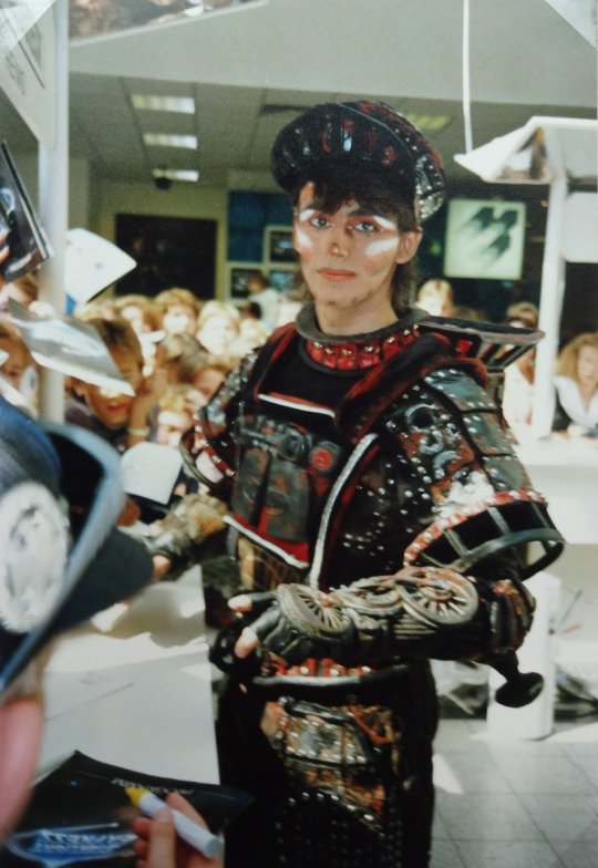
Obligatory JapanAus picture because those tours overall had the BEST costume aesthetics.

Let’s get started:
(Also just to go ahead and get this out of the way, this post is almost completely ignoring the 2018 redesigns, like. Those don’t live in my head. I’ll just be focusing on the Broadway/Bochum/tour designs.)
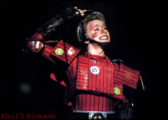
Rusty:
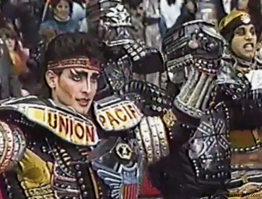
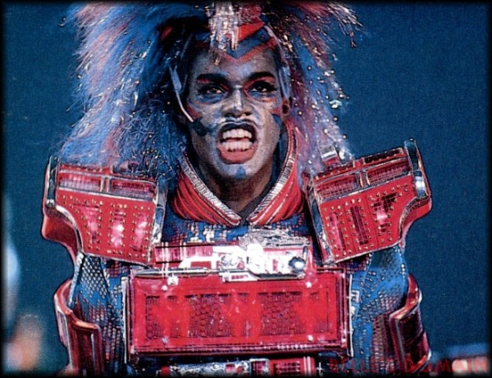
Okay so with Rusty my main nitpick is!!! That stupid empty black space that’s above his chest plate in SO many of the costumes!! Like WHY is that there?! Here’s a good picture of it:
It drives me absolutely insane aljsldf. Luckily Bochum eventually corrected this but that it was ever there drives me up a wall.
Another nitpick is his headband… I can tolerate it when it’s paired with the hat, but I can’t stand it on its own, it just looks ugly to me. And speaking of his hat, I love most versions of it, EXCEPT for the New Starlight Express one where it was styled after a baseball cap. That bothers me on a level I don’t even fully understand alsjflds.
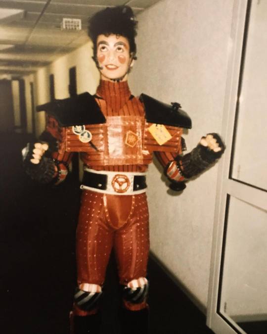
Anyway, I think overall my favorite version of Rusty’s costume is the 2018 version… I think the silhouette looks strange, especially from the side, like kind of too baggy? But overall it’s really cute, I love the colors and the new chest plate design, and the HAT. Also really like the new makeup!! It was looking rough for a minute lmao.
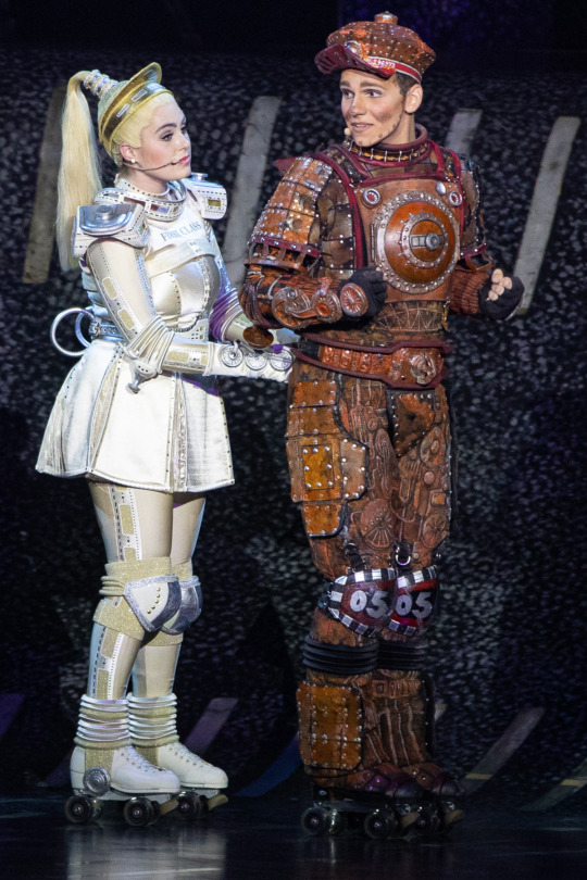
This is Peak Performance (not the Pearl…definitely not the Pearl):
Pearl:
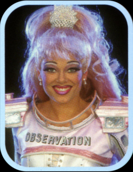
Being as I’m in love with most of Pearl’s costumes I actually don’t have a ton of nitpicks. I think my main one is that I’m not a fan of the salmon/gold tones that were sometimes used for the bodice. For example:
I think moreso than the costumes I’m critical of Pearl’s wigs. I HATE when she has straight wigs… the only exception to this rule is Stephanie Lawrence’s and Nikki Belsher’s because those wigs were also big and fluffy. But that lanky thing Bochum had in the early 2000s? Terrible. Pearl should have big, dramatic curls. Also, this should go without saying but her hair should be PINK. Blonde Pearl actually gives me acid reflux.
Also I don’t think much attention is given to her headpiece, but I really love when they’re big and princess-y. Like, this headpiece with these earrings? I love:
As far as a favorite Pearl costume, that’s really hard because I love so many of them, but I’ll say this one. I think it’s a nice balance of pink and white:

Greaseball:
I don’t have a ton of nitpicks about Greaseball’s costume… like, it fucks pretty hard? I moreso have beef with his makeup. NONE of these men know how to blend and it looks terrible. I get that it might be a stage makeup thing that looks better under stage lights but I still don’t even really buy that because every other character blends?? Also, I don’t like how the makeup is just contouring… I get that it’s to make the actors look more masculine, which does suit Greaseball’s character, but PLEASE give that diesel some character makeup!!
I really stan the Broadway makeup for this reason. Look at this Jareth-looking bitch, he looks amazing! And it’s just SO cool:
Idk even this London makeup is pretty okay imo… anything to make him more visually interesting 😭:

Dinah:
My main gripe with Dinah’s costume will forever and always be the apron lmao. I’m very, very picky about it because it’s SO easy to make look tacky as hell. The 2018 apron is the ugliest its ever been, I’m sorry:
LIKE WHY IS IT SO BIG AND LONG. Also the silver strap around her chest is WAY too high now. I swear they tried to make the 2018 coaches more modest in the ugliest ways possible. But anyway.
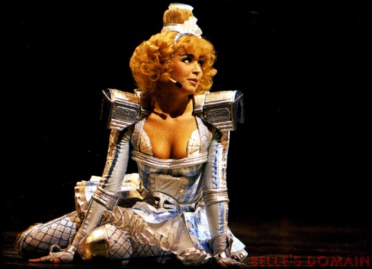
I prefer for the apron to only be beneath the belt, but if it also has to be above the belt I can tolerate it if its small, like the Broadway design or the earlier Bochum designs. I also prefer when her leggings are on the more silver/metallic side than just straight up blue. Broadway and Japan-Australia had the right idea with how metallic they made everyone look.
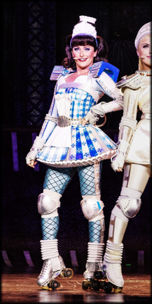
As far as Bochum goes, I feel like the costume’s peak was from like 1997 to 2007:

PERSONALLY, though, my ideal Dinah costume would be Debbie Wake’s from the Japan tours. The color, the leggings, the wig, it’s all so… Peak! I also really love how the top of her skirt is divided into sections?? It’s really cute. The only thing I’d change is I’d remove the part of the apron that reaches above the belt and adjust the color of her wig. But otherwise I love this one so much 🥺🥺🥺:
Electra:
I have a lot of very disjointed thoughts on Electra’s costume, but bottom line is I’m rarely content with it… but my MAIN nitpick is definitely the color scheme. I know that it’s intended to be blue/red/silver but instead it often looks blue/red/white to me and I just CANNOT dissociate that from the American flag/overzealous patriotism alsjdlf, it kind of gives me heartburn. I’ve seen some fan redesigns of the costume that incorporate a blue/red/gold color scheme instead and I think that could REALLY fuck, though I don’t know how it’d translate to the stage/irl. Or just?? Design his palette after the bi flag colors??
Another nitpick is how boxy and bulky his chest box often is. I feel like I can’t criticize this TOO harshly because, in my opinion, this musical should be FIRMLY 80s, and that’s probably what counted as “futuristic” in the 80s, but it’s just a personal preference of mine that I wish his chest piece was more slender and streamlined. I think it’d make the silhouette better and just?? Look better??
I also don’t like most of the mohawk wigs… they just look… VERY cheap and fake to me most of the time. I prefer the looser/wilder wigs because they look softer and more natural.
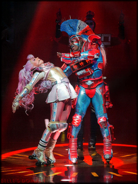
ANYWAY I’ve found that the costume that actually sates most of these complaints for me is the Japan-Australia costume. The palette actually looks blue, red, and SILVER to me, and the body suit is just?? Sooo shiny and metallic and sparkly?? It’s so pretty. The wig is a perfect balance of the looser/wilder London wigs and the early mohawk wigs, and the MAKEUP is so good, it’s the only time I’ve seen a silvery/metallic base on Electra work and NOT whitewash the fuck out of the actor. Not to mention the base in JapanAus matched the body suit REALLY well and aaaah idk I could wax poetic about this costume all night aljsfld it’s really good and I appreciate it for being the, like, one (1) Electra costume I vibe with 😭.
Again, I’d streamline the chest box if I could but overall? This is peak performance:
CB:
Off the bat I’ll say I hate how big his shoulder boxes have gotten over the years. Like they are just ridiculously massive, it looks kind of awkward when the actors can’t even rest their arms by their sides due to it. They look like little kids wearing arm floats. Also not a fan of how much lower the neckline has gotten, and how much smaller the bandana has gotten?? His chest and neck are SO exposed now when they use to be completely covered and it irks the hell out of me.
Funnily, this one picture pretty clearly displays all three of these nitpicks:

Compare this to back when the neckline was higher/the bandana larger, he’s completely covered. He also isn’t fucking DROWNING in his shoulder boxes:
Also not a fan of the hair piece Bochum has used in recent years. Like it was just so much cuter when the actors used their real hair :^//. And I just Do Not Vibe with how straight and neat the hair piece is, CB has wild, curly hair and I’ll die on that hill.
ALSO, and this is more specific to just one actor, but I kind of hate Dan Ellison’s makeup aljsldf. Like it’s well done but it just has far too much going on. All what CB needs done is his cheeks, his eyes, and his lips— all that extra that Dan does on his jawline and with the laugh lines around his mouth and eyes is just… too much. And it frustrates me so much because he would be SO much cuter if he went with a simpler makeup!! Ugh. But anyway.
This was 100% the makeup at its best, like. Absolutely peak, thank you Thierry Gondet:

And my favorite costume comes from the 1990 Japan tour. I ADORE how this chest box is fitted and designed, and it just looks so shiny and red? Like it was freshly washed and painted 😭. Not to mention the red contour on his temples is kind of a Look:
The only thing I’d adjust is I’d give him the suspenders present in most of his costumes, because they’re honestly adorable. And, of course, he needs his Chessie System sticker. But otherwise? This is Peak Performance.
Okay I was gonna do more but this thing is fuckoff long as it is, so I’ll just stick to the Big Six. If you made it this far you’re a trooper, thank you for taking the time to read my ramblings aljsldfs.
#stex appreciation month#starlight express#stex rusty#stex pearl#stex greaseball#stex dinah#stex electra#stex cb#naph.txt#THIS IS SO LONG ALJKSLFDS I'M SORRY
32 notes
·
View notes
Last Seen Blogs

arrowjp
arrowjp

floralunderground
Floral Underground

elevateprotocolweb3
Untitled
arrowjp
arrowjp
arrowjp
arrowjp