#it’s the interplay between those shots that creates SO MUCH MEANING. it’s not about matching them. emotionally or visually
Video
youtube
not exactly flashy but it is pretty fast, like, 2-4 clips per second
inspiration (in music, style, theme even, accidentally, i basically copied the whole thing)
so i melted all the words in my thasmissy fic, added yazs sexual awakening and whipped it until it formed peaks, carefully folded in the doctor’s childhood trauma, added a pinch of missys whole situation with clara, poured it all into my video editor and i baked it for two weeks at whatever temperature my laptops processor gets when i run premiere. this is the result, entitled: With The Power Of The Kuleshov Effect I Can Make Thasmin Kiss
the story of this fic is that yaz and 13 travelling after revolution at some point run into missy because lo and behold one of missys doctor-catching traps actually works and she has successfully lured in a doctor. too bad it’s the wrong one.
when 13 realises this is missy circa s9, pre-vault times, she gets it into her pretty little traumatised head that if she reforms this missy, then the doctor falls doesnt happen, the master doesnt happen, gallifrey doesnt happen, she can get her friend back and undo the destruction of gallifrey, and maybe even unknow the things shes learnt about the timeless child
obviously this is 1) incredible ‘your control freakiness is making you disrespect your friends’ autonomies and also is gonna get you all hurt’ behaviour, and 2) a very bad idea because rewriting not just your own personal timeline but also the master’s and also yaz’s (and bill’s and nardole’s, like a ‘how many of your friends can you hurt at once’ bingo and shes winning) is gonna result in some very unsustainable and very painful paradoxes. which she cant tell yaz or missy about because they’d get rightfully mad for starters and also because neither of them know Anything about s10. so 13 is like ‘im gonna quietly suffer as i try to rewrite the last century and a half of my life’ in some clara-like mindset of “i am owed”
she doesnt deserve it but she is owed. she wants these people in her life. and shes sick of losing. so shes just gonna take what she wants.
so vault times 2.0, which is actually 1.0 for missy and shes not actually in a vault shes just hanging out with them in the tardis, basically skipping the first 70 years of the vault times bc she proves herself in the first chapter by stepping in front of yaz as shes about to get shot (was this on purpose? nobody’s sure). the doctor is still as distant as they were during the vault times. for reasons of traumatised and also it hurts to rewrite your timeline so shes Not Feeling Great and ALSO because cant accidentally let missy know what shes doing if they touch and she reads her mind.
thats whats happening, but thats not actually what the fic is about. because we’re in yaz’s pov. she has no idea about all of the doctor’s great life choices until the end when it explodes in all their faces. so what the fic is actually about is yaz having realised shes in love with the doctor but not knowing what that means, and by lack of any help from the doctor to figure out what it means, she turns to the only other person available, who is also in love with the doctor so thats great, but it’s the worst love you can imagine so thats less great. nothing good comes of any of this.
im not sure i will finish this fic but since making this video i got less stuck on it so i have hope. needs a lot of editing though so we’ll see. in the meantime have the film adaptation.
it’s about the stuff that gets stuck in our body that we cant touch, it’s about the intermingling of pleasure and pain, desire and disgust, it’s about the crossed wires and situations where youre not sure you can leave but also not sure you want to and whats the chicken and whats the egg there. it’s about unravelling ourselves like timelines unravel, with lots of blood and guts and ghosts, not pretty and not painless and not knowing what we’ll be at the end of it. it’s about all the things we havent told ourselves.
there are two versions, one with dialogue one without, because i think i managed to convey the story with just images very well, i did it with dialogue too, as well as with them combined. and i think you can see different things when the dialogue is off. like really appreciate the kuleshov in certain moments you know? i just like both versions so you get them both. bon appétit
youtube
editor’s commentary 1: intro
editor’s commentary 2: shame
editor’s commentary 3: the gay part
4.1 repeated clips: stake & snake
#I AM SO PROUD OF THIS ONE#i realised such new depths of what putting two images next to each other can Really do! like!#i watch videos that i think are great sometimes for inspiration but i cant really like. dissect what exactly works so well about them?#im not super good at that. i just watch them and hope to pick up the vibes recreate them intuitively later#(this video’s inspiration had a very distinctive style thats easy to copy though. i didnt entirely.#they used more tiny repetitions within scenes which i think is cool)#but one thing i can identify is match cuts bc theyre like the easiest thing to identify. theyre very easy to see happen. and they look cool!#so i look for them when im making videos too. there are a few in this one. like yaz missy and 13 all turning to their right our left at 0:46#or like in the ‘on my command’ video where i matched yaz and 13 walking down the atropos stairs. that creates meaning too#but what i really really learned with this video is that the most meaning is created in CONTRAST#the bigger the difference the more meaning springs up between two shots#like in the first 20 seconds. the difference in emotion between each shot is really what creates the meaning there i think#it’s like. 13: dont leave. yaz+13:happy. 13: youre not leaving? 13: dont ask me questions i dont want to answer. 13: youre not leaving?#13: DONT ask me questions i dont want to answer. yaz: i want more time with you. 13: dont leave me. yaz: frustrated.#13: anticipating disappointing.#it’s the interplay between those shots that creates SO MUCH MEANING. it’s not about matching them. emotionally or visually#(although i think matching visually but contrasting emotionally might be super potent? should try that sometime)#it’s about the difference. the further apart two moments lie the more meaning springs up between them when you connect them#i guess this is like rule 1 in any art that definition lies in contrast but i had a lot of fun learning that with this video#and IM SO GLAD I FINISHED IT#im so so happy with it#and if i start having ideas again someone spritz me with a water bottle like a naughty cat asjdkhjgh#i cant do this again (i say while already having started the next video in my head rip)#also let me know if theres interest in a directors commentary?#or editors commentary i guess technically?#i could probably talk for ages about all the meaning and Intentions i stuffed into this video#but idk if that'd be interesting or if everyone would just be like 'yeah. DUH. we can See That'#so idk let me know if that would be interesting. no promises tho. maybe i have nothing more to say about it all. maybe ive said it all#thasmissy
66 notes
·
View notes
Text
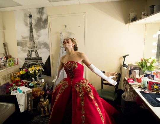
Lady in Red: Linda Cho’s “Anastasia” Pièce de Résistance
I was going to wait a little bit before doing a piece on one specific outfit, especially since I’ve blogged about it a couple times, but inspiration has struck and I want to try and go in-depth on one of my absolute favorite costumes of the 2016-2017 season today.
As those who follow my other blog ( @overheardinwod ) already know, I am a huge fan of the musical Anastasia and have eagerly anticipated its debut for years. Linda Cho, in doing her research for the costumes for the stage musical, clearly took some inspiration from the 1997 animated Don Bluth classic upon which the musical is partially based, but instead of doing a shot-for-shot remake of Anya’s costumes, she chose to adapt them or create entirely new designs.
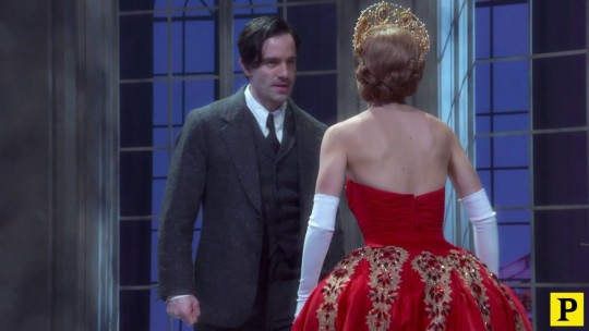
One of those designs is Anastasia’s Royal Red gown, sumptuously decorated with gold filigree, beadwork, and some of the most impressive gem work I have seen on Broadway this season. It’s a showstopping gown, and the one in which Christy Altomare took her very well-deserved bow on opening night, which is where many of the stills for this review have come from. Fortunately for me, this is an eye-catching gown, and so there are a lot of high-quality stills to choose from.
So, without further ado, let’s take a look at what I believe to truly be Linda Cho’s greatest accomplishment from the production:

(Photo credit: JustJared)
I’d be emotional in something this fine too, so I completely understand the expression on Christy Altomare’s face (okay, it’s because of the wild reception to her performance from the crowd, but I had to). The dress is absolutely fantastic on her figure, which is both petite and slender--in some ways, that made Linda Cho’s job designing a little easier because (while a bit on the short side), Christy Altomare has a “classical” figure for a leading lady on Broadway.
The dress itself is in two parts: a rust-red and gold brocade underskirt (presumably with some kind of corsetry or petticoats beneath to provide additional body), with an outer satiny, silky red body that is richly enhanced by gold filigree, beadwork, and truly impressive beadwork. At first glance, it positively screams royalty, even without the tiara (it’s not quite a kokoshnik this time because of the lack of a solid band!) on the head of the wearer. It’s a gown that is meant to impress the audience, not only in the scene but out in the crowd as observers of the musical. It has presence and helps to make Anastasia stand out in a positive way.
Look at the background of the scene (where this dress appears, even if this is a still from the bows). The scenery is a blend of black, white, and gray, and the other figured onstage are clad either in white or in much more muted colors. The bright, vibrant red of the outer portion of the dress and the bust are designed to command the attention of the viewer; they make clear that not only is Anastasia the central character here, she is the most important figure in the building. Even from a distance, one can see how important this costume is: it’s heavy, it’s rich, it’s colorful (and in shades not seen elsewhere in the musical), and it has body that gives it substance. But beyond all of that, the detail hops out even from afar.
From afar, we can see the patterning in rough form. The fold filigree forms a geometric, almost feather-like design on the gown, while the bust sports a pattern that should be familiar to students of Russian history: it’s an homage to the Romanovs’ double-headed eagle, a symbol of Imperial Russia, the Romanov family, and the empire itself. But while typically a quite masculine symbol, here it takes on an airier, more feminine tone as befits the character. Even in a heavy dress like this, the light touch with the gold means that we are reminded that this is a princess, with all the soft connotations that word tends to conjure in our minds.
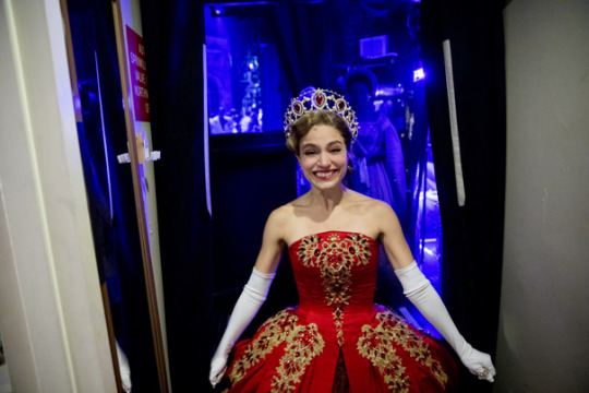
Let’s go in a bit closer, with a Broadway.com still from Christy Altomare’s dressing room (which I also first saw on @anyasdimitry‘s blog):
Up close, it’s easy to see the sheer beauty and mastery of the detail work, and the lighting lets us look even closer. We see that Linda Cho has chosen to accent the dress not only with gold filigree detailing, but with beadwork and with gem work. The way the light falls in this image, we can see that the jewels are quite a bit darker than the outer gown, but also more bright and “pure” red than the brocade that forms the inner body of the gown. That is a clever and intentional design decision; whenever you are stacking colors atop one another, you need to find ways to distinguish them. Usually you will do that by one of two means: variations in shade, or variations in texture. Linda Cho has taken both options here: she varied the texture of the brocade, silk or satin, and jewels, all the while finding complementary but quite different shades of red.
By having darker jewels on the dress, I noted earlier that there is an almost fiery effect. The jewels allow the dress to shimmer, looking like “sparks” over the more sustained flame of the satin surface of the outer body. It also means that the light will never catch on the dress the same way twice. Remember that jewels, when of a high quality (and while almost certainly rhinestones here, they will be of unmatched quality for a first-run Broadway production), jewels refract light and offer a little bit of “glow” when used in costumery.
For a better idea, Playbill provides us with a shot of Anastasia’s gown from the rear (I believe this still is from the Hartford production, but the gown itself did not change between tryouts and Broadway as near as I have been able to discern from my research):
Take a look at the sparkle and shine of the jewels on the bustle (which is the term generally used for the part of the rear of the dress that pops out a bit, offering a contrast to a woman’s bust in the front; traditionally this provided her with a bit more “personal space” on a ballroom floor, as well as flattered her figure). The darkness compared with the rich red color of the fabric gives the gown a whole new feel: the light catching on the stones almost gives a crackling effect. The gold filigree, in some ways, even takes a backseat to the interplay between the jewels and the fabric of the dress itself--but it also provides a contrast that is important.
There’s more than just color-matching at work here. Balancing a primary color with a metallic color has been a standard practice in design since the age of heraldry; colors (red, blue, yellow, and combinations thereof) and metals (gold and silver) could be mixed, but you always wanted to have a buffer between them, especially when using two different shades of the same color or tones of the same metal. Linda Cho has obeyed that relatively ancient rule by surrounding the ruby-red jewels with the gold filigree. In so doing, the jewels “pop” more and become much more noticeable than if they had merely been laid against the red body of the gown.
Another Broadway.com still offers us a better example of just how well this design works, this time as Ms Altomare emerges offstage:
Once again, we’re able to see the balance of the red tones from the brocade (the V-shape at the bottom of the frame), the silk/satin of the gown itself, and the jewels. In this light, the jewels on the bodice/bust appear dark and rich, almost crimson in color and tone, while those on the body of the dress, flaring out to the sides, are a lighter color that is just a bit offset from the red of the fabric beneath. This is one of the two images I have seen of this dress that really made me think of the phoenix idea I mentioned in another post. The other comes from my all-time favorite picture of the dress, from the New York Post’s “Page Six” blog:
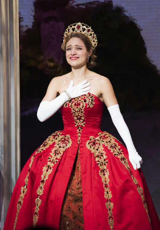
Take these two previous pictures together and you can see some of what I mean by phoenix-like. The myth of the phoenix is that it is an immortal bird which ends its life in a bright explosion of flame and color, only to rise from the ashes reborn; it’s a classic mythological trope and one that I can’t help but think Linda Cho was trying to harness in this gown. Recall what I said earlier about the design elements of the gown: on the body of the dress, we see the almost feather-like filigree and jewel-work (accented with some gold beadwork), while the bust is covered with an homage to the Romanov double-headed eagle.
Doesn’t it look a tiny bit like the eagle has “shed” the feathers that float down the sides of the gown? Look at the way the eagle design “drips” down towards the open seam that reveals the brocade, jewels in every inch of the “tail.” To my mind, it’s a little like a phoenix that has shed its old feathers, burst into flame, and risen again up the bust of the gown as a new being. In many ways, that’s a great metaphor for Anastasia herself: she had an identity as the Grand Duchess, lost it, found it again, and then decided to renounce it in favor of another identity. Like the mythical firebird, she undergoes a cycle of birth and renewal over and over throughout the course of the musical.
I don’t know for certain that this is the effect Linda Cho was trying to harness with this gown, but it certainly seems plausible given how richly designed it is and how keen an eye for detail she possesses as a costume designer. This dress is rightfully the showpiece of the end of the musical, and the one that is designed to leave the audience with a key visual to take away from their enjoyment of the performance. It’s rich, heavy, and gorgeous from bust to floor and all points in between, and sits perfectly on the wearer.
Simply put, this is Linda Cho’s 2016-2017 pièce de résistance, a masterwork to end all masterworks, and one that deserves to be studied by fans of classic and modern design, the theatre, and the way in which these art forms intersect. It’s a joy to look at and a joy to analyze.
And that’s what costumery is about: bringing a sense of emotion and wonder to the viewer to complement their feelings regarding the performance onstage. In that regard, the royal red gown from Anastasia is a complete and total success.
#anastasia#anastasia musical#broadway#theatre#musicals#linda cho#christy altomare#costumery#long post
340 notes
·
View notes
Text
The new Photoshop for iPad isn't the best tablet photo-editing app
The Lightroom app for iPad is impressively complete. This photo was shot on film and synced over to the iPad as a smart preview. (Stan Horaczek/)
This week, Adobe introduced the first full version of Photoshop for the iPad. The initial release is missing some familiar features like the Pen Tool for drawing vector-based shapes, but the company has made it very clear that this is only the beginning. It’s an exciting prospect for those who want to do extensive retouching, serious illustration, or layer-intensive compositing without the need for a Wacom or similar tablet. But, if you’re just looking to do some photo editing, Adobe’s Lightroom app has been around for years and it’s still one of the best options around.
Lightroom is designed for photographers. The desktop version provides an end-to-end workflow that starts by helping you organize and tag your photos upon import. It has an extensive range of editing tools and preset options, and then you can export photos with settings that match your specific purpose. Just this week, Adobe announced that users can finally export images to TIFF files directly from Lightroom, which is another step toward making it an all-in-one solution.
While the desktop version is tried-and-true for many photographers, the app version still doesn’t get as much credit as it deserves. When you import photos from your camera or phone into the desktop version of Lightroom, it can create smart previews and sync the library up to the app, which allows you to edit across both platforms.
Lightroom uses non-destructive editing, which means it stores information about your edits separately from the image files themselves. In Photoshop, you can accidentally save over the original picture, whereas Lightroom forces you to export a new version of your photo with the edits applied.
This type of processing also makes it easy to sync edits across devices. You can make color, light, and other image adjustments using smaller, preview files on the iPad and then sync them back to the desktop to export full versions. Or, you can simply save images to your camera roll from the app itself.
Even if you don’t want to make your iPad a primary editing device, it comes in very handy for things like sorting through a huge collection of photos on the road, then syncing those selections back to the desktop version for final edits and exporting.
The shared Creative Cloud catalog between Lightroom versions isn’t perfect. You have to make sure to remember to sync your iPad over a fast connection before taking it on the road and it’s easy to get lazy about importing photos from the smartphone version of the App and making your catalog a bit messy. But, once you’re in the habit of keeping things organized, it’s one of the better examples of a platform working across three different devices.
Sadly, Adobe’s Creative Cloud storage plans aren’t exactly roomy, so space can be a limiting factor when it comes to syncing and keeping tons of images in your Creative Cloud library. But, Adobe’s new Photoshop app relies even more heavily on the cloud. It’s now using a new file format called PSDC to sync edits and app data about your files via the web. Hopefully, that will entice the company to improve some of its storage options down the road.
I’m looking forward to seeing what future versions of the Photoshop iPad app will be able to do, but for now, Lightroom handles most of what I need to do from a photography perspective. Like, with Photoshop, it still requires a Creative Cloud subscription, but its included in the $10 per month photography subscription, which is still a solid deal years after its debut.
On the desktop, there’s a lot of interplay between Lightroom and Photoshop, so it will be interesting to see how Adobe integrates the two as part of its total cross-platform solution. Right now, it’s simple to switch back and forth between the two sitting behind a computer—Lightroom handles the brightness and tonality adjustments, while Photoshop drills down into the retouching and cloning function. It’s not as simple on an iPhone or iPad, however, and switching involves repeated exporting and importing. But, as Adobe said, this version of Photoshop is just the beginning, so the dream of seamless end-to-end editing on the iPad may come to be down the line.
from Popular Photography | RSS https://ift.tt/36JPHry
0 notes
Text
MCU Timeline: Watch each Marvel film and present within the excellent order
http://tinyurl.com/y36ej9gm
You’ve got in all probability seen most of Marvel’s films, however what in regards to the TV exhibits? Timelines in the world of comics and movies might be greater than just a little complicated. And now, as we method the fruits of greater than a decade of flicks and Part Three of the newly named Infinity Saga, issues could very nicely change into much more complicated. Will Marvel Studios ever decelerate? (Ought to it?) Marvel After greater than a decade of flicks, TV exhibits, shorts, and post-credits scenes, there’s quite a bit to work by means of within the MCU. Editors’ word, 2019: We’re within the Endgame now. Try our review, sister web site GameSpot’s and more, and preserve scrolling for extra on the state of the MCU. Beforehand, March 2019: It is lastly occurred, we have redesigned the *whole timeline.* Please proceed to pontificate within the feedback about how nice or horrible it’s! And in case you’re trying to stream some MCU movies, we can help. Suppose you have discovered a mistake? Tell us within the feedback. So to both assist you fill within the gaps earlier than Endgame, to only watch all of the exhibits for enjoyable, and even merely attempt to impress your folks, we have created a timeline of what Marvel President Kevin Feige has now dubbed The Infinity Saga within the excellent viewing order. Or perhaps you simply care about the place Captain Marvel matches in (trace: it is not the place you assume!). The Marvel Cinematic Universe, as the complete franchise is known as, additionally generally contains linked properties reminiscent of film tie-in comics or shorts. For the graphic, we have disregarded smaller properties and caught to the large two of movies and exhibits, however there are extra goodies under. Sean Enzwiler/CNET OK, now earlier than you lash out in anger about a number of the, ahem, more moderen movies’ placement, please preserve two tremendous, mega, main issues in thoughts. MCU postcredits scenes don’t matter Severely, the mid- and postcredits scenes are nothing greater than enjoyable throwaways, or in-canon nods for fervent followers. Even Marvel itself has fairly actually rewritten older scenes with new motion pictures. Assuming Feige and different heads of Marvel Studios thought in regards to the subsequent 10, 20 and even 30 years of MCU movies proper from the beginning is a bit presumptuous and fully ignores the enjoyable some directors have said they’d with these scenes. It is insanity to assume that these movies ought to solely be watched or skilled in a single manner. Do I consider that is the easiest way to observe the franchise, sure. Will I sometime introduce family and friends utilizing this CNET Methodology? OF COURSE. However that does not imply it is best for you. My colleague Sean Keane has graciously ranked all of the MCU postcredits scenes for you (but when it might be useful, perhaps we are able to additionally develop a timeline of which to observe and when). I am unable to say it sufficient instances for first-time viewers: Ignore all of the postcredits scenes (simply watch the enjoyable ones your folks inform you to). Particularly when watching on this order, don’t watch the Ant-Man and the Wasp credit scenes or you’ll be very confused. And as to your subsequent large query… Marvel Studios, composite by Chelsea Shi/CNET Captain Marvel doesn’t belong in chronological order No actually, hear me out! Captain Marvel is the primary true origin story (as in, she wasn’t seen in a Marvel film beforehand) since 2016’s Doctor Strange, however the movie additionally provides followers a brand new take a look at Brokers Nick Fury and Phil Coulson, in addition to the Tesseract. Should you had been following a chronological watch order to your first viewing ever of those MCU movies, you’d have So Many Questions watching the film proper after Captain America’s first outing. Within the movie, Vers takes years to find her true id, and by ready to observe her story with the context and nuance of 18 prior movies you give your self a deal with. It is extra enjoyable to bask within the enjoyable of quite a few in-jokes, “A-ha!” moments and Fury backstory you probably would not have cared about 17 motion pictures in the past. On this order, Captain Marvel is the deal with you get earlier than the Infinity Warfare-prequel that’s Thor: Ragnarok. Regardless of what order you find yourself experiencing these motion pictures in, it’s best to save your self a couple of hours and undoubtedly nonetheless word that The Incredible Hulk is certainly nonetheless skippable and even William Hurt (“Thunderbolt” Ross himself) admitted it. Speaking to IGN in 2015, Hurt said that “[Ross in Civil War] is completely different as a result of it is a completely different fashion… And what they’ve carried out is that they’ve taken a personality who was the Ross from the older movie and made a brand new model. This can be a a lot newer Ross. A a lot completely different Ross.” After watching each, we are able to affirm that is certainly the case. You will additionally discover that shorts and the Marvel One-Shots are lacking from the graphic. These temporary movies had been initially created as standalone tales to offer backstory for characters or issues seen within the motion pictures, with two of them later changing into full-fledged exhibits. Marvel One-Photographs Title, launch date Takes place… The Guide (Sept. 2011) On the finish of Iron Man 2 A Humorous Factor Occurred on the Approach to Thor’s Hammer (Oct. 2011) Instantly earlier than Thor Merchandise 47 (Sept. 2012) Instantly following the Battle of New York in Avengers Agent Carter (Aug. 2013) One yr after Captain America: The First Avenger; earlier than Agent Carter All Hail the King (Feb. 2014) Roughly two years after Iron Man 3; earlier than Brokers of S.H.I.E.L.D. Marvel Webisodes Extra continuity within the MCU There’s undoubtedly some continuity strangeness when you’ve each motion pictures and tv present properties, and people listed on the graphic aren’t any exception. Season 1 of Agents of S.H.I.E.L.D. noticed the discharge of two Marvel motion pictures and needed to deal with incorporating these plots. Airing after the discharge of Thor: The Dark World, episode eight of S.H.I.E.L.D. undoubtedly takes place straight after these occasions. Physician Unusual undoubtedly doesn’t happen earlier than Winter Soldier, completely not. Marvel Later in that season, episode 16 aired the identical weekend as the discharge of Captain America: Winter Soldier and, in a neat little bit of continuity, the occasions portrayed on S.H.I.E.L.D. happen at virtually the identical time because the movie. (Some folks say episode 16 comes earlier than Winter Soldier, and you’ll definitely deal with it as such. The *absolute* finest strategy to watch them can be concurrently, however I’ve but to see anybody make that fan edit.) Netflix’s Daredevil and Jessica Jones even have wibbly-wobbly timelines. Early within the sequence, the Battle of New York is referenced to as The Incident, and it is mentioned that it occurred about two years prior. However due to the present’s lack of interplay with any big-screen Marvel characters, it might happen virtually anyplace on the timeline between Thor: A Darkish World and Avengers: Age of Ultron. In our timeline, we positioned it concurrent with the second season of S.H.I.E.L.D. in order to remain nearer to the time it was really launched. Guardians of the Galaxy Vol. 2 is increased up than you could have anticipated — that is due to the variety of years the movie says have handed, that means it takes place only a few months after the primary movie. Some say that Physician Unusual ought to come earlier than Winter Soldier, due to a sure rooftop scene. A rabbit gap one IGN editor has already gone done and debunked. So Unusual stays the place it’s. (However with time manipulation up for grabs now, who actually is aware of??) A frequent query in regards to the timeline is why Captain America: TFA is first. That is all simply my opinion, however I believe watching Steve Rogers develop up first, adopted by seeing Agent Carter’s story, is an effective way to start an MCU foray. There is a case to be made that he’s a very powerful Avenger, and whether or not you agree with that or not, it is value it to leap in with him first. As for the second most-asked query: No, Iron Man 2 should not come earlier than Unimaginable Hulk due to the brief, The Guide. That brief was launched a lot in a while the Thor DVD in an attempt to simply backfill the storyline. I am 100 p.c going to say that if something ought to transfer, it is the timing of if you watch that brief — perhaps put it after Iron Man 2 as a substitute and that may assist. Yeah, I will make that change on the one-shot checklist, that ought to assist. Past the Infinity Saga Years in the past, Marvel Studios president Kevin Feige told me range is essential to Marvel: “You take a look at any of our movies and so they’ve been very various,” he mentioned. “We really feel like we’re simply doing justice to the books by representing that totally.” After Black Panther and Captain Marvel‘s performances on the field workplace, all bets are off for the way forward for the MCU. Their record-breaking, record-setting origin tales broke all of the superhero story guidelines — and this is hoping Marvel continues to take action. Trying forward previous Endgame, the one movie we all know is for certain coming is that this summer time’s Spider-Man: Far From Home. We do, nonetheless, have a complete mess of “confirmed” films, in line with Deadline, THR and extra. In-production and rumored upcoming movies for the subsequent Part/Saga of MCU embody: Marvel on Netflix, and the Disney Plus future Netflix’s Marvel exhibits nonetheless rule outdoors the theaters. ABC tried to leap again into the sport with Inhumans however poor rankings imply any whisper of a second season is fortunately absent. S.H.I.E.L.D. has a brand new season set to premiere after Endgame, however no teaser or phrase but on the way it’ll cope with… a number of deaths (spoilers). New Marvel exhibits at the moment are fairly constantly popping up, however just some are inside the MCU canon. Cloak and Dagger’s second season begins in Could on Freeform, whereas Marvel’s New Warriors is theoretically nonetheless floating round someplace? In Nov. 2017, THR revealed the present was being shopped to networks, however no phrase but on the place it’s going to find yourself (perhaps Disney Plus?). We not too long ago discovered Marvel’s Runaways on Hulu will return for a 3rd season, however the identical can’t be mentioned for the Marvel-Netflix properties. Regardless of vital popularity of a number of the exhibits, the entire Netflix originals have been canceled. Will they ever return? By no means say by no means, however possibilities appear slim. As an alternative, hope for a brand new reincarnation of the characters on the upcoming Disney Plus streaming service. The expansion of the Marvel universe is extraordinary (har-har) and because the comics large introduces new followers to new characters (some folks had no thought who Physician Unusual was a few years in the past) and companions with cable tv and Netflix to broaden even additional, we might see some fairly epic pairings, groups and characters come out of the woodwork. Which characters would you wish to see in Marvel’s not-yet-announced-but-certainly-inevitable subsequent phases on each the small and large display? Tell us within the feedback. This piece first revealed in 2015, and is now on its 47th revision (roughly). Source link
0 notes
Last Seen Blogs

lykos-attic
LOSERCORE

ethan-torchio-angelo
Emma
ethan-torchio-angelo
Emma

bla-nck
Soft.X

whitepinetherapy
White Pine Therapy