#ixd301
Text
Elements Project Links
Sketchbook:
https://www.dropbox.com/s/qqnhk388wp0ww18/Elements%20project%20sketchbook.pdf?dl=0
Prototype link: https://projects.invisionapp.com/prototype/ckjl0m8c700gwn201oyyctbms/play
1 note
·
View note
Text
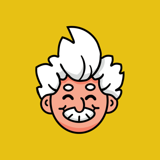
Materia Illustrations
Below are the digital illustrations that I have created and developed from my original sketches.

Avatar
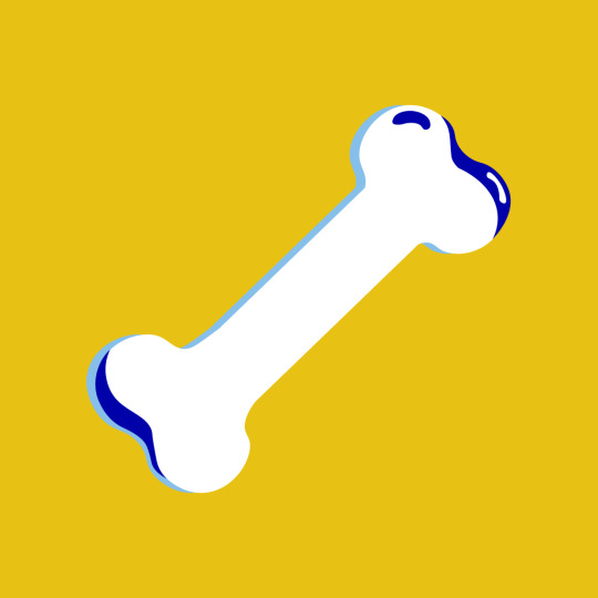
Bone

Red Blood cell
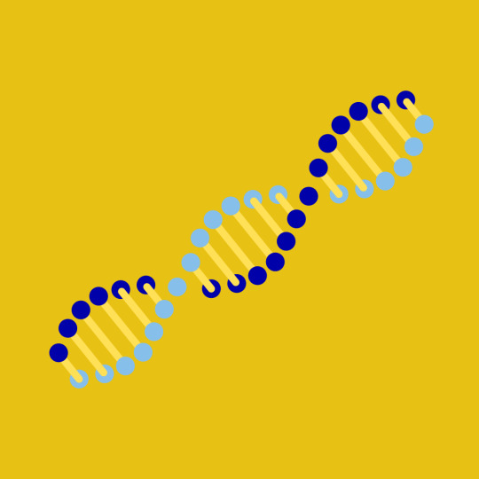
DNA
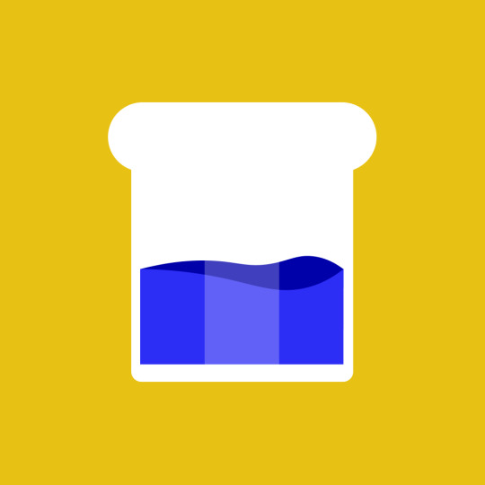
Water
Hair(head)
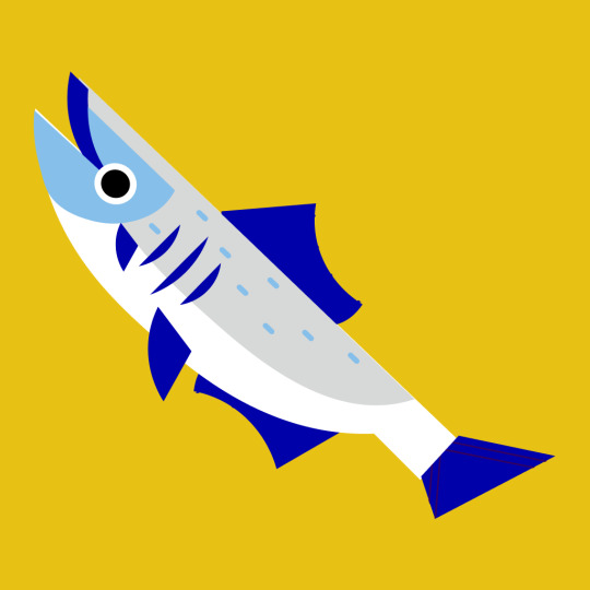
Fish
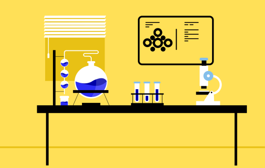
laboratory
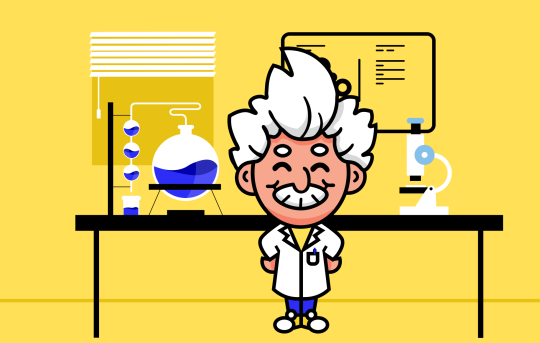
Laboratory with avatar
1 note
·
View note
Photo
Elements Superhero Project
11 notes
·
View notes
Text
Dumb Ways to Die.
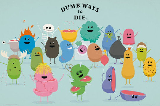
I was tipped by my teacher Chris to do character research on the famous public service announcement campaign “Dumb Ways to Die” by Metro Trains, to promote railway safety. It went viral in November 2012.
The characters have a lot of varieties in simple shapes, sizes and colors and I found the game/video very useful for my own character development.
2 notes
·
View notes
Text
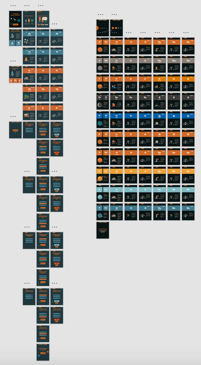
Prototyping in Xd
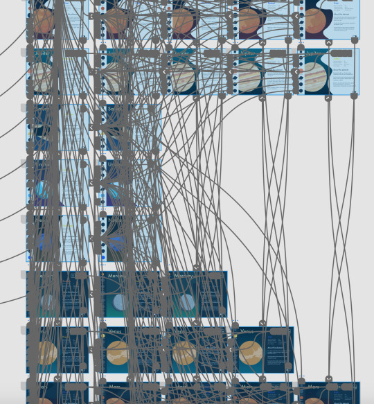
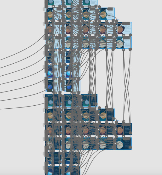
Making sure every single button is connected to the right screen and has the right transition selected. Prototyping is an art form in itself.
2 notes
·
View notes
Text
App Screens - First version
The photos below show how my app looked before a feedback session with my lecturer. I will be discussing the feedback in a separate post. These are a few of the element screens I created prior to my feedback session as I wanted to hear my lecturers thoughts before going further with my app design. App screens shown on an iPad mockup.


2 notes
·
View notes
Text
Issues in the process of coding
My first issue revolved around the first 600px that people see, and after trying to find margins, padding or something else that could be creating a huge space under the introduction part of the webpage I finally worked out that the issue came from the resolution of the background image. To resolve this issue I went back into Affinity Designer and changed the resolution of the background image until I got the desired outcome. Problem was, that this did not fix the huge gap issue I was facing and after playing around in CSS I found that there was a "height" implied that made this huge space between content.
https://codepen.io/chriscoyier/pen/LNamvy I had some issues with the formatting of text as it would not go onto another line in the desired location, I tried adding borders which didnt work at all, then I tried adding a margin and that counteracted the issue.
Another issue I had was that I wasnt able to change the text colour only for the specified "titles3" div tag. To counteract this issue, I simply wrote "titles3 h3" in order to change the colour of the h3 within this div tag specifically.
In order to change the background specifically for the footer, I added the "background-image" selection to the div tag that matched the footer.
I faced another hard choice; the font style which I used for the high resolution mark-ups was not available in Google fonts and there was no way of embedding it into the HTML and CSS code therefore I went on a wild goose chase to find a colour that could replace the one I had used before. To find something similar I went to this website where I could look at font styles (available in Google Fonts) that would look similar to the original High Tower Text style. After inputting the same HTML and CSS commands to initiate font styles including EB Garamond, Libre Baskerville, Jomolhari and more I had found one that wasnt too jarred nor too fancy. The selected font style is Crimson Text which I will use throughout my site. This has taught me to first look at Google fonts before making high resolution mark-ups.
I wanted to make the "projects" section's paragraphs justified to all borders and thus looked up how to do this in CSS. I found that adding this line of code: "text-align: justify;" "text-justify: inter-word;" would make the paragraphs fit into the specified grid making the alignment more similar to the one I created in my high resolution markup.
When creating my first case study webpage, I had no idea how I could hyperlink a button to take me to the specific case study webpage, however after reading this article about linking HTML webpages, I was ready to create my first internal hyperlink.
2 notes
·
View notes
Photo
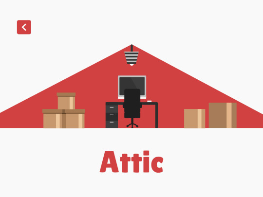
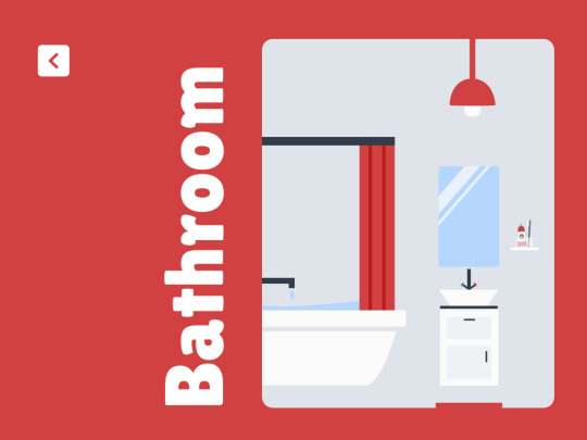
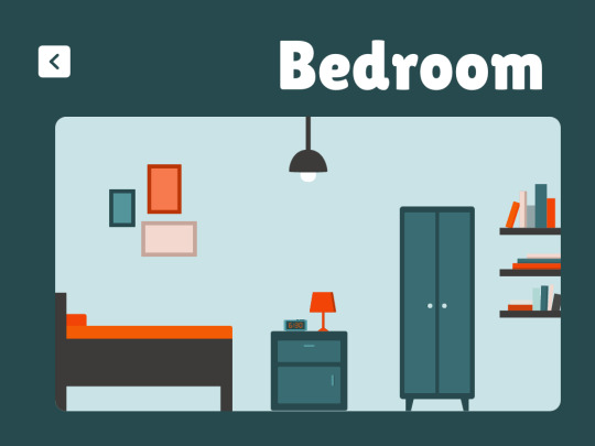
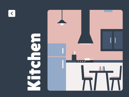
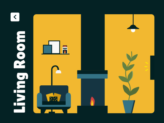
Final Room Designs
The design for the rooms weren't too tricky, going from a simple sketch, having the room on the right and the text above or on the left, depending on the size of the room. It was just reducing the size, making sure everything was looking accurate.
I decided to use a back button that looked like an element symbol, to keep consistency.
I am pleased with each room and now just need to work on the item designs and actually making the items in each pulse.
1 note
·
View note
Text
Usability Testing
What is usability testing?
Usability testing is a way to see how easy to use something is by testing it with real users.
Users are asked to complete tasks, typically while they are being observed by a researcher, to see where they encounter problems and experience confusion. If more people encounter similar problems, recommendations will be made to overcome these usability issues.
Usability testing evaluates ease of use
Usability testing is a method used to evaluate how easy a website is to use. The tests take place with real users to measure how ‘usable’ or ‘intuitive’ a website is and how easy it is for users to reach their goals.
The video below demonstrates how a usability test might work with a short clip from a real usability test we conducted for one of our clients:
The key difference between usability testing and traditional testing (bug testing, acceptance testing etc.) is that usability testing takes place with actual users or customers of the product. Whilst traditional testing might be undertaken by a developer, designer or project manager, usability testing removes any bias by collecting feedback direct from the end user.
There are a few different types of usability testing or reasons to conduct usability research:
Comparative Usability Testing
Used to compare the usability of one website with another. Comparative tests are commonly used to compare a website against peer or competitor sites, however it can also be used to compare two designs to establish which provides the best user experience.
Explorative Usability Testing
Before a new product is released, explorative usability testing can establish what content and functionality a new product should include to meet the needs of its users. Users test a range of different services where they are given realistic scenarios to complete which helps to highlight any gaps in the market that can be taken advantage of and illustrate where to focus design effort.
Usability Evaluation
This is a test of a new or updated service either pre or post-launch. This usability test introduces users to the new design to ensure it is intuitive to use and provides a positive user experience. The aim of the usability evaluation is to ensure any potential issues are highlighted and fixed before the product is launched.
Advantages
There are many advantages of usability testing including:
feedback direct from the target audience to focus the project team
internal debates can be resolved by testing the issue to see how users react to the different options being discussed
issues and potential problems are highlighted before the product is launched
The business advantages of usability testing can be seen at the end of the project:
it increases the likelihood of usage and repeat usage
it minimises the risk of the product failing
users are better able to reach their goals, which results in the business meeting its targets
Disadvantages
Usability testing provides many benefits, but there are a few disadvantages in using this methodology, which should be noted. Firstly, testing is not 100% representative of the real life scenario, e.g. a mother will not have her two young children running around like she might have at home. Also, usability testing is mainly qualitative, so does not provide the large samples of feedback that a questionnaire might, but the feedback can be far more accurate and insightful.
Conclusion
Usability testing can be used in a variety of ways during your project lifecycle. Despite not being able to mimic real life usage, usability testing is still the best method of ensuring your website supports users in achieving their goals quickly and easily. When businesses meet the needs and expectations of their users, they are more likely to develop a successful service.
1 note
·
View note
Link
To help me distinguish between User Stories and Job Stories, I found this article which breaks down job stories and gives examples to how the differ from user stories.
1 note
·
View note
Text
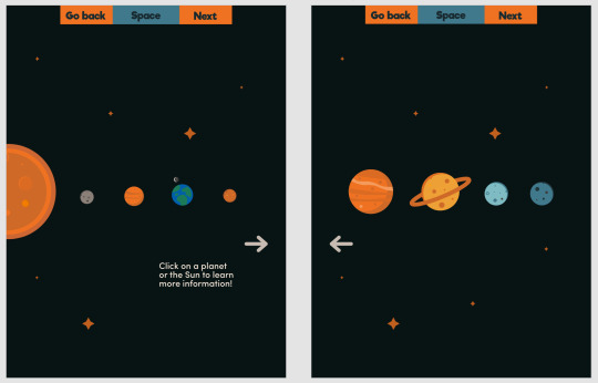
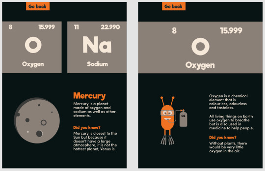
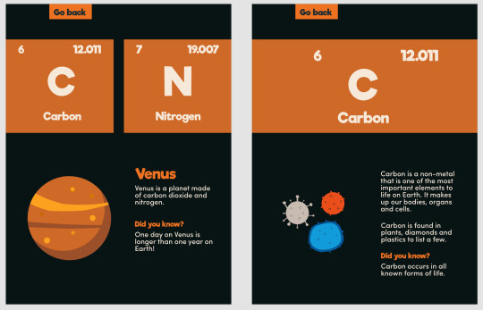
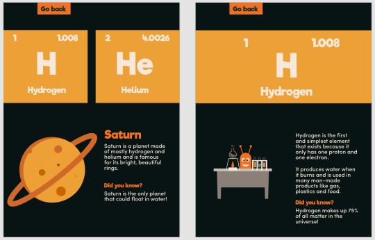
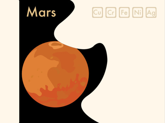
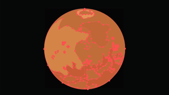
Elements Project Idea
My ideas is to design an AR app that displays information about the precious metals traded on the stock exchange. The way that the user sees this is my scanning an element cards using there camera on there phone and once the cards is scanned an AR genteel information about the element will appear above the cards hovering in space and will follow the user as they turn around the card. The information displayed will be about stock price, discovery date, atomic mass.
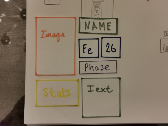
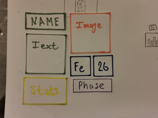
Layout of content sketches
Here are images of my sketches of different ideas for the layout out of the AR app.
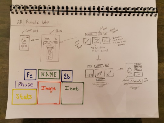
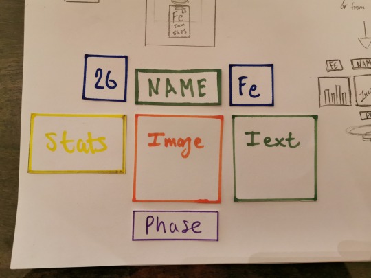
Paper layout mock-up
After doing some sketches I drew and cut out blocks of content on paper and started to arrange them into different ways to find out which one looks the best. Using this method of layout design
The advantages of using this method of layout design makes it really fast to changes parts in the early stage of design as paper cards can be added, taken away and cut to different sizes simply.
2 notes
·
View notes
Text
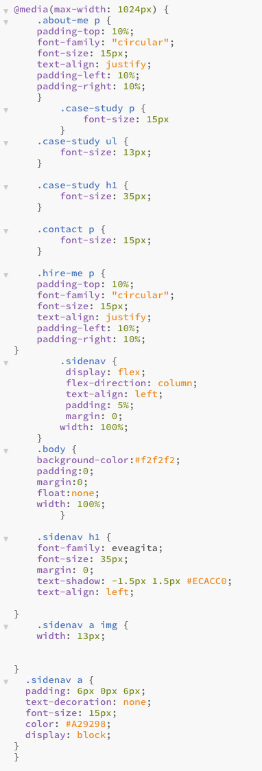
RESPONSIVE STYLING
Here is the code I used to make my website responsive using media queries, firstly for an iPad and then an iPhone. During this process I didn’t have to worry too much about making the images responsive as I had done that throughout, though that wasn’t the case for everything else.
I also struggled with figuring out why my responsiveness wasn’t working, it ended up simply being that the bigger screens media queries must come before those that are smaller.

1 note
·
View note
Photo
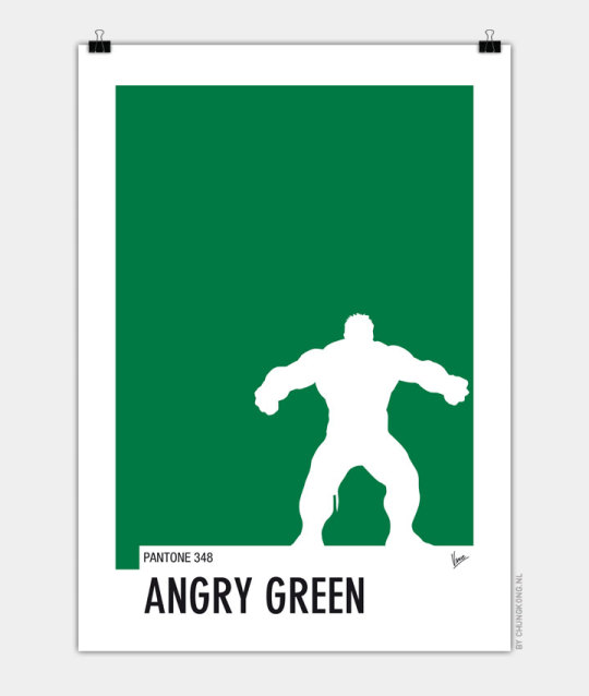
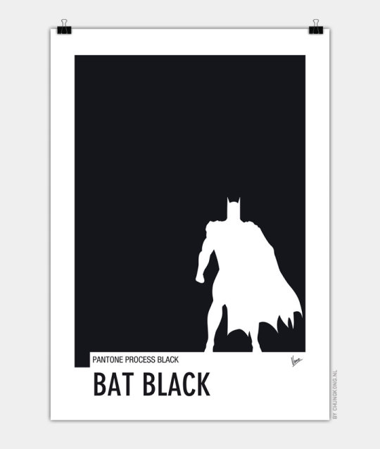
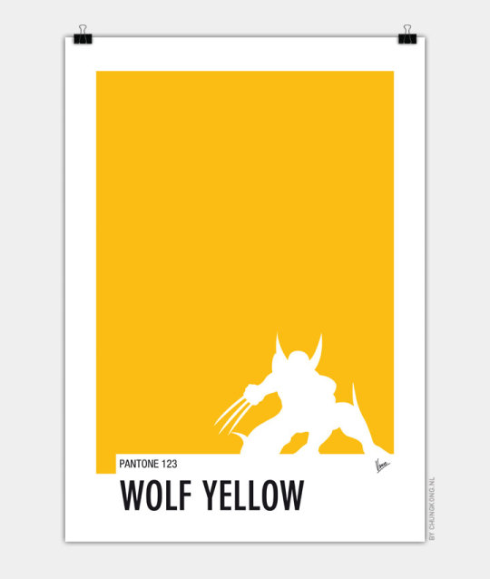
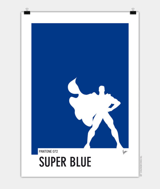
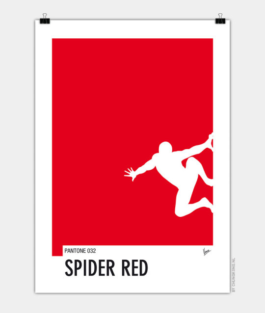

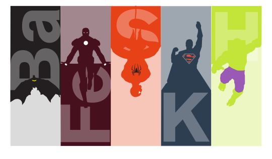
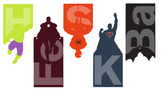
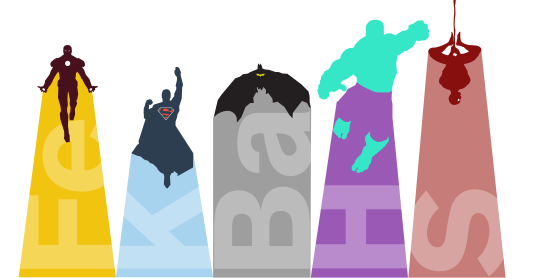
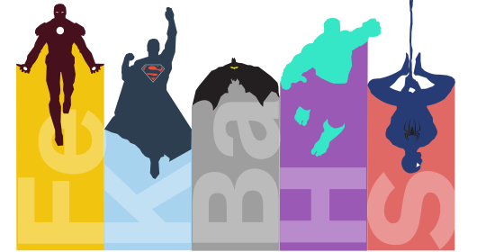
Illustrative Inspiration for Elements Project
Chungkong
“Chungkong is a Netherlands based designer. Away from his day job designing brilliant brand identities and advertising for his clients Chungkong spends time creating his own artwork, his posters are really eye catching. Chungkong strips the subjects down to their bare bones and brings them to life in vibrant and playful designs, covering a variety of subjects from cult movies, books and sports.”
I was drawn to the bold, vibrant colours and minimalist stencil- like style of Chungkong’s. This striped back yet colourful design is eye catching and aesthetically pleasing.
1 note
·
View note
Text
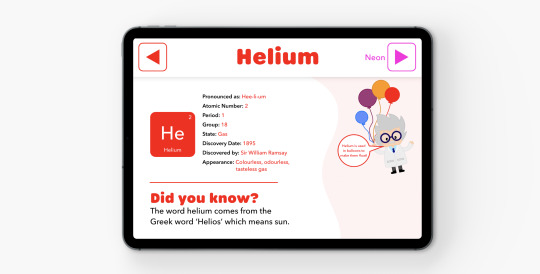
PSA
A handful of finished screens from my elements project but I still might do minor touches here and there. Prototype link down below. (Miko is the only available character atm.)
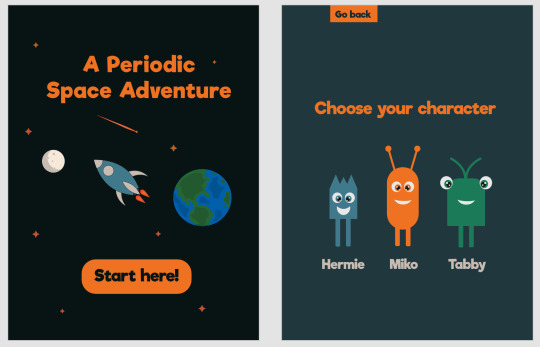
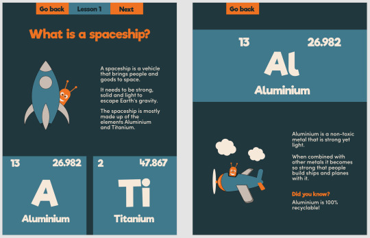

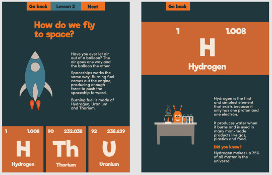
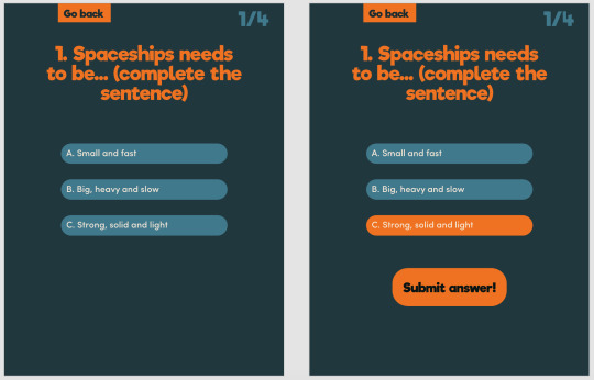
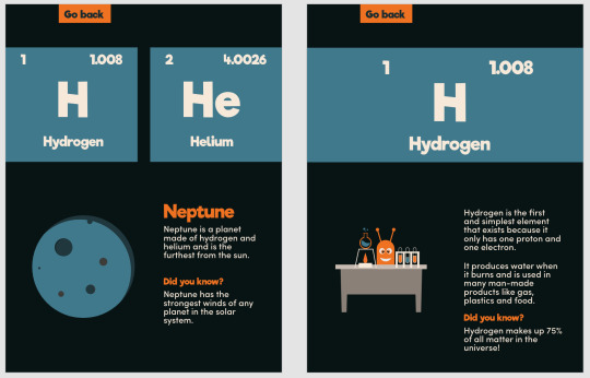
https://xd.adobe.com/view/cf8a7815-95e7-47be-5441-53ccb9af909e-b9bb/
1 note
·
View note
Text
From images to illustrations
Before:

After:
I created the illustrations in Adobe Illustrator.
Choosing to do the illustrations myself rather than sticking to the images allowed me to create a certain look and feel for the app.
2 notes
·
View notes
Last Seen Blogs

fromtheboundlesssea
Home of the Celiaverse

idealmortgagerates
Untitled

outletcrash
mr. outletcrash

rusaliar87
Basah

jctaimc
flower gleam and glow