#like i'd be lying if i said i didn't prefer the lushhhhh covers
Text
Avon is deeeefinitely experimenting with their covers next year and I find it very interesting (because I love romance novels and in fact do have an art history degree that I never use).
In January they're dropping The Duke Gets Even...
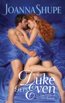
which is riffing off an early 2000s-2010s cover style that they accidentally stumbled into success with. The Heiress Hunt (which is generally, as a note, the least-loved of the Fifth Avenue Rebels series) is more of a classic Avon Era Shupe cover with the hero and heroine in Gilded Age garb and in something of a clinch, the Newport Beach atmosphere that's a mainstay for the series in the background. However, they were not able to do this for The Lady Gets Lucky due to COVID (no photoshoots) and they subbed in an old Tessa Dare castoff shoot (I SUSPECT from her Spindle Cove era, as this seems like a similar vibe to the A Week to Be Wicked cover). The Lady Gets Lucky was quite successful, so The Bride Goes Rogue and The Duke Gets Even followed suit with their cover styles. It's classic Avon, especially if it's based off a Spindle Cove era style--man and woman entangled in bed, lots of nudity, very lush and erotic (the hair grab!).
On that same day, Megan Frampton's Her Lessons in Persuasion...
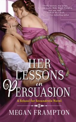
is coming out from Avon. Very classic Frampton cover, an open-shirted man with a girl in his lap, she's taking the initiative and dominating him, a little bit of fun is being had with the font. Frampton books are sexy and funny, typically with assertive heroines and heroes who enjoy being pushed around a little, in my experience, so this all fits and again is kind of a classic Frampton/Avon moment (note: will be reviewing this book in part because I really enjoy the cover).
In February, Vivienne Lorret's Never Seduce A Duke...

is dropping. This one reminds me a LOT of the latter three Fifth Avenue Rebels. Two naked people in bed, very lush, has the same sort of gleaming, feminine, super romantic vibe as the other Mating Habits of Scoundrels books--and the pose totally fits, as this is a book we go into *knowing* from the previous novel that this is an "oops he got me pregnant" novel. They're hitting it sooner rather than later.
In March, we see Scarlett Peckham's The Portrait of A Duchess,

which on paper seems very different from The Rakess, her other Avon release, but actually has a lot of similarities--the painterly quality, the man taking a subservient stance (visually) with the woman. Him on his knees has a suggestion of sex and femdom--totally Scarlett Peckham, and while the font is a bit creative and modern for Avon, it's still very much a classic Avon by way of Scarlett Peckham in many ways. (Though of course, we will notice that we have an interracial couple, which is NOT standard for Avon historicals.)
In April, you have Eva Leigh's Last Chance Scoundrels conclusion, another cover I love, A Rogue's Rules for Seduction.
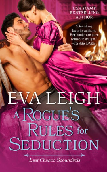
It all makes total sense. Saturated colors just as you saw in the previous two books, a sexy clinch with a very actively involved heroine (a "they're about to bone" clinch), a hint at power play going on (which, from what Eva's hinted at, is going to be A Thing in this book). It's not dissimilar to Megan Frampton's cover, which is interesting. I would say that they're not dissimilar authors, though I think Megan's books are a bit lighter, Eva's a bit hotter.
HOWEVER.
In February, we also have the kickoff to Lorraine Heath's new series (The Chessmen: Masters of Seduction, a series title I will never not be obsessed with), The Counterfeit Scoundrel.
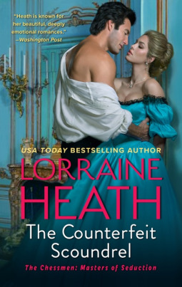
Here we see a style that... Is somehow both clearly digital and also more photographic than past Lorraine Heath covers? And this isn't a critique, I love the clinch, I'm a big fan of the color scheme (the blue tones against the hot pink author name, YES). The font is just so clean, so modern, no hint of cursive or--I suppose, "artsiness". Which in itself is very contemporary--you often see contemporary photographic covers with a very clean, clear typeface compared to the looping, illustrative script associated with historical covers.
Similarly, Cathy Maxwell's new series starter, A Kiss in the Moonlight, has this digitally softened photographic couple.
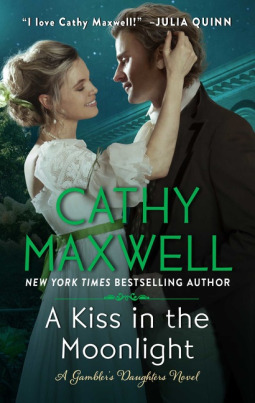
The clinch is very different, though I don't find that weird--Lorraine writes steamier books, from what I've read of the two, and hers tend more towards "sex and scandal" while Cathy's are more "sweet romantic comedy" in vibe.
This isn't a critique, exactly--I'm always in favor of something that isn't "cartoony" for historicals, and suggests actual romance and sexuality between the couple. But I do think it's interesting that these covers have, in sensibility and certainly in font, similarities to Sarah MacLean's Hell's Belles series. Bombshell definitely doesn't look quite as photographic, but in many ways Heartbreaker does.
I also think that it's worth noting that, of the books I mentioned prior to Lorraine's, all but Megan Frampton's continue a series. You wouldn't abruptly change style of the covers in a series that dramatically mid-series unless sales were super low, OR circumstances dictated it (see: Fifth Avenue Rebels).
I know that these things were done in part to create an appeal to a modern audience--much like the cartoony covers have been. And I find it to be an interesting sort of compromise. It makes sense to me that this approach would first be tried with Sarah MacLean's books, as she's generally a very consistently successful author, one of the bigger names in historical romance right now. You could reliably trust a lot of people to buy her books no matter what--the question is, will new readers pick these up. That's what they're testing.
Whatever it takes to get historical romance out to new readers--there's a need to make it seem more approachable. And I definitely think that there's a bit of experimenting going on.
#romance novel blogging#anywaaaay#personally i'm not mad#like i'd be lying if i said i didn't prefer the lushhhhh covers#but like this is better than cartoony covers amirite#head empty nothing but the politics of romance novel covers#maybe THAT'S what i should do my dissertation on if i ever go back for the phd#(lol that would be impossible)#the duke gets even cover is perfect#if accuracy was upheld over limitations he'd be biting her tit but oh well
22 notes
·
View notes
Last Seen Blogs

dyingpharaohs
Dying Pharaohs

spurguy
urban cowboy

h45k
VFX Artist/Compositor/Actor

pofefumibuwo
Untitled
31madison
Fashion, Jewellery & Accessories