#no layout plan just vibes and pinterest pics
Text
finally actually playing sims today…im currently trying to figure out to make that penthouse (not the 3 stories one) into my dream apartment 🤩🙈

#no layout plan just vibes and pinterest pics#the premade sun room is literally so good but wtf was ea or maxis was thinking when they designed this apartment 😭😭#an absolute mess but i can fix it!!#im so happy cause it’s kinda a fun stress reliever#🪐 speaking
9 notes
·
View notes
Text
#showyourprocess
From planning to posting, share your process for making creative content!
To continue supporting content makers, this tag game is meant to show the entire process of making creative content: this can be for any creation.
RULES — When your work is tagged, show the process of its creation from planning to posting, then tag up to 5 people with a specific link to one of their creative works you’d like to see the process of. Use the tag #showyourprocess so we can find yours!
sabrina @lanwangiji, my love, tagged me to share my process of making this typography edit! check out her explanation of her the untamed edit and her edit tag.
1. PLANNING
i once opened lyrics edit requests so i can learn and practice typography. this edit was a request as well. i asked them which lyrics they wanted to have and the colors they’d like. since i got several requests and it was hard to keep tabs on them, i made a trello board so i could organize everything. i’m still using the trello board for every edit idea i have, the board makes my life easier.
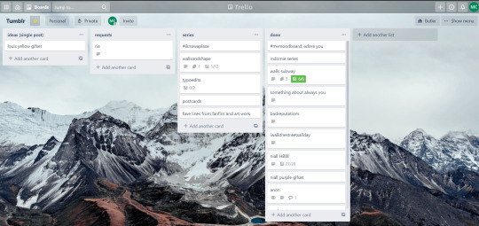

above is what i filled the card in the board with. basically just information of the requests.
1.1 INSPIRATION
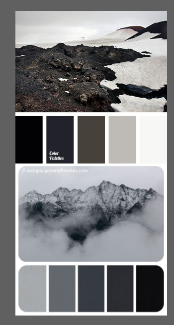
once i got the request, my first thought was to find the vibe the song/lyrics exude. “it’s an old curse” screamed witchy vibes to me, so i went to pinterest to find some inspirations. at first i was looking for witchy poster designs and i came across this. i liked how it has smoke-ish graphic and i thought the smoke suited the “old curse” lyrics. and tbh pinterest is a rabbit hole, they gave me suggestions after suggestions, like this and this which became my inspiration for the color palette (i added the gold from those pics) and the sun moon design gave me the idea to incorporate space stuffs too. i somehow landed on this too, and because i wanted to include space theme, i made a simple phases of the moon. ultimately the hero of this edit was the lyrics, i didnt want the graphics took the center stage. i was inspired to make a crystal ball and do this kind of typography but after several trials i couldnt get the the typography right, so i scratched that idea and went with the space theme instead.
1.2 PICKING COLORS
after i was feeling inspired enough, i went looking for the right colors. i usually just type “color name” and “palette” on pinterest. example “dark grey color palette” and i chose the one i liked best. when the request only asked for 1 color, i always searched for either a complimentary or contrasting color to give it a jushz, to add sprinkles. that’s why i added gold on top of the dark grey.
1.3 FINDING FONTS
this is the hardest part. the fonts play important role to the design. they need to convey the vibes of the lyrics, in this case witchy/magic vibe. i needed to find fonts or font just as magical and a bit whimsical. tho i hoard fonts... i like to use new font for every typography edit lmao sue me.
i highly recommend going to creativemarket free goods site, pixelsurplus font freebies and behance to search for fonts. i always use 100% free fonts, that means i can use it personally as well as commercially. creativemarket gives me desktop license for the fonts, which means i can use it for commercial as well. the reason i do this because i want to open an etsy shop someday, and i want to have the right license when i sell my stuffs. i almost never buy fonts bc they are expensive lmao.
the fonts in used are “Vintage” for the main typograpy (i think i was a freebie from creativemarket) and “Morganite” for the title of the lyrics and the name of artist.
2. CREATING
once i have my materials and ideas, i open my illustrator and hope it doesnt crash every 5 min.
for this kind of typography edits, i use 600x700 px. tbh i dont like using 540px, the suggested tumblr size, as the width bc to me it doesn’t look as good in quality, so i up the px. but more on this sizing later. i utilize the artboards function in illustrator, and i use 2 artboards.
i use illustrator (ai) bc i’m working with vectors. when i work with vectors, the graphics/texts or whatever im making in ai wont become blurry or lose its quality when i enlarge or shrink it. in compare to photoshop, i need to make for example the moon graphic very big, so i wont lose the quality when i reduce and enlarge it again. with vector, i can start small and when i expand it, it’s still as good as when it’s tiny.
2.1 GRADIENTS
i started with the gradients first. i created a rectangle as big as 600x700px and with the “freeform gradient” tool in ai, i played with the colors. below is the color palettes i used
2.2 LYRICS AND GRAPHICS
once the gradients are done, i worked with the lyrics and graphics right away. when i first doing this edits, i made typos a lot lmaooooooo. so i copy and pasted the lyrics on top of my artboard, so i wouldnt have any typos.
i had 3 layers in my ai. one for the inspo pics and the OG lyrics. the rest for the edits themselves. i broke up “It's an old curse/dreamers diving headfirst” into to parts, hence the 2 more layers
i almost always started with the lyrics first then the graphics. but for this edit, i made the smoke first so i can layout where my text would be.
tbh the process of making the lyrics is a trial and error. i tried bunch of different stuffs and i chose whatever the best. but i worked like methodically, i made sure i finished the first part of the lyrics first then i could move on.
i was lucky with this font “vintage”. the font offers me several glyphs like these
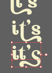
and i chose the one at the bottom. you’re very lucky if you find a font and they have glyphs.
excursion: glyphs vs fonts
glyph is an individual character. It might be a letter, an accented letter, a ligature, a punctuation mark, a dingbat, etc.
A font is a digital file which is used to display a typeface, which contains the entire upper- and lowercase alphabet as well as punctuation, numbers, and other special characters.
after i was finished with all the lyrics i added some graphics to make the edit pretty like small stars or dots. i added the song title and the artist too, sometimes at the bottom sometimes at the top. and i added my watermark put it as small as i could and made it a bit invisible but still can be seen.
2.3 EXPORTING
exporting! this is where i’m going to go deeper with the dimension of my work. in ai, i always choose to save with “export as screens” function. it automatically divides the artboards i have and save them separately. i always save as png, bc the size is smaller than jpg but can maintain the quality.
now the export tab looks like this
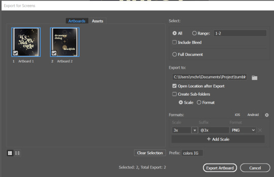
see the formats? i always scale up my edits, 2-3 times the original artboard size. reason is, to maintain the quality. i have tried to save it as original, 600x700 px, but it turned out a bit blurry. bc everything in ai is vector, when i scale up it doesnt lose the quality. BUT once i save it as png, it’s not a vector anymore, and when you zoom in until a certain degree it’ll be pixelated. that’s why i always scale up, to avoid it becoming pixelated when it’s just zoomed 1 or 2 times.
2.4 FINAL TOUCH
i opened my photoshop and also pray it won’t crash. import the png of my edits, add some grains/noise. the reason i use photoshop is, the noise filter is way better than in ai. it’s smoother somehow. and then i export my edits.
(i have a timelapse of how i made one of my edits, it’s not this one, but it’ll give you a better visualization. find it HERE
3. POSTING
now the hardest parts are done, we go to posting!
i uploaded the 2 posters on tumblr as photos then i wrote the captions. for this typography edit, i always chose another lyrics that i like from the same song for the caption. i bolded the lyrics, add link to all of my typography gradient edits.
i always use this link to color my caption. i usually choose 3-4 colors, and i took the colors from my edit. but this was not until recently lmao. before i just took a guess and looked for similar colors that match the edit, but then i thought “why didnt i just use the color in the posters lmao”
ok after i have my html code for the caption, i go to this site to replace the “;” with “ “ so tumblr can read the code.
i’m not one who puts their edits in draft, bc i just cant wait to post it. i have to option here, either i post it immediately when the time is right (i usually post between 4-8) or i schedule it, if im finished before 4.
i put all the necessary tags and click post! i am done finally!
i’m tagging:
@thetriangletattoo for this amazing series
@deludedandlostcause for this impressive gif
@half-lightl for this spectacular edit
@gayndrew for this stunning drawing
@thechampagnelovers for this cool collage
@cloudslou for this incredible edit
@heyangels for this incredible edit
35 notes
·
View notes
Text
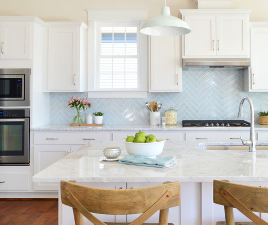
How We Planned The Beach House Kitchen
The beach house kitchen will be our seventh kitchen project (!!!) after redoing three of our own (this one’s our favorite), a showhouse that we did in 2014, a spec house for a local builder in 2016 (seen below – we loved that blue tile), and a local teachers’ lounge that we redid last year.
And while that sounds like a lot of kitchens to have under our belts, the process can still feel pretty daunting – probably just due to the sheer number of decisions that a kitchen reno brings. “What’s the most functional layout? Is that too many drawers or not enough? Will I live to regret the lighting? Is it all going to come in within budget?” So many questions. And decisions. And changing of minds.
But as much work as it is to plan, stress, overthink, and replan a kitchen – it can easily be one of the biggest improvements you can make to a house. And now that we’re so close to FINALLY installing the beach house kitchen (hello light at the end of the tunnel!), we thought we’d take you through the steps (and kitchen planning tools) that we used to make our plan.
That photo above is what the space looked like as of last week. The lights are hung, trim is getting painted, and the floor holes are all patched with matching reclaimed pine. Once they’re sanded and sealed we can begin the kitchen install! It’s feeling very real all of a sudden. And it’s a far cry from what it looked like when we first started planning the space last year:
I won’t rehash all of the floor planning we did (it’s in this post) but you can see where we ended up below. Well, mostly ended up (the master bath got rearranged one more time to accommodate a shower). But the important part is the kitchen, which you can see in the upper left of these schematics:
We made those initial floor plans in Photoshop (like I’m sure all the professional architects do…. right?) so it wasn’t precisely to scale and not even close to something we could rely on to order cabinets. So having made the decision to order our cabinetry from Ikea, we turned to their free 3D kitchen planning software.
It’s not my favorite interface in the world (you can read all my pros & cons in this post) but if you’re using Ikea products, it’s a great way to plan the precise items you’ll need. We also used it when ordering our laundry room cabinets and our bonus room built-ins (shown below), both of which we’ve been very happy with – so Ikea was a no-brainer for keeping the beach house kitchen looking good, without costing a fortune.
We went through a few different ideas and layouts within the software – like do we do upper cabinets or skip them? We eventually landed on no uppers, just because we’re suckers for open shelves and the cabinets were looking pretty heavy in the rendering, even in white (we want the room to feel balanced, not left-heavy with too much stuff on that wall as you walk into the room). And since this is going to be a weekly vacation rental, nobody is going to be living here for months on end, so we realized we’d have plenty of storage space for vacation goers – especially with the extra cabinets that we added to flank the back door.
One challenge with the Ikea software is that you can’t pull in products that aren’t theirs – so I couldn’t render our 40″ pink stove or the exact dimensions of the fridge we’ve had our eye on. And I can never get their shelves to look the way I want (this is reminding me that I really need to relearn Google SketchUp). So the renderings are a little imperfect, but this one is probably the closest to what it’ll be like (just add sconces, pendants, and shelves in your mind).
Before ordering, we also loosely mapped things out in real life to make sure we liked the clearance of everything. You can see our fancy stand-ins for the island. Not the big saw, just the wood scraps on the floor. Told you they were fancy.
It’s also pretty hard to get a sense of the finishes in these renderings, so we ended up making some mood boards to be sure we liked the road we were headed down. Here’s the final one, but I’ll show you how we got to this mix in a second:
1. Stove / 2. Faucet / 3. Hood / 4. Sconces / 5. Island Pendants / 6. Counter (inspo pic) / 7. Cabinet doors / 8. Fridge (inspo pic)
From the get-go, Sherry and I both agreed we wanted this kitchen to feel casual and unfussy. The beach is supposed to be relaxing, so we wanted the kitchen to feel the same way. One of our first big inspiration pictures is shown above as #7, because it just looks very chill. Still plenty nice, but not too formal or uptight (which is generally right where we’re aiming with this beach house). Sorry, I can’t find a source better than this one.
The flat-fronted cabinets really stood out to us in that picture because we’ve never been drawn to them before. They always struck us as crazy modern or too commercial (like a school cafeteria from the 90’s). But after hunting down more inspiration photos on Pinterest, we were officially flat-front converts for the beach house.
(sources: left image, right image)
You’ll also notice that 4 out of these 5 photos don’t show upper cabinets, which further confirmed our lean towards a more unfussy/casual look with lots of open space for the eye to move around.
(sources: left image, right image)
We haven’t chosen hardware yet because we’re waiting to see how everything looks once we have it installed – but the idea of leather pulls is pretty cool (and clearly they’re very popular with flat-front drawers). We’re considering a few other options, and we also might try to hunt down some wood knobs to play off of some of the old wood doorknobs in the house. We’re hoping the right choice will be much clearer once we can actually hold up some samples in the finished space, but here are a few of the ones we’re considering: 1 / 2 / 3 / 4 / 5 / 6 / 7 / 8 / 9
Another big source of inspiration for us is Orlando’s kitchen. He revealed it on Emily Henderson’s blog right around the time we were ordering ours, so it helped us lock in our decision to do butcher block counters (we actually switched our plan last minute to get the exact ones that he chose – these from Ikea). We even ordered extra butcher block so we can make our floating shelves from the same stuff.
(source)
People have mixed feeling about butcher block in a rental, but we like that it’s affordable (like 10 times more affordable than some other options) and we LOVE that we can sand and refinish any major beatings that it might take (can’t say that if someone cracks/scratches/stains an expensive stone slab). We’ve actually heard a ton of helpful info from those of you with butcher block counters about how to seal them / treat them so they look good and last, so we’ll definitely be sharing all of that once they’re in (and we’ll be honest about how they hold up too – so stay tuned for photos and stuff as they get used and abused).
Orlando’s kitchen was also reassuring because he used the exact fridge we were considering. We don’t have space for a large fridge and we worried this one might look cheap, but – phew! – it looks great.
All of these decisions were made back in April, and we happened to lock everything in right as Ikea was having their semi-annual Kitchen Event Sale (more on that in podcast episode #52). The total (for cabinets and counters) would’ve been about $3200 – but we got 20% off our entire order thanks to the sale. Which saved us about $600 and brought the total closer to $2,600. That even includes the sink, soft close drawers/doors, and a pull-out trash can!
But even with most of the big items ordered, we still had lighting to figure out. Our first challenge was actual brightness, because I, John Petersik, am a lighting over-thinker to the Nth degree. First, we nixed the idea of adding recessed can lighting because we worried it would feel too “new” for the look we wanted in this 100 year old house. We have a few recessed lights elsewhere, so we’re not totally against them for the house, but the kitchen/dining room ceiling is SUCH a large plane, we wanted to avoid having a bunch of glowing circles dotting those pretty extra-high ceilings.
In the past we’ve relied on recessed lights to provide most of the functional lighting in our own kitchens, with pendants providing task and accent lighting. But in the beach house, our kitchen lighting – two island pendants and three sconces (along with two lights over the dining table nearby) – would need to do it all. So we quickly realized we needed to nix anything with a solid shade, so that every bulb could cast light in all directions instead of just shining it down. For instance, anything like the ones in our house’s kitchen were immediately out of the running. Sorry, guys.
Even with that no-shades rule helping us narrow things down, we still had a ton of lights that we were considering. So I mocked up this graphic to get a better sense of how our options looked with the rest of the kitchen. This was a failed option we were just playing around with at first (note the solid shades on both the sconces and pendants) but it was a huge help to see things this way. The subway backsplash isn’t for sure either, just a nice simple choice that lets us focus on what lights could work best:
We considered a few multi-light pendants, but most of them got eliminated for being the wrong style (these felt too modern) or so large that they dwarfed the island (or broke the bank).
A lot of the lights we typically would choose in a heartbeat (like these guys from Ballard Designs) felt too traditional for the vibe we were going for once we saw them in the mockup. Much of that had to do with the pink stove I think. It’s really cool and old and fun, but it might not lend itself to anything too formal.
The other thing we started bumping up against was scale. For instance, we started to think these beauties were the answer to all of our problems: glass shades, vintage look, right finish…
…but I was alarmed by 6″ measurement in its description (and that was the LARGER option they offered). My rendering above wasn’t to scale, so I started making a new version that was a bit more representative of size – particularly of the light in proportion to the eight foot island. That shed A LOT of light on the situation (pun completely intended). These were definitely too small.
I’ll cut to the chase. We ended up with this, as you saw in the original mood board up top. The pendants are 15″ wide and the clear shades allow them to throw light in every direction. Oh how I wish they were still on the Internet to link to them for you (they’re even prettier in person than in photos) but they seem to be out of stock everywhere. They were Trent Austin from Wayfair, so cross your fingers they come back someday.
We love how large the glass shades are without feeling heavy. The room instantly feels a lot closer to “done” with them hung, like they’re just begging for an island to be there. And the rest of the cabinets. And the appliances.
The sconces have shades that are wire mesh, so the light passes through them just like we wanted. We actually saw them in a showhouse shortly after ordering them and they looked GREAT all lit up. You can see how they’re not solid a bit better in this shot (there’s one more across the room too, which you can see in the second picture in this post).
Okay and one last mock-up. We also did this one that included plans for the adjacent dining area, just to try to picture how that would work with everything going on in the kitchen. Of course it has a pair of capiz pendants, because it wouldn’t be a beach house without Sherry’s favorite material of all time.
We opted for two lights over the dining table so that from the couch in the living room, the kitchen lights wouldn’t intersect at an odd place (once centered fixture would have). We also thought it would be fun to try two smaller pendants instead of one large chandelier. They don’t look great in the shot above because they’re hung higher than they’ll eventually go (and there’s no table under them to ground them). Oh yeah and the capiz is all still wrapped in its plastic shipping. Mummified capiz is the new black.
So that’s where we are. We’re headed out there soon to finish restoring the tub upstairs and to see how a few last floor repairs went upstairs. There are just a few tiny things on the to-do list (like finishing a railing for the back stairs) and then floor sanding and sealing can begin! After that, we can finally get started on making this kitchen come to life… and finally get those Ikea boxes out of our garage, which I’m also pretty stoked about.
Psst- You can read all about our past progress at the beach house by clicking into Our Beach House category.
*This post contains affiliate links
The post How We Planned The Beach House Kitchen appeared first on Young House Love.
How We Planned The Beach House Kitchen published first on http://ift.tt/2qxZz2j
0 notes
Text
How We Planned The Beach House Kitchen
The beach house kitchen will be our seventh kitchen project (!!!) after redoing three of our own (this one’s our favorite), a showhouse that we did in 2014, a spec house for a local builder in 2016 (seen below – we loved that blue tile), and a local teachers’ lounge that we redid last year.
And while that sounds like a lot of kitchens to have under our belts, the process can still feel pretty daunting – probably just due to the sheer number of decisions that a kitchen reno brings. “What’s the most functional layout? Is that too many drawers or not enough? Will I live to regret the lighting? Is it all going to come in within budget?” So many questions. And decisions. And changing of minds.
But as much work as it is to plan, stress, overthink, and replan a kitchen – it can easily be one of the biggest improvements you can make to a house. And now that we’re so close to FINALLY installing the beach house kitchen (hello light at the end of the tunnel!), we thought we’d take you through the steps (and kitchen planning tools) that we used to make our plan.
That photo above is what the space looked like as of last week. The lights are hung, trim is getting painted, and the floor holes are all patched with matching reclaimed pine. Once they’re sanded and sealed we can begin the kitchen install! It’s feeling very real all of a sudden. And it’s a far cry from what it looked like when we first started planning the space last year:
I won’t rehash all of the floor planning we did (it’s in this post) but you can see where we ended up below. Well, mostly ended up (the master bath got rearranged one more time to accommodate a shower). But the important part is the kitchen, which you can see in the upper left of these schematics:
We made those initial floor plans in Photoshop (like I’m sure all the professional architects do…. right?) so it wasn’t precisely to scale and not even close to something we could rely on to order cabinets. So having made the decision to order our cabinetry from Ikea, we turned to their free 3D kitchen planning software.
It’s not my favorite interface in the world (you can read all my pros & cons in this post) but if you’re using Ikea products, it’s a great way to plan the precise items you’ll need. We also used it when ordering our laundry room cabinets and our bonus room built-ins (shown below), both of which we’ve been very happy with – so Ikea was a no-brainer for keeping the beach house kitchen looking good, without costing a fortune.
We went through a few different ideas and layouts within the software – like do we do upper cabinets or skip them? We eventually landed on no uppers, just because we’re suckers for open shelves and the cabinets were looking pretty heavy in the rendering, even in white (we want the room to feel balanced, not left-heavy with too much stuff on that wall as you walk into the room). And since this is going to be a weekly vacation rental, nobody is going to be living here for months on end, so we realized we’d have plenty of storage space for vacation goers – especially with the extra cabinets that we added to flank the back door.
One challenge with the Ikea software is that you can’t pull in products that aren’t theirs – so I couldn’t render our 40″ pink stove or the exact dimensions of the fridge we’ve had our eye on. And I can never get their shelves to look the way I want (this is reminding me that I really need to relearn Google SketchUp). So the renderings are a little imperfect, but this one is probably the closest to what it’ll be like (just add sconces, pendants, and shelves in your mind).
Before ordering, we also loosely mapped things out in real life to make sure we liked the clearance of everything. You can see our fancy stand-ins for the island. Not the big saw, just the wood scraps on the floor. Told you they were fancy.
It’s also pretty hard to get a sense of the finishes in these renderings, so we ended up making some mood boards to be sure we liked the road we were headed down. Here’s the final one, but I’ll show you how we got to this mix in a second:
1. Stove / 2. Faucet / 3. Hood / 4. Sconces / 5. Island Pendants / 6. Counter (inspo pic) / 7. Cabinet doors / 8. Fridge (inspo pic)
From the get-go, Sherry and I both agreed we wanted this kitchen to feel casual and unfussy. The beach is supposed to be relaxing, so we wanted the kitchen to feel the same way. One of our first big inspiration pictures is shown above as #7, because it just looks very chill. Still plenty nice, but not too formal or uptight (which is generally right where we’re aiming with this beach house). Sorry, I can’t find a source better than this one.
The flat-fronted cabinets really stood out to us in that picture because we’ve never been drawn to them before. They always struck us as crazy modern or too commercial (like a school cafeteria from the 90’s). But after hunting down more inspiration photos on Pinterest, we were officially flat-front converts for the beach house.
(sources: left image, right image)
You’ll also notice that 4 out of these 5 photos don’t show upper cabinets, which further confirmed our lean towards a more unfussy/casual look with lots of open space for the eye to move around.
(sources: left image, right image)
We haven’t chosen hardware yet because we’re waiting to see how everything looks once we have it installed – but the idea of leather pulls is pretty cool (and clearly they’re very popular with flat-front drawers). We’re considering a few other options, and we also might try to hunt down some wood knobs to play off of some of the old wood doorknobs in the house. We’re hoping the right choice will be much clearer once we can actually hold up some samples in the finished space, but here are a few of the ones we’re considering: 1 / 2 / 3 / 4 / 5 / 6 / 7 / 8 / 9
Another big source of inspiration for us is Orlando’s kitchen. He revealed it on Emily Henderson’s blog right around the time we were ordering ours, so it helped us lock in our decision to do butcher block counters (we actually switched our plan last minute to get the exact ones that he chose – these from Ikea). We even ordered extra butcher block so we can make our floating shelves from the same stuff.
(source)
People have mixed feeling about butcher block in a rental, but we like that it’s affordable (like 10 times more affordable than some other options) and we LOVE that we can sand and refinish any major beatings that it might take (can’t say that if someone cracks/scratches/stains an expensive stone slab). We’ve actually heard a ton of helpful info from those of you with butcher block counters about how to seal them / treat them so they look good and last, so we’ll definitely be sharing all of that once they’re in (and we’ll be honest about how they hold up too – so stay tuned for photos and stuff as they get used and abused).
Orlando’s kitchen was also reassuring because he used the exact fridge we were considering. We don’t have space for a large fridge and we worried this one might look cheap, but – phew! – it looks great.
All of these decisions were made back in April, and we happened to lock everything in right as Ikea was having their semi-annual Kitchen Event Sale (more on that in podcast episode #52). The total (for cabinets and counters) would’ve been about $3200 – but we got 20% off our entire order thanks to the sale. Which saved us about $600 and brought the total closer to $2,600. That even includes the sink, soft close drawers/doors, and a pull-out trash can!
But even with most of the big items ordered, we still had lighting to figure out. Our first challenge was actual brightness, because I, John Petersik, am a lighting over-thinker to the Nth degree. First, we nixed the idea of adding recessed can lighting because we worried it would feel too “new” for the look we wanted in this 100 year old house. We have a few recessed lights elsewhere, so we’re not totally against them for the house, but the kitchen/dining room ceiling is SUCH a large plane, we wanted to avoid having a bunch of glowing circles dotting those pretty extra-high ceilings.
In the past we’ve relied on recessed lights to provide most of the functional lighting in our own kitchens, with pendants providing task and accent lighting. But in the beach house, our kitchen lighting – two island pendants and three sconces (along with two lights over the dining table nearby) – would need to do it all. So we quickly realized we needed to nix anything with a solid shade, so that every bulb could cast light in all directions instead of just shining it down. For instance, anything like the ones in our house’s kitchen were immediately out of the running. Sorry, guys.
Even with that no-shades rule helping us narrow things down, we still had a ton of lights that we were considering. So I mocked up this graphic to get a better sense of how our options looked with the rest of the kitchen. This was a failed option we were just playing around with at first (note the solid shades on both the sconces and pendants) but it was a huge help to see things this way. The subway backsplash isn’t for sure either, just a nice simple choice that lets us focus on what lights could work best:
We considered a few multi-light pendants, but most of them got eliminated for being the wrong style (these felt too modern) or so large that they dwarfed the island (or broke the bank).
A lot of the lights we typically would choose in a heartbeat (like these guys from Ballard Designs) felt too traditional for the vibe we were going for once we saw them in the mockup. Much of that had to do with the pink stove I think. It’s really cool and old and fun, but it might not lend itself to anything too formal.
The other thing we started bumping up against was scale. For instance, we started to think these beauties were the answer to all of our problems: glass shades, vintage look, right finish…
…but I was alarmed by 6″ measurement in its description (and that was the LARGER option they offered). My rendering above wasn’t to scale, so I started making a new version that was a bit more representative of size – particularly of the light in proportion to the eight foot island. That shed A LOT of light on the situation (pun completely intended). These were definitely too small.
I’ll cut to the chase. We ended up with this, as you saw in the original mood board up top. The pendants are 15″ wide and the clear shades allow them to throw light in every direction. Oh how I wish they were still on the Internet to link to them for you (they’re even prettier in person than in photos) but they seem to be out of stock everywhere. They were Trent Austin from Wayfair, so cross your fingers they come back someday.
We love how large the glass shades are without feeling heavy. The room instantly feels a lot closer to “done” with them hung, like they’re just begging for an island to be there. And the rest of the cabinets. And the appliances.
The sconces have shades that are wire mesh, so the light passes through them just like we wanted. We actually saw them in a showhouse shortly after ordering them and they looked GREAT all lit up. You can see how they’re not solid a bit better in this shot (there’s one more across the room too, which you can see in the second picture in this post).
Okay and one last mock-up. We also did this one that included plans for the adjacent dining area, just to try to picture how that would work with everything going on in the kitchen. Of course it has a pair of capiz pendants, because it wouldn’t be a beach house without Sherry’s favorite material of all time.
We opted for two lights over the dining table so that from the couch in the living room, the kitchen lights wouldn’t intersect at an odd place (once centered fixture would have). We also thought it would be fun to try two smaller pendants instead of one large chandelier. They don’t look great in the shot above because they’re hung higher than they’ll eventually go (and there’s no table under them to ground them). Oh yeah and the capiz is all still wrapped in its plastic shipping. Mummified capiz is the new black.
So that’s where we are. We’re headed out there soon to finish restoring the tub upstairs and to see how a few last floor repairs went upstairs. There are just a few tiny things on the to-do list (like finishing a railing for the back stairs) and then floor sanding and sealing can begin! After that, we can finally get started on making this kitchen come to life… and finally get those Ikea boxes out of our garage, which I’m also pretty stoked about.
Psst- You can read all about our past progress at the beach house by clicking into Our Beach House category.
*This post contains affiliate links
The post How We Planned The Beach House Kitchen appeared first on Young House Love.
How We Planned The Beach House Kitchen published first on http://ift.tt/2r6hzQy
0 notes
Text
How We Planned The Beach House Kitchen
The beach house kitchen will be our seventh kitchen project (!!!) after redoing three of our own (this one’s our favorite), a showhouse that we did in 2014, a spec house for a local builder in 2016 (seen below – we loved that blue tile), and a local teachers’ lounge that we redid last year.
And while that sounds like a lot of kitchens to have under our belts, the process can still feel pretty daunting – probably just due to the sheer number of decisions that a kitchen reno brings. “What’s the most functional layout? Is that too many drawers or not enough? Will I live to regret the lighting? Is it all going to come in within budget?” So many questions. And decisions. And changing of minds.
But as much work as it is to plan, stress, overthink, and replan a kitchen – it can easily be one of the biggest improvements you can make to a house. And now that we’re so close to FINALLY installing the beach house kitchen (hello light at the end of the tunnel!), we thought we’d take you through the steps (and kitchen planning tools) that we used to make our plan.
That photo above is what the space looked like as of last week. The lights are hung, trim is getting painted, and the floor holes are all patched with matching reclaimed pine. Once they’re sanded and sealed we can begin the kitchen install! It’s feeling very real all of a sudden. And it’s a far cry from what it looked like when we first started planning the space last year:
I won’t rehash all of the floor planning we did (it’s in this post) but you can see where we ended up below. Well, mostly ended up (the master bath got rearranged one more time to accommodate a shower). But the important part is the kitchen, which you can see in the upper left of these schematics:
We made those initial floor plans in Photoshop (like I’m sure all the professional architects do…. right?) so it wasn’t precisely to scale and not even close to something we could rely on to order cabinets. So having made the decision to order our cabinetry from Ikea, we turned to their free 3D kitchen planning software.
It’s not my favorite interface in the world (you can read all my pros & cons in this post) but if you’re using Ikea products, it’s a great way to plan the precise items you’ll need. We also used it when ordering our laundry room cabinets and our bonus room built-ins (shown below), both of which we’ve been very happy with – so Ikea was a no-brainer for keeping the beach house kitchen looking good, without costing a fortune.
We went through a few different ideas and layouts within the software – like do we do upper cabinets or skip them? We eventually landed on no uppers, just because we’re suckers for open shelves and the cabinets were looking pretty heavy in the rendering, even in white (we want the room to feel balanced, not left-heavy with too much stuff on that wall as you walk into the room). And since this is going to be a weekly vacation rental, nobody is going to be living here for months on end, so we realized we’d have plenty of storage space for vacation goers – especially with the extra cabinets that we added to flank the back door.
One challenge with the Ikea software is that you can’t pull in products that aren’t theirs – so I couldn’t render our 40″ pink stove or the exact dimensions of the fridge we’ve had our eye on. And I can never get their shelves to look the way I want (this is reminding me that I really need to relearn Google SketchUp). So the renderings are a little imperfect, but this one is probably the closest to what it’ll be like (just add sconces, pendants, and shelves in your mind).
Before ordering, we also loosely mapped things out in real life to make sure we liked the clearance of everything. You can see our fancy stand-ins for the island. Not the big saw, just the wood scraps on the floor. Told you they were fancy.
It’s also pretty hard to get a sense of the finishes in these renderings, so we ended up making some mood boards to be sure we liked the road we were headed down. Here’s the final one, but I’ll show you how we got to this mix in a second:
1. Stove / 2. Faucet / 3. Hood / 4. Sconces / 5. Island Pendants / 6. Counter (inspo pic) / 7. Cabinet doors / 8. Fridge (inspo pic)
From the get-go, Sherry and I both agreed we wanted this kitchen to feel casual and unfussy. The beach is supposed to be relaxing, so we wanted the kitchen to feel the same way. One of our first big inspiration pictures is shown above as #7, because it just looks very chill. Still plenty nice, but not too formal or uptight (which is generally right where we’re aiming with this beach house). Sorry, I can’t find a source better than this one.
The flat-fronted cabinets really stood out to us in that picture because we’ve never been drawn to them before. They always struck us as crazy modern or too commercial (like a school cafeteria from the 90’s). But after hunting down more inspiration photos on Pinterest, we were officially flat-front converts for the beach house.
(sources: left image, right image)
You’ll also notice that 4 out of these 5 photos don’t show upper cabinets, which further confirmed our lean towards a more unfussy/casual look with lots of open space for the eye to move around.
(sources: left image, right image)
We haven’t chosen hardware yet because we’re waiting to see how everything looks once we have it installed – but the idea of leather pulls is pretty cool (and clearly they’re very popular with flat-front drawers). We’re considering a few other options, and we also might try to hunt down some wood knobs to play off of some of the old wood doorknobs in the house. We’re hoping the right choice will be much clearer once we can actually hold up some samples in the finished space, but here are a few of the ones we’re considering: 1 / 2 / 3 / 4 / 5 / 6 / 7 / 8 / 9
Another big source of inspiration for us is Orlando’s kitchen. He revealed it on Emily Henderson’s blog right around the time we were ordering ours, so it helped us lock in our decision to do butcher block counters (we actually switched our plan last minute to get the exact ones that he chose – these from Ikea). We even ordered extra butcher block so we can make our floating shelves from the same stuff.
(source)
People have mixed feeling about butcher block in a rental, but we like that it’s affordable (like 10 times more affordable than some other options) and we LOVE that we can sand and refinish any major beatings that it might take (can’t say that if someone cracks/scratches/stains an expensive stone slab). We’ve actually heard a ton of helpful info from those of you with butcher block counters about how to seal them / treat them so they look good and last, so we’ll definitely be sharing all of that once they’re in (and we’ll be honest about how they hold up too – so stay tuned for photos and stuff as they get used and abused).
Orlando’s kitchen was also reassuring because he used the exact fridge we were considering. We don’t have space for a large fridge and we worried this one might look cheap, but – phew! – it looks great.
All of these decisions were made back in April, and we happened to lock everything in right as Ikea was having their semi-annual Kitchen Event Sale (more on that in podcast episode #52). The total (for cabinets and counters) would’ve been about $3200 – but we got 20% off our entire order thanks to the sale. Which saved us about $600 and brought the total closer to $2,600. That even includes the sink, soft close drawers/doors, and a pull-out trash can!
But even with most of the big items ordered, we still had lighting to figure out. Our first challenge was actual brightness, because I, John Petersik, am a lighting over-thinker to the Nth degree. First, we nixed the idea of adding recessed can lighting because we worried it would feel too “new” for the look we wanted in this 100 year old house. We have a few recessed lights elsewhere, so we’re not totally against them for the house, but the kitchen/dining room ceiling is SUCH a large plane, we wanted to avoid having a bunch of glowing circles dotting those pretty extra-high ceilings.
In the past we’ve relied on recessed lights to provide most of the functional lighting in our own kitchens, with pendants providing task and accent lighting. But in the beach house, our kitchen lighting – two island pendants and three sconces (along with two lights over the dining table nearby) – would need to do it all. So we quickly realized we needed to nix anything with a solid shade, so that every bulb could cast light in all directions instead of just shining it down. For instance, anything like the ones in our house’s kitchen were immediately out of the running. Sorry, guys.
Even with that no-shades rule helping us narrow things down, we still had a ton of lights that we were considering. So I mocked up this graphic to get a better sense of how our options looked with the rest of the kitchen. This was a failed option we were just playing around with at first (note the solid shades on both the sconces and pendants) but it was a huge help to see things this way. The subway backsplash isn’t for sure either, just a nice simple choice that lets us focus on what lights could work best:
We considered a few multi-light pendants, but most of them got eliminated for being the wrong style (these felt too modern) or so large that they dwarfed the island (or broke the bank).
A lot of the lights we typically would choose in a heartbeat (like these guys from Ballard Designs) felt too traditional for the vibe we were going for once we saw them in the mockup. Much of that had to do with the pink stove I think. It’s really cool and old and fun, but it might not lend itself to anything too formal.
The other thing we started bumping up against was scale. For instance, we started to think these beauties were the answer to all of our problems: glass shades, vintage look, right finish…
…but I was alarmed by 6″ measurement in its description (and that was the LARGER option they offered). My rendering above wasn’t to scale, so I started making a new version that was a bit more representative of size – particularly of the light in proportion to the eight foot island. That shed A LOT of light on the situation (pun completely intended). These were definitely too small.
I’ll cut to the chase. We ended up with this, as you saw in the original mood board up top. The pendants are 15″ wide and the clear shades allow them to throw light in every direction. Oh how I wish they were still on the Internet to link to them for you (they’re even prettier in person than in photos) but they seem to be out of stock everywhere. They were Trent Austin from Wayfair, so cross your fingers they come back someday.
We love how large the glass shades are without feeling heavy. The room instantly feels a lot closer to “done” with them hung, like they’re just begging for an island to be there. And the rest of the cabinets. And the appliances.
The sconces have shades that are wire mesh, so the light passes through them just like we wanted. We actually saw them in a showhouse shortly after ordering them and they looked GREAT all lit up. You can see how they’re not solid a bit better in this shot (there’s one more across the room too, which you can see in the second picture in this post).
Okay and one last mock-up. We also did this one that included plans for the adjacent dining area, just to try to picture how that would work with everything going on in the kitchen. Of course it has a pair of capiz pendants, because it wouldn’t be a beach house without Sherry’s favorite material of all time.
We opted for two lights over the dining table so that from the couch in the living room, the kitchen lights wouldn’t intersect at an odd place (once centered fixture would have). We also thought it would be fun to try two smaller pendants instead of one large chandelier. They don’t look great in the shot above because they’re hung higher than they’ll eventually go (and there’s no table under them to ground them). Oh yeah and the capiz is all still wrapped in its plastic shipping. Mummified capiz is the new black.
So that’s where we are. We’re headed out there soon to finish restoring the tub upstairs and to see how a few last floor repairs went upstairs. There are just a few tiny things on the to-do list (like finishing a railing for the back stairs) and then floor sanding and sealing can begin! After that, we can finally get started on making this kitchen come to life… and finally get those Ikea boxes out of our garage, which I’m also pretty stoked about.
Psst- You can read all about our past progress at the beach house by clicking into Our Beach House category.
*This post contains affiliate links
The post How We Planned The Beach House Kitchen appeared first on Young House Love.
How We Planned The Beach House Kitchen published first on http://ift.tt/2qCHnUt
0 notes
Photo
How We Planned The Beach House Kitchen http://ift.tt/2fxRI48
The beach house kitchen will be our seventh kitchen project (!!!) after redoing three of our own (this one’s our favorite), a showhouse that we did in 2014, a spec house for a local builder in 2016 (seen below – we loved that blue tile), and a local teachers’ lounge that we redid last year.
And while that sounds like a lot of kitchens to have under our belts, the process can still feel pretty daunting – probably just due to the sheer number of decisions that a kitchen reno brings. “What’s the most functional layout? Is that too many drawers or not enough? Will I live to regret the lighting? Is it all going to come in within budget?” So many questions. And decisions. And changing of minds.
But as much work as it is to plan, stress, overthink, and replan a kitchen – it can easily be one of the biggest improvements you can make to a house. And now that we’re so close to FINALLY installing the beach house kitchen (hello light at the end of the tunnel!), we thought we’d take you through the steps (and kitchen planning tools) that we used to make our plan.
That photo above is what the space looked like as of last week. The lights are hung, trim is getting painted, and the floor holes are all patched with matching reclaimed pine. Once they’re sanded and sealed we can begin the kitchen install! It’s feeling very real all of a sudden. And it’s a far cry from what it looked like when we first started planning the space last year:
I won’t rehash all of the floor planning we did (it’s in this post) but you can see where we ended up below. Well, mostly ended up (the master bath got rearranged one more time to accommodate a shower). But the important part is the kitchen, which you can see in the upper left of these schematics:
We made those initial floor plans in Photoshop (like I’m sure all the professional architects do…. right?) so it wasn’t precisely to scale and not even close to something we could rely on to order cabinets. So having made the decision to order our cabinetry from Ikea, we turned to their free 3D kitchen planning software.
It’s not my favorite interface in the world (you can read all my pros & cons in this post) but if you’re using Ikea products, it’s a great way to plan the precise items you’ll need. We also used it when ordering our laundry room cabinets and our bonus room built-ins (shown below), both of which we’ve been very happy with – so Ikea was a no-brainer for keeping the beach house kitchen looking good, without costing a fortune.
We went through a few different ideas and layouts within the software – like do we do upper cabinets or skip them? We eventually landed on no uppers, just because we’re suckers for open shelves and the cabinets were looking pretty heavy in the rendering, even in white (we want the room to feel balanced, not left-heavy with too much stuff on that wall as you walk into the room). And since this is going to be a weekly vacation rental, nobody is going to be living here for months on end, so we realized we’d have plenty of storage space for vacation goers – especially with the extra cabinets that we added to flank the back door.
One challenge with the Ikea software is that you can’t pull in products that aren’t theirs – so I couldn’t render our 40″ pink stove or the exact dimensions of the fridge we’ve had our eye on. And I can never get their shelves to look the way I want (this is reminding me that I really need to relearn Google SketchUp). So the renderings are a little imperfect, but this one is probably the closest to what it’ll be like (just add sconces, pendants, and shelves in your mind).
Before ordering, we also loosely mapped things out in real life to make sure we liked the clearance of everything. You can see our fancy stand-ins for the island. Not the big saw, just the wood scraps on the floor. Told you they were fancy.
It’s also pretty hard to get a sense of the finishes in these renderings, so we ended up making some mood boards to be sure we liked the road we were headed down. Here’s the final one, but I’ll show you how we got to this mix in a second:
1. Stove / 2. Faucet / 3. Hood / 4. Sconces / 5. Island Pendants / 6. Counter (inspo pic) / 7. Cabinet doors / 8. Fridge (inspo pic)
From the get-go, Sherry and I both agreed we wanted this kitchen to feel casual and unfussy. The beach is supposed to be relaxing, so we wanted the kitchen to feel the same way. One of our first big inspiration pictures is shown above as #7, because it just looks very chill. Still plenty nice, but not too formal or uptight (which is generally right where we’re aiming with this beach house). Sorry, I can’t find a source better than this one.
The flat-fronted cabinets really stood out to us in that picture because we’ve never been drawn to them before. They always struck us as crazy modern or too commercial (like a school cafeteria from the 90’s). But after hunting down more inspiration photos on Pinterest, we were officially flat-front converts for the beach house.
(sources: left image, right image)
You’ll also notice that 4 out of these 5 photos don’t show upper cabinets, which further confirmed our lean towards a more unfussy/casual look with lots of open space for the eye to move around.
(sources: left image, right image)
We haven’t chosen hardware yet because we’re waiting to see how everything looks once we have it installed – but the idea of leather pulls is pretty cool (and clearly they’re very popular with flat-front drawers). We’re considering a few other options, and we also might try to hunt down some wood knobs to play off of some of the old wood doorknobs in the house. We’re hoping the right choice will be much clearer once we can actually hold up some samples in the finished space, but here are a few of the ones we’re considering: 1 / 2 / 3 / 4 / 5 / 6 / 7 / 8 / 9
Another big source of inspiration for us is Orlando’s kitchen. He revealed it on Emily Henderson’s blog right around the time we were ordering ours, so it helped us lock in our decision to do butcher block counters (we actually switched our plan last minute to get the exact ones that he chose – these from Ikea). We even ordered extra butcher block so we can make our floating shelves from the same stuff.
(source)
People have mixed feeling about butcher block in a rental, but we like that it’s affordable (like 10 times more affordable than some other options) and we LOVE that we can sand and refinish any major beatings that it might take (can’t say that if someone cracks/scratches/stains an expensive stone slab). We’ve actually heard a ton of helpful info from those of you with butcher block counters about how to seal them / treat them so they look good and last, so we’ll definitely be sharing all of that once they’re in (and we’ll be honest about how they hold up too – so stay tuned for photos and stuff as they get used and abused).
Orlando’s kitchen was also reassuring because he used the exact fridge we were considering. We don’t have space for a large fridge and we worried this one might look cheap, but – phew! – it looks great.
All of these decisions were made back in April, and we happened to lock everything in right as Ikea was having their semi-annual Kitchen Event Sale (more on that in podcast episode #52). The total (for cabinets and counters) would’ve been about $3200 – but we got 20% off our entire order thanks to the sale. Which saved us about $600 and brought the total closer to $2,600. That even includes the sink, soft close drawers/doors, and a pull-out trash can!
But even with most of the big items ordered, we still had lighting to figure out. Our first challenge was actual brightness, because I, John Petersik, am a lighting over-thinker to the Nth degree. First, we nixed the idea of adding recessed can lighting because we worried it would feel too “new” for the look we wanted in this 100 year old house. We have a few recessed lights elsewhere, so we’re not totally against them for the house, but the kitchen/dining room ceiling is SUCH a large plane, we wanted to avoid having a bunch of glowing circles dotting those pretty extra-high ceilings.
In the past we’ve relied on recessed lights to provide most of the functional lighting in our own kitchens, with pendants providing task and accent lighting. But in the beach house, our kitchen lighting – two island pendants and three sconces (along with two lights over the dining table nearby) – would need to do it all. So we quickly realized we needed to nix anything with a solid shade, so that every bulb could cast light in all directions instead of just shining it down. For instance, anything like the ones in our house’s kitchen were immediately out of the running. Sorry, guys.
Even with that no-shades rule helping us narrow things down, we still had a ton of lights that we were considering. So I mocked up this graphic to get a better sense of how our options looked with the rest of the kitchen. This was a failed option we were just playing around with at first (note the solid shades on both the sconces and pendants) but it was a huge help to see things this way. The subway backsplash isn’t for sure either, just a nice simple choice that lets us focus on what lights could work best:
We considered a few multi-light pendants, but most of them got eliminated for being the wrong style (these felt too modern) or so large that they dwarfed the island (or broke the bank).
A lot of the lights we typically would choose in a heartbeat (like these guys from Ballard Designs) felt too traditional for the vibe we were going for once we saw them in the mockup. Much of that had to do with the pink stove I think. It’s really cool and old and fun, but it might not lend itself to anything too formal.
The other thing we started bumping up against was scale. For instance, we started to think these beauties were the answer to all of our problems: glass shades, vintage look, right finish…
…but I was alarmed by 6″ measurement in its description (and that was the LARGER option they offered). My rendering above wasn’t to scale, so I started making a new version that was a bit more representative of size – particularly of the light in proportion to the eight foot island. That shed A LOT of light on the situation (pun completely intended). These were definitely too small.
I’ll cut to the chase. We ended up with this, as you saw in the original mood board up top. The pendants are 15″ wide and the clear shades allow them to throw light in every direction. Oh how I wish they were still on the Internet to link to them for you (they’re even prettier in person than in photos) but they seem to be out of stock everywhere. They were Trent Austin from Wayfair, so cross your fingers they come back someday.
We love how large the glass shades are without feeling heavy. The room instantly feels a lot closer to “done” with them hung, like they’re just begging for an island to be there. And the rest of the cabinets. And the appliances.
The sconces have shades that are wire mesh, so the light passes through them just like we wanted. We actually saw them in a showhouse shortly after ordering them and they looked GREAT all lit up. You can see how they’re not solid a bit better in this shot (there’s one more across the room too, which you can see in the second picture in this post).
Okay and one last mock-up. We also did this one that included plans for the adjacent dining area, just to try to picture how that would work with everything going on in the kitchen. Of course it has a pair of capiz pendants, because it wouldn’t be a beach house without Sherry’s favorite material of all time.
We opted for two lights over the dining table so that from the couch in the living room, the kitchen lights wouldn’t intersect at an odd place (once centered fixture would have). We also thought it would be fun to try two smaller pendants instead of one large chandelier. They don’t look great in the shot above because they’re hung higher than they’ll eventually go (and there’s no table under them to ground them). Oh yeah and the capiz is all still wrapped in its plastic shipping. Mummified capiz is the new black.
So that’s where we are. We’re headed out there soon to finish restoring the tub upstairs and to see how a few last floor repairs went upstairs. There are just a few tiny things on the to-do list (like finishing a railing for the back stairs) and then floor sanding and sealing can begin! After that, we can finally get started on making this kitchen come to life… and finally get those Ikea boxes out of our garage, which I’m also pretty stoked about.
Psst- You can read all about our past progress at the beach house by clicking into Our Beach House category.
*This post contains affiliate links
The post How We Planned The Beach House Kitchen appeared first on Young House Love.
0 notes
Text
How We Planned The Beach House Kitchen
The beach house kitchen will be our seventh kitchen project (!!!) after redoing three of our own (this one’s our favorite), a showhouse that we did in 2014, a spec house for a local builder in 2016 (seen below – we loved that blue tile), and a local teachers’ lounge that we redid last year.
And while that sounds like a lot of kitchens to have under our belts, the process can still feel pretty daunting – probably just due to the sheer number of decisions that a kitchen reno brings. “What’s the most functional layout? Is that too many drawers or not enough? Will I live to regret the lighting? Is it all going to come in within budget?” So many questions. And decisions. And changing of minds.
But as much work as it is to plan, stress, overthink, and replan a kitchen – it can easily be one of the biggest improvements you can make to a house. And now that we’re so close to FINALLY installing the beach house kitchen (hello light at the end of the tunnel!), we thought we’d take you through the steps (and kitchen planning tools) that we used to make our plan.
That photo above is what the space looked like as of last week. The lights are hung, trim is getting painted, and the floor holes are all patched with matching reclaimed pine. Once they’re sanded and sealed we can begin the kitchen install! It’s feeling very real all of a sudden. And it’s a far cry from what it looked like when we first started planning the space last year:
I won’t rehash all of the floor planning we did (it’s in this post) but you can see where we ended up below. Well, mostly ended up (the master bath got rearranged one more time to accommodate a shower). But the important part is the kitchen, which you can see in the upper left of these schematics:
We made those initial floor plans in Photoshop (like I’m sure all the professional architects do…. right?) so it wasn’t precisely to scale and not even close to something we could rely on to order cabinets. So having made the decision to order our cabinetry from Ikea, we turned to their free 3D kitchen planning software.
It’s not my favorite interface in the world (you can read all my pros & cons in this post) but if you’re using Ikea products, it’s a great way to plan the precise items you’ll need. We also used it when ordering our laundry room cabinets and our bonus room built-ins (shown below), both of which we’ve been very happy with – so Ikea was a no-brainer for keeping the beach house kitchen looking good, without costing a fortune.
We went through a few different ideas and layouts within the software – like do we do upper cabinets or skip them? We eventually landed on no uppers, just because we’re suckers for open shelves and the cabinets were looking pretty heavy in the rendering, even in white (we want the room to feel balanced, not left-heavy with too much stuff on that wall as you walk into the room). And since this is going to be a weekly vacation rental, nobody is going to be living here for months on end, so we realized we’d have plenty of storage space for vacation goers – especially with the extra cabinets that we added to flank the back door.
One challenge with the Ikea software is that you can’t pull in products that aren’t theirs – so I couldn’t render our 40″ pink stove or the exact dimensions of the fridge we’ve had our eye on. And I can never get their shelves to look the way I want (this is reminding me that I really need to relearn Google SketchUp). So the renderings are a little imperfect, but this one is probably the closest to what it’ll be like (just add sconces, pendants, and shelves in your mind).
Before ordering, we also loosely mapped things out in real life to make sure we liked the clearance of everything. You can see our fancy stand-ins for the island. Not the big saw, just the wood scraps on the floor. Told you they were fancy.
It’s also pretty hard to get a sense of the finishes in these renderings, so we ended up making some mood boards to be sure we liked the road we were headed down. Here’s the final one, but I’ll show you how we got to this mix in a second:
1. Stove / 2. Faucet / 3. Hood / 4. Sconces / 5. Island Pendants / 6. Counter (inspo pic) / 7. Cabinet doors / 8. Fridge (inspo pic)
From the get-go, Sherry and I both agreed we wanted this kitchen to feel casual and unfussy. The beach is supposed to be relaxing, so we wanted the kitchen to feel the same way. One of our first big inspiration pictures is shown above as #7, because it just looks very chill. Still plenty nice, but not too formal or uptight (which is generally right where we’re aiming with this beach house). Sorry, I can’t find a source better than this one.
The flat-fronted cabinets really stood out to us in that picture because we’ve never been drawn to them before. They always struck us as crazy modern or too commercial (like a school cafeteria from the 90’s). But after hunting down more inspiration photos on Pinterest, we were officially flat-front converts for the beach house.
(sources: left image, right image)
You’ll also notice that 4 out of these 5 photos don’t show upper cabinets, which further confirmed our lean towards a more unfussy/casual look with lots of open space for the eye to move around.
(sources: left image, right image)
We haven’t chosen hardware yet because we’re waiting to see how everything looks once we have it installed – but the idea of leather pulls is pretty cool (and clearly they’re very popular with flat-front drawers). We’re considering a few other options, and we also might try to hunt down some wood knobs to play off of some of the old wood doorknobs in the house. We’re hoping the right choice will be much clearer once we can actually hold up some samples in the finished space, but here are a few of the ones we’re considering: 1 / 2 / 3 / 4 / 5 / 6 / 7 / 8 / 9
Another big source of inspiration for us is Orlando’s kitchen. He revealed it on Emily Henderson’s blog right around the time we were ordering ours, so it helped us lock in our decision to do butcher block counters (we actually switched our plan last minute to get the exact ones that he chose – these from Ikea). We even ordered extra butcher block so we can make our floating shelves from the same stuff.
(source)
People have mixed feeling about butcher block in a rental, but we like that it’s affordable (like 10 times more affordable than some other options) and we LOVE that we can sand and refinish any major beatings that it might take (can’t say that if someone cracks/scratches/stains an expensive stone slab). We’ve actually heard a ton of helpful info from those of you with butcher block counters about how to seal them / treat them so they look good and last, so we’ll definitely be sharing all of that once they’re in (and we’ll be honest about how they hold up too – so stay tuned for photos and stuff as they get used and abused).
Orlando’s kitchen was also reassuring because he used the exact fridge we were considering. We don’t have space for a large fridge and we worried this one might look cheap, but – phew! – it looks great.
All of these decisions were made back in April, and we happened to lock everything in right as Ikea was having their semi-annual Kitchen Event Sale (more on that in podcast episode #52). The total (for cabinets and counters) would’ve been about $3200 – but we got 20% off our entire order thanks to the sale. Which saved us about $600 and brought the total closer to $2,600. That even includes the sink, soft close drawers/doors, and a pull-out trash can!
But even with most of the big items ordered, we still had lighting to figure out. Our first challenge was actual brightness, because I, John Petersik, am a lighting over-thinker to the Nth degree. First, we nixed the idea of adding recessed can lighting because we worried it would feel too “new” for the look we wanted in this 100 year old house. We have a few recessed lights elsewhere, so we’re not totally against them for the house, but the kitchen/dining room ceiling is SUCH a large plane, we wanted to avoid having a bunch of glowing circles dotting those pretty extra-high ceilings.
In the past we’ve relied on recessed lights to provide most of the functional lighting in our own kitchens, with pendants providing task and accent lighting. But in the beach house, our kitchen lighting – two island pendants and three sconces (along with two lights over the dining table nearby) – would need to do it all. So we quickly realized we needed to nix anything with a solid shade, so that every bulb could cast light in all directions instead of just shining it down. For instance, anything like the ones in our house’s kitchen were immediately out of the running. Sorry, guys.
Even with that no-shades rule helping us narrow things down, we still had a ton of lights that we were considering. So I mocked up this graphic to get a better sense of how our options looked with the rest of the kitchen. This was a failed option we were just playing around with at first (note the solid shades on both the sconces and pendants) but it was a huge help to see things this way. The subway backsplash isn’t for sure either, just a nice simple choice that lets us focus on what lights could work best:
We considered a few multi-light pendants, but most of them got eliminated for being the wrong style (these felt too modern) or so large that they dwarfed the island (or broke the bank).
A lot of the lights we typically would choose in a heartbeat (like these guys from Ballard Designs) felt too traditional for the vibe we were going for once we saw them in the mockup. Much of that had to do with the pink stove I think. It’s really cool and old and fun, but it might not lend itself to anything too formal.
The other thing we started bumping up against was scale. For instance, we started to think these beauties were the answer to all of our problems: glass shades, vintage look, right finish…
…but I was alarmed by 6″ measurement in its description (and that was the LARGER option they offered). My rendering above wasn’t to scale, so I started making a new version that was a bit more representative of size – particularly of the light in proportion to the eight foot island. That shed A LOT of light on the situation (pun completely intended). These were definitely too small.
I’ll cut to the chase. We ended up with this, as you saw in the original mood board up top. The pendants are 15″ wide and the clear shades allow them to throw light in every direction. Oh how I wish they were still on the Internet to link to them for you (they’re even prettier in person than in photos) but they seem to be out of stock everywhere. They were Trent Austin from Wayfair, so cross your fingers they come back someday.
We love how large the glass shades are without feeling heavy. The room instantly feels a lot closer to “done” with them hung, like they’re just begging for an island to be there. And the rest of the cabinets. And the appliances.
The sconces have shades that are wire mesh, so the light passes through them just like we wanted. We actually saw them in a showhouse shortly after ordering them and they looked GREAT all lit up. You can see how they’re not solid a bit better in this shot (there’s one more across the room too, which you can see in the second picture in this post).
Okay and one last mock-up. We also did this one that included plans for the adjacent dining area, just to try to picture how that would work with everything going on in the kitchen. Of course it has a pair of capiz pendants, because it wouldn’t be a beach house without Sherry’s favorite material of all time.
We opted for two lights over the dining table so that from the couch in the living room, the kitchen lights wouldn’t intersect at an odd place (once centered fixture would have). We also thought it would be fun to try two smaller pendants instead of one large chandelier. They don’t look great in the shot above because they’re hung higher than they’ll eventually go (and there’s no table under them to ground them). Oh yeah and the capiz is all still wrapped in its plastic shipping. Mummified capiz is the new black.
So that’s where we are. We’re headed out there soon to finish restoring the tub upstairs and to see how a few last floor repairs went upstairs. There are just a few tiny things on the to-do list (like finishing a railing for the back stairs) and then floor sanding and sealing can begin! After that, we can finally get started on making this kitchen come to life… and finally get those Ikea boxes out of our garage, which I’m also pretty stoked about.
Psst- You can read all about our past progress at the beach house by clicking into Our Beach House category.
*This post contains affiliate links
The post How We Planned The Beach House Kitchen appeared first on Young House Love.
How We Planned The Beach House Kitchen published first on http://ift.tt/2uiWrIt
0 notes
Text
How We Planned The Beach House Kitchen
The beach house kitchen will be our seventh kitchen project (!!!) after redoing three of our own (this one’s our favorite), a showhouse that we did in 2014, a spec house for a local builder in 2016 (seen below – we loved that blue tile), and a local teachers’ lounge that we redid last year.
And while that sounds like a lot of kitchens to have under our belts, the process can still feel pretty daunting – probably just due to the sheer number of decisions that a kitchen reno brings. “What’s the most functional layout? Is that too many drawers or not enough? Will I live to regret the lighting? Is it all going to come in within budget?” So many questions. And decisions. And changing of minds.
But as much work as it is to plan, stress, overthink, and replan a kitchen – it can easily be one of the biggest improvements you can make to a house. And now that we’re so close to FINALLY installing the beach house kitchen (hello light at the end of the tunnel!), we thought we’d take you through the steps (and kitchen planning tools) that we used to make our plan.
That photo above is what the space looked like as of last week. The lights are hung, trim is getting painted, and the floor holes are all patched with matching reclaimed pine. Once they’re sanded and sealed we can begin the kitchen install! It’s feeling very real all of a sudden. And it’s a far cry from what it looked like when we first started planning the space last year:
I won’t rehash all of the floor planning we did (it’s in this post) but you can see where we ended up below. Well, mostly ended up (the master bath got rearranged one more time to accommodate a shower). But the important part is the kitchen, which you can see in the upper left of these schematics:
We made those initial floor plans in Photoshop (like I’m sure all the professional architects do…. right?) so it wasn’t precisely to scale and not even close to something we could rely on to order cabinets. So having made the decision to order our cabinetry from Ikea, we turned to their free 3D kitchen planning software.
It’s not my favorite interface in the world (you can read all my pros & cons in this post) but if you’re using Ikea products, it’s a great way to plan the precise items you’ll need. We also used it when ordering our laundry room cabinets and our bonus room built-ins (shown below), both of which we’ve been very happy with – so Ikea was a no-brainer for keeping the beach house kitchen looking good, without costing a fortune.
We went through a few different ideas and layouts within the software – like do we do upper cabinets or skip them? We eventually landed on no uppers, just because we’re suckers for open shelves and the cabinets were looking pretty heavy in the rendering, even in white (we want the room to feel balanced, not left-heavy with too much stuff on that wall as you walk into the room). And since this is going to be a weekly vacation rental, nobody is going to be living here for months on end, so we realized we’d have plenty of storage space for vacation goers – especially with the extra cabinets that we added to flank the back door.
One challenge with the Ikea software is that you can’t pull in products that aren’t theirs – so I couldn’t render our 40″ pink stove or the exact dimensions of the fridge we’ve had our eye on. And I can never get their shelves to look the way I want (this is reminding me that I really need to relearn Google SketchUp). So the renderings are a little imperfect, but this one is probably the closest to what it’ll be like (just add sconces, pendants, and shelves in your mind).
Before ordering, we also loosely mapped things out in real life to make sure we liked the clearance of everything. You can see our fancy stand-ins for the island. Not the big saw, just the wood scraps on the floor. Told you they were fancy.
It’s also pretty hard to get a sense of the finishes in these renderings, so we ended up making some mood boards to be sure we liked the road we were headed down. Here’s the final one, but I’ll show you how we got to this mix in a second:
1. Stove / 2. Faucet / 3. Hood / 4. Sconces / 5. Island Pendants / 6. Counter (inspo pic) / 7. Cabinet doors / 8. Fridge (inspo pic)
From the get-go, Sherry and I both agreed we wanted this kitchen to feel casual and unfussy. The beach is supposed to be relaxing, so we wanted the kitchen to feel the same way. One of our first big inspiration pictures is shown above as #7, because it just looks very chill. Still plenty nice, but not too formal or uptight (which is generally right where we’re aiming with this beach house). Sorry, I can’t find a source better than this one.
The flat-fronted cabinets really stood out to us in that picture because we’ve never been drawn to them before. They always struck us as crazy modern or too commercial (like a school cafeteria from the 90’s). But after hunting down more inspiration photos on Pinterest, we were officially flat-front converts for the beach house.
(sources: left image, right image)
You’ll also notice that 4 out of these 5 photos don’t show upper cabinets, which further confirmed our lean towards a more unfussy/casual look with lots of open space for the eye to move around.
(sources: left image, right image)
We haven’t chosen hardware yet because we’re waiting to see how everything looks once we have it installed – but the idea of leather pulls is pretty cool (and clearly they’re very popular with flat-front drawers). We’re considering a few other options, and we also might try to hunt down some wood knobs to play off of some of the old wood doorknobs in the house. We’re hoping the right choice will be much clearer once we can actually hold up some samples in the finished space, but here are a few of the ones we’re considering: 1 / 2 / 3 / 4 / 5 / 6 / 7 / 8 / 9
Another big source of inspiration for us is Orlando’s kitchen. He revealed it on Emily Henderson’s blog right around the time we were ordering ours, so it helped us lock in our decision to do butcher block counters (we actually switched our plan last minute to get the exact ones that he chose – these from Ikea). We even ordered extra butcher block so we can make our floating shelves from the same stuff.
(source)
People have mixed feeling about butcher block in a rental, but we like that it’s affordable (like 10 times more affordable than some other options) and we LOVE that we can sand and refinish any major beatings that it might take (can’t say that if someone cracks/scratches/stains an expensive stone slab). We’ve actually heard a ton of helpful info from those of you with butcher block counters about how to seal them / treat them so they look good and last, so we’ll definitely be sharing all of that once they’re in (and we’ll be honest about how they hold up too – so stay tuned for photos and stuff as they get used and abused).
Orlando’s kitchen was also reassuring because he used the exact fridge we were considering. We don’t have space for a large fridge and we worried this one might look cheap, but – phew! – it looks great.
All of these decisions were made back in April, and we happened to lock everything in right as Ikea was having their semi-annual Kitchen Event Sale (more on that in podcast episode #52). The total (for cabinets and counters) would’ve been about $3200 – but we got 20% off our entire order thanks to the sale. Which saved us about $600 and brought the total closer to $2,600. That even includes the sink, soft close drawers/doors, and a pull-out trash can!
But even with most of the big items ordered, we still had lighting to figure out. Our first challenge was actual brightness, because I, John Petersik, am a lighting over-thinker to the Nth degree. First, we nixed the idea of adding recessed can lighting because we worried it would feel too “new” for the look we wanted in this 100 year old house. We have a few recessed lights elsewhere, so we’re not totally against them for the house, but the kitchen/dining room ceiling is SUCH a large plane, we wanted to avoid having a bunch of glowing circles dotting those pretty extra-high ceilings.
In the past we’ve relied on recessed lights to provide most of the functional lighting in our own kitchens, with pendants providing task and accent lighting. But in the beach house, our kitchen lighting – two island pendants and three sconces (along with two lights over the dining table nearby) – would need to do it all. So we quickly realized we needed to nix anything with a solid shade, so that every bulb could cast light in all directions instead of just shining it down. For instance, anything like the ones in our house’s kitchen were immediately out of the running. Sorry, guys.
Even with that no-shades rule helping us narrow things down, we still had a ton of lights that we were considering. So I mocked up this graphic to get a better sense of how our options looked with the rest of the kitchen. This was a failed option we were just playing around with at first (note the solid shades on both the sconces and pendants) but it was a huge help to see things this way. The subway backsplash isn’t for sure either, just a nice simple choice that lets us focus on what lights could work best:
We considered a few multi-light pendants, but most of them got eliminated for being the wrong style (these felt too modern) or so large that they dwarfed the island (or broke the bank).
A lot of the lights we typically would choose in a heartbeat (like these guys from Ballard Designs) felt too traditional for the vibe we were going for once we saw them in the mockup. Much of that had to do with the pink stove I think. It’s really cool and old and fun, but it might not lend itself to anything too formal.
The other thing we started bumping up against was scale. For instance, we started to think these beauties were the answer to all of our problems: glass shades, vintage look, right finish…
…but I was alarmed by 6″ measurement in its description (and that was the LARGER option they offered). My rendering above wasn’t to scale, so I started making a new version that was a bit more representative of size – particularly of the light in proportion to the eight foot island. That shed A LOT of light on the situation (pun completely intended). These were definitely too small.
I’ll cut to the chase. We ended up with this, as you saw in the original mood board up top. The pendants are 15″ wide and the clear shades allow them to throw light in every direction. Oh how I wish they were still on the Internet to link to them for you (they’re even prettier in person than in photos) but they seem to be out of stock everywhere. They were Trent Austin from Wayfair, so cross your fingers they come back someday.
We love how large the glass shades are without feeling heavy. The room instantly feels a lot closer to “done” with them hung, like they’re just begging for an island to be there. And the rest of the cabinets. And the appliances.
The sconces have shades that are wire mesh, so the light passes through them just like we wanted. We actually saw them in a showhouse shortly after ordering them and they looked GREAT all lit up. You can see how they’re not solid a bit better in this shot (there’s one more across the room too, which you can see in the second picture in this post).
Okay and one last mock-up. We also did this one that included plans for the adjacent dining area, just to try to picture how that would work with everything going on in the kitchen. Of course it has a pair of capiz pendants, because it wouldn’t be a beach house without Sherry’s favorite material of all time.
We opted for two lights over the dining table so that from the couch in the living room, the kitchen lights wouldn’t intersect at an odd place (once centered fixture would have). We also thought it would be fun to try two smaller pendants instead of one large chandelier. They don’t look great in the shot above because they’re hung higher than they’ll eventually go (and there’s no table under them to ground them). Oh yeah and the capiz is all still wrapped in its plastic shipping. Mummified capiz is the new black.
So that’s where we are. We’re headed out there soon to finish restoring the tub upstairs and to see how a few last floor repairs went upstairs. There are just a few tiny things on the to-do list (like finishing a railing for the back stairs) and then floor sanding and sealing can begin! After that, we can finally get started on making this kitchen come to life… and finally get those Ikea boxes out of our garage, which I’m also pretty stoked about.
Psst- You can read all about our past progress at the beach house by clicking into Our Beach House category.
*This post contains affiliate links
The post How We Planned The Beach House Kitchen appeared first on Young House Love.
How We Planned The Beach House Kitchen posted first on http://ift.tt/2qOPBf9
0 notes
Text
How We Planned The Beach House Kitchen
The beach house kitchen will be our seventh kitchen project (!!!) after redoing three of our own (this one’s our favorite), a showhouse that we did in 2014, a spec house for a local builder in 2016 (seen below – we loved that blue tile), and a local teachers’ lounge that we redid last year.
And while that sounds like a lot of kitchens to have under our belts, the process can still feel pretty daunting – probably just due to the sheer number of decisions that a kitchen reno brings. “What’s the most functional layout? Is that too many drawers or not enough? Will I live to regret the lighting? Is it all going to come in within budget?” So many questions. And decisions. And changing of minds.
But as much work as it is to plan, stress, overthink, and replan a kitchen – it can easily be one of the biggest improvements you can make to a house. And now that we’re so close to FINALLY installing the beach house kitchen (hello light at the end of the tunnel!), we thought we’d take you through the steps (and kitchen planning tools) that we used to make our plan.
That photo above is what the space looked like as of last week. The lights are hung, trim is getting painted, and the floor holes are all patched with matching reclaimed pine. Once they’re sanded and sealed we can begin the kitchen install! It’s feeling very real all of a sudden. And it’s a far cry from what it looked like when we first started planning the space last year:
I won’t rehash all of the floor planning we did (it’s in this post) but you can see where we ended up below. Well, mostly ended up (the master bath got rearranged one more time to accommodate a shower). But the important part is the kitchen, which you can see in the upper left of these schematics:
We made those initial floor plans in Photoshop (like I’m sure all the professional architects do…. right?) so it wasn’t precisely to scale and not even close to something we could rely on to order cabinets. So having made the decision to order our cabinetry from Ikea, we turned to their free 3D kitchen planning software.
It’s not my favorite interface in the world (you can read all my pros & cons in this post) but if you’re using Ikea products, it’s a great way to plan the precise items you’ll need. We also used it when ordering our laundry room cabinets and our bonus room built-ins (shown below), both of which we’ve been very happy with – so Ikea was a no-brainer for keeping the beach house kitchen looking good, without costing a fortune.
We went through a few different ideas and layouts within the software – like do we do upper cabinets or skip them? We eventually landed on no uppers, just because we’re suckers for open shelves and the cabinets were looking pretty heavy in the rendering, even in white (we want the room to feel balanced, not left-heavy with too much stuff on that wall as you walk into the room). And since this is going to be a weekly vacation rental, nobody is going to be living here for months on end, so we realized we’d have plenty of storage space for vacation goers – especially with the extra cabinets that we added to flank the back door.
One challenge with the Ikea software is that you can’t pull in products that aren’t theirs – so I couldn’t render our 40″ pink stove or the exact dimensions of the fridge we’ve had our eye on. And I can never get their shelves to look the way I want (this is reminding me that I really need to relearn Google SketchUp). So the renderings are a little imperfect, but this one is probably the closest to what it’ll be like (just add sconces, pendants, and shelves in your mind).
Before ordering, we also loosely mapped things out in real life to make sure we liked the clearance of everything. You can see our fancy stand-ins for the island. Not the big saw, just the wood scraps on the floor. Told you they were fancy.
It’s also pretty hard to get a sense of the finishes in these renderings, so we ended up making some mood boards to be sure we liked the road we were headed down. Here’s the final one, but I’ll show you how we got to this mix in a second:
1. Stove / 2. Faucet / 3. Hood / 4. Sconces / 5. Island Pendants / 6. Counter (inspo pic) / 7. Cabinet doors / 8. Fridge (inspo pic)
From the get-go, Sherry and I both agreed we wanted this kitchen to feel casual and unfussy. The beach is supposed to be relaxing, so we wanted the kitchen to feel the same way. One of our first big inspiration pictures is shown above as #7, because it just looks very chill. Still plenty nice, but not too formal or uptight (which is generally right where we’re aiming with this beach house). Sorry, I can’t find a source better than this one.
The flat-fronted cabinets really stood out to us in that picture because we’ve never been drawn to them before. They always struck us as crazy modern or too commercial (like a school cafeteria from the 90’s). But after hunting down more inspiration photos on Pinterest, we were officially flat-front converts for the beach house.
(sources: left image, right image)
You’ll also notice that 4 out of these 5 photos don’t show upper cabinets, which further confirmed our lean towards a more unfussy/casual look with lots of open space for the eye to move around.
(sources: left image, right image)
We haven’t chosen hardware yet because we’re waiting to see how everything looks once we have it installed – but the idea of leather pulls is pretty cool (and clearly they’re very popular with flat-front drawers). We’re considering a few other options, and we also might try to hunt down some wood knobs to play off of some of the old wood doorknobs in the house. We’re hoping the right choice will be much clearer once we can actually hold up some samples in the finished space, but here are a few of the ones we’re considering: 1 / 2 / 3 / 4 / 5 / 6 / 7 / 8 / 9
Another big source of inspiration for us is Orlando’s kitchen. He revealed it on Emily Henderson’s blog right around the time we were ordering ours, so it helped us lock in our decision to do butcher block counters (we actually switched our plan last minute to get the exact ones that he chose – these from Ikea). We even ordered extra butcher block so we can make our floating shelves from the same stuff.
(source)
People have mixed feeling about butcher block in a rental, but we like that it’s affordable (like 10 times more affordable than some other options) and we LOVE that we can sand and refinish any major beatings that it might take (can’t say that if someone cracks/scratches/stains an expensive stone slab). We’ve actually heard a ton of helpful info from those of you with butcher block counters about how to seal them / treat them so they look good and last, so we’ll definitely be sharing all of that once they’re in (and we’ll be honest about how they hold up too – so stay tuned for photos and stuff as they get used and abused).
Orlando’s kitchen was also reassuring because he used the exact fridge we were considering. We don’t have space for a large fridge and we worried this one might look cheap, but – phew! – it looks great.
All of these decisions were made back in April, and we happened to lock everything in right as Ikea was having their semi-annual Kitchen Event Sale (more on that in podcast episode #52). The total (for cabinets and counters) would’ve been about $3200 – but we got 20% off our entire order thanks to the sale. Which saved us about $600 and brought the total closer to $2,600. That even includes the sink, soft close drawers/doors, and a pull-out trash can!
But even with most of the big items ordered, we still had lighting to figure out. Our first challenge was actual brightness, because I, John Petersik, am a lighting over-thinker to the Nth degree. First, we nixed the idea of adding recessed can lighting because we worried it would feel too “new” for the look we wanted in this 100 year old house. We have a few recessed lights elsewhere, so we’re not totally against them for the house, but the kitchen/dining room ceiling is SUCH a large plane, we wanted to avoid having a bunch of glowing circles dotting those pretty extra-high ceilings.
In the past we’ve relied on recessed lights to provide most of the functional lighting in our own kitchens, with pendants providing task and accent lighting. But in the beach house, our kitchen lighting – two island pendants and three sconces (along with two lights over the dining table nearby) – would need to do it all. So we quickly realized we needed to nix anything with a solid shade, so that every bulb could cast light in all directions instead of just shining it down. For instance, anything like the ones in our house’s kitchen were immediately out of the running. Sorry, guys.
Even with that no-shades rule helping us narrow things down, we still had a ton of lights that we were considering. So I mocked up this graphic to get a better sense of how our options looked with the rest of the kitchen. This was a failed option we were just playing around with at first (note the solid shades on both the sconces and pendants) but it was a huge help to see things this way. The subway backsplash isn’t for sure either, just a nice simple choice that lets us focus on what lights could work best:
We considered a few multi-light pendants, but most of them got eliminated for being the wrong style (these felt too modern) or so large that they dwarfed the island (or broke the bank).
A lot of the lights we typically would choose in a heartbeat (like these guys from Ballard Designs) felt too traditional for the vibe we were going for once we saw them in the mockup. Much of that had to do with the pink stove I think. It’s really cool and old and fun, but it might not lend itself to anything too formal.
The other thing we started bumping up against was scale. For instance, we started to think these beauties were the answer to all of our problems: glass shades, vintage look, right finish…
…but I was alarmed by 6″ measurement in its description (and that was the LARGER option they offered). My rendering above wasn’t to scale, so I started making a new version that was a bit more representative of size – particularly of the light in proportion to the eight foot island. That shed A LOT of light on the situation (pun completely intended). These were definitely too small.
I’ll cut to the chase. We ended up with this, as you saw in the original mood board up top. The pendants are 15″ wide and the clear shades allow them to throw light in every direction. Oh how I wish they were still on the Internet to link to them for you (they’re even prettier in person than in photos) but they seem to be out of stock everywhere. They were Trent Austin from Wayfair, so cross your fingers they come back someday.
We love how large the glass shades are without feeling heavy. The room instantly feels a lot closer to “done” with them hung, like they’re just begging for an island to be there. And the rest of the cabinets. And the appliances.
The sconces have shades that are wire mesh, so the light passes through them just like we wanted. We actually saw them in a showhouse shortly after ordering them and they looked GREAT all lit up. You can see how they’re not solid a bit better in this shot (there’s one more across the room too, which you can see in the second picture in this post).
Okay and one last mock-up. We also did this one that included plans for the adjacent dining area, just to try to picture how that would work with everything going on in the kitchen. Of course it has a pair of capiz pendants, because it wouldn’t be a beach house without Sherry’s favorite material of all time.
We opted for two lights over the dining table so that from the couch in the living room, the kitchen lights wouldn’t intersect at an odd place (once centered fixture would have). We also thought it would be fun to try two smaller pendants instead of one large chandelier. They don’t look great in the shot above because they’re hung higher than they’ll eventually go (and there’s no table under them to ground them). Oh yeah and the capiz is all still wrapped in its plastic shipping. Mummified capiz is the new black.
So that’s where we are. We’re headed out there soon to finish restoring the tub upstairs and to see how a few last floor repairs went upstairs. There are just a few tiny things on the to-do list (like finishing a railing for the back stairs) and then floor sanding and sealing can begin! After that, we can finally get started on making this kitchen come to life… and finally get those Ikea boxes out of our garage, which I’m also pretty stoked about.
Psst- You can read all about our past progress at the beach house by clicking into Our Beach House category.
*This post contains affiliate links
The post How We Planned The Beach House Kitchen appeared first on Young House Love.
How We Planned The Beach House Kitchen published first on http://ift.tt/2qxZz2j
0 notes
Text
How We Planned The Beach House Kitchen
The beach house kitchen will be our seventh kitchen project (!!!) after redoing three of our own (this one’s our favorite), a showhouse that we did in 2014, a spec house for a local builder in 2016 (seen below – we loved that blue tile), and a local teachers’ lounge that we redid last year.
And while that sounds like a lot of kitchens to have under our belts, the process can still feel pretty daunting – probably just due to the sheer number of decisions that a kitchen reno brings. “What’s the most functional layout? Is that too many drawers or not enough? Will I live to regret the lighting? Is it all going to come in within budget?” So many questions. And decisions. And changing of minds.
But as much work as it is to plan, stress, overthink, and replan a kitchen – it can easily be one of the biggest improvements you can make to a house. And now that we’re so close to FINALLY installing the beach house kitchen (hello light at the end of the tunnel!), we thought we’d take you through the steps (and kitchen planning tools) that we used to make our plan.
That photo above is what the space looked like as of last week. The lights are hung, trim is getting painted, and the floor holes are all patched with matching reclaimed pine. Once they’re sanded and sealed we can begin the kitchen install! It’s feeling very real all of a sudden. And it’s a far cry from what it looked like when we first started planning the space last year:
I won’t rehash all of the floor planning we did (it’s in this post) but you can see where we ended up below. Well, mostly ended up (the master bath got rearranged one more time to accommodate a shower). But the important part is the kitchen, which you can see in the upper left of these schematics:
We made those initial floor plans in Photoshop (like I’m sure all the professional architects do…. right?) so it wasn’t precisely to scale and not even close to something we could rely on to order cabinets. So having made the decision to order our cabinetry from Ikea, we turned to their free 3D kitchen planning software.
It’s not my favorite interface in the world (you can read all my pros & cons in this post) but if you’re using Ikea products, it’s a great way to plan the precise items you’ll need. We also used it when ordering our laundry room cabinets and our bonus room built-ins (shown below), both of which we’ve been very happy with – so Ikea was a no-brainer for keeping the beach house kitchen looking good, without costing a fortune.
We went through a few different ideas and layouts within the software – like do we do upper cabinets or skip them? We eventually landed on no uppers, just because we’re suckers for open shelves and the cabinets were looking pretty heavy in the rendering, even in white (we want the room to feel balanced, not left-heavy with too much stuff on that wall as you walk into the room). And since this is going to be a weekly vacation rental, nobody is going to be living here for months on end, so we realized we’d have plenty of storage space for vacation goers – especially with the extra cabinets that we added to flank the back door.
One challenge with the Ikea software is that you can’t pull in products that aren’t theirs – so I couldn’t render our 40″ pink stove or the exact dimensions of the fridge we’ve had our eye on. And I can never get their shelves to look the way I want (this is reminding me that I really need to relearn Google SketchUp). So the renderings are a little imperfect, but this one is probably the closest to what it’ll be like (just add sconces, pendants, and shelves in your mind).
Before ordering, we also loosely mapped things out in real life to make sure we liked the clearance of everything. You can see our fancy stand-ins for the island. Not the big saw, just the wood scraps on the floor. Told you they were fancy.
It’s also pretty hard to get a sense of the finishes in these renderings, so we ended up making some mood boards to be sure we liked the road we were headed down. Here’s the final one, but I’ll show you how we got to this mix in a second:
1. Stove / 2. Faucet / 3. Hood / 4. Sconces / 5. Island Pendants / 6. Counter (inspo pic) / 7. Cabinet doors / 8. Fridge (inspo pic)
From the get-go, Sherry and I both agreed we wanted this kitchen to feel casual and unfussy. The beach is supposed to be relaxing, so we wanted the kitchen to feel the same way. One of our first big inspiration pictures is shown above as #7, because it just looks very chill. Still plenty nice, but not too formal or uptight (which is generally right where we’re aiming with this beach house). Sorry, I can’t find a source better than this one.
The flat-fronted cabinets really stood out to us in that picture because we’ve never been drawn to them before. They always struck us as crazy modern or too commercial (like a school cafeteria from the 90’s). But after hunting down more inspiration photos on Pinterest, we were officially flat-front converts for the beach house.
(sources: left image, right image)
You’ll also notice that 4 out of these 5 photos don’t show upper cabinets, which further confirmed our lean towards a more unfussy/casual look with lots of open space for the eye to move around.
(sources: left image, right image)
We haven’t chosen hardware yet because we’re waiting to see how everything looks once we have it installed – but the idea of leather pulls is pretty cool (and clearly they’re very popular with flat-front drawers). We’re considering a few other options, and we also might try to hunt down some wood knobs to play off of some of the old wood doorknobs in the house. We’re hoping the right choice will be much clearer once we can actually hold up some samples in the finished space, but here are a few of the ones we’re considering: 1 / 2 / 3 / 4 / 5 / 6 / 7 / 8 / 9
Another big source of inspiration for us is Orlando’s kitchen. He revealed it on Emily Henderson’s blog right around the time we were ordering ours, so it helped us lock in our decision to do butcher block counters (we actually switched our plan last minute to get the exact ones that he chose – these from Ikea). We even ordered extra butcher block so we can make our floating shelves from the same stuff.
(source)
People have mixed feeling about butcher block in a rental, but we like that it’s affordable (like 10 times more affordable than some other options) and we LOVE that we can sand and refinish any major beatings that it might take (can’t say that if someone cracks/scratches/stains an expensive stone slab). We’ve actually heard a ton of helpful info from those of you with butcher block counters about how to seal them / treat them so they look good and last, so we’ll definitely be sharing all of that once they’re in (and we’ll be honest about how they hold up too – so stay tuned for photos and stuff as they get used and abused).
Orlando’s kitchen was also reassuring because he used the exact fridge we were considering. We don’t have space for a large fridge and we worried this one might look cheap, but – phew! – it looks great.
All of these decisions were made back in April, and we happened to lock everything in right as Ikea was having their semi-annual Kitchen Event Sale (more on that in podcast episode #52). The total (for cabinets and counters) would’ve been about $3200 – but we got 20% off our entire order thanks to the sale. Which saved us about $600 and brought the total closer to $2,600. That even includes the sink, soft close drawers/doors, and a pull-out trash can!
But even with most of the big items ordered, we still had lighting to figure out. Our first challenge was actual brightness, because I, John Petersik, am a lighting over-thinker to the Nth degree. First, we nixed the idea of adding recessed can lighting because we worried it would feel too “new” for the look we wanted in this 100 year old house. We have a few recessed lights elsewhere, so we’re not totally against them for the house, but the kitchen/dining room ceiling is SUCH a large plane, we wanted to avoid having a bunch of glowing circles dotting those pretty extra-high ceilings.
In the past we’ve relied on recessed lights to provide most of the functional lighting in our own kitchens, with pendants providing task and accent lighting. But in the beach house, our kitchen lighting – two island pendants and three sconces (along with two lights over the dining table nearby) – would need to do it all. So we quickly realized we needed to nix anything with a solid shade, so that every bulb could cast light in all directions instead of just shining it down. For instance, anything like the ones in our house’s kitchen were immediately out of the running. Sorry, guys.
Even with that no-shades rule helping us narrow things down, we still had a ton of lights that we were considering. So I mocked up this graphic to get a better sense of how our options looked with the rest of the kitchen. This was a failed option we were just playing around with at first (note the solid shades on both the sconces and pendants) but it was a huge help to see things this way. The subway backsplash isn’t for sure either, just a nice simple choice that lets us focus on what lights could work best:
We considered a few multi-light pendants, but most of them got eliminated for being the wrong style (these felt too modern) or so large that they dwarfed the island (or broke the bank).
A lot of the lights we typically would choose in a heartbeat (like these guys from Ballard Designs) felt too traditional for the vibe we were going for once we saw them in the mockup. Much of that had to do with the pink stove I think. It’s really cool and old and fun, but it might not lend itself to anything too formal.
The other thing we started bumping up against was scale. For instance, we started to think these beauties were the answer to all of our problems: glass shades, vintage look, right finish…
…but I was alarmed by 6″ measurement in its description (and that was the LARGER option they offered). My rendering above wasn’t to scale, so I started making a new version that was a bit more representative of size – particularly of the light in proportion to the eight foot island. That shed A LOT of light on the situation (pun completely intended). These were definitely too small.
I’ll cut to the chase. We ended up with this, as you saw in the original mood board up top. The pendants are 15″ wide and the clear shades allow them to throw light in every direction. Oh how I wish they were still on the Internet to link to them for you (they’re even prettier in person than in photos) but they seem to be out of stock everywhere. They were Trent Austin from Wayfair, so cross your fingers they come back someday.
We love how large the glass shades are without feeling heavy. The room instantly feels a lot closer to “done” with them hung, like they’re just begging for an island to be there. And the rest of the cabinets. And the appliances.
The sconces have shades that are wire mesh, so the light passes through them just like we wanted. We actually saw them in a showhouse shortly after ordering them and they looked GREAT all lit up. You can see how they’re not solid a bit better in this shot (there’s one more across the room too, which you can see in the second picture in this post).
Okay and one last mock-up. We also did this one that included plans for the adjacent dining area, just to try to picture how that would work with everything going on in the kitchen. Of course it has a pair of capiz pendants, because it wouldn’t be a beach house without Sherry’s favorite material of all time.
We opted for two lights over the dining table so that from the couch in the living room, the kitchen lights wouldn’t intersect at an odd place (once centered fixture would have). We also thought it would be fun to try two smaller pendants instead of one large chandelier. They don’t look great in the shot above because they’re hung higher than they’ll eventually go (and there’s no table under them to ground them). Oh yeah and the capiz is all still wrapped in its plastic shipping. Mummified capiz is the new black.
So that’s where we are. We’re headed out there soon to finish restoring the tub upstairs and to see how a few last floor repairs went upstairs. There are just a few tiny things on the to-do list (like finishing a railing for the back stairs) and then floor sanding and sealing can begin! After that, we can finally get started on making this kitchen come to life… and finally get those Ikea boxes out of our garage, which I’m also pretty stoked about.
Psst- You can read all about our past progress at the beach house by clicking into Our Beach House category.
*This post contains affiliate links
The post How We Planned The Beach House Kitchen appeared first on Young House Love.
How We Planned The Beach House Kitchen published first on http://ift.tt/2r6hzQy
0 notes
Text
How We Planned The Beach House Kitchen
The beach house kitchen will be our seventh kitchen project (!!!) after redoing three of our own (this one’s our favorite), a showhouse that we did in 2014, a spec house for a local builder in 2016 (seen below – we loved that blue tile), and a local teachers’ lounge that we redid last year.
And while that sounds like a lot of kitchens to have under our belts, the process can still feel pretty daunting – probably just due to the sheer number of decisions that a kitchen reno brings. “What’s the most functional layout? Is that too many drawers or not enough? Will I live to regret the lighting? Is it all going to come in within budget?” So many questions. And decisions. And changing of minds.
But as much work as it is to plan, stress, overthink, and replan a kitchen – it can easily be one of the biggest improvements you can make to a house. And now that we’re so close to FINALLY installing the beach house kitchen (hello light at the end of the tunnel!), we thought we’d take you through the steps (and kitchen planning tools) that we used to make our plan.
That photo above is what the space looked like as of last week. The lights are hung, trim is getting painted, and the floor holes are all patched with matching reclaimed pine. Once they’re sanded and sealed we can begin the kitchen install! It’s feeling very real all of a sudden. And it’s a far cry from what it looked like when we first started planning the space last year:
I won’t rehash all of the floor planning we did (it’s in this post) but you can see where we ended up below. Well, mostly ended up (the master bath got rearranged one more time to accommodate a shower). But the important part is the kitchen, which you can see in the upper left of these schematics:
We made those initial floor plans in Photoshop (like I’m sure all the professional architects do…. right?) so it wasn’t precisely to scale and not even close to something we could rely on to order cabinets. So having made the decision to order our cabinetry from Ikea, we turned to their free 3D kitchen planning software.
It’s not my favorite interface in the world (you can read all my pros & cons in this post) but if you’re using Ikea products, it’s a great way to plan the precise items you’ll need. We also used it when ordering our laundry room cabinets and our bonus room built-ins (shown below), both of which we’ve been very happy with – so Ikea was a no-brainer for keeping the beach house kitchen looking good, without costing a fortune.
We went through a few different ideas and layouts within the software – like do we do upper cabinets or skip them? We eventually landed on no uppers, just because we’re suckers for open shelves and the cabinets were looking pretty heavy in the rendering, even in white (we want the room to feel balanced, not left-heavy with too much stuff on that wall as you walk into the room). And since this is going to be a weekly vacation rental, nobody is going to be living here for months on end, so we realized we’d have plenty of storage space for vacation goers – especially with the extra cabinets that we added to flank the back door.
One challenge with the Ikea software is that you can’t pull in products that aren’t theirs – so I couldn’t render our 40″ pink stove or the exact dimensions of the fridge we’ve had our eye on. And I can never get their shelves to look the way I want (this is reminding me that I really need to relearn Google SketchUp). So the renderings are a little imperfect, but this one is probably the closest to what it’ll be like (just add sconces, pendants, and shelves in your mind).
Before ordering, we also loosely mapped things out in real life to make sure we liked the clearance of everything. You can see our fancy stand-ins for the island. Not the big saw, just the wood scraps on the floor. Told you they were fancy.
It’s also pretty hard to get a sense of the finishes in these renderings, so we ended up making some mood boards to be sure we liked the road we were headed down. Here’s the final one, but I’ll show you how we got to this mix in a second:
1. Stove / 2. Faucet / 3. Hood / 4. Sconces / 5. Island Pendants / 6. Counter (inspo pic) / 7. Cabinet doors / 8. Fridge (inspo pic)
From the get-go, Sherry and I both agreed we wanted this kitchen to feel casual and unfussy. The beach is supposed to be relaxing, so we wanted the kitchen to feel the same way. One of our first big inspiration pictures is shown above as #7, because it just looks very chill. Still plenty nice, but not too formal or uptight (which is generally right where we’re aiming with this beach house). Sorry, I can’t find a source better than this one.
The flat-fronted cabinets really stood out to us in that picture because we’ve never been drawn to them before. They always struck us as crazy modern or too commercial (like a school cafeteria from the 90’s). But after hunting down more inspiration photos on Pinterest, we were officially flat-front converts for the beach house.
(sources: left image, right image)
You’ll also notice that 4 out of these 5 photos don’t show upper cabinets, which further confirmed our lean towards a more unfussy/casual look with lots of open space for the eye to move around.
(sources: left image, right image)
We haven’t chosen hardware yet because we’re waiting to see how everything looks once we have it installed – but the idea of leather pulls is pretty cool (and clearly they’re very popular with flat-front drawers). We’re considering a few other options, and we also might try to hunt down some wood knobs to play off of some of the old wood doorknobs in the house. We’re hoping the right choice will be much clearer once we can actually hold up some samples in the finished space, but here are a few of the ones we’re considering: 1 / 2 / 3 / 4 / 5 / 6 / 7 / 8 / 9
Another big source of inspiration for us is Orlando’s kitchen. He revealed it on Emily Henderson’s blog right around the time we were ordering ours, so it helped us lock in our decision to do butcher block counters (we actually switched our plan last minute to get the exact ones that he chose – these from Ikea). We even ordered extra butcher block so we can make our floating shelves from the same stuff.
(source)
People have mixed feeling about butcher block in a rental, but we like that it’s affordable (like 10 times more affordable than some other options) and we LOVE that we can sand and refinish any major beatings that it might take (can’t say that if someone cracks/scratches/stains an expensive stone slab). We’ve actually heard a ton of helpful info from those of you with butcher block counters about how to seal them / treat them so they look good and last, so we’ll definitely be sharing all of that once they’re in (and we’ll be honest about how they hold up too – so stay tuned for photos and stuff as they get used and abused).
Orlando’s kitchen was also reassuring because he used the exact fridge we were considering. We don’t have space for a large fridge and we worried this one might look cheap, but – phew! – it looks great.
All of these decisions were made back in April, and we happened to lock everything in right as Ikea was having their semi-annual Kitchen Event Sale (more on that in podcast episode #52). The total (for cabinets and counters) would’ve been about $3200 – but we got 20% off our entire order thanks to the sale. Which saved us about $600 and brought the total closer to $2,600. That even includes the sink, soft close drawers/doors, and a pull-out trash can!
But even with most of the big items ordered, we still had lighting to figure out. Our first challenge was actual brightness, because I, John Petersik, am a lighting over-thinker to the Nth degree. First, we nixed the idea of adding recessed can lighting because we worried it would feel too “new” for the look we wanted in this 100 year old house. We have a few recessed lights elsewhere, so we’re not totally against them for the house, but the kitchen/dining room ceiling is SUCH a large plane, we wanted to avoid having a bunch of glowing circles dotting those pretty extra-high ceilings.
In the past we’ve relied on recessed lights to provide most of the functional lighting in our own kitchens, with pendants providing task and accent lighting. But in the beach house, our kitchen lighting – two island pendants and three sconces (along with two lights over the dining table nearby) – would need to do it all. So we quickly realized we needed to nix anything with a solid shade, so that every bulb could cast light in all directions instead of just shining it down. For instance, anything like the ones in our house’s kitchen were immediately out of the running. Sorry, guys.
Even with that no-shades rule helping us narrow things down, we still had a ton of lights that we were considering. So I mocked up this graphic to get a better sense of how our options looked with the rest of the kitchen. This was a failed option we were just playing around with at first (note the solid shades on both the sconces and pendants) but it was a huge help to see things this way. The subway backsplash isn’t for sure either, just a nice simple choice that lets us focus on what lights could work best:
We considered a few multi-light pendants, but most of them got eliminated for being the wrong style (these felt too modern) or so large that they dwarfed the island (or broke the bank).
A lot of the lights we typically would choose in a heartbeat (like these guys from Ballard Designs) felt too traditional for the vibe we were going for once we saw them in the mockup. Much of that had to do with the pink stove I think. It’s really cool and old and fun, but it might not lend itself to anything too formal.
The other thing we started bumping up against was scale. For instance, we started to think these beauties were the answer to all of our problems: glass shades, vintage look, right finish…
…but I was alarmed by 6″ measurement in its description (and that was the LARGER option they offered). My rendering above wasn’t to scale, so I started making a new version that was a bit more representative of size – particularly of the light in proportion to the eight foot island. That shed A LOT of light on the situation (pun completely intended). These were definitely too small.
I’ll cut to the chase. We ended up with this, as you saw in the original mood board up top. The pendants are 15″ wide and the clear shades allow them to throw light in every direction. Oh how I wish they were still on the Internet to link to them for you (they’re even prettier in person than in photos) but they seem to be out of stock everywhere. They were Trent Austin from Wayfair, so cross your fingers they come back someday.
We love how large the glass shades are without feeling heavy. The room instantly feels a lot closer to “done” with them hung, like they’re just begging for an island to be there. And the rest of the cabinets. And the appliances.
The sconces have shades that are wire mesh, so the light passes through them just like we wanted. We actually saw them in a showhouse shortly after ordering them and they looked GREAT all lit up. You can see how they’re not solid a bit better in this shot (there’s one more across the room too, which you can see in the second picture in this post).
Okay and one last mock-up. We also did this one that included plans for the adjacent dining area, just to try to picture how that would work with everything going on in the kitchen. Of course it has a pair of capiz pendants, because it wouldn’t be a beach house without Sherry’s favorite material of all time.
We opted for two lights over the dining table so that from the couch in the living room, the kitchen lights wouldn’t intersect at an odd place (once centered fixture would have). We also thought it would be fun to try two smaller pendants instead of one large chandelier. They don’t look great in the shot above because they’re hung higher than they’ll eventually go (and there’s no table under them to ground them). Oh yeah and the capiz is all still wrapped in its plastic shipping. Mummified capiz is the new black.
So that’s where we are. We’re headed out there soon to finish restoring the tub upstairs and to see how a few last floor repairs went upstairs. There are just a few tiny things on the to-do list (like finishing a railing for the back stairs) and then floor sanding and sealing can begin! After that, we can finally get started on making this kitchen come to life… and finally get those Ikea boxes out of our garage, which I’m also pretty stoked about.
Psst- You can read all about our past progress at the beach house by clicking into Our Beach House category.
*This post contains affiliate links
The post How We Planned The Beach House Kitchen appeared first on Young House Love.
How We Planned The Beach House Kitchen published first on http://ift.tt/2qCHnUt
0 notes
Text
How We Planned The Beach House Kitchen
The beach house kitchen will be our seventh kitchen project (!!!) after redoing three of our own (this one’s our favorite), a showhouse that we did in 2014, a spec house for a local builder in 2016 (seen below – we loved that blue tile), and a local teachers’ lounge that we redid last year.
And while that sounds like a lot of kitchens to have under our belts, the process can still feel pretty daunting – probably just due to the sheer number of decisions that a kitchen reno brings. “What’s the most functional layout? Is that too many drawers or not enough? Will I live to regret the lighting? Is it all going to come in within budget?” So many questions. And decisions. And changing of minds.
But as much work as it is to plan, stress, overthink, and replan a kitchen – it can easily be one of the biggest improvements you can make to a house. And now that we’re so close to FINALLY installing the beach house kitchen (hello light at the end of the tunnel!), we thought we’d take you through the steps (and kitchen planning tools) that we used to make our plan.
That photo above is what the space looked like as of last week. The lights are hung, trim is getting painted, and the floor holes are all patched with matching reclaimed pine. Once they’re sanded and sealed we can begin the kitchen install! It’s feeling very real all of a sudden. And it’s a far cry from what it looked like when we first started planning the space last year:
I won’t rehash all of the floor planning we did (it’s in this post) but you can see where we ended up below. Well, mostly ended up (the master bath got rearranged one more time to accommodate a shower). But the important part is the kitchen, which you can see in the upper left of these schematics:
We made those initial floor plans in Photoshop (like I’m sure all the professional architects do…. right?) so it wasn’t precisely to scale and not even close to something we could rely on to order cabinets. So having made the decision to order our cabinetry from Ikea, we turned to their free 3D kitchen planning software.
It’s not my favorite interface in the world (you can read all my pros & cons in this post) but if you’re using Ikea products, it’s a great way to plan the precise items you’ll need. We also used it when ordering our laundry room cabinets and our bonus room built-ins (shown below), both of which we’ve been very happy with – so Ikea was a no-brainer for keeping the beach house kitchen looking good, without costing a fortune.
We went through a few different ideas and layouts within the software – like do we do upper cabinets or skip them? We eventually landed on no uppers, just because we’re suckers for open shelves and the cabinets were looking pretty heavy in the rendering, even in white (we want the room to feel balanced, not left-heavy with too much stuff on that wall as you walk into the room). And since this is going to be a weekly vacation rental, nobody is going to be living here for months on end, so we realized we’d have plenty of storage space for vacation goers – especially with the extra cabinets that we added to flank the back door.
One challenge with the Ikea software is that you can’t pull in products that aren’t theirs – so I couldn’t render our 40″ pink stove or the exact dimensions of the fridge we’ve had our eye on. And I can never get their shelves to look the way I want (this is reminding me that I really need to relearn Google SketchUp). So the renderings are a little imperfect, but this one is probably the closest to what it’ll be like (just add sconces, pendants, and shelves in your mind).
Before ordering, we also loosely mapped things out in real life to make sure we liked the clearance of everything. You can see our fancy stand-ins for the island. Not the big saw, just the wood scraps on the floor. Told you they were fancy.
It’s also pretty hard to get a sense of the finishes in these renderings, so we ended up making some mood boards to be sure we liked the road we were headed down. Here’s the final one, but I’ll show you how we got to this mix in a second:
1. Stove / 2. Faucet / 3. Hood / 4. Sconces / 5. Island Pendants / 6. Counter (inspo pic) / 7. Cabinet doors / 8. Fridge (inspo pic)
From the get-go, Sherry and I both agreed we wanted this kitchen to feel casual and unfussy. The beach is supposed to be relaxing, so we wanted the kitchen to feel the same way. One of our first big inspiration pictures is shown above as #7, because it just looks very chill. Still plenty nice, but not too formal or uptight (which is generally right where we’re aiming with this beach house). Sorry, I can’t find a source better than this one.
The flat-fronted cabinets really stood out to us in that picture because we’ve never been drawn to them before. They always struck us as crazy modern or too commercial (like a school cafeteria from the 90’s). But after hunting down more inspiration photos on Pinterest, we were officially flat-front converts for the beach house.
(sources: left image, right image)
You’ll also notice that 4 out of these 5 photos don’t show upper cabinets, which further confirmed our lean towards a more unfussy/casual look with lots of open space for the eye to move around.
(sources: left image, right image)
We haven’t chosen hardware yet because we’re waiting to see how everything looks once we have it installed – but the idea of leather pulls is pretty cool (and clearly they’re very popular with flat-front drawers). We’re considering a few other options, and we also might try to hunt down some wood knobs to play off of some of the old wood doorknobs in the house. We’re hoping the right choice will be much clearer once we can actually hold up some samples in the finished space, but here are a few of the ones we’re considering: 1 / 2 / 3 / 4 / 5 / 6 / 7 / 8 / 9
Another big source of inspiration for us is Orlando’s kitchen. He revealed it on Emily Henderson’s blog right around the time we were ordering ours, so it helped us lock in our decision to do butcher block counters (we actually switched our plan last minute to get the exact ones that he chose – these from Ikea). We even ordered extra butcher block so we can make our floating shelves from the same stuff.
(source)
People have mixed feeling about butcher block in a rental, but we like that it’s affordable (like 10 times more affordable than some other options) and we LOVE that we can sand and refinish any major beatings that it might take (can’t say that if someone cracks/scratches/stains an expensive stone slab). We’ve actually heard a ton of helpful info from those of you with butcher block counters about how to seal them / treat them so they look good and last, so we’ll definitely be sharing all of that once they’re in (and we’ll be honest about how they hold up too – so stay tuned for photos and stuff as they get used and abused).
Orlando’s kitchen was also reassuring because he used the exact fridge we were considering. We don’t have space for a large fridge and we worried this one might look cheap, but – phew! – it looks great.
All of these decisions were made back in April, and we happened to lock everything in right as Ikea was having their semi-annual Kitchen Event Sale (more on that in podcast episode #52). The total (for cabinets and counters) would’ve been about $3200 – but we got 20% off our entire order thanks to the sale. Which saved us about $600 and brought the total closer to $2,600. That even includes the sink, soft close drawers/doors, and a pull-out trash can!
But even with most of the big items ordered, we still had lighting to figure out. Our first challenge was actual brightness, because I, John Petersik, am a lighting over-thinker to the Nth degree. First, we nixed the idea of adding recessed can lighting because we worried it would feel too “new” for the look we wanted in this 100 year old house. We have a few recessed lights elsewhere, so we’re not totally against them for the house, but the kitchen/dining room ceiling is SUCH a large plane, we wanted to avoid having a bunch of glowing circles dotting those pretty extra-high ceilings.
In the past we’ve relied on recessed lights to provide most of the functional lighting in our own kitchens, with pendants providing task and accent lighting. But in the beach house, our kitchen lighting – two island pendants and three sconces (along with two lights over the dining table nearby) – would need to do it all. So we quickly realized we needed to nix anything with a solid shade, so that every bulb could cast light in all directions instead of just shining it down. For instance, anything like the ones in our house’s kitchen were immediately out of the running. Sorry, guys.
Even with that no-shades rule helping us narrow things down, we still had a ton of lights that we were considering. So I mocked up this graphic to get a better sense of how our options looked with the rest of the kitchen. This was a failed option we were just playing around with at first (note the solid shades on both the sconces and pendants) but it was a huge help to see things this way. The subway backsplash isn’t for sure either, just a nice simple choice that lets us focus on what lights could work best:
We considered a few multi-light pendants, but most of them got eliminated for being the wrong style (these felt too modern) or so large that they dwarfed the island (or broke the bank).
A lot of the lights we typically would choose in a heartbeat (like these guys from Ballard Designs) felt too traditional for the vibe we were going for once we saw them in the mockup. Much of that had to do with the pink stove I think. It’s really cool and old and fun, but it might not lend itself to anything too formal.
The other thing we started bumping up against was scale. For instance, we started to think these beauties were the answer to all of our problems: glass shades, vintage look, right finish…
…but I was alarmed by 6″ measurement in its description (and that was the LARGER option they offered). My rendering above wasn’t to scale, so I started making a new version that was a bit more representative of size – particularly of the light in proportion to the eight foot island. That shed A LOT of light on the situation (pun completely intended). These were definitely too small.
I’ll cut to the chase. We ended up with this, as you saw in the original mood board up top. The pendants are 15″ wide and the clear shades allow them to throw light in every direction. Oh how I wish they were still on the Internet to link to them for you (they’re even prettier in person than in photos) but they seem to be out of stock everywhere. They were Trent Austin from Wayfair, so cross your fingers they come back someday.
We love how large the glass shades are without feeling heavy. The room instantly feels a lot closer to “done” with them hung, like they’re just begging for an island to be there. And the rest of the cabinets. And the appliances.
The sconces have shades that are wire mesh, so the light passes through them just like we wanted. We actually saw them in a showhouse shortly after ordering them and they looked GREAT all lit up. You can see how they’re not solid a bit better in this shot (there’s one more across the room too, which you can see in the second picture in this post).
Okay and one last mock-up. We also did this one that included plans for the adjacent dining area, just to try to picture how that would work with everything going on in the kitchen. Of course it has a pair of capiz pendants, because it wouldn’t be a beach house without Sherry’s favorite material of all time.
We opted for two lights over the dining table so that from the couch in the living room, the kitchen lights wouldn’t intersect at an odd place (once centered fixture would have). We also thought it would be fun to try two smaller pendants instead of one large chandelier. They don’t look great in the shot above because they’re hung higher than they’ll eventually go (and there’s no table under them to ground them). Oh yeah and the capiz is all still wrapped in its plastic shipping. Mummified capiz is the new black.
So that’s where we are. We’re headed out there soon to finish restoring the tub upstairs and to see how a few last floor repairs went upstairs. There are just a few tiny things on the to-do list (like finishing a railing for the back stairs) and then floor sanding and sealing can begin! After that, we can finally get started on making this kitchen come to life… and finally get those Ikea boxes out of our garage, which I’m also pretty stoked about.
Psst- You can read all about our past progress at the beach house by clicking into Our Beach House category.
*This post contains affiliate links
The post How We Planned The Beach House Kitchen appeared first on Young House Love.
How We Planned The Beach House Kitchen published first on http://ift.tt/2qxZz2j
0 notes
Text
How We Planned The Beach House Kitchen
The beach house kitchen will be our seventh kitchen project (!!!) after redoing three of our own (this one’s our favorite), a showhouse that we did in 2014, a spec house for a local builder in 2016 (seen below – we loved that blue tile), and a local teachers’ lounge that we redid last year.
And while that sounds like a lot of kitchens to have under our belts, the process can still feel pretty daunting – probably just due to the sheer number of decisions that a kitchen reno brings. “What’s the most functional layout? Is that too many drawers or not enough? Will I live to regret the lighting? Is it all going to come in within budget?” So many questions. And decisions. And changing of minds.
But as much work as it is to plan, stress, overthink, and replan a kitchen – it can easily be one of the biggest improvements you can make to a house. And now that we’re so close to FINALLY installing the beach house kitchen (hello light at the end of the tunnel!), we thought we’d take you through the steps (and kitchen planning tools) that we used to make our plan.
That photo above is what the space looked like as of last week. The lights are hung, trim is getting painted, and the floor holes are all patched with matching reclaimed pine. Once they’re sanded and sealed we can begin the kitchen install! It’s feeling very real all of a sudden. And it’s a far cry from what it looked like when we first started planning the space last year:
I won’t rehash all of the floor planning we did (it’s in this post) but you can see where we ended up below. Well, mostly ended up (the master bath got rearranged one more time to accommodate a shower). But the important part is the kitchen, which you can see in the upper left of these schematics:
We made those initial floor plans in Photoshop (like I’m sure all the professional architects do…. right?) so it wasn’t precisely to scale and not even close to something we could rely on to order cabinets. So having made the decision to order our cabinetry from Ikea, we turned to their free 3D kitchen planning software.
It’s not my favorite interface in the world (you can read all my pros & cons in this post) but if you’re using Ikea products, it’s a great way to plan the precise items you’ll need. We also used it when ordering our laundry room cabinets and our bonus room built-ins (shown below), both of which we’ve been very happy with – so Ikea was a no-brainer for keeping the beach house kitchen looking good, without costing a fortune.
We went through a few different ideas and layouts within the software – like do we do upper cabinets or skip them? We eventually landed on no uppers, just because we’re suckers for open shelves and the cabinets were looking pretty heavy in the rendering, even in white (we want the room to feel balanced, not left-heavy with too much stuff on that wall as you walk into the room). And since this is going to be a weekly vacation rental, nobody is going to be living here for months on end, so we realized we’d have plenty of storage space for vacation goers – especially with the extra cabinets that we added to flank the back door.
One challenge with the Ikea software is that you can’t pull in products that aren’t theirs – so I couldn’t render our 40″ pink stove or the exact dimensions of the fridge we’ve had our eye on. And I can never get their shelves to look the way I want (this is reminding me that I really need to relearn Google SketchUp). So the renderings are a little imperfect, but this one is probably the closest to what it’ll be like (just add sconces, pendants, and shelves in your mind).
Before ordering, we also loosely mapped things out in real life to make sure we liked the clearance of everything. You can see our fancy stand-ins for the island. Not the big saw, just the wood scraps on the floor. Told you they were fancy.
It’s also pretty hard to get a sense of the finishes in these renderings, so we ended up making some mood boards to be sure we liked the road we were headed down. Here’s the final one, but I’ll show you how we got to this mix in a second:
1. Stove / 2. Faucet / 3. Hood / 4. Sconces / 5. Island Pendants / 6. Counter (inspo pic) / 7. Cabinet doors / 8. Fridge (inspo pic)
From the get-go, Sherry and I both agreed we wanted this kitchen to feel casual and unfussy. The beach is supposed to be relaxing, so we wanted the kitchen to feel the same way. One of our first big inspiration pictures is shown above as #7, because it just looks very chill. Still plenty nice, but not too formal or uptight (which is generally right where we’re aiming with this beach house). Sorry, I can’t find a source better than this one.
The flat-fronted cabinets really stood out to us in that picture because we’ve never been drawn to them before. They always struck us as crazy modern or too commercial (like a school cafeteria from the 90’s). But after hunting down more inspiration photos on Pinterest, we were officially flat-front converts for the beach house.
(sources: left image, right image)
You’ll also notice that 4 out of these 5 photos don’t show upper cabinets, which further confirmed our lean towards a more unfussy/casual look with lots of open space for the eye to move around.
(sources: left image, right image)
We haven’t chosen hardware yet because we’re waiting to see how everything looks once we have it installed – but the idea of leather pulls is pretty cool (and clearly they’re very popular with flat-front drawers). We’re considering a few other options, and we also might try to hunt down some wood knobs to play off of some of the old wood doorknobs in the house. We’re hoping the right choice will be much clearer once we can actually hold up some samples in the finished space, but here are a few of the ones we’re considering: 1 / 2 / 3 / 4 / 5 / 6 / 7 / 8 / 9
Another big source of inspiration for us is Orlando’s kitchen. He revealed it on Emily Henderson’s blog right around the time we were ordering ours, so it helped us lock in our decision to do butcher block counters (we actually switched our plan last minute to get the exact ones that he chose – these from Ikea). We even ordered extra butcher block so we can make our floating shelves from the same stuff.
(source)
People have mixed feeling about butcher block in a rental, but we like that it’s affordable (like 10 times more affordable than some other options) and we LOVE that we can sand and refinish any major beatings that it might take (can’t say that if someone cracks/scratches/stains an expensive stone slab). We’ve actually heard a ton of helpful info from those of you with butcher block counters about how to seal them / treat them so they look good and last, so we’ll definitely be sharing all of that once they’re in (and we’ll be honest about how they hold up too – so stay tuned for photos and stuff as they get used and abused).
Orlando’s kitchen was also reassuring because he used the exact fridge we were considering. We don’t have space for a large fridge and we worried this one might look cheap, but – phew! – it looks great.
All of these decisions were made back in April, and we happened to lock everything in right as Ikea was having their semi-annual Kitchen Event Sale (more on that in podcast episode #52). The total (for cabinets and counters) would’ve been about $3200 – but we got 20% off our entire order thanks to the sale. Which saved us about $600 and brought the total closer to $2,600. That even includes the sink, soft close drawers/doors, and a pull-out trash can!
But even with most of the big items ordered, we still had lighting to figure out. Our first challenge was actual brightness, because I, John Petersik, am a lighting over-thinker to the Nth degree. First, we nixed the idea of adding recessed can lighting because we worried it would feel too “new” for the look we wanted in this 100 year old house. We have a few recessed lights elsewhere, so we’re not totally against them for the house, but the kitchen/dining room ceiling is SUCH a large plane, we wanted to avoid having a bunch of glowing circles dotting those pretty extra-high ceilings.
In the past we’ve relied on recessed lights to provide most of the functional lighting in our own kitchens, with pendants providing task and accent lighting. But in the beach house, our kitchen lighting – two island pendants and three sconces (along with two lights over the dining table nearby) – would need to do it all. So we quickly realized we needed to nix anything with a solid shade, so that every bulb could cast light in all directions instead of just shining it down. For instance, anything like the ones in our house’s kitchen were immediately out of the running. Sorry, guys.
Even with that no-shades rule helping us narrow things down, we still had a ton of lights that we were considering. So I mocked up this graphic to get a better sense of how our options looked with the rest of the kitchen. This was a failed option we were just playing around with at first (note the solid shades on both the sconces and pendants) but it was a huge help to see things this way. The subway backsplash isn’t for sure either, just a nice simple choice that lets us focus on what lights could work best:
We considered a few multi-light pendants, but most of them got eliminated for being the wrong style (these felt too modern) or so large that they dwarfed the island (or broke the bank).
A lot of the lights we typically would choose in a heartbeat (like these guys from Ballard Designs) felt too traditional for the vibe we were going for once we saw them in the mockup. Much of that had to do with the pink stove I think. It’s really cool and old and fun, but it might not lend itself to anything too formal.
The other thing we started bumping up against was scale. For instance, we started to think these beauties were the answer to all of our problems: glass shades, vintage look, right finish…
…but I was alarmed by 6″ measurement in its description (and that was the LARGER option they offered). My rendering above wasn’t to scale, so I started making a new version that was a bit more representative of size – particularly of the light in proportion to the eight foot island. That shed A LOT of light on the situation (pun completely intended). These were definitely too small.
I’ll cut to the chase. We ended up with this, as you saw in the original mood board up top. The pendants are 15″ wide and the clear shades allow them to throw light in every direction. Oh how I wish they were still on the Internet to link to them for you (they’re even prettier in person than in photos) but they seem to be out of stock everywhere. They were Trent Austin from Wayfair, so cross your fingers they come back someday.
We love how large the glass shades are without feeling heavy. The room instantly feels a lot closer to “done” with them hung, like they’re just begging for an island to be there. And the rest of the cabinets. And the appliances.
The sconces have shades that are wire mesh, so the light passes through them just like we wanted. We actually saw them in a showhouse shortly after ordering them and they looked GREAT all lit up. You can see how they’re not solid a bit better in this shot (there’s one more across the room too, which you can see in the second picture in this post).
Okay and one last mock-up. We also did this one that included plans for the adjacent dining area, just to try to picture how that would work with everything going on in the kitchen. Of course it has a pair of capiz pendants, because it wouldn’t be a beach house without Sherry’s favorite material of all time.
We opted for two lights over the dining table so that from the couch in the living room, the kitchen lights wouldn’t intersect at an odd place (once centered fixture would have). We also thought it would be fun to try two smaller pendants instead of one large chandelier. They don’t look great in the shot above because they’re hung higher than they’ll eventually go (and there’s no table under them to ground them). Oh yeah and the capiz is all still wrapped in its plastic shipping. Mummified capiz is the new black.
So that’s where we are. We’re headed out there soon to finish restoring the tub upstairs and to see how a few last floor repairs went upstairs. There are just a few tiny things on the to-do list (like finishing a railing for the back stairs) and then floor sanding and sealing can begin! After that, we can finally get started on making this kitchen come to life… and finally get those Ikea boxes out of our garage, which I’m also pretty stoked about.
Psst- You can read all about our past progress at the beach house by clicking into Our Beach House category.
*This post contains affiliate links
The post How We Planned The Beach House Kitchen appeared first on Young House Love.
How We Planned The Beach House Kitchen published first on http://ift.tt/2qCHnUt
0 notes
Last Seen Blogs

dokidobe
yellow.dr.monv

mig8b
Nhà Cái MIG8

starkalexandre
Alexandre STARK

laurasinele
Dilettante extraordinaire

allfurandclaws
AllFurandClaws