#once again sorry I have no idea how to do layouts for comics and speech :’)))
Text

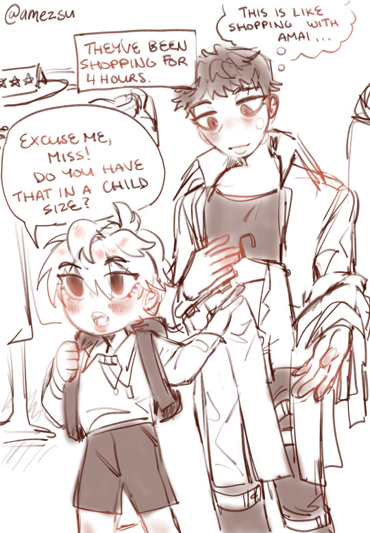
Self indulgence Sunday ft the weirdo family ((Also idk anything about comic layouts or fashion and I’m sorry for my handwriting 😭😭))
#bdjsjfj pls reblog this set of drawings took like a whole day#once again sorry I have no idea how to do layouts for comics and speech :’)))#anyways I know in canon CE like despises Amai and that is still implied here lol#they begrudgingly tolerate each other#tho I HC that isamu probably looks up to Amai or subconsciously copies his behaviour#they are like the only two running S-class relations and even if they fight I’m amai is still a significant figure in his life#like amai is shit at running the team personally but for management he does rlly good#anyways all this to say amai is probably going to be a visible influence on him when he grows up#headcanons over lol sorry to the tags#I’ll ramble more on a rb from my main acc#my art#art#artists on tumblr#doodle#anime#drawing#digital art#fanart#opm#one punch man#one punch man fanart#isamu opm#child emperor#amai mask#sweet mask#zombieman#zombiedad brainrot#amazomb#zombiemask#if you squint but it is implied 👍
66 notes
·
View notes
Photo
Yay! Thank you!
Yeah, experimentation comes into play hugely. I’d think 60% of the process is just “Step 2: ???”. But I can show you a bit of how I make the choices that end in the final aesthetic.
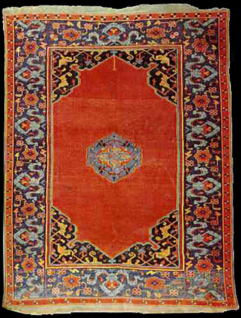
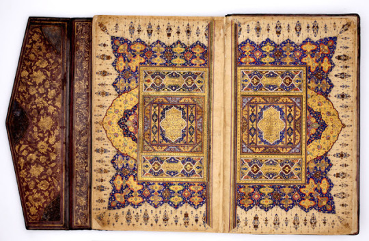
So The Carpet Merchant looks like this:


It’s a blend of several influences; bande dessinee meets art history meets me. But The Carpet Merchant aesthetic is meant to be the comics-version of Ottoman Miniature (minyatur), and that has been the “gimmick”, as I would call it, that drove the art direction of the story.
So much of the work in designing these layouts (before doing the thumbnails, and while drawing the actual pages themselves) is doing the research. Which means finding the correct references and making a mood board, but also understanding the rules, elements and philosophy behind the art itself. So that you’ll know which rules to break, stretch, fuse, adapt, yet still keep the essence of the thing.
Here are some of the references from my folder: (no sources attached as I’m feeling lazy rn lol sorry)


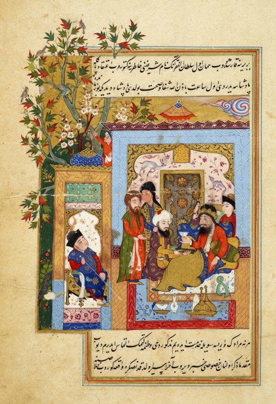


You’ll see it’s not just the minyatur itself I’m referencing. I’m bringing in the whole gang (architecture, textile, fashion and more) into the art direction, since artists never create in a vacuum, so it’s super important to find out what sort of artistic influence they may have been immersed in at the time. (You can’t always get an accurate impression, you’ve to aim for close enough...which is the moral of the story)
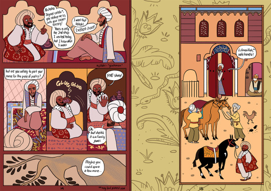
Anyway looking at the minyaturs, you can observe where and how they have influenced the layouts of TCM, and how TCM responds as a modern interpretation and usage of the style. TCM doesn’t look like the references 100%, it’s not meant to be because COMICS. But you can see how the old and the new link together. Look again at the image with the two people running across the house.

What the heck!! It’s madness. Each part of the house can be a comics panel by itself, if the original artist decided to stretch the idea. Then you see how there are captions that narrate the scene, above, below and within. Hello friends, you got yourself a comics page.

Two panels of a scene! Slap some speech bubbles on top of it. Boom. Comic.
There’s a lot more to see of this once you go into the Research Hell phase, but even with these two alone you can see how the “gimmick” came about. It’s a natural, logical extension of the original. But how does that influence the design of the layouts? This is where the rules come into play.
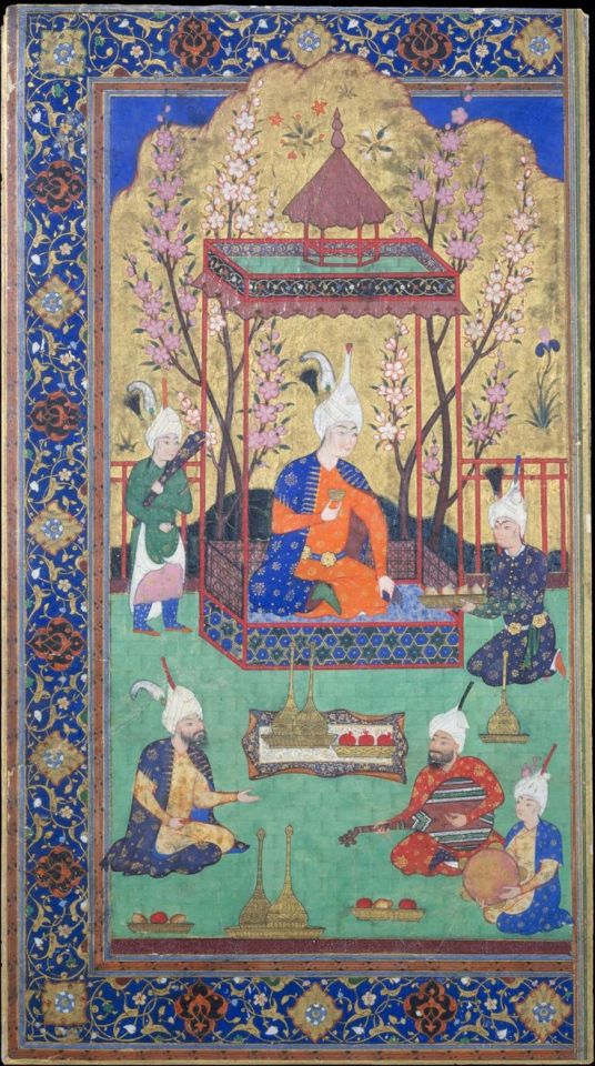
So I gather up as many references as possible (and making sure most of them are identified as Ottoman, though I’ll allow the occasional Mughal or Persian), and analyse the heck out of everything. Here’s my understanding of the rules:
Colour: Pastel yet bright. Blue, yellow and red are standard.
Framing: Figures are contained in a frame, always. Whether it’s a simple box, an archway, or a building (that becomes a big panel containing tinier panels, as seen earlier).
Embellishments: lots of pretty details and patterns, arabesques and florals. None of them clutter the illustration, and all of them function to draw your eye to the central figures, and harmonise the composition.
Usage of space: despite how sparse the outside of a minyatur appears, it actually uses THE ENTIRE PAGE as part of its storytelling. You can see it in the earlier minyatur with the tree growing out of the framing. Sometimes the background is painted and contains scenes of wildlife, more florals, and marbling/speckling.
Adapting all these rules to TCM:
Colour: No change. My colouring style is already pastel yet bright. I can go on and on about how the colours in TCM are used to tell the story but that’s another big post entirely.
Framing: still pretty true to form (I hope). Except it morphs and changes, depending on the needs of each part of the story.
Embellishments: people always notice this about TCM! I’ve to point out that it’s more than just pretty. Many of the embellishments are actually my way of incorporating carpets into the story, without necessarily having to show the carpets themselves. (and if you notice in the original, you can see the parallel with carpets too, see below)

Usage of space: This translates into using gutters (the empty spaces between and around panels) as part of the storytelling. Effectively turning the gutters into comic panels and framings themselves. It’s a lot easier to figure out how to use gutters if you’ve experience in doing illustration and thinking like an illustrator. But it’s all up to how creative you want to be.

The stars and moon on the left set the night time scene, as do the colours of the background. The branching florals guide your eye to the green panel, as well as framing it, and they also represent Zeynel’s blooming into his new life.
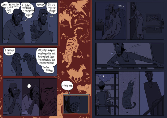
Zeynel is on the verge of a breakdown, struggling to curb his vampiric hunger and losing his grip on his identity as a not-vampire person. The red panel pays homage to the wildlife backgrounds in minyatur, but they take on an active rather than decorative role to represent his mental state.
Taken together:
Some of the layouts are simple. I usually reserve simplicity for highly emotional scenes, since I want the emotion to be the focus. These are the more conventional style layouts.

Then there’s the middle ground.

And finally, there are the WILD ones. The ones where I had fun bending and twisting the rules. How comic can an Ottoman minyatur go, and vice versa?


There’s a lot of experimentation. Most of the time I can’t really explain how I translate the script/dialogue to what you see on the page, since the process from thumbnails to colours is evolving, though the basic composition remains. I do have the rules though, and I tend to follow them. And I try to make each layout as unique as possible, though I don’t pressure myself. It all depends on the story. It’s learning to trust your intuition and going with it.
If you want to do your comics this way...for each comic you create, there will be different rules you’ve to discover yourself. For TCM, it’s this. For Seance Tea Party, it’s something else. And for Alexander, it’s another thing.
(this is my excuse for saying I AM SORRY I CAN’T GIVE GENERALISED INFO!! If you ask me to do a version of this post with Seance Tea Party it’ll look super different)
You just do what you got to do. Sometimes your comic tells you it wants to be a black and white minimalist manga, and THAT’S COOL! Let your story guide you to how it wants to look, and remember to always have FUN!
#comics#tutorial#the carpet merchant of konstantiniyya#A REALLY LONG POST#about how I design my layouts
239 notes
·
View notes
Last Seen Blogs

pupilchickchan-blog
(๑• . •๑)

super-chaotic-cloud
Chaotic Cloud

surbhidryfruits
Dry fruits wholesale in delhi
jellyfish-grave
Hello my little temporal pebble ^^

hades-sheol
Tanatopraxia y Taxidermia