#only thing im a bit :l about is the texturing on the background and objects
Text

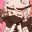
The Chase
#rain world#my art#rain world art#rain world fanart#rain world vulture#rainworld#rainworld art#digital art#art#rw#rw art#gggggg tagging is my least favorite part >.<#for this one i was mainly trying to do a wacky perspective#and im pretty happy with it!#theres also a white lizard hidden in the upper right :D#only thing im a bit :l about is the texturing on the background and objects#i kinda got lazy there so its looks a bit plain#luckily unsharp mask and my color filters came to my rescue!
97 notes
·
View notes
Text
Scratch that
I put this assignment aside for a day and have come back to it now to realise that I need to take a different approach because what I’ve done so far is not working and kind of ugly. I blame lack of sleep and stress. But we are recharged now so I will be starting again.
But instead I’ll be starting with the cover first and see if I can develop a theme from there.
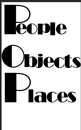
I would like to have some kind of typographical title using the Broadway font. My reasoning for this is that I find this font fun to manipulate and change to create a single image. It’s going to take a few tries to find the right way to fit the letters together so the following images will be all my different iterations.
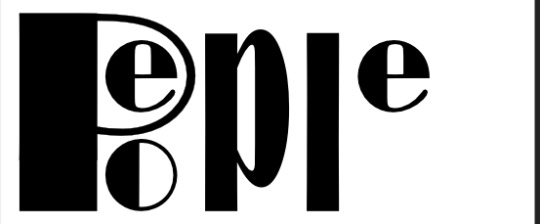
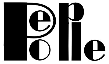

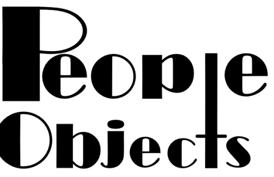
After some time playing around with the letters, trying to get them to fit together and make some clever letter/word play design, it wasn’t much of a success. The letters being used didn’t compliment each other well enough to work.

From trying to fit the L, J and L together from each word, I got the idea to instead play with the meaning of the words instead by incorporating a bee-line to replace those letters. I designed the bee line to create the shape of the letter T for the word “Objects” however im not sure if it actually is replacing it or if the eye just reads the word correctly anyway. From looking at this it seems like there aren’t any missing letters so I’m running with it and calling it a success!

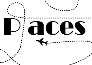
I hand drew an airplane to attach to the end of the beeline to integrate with the whole “places” thing for the title. But then from there I thought if I’m matching the art with the words, I could see what I could do for ‘people’...
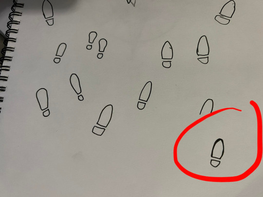
So I drew some footprints! As you can see it took me a few attempts to get the right one.
Here I tried introducing both of them but thought that the footprints looked a bit like marching ants... So I scrapped that idea and stuck with the plane only.
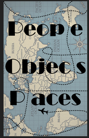
Then I got the idea to include a map as the background. I found this one from free pix https://www.freepik.com/free-vector/vintage-theme-drawing-world-map_5671432.htm#query=map&position=4&from_view=search

Then I played around with the colour and texture a bit to make it look a bit more vintage and old. I’m not sure the overall theme I want for this POP publication, however I do want to play off the whole travel, world wide thing considering each of the publications included are about four different ethnicities.
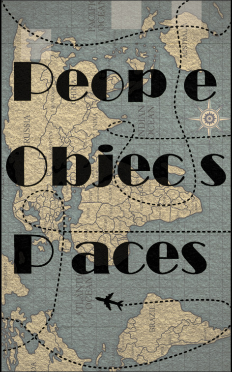
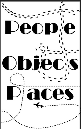
The final front cover after some title realignment.
0 notes
Last Seen Blogs
artis-malaysia-hot
artis malaysia
karolinsstuff
karolina
sexilydrawn
SexilyDrawn

paquitasalas-blog
PS Management