#so i went softer this time more rounded shapes more subtle shading
Photo

*aqua voice* TERRAHHH
there is no greater pain that being unable to draw ur fav. terra for whatever reason has just been SOOO hard for me to draw. n i finally after over a yr have made something i think i actually like YAY
terra baby i love you so much
#kingdom hearts#terra kh#birth by sleep#kh bbs#kh terra#TEWWA BAYBEEE IM SORRY#its been a tough balance between a lot of things. 1 trying to translate the square enix style into my own. HARD. especially the hair#2 trying to inject my hcs. i like to interpret terra as a bit boxier than in canon but ive been having diffuculty keeping it *terra*#for a long time i think i went too sharp n too masculine trying to emphasize the darker more hostile part of his character#but then it just. didnt look like him.#so i went softer this time more rounded shapes more subtle shading#n i think finally that has worked#and lastly. 3#i think bc i loved him SO much i overthought it. i wanted every detail to be right instead of focusing on the bigger picture.#so it never looked 'right' to me. i was so concerned in maknig it perfect it actually. SUCKED#anyways ya#hopefully this isnt a fluke n ive finally cracked drawing him. finally#also no pauldron bc i want NOTTTT drawing that#LOL#consider this a companion piece to the aqua one#peep the eyes HEHE
708 notes
·
View notes
Text
HOW I CREATED MY MAP SIDE FOR MY LEAFLET ! (PROBLEM SOLVING)
Over the last week I have been putting together my leaflet for my campaign and my leaflet consists of a map of London and fun facts about the places that are on the map and also contains safety precautions that you need to take when in London and a fun game for children to play which encourages people to look around London the game links with my posters that I’ve created for this project which I’m really happy with.
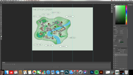
The map contains key points in the city of London including Buckingham, Palace St. Paul’s Cathedral, London Bridge etc The reason I have decided to pinpoint special places in London is due to these places not being visited much during lockdown and places on the map like cafés and hotels need tourism to help their industries.
On the map I’ve also included tube stations that are near the places as it is a way of travelling round London and getting to places faster rather than walking I’ve included train stations including Piccadilly Circus Waterloo monument etc.
I want is my leaflet to be appealing for tourists that are going to London after lockdown and I wanted London to look more inviting and fun and safe that is why I have added a game on the leaflet as it is a way of children and adults travelling around the city and have a bit of a purpose and it encourages travelling to these individual places.
The game that I have made is called the poster challenge it links to the posters that I have created within this project of places around London. For aim of the game is to find the posters around London and write in the number that is on the poster that I’ve created. I have also promoted my app and added a QR code that you can scan to download the app as people normally have their phones and is another way of seeing the leaflet but digitally.
The final thing that I have on the leaflet and I thing that is very important during these times is a safety precaution list that people need to follow while travelling and visiting the city on the back of the leaflet it consists of how to wear your mask properly and three rules that you need to follow.
Below is how I created my leaflet and what problem-solving and challenges I had to encounter when creating it and it shows how I solve these problems and how I worked around it to get my final product which I’m very happy with.
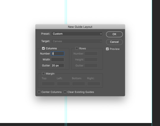
The first thing that I did was I created an A4 landscape document on photo shop and then I divided the A4 document into three sections, to do this I went to the tab at the top of my screen that is labelled view and scroll down to the label that says new grid layout. Once I done this a box popped up and I made sure that the column number was three and the gutter was 20px I then pressed okay and this gave me a grid separating my document into three sections ready to create a leaflet.

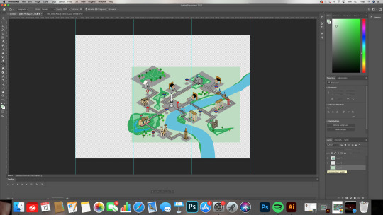
After creating the grid I proceeded to adding my map that I created via procreate on my iPad once I had added the document to my A4 photo shop document I placed it where I wanted it to go and added to the map using the brush tool I done this to make the map look more free rather than in a box.
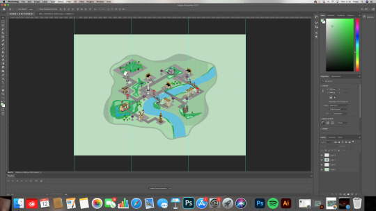

Once I had added bits to my map using the brush tool I created a freestyle pattern around the map using a muddy green and then using the one title I experimented with the background of the map I selected different sections and used the paint bucket all to fill in those sections and by the end when I was finished I had different sections that were different colours of green. After I had finished doing this process I wasn’t really happy with the look so I went back on myself and decided to use the gradient tool I selected the whole background of the map and then using the gradient all I selected the colour green and white and experimented with different angles of the gradient. Finally I was happy with the gradient that I chose and decided to outline the freestyle shape using that muddy green colour again with the brush tool.
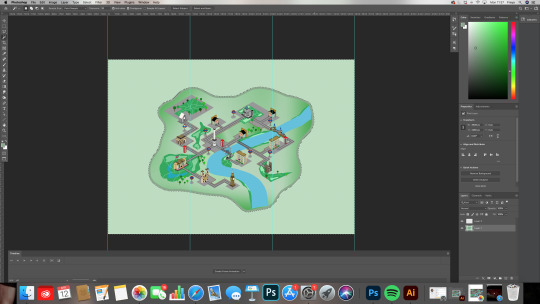

After I completed the map background I placed it in the middle of the document and proceeded to making a border to create some sort of aesthetic to the page I started adding circles in different shades of green around the edge but decided it didn’t look great and I wasn’t happy with it and I felt like it didn’t flow with the theme of my leaflet so I decided to get rid of all the circles and try something new.


Once I’ve got rid of all the circles around the border I decided to re-scale my map and start adding labels to it. I first started off with labelling each tube station sign to create the labels are used the eclipse tool and the text tool. After experimenting with a border and without a border on the eclipse shapes I’ve come to decision of having no border around the labels as it creates a softer affect similar to the outline of my map.

The Nextep in my leaflet was adding fun facts about each place around the edge of my map I had to reschedule my map again as it was causing problems with me being out to fit The text around it after completing the fun facts I proceeded to adding a background to separate everything from each other and make it more interesting. To do this I found an image online of cartoon clouds and copied and pasted the image onto my document.
After this I selected the image with the controls CMD shift T this allowed me to select the image and size it to the right scale.

Once I had got it to the scale I wanted I select the layer and use the one tool to get rid of the blue background once this was done I selected the layer again and changed it from normal to luminosity this created a subtle version of the picture that works well with my theme anaesthetic, I try different styles including multiply, lighten, lighten colour, hard light, hue and finally luminosity.
After getting my background to the right style I then proceeded to add boxes around the fun facts to make them stand out more.
After all this was done above I added the final touches of adding the title ‘the City of London’ and my logo for my campaign by doing this it made it more professional and looks like a real map for a leaflet for my title I decided to use a more cartoony typography as one of my main points for my project is to make London look more inviting and fun and by adding a pop of colour like purple it grabs the audiences attention and makes it look more interesting rather than a blocky type that is black which is not as fun as the one that I decided to use.
Finally the map side of my leaflet was completed there was problems on the way such as The map being too big to contain the facts around the edge but I decided to make the mat smaller and bring it over to the side slightly to add fax down the side of it and some small facts around the edge which works better than me putting the map in the middle. I did a lot of experimenting with this side of the leaflet especially with the maps background the original drawing has a grey background on it but to me didn’t look that inviting so I decided to use the colour green as it’s a bright colour and can represent the grass in London and the parks for the background are used different processes and finally decided to use the gradient for the background which works really well and is not too harsh and doesn’t override the main point which is the places on the map.
But overall I am happy with this aesthetic and how the layout has worked and think it looks inviting and I think it betrays the point I’m trying to get across in my FMP project.
0 notes
Text
6
The hamlet was on none of Simra’s maps, nor any map he could remember seeing. Not the faded and fingermarked Imperial Cartographic Society print; proud on the front two pages of his Third Era almanac; showing Morrowind as it had been. Not the dog-eared bundle of smaller scale charts he’d gathered down the years. ‘Stonefalls…Southern Deshaan…Narsis & City Limits…Ascadian Isles & Azura’s Coast…Holdings of the Mainland & Zafirbel Telvanni.’ The maps and sketches that showed Morrowind, piece by piece, as it was now.
It was easy to reckon out any number of reasons. Harder was choosing between two whys. Was the hamlet missed off from the maps because it was too new, or still too much of a nothing? The same story and the same questions shaded over any number of villages and outposts in Morrowind.
Half a handful of buildings in packed earth and brick, raised up on platforms from the riverfork’s damp. A handful more of wooden trellis and stretched hide, roofs and lintels blue-black and green with moss. Snagged plots of shortbeans and leafy watergreens grew in the damplogged dirt. And that was all. The people here were fisherfolk, or people waiting for their chance to leave.
Old women in tarred leather coracles floated the river’s broad splay, barb-spears poised to snatch up fish, or whatever else lived in the water. Skinny children wrestled and fixed nets on the far muddy bank. All of them were swaddled against the cold, despite the pale afternoon sun.
The boatmer scowled and fixed his mouth like there was a smell to this place more foul by far than his boat and its baskets. To Simra there was no difference. He’d be glad to put both to his back. Upwind if his luck ran kind, but when did it ever?
The boat passed at a distance, then shunted against the southernmost bank.
“That piece?”
The boatmer cornered Noor as she came outside from the cabin. His dialect was thick, murky and rural. Hard to understand for any of them. For Simra it wasn’t so much the words he used that were difficult. In themselves Simra knew most if not all. It was how he put them together into sentences. Put across his meaning — or didn’t.
“This piece, that piece,” he said, slow to Noor, as if she were simple. “This piece is gift ago. That piece is no. That piece is where? We together an agree.”
Simra strapped into his bags. Satchel, book-bag, gathersack. Swordbelt and the pouch that hung from it. No matter that he was the one who’d treated with the boatmer all this while. Arranged payment. Haggled a discount when he told the older mer he’d be more protection than passenger, showing him the sword he carried. The boatmer always spoke to Noor first when he had something to say. The eldest of them, Simra supposed. Determined by tradition.
“Isn’t this were you step in, usually?” Simra turned to the boatmer’s daughter. Her Dunmeris had a broader catch to it, grown by necessity like thorns from a fern — a short lifetime of translating for her father must’ve done that.
She wrinkled her pug-nose and spat, past the boat’s side and into the water. “Please.” When she looked back to Simra, she wore a small grin. “Will rescue when they stop being funny.”
Simra gave a rattling sigh in the back of his throat and crossed to the boat’s far side. The boatmer fixed him with another scowl. An interruption; torn decorum. But what was the use in caring now? This was as far as their paths went together.
“This piece, I’ve given you,” Simra said, jutting a thumb over his shoulder and into the past. “That piece…” He rummaged in the pouch at his swordbelt and hooked out three jangling strings of shils. That had been the deal: four then and three now. “Happy?”
“Happy,” the boatmer nodded. A look of sheepish discomfort in his face as he took the last three yera of his pay.
Simra raised his brows at Noor, a lean cut of smile crossing his face. Satisfaction, but only shortlived. It’d be sweeter to know he held the pursestrings of their venture if it didn’t mean opening his own purse so often. He’d paid their passage – she and Tammunei – and provisioned them this far. Tammunei, he knew, carried no money at all. Noor had shown no signs of being any different. At another kind of time, with another kind of head on his shoulders, Simra might have asked her.
Instead they flopped from the boat’s beached prow and onto the bank. Tammunei first, who helped Noor down. Then Simra, alone, with a leap to get clear from the worst of the mud. A moment later he doubled back, remembering something, cursing as the bank sucked at his boots.
He filled his waterskin at the riverside. No regard for the dirt and scum afloat in what he gathered. Not these days. He had something for that. He reached into his satchel and brought out a leather cord, tied round a small tarnished bronze medallion, scratched with a single sigil. He slipped it into his waterskin’s mouth a moment. When he pulled it back, the medallion gleamed wet, though the tarnish had grown worse.
Noor stood a ways from the bank, long hair turned whiplike by wind. A covered basket was strapped to her back, hunching her. Every bit the crone, Simra thought, but there was no knowing how old or young she truly was. No polite way to find out — but when had politeness ever been a concern of hers? Only in her ashlander way. Gift and ritual; the right words, and the wit to improvise round them.
“Best to get on,” she called out over the breeze. “There’s daylight yet, but less than there might be.” Her voice had grown stronger of late. For better or worse was still to be seen.
Simra glanced behind them, over the wide river, across to the hamlet. “Supplies first?”
Noor gave him a pitying look. “More?” she said. “After so long wasted in Bodram? Getting and spending… Bread and grains…”
Wasted? Thanks to her it was time lost to them already. Time that Simra had put to as good a use as he could. Saving what’s wasted from going to waste — a necromancer ought to’ve understood that, he thought.
Something stormy and sour must have crossed his face. When Noor spoke again, she spoke softer:
“We’ll travel faster burdened by less. You want to travel fast, don’t you?”
Simra gave a reluctant nod.
“Good. Can you hunt? Trap?”
And there it was again. A moment’s kindness, and then the crush of a question: Are you enough, Simra Hishkari? “Not as such,” he said.
“No matter.” Noor’s voice was sunny, strange and bright. “Tammu and I will forage as we go.” She paused. Cocked her head at him, with a look like someone trying to tongue something from between their backmost teeth. “What are you, Simra Hishkari?”
Simra’s face stiffened. His cheeks hollowed. The same question again, given voice this time. The urge to deflect struck fast as instinct. “The proud owner of the longest legs among us,” he said. “Try to keep up.”
And all the rest was hard pacing. Cross-country, at least until Ouadabridge. On foot. There was no point disputing it now they’d set out. And he was no wisewoman. Hardly an ashlander. Couldn’t hunt, couldn’t herd, hated to ride except when he’d hate walking worse. What did he know, then? Only that this seemed a bad trade. He’d tell them. First one to cry footsore, he’d tell them, and next time they’d listen to him. Next time, he’d have will to form the words. But for now they’d follow Noor’s wisdom. Like playing at cards, Simra saved his hand.
The land as they travelled stretched open. First the mountains of Stonefalls faded behind them, then the foothills too. After there was only starkness, steppe, shreds of scrub or seams of wet black dirt. Long grey-green grass, occasional as cresting waves in a sea of shorter blue-green grazing.
They travelled a rough southing course. One league, two leagues, three, trusting in Noor’s memory to see them right. For all Simra walked fastest among them, she was the one that led.
He had journeyed through the Northern Deshaan before, but never this part, and never off-road. Here was a gape of emptiness, featured only on the oldest and most outdated of his maps. Even then it was only a stretch of empty paper, equated by a black writhe of river: the Dathan. And there was an itching fear in that. Like staring into pitch-blackness, sure you feel things staring back. Who’s to say what an emptiness might turn out to be full of? Or why it should ever be anything pleasant?
“We safe to have a fire?” Simra asked as the sun began setting.
“I can make us safe,” Noor answered.
Simra kissed his teeth. By sword and spell, he could make them safe too. Difference was, he’d rather not have cause. He remembered the Rift, and the risk of showing yourself on the steppe. Lighting a cookfire was good as lighting a beacon in the open. Light by night, or the lure of smoke by day.
Still, in the last hour of light they had, he gathered what brush he saw. Spindly windfalls and dry spreads of fern. Knotted bulbs, half-hidden by grass. A dusty tumble of weed and straw, blown along in the breeze. Whatever he reckoned would burn.
As they began they were nowhere at all. A river and mountains for placemarks. Since then they’d left them behind. Now, as night closed in, the world grew tight, and where they were seemed a deeper nowhere still.
“Here,” said Noor. “We stop here.” She was breathless as she called it.
Simra dropped his bundle of brush and fuel.
Tammunei took the arm-long shape of hides and struts they carried from their back, and planted one picket-pointed end in the ground. Leaning close, they murmured something to it. A strange and pitchy line of song. A spell. And the yurt began to unfold.
Simra had seen it before. Countless times on countless nights, and in reverse come morning. But the process was soothing, subtle but impressive. A great and everyday magic of the kind that came natural in Morrowind. In Skyrim it’d be just as natural to see it as some outlandish excess. Weakness, decadence, witchcraft. To Simra it seemed like common sense.
Like some uncanny tree, the yurt spread roots from its central stem. Spider’s legs of twitching creaking growing bone that spread out to form a floor. Between them, hide stretched itself, like the leather of a bat’s wings, going from lustrous dark to pale cream-brown as it warped and spread wider. Limbs of wood reached up and out to form eaves, then wall-frames. The bones arched up and met to make a door. And from the yurt’s domed apex, yet more skin unfurled and stretched, to cover its slow-grown skeleton.
It was small. Room enough for one to sit and shelter in comfort. For two, Simra knew it, was cramped. For three..?
He muddled his fuel into a shallow-sided pyramid, built round a heart of dry grass. With outheld hands, he lit the heap in a rise and spray of sparks.
Noor by then was pacing a circle round their camp. A warbling husky song flowed from her as she walked. Round and round, head down, then up-bucked to the sky.
Magic, Simra supposed. She’d said she could make them safe. He crouched by the growing light of his fire and brought out his almanac, untucking the right chart from its pages. Stonefalls. He found the fork of the river they’d left, marked it, and wrote in a careful hand: ‘Fisher’s Fork’. If the place had no name before, it did now.
He placed his kettle on the fire, filled with enough water to cook mountain millet.
Abrupt as a change in the breeze, Noor finished her song. Trying to keep a stumble from her step, she came into the firelight and slumped to sit.
Something had changed. The night was darker, more enclosed. Frowning, Simra cricked back his neck to look at the sky. The moons and stars were gone.
“Safe,” breathed Noor.
9 notes
·
View notes
Text
The Big Beauty Sale
Over the last year, I employed a new method of purchasing beauty products & it’s ended up saving me so much money in the long run. I used to just wait until I ran out of something & then have to run over to Sephora or ULTA at the last minute in a frenzy to buy more. I knew there had to be a better way to plan ahead, so I decided to start buying the things I use regularly when they’re on sale (whether or not I currently need them).
In some cases, this means that I will have 3-4 of the same pencil in my drawer just waiting to be used (and I do have to take shelf life into consideration). But, this not only ensures that I have backups to use when I run out of my current products, but it also means that I never have to pay full price! Because a lot of the brands that I wear end up being excluded from usual promos & coupons, I’ve gotten pretty good at learning when the big sales are and stocking up.
Right now, one of those sales is happening that I will personally be taking advantage of, so I decided to do a round-up of my top picks so you can also shop & save! I’m only sharing the products that I use on a regular basis & love, so these all have been tested by me, purchased with my own money (read: not sponsored) & have my full endorsement! Everything is on sale now (15-20% off) with code VIP + you’ll get free shipping when you spend $49.
FACE
I recently discovered this enzyme peel & I fell in love with the way it made my skin feel! This is a gentle peel, which makes it perfect for my sensitive skin – I noticed a marked improvement in softness & radiance after using regularly once a week. I’m a big fan of the Elemis brand, but I don’t own a lot of their products because they are a little pricey – so this is a great time to grab some skincare from their line for less.
Before applying makeup, I always prep my skin with primer – I’ve used this one for years because it creates a smooth base & helps everything stay put. It’s worth noting that there are several different formulations of this primer & they also come in travel sizes, so you can test them out first & find your favorite – see them all here.
I’ve been wearing this CC Cream since it first hit the market & it’s still my favorite for everyday wear. I wear Light or Light Medium during most of the year, but switch to Medium in the summer months. I love that it gives me a natural look with buildable coverage & that it has the SPF50 built-in. This also comes in a travel size, which I took with me when I went to India. I apply mine with this beautyblender & finish it off with this setting spray – this is a game-changer for those hot summer days or events when I need my makeup to stay put (travel size here).
I’m one of those people who doesn’t go “all out” with my makeup every day, but I have started adding in a little contouring & it makes such a big difference! I have tested lots of products & this palette gives the most natural effect of all the ones I’ve tried. I use the Soft Contour color in the hollows of my cheeks and just under my jawline/chin & then I apply the Radiance Highlight on my cheekbones. You want to blend it really well so the definition is subtle and not too severe – I use this brush to smooth everything out & I use this one to apply the highlighter. Once I’m done, I’ll add a little blush to the apples of my cheeks (because otherwise I look too pale!) – this one is a cult favorite for a reason…the color looks good on every skin tone. Also highly recommend this brush cleaner if you don’t already have one – it’s great to use in between deep cleans & it dries really fast!
EYES
After a significant amount of trial & error, I’ve finally come up with a 3-step process for effectively covering my dark undereye circles without looking like I’ve caked a bunch of product on. I start with this magic wand (in Radiant Light), which has a creamy consistency & gives an illuminated look. After blending it in well, I warm up a small dab of this full coverage concealer (in Light Amber) between my fingertips and apply conservatively (a little goes a long way). Then I set it all with this brightening powder (in Shade 1). But, for what it’s worth, I also have some friends who found the It Cosmetics concealer wasn’t moisturizing enough – I’ve heard from makeup artists & beauty influencers that this one is a better option for those with dry or aging skin.
There’s nothing worse than spending a ton of money on an eyeshadow palette to only end up using a few of the colors. And while I do own both of the popular Urban Decay palettes (here & here), I actually found that this one has all the pretty neutral shades I want and it’s so much cheaper! These blend like a dream with very minimal fallout – this is a $61 value for only $20!
If you’ve never tried this volumizing mascara, this is the perfect time to order! I suggest getting the travel size first to test it out, but I know you’ll love it because everyone who I’ve recommended it to has converted for life! I’m ordering more while it’s on sale, because this brand is usually excluded from promos. And I’m also stocking up on my favorite brow pencil (I wear Soft Brown) – even though my brows are microbladed, I’m long overdue for a touch-up so they’ve faded quite a bit. This pencil has a super-fine tip that allows me to create tiny strokes that mimic the look of real hairs to fill in any sparse areas & give more definition.
LIPS
You’ve heard me rave about this lip overnight treatment before & it really is magical – I actually prefer it over the Laneige lip mask that everyone swears by! I love the smell & appreciate that it’s 100% natural and uses fair trade coconut oil as one of the main ingredients. After falling in love with it, I decided to also order their tinted lip treatment to use during the day – this has SPF30 & keeps my lips baby soft all day long. I wore the Naturally Nude all summer long, so now I plan on ordering Touch of Berry, which looks like it will be the perfect hue for fall & winter.
HAIR
This seems random, but a question I frequently get asked is what type of hairspray I use. Truth be told, on most days, I don’t use any at all – I think the overuse of AquaNet in my teen years has me a little gun-shy. But, there are times when I do need it like when we’re shooting photos for the blog & it’s windy out; when we’re headed to a special event or when I create an updo that I need to stay put. This one has been my go-to for years because it has great hold, but doesn’t leave a sticky residue or make my hair feel stiff. My husband actually uses this more than I do (ha!) and he loves it too.
I can’t remember where I first read about this hair treatment, but the before & after pictures were so amazing that I felt compelled to give it a try. Let’s just say, there’s a reason why it’s won so many beauty awards – I’ve only used it once & I couldn’t believe how it completely transformed my naturally curly hair to be so sleek & shiny. I applied it to my towel-dried hair, combed through & then blew-dry as usual – not only was my hair softer than ever before, but it didn’t get frizzy after walking my dog in the afternoon heat & humidity. This is definitely going to be a new staple product for me!
NAILS
As most of you know, I’m pretty neurotic when it comes to my nails looking nice. Growing up, my mom had the most beautiful long almond-shaped nails – she always did her own manicures at home and taught me from a very young age how to care for & paint my nails like a pro. I like to change my color weekly, although I can get my polish to last for 10-14 days if I’m careful. Essie is usually my brand of choice because I prefer their brush, plus they have every color under the rainbow. This is a great time to scoop up a new polish (or two) for the coming season – my fall favorites are Angora Cardi, Merino Cool & Bordeaux. If you have a harder time making your manicures last, I recommend trying out their Gel Couture line – it doesn’t require a special light to cure, but you will need this top coat (colors I love: Spiked With Style, Bubbles Only & Caviar Bar).
The post The Big Beauty Sale appeared first on Penny Pincher Fashion.
The Big Beauty Sale published first on https://skinalleyupdates.tumblr.com/
0 notes
Text
'Design is thinking, made visual’
During this workshop we looked at the work of graphic artist and filmmaker Saul Bass. He was best known for his film posters, title sequences, and corporate logos. We investigated Bass’ use of visual language and techniques with the aim to apply this to a physical outcome. Bass’ work is often credited as being timeless, accessible, and thoughtful.
We started the case study by looking at three different examples of Bass’ work, asking ourselves the following questions:
- Can you describe the visual language of the work?
- What is the effect of the visual language?
- Does the work send an immediate message or are their subtle parts that take a while to digest?
- Why do you think the work could be described as timeless?

Anatomy of a Murder Poster:
Colour - The red background gives the poster an intense feeling, and the colour red often represents danger, murder, and blood.
Shape - The uncoordinated and rough shapes of the limbs give the poster a more organic look, as if the shapes have been cut out by hand.
Text - The text is split up between the limbs, implying that they need to be put together (to possibly solve a mystery).
Simplistic -
Composition - The placement of the body being horizontal shows that the person is dead, if the body was placed vertically it would still seem alive, even with the limb separated.

Girl Scouts Logo (1978):
Shape - The obvious shape of the logo is of the three girls side by side. Though the girls look similar they all have slight differences, which symbolises unity and equality within the girl scouts despite every girl being different. There is also a more subtle shape to the logo. It is shaped similar the the first aid symbol - the cross. This cross however is more rounded, which to me makes it look softer and more minimalistic. It has this shape due to the skills that girl scouts learn.
Colour - The colour green is universally seen as the colour of nature and peace. This also links to the first aid sign which is a similar shade of green.
Simplistic - The simplistic nature of the logo is what makes it universal and timeless. If it was more detailed and obvious it wouldn’t be able to be understood by multiple generations.

Bunny Lake is Missing Poster:
Colour - The poster is monochrome. This makes it look similar to a real missing poster, as they are usually mass produced in black and white. It also looks similar to a newspaper, and the composition makes it look like a polaroid picture, due to the black square in the middle and the white space around it.
Typography - The text is hand written, which gives it a more organic look, as if it was a homemade missing poster. The colour of the text is black but is fading towards the end on the word ‘missing’. This could imply that time is running out to find the person that is missing, or that they are being forgotten.
Subject Matter - The poster features a cut out of what looks to be a small girl (possibly a child, guessing from the size). Despite being cut out of the black negative space, her hand is still slightly attached, implying that she is still there and can still be found.
After looking at these we watched three title sequences that Bass had worked on during his career.
youtube
The first sequence we watched was for Anatomy of a Murder. It featured the same figure as the poster, as was created using stop motion techniques. The hand rendered figure moved in time to the music; the music added definition and drama to the sequence, but wasn't as serious as the title of the film suggested. This implies that the film, despite being about murder, has a comedic tone to it. It also has a slightly nostalgic feel, being compared to the music for monsters inc and pink panther by my peers.
youtube
The second title sequence was for the film Psycho. Compared to the first sequence, the music is a lot louder and more intense. Bass uses geometric shapes to cut up the words and negative space. This makes the sequence more sinister and tense, but isn’t as obvious as the previous sequence.
youtube
The third and final sequence was for the film Seconds. Unlike the last two this one uses real, yet distorted imagery. It’s unsettling and makes the viewer uncomfortable, being forced to feel uneasy and claustrophobic. It was also similar to Frankenstein, with some of the facial features being chopped up and put back together.
After this we looked at three artworks that were inspired by the works of Saul Bass, and did this so we could figure out the rules of his work and how we can use these rules in our own work.

Noma Bar ‘Bittersweet’ Book:
- Negative space
- Limited colours, use of one bold colour as the background
- Images within an image, other animals making up the features of the dog

Cody Hudson ‘Pacific Vortex’ Poster:
- Basic shapes
- Type and imagery
- Limited colour palette

Olly Moss ‘Rocky’ Poster:
- Basic shapes and silhouette
- Cut out shapes
- Limited colour palette, using one bold colour and the background and neutral colours as the silhouette and text
After analysing these works we decided on the rules as a class:
- A good and purposeful use of negative space
- Clear relationship between type and image
- Intense and meaningful colour
- Clear message with subtlety
- Hand rendered aesthetic
- Simplicity of shapes
- Narrative and story
Use these rules we then went ahead to respond the Bass’ work. I initially found this hard and wasn't very inspired. I started by sketching some designs in my sketchbook then moved onto adobe illustrator as I want to get better at this particular program.

I decided to create a graphic of the game Dark Souls. The picture is of the character Solaire reaching Anor Londo, a fan favourite area of the series. The cathedral is the centre point of the location, featuring the most well loved boss duo of the series, Ornstein and Smough. I used a sunny yellow colour as the background because Anor Londo is shown to be ‘bathed in sunlight’, and is the land where the gods once lived.
0 notes
Last Seen Blogs