#the quotes; layout; trying to balance everything visually took some planning!
Text


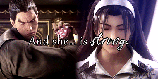
well have you considered that maybe the unstoppable force is in love with the immovable object
maybe the reason one refuses to stop and the other refuses to move is because they both long for the collision
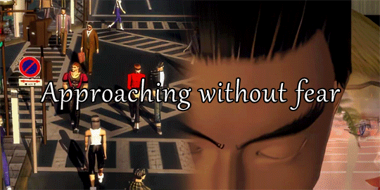
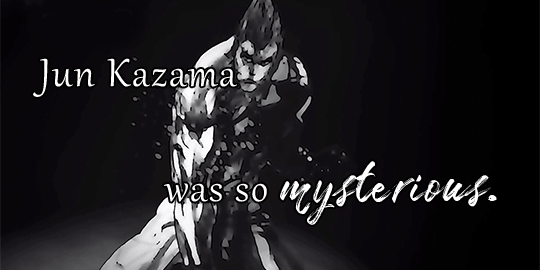
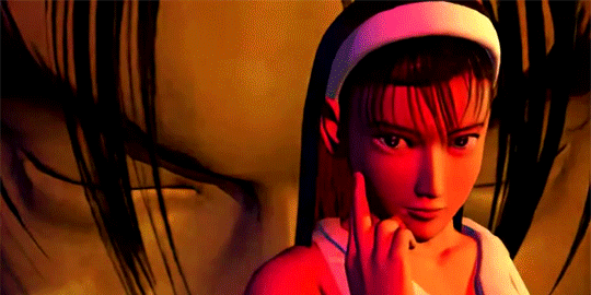
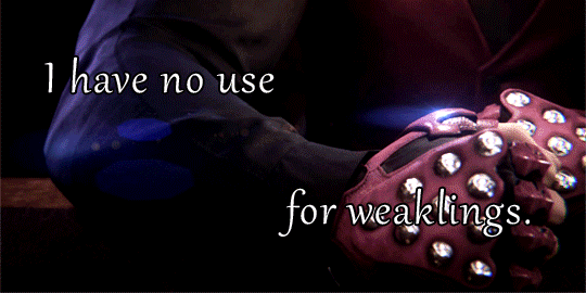
#jun kazama#kazuya mishima#kazuya x jun#kazujun#kazjun#tekken#tekkenedit#my edit#my stuff#wowie this took me AGES!#here is that thing I've been working on for our beloved mother nature and daddy electric#I wanted to do something encompassing the bits we see of their relationship throughout the games!#it's extremely clear to me they love each other intensely and have for the past 22 years so my aim was to evoke that sense of scope#guess you could call this my kazjun manifesto in a way haha#the quotes; layout; trying to balance everything visually took some planning!#hope youse like 💖💖#also thank u to divorce-enjoyer for the post caption text. i would have linked the post but tumblr yelled at me#bc all the coloured text html was too many characters already lol
71 notes
·
View notes
Text
EVALUATION
THE PLACE OF WORDS
~final book
What informed and motivated my design decisions?
Initially my research was very brief, I used our InDesign workshops and other lecture workshops to start building up an understanding of layout, typography and imagery. The first bit of proper research that influenced my designing and ideas for my book was when I looked at the books Why Fonts Matter and New Typographic Design. My initial designs form spreads focused heavily on layout and how my text would read as that was most important to me and it’s what I took most from my research. The idea of linking my double spreads with image or colour and type came from this initial research and I kept it in mind throughout my exploration as I finalised my pages, in my tutorials it was all about linking the two pages together as a spread and making a coherent design. I was still uncertain how to use colour at this point, but the idea of introducing one or two colours came to mind here and I soon picked up how to use colour in my book later in my research. I started thinking more about how my text would interact with my illustrations which helped me create the balance I think I achieved in my book of text and imagery where they aren’t fighting each other too much for attention.
The Baddeley Brothers book helped me with the style of incorporating colour and image together in my final book however, what most directed my book design was my Pinterest search as I looked also at colour pallets and the pink page was one of the first colours I decided on. After that it was relatively easy to come up with a range of colours that matched each other in tone and worked well together. Imagery-wise I knew I wanted to use illustration as it would work well with the subject matter of my text and I could produce more of it to a higher quality than I could with photography. I wanted to be able to manipulate it more to fit with my text and so illustration made sense to me. I am also I big fan of David Shrigley and wanted to see how I can test myself with illustration as it’s still pretty new to me. I didn’t want to do something too easy and so by experimenting in my sketchbook and looking at his work I could produce some successful imagery that adds to my book. David Shrigley uses predominantly just black on white for his drawings, which is what I wanted to do so colour would be more manageable to inject into my pages.
What changes and developments has my project gone through?
It took me a while to finalise my idea and I only really decided what my book was about when I was halfway through looking for my text. The text ended up inspiring me and its casual content pushed towards the idea of Technology going wrong or us just messing it up. I didn’t have a title at first, I was just going to use some words from in the book however at the end it made sense to call it ‘I though technology was meant to be easy’. My idea grew into itself as everything came together around it. My illustrations became more stylised I think, I can begin to see a style of my own coming through in my drawings, especially as I fiddled with them to make them coherent and part of a set as I wanted them.
The biggest developments and changes have been from my initial spreads to when I introduced colour. Initially it was all black and white and colour scared me but once I began to play around with it, I became more confident and you can see how I brought it into my text and my illustrations. This paid off as my book looks so much more successful because of it. The spread that developed the most was my auto correct spread. It was a quote I pulled about Yorkshire puddings before and the auto correct quote was going to go on the front cover. However, it soon made sense to use it in the book instead as it added a stepping stone to my text that helped it read as one set of text. I found more text to add context to the page; ‘Death to auto correct’, this pulled that entire spread together and it was easy to create illustrations to go with it. I had wanted to use that yellow in my book somewhere so the whole thing came together very well at the end and is now one of my favourite pages.
Did I manage my time well throughout the unit?
On a whole I could’ve worked better with my time management, I was slow to start which meant I felt like I was trying to catch up to myself for a large portion of this brief. I was better in the last 3 weeks or so as I set myself aims and properly planned hat I needed to get done, prioritising making the actual book over other stuff. Next unit though I need to keep more on top of things.
How did I respond to my feedback?
I find feedback extremely helpful and am always asking people what they think of my work. Not because I want them to like it per say but because I need to know its functioning the way intend, after looking at something for too long it becomes difficult to see what needs work and what not. Whenever I’ve had tutorials I make sure to note down all my feedback and take it on board as soon as I can, but also I need to agree with it as it’s my work.
What have I learnt from this unit of study?
The main thing I’ve taken from this unit skills wise has been book binding and using InDesign properly as I’d become a little rusty, I’ve finally understood pagination and I understand more of the ‘whys’ when it comes to designing spreads. I’m not just doing something because I’ve been told its how to do it, I can actually understand it for myself now. Otherwise I’ve learnt how and what to look for when it comes to unpicking at editing typography. Leading, spacing, margins and fonts are much more important to me now and I think I can work with them far better. I’ve also gained an insight into how imagery interacts with typography and feel more confident when working with them.
Are there any areas of my design process that need more practise?
I really struggled with InDesign as moving between apple and windows makes it difficult to adjust to the shortcuts and how everything works. I need to work on the programme more to get the hang of it so it’s easier in the future. Working quicker is also something I need to work on, throughout designing I can be quite indecisive when I need to get better t working through a problem and creative block. I think I have a good understanding of typography but I want to be more experimental in the future and play with hand rendered experiments more.
On reflection are there any improvements that I would make to my final outcome?
I would have done more experimental typography and perhaps some hand rendered as I enjoy that. But illustration was important as imagery was more needed to balance the text and create a more visual piece. It needed to be interesting to read and the illustration helps you pull out parts of the text I want you to, as well as make it more visually stimulating. If this was a bigger project and my book was maybe bigger, I would have looked into using different paper to get a different finish. Ideally the printing would have been better but that was down to print and it was out of my control. Next time I need to assess each stage fully, I did do this however, I think I could have done more and analysed it all further. Also, for this project I didn't go into much depth as I could have for research. I used plenty books to get inspiration from however I didn’t get a wide enough variety of work I feel that I would have liked to help me with my project.
I could’ve introduced the colours of the book here but I like how they bookend it. It’s a nice surprise as you open the book and the lack of colour gives this David Shrigley-esk quality to it I think, the back cover looks like the back of an IKEA instructions manual and I actually quite like this, its somehow funny to me, and that’s what I wanted with my book.Overall I have happy with my final outcome as its far the bet I've managed to understand spreads and editorial design, I’ve also been able to use InDesign better and bring in illustrations in a somewhat successful way.
0 notes
Text
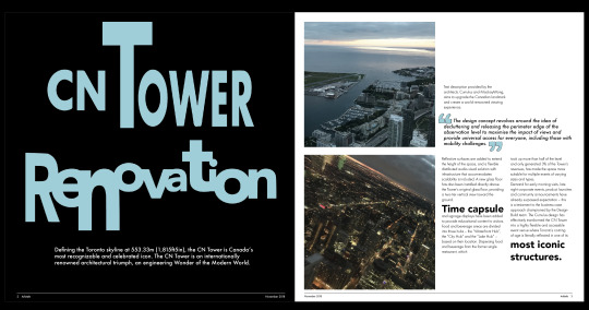
Arkitekt Magazine Task
This post will show the journey I faced when creating my magazine layout.
I started off with turning my scamps into a wireframe layout, similar to what the Lydna tutorial showed me how to create. I began inputting placement text and my own images down to get a feel for the layout. I repeated the process for my second double page spread.
Attempt 1

This image shows me inputting my article and refining the layout of my images.

What went well:
Aligned my text and images with my four column grid system.
The layout is simple and easy to understand
Improvements:
Emphasise a text hierarchy e.g. header, sub-header and body of text
Use white space more - too crowded
Experiment with a pull-out quote
Use my own images more
Overall, my improvement related to the level of text as it was too much and spaced too close together. By considering text hierarchy and white space it would make my article more approachable and easy to navigate through.
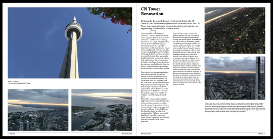
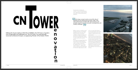
In addition, the main improvement I had was to include only my own images. The article I used relied on the agency’s design concept for the CN Tower. So I included it in my layout for my magazine but regardless of the design of it, the images would always make it look better. To solve this problem I intend to draw on top of my images my interpretation of the design agency’s design concept.
Attempt 2

I made this layout using my feedback as well as my visual inspiration. When making this layout I kept in mind that my monoprints would be the front cover. So I wanted to link the cover with my double page spreads. To do this I applied one of the textures I made to the title page of my article.
My monoprint cover.
It didn’t turn out as well as I thought it would. I tried laying it on top of images but it still didn’t look right. I felt the print took away from the layouts and the aim of the magazine. Arkitekt is supposed to be a high-end magazine that’s targeted to students and professionals in the architecture industry. However, my print made the magazine seem too artsy and unlike typical high-end magazines. Therefore I decided to approach the front cover with a black and white image, which is below.
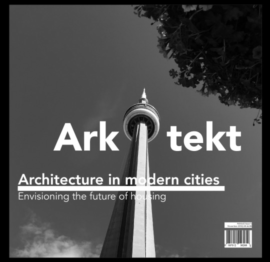
For this cover, I wanted to use the tower to symbolise the ‘i’ in Arkitekt. However, I feel it’s not that obvious to the viewer. I could have added the letter to the title or maybe add the dot (tittle) to the tower. Although I tried doing this and it didn’t have the same effect as the image above.
What went well:
The contrast of the texture helps to make the text and image stand out
The larger titles and the separation from the main body of text helps to make it visually more interesting - makes the viewer have to explore further and find the information.
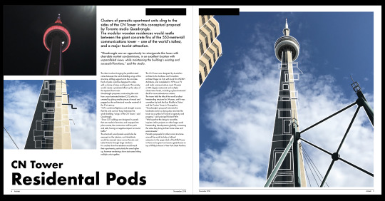
My images that represent the reimagined CN Tower - the simplicity of the pods and the lack of colour to them creates a contrast between the photo and the drawings - helps to emphasise them.
Placement of the two images on CN Tower Residential pods - creates the tower but in a mashed up way - visually interesting
Improvements:
Experiment with the front cover - work on the layout of the type and the subheading for the magazine
Try layouts without the texture - feels out of place without the monoprint as the cover
Try layout without the decorative lines - don’t add anything to my article or layout
Try layout without the column length image - out of place compared to the column of equally spaced images.
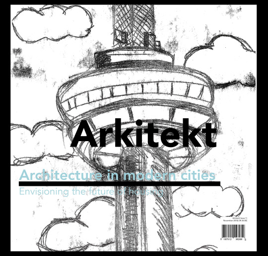
Attempt 3


When making this layout I mainly experimented with the size of my titles and the spacing of my articles. The front cover was inspired by Matt Willey’s Avaunt cover for issue 3.
What went well:
The front cover - the use of blue helps to create a strong contrast between the black and white image, which emphasises the information there.
The title for CN Tower Renovation - visually interesting.
Using only one image for the residential pods - looks cleaner and easy to navigate the article.
Improvements:
The placement of the third article on the front cover - the tower makes it harder to make out the article title
Ensure that the article titles are aligned with each other - should only have two lines for the name
Try to align the word renovation - the letter ‘n’ is out of place
Align the CN Tower with the introduction to the article
Put quotation marks on the second double page spread
Try the layout without the quotation marks - ruins the minimal look of my pages
Attempt 4

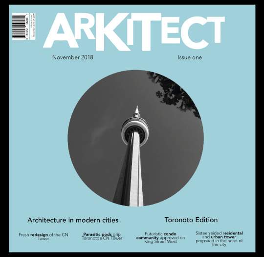
I wanted to experiment further with the front cover. So I tried cropping my image to the shape of a circle and positioning it to the centre of the page. This was inspired by Mark’s magazine front cover. (The image I used can be found on my inspiration post)
Originally I planned to only list the articles at the bottom however, the title area looked plain and out of place compared to the bottom. So I include some of the information found near the barcode at the top. After adding this my design feels more balanced.
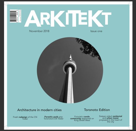
After making the last change I realised that I spelt the name wrong. However, changing the letter ‘c’ to ‘k’ meant remaking the whole thing. This is because I made the font in Illustrator. Below is a quick summary of how I made it
Firstly I typed out the correct spelling of the Arkitekt in Indesign using the font Avenir black. I then screenshot the word and brought into Illustrator. I used image trace to create a vector of my word. I then used the selection tool to enlarge the whole word. After I selected individual letters to create a bouncy look to the logo of the magazine.

The screenshot of the font before altering it
Below is my layout attempt 4

What went well:
The front cover turned out better then I thought. The blue background and the image creates a strong contrast that emphasises the design, helping to make the viewer immediately drawn to it.
The layout of the article listing. Everything equally spaced and feels clean/professional
The contrast between CN Tower Renovation and the black background - emphasises the title and the introduction into it
The layout of CN Tower Residental pod is visually interesting. The way it surrounds the image helps to make both works well together.
The larger words within the article help to show you the key points within the article
Quotation marks add a pop of colour to the design as well as links to the cover
Improvements:
Make the title line up with the article listing at the bottom
Ensure the article names stick to only two lines
Define November 2018 and Issue one - out of place compared to the article listing
Align the introduction with CN Tower Renovation
Try without the quotation marks - very minimal designs but they ruin it
The larger words aren’t needed - ruins the designs and adds nothing to the article
0 notes
Text
Evaluation
After researching into the 40 suggested books, I chose The Secret Garden as the focus point for my project, because I felt like it had a heart-warming narrative with a lot of potential for interesting garden visuals. I wanted to focus my story on the main character Mary because her personality changed as the story unfolded. She started off as being a lonely, spoilt and weak child who then grew stronger and realised how to make friends and enjoy life. I began my research by reading the book itself and writing down notes of ideas I came up with as I read the story. Then in my sketchbook I created mind maps to help me analyse the book. These contained quotes from the book, analysation of characters and events and imagery of the garden which then helped me to narrow down and choose a part of the book I wanted to focus on. I decided that I wanted to create a physical book for a younger audience of 7 – 9 year olds. Throughout my book there will be a theme of secrets, shown in both pop-up elements and in the visuals and the story focuses on the main character Mary and how she discovers The Secret Garden.
I started sketching some initial ideas to help me decide how I want to format my book. I researched and looked at creating sculptures, pop-up books, animated books, laser cutting and using textiles in books. I looked at the designers Barrie Tullet and Sam Winston who helped me to come up with ideas and how to layout the pages. I visited the Here and Now exhibition at the Mac which gave me inspiration for more ideas including using textiles in my work. I narrowed my ideas down to four ideas, the first was a circle book that spins to reveal the illustrations, the second was a pop-up book that uses coloured acetate to reveal secret messages, the third was a laser cut book made into an animation and the forth was a book that relied on shadows. I created mini tests of all these ideas and decided I liked the second idea the best because it allowed me to be the most creative and try a lot of skills I have not tried before such as book binding and illustrations. To help me decide on my illustration style, I created mood boards on the secret garden, children`s book designs and character design. I liked the idea of having a watercolour effect with calligraphy titles on each page. I chose my colour scheme when doing marbling for the Easter project, which consists of pastel colours, greens, blues and pinks and the use of floral patterns. Once I had planned how the style of the book would look, I created a storyboard of the scenes/events I wanted to feature in the book (shown on my blog). I started with nine events that I then narrowed down to seven.
I went to technical workshops such as Letterpress and Riso Printing to help me expand my knowledge on book making, although these were not used in my project. I began the production process by using water colour paints to illustrate each event for the pages in the book. I used the mood boards I made earlier for inspiration and to ensure I kept a similar style throughout the drawings. Reflecting on this, I found that my initial character drawings were not to a high enough standard so I researched into Charlie and Lola and redrew my characters which turned out to be much more suitable for a children’s book. Although this added more to my production time, it was a crucial step to ensure my book was a high quality. I also practiced doing calligraphy and I hand wrote all the titles for the page’s multiple times so that I could pick the ones that were the most fluid. I experimented using collage which worked out very well and created practise tests to work out how to create the pop-up element and how to use coloured acetate to reveal messages. After making a mock up and receiving advice from my tutor, I decided that I would not be using the coloured acetate because it did not match the delicate colour scheme I was using. The unique selling point of my book would be the fact that it is pop-up and is revealed from an envelope which reflects the letters that the characters send to each other in the original book. When the visuals were drawn, I scanned them into illustrator, sharpened the images and drew over them so that they still had a slightly more vector feel to them. I created a document to the size of 280mm width and 135mm length which fit two pages with a fold. I allowed a 15mm border and lined up my titles, body copy and visuals with guidelines. The body copy font is Futura because I feel that it is an easily read font which would be suitable for children and it also does not clash with the hand-written titles. To ensure my book looked professional I considered visual hierarchy and page layout, which is sometimes a task I struggle with, to ensure the page looks balanced. Once my pages were lined up I professionally printed them out on 200gsm card with a matt finish so that it was a high quality. I took my work to the printers however the colours did not come out as how they did in my tests, so due to timing I printed my model using my printer. If I had more time I would have experimented more with colouring and finishes of printing.
Once everything was printed, I cut the pieces to size with a guillotine and used a scalpel to precisely cut the pop-up elements. I also added collage to the pages where needed. Due to the pop-feature I had to layer the card back to back to hide the second layer of the pop-up. When the pages were done, I measured and drew five dots along the fold line of each page. I then used a needle to create a hole for the thread to go through and used the method of saddle stitch book binding. This worked very well as it was strong, but to ensure it stayed I also glued parts for extra strength. I tested different book binding methods and found out saddle stitch would be the most suitable for my book.
I think I was resourceful during this project because I attended workshops that helped me to stimulate ideas through the designing process. The Contextual lectures were very useful because they explained more about narrative and how stories should be told. A positive about my final design is that I really like the style of my book and how the colours work with the collaging. I also really like the pop-up element and the design of the envelope. If I could improve my final design I would use paper/card with a glossy finish as the matt looks slightly dull. I would also add more interactive elements to the book to add ore interest for children. Finally, I would get each page laser cut so that the measurements are precise, although I do like the handmade feel of my final book. If I had more time I would have professionally printed my book with the correct colours at the printers. However, by going to the printers I could look at paper thicknesses and finishes. They also recommended certain card and gave me advice. I was also resourceful when speaking to tutors and taking on advice and improvements. Overall I am very happy with my outcome and I think it suits my target market of 7-9 year olds.
0 notes
Last Seen Blogs
precambrianhottopic
PRION DISEASE
cloud-cloudyy
Cloud Cloudy
wantedtownbicycle2
Untitled

cabswalton
Untitled