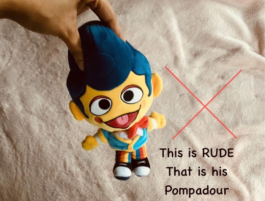
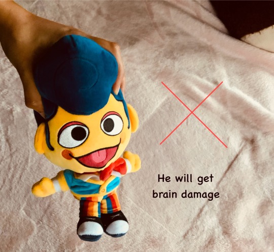
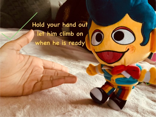
#these photos were edited for quality sake he is not actually that colour
Text


I had to.
#I had been planning this for months#I don’t know if anyone else has already done this with him irl#either way here you go#wally darling plush#wally darling#welcome home#welcome home arg#these photos were edited for quality sake he is not actually that colour#i love him
90 notes
·
View notes
Photo

Post-It Crit 12/10/17
Bring out the space provided with curves and shapes to help better project it to the viewer.
I already want to play around with cut outs further and perhaps 3D elements. The curves do need to be balanced with lines.
Looks like Vogue. Artist suggestion: David Lachepelle.
I looked into the kitsch pop surrealist photographer, while I do enjoy his work and the intense colours I do not feel a connection between my pieces and his.
Intent.
Intent means purpose/determined to do. I am not sure if this means intent is apparent in my work or that I need it.
Banners.
Banner printing is an option but depending on the image quality and my budget.
Depth of field, layering, texture stand out to me. Very close attention to form (bold).Contrast! Love this work! Don’t know what to suggest to keep relentlessly producing and analysing themes. Daily collages of interesting images. Each piece of work has a real personality.
I like the idea of creating a daily collage although the time consuming process could hold me back and I do not want to rush any pieces.
Paint or collage on glass and put the made image behind it to create a higher contrast. Maybe use found objects in the shape of the image to create a 3D effect.
Have a go at painting one of your digital compositions.
Reminds me of strange abstract sci-fi? I like these images as they are maybe photcollage. BIGGER. Try using paint with images.
A few people suggested using paint but after lots of experimentation in 2nd year I realised that I do not get on with paint well. I find painting takes energy away from me whereas other mediums give me energy. I understand the quirky sci-fi feel, I am happy for my work to project this.
Posters would look good, big and bold, even more colour.
I intended to go bigger anyway but depending on the quality of the images. I do not wish to sacrifice how good a collage looks for the sake of size.
Make a film. Use sound to express.
I have experience with film and editing especially stop-motion animation but the process can be very time consuming. I am unsure what kind of sound would work alongside the art however.
Sequence comes to mind and snapshot. Maybe use mixed media to remake some of them-texture! I would consider going bigger.
I am unsure how texture would fit into the hard edged mass media aesthetic.
Propaganda, use mixed media and go big! Fashion posters.
Propaganda is a word often suggested for my work, probably because of the underlying cause. I already plan on mixed media. (Magazines, holographic paper, Polaroids etc.) I looked into fashion posters, they are very bold with their shapes and colours. They are certainly not soft which I really like.
Look at Hannah Hoch.
I researched the artist who is associated with dada photomontage. She focuses on women and dismantling the patriarchy. Her work has a real vintage feel but they are so effective in their subject matter. I like the artists ideals and clever use of images.
Look at Joseph Cornell.
I like the way Cornell cleverly frames the collages and incorporates found objects. However, I do not relate his work to my own.
Look at Kurt Schwitters.
He is an artist working in graphic design, typography and installation relating to dadaism, constructivism and surrealism. The artist once again has a vintage feel because of the nature and colour of the collage pieces and found objects.
More Polaroids to create a collage with a bigger scale.
Grid work, jigsaw puzzle. Redesigning. Deconstructing to reconstruct. Colour is effective. Perhaps work outside the frame, expand. Love the cats.
Mix shapes up, treat it like a puzzle to create new compositions.
Words you could use: snapshot, advert, puzzle, grid. Polaroids over collage works really well! Use grid, blinds more to block out parts of image. Use more curves with straight lines.
I intend to keep adding Polaroids but more balanced with curves. Cats are always a constant in my work and help me communicate about women and society. I also read from my work associations to puzzle.
Love how you have put your work behind blinds - maybe create your own different shaped viewfinders to layer over your pieces.
Love your collage technique and the continuous motif of the horizontal lines. They look like blinds over a window! Perhaps try working on a larger scale and try putting your collaged images behind the ‘blinds’ or research more into artists that display their work cut up into sections.
I want to continue the layering in places like behind blinds. Adding to a location, photographing and using the photo so that the original is once again removed from the situation. I really like how some people were unaware that I actually used blinds and thought I just made it look that way. The visual deception is exciting.
0 notes