#this was sitting in my drafts bc it was an alternate coloring
Photo
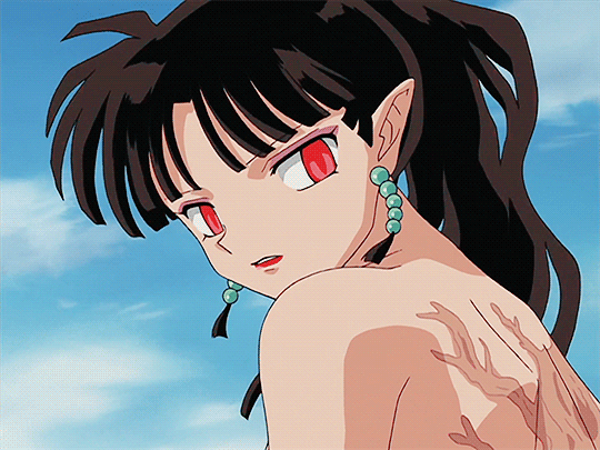
#inuyasha#kagura#kagura of the wind#kagura inuyasha#inuyasha kagura#dailyanime#animangaladies#anisource#anime gif#anime#2000s#this was sitting in my drafts bc it was an alternate coloring#& im not making any iy content any time soon so here u go#<3#luv u#mygifs#*#ep166
153 notes
·
View notes
Text
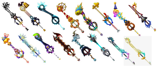
my completely biased and official rating of every keyblade ever:
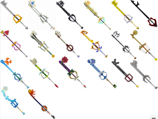
Kingdom Key: absolute classic. excellent design for the like, mascot keyblade. very simple, vaguely key shaped. i hate the mouse head though it's so stupid and makes no sense. and i hate mickey. 9/10 minus a point for the weird mickey keychain
Oathkeeper: wonderful. amazing. never boring. excellent design love the heart and wings and all the significance. and that the keychain is kairi's charm? terrific. 10/10
Oblivion: brilliant. awesome. phenomenal. again excellent design the wings and chains and purple crystal are absolutely perfect. love the crown keychain. 10/10
Ultima Weapon 1: literally just a sword with some filigree on it. nice. too much yellow and i don't like the weird cyan gradient on the guard. 7/10
Kingdom Key D: d for disgusting. i don't have any other comments i just hate it. 2/10
Keyblade of Hearts: yeah that sure is an anti-keyblade. love the simplicity and the heart in the negative space of the teeth. and that it doesn't have a keychain, that fueled a lot of theories for 12yo me 8/10
Lady Luck: i think i don't like this one bc to get it u need to use a white trinity but you can't do that until near the end and i have way cooler blades to use. the design is pretty ok, don't really get the card keychain tho. 5/10
Olympia: oh the sight of this one makes me irritated because the kh1 strategy guide uses this in one of the pictures for the fight against possessed riku. it did not help me win. and i hate short keyblades. love the clouds and columns though 7/10
Jungle King: kinda ugly but i appreciate that it looks kinda handmade. also like the butterfly keychain bc it doesn't look like it fits but it Does. also the first good alternate blade u get in the game so. 8/10
Three Wishes: not bad but it doesn't stick out to me either. also doesn't scream agrabah to me but also it does? 6/10
Pumpkinhead: NICE. very long and very cool. the teeth looks like bat wings and a pumpkin so very epic. 9/10
Wishing Star: so pointless i already have pumpkinhead. also short. cute design though i like the gears. 5/10
Crab Claw: i never used this one because it stuck out so ugly in Halloween Town </3 i love blue and crabs though so 8/10
Fairy Harp: I HATE YOU DIE. short and stupid. does NOT remind me of neverland at all. 1/10
Divine Rose: pretty nice but short and lategame. always thought its existence was kinda weird?? like thanks belle but why. i have oblivion. 7/10
Spellbinder: for some reason i really don't like it. i like blue and the circles are neat. the handle looks really painful though. 4/10
Metal Chocobo: kinda ugly lol. love the holes and chocobo keychain. 8/10
Lionheart: oh i am so biased by recoded. absolutely excellent keyblade. design's kind of weird tho where are those lions going. 9/10
Diamond Dust: so i was really confused because i thought this was khux-only or maybe bbs keyblade but apparently it's kh1 final mix only. you know what i got as a reward for fighting the ice titan? sephiroth. you know what i got for fighting sephiroth? NOTHING. it was my favorite khux blade though so grrrr 7/10
One-Winged Angel: grr bark bark final mix again fuck you. kinda weird design though like what is the teeth? a meteor? should've been a wing. nice guard though there's not enough hand room. excellent keychain obviously. 8/10
Ultima Weapon 2: very similar to the first but blue and symmetrical. very good learn from your mistakes. 9/10
Way to Dawn: YEAAAHHHHHHH BOY HERE IT IS PERFECT EXCELLENT GREAT DESIGN WONDERFUL LORE. HAS WINGS. THE EVOLUTION FROM SOUL EATER. THE LACK OF THORNS ON THE HEART. 10/10
Destiny's Embrace: very cute!! my favorite part is the name. i wish it wasn't so like. stereotypically girly though. like you look at the destiny trio's keyblades and can immediately pick out which one is The Girl's. 9/10
Star Seeker: i wanna hate it because it's mickey's/yen sid's but honestly it's so nice. the stars and moons and comets and gradients and colors... wonderful 9/10
Rumbling Rose: oof. weird and ugly and gross. keychain looks like a ladybug from far away. 3/10
Hero's Crest: bring the clouds back. i don't really get the design but i like columns. 5/10
Monochrome: super cute!! i don't like Timeless River but this fits it so well and has cute hit effect. 8/10
Mysterious Abyss: i always get this one way late in the game so it's always pretty pointless oops lol. also the design doesn't really say atlantica?? 3/10
Follow the Wind: another weird miss but i like this one more. nice wheel shaped guard, and that the keychain is a cursed coin. 6/10
Wishing Lamp: now THIS is the agrabah keyblade. very nice and elegant. looks like the palace! 7/10
Decisive Pumpkin: THIS ONE 😭😭 it's so ugly but it's so strong so i have to use it but it's so ugly. it does look like jack's idea of christmas so points i guess 😭 4/10
Circle of Life: also pretty ugly. and short. sorry simba. 3/10
Sweet Memories: shrek voice it doesn't even have attack. i don't like winnie the pooh so that's definitely influencing me. makes cute noises iirc and looks pretty cute. 4/10
Photon Debugger: this one should look pretty cool but my brain is saying it's bad. i think the giant red ball by the teeth are throwing me off. love the neon blue tho 5/10
Gull Wing: why the weird space in the name. anyway. i really want to love this keyblade bc i love X2 but it's really bad. i'm so sorry YRP kh did you so wrong. excellent keychain choice though. 2/10
Guardian's Soul: MUCH better thank you. auron my beloved <3 the lines are very appealing and i like how simple it appears. also looks like auron's swords. 8/10
Sleeping Lion: wayyy better than lionheart. looks kinda like a gunblade! again though what are those lions doing. 8/10
Fenrir: my car key got in a fight. 1/10
Bond of Flame: looks like a bad first draft of axel's keyblade. either the teeth or the guard should look like a chakram, pick one. love it though. 7/10
Two Become One: MY BELOVED <3 excellent design, so so so roxas i think he should use it. very excellent i love the little twist at the top. checkered handle is a little weird. 10/10
Fatal Crest: lol i was so mad when i first saw this because it looked like one of my oc's keyblades. i like it now though, it's a dragon!! pretty neat bro 8/10
Winner's Proof: oh this one is so cute. if it wasn't a reward it would be really weird and bad. surprisingly elegant! and there's even 13 mushrooms on it! 9/10
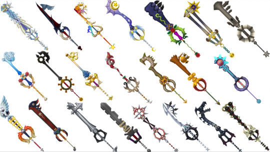
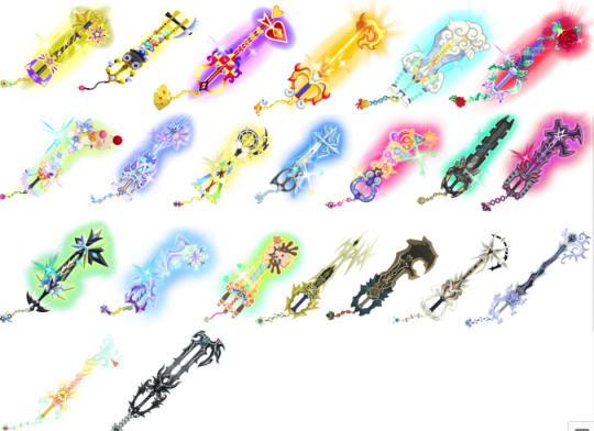
(shoutout to portadorx on deviantart for the 358 keyblade refs)
Missing Ache: YOU. interesting design, though it says roxas more than ventus to me. great first alt keyblade. 7/10
Ominous Blight: very edgy names in this game <3 looks like guardian's soul, which is interesting. i don't like yellow but it works bc blight 6/10
Abaddon Plasma: what a cool fucking name. so many yellow keyblades. but very cool looking i love roxas' aesthetic 8/10
Pain of Solitude: this is just pink missing ache. 8/10
Sign of Innocence: SO COOL. idk what's going on in most of these blades but i love it. 9/10
Crown of Guilt: come on. it doesn't look like a crown. big disappointment. very cool though 6/10
Abyssal Tide: so cool!! i love blue and fighting in midair <3 the teeth kinda looks like waves 8/10
Leviathan: weirdly furry looking. very cool guard 6/10
True Light's Flight: looks like two become one if it was only one. the top kinda looks like the nobody sigil 9/10
Rejection of Fate: SPEAR. epic name too, but i think it should swap names with true light's flight. very cool but i don't remember seeing it in name. kinda awkward bc it looks like it should be a spear 7/10
Midnight Roar: sooo cool. the orange handle pops without looking wrong... nice. also the teeth kinda look like a bat. 9/10
Glimpse of Darkness: ugly. weirdly bulky and hollow. short. 3/10
Total Eclipse: weirdly bumpy sword. i like how the orange looks like it glows. 5/10
Silent Dirge: GoD but purple. 2/10
Lunar Eclipse: TE but purple. 4/10
Darker than Dark: Hello 😳TLF but purple 10/10
Astral Blast: Abyssal Tide but yellow. interesting choice, but kinda clashes with the blue accents 7/10
Maverick Flare: Ominous Blight but red... excellent. very nice. 8/10
Twilight Blaze: Abaddon Plasma but red... also excellent. very epic. 9/10
Omega Weapon: props for not looking like any of the ultima weapons. very interesting and spiky but i kinda don't like it. 6/10
Aubade: kinda weird. "draws forth its wielder's personality"... ok. looks light elemented. 7/10
Wooden Stick: lol 10/10
Umbrella: not what i would've chosen but lol 10/10
Zero/One: WONDERFUL, EXCELLENT, AMAZING. i can't really explain why i love this one so much it's just very good. 10/10

Earthshaker: very solid design. not much to say it's just nice. love the colored guard. 7/10
Ends of the Earth: love that it is so clearly an earthshake upgrade. makes u realize how incomplete the first one is. 9/10
Dreadgnaw: kinda silly looking lol those are teeth. love the red bit in the center. looks very similar to earthshaker in a good way. 8/10
Chaos Ripper: looks like EotE but in a bad way. i don't like the weird teeth. it's also almost impractically long but i'm here for that. ALSO THE EYE. NICE. 7/10
Rainfell: oooo i love this it's so simple but so nice. very elegant 9/10
Stormfall: less nice. looks like a rainfell upgrade though. also kinda looks like master's defender which makes sense but i don't like it. 6/10
Brightcrest: GORGEOUS. PERFECT AND WONDERFUL. SO PRETTY. i wish it was kairi's. kinda looks to ornamental for aqua? but good for her. 10/10
Wayward Wind: none of ventus' blades look very ventusy to me. this one looks like an extra training one they had sitting around. cool shape though 5/10
Frolic Flame: NICE. looks like lea's frisbees! i like fire and fire designs so but it's a little awkward looking 8/10
Lost Memory: ok so first off WINGS. EXCELLENT. love that the only color is the heart. very cool and epic but i don't understand why it doesn't have a reverse grip handle. or the pointy bit at the tip. but still 10/10
Void Gear: hiii vanitas :) so anyway in my totally unbiased opinion this is the best keyblade ever obviously. love the gears and red accents and it's just super cool. the eyes and chains... vanitas character development keyblade when <3 10/10
Void Gear (White?): still very cool, love the simple contrast going on. 10/10
No Name: i didn't know this one was also called no name which is kinda lame. but i love the keyblade it's very cool. super glowy and i love the time design. 9/10
Crown Unlimit: I almost really like this one. very neat design, love the crowns and twists and glow. 7/10
Master's Defender: literally so plain and boring. i don't care if that's the point give it some frills. nice design though :/ 7/10
Broken Xblade: love the broken bits and the weird rust color. wish one of the kingdom keys was more broken and i think the top bit should be broken too. 7/10
Wooden Keyblade: sobbing and crying and tears. this is literally so cute and good and i love that it looks like Ends of the earth. or the kingdom key i guess. 10/10
Treasure Trove: i never expect to like this one but it's actually pretty nice :) wish the gems looked like they were spilling from the top and not leaking from the bottom. 8/10
Stroke of Midnight: also surprisingly nice! the guard kinda looks like a pumpkin which is cute. just a very cute design. 8/10
Fairy Stars: rad as hell. absolutely love this design very appealing. like how point the stars are. 9/10
Victory Line: i hate this one. maybe bc i don't like the world. kinda ugly and the teeth look awkward. 3/10
Mark of a Hero: ok we brought the clouds back but the weirdly buff trophy arm fucks this up. the blade is also just kind of a column, nothing going on there. 4/10
Hyperdrive: super cute!! love how the blade looks like laser fire and engine streams. the teeth are weird again though, and the handle looks like a bee 8/10
Pixie Petal: SO much better than fairy harp. this one is very cute and these teeth actually fit with the rest of the design. kinda short though >:/ 7/10
Sweetstack: oh this is so cute. a bunch of ice cream scoops!! why are the teeth oranges and what are some of those flavors. why are cones on the guard soft serve. 8/10
Ultima Weapon bbs: NICE. A SWORD WITH SOME FILIGREE BUT ALL IN BLUE. LOVE the wayfinders on it, very good for them. wish it wasn't just blue since it seems so aqua-centric but it looks nice soo 10/10
Skull Noise: LITERALLY SO PERFECT. THAT'S SO TWEWY. INCREDIBLE. the headphones and mr mew keychain... wonderful. only thing is that the name is kinda weird. like it makes sense but sounds weird. 10/10
Guardian Bell: i like it more than i think i would. elegant looking, and i love the gargoyles on it. hate the sentient gargoyles tho. 8/10
Dual Disk: VERY cool! looks like it has a reverse grip. the teeth are really cool and i love the bright blue. 9/10
Ferris Gear: eh. pretty cute but i think my pinocchio bias is acting up. the gears are nice, reminds me of wishing star. 5/10
Knockout Punch: SO COOL. really love the spikiness and colors and that the guard looks like the monkey. unfortunately for it, i don't like monkey. 8/10
All for One: the design's nice and it matches the world... but eh. 5/10
Counterpoint: so fun!! the violin guard is great, and the blade looks so cool. the teeth are a little awkward looking, it goes up too much. 9/10
Divewing: RAD!. just a sword with a heart on it and i love it. just so fucking cool. and the guard looks like a wing so 10/10
Sweet Dreams: so cute :) in love with the meow wow on top, but the teeth go up too much again. and i think there should be some komory wings on it. 7/10
Ultima Weapon DDD: NICE. almost identical to the kh1 blade, but blue and BETTER. the wings above the guard and the crown coming out of dream eater sigil... brilliant. 10/10
Unbound: not a hit 💔 just kinda weird and unfinished looking? and the lime green bit is off-putting. the hear at the top is nice. 2/10
End of Pain: ok mood shift hello. looks like it should be one of terra's evil blades. at first i was thrown off but looking closer it's so cool. the wings and eye at the top... the horns above the guard... the butterfly and gazing eye (buttereye) keychain... magnificent. the blade reminds me of x2 dark knight paine's sword. 10/10
Ocean Rage: looks pretty cool at first but the monstro mouth guard is literally horrifying i don't want to look at it anymore 1/10
YMX's keyblade: apparently has no name and is different than the one in bbs. nothing new really to say since it looks pretty similar but the goat head on top is super interesting. how much did No Name (luxu) influence young xehanort... 9/10
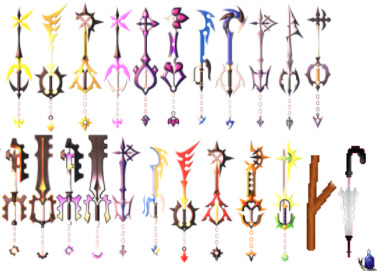
Mirage Split: absolutely perfect. i can't think of anything that isn't positive to say. the stained glass, the heart by the teeth, the thin lines, the gradient, wings, pointy, the keychain, literally all perfect. 10/10
Nightmare's End: also utterly perfect. i don't like yellow but it works here and looks great. the cyan gradient is startling but matches MS so i love it. all the colors in the stained glass are wonderful. 10/10
Starlight+: a little guady. but i love how the stars look like comets. the twisted blade looks neat too, but what's the point of the pointy bit on top. 7/10
Treasure Trove+: love that it looks golden and gem encrusted. very rich looking, but the cart is still leaking gems. 8/10
Lady Luck+: NOW the card thing makes more sense, i love how its incorporated throughout the design. more more interesting than the original. 9/10
Three Wishes+: looks like fire?? which is way cooler but why??? i like it more but where's the agrabah. 8/10
Olympia+: CLOUDS. like that zeus is in the clouds, but they took my columns. and the cyan handles are really weird. 7/10
Divine Rose+: excellent. what it should've been all along. the iridescenty guard is suuuper pretty and all the leaves and vines are great. 10/10
Moogle o' Glory: a lot happening here but i love smacking shit with a moogle head. there's so much happening and i don't really get it. 7/10
Fairy Stars+: i didn't know it could get better, the teeth is super cool looking but i wish the twisty blade was more visible. 9/10
Sleeping Lion+: love that it turns that metallic light blue color, very pretty. and the handle looks more like the gunblade! very nice looking and i used it a lot but the top is very weird. 9/10
Counterpoint+: let's take all the fun and exciting bits from the original and crANK IT UP TO ELEVEN. wait. stop. go back it's too much. very pretty still i love colors. 8/10
Fenrir+: my car key recovered from that fight. looks wayyy cooler and looks like ff7. hate the cyan glow though it feels weird. 6/10
Darkgnaw+: took me forever to find an image bc i keep calling it dreadgnaw. much cooler than the original, it looks like it's gonna bite you. the purple is also very nice. 9/10
Missing Ache+: POINTY. super cool but how does ventus twirl it around without poking himself. the colors are fun and it looks rad. 10/10
Diamond Dust+: i used this one the most <3 very pretty i love shades of blue and purple :) looks kinda icy but the top is weirdly flat. 9/10
Bad Guy Breaker: there's so much happening calm down 😭kinda nice but there's a lot to look at. also this world irritated me. 4/10
Gula's Keyblade: #leopardus4ever. as you can see, this keyblade is perfection. fun and spiky and lightningy. i think the whole blade should be lightning tho. 10/10
Aced's Keyblade: do any of these have names. anyway what a dreadgnaw ripoff 🙄 it suits him but guess what. i don't like him. 5/10
Ira's Keyblade: i don't like ira either but his blade is fucking great. love the teeth so much, and the colors. very pretty and cool 8/10
Invi's Keyblade: absolutely gorgeous. i love the flowing lines and little vines. love the colors and also it's super long. 9/10
Ava's Keyblade: girl this hurts to look at on a white background. very pretty though, i love how wispy and cloud-like it is. looks delicate which is great considering she'll kick anyone's ass. 8/10
No Name: unfortunately, this is absolutely wicked. look at it. it's wonderful. the goat head looks so much cooler than the other animal heads somehow, and i love the hollow center of the blade. and the teeth look like a claw, a little. just so fucking cool but i hate everyone who uses this. 10/10
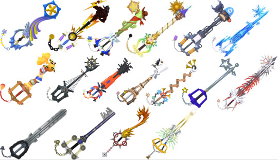
Shooting Star: super pretty, i love how this one flows. i wish the blade went down to wrap around the guard though, instead of cutting off. 8/10
Hero's Origin: they took away my clouds again. i like that half of it is just. zeus. the lightning bolts are cool, but the handle and guard don't really match. 6/10
Favorite Deputy: you are not my favorite deputy fuck you. i don't like toy story but i do like cactuses. 3/10
Ever After: this one's nice :) the guard is super pretty, but i wish there was more going on with the blade. 7/10
Happy Gear: this one's kinda ugly but i like it soo. the energy canister guard is cute. 7/10
Crystal Snow: i hate it so much. it's boring and the keychain is olaf and i don't like frozen. 1/10
Hunny Spout: pretty cute :) the honey jars remind me of sweetstack. i like the wooden handle. 7/10
Wheel of Fate: cool as hell that's my boat. love that the blade looks like a mast that's so cool. wish it wasn't so gray though. 8/10
Nano Gear: ah, here's the color. i like everything except how the nanobots look at the top. it's just kinda gross. 7/10
Grand Chef: oh this is so cute. but why is remy the teeth. poor rat :( but it looks very nice i like how the Tower goes into the guard 8/10
Classic Tone: fuckyoufuckyoufuc. i hate this one. pretty ugly and i don't like it. 2/10
Starlight: SO GOOD. very simple but i like that. looks mysteriously similar to the kingdom key? i love it but it needs a little more going on. 9/10
Ultima Weapon 3: LOOK AT IT. ABSOLUTELY INCREDIBLE THEY CAN'T MAKE A BETTER ULTIMA WEAPON. the silver and red look so good and it's spiky and cool. and the red is glittery!!! why? i don't care it's phenomenal. the spiky heart teeth. that it looks like it's moving. i wish i could break my rating scale. 10/10
Braveheart: riku kingdomhearts stole my fucking car key. we've all heard the complaints i'm not repeating them 1/10
Star Cluster: it's really nice >:( mickey switch with riku pleaase. the star theme is really cute and the colors are nice but why does it look so similar to the kingdom key. 8/10
Flame Liberator: i don't like the name but ok i guess. the keyblade is so fucking cool though. it's what bond of flame wanted to be. i love fire and it looks like it moves so hell yeah. 9/10
Xblade: still can't decide if i like this or not. How do you hold it comfortably. Love the glistening spiky bits. 8/10
#that's all of them holy shit#you are required to read this#might make another list with all of them in order if i feel insane enough#kingdom hearts#pere's bullshit#kh#keyblades
38 notes
·
View notes
Text
#ShowYourProcess
From planning to posting, share your process for making creative content!
To continue supporting content makers, this tag game is meant to show the entire process of making creative content: this can be for any creation.
RULES — When your work is tagged, show the process of its creation from planning to posting, then tag 5 people with a specific link to one of their creative works you’d like to see the process of. Use the tag #showyourprocess so we can find yours!
Kiera @claudiablack tagged me for this post! <3<3<3<3
1. Planning
Picking shots is maybe my favorite part of giffing! With this kind of episode-specific set, I'll take it as an excuse to watch the episode first, and take note of shots I think are particularly striking. I like to alternate shots that are more portrait-like with those that are showing landscapes/objects/etc. I also like to focus on wwx, jyl, and jc when I can.
2. Creating
The most obvious part of this set that I like to do is put the white border around them, I like the feel that it creates, like it's more of a snapshot. Once I have the gif finished I'll change the canvas size to make it slightly bigger (symmetrically) and then add a white square on the bottom. <3
From a coloring perspective what makes these different is I try to tie them together by having them all have the same color layer on top (soft light at usually around 1/3 - 1/2 opacity). For this set the color was the one below, but it'll change for each (the first set in this series had a pale green on each).

[id: solid stripe a very light peach color, hex code #fee5d8. /end id]
Here's what the shot looks like before and after coloring:

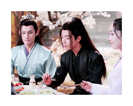
[id: two gifs of the same shot in the 11th episode, where Jiang Cheng, Wei Wuxian, and Jiang Yanli are sitting at a table eating together before looking up with caution as their mother is heard speaking. The second gif has notably darker dark colors and also has a tinge of the peach color noted before. /end id]
3. Posting
For this one specifically, I remember really liking it and posting it immediately. But I've got another one of these in my drafts right at this very moment (that's been sitting there for about a week) because I haven't quite figured out a fifth shot that pairs well with the other four.
Usually I end up making more than five gifs and slimming it down to five based on what turns out well, which is a process that usually happens over several days. I'll just come back to it when I feel like it, or as a reward for finishing some homework or something. <3
--
okay I'm going to pick out some really specific things I admire! apologies if I double tag anyone, and feel free to ignore!
@mieczyslaf and this one <3 bc I particularly like the colors here!!
@qinghe-s and really ANY of your tragicomic ghost gifs but particularly this one if you want!!
@runqings and this set or really any from this series because they always look so so so so nice
@smapis and this piece of art!! scorpion sunday babey!!!
@surii and this post which changed my life
@gusucloud and this set which is SO pretty
@milkcrates and this piece of art good GOD
OKAY i know that's more than five and i'm getting carried away but please @vvuji give us insight into your mb process like I'm specifically thinking of this one but like. they're all so good
#showyourprocess#cql#lexi speaks#my gifs#usually when tagging i'm like. let's not bother anyone#but today i was like actually you know what let's bother some people
10 notes
·
View notes
Text
↬ what scene will you be?
date: early 2017 / january 2020 / august 2020.
location: some random apartment / ash’s home studio.
word count: 1,875 words, not including lyrics.
summary: n/a.
triggers: passing mention of alcohol.
notes: creative claims verification. mentions of youngjoo 🥴 but in the least angsty context yet! some parts in the middle are repurposed from a defunct verification.
early 2017.
the concept of the song first comes to him early in his relationship with youngjoo. there’s something about the beginning of a new relationship that never fails to bring out inspiration for a flood of love songs from the depths of ash’s mind, and youngjoo is the perfect muse for his poetry in the midst of the fluttery, dreamy feeling of their honeymoon phase.
they’re watching a film, a surprise date night planned out by ash that had involved talking a senior friend into letting him have his apartment for a few hours that evening (which, he’d like to note, had been incredibly hard to do when he couldn’t explain why he needed it). he’d set up a projector in the living room and a film he knew she liked and he’d gotten an expert opinion on a good wine pairing for the dinner he’d made.
it’s strange, dating youngjoo, but it has nothing to do with discomfort in his feelings for her. she’s youngjoo. smart, successful, talented, kind, interesting in a way that keeps him captivated from the moment she walks into a room, and gorgeous in a way ash hadn’t been able to ignore even when friendship had been all there was between them. he could listen to her talk for hours about anything in the world, and he wishes he had the time to do just that. she’s every color in the world and ones that haven’t been discovered yet, and he watches her more than he watches the movie.
every time a slight smile curves on her lips, his heart beats faster and he swears goosebumps raise little peaks on his skin.
the greatest film on earth couldn’t possibly compare to an evening spent in youngjoo’s presence. given the chance to own all of the greatest art in history, he’d reject it if he could spend evening upon evening with youngjoo by his side instead.
he loves her.
he hasn’t told her yet. it feels too early, but he knows he does. there’s no other way to describe the elation that fills him at the mere thought of seeing her or the fact that she’s his last thought every night before he tries to sleep.
he writes the chorus in his mind as he sneaks glances at her, and he puts it down onto paper that night after returning to knight’s dorm, a rare smile on his face and the feeling of their kiss goodbye lingering on his lips.
january 2020.
the song had been abandoned in ash’s files after he’d broken up with youngjoo, deemed unlikely to ever be dug out again.
he finds it again on an old hard drive he digs out from a box he still hasn’t unpacked after coming home from another meeting with bc about the singles he’d be releasing throughout the year.
these kinds of meetings with this frequency had only become common in the lead up to fatalism. he hadn’t had so many meetings for daydream, he’s sure, but then again, he’d put a halt to all of those when he’d injured his ankle that year. he can’t quite remember the frequency of meetings for i’m young, but that had been his first album and his first chance to prove himself. by now, bc and the other producers should have more faith in him than they seem to.
they’d talked again about image. sexy had been their plan for fatalism, but it hadn’t been the success they’d wanted and ash is known for his heartbreak ballads after the success of “untitled, 2014”, not to mention “d (half moon)” outcharting anything that could be considered sexy on his last album. it’d be terrible business practice to abandon that entirely for a new image that ash had been pulled into simply because sexy performance soloist is currently a less competitive market than acoustic love song ballad singer-songwriter. there are so many of those, but the performance soloist category is more dominated by female soloists these days, so by growing his image, they could assure ash is able to become a household name instead of just another disposable singer, they’d said. the company wants to bring in the kind of brand ambassador money that comes with standing out instead of blending in. with the way he works day and night at events that drain him of every last ounce of social energy to please brands, ash would think they’d be happy with his current status, but it’s a mistake to think a company can ever be satisfied in their greed. ash doesn’t want to care, but he can’t help but feel a little prideful that they’d apparently been wrong... if he ignores the success “troublemaker” and “now” had had last year.
it’s been a couple of months now since ash had had to fight for his own input for the album concept. some of the tension in the reins has been slackened in response to romanticism not being the smash hit they’d wanted. ash is still struggling to pull himself out of the mindset he’d had to live in for fatalism, though, and it’s rare something entirely fresh comes to him.
this isn’t fresh either, technically. it’s nearly three years old and based on feelings long past, but as he listens to the track, he’s struck with the feeling he’d been onto something and he saves it to the computer in his studio to come back to before checking that his schedule is clear for some time, so he can and hole himself up in his studio with some hope of being able to work uninterrupted.
this isn’t going to be the song he’s supposed to be working on. maybe it could work for his spring single, but that seems far-off now.
he sets to work and the song soon expands its references to a lover as a film he can’t take his eyes off of. he hadn’t latched on to the initial metaphor too deeply when he’d first heard it since the memory that had inspired it is so far in the past now, but the feelings that start to crawl their way out of him so naturally keep the idea from going entirely neglected. more than the lyrics, he focuses on what to do with the instrumental. the original draft had been simple in melody, acoustic and sweet, like a lot of his music had been when he’d only been in the beginnings of creating anything good enough to win bc’s approval. (it’s bitterly funny how that’s a battle he’s still fighting in spite of his style changing so much since then.) now, a more refined composer and producer, ash switches up the style entirely to something more unconventional and syncopated and in a style he’s wanted to try but has never gotten the chance to up until now.
it’s upbeat enough to be make bc happy with the possibility of a more choreographed stage (though, in ash’s opinion, it’d be a good song to stand and sing on stage with only a microphone stand and background projections), but in a way that’s not shoe-horned in for the sake of achieving what anyone else wants. he’s written so much heavy music lately, weighed down by angst or lust or anger or resentment, but this is pure. not pure in the way he would have thought to make it three years ago, but it’s love re-invented, taken from a confessional letter to a musical story of a man he doesn’t entirely identify with anymore.
it’s a project he spreads out over a few weeks, coming back to it whenever he wants to play around with something exciting instead of nailing himself down to another song that’s too much like something he’s made or heard before. as more work comes in with deadlines, at some point in the working process, he abandons it. be it fun to work on or not, he’s a seasoned professional now and it’s more critical to meet deadlines than finish some conceptual track that probably won’t even be used.
august 2020.
months later, ash is more focused on the creation of his next album than anything else. it’s been pushed back once already and every time he tries to make something new, it comes out the same: an alternative r&b track and heartbreak or longing. he’s getting nowhere, so, one day in his studio, he re-opens that “concept track” he’d left to the dust and spiderwebs months earlier. he already knows precisely what he needs from it.
he has a vision for the full song now. it should be the sound of a relationship that’s still passionate and hesitant like early love so often is. a movie that draws in the eye and the ear and the mind from the very beginning, but as it progresses, it turns inward.
if a lover feels like every great film every written, how long can it last before you’re left questioning how that’s something you deserve? if a lover is every color in the world, how do you ever know what their true colors toward you are?
when he’d first begun writing the lyrics, it’d been so hopeful, but he knows now where that hope had led him.
the song isn’t meant to be dark, so he keeps the wonderous tone, letting the worry set in only as the song leads itself out.
what scene will you be?
some day, will our story be told by others?
who will be the next lead?
what if i’m just a cameo?
should i just sit in my seat?
all that the song really needs now is some additional production work from him and it could be submitted to be slotted into his new album. it’s different in tone from everything he’s submitted so far, but that could be exactly what the album needs that it’s evidently so direly missing to be truly complete.
he sets to work recording final vocal tracks for the song, or what will be final unless it’s approved and bc sends him in for a cleaner take. he keeps his delivery light and entranced, like he’s whispering to himself out of fear of being overheard. the more he tries to connect to the song, the more he realizes how hard it is to do so without thinking of youngjoo. it’s so uniquely her. or rather, uniquely him when it comes to her. the feeling of someone entrancing him so completely, like someone he isn’t deserving of experiencing, is one that he’s never felt in the exact way the lyrics and music convey with anyone else.
so, he lets himself think of her, of their past and their present and how fleeting any moment in time has ever been between them, if only for the sake of getting a successful recording.
the ending of the song hits a little too strongly when he does that and his delivery becomes more rushed, barely keeping in time with the beat as the questions rush out of his mouth. he takes a break and stops himself from getting too deep into the insecurity he’s trapping himself into needing to access.
he considers changing the end of the song, but he can’t imagine it ending any other way. that’s the story that has to be told and he needs to tell it, even if it all hits closer to home even now than he’d like to admit.
#fmdverification#the number of verifications mentioning youngjoo is getting embarrassing now#this one wasn't even supposed to mention her and look where he ended up#*we#there are at least four more that have to mention her.... it's okay i hate ash too#&& when you're screaming but they only hear you whisper | self para
1 note
·
View note
Last Seen Blogs

johnkatsmc5
return to the underground,the other side of music

hyuckatelier222
hello! ୨୧
homeimprovementttt
Home Improvement Appreciation Blooog

oneluckypunk
Prove This

ketojourneyofaj-blog
Untitled