#wanted to do something more experimental and graphic w shapes and colors
Text

don't think i am going to walk in your shadow forever
#franziska von karma#miles edgeworth#wanted to do something more experimental and graphic w shapes and colors#von karma siblings#ace attorney#fanart#art
4K notes
·
View notes
Text
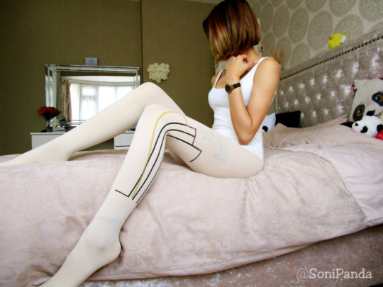
Now let’s be creating some little statements with a new brand! This company got in touch and wanted me to test out their products. At first, I thought they were a little different to what I was used to (mainly because they’re a thicker denier with different designs) but I really had to give them a go.
I have to say their whole brand is pretty quirky – and it’s something that is right up my street as long as I can style them right!
Oh and this is also Blog 1 of 2 – I have another one coming up for you all tomorrow 🙂
About 77Denari
77DENARI is an Italian line of tights & socks of Italian manufacture produced in limited edition.
The line has an experimental and at the same time ancient character: the tights, of an elastic nature, are in fact printed according to the original artisan method and with water colors, a technique in use for “still” supports of natural origin.
Every single graphic element has changed to a frame, thus becoming an absolutely prized piece, a unique piece, and the ethical-aesthetic choice of using water colors alone makes the product complex and innovative; therefore the study of colors, designs and print media are the result of a combination of ingenuity and magic, feasibility and disruption of the rules.
77denari was born in 2012 and is composed of 8 tights / stories per collection; starting from 2018, 77news grows and launches the Socks collection, and the “STRIPPANTI” Other Line.
The entire creative and printing process is carried out by the two founders of 77denari, Simona Berardi and Carla Armillei, and is inspired by the crude vision of geometric elements typical of the instinct of Nature.
77denari also boasts the collaboration of various artists working in the field of graphic design and illustration, photography, music, video and styling. Each of them supports the project becoming an integral part of the creative process; their participation opens the circle of possibilities towards still unexplored and seductive alchemies, and they contribute to creating, for the 77DENARI project, an imprint that is renewed over time.
The idea on which the project is based is the desire to give “beauty” an extra value, in which harmony and proportions of the parts go beyond the absolute, of time and memory, and focus on the “Physical soul” of intrigued consciences. In this case in fact the work is worn and moves: it walks, runs, dances and lives stories, reinterpreting the proposed contents with its own voice, and in the meantime creating a new identity.
Tights – talisman therefore, capable of breaking the classical scheme of gender and form and of ruffling with wonder.
A special thanks goes to the “DUEC Calzificio” and to our consultant Renato Altimani.
– taken from their website
The Spec
Colour: Cream
Style: #55
Size: One Size
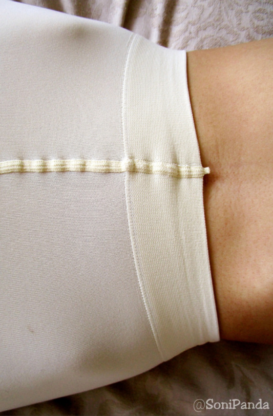
Denier: 60
Materials: 85% polyamide, 15% elastane
Price: N/A
Website: 77Denari – A/W 18-19 #55
My Outfit
Instead of creating something loud, I thought I would incorporate the tights into my outfit. I wore my cream bodysuit paired with my teal skirt and added my mustard boots to finish off the look. You could easily pair any other colour footwear with them to create a colour block, but I wanted to fuse it altogether to create a piece 🙂
My Deets
Bodysuit: Pull & Bear
Skirt: H&M
Tights: 77Denari
Boots: New Look
The Review
From The Website: 77denari, for autumn-winter 18/19, explores the vast world of feelings, and the multiple points of view they can generate. Thanks to the senses, the body in fact receives information from the interior and exterior environment. They are accessing the world itself within us. Each of them has the ability to form a perceptual opinion before the action of intelligence.
We have been taught that there are five senses: sight, hearing, taste, smell and touch, and that is anatomically, but also admits that we have a thermal sensitivity, and we know how to recognize the sense of well being, pain, or discomfort of the organism as a whole.
For this reason 77denarians have explored various currents, which have identified from 9 to 21. We have embraced 12 of them; precisely 7 more than the 5, through which we think we can fully experience our perception, and then transform us into what surrounds us, to try to increase that degree of cooperation, according to which individuals build together a reality and a shared truth.
– 100% made in Italy: the basic pantyhoses and socks are made by Italian manufacturer DUEC Calzificio located in Goffredo Castiglione;
– 100% handmade screen printing: no use of printer;
– composition: 85% polyamide and 15% elastane;
– one size fits all: the basic product is extremely elastic for sizes S-M-L;
– drawings only with water colors;
– limited edition: max 100 pieces for model;
– high resistance and durability of the design: hand washing at 30 degrees is recommended.
The Packaging: now I have to say how impressed I was with their packaging. They were sent in a super padded envelope, in 2 small boxes.
Very simple, but they are certainly different and I love it. Even though there isn’t much detail to them in terms of model, sizing, blurb about the hosiery etc, they still aren’t bad at all.
Getting Them On: now as the pattern is symmetrical on each leg, I took my time doing the scrunch and roll up the legs making sure I pair it as evenly as I can so I don’t have to do it again later.
These were fine rolling up the legs, and going over anklets. I had no issues at all – if anything they were super soft and so easily to glide right up.
On The Legs:
well all I can say is how funky are these?!?!?!
The quality of these are really good I have to say. They are such a gorgeous fit on the legs; even if they are a one size pair! They have so much stretch to them and really do hug the legs well. I expected them to be slightly loose, but in actual fact that is not the case!
They look like they are a block cream colour, but if you stretch them (like how they stretch on my thighs) they do go slightly lighter. You still do get really good leg coverage overall, but it’s something to note if you want a true opaque block colour.
The design is super awesome; I have done something similar a while ago with a Jonathan Aston pair (called Dynamic) which was black sheer with a black design and they really rocked. I love how they have worked the black and goldy-yellow colour at the side of the legs, which gives you the opportunity to actually pair up colours easily with it. As I mentioned, I kept with my mustard boots, but I could have easily done purple or blue (with a different skirt too) and it would just enhance the colour and design even more.
The only downside I had was that the print was a little off on the left leg; it’s like it got stuck and slightly peeled off a little. It’s nothing major but if I’m going into the nitty gritty details, that is something I picked up on when I got them out the packaging.
The fit of these are great; as I said for a one size pair, these are fab. I do feel it could fit up to a large size but you would be looking at a sheerer cream colour than a block opaque.
The feel of them are super soft and so nice on the legs. They’re smooth (both inside and out), they’re soft to touch and they really do caress the legs.
The Toes & Ankle: are also great. I expected some chunky seams around the toes creating little bumps around the ends but nothing of the sort. They fit and shape to the toes really nicely so you get a smooth looking finish. This also carries around the foot and up the ankles too.
You will find these will wrinkle slightly around the ankle due to the higher denier, but nothing too major.
I do think these are reinforced – and I will say that as the denier is quite thick so it would be pretty hard to create holes in these!
The Waistband: is so soft and so comfortable I don’t wanna take these off! I love the way they sat on the waist and actually just moved with me. They don’t fall down or move out of place once you set them, and they certainly don’t lose elasticity quickly either no matter how many times you pull them down and back up again.
It’s a proper comfort band, and I really like it!
My Thoughts?
I gotta say I really loved being in these. They were such an experience. I know most higher denier can be a hit or miss, but these are a pair which I would class as a luxe pair. I say this purely because of the way they are made, how they feel on the legs and the quality is just lovely. Trust me when I say when you roll these on, you instantly tell what they’re gonna be like for the next 10+ hours!
I am so looking forward to my 2nd pair I get to try out!
77Denari A/W 18-19 Cream Printed Tights Now let's be creating some little statements with a new brand! This company got in touch and wanted me to test out their products.
19 notes
·
View notes
Text
The Full Interview
Michael Roulier and Philippe Lhomme, directors of foodfilm Interview:
1. Could you introduce the work experience of both of you? When did you two begin to form the team to work together on creativity?
We both have quite a long advertising background, and one thing we have in common is that when we started we did not take advertisement very seriously, at least at first, being more interested into art creation.
In the nineties, if you aspired to exhibit artwork in galleries, it had to stay "secret". So both of us entered the advertising world almost "by accident". After finishing his studies at Penninghen art school, Philippe started painting and installed his atelier in Mesnilmontant district in Paris with no heating. Living and breathing only for his art. Still today he is the one who draws all our scripts, and it is important for us to keep it that way since it is the very first contact we have with clients to seduce them with our stories.
I take care of the writing. I started as a photographer hesitating between photo- journalism and fine arts after having passed a master in Philosophy, but absolutely passionate by all forms of photography. We where both introduced to the advertisement world almost by chance. We did not know each other at that time. It was a golden age for advertisers.Ten years later Philippe was a Creative Director at DDB mainly in charge of an iconic French award winning food brand that French people loved because of the quality of communication and visuals.
On my side I had become a studio still life photographer working mainly for luxury brands and cosmetics subjects. One day Philippe called me and asked if I was interested to do some "food tests" for the brand, and I must admit I was not too excited about it.
Food was not really glamorous in those days...it was called "alimentary photography". Restaurant Chefs where not considered like the Rock Stars they are today, and I cared more about my personal research considering advertisement like a lovely job, but not like a finality, even though I was lucky enough to work for beautiful brands like Hermes, Gallery Lafayette etc... In the end it was a revelation. I discovered a completely new world into which I had a total creative freedom, which was not at all the case for others kind of advertised subjects. Usually Art directors had no clue about what to do with food, and it was very much 'comedy' orientated as they felt more confortable doing that. It was not the case of Philippe who already believed that there was a lot do in this field and really tried to bring the visuals to a very artistic level. We inspired a lot of other food brands with our images, and the brand became a real visual reference for food. Finally we ended up becoming food specialists, but it had never been our initial projects. We collaborated together for 15 years always trying to focus as much as possible on textures. Food can be naturally ugly and somehow you need quite a lot of experience to master it. We noticed at that time that the food film industry was still surfing on a quite archaic imagery, where the heroes where definitely not the food. In parallel amazing cook books where being printed as editors understood there was a huge market in selling this very artistic food approach. I did 36 books and had the chance to meet these amazing Michelin star chefs who where all desiring to do their proper "food manifesto". It was part of their "business plan" to do such books. A necessity for them that made photographers very happy.
The brand we where working for was only doing print, but one day they asked us to film some recipes for viral videos. They where short on budget but we where given "carte blanche". We just loved doing them, and applied our print workflow to this new experience. We where both passionate about films in our personal life. I was interested in doing experimental research around cinematic experiences inspired by people like Stan Brakhage or Maya Deren. Philippe was spending a lot of time in contemporary art galleries watching artists using video as a medium. Strangely the brand hardly used these film recipes we did for them, and it stayed completely confidential until we decided to post them all in one batch on Vimeo. It became like a tsunami: phones started ringing all the time, and many production companies scouting on Vimeo made us tons of propositions. It all went really quickly, and a year later, Philippe naturally quit his job as creative director at DDB, and on my side I switched from still-life photography to film directing.
2. Which clients do you serve currently?
Our website is built like a simple blog, so the very first page represents our actuality and the clients we lately served.
We have a lot of different clients, and we have enlarged our "film perspective" in exploring other field like the cosmetic world.
Usually cosmetic brands would hire purely still life directors specialized in jewelry, watches, or shooting very "static" items. They had a very "contemplative" approach. Almost robotic. We brought "life" and action, avoiding the 3d representations mainly used at that time. Agencies where seduced by our food background and tried to apply this "spirit" to selling cosmetics...they where seduced by our organic approach.
We love also working for cosmetic brands (L'Oréal, Garnier, Yves Rocher, Décleor, Neutrogena) because the visual grammar has to be very metaphoric, so there is a lot of creativity involved in the process, and they are really expecting this from us: "unseen ideas" to illustrate the benefit of the products....
As far as food it stays our main subjects. Our clients are very eclectic. When you shoot food films you have to collaborate with the big agri-food groups like Neslté, Lactalis, Mondelez etc...and the creative validation process tends to be quite heavy. We can vigorously defend our ideas until a certain point, but at one stage "the big machine" can easily "laminate" your creativity. We are used to that. So what's really remains is the quality of the CRAFT. Our background in print photography really helped us here. I have always been passionate by the digital world and started working early with computers. We try to control in-house as much as we can: compositing, post production and coloring. Our workflow is very direct and since we don't have "a complex post-production pipeline" our approach is very "boutique" in a way. We do hire some digital artists, but they come to work in our studio under our supervision before the film presentation.
We do a lot of this post production job directly on the set: we have great people around us helping us to achieve "live" what is usually done a few weeks later, which is quite an unusual workflow, and spend the nights coloring the clips to be able to show them the next day.
2bis. What’s your core concept of making creativity for clients?
What inspires us most is graphics, architecture, contemporary art, constructivism, Bauhaus, Melies (a French director of the beginning of the century creating illusion) and I am forgetting a lot of other things. Being two "brains" enlarges the perspectives and the approaches. We don't use any DOP, so it's really a duo work.
Philippe and I have very different personalities and skills, and strangely it works really well. But what really unifies us is a desire for elegance and fluidity. A lot of food studios sometimes lack this little something related to external input. Our respective personal passions in life keep enriching our professional work.To resume, it's about "good taste" as we say in France.
We have been too much categorized as "graphic" directors, and that saddens us a bit because we are very much about filming "sensuality". This is probably due to our long collaboration for Marks & Spencer, and to the number of films we did for them.
Our camera angles are usually very simple, frontal and direct. We do have an in-house Kuka robot, but actually don't use it so much, considering that the most important part of our job is composition, more than just a robotic technical achievement.
The editing is the other part into which we have put a lot of energy. The rhythm is not only achieved by the editing skills, but also by the use of visual patterns within the individual clips. We don't "contemplate" too much with long travellings, our work is all about action and the smart ways we have to find in order to animate our textures. And finally the transitions within clips are to our eyes as important as the clips themselves, and we always look for little tricks in order to help the editor's work.
3. Why do you want to be specialized in food films and why began? What’s the benefits of working in this specialized area? How is this area special among creative films?
Food was up to quite recently an unexplored territory. This is what makes it fascinating for us. We are artists using food as our playground. Being French also means that we have a cultural respect for it. Colors, shape, complexity of textures, infinite visual associations and concatenation, and in a certain way "porn".
Pornfood meaning that we can induce by the visuals the viewer to "drool" when we film organoleptic textures that provoque desire and satisfaction.
The other challenge was to totally erase human beings. It's more a philosophical and artistic choice than a necessity for us, and every time we are asked to shoot actors we are happy to do it. But to be able to captivate audience without the acting support is a really an interesting direction. The concept of no-hands-films has led us those last years, but we are in constant evolution, and I am sure it will change.
Being specialized in food give us more freedom than working for other subjects. Everybody has to say something about fashion, cloths, talent acting etc...but very few can have a clear vision about how to stage food, and it gives us a real license for creativity. It's a niche, and that's what's great about it.
4. What kind of experience can you share about food films making? What is the critical thing when making them? Could you explain with 1-2 examples?
One of the critical point is always Time management. When you work with textures you are always surprised by the fact that you cannot really know in advance what shots are going to take more time than others. When you have a long shooting on multiple days your can "deal" with a certain time-elasticity, much better than a single day shoot, when you know that in the same day, whatever happens, you have to "deliver".
We have to obtain the "visual miracle" in a very short time and sometimes it just does not happens, and you can feel the production team and clients become stressed. We learned how to deal with that quite well. Experience will help of course, but sometimes a simple action like just filling a glass of wine in front of the camera can become a nightmare. Of course one could rely on robotics to do that, but then you might lose all the beautiful accidents that can make the quality of the shot. So it's all about making the right choices at the right time.
The same critical point goes when writing the scripts. We have to constantly evaluate the "is-this-going-to-be-possible?". It's great to have ideas, but they have to be somehow realistic and credible, and sometimes we are not really sure of way the texture will behave. There is a lot of randomness that we don't control. We often start over and over again to get the right movement or action. We do work with some great SFX teams that we constantly challenge with our crazy ideas, as we took an ideological posture with Philippe not use 3D, and to always film everything for real. Many people think we use 3D, but I can assure that we don't. We do composite a lot though.
5. Why do you think your work is attractive to the audience and help the brand grow? Can you share one of your favorite works?
I think that what attracts people to our work is that we are often "on the edge of credibility".
We play a lot with illusion, like a magician who will suddenly speed up a gesture to hide the tricks. The rhythm will help us to create this magic. For example we also very often defy gravity, or normality, in order to give a sense of quirkiness. Make it a bit "weird" to get more appeal or unexpectedness. We also try to show details that people usually don't really see, emphasizing a certain playfulness with our camera. The slow motion Phantom camera really helps the observation of the unseen.
The other attractive thing is that our scenes are always "in action". The common question for us is "how are we going to activate this image". No time to contemplate, the textures are always animated in order to keep the tension of the viewer.
6. How’s film creativity different from the general creativity making?
To accept to work as a team with other people. Even more, to admit the power of a team, like a football player.
It is much easier for Philippe who is an ex Creative Director used to commission other artists. I am a bit of "a control freak" and that makes me makes me suffer more than him, and probably others too. This is where we are really complementary.
Nevertheless our team is much smaller than a conventional cinema team, and we try to keep this "boutique" home-made atmosphere. The idea is to never lose the "primal vision" of the film, and keep an eye on everything. We always work with the same team, and we all know each other really well, and that gives a lot of fluidity to our relations. When there is a difficulty, we naturally team up all together to find solutions. It's very democratic!
A good team is like a good wine and it's years of maturation. We where lucky to achieve this.
7. How do you usually allocate work between you two and collaborate with other members in your company? How’s your creativity making process usually?
We both do everything, it's democracy again. We try to put our ego's on the side of our relation.
We do fight a lot though to defend our personal vision of the film, but this is what makes our treatments so rich.
We usually take two days to write a script. The first day is only dedicated to brainstorming, and we throw as much as ideas as we can. Phillipe does quick drawings as we
speak to keep it as a memo. The next day he does the drawings, always in black and white. I love the simplicity of his style, and he really has a camera in the eyes. His drawing treatment is very different of what would provide a rough-man or illustrator . I take care of the writing, and I am extremely precise in our explanations. It's the main secret to win bids. We also try to control as much as we can the art direction of the treatment, and exchange a lot with the creative team doing the lay-outs in the production house. Same goes for the mood boards.
8. Could you tell me an unforgettable thing during you two’s collaboration?
Sometimes the shape of an object, a texture or anything else can slowly become sexually evocative. We remember this time when breaking a poached egg was really reminding a close up of a "very different" scene that could have been extracted from an X-rated movie. Nobody was saying anything, but everybody was thinking the same thing. It was at the same time really evident, and somehow quite understated. At one point the producer "played" his job, and said it, which meant that we had to reshoot the whole scene. It was a good laugh for everybody. It's foodporn after all !
We have hundred of anecdotes with our job, but that's another interview.
9. How will Foodfilm or you personally partner with Stink? What do you think you will bring to Stink’s team through this partnership?
We are very excited with this new partnership, and as we are quite easygoing, it should work really well.
Being represented by Stink is a caution of creativity, so we might have to fight less to defend bold ideas. I don't really know if Stink represents a lot of other table top directors in their international "spiderweb"? I think that the food film market is really huge, and still
growing. So if we can fill this gap for them it's really a great win-win association. Let's talk again about it in a year time!
0 notes
Text
Inspired Design Decisions With Bradbury Thompson: The Art Of Graphic Design
After 12 inspiring articles, Andy Clarke draws his Inspired Design Decisions series to a close by explaining how studying the work of Bradbury Thompson — one of the masters of 20th Century graphic — will teach you how to combine graphic and typographical elements with innovative layouts to create stunning designs for the web. In this final article, Andy brings together lessons from all his previous articles to teach you about choosing color palettes, working with compound and modular grids, and designing graphical and readable typography. If you’ve skipped any of the articles in this series, you definitely won’t want to miss this one.
The idea for this series — and the book which will follow it — was sparked by a casual conversation, but writing it has had a profound impact on me and the work I make for the web.
I’m more thoughtful in my approach to page layout and to the ways a page and its content adapt to different screen sizes. I have a far greater understanding of how composition helps communication and can improve the stories I tell about my clients’ businesses, products, or services.
I discovered how to better create a rhythm which flows from page to page. I learned how that rhythm produces more attractive visual designs and engaging experiences, and how flexible even the simplest grids can be when approached with imagination.
I became fascinated by the ways magazine art directors including Alexey Brodovitch and Bea Feitler brought images and text together. My knowledge of typography developed alongside my enthusiasm for expressive and entertaining type. I’m unlikely ever to make type as beautiful as Herb Lubalin, or as challenging as Neville Brody, but I am more confident to experiment.
This project gave me the confidence to — as Ruth Ansel suggested — “step outside of what is expected,” make confident choices, and and to trust my instincts when something feels right. I learned how to channel my often rebellious attitude to conventional design thinking to develop novel solutions to often everyday design problems.
We work in an industry which is now more dominated by the academic, mechanical, and technical aspects of design. Developing this series has reinforced for me that while those activities matter, as Giovanni Pintori wrote, we “need logic and imagination in equal measure.”
As Neville Brody explained, “Once you have broken down the rules, literally anything is possible.” Unconventional thinking needn’t come at the expense of usability. Learning how people interact with a website or use a product shouldn’t dictate a design but instead provide a platform on which to develop engaging, entertaining, and ultimately more memorable experiences.
Learning about the work of designers from different eras and various fields not only inspired my own ideas, it gave me enthusiasm to learn more. Finding new sources of inspiration has become an almost daily obsession, and while my studio walls might not yet be as full as Ruth Ansel’s and Bea Feitler’s, my bookcases, coffee tables, and desk are almost overflowing with my collection of design books.
Left: W is for War spread designed by Bradbury Thompson, 1952. Right: America at War spread designed by Bradbury Thompson. (Large preview)
For a long time, I had a nagging feeling the web can so much more than we’re making it. Every one of the designers I’ve featured throughout this series challenged perceptions, influenced the direction of their medium, and ultimately inspired others—myself included—to create better work. I hope in some small way, this series can do the same.
Inspired By Bradbury Thompson
Studying one of the most accomplished art directors and graphic designers of the last century seems like a fitting close to this series.
Bradbury Thompson was born in Kansas in 1911, and while he may not have been the best-known, there’s no doubt he was one of the most influential. Thompson studied at Washburn College in his home city of Topeka. From early on, he was inspired by print designs, especially magazines, and used this influence to design the college’s yearbooks.
After graduating from Washburn, Thompson worked for five years at Capper Publications, a local printing company. This first job as a printshop junior wouldn’t have been glamorous, but it gave Thompson a broad knowledge of design and printing techniques which he would use throughout his long career.
Kansas in the 1930s was well-known for its severe dust storms, but not as a creative centre, so in 1938 Thompson travelled the 1,200 miles east to New York City. Incredibly, for a young man fresh off the road from Kansas, one of his first projects was designing the 1939 World’s Fair catalogue.
Thompson worked for Rogers-Kellogg-Stillson—the printing firm responsible for that World’s Fair—and was assigned to work on Westvaco Inspirations for Printers. This series of promotional booklets were published by Westvaco Corporation to showcase its line of printing papers. Each issue consisted of just sixteen pages, but gave Thomson a “rare opportunity for experimentation provided a receptive designer.”
C Stands for Constitution designed by Bradbury Thompson. (Large preview)
Westvaco had published Inspirations since the 1920s and was already widely circulated to an audience of 35,000 agencies, museums, printers, schools, and universities.
Thomson was given no budget to commission original artwork or photographs for the publication, but instead of letting this limit his ideas, he used it as an opportunity to be creative. Inspirations gave Thomson the freedom to experiment with ideas and techniques, and to explore creative concepts. He became “one of the best scroungers in my profession” by borrowing printed plates and separations from agencies, magazines, and even museums, to incorporate into his work.
These borrowed elements included historical photographs and illustrations which Thomson combined with contemporary typography and modern process colors. For Victory, a spread for Inspirations in 1953, Thomson incorporated arrow illustrations and integrated them into targets made from solid colors. He borrowed elements from folk and primitive art, turning them into original works which blended modern with traditional. Working on Inspirations stimulated Thompson’s creativity, and he went on to design over 60 editions.
During WW2, Thompson designed the final few issues of two wartime magazines—Victory and USA—which were published by the Office of War Information. Then in 1945 he became art director of Mademoiselle magazine and stayed in the role for the next fifteen years.
Victory spread designed by Bradbury Thompson, 1953. (Large preview)
The eclectic tendencies Thompson had developed working on Inspirations continued at Mademoiselle and now with a budget to work with, he commissioned up-and-coming artists Andy Warhol, Joan Miro, Willem de Kooning, and my personal favourite pop artist Jasper Johns to illustrate for its fiction section.
Thomson’s magazine work didn’t begin or end with Mademoiselle and throughout his career he work on over thirty more including Business Week, the Harvard Business Review, and Smithsonian magazine.
Bradbury Thompson may not be among the most famous graphic designers but he was widely recognised in the his industry, receiving all three major design awards and more. His awards included the National Society of Art Directors of the Year Award (1950) and the AIGA Medal (1975.) In 1977 Thompson was inducted into Art Directors Club Hall of Fame, and during the 1980s he won first the Frederic W. Goudy Award and then the Type Director’s Club Medal.
Horsepower spread designed by Bradbury Thompson. (Large preview)
From his earliest experiences working in Topeka, Thompson was a details-orientated designer who paid attention to the finest details in his typography and to the precise cropping and placement of his images. His clever use of often simple palettes of process colors along with black-and-white historical illustrations and geometric forms made his work at the same time classic and contemporary.
Type is a thing of constant interest to me. In short, type can be a tool, a toy, and a teacher. It can provide a means of livelihood, a hobby for relaxation, an intellectual stimulant—and a spiritual satisfaction. I believe an avid interest in type necessarily includes a zest for everyday life.
— Bradbury Thompson
Like architecture, typography is a blend of beauty with functional utility and Thompson’s designs often combined unusual typographic arrangements with colorful shapes. For Rain, Rain, Rain — a spread for Mademoiselle magazine in 1958 — he reproduced the same raincoat wearing figure carrying an umbrella as five colored silhouettes.
Rain, Rain, Rain spread designed by Bradbury Thompson, 1958. (Large preview)
In Futural — a spread for Westvaco Inspirations for Printers in 1962 — Thompson mirrored the simplified shapes of aeroplanes across pages, using line-work on the verso and solid colors on the recto. He regularly overprinted his colorful shapes to add depth and interest to his designs.
Futural spread designed by Bradbury Thompson, 1962. (Large preview)
Using his experience of printing technologies, Thompson’s signature designs often use just four process colors. In offset printing, process colors are comprised of percentages of cyan, magenta, yellow, and key (black) inks (CMYK). This process of four-color printing is capable of producing a wide range of colors.
Thompson’s best-known designs often use these colors in their purest form. He frequently separated the colors and printed them in different areas in his compositions. We use the RGB model when we design for screens, but separating those three colors in the way Thompson separated component CMYK colors can create inspiring designs for the web.
R Stands for Rightous spread designed by Bradbury Thompson. (Large preview)
Thompson taught graphic design at Yale University’s School of Art from 1956 until his death in Connecticut in 1995.
The New York Times Book Review said that his artistic autobiography, “The Art of Graphic Design,” was a book in which “art and design are gloriously and daringly mixed”, which is a good representation of his design strategy in general. “The Art of Graphic Design,” was published 1988. While the original hardcover copy I’d like for my collection is now prohibitively expensive, reprinted paperback versions are available at more realistic prices.
Processing The Color Palette
For this first design, I chose a CMYK inspired palette using darker tints of cyan, magenta, and yellow for better results on screen. (Large preview)
I start implementing this first design by first considering my content, then the most appropriate HTML elements to describe it. For this Thompson-inspired design, I need only a few elements, a header, article, and aside, plus two figures:
<header> <svg id="logo">…</svg> <h1>…</h1> <svg id="banner">…</svg> </div>
</header> <article> <main>…</main>
</article> <figure>…</figure>
<aside>…</aside>
<figure>…</figure>
As I’ve discussed throughout this series, my process always starts by applying foundation styles, which include colors and typography. I add a deep blue background color and contrasting white serif text:
body {
padding: 2rem 0;
background-color: #1f455f;
font-family: 'serif';
color: #fff; }
I style my italic headlines, then add sizes for the heading levels and paragraphs:
h1, h2 {
font-style: italic; } h1 {
font-size: 2.8rem; } h2 {
font-size: 2.027rem; } p {
font-size: .8rem; }
Finally, I color the captions which accompany both my figures’ images with a vibrant green and italicise the text to match my headline styles:
figcaption {
font-size: .8rem;
font-style: italic;
text-align: center;
color: #d2de4a; }
(Large preview)
CMYK in RGB
To produce CMYK process colors—cyan, magenta, yellow, and key (black) in RGB (red, green, and blue) for screens, use maximum values for two out of those colors. If the result is too hard on the eyes, add black to create tints and soften the effect.
On even the smallest screens, some space needs to remain empty. This allows the eye to flow around content. Margins and padding are often all that’s needed to add empty space:
#logo {
margin: 0 auto 1rem; } #banner {
margin: 1rem 1rem 1rem 0; } main, aside {
margin: 0 1rem; } figure {
margin: 2rem auto; }
Reducing the maximum width of graphic elements adds white-space and visual interest to small-screen designs:
#logo {
max-width: 25vw; } figure {
max-width: 50vw; }
Before implementing any design, I often make a storyboard to demonstrate how my elements will flow across a selection of screen sizes. (Large preview)
The extra space available on medium-size screens allows me to introduce the first set of layout styles to this design. By splitting my running text across two columns, I help to maintain consistency in its measure. Placing my two figures, side-by-side maintains their relative proportions to my text.
I start by applying grid properties and an unusual five-column symmetrical grid to the body element. Then, I add a data URI background image and position it to the right of my layout:
@media (min-width: 48em) { body {
display: grid;
grid-template-columns: repeat(5, 1fr);
gap: 2rem;
background-image: url("data:image/svg+xml…");
background-position: 120% 50%;
background-repeat: no-repeat; }
}
I need to place the content of my header and article directly onto my grid, so I change those elements’ display property to contents, which effectively removes them for styling purposes:
header, article {
display: contents; }
Then, I place each content elements into a different set of grid columns and rows using line numbers. First, I place the Ford logo into a single column. I can remove the maximum width I set earlier as its size will now depend on the width of its column:
#logo {
grid-column: 2;
margin: 0;
max-width: none; }
The banner contains a Transit van profile, and the main headline occupies the first four of my five columns:
#banner,
h1 {
grid-column: 1 / 4; }
By leaving the first column empty, content in the main and aside elements are indented from the left. By setting their widths to match that of my banner, I add a pleasing asymmetry to the layout:
main, aside {
grid-column: 2 / -1; }
Although my two figures are’t adjacent elements in my HTML, CSS Grid makes placing them side-by-side simple. I place them into different columns on the same row without needing to alter my HTML:
figure:nth-of-type(1) {
grid-column: 2 / 4;
grid-row: 5; } figure:nth-of-type(2) {
grid-column: 4 / -1;
grid-row: 5; }
In many of my designs, I use indentation instead of paragraph spacing to create solid blocks from my running text. This effect is even more striking when setting text in multiple columns:
p {
margin-bottom: 0; } p + p {
text-indent: 2ch; } main {
column-width: 16em; }
Figure elements can include one or more captions and images. Captions commonly appear under the pictures they describe, but there’s no reason captions need to stay underneath. I can place them above, or to the left or right of an image too.
When I place captions on either the left or right of an image, I immediately give designs the look of a magazine. I use Flexbox and then the flex-direction property to move them:
figure {
display: flex; }
My first figure caption appear on the left, so I reverse the flex-direction of this figure from its default row:
figure:nth-of-type(1) {
flex-direction: row-reverse; }
Flexbox allows me to arrange elements vertically as well as horizontally. To place my captions at the bottom edge of my images, I change their cross-axis alignment from the default stretch to flex-end:
figure {
align-items: flex-end; }
For a finishing touch to this medium-size design, I align both captions in opposite directions:
figure:nth-of-type(1) figcaption {
text-align: right; } figure:nth-of-type(2) figcaption {
text-align: left; }
Overlapping four and six columns creates this compound grid. (Large preview)
Empty space helps to lead the eye at every stage of this layout. The extra space available on larger screens allows me to develop a distinctive asymmetric design.
Using a compound grid—two or more overlapping or stacked grids—on one page can create eye-catching compositions. The compound grid for this design overlaps a four-column and six-column grid which creates a rhythmic pattern of 2|1|1|2. I transfer that pattern to fr units and apply them as columns to the body element:
@media (min-width: 64em) { body {
grid-template-columns: 2fr 1fr 1fr 2fr 2fr 1fr 1fr 2fr; }
}
Then, I add four rows using a combination of pixels, rem units, and intrinsic sizing, before setting the minimum height of the page to fill the viewport:
body {
grid-template-rows: 100px 14rem 14rem auto;
min-height: 100vh; }
To complete the body styles, I add two new data URI background images and specify their sizes so they’re always contained within the viewport:
body {
background-image:
url("data:image/svg+xml…"),
url("data:image/svg+xml…");
background-position: 0 50%, 100% 50%;
background-size: contain; }
This asymmetric design is highly structured, and every element is placed precisely onto my grid. (Large preview)
This asymmetric design is highly structured, and every element is precisely placed onto my grid. I use line numbers to place the structural elements, raising the overlapping headline above the banner image in the stacking order:
#logo {
grid-column: 2 / 4;
grid-row: 1; } h1 {
grid-column: 1 / 5;
grid-row: 2 / 4;
align-self: center;
z-index: 2; } #banner {
grid-column: 1 / 5;
grid-row: 2 / 4;
z-index: 1; }
My main content occupies the last two columns and forms and island in the right of this design:
main {
grid-column: 7 / -1;
grid-row: 2 / 4;
column-width: auto; } aside {
grid-column: 6 / -1;
grid-row: 4 / 5; }
I place the two figures onto this new grid:
figure:nth-of-type(1) {
grid-column: 5 / 6;
grid-row: 2 / 3; } figure:nth-of-type(2) {
grid-column: 2 / 5;
grid-row: 4 / 5; }
Then, I adjust the direction of their flex, setting the first figure vertically, so my caption appears above its sibling image:
figure:nth-of-type(1) {
flex-direction: column-reverse; }
The content of my second figure is arranged horizontally with both the image and caption resting on the baseline:
figure:nth-of-type(2) {
flex-direction: row;
align-items: flex-end; }
Alternative approaches to color give dramatically different results. Left: Monochrome. Right: Split complementary. (Large preview)
I fine-tune the alignment of both caption and this first Thompson-inspired design is complete:
figure:nth-of-type(1) figcaption {
text-align: center; } figure:nth-of-type(2) figcaption {
flex: 1;
text-align: left; }
Colorfully Complementary
This colorfully complementary header is the centrepiece of my design for medium and large screens. (Large preview)
Despite the apparent complexity of this layout, I need only three structural elements in my HTML: a header which contains Transit vans in a variety of complementary colors, then two content elements, a main and an aside:
<header>…</header> <main>…</main> <aside>…</aside>
A colorfully complementary header is the centrepiece of this design. It might be tempting to implement this using a single large image. But, I want to develop various arrangements for different screen sizes, so using nine separate images allows me to make a scrolling panel for small screens, and arrange them in a grid for medium and large screens:
<header> <img src="header-1.svg" alt="Ford Transit"> <img src="header-2.svg" alt=""> <img src="header-3.svg" alt=""> … <img src="header-9.svg" alt="">
</header>
In a split complementary palette, two colors on either side of the complementary on the color wheel are used. (Large preview)
Both the main and aside elements include a headline, an exploded Transit parts SVG image, plus divisions for arranging my content into columns:
<main> <h1>…</h1> <div>…</div> <div>…</div> <svg>…</svg>
</main> <aside> <h2>…</h2> <div>…</div> <div>…</div> <svg>…</svg>
</aside>
I start by applying a dark grey background color to the body element, and add stying to my headlines and paragraphs:
body {
background-color: #262626;
font-family: 'sans-serif';
color: #fff; } h1, h2 {
font-size: 2.027rem;
font-style: italic;
text-transform: uppercase; } p {
font-size: .8rem; }
On small screens, the main and aside elements get grid layout too. (Large preview)
Often, normal flow plus a few foundation styles are all I need to implement a small-screen version of my designs, but this one includes layout styles from the start. I begin by transforming my header and its nine images into a horizontally scrolling panel by adding flex and overflow properties:
header {
display: flex;
overflow-x: scroll;
margin: 0 2rem 2rem; } header img:not(:last-of-type) {
margin-right: 1rem; }
The header isn’t the only element to get a layout on small screens, the main and aside elements get grids too:
main, aside {
display: grid;
margin: 0 2rem; }
First, I apply a two-column layout to the main element. The exploded Transit parts SVG image fit into the right column, so I fix its width at 100px. The left column expands to fill any remaining space.
main {
grid-template-columns: [content] 1fr [svg] 100px; }
Then, I place main element items using grid lines with names which reflect their content:
h1 {
grid-column: content;
grid-row: 1; } main > div:nth-of-type(1) {
grid-column: content;
grid-row: 2; } main > div:nth-of-type(2) {
grid-column: content;
grid-row: 3; } main > svg {
grid-column: svg;
grid-row: 1 / 4; }
The aside element also has a two-column layout, but this time the narrow column and its exploded Transit parts are on the left. To emphasise the distinction between my main and aside content areas, I add a solid border at the top of the aside:
aside {
grid-template-columns: [svg] 100px [content] 1fr;
padding-top: 1rem;
border-top: 3px solid #b22f65; }
I use named lines to place its content into my grid:
h2 {
grid-column: 1 / -1;
grid-row: 1; } aside > div:nth-of-type(1) {
grid-column: content;
grid-row: 2; } aside > div:nth-of-type(2) {
grid-column: content;
grid-row: 3; } aside > div:nth-of-type(3) {
grid-column: svg;
grid-row: 2 / 4; }
A horizontally scrolling header and grids in my content demonstrate how it’s sometimes beneficial to use more than a single-column layout for small screens. Those same elements can be arranged in very different ways in the extra space available on medium-size screens.
In this version of my design, a grid of nine colorfully complementary images fills the header. I apply grid properties and three symmetrical columns:
@media (min-width: 48em) { header {
display: grid;
grid-template-columns: 1fr 1fr 1fr;
gap: 1rem;
overflow-x: visible; }
}
Left: grid-auto-flow with a value of row places elements horizontally across rows. Right: Changing the grid-auto-flow value to column, fills each column vertically. (Large preview)
Unlike other elements in this design, there’s no need to place the images into this grid, as the browser’s auto-placement algorithm arranges them automatically.
By default, browsers place elements horizontally across rows. But, by changing the grid-auto-flow value to column, a browser fills each column vertically before moving onto the next:
With more space available for my content, I increase the number of columns from two to four:
main, aside {
grid-template-columns: 1fr [svg] 1fr 1fr 1fr;
gap: 2rem; }
Then, I align content in my main element to the end, so it forms a solid block in the centre of my layout:
main {
align-items: end; }
My main headline spans all four columns. Although it appears first in my HTML, I can place it visually below my running text and images by adding it to the second row:
h1 {
grid-column: 1 / -1;
grid-row: 2;
border-bottom: 3px solid #b22f65; }
I place my first block of content into the left column:
main > div:nth-of-type(1) {
grid-column: 1;
grid-row: 1; }
The second block spans two columns on the right:
main > div:nth-of-type(2) {
grid-column: 3 / span 2;
grid-row: 1; }
Next, I place the final division—which contains my SVG image — into the second column using its line name:
main > div:nth-of-type(3) {
grid-column: svg;
grid-row: 1; }
Implementing columns for the aside element follows a similar method. Again, I alter the visual placement of my headline using row line numbers:
h2 {
grid-column: 3 / -1;
grid-row: 2; } aside > div:nth-of-type(1) {
grid-column: 1;
grid-row: 1 / 3; } aside > div:nth-of-type(2) {
grid-column: 3 / -1;
grid-row: 1; } aside > div:nth-of-type(3) {
grid-column: svg;
grid-row: 1 / 3; }
When you use modular grids thoughtfully they can fill your designs with energy. (Large preview)
A full-page image filling one half of a spread is a common sight in magazine designs. Large images like these can be equally as effective on widescreen displays. I apply grid properties to the body element with two symmetrical columns, then name the left column verso and the right column recto:
@media (min-width: 64em) { body {
display: grid;
grid-template-columns: [verso] 1fr [recto] 1fr;
gap: 2rem; }
}
These terms originate in Latin where two opposite pages are called folium rectum and folium versum. I place my header into the verso column, and the main and aside elements stack in the recto column:
header {
grid-column: verso;
grid-row: 1 / 4; } main, aside {
grid-column: recto; }
Modular grids help bring order to large amounts of varied content and create visually appealing layouts. (Large preview)
Finally, to improve the readability of my running text on very wide displays, I introduce a multi-column layout. A browser will automatically generate 10em-wide columns to fill the space available:
@media (min-width: 72em) { main > div:nth-of-type(2),
aside > div:nth-of-type(2) {
column-width: 10em;
column-gap: 2rem; }
}
Masking Scalable Type
Brightly colored blocks of SVG text add impact in this distinctive design, inspired by Bradbury Thompson. (Large preview)
As someone who enjoys the creative aspects of typographic design — but also values accessibility and performance — SVG has become as much a part of my everyday development toolkit as CSS and HTML.
This next Thompson-inspired design combines SVG text with CSS masks and shapes, but needs very little HTML, just one header and a main element:
<header> <div> <svg>…</svg> </div>
<header> <main> <svg>…</svg>
</main>
Before I start developing the striking SVGs, I add foundation styles which give the page a deep blue background color and contrasting white text:
body {
background-color: #1f455e;
font-family: 'sans-serif';
color: #fff; }
Left: Scalable graphic with repeating text. Center: CSS mask-image uses black and white parts of an image. Right: Repeating text shaped by a Transit van silhouette. (Large preview)
This header includes a scalable graphic where the repeating text is shaped by a Transit van outline. SVG includes its own method for clipping parts of an image. To define a clipping path I add a clipPath element to my SVG. This, in turn, contains a path which defines my clipped area. So I can reference this clipPath later in my SVG, I give it a unique identifier:
<svg> <clipPath id="transit"> <path>…</path> </clipPath>
</svg>
Then, I add the path coordinates which make up my graphical text. I give this group of brightly colored paths a class attribute value which I can use to bind it to my clipPath:
<svg> <clipPath id="transit">…</clipPath> <g class="transit"> <path>…</path> </g>
</svg>
Whether I include this SVG in my HTML using an image element, or embed the SVG directly into my markup, I use the CSS clip-path property to clip my graphic text using its clipPath:
<style type="text/css"><![CDATA[
.transit {
-webkit-clip-path: url(#transit);
clip-path: url(#transit); }
]]></style>
Using clipPath, only areas within a clipping path are displayed. Anything outside the clipped area will remain invisible.
But, there’s another way to mask an element, one which works with all types of content, not just SVG. Similar to clip-path, CSS masks hide parts of an element using a black and white mask image.
header div {
-webkit-mask-image: url("mask.svg");
mask-image: url("mask.svg"); }
When a mask is applied, only areas of an element which coincide with the black parts of the mask will be displayed. Everything outside these areas will disappear.
Applying an alternative mask image preserves the visual weight of this masked header on smaller screens. (Large preview)
The properties of mask-image share many similarities with backgrounds in CSS. Just like background images, masks can be positioned, repeated, and sized, and can even be developed from background gradients. As I don’t need my mask image to repeat, I set its value to no-repeat, just as would with any background image:
header div {
-webkit-mask-repeat: no-repeat;
mask-repeat: no-repeat; }
Brightly colored lines of SVG text styled using CSS. (Large preview)
The contents of my SVG in the main element is entirely different. This graphic contains brightly colored lines of SVG text which explain the Transit van’s pedigree. I wrap each line inside a tspan element, each with its own x and y coordinates which tightly pack the text into a solid block:
<svg>
<text>
<tspan x="0" y="86">BUILT AS A PASSENGER VAN, MINIBUS, </tspan>
<tspan x="0" y="156">CUTAWAY VAN CHASSIS, AND A PICKUP </tspan>
<tspan x="0" y="226">TRUCK. OVER 8,000,000 TRANSIT VANS </tspan>
<tspan x="0" y="296">HAVE BEEN SOLD, MAKING IT THE THIRD </tspan>
<tspan x="0" y="366">BEST-SELLING VAN OF ALL TIME.</tspan>
</text>
</svg>
SVG text elements can be styled like any HTML text, so to emphasise the solidity of this block, I choose a heavyweight, condensed sans-serif, then adjust its tracking by reducing the letter spacing by -2px;
text {
font-family: 'sans-serif-condensed';
font-size: 83px;
font-weight: 700;
letter-spacing: -2px; }
CSS pseudo-class selectors are as useful for styling elements in SVG as they are for HTML. I use nth-of-type selectors to give each line of tspan text its own color:
tspan:nth-of-type(1) {
fill: #c43d56; } tspan:nth-of-type(2) {
fill: #f2c867; } tspan:nth-of-type(3) {
fill: #377dab; } tspan:nth-of-type(4) {
fill: #fff; } tspan:nth-of-type(5) {
fill: #c43d56; }
In this alternative version of my design for larger screens, I want the paragraph to float alongside the masked graphic. (Large preview)
The solid style of this typographic design makes a stylish header element, but there are times when I might need to add more content to this page. For an alternative take on this design, I add a paragraph explaining the history of the Transit van’s production to my header:
<header> <div> <svg>…</svg> </div> <p>…</p>
</header>
In my foundation styles, I add a font size and set the paragraph in uppercase to match my previous SVG text:
header p {
font-size: .91rem;
text-transform: uppercase; }
Then, I justify the paragraph text for people who use browsers which also support automatic hyphenation:
@supports (-webkit-hyphens: auto) or (hyphens: auto) {
header p {
-webkit-hyphens: auto;
hyphens: auto;
text-align: justify; }
}
On small and medium-size screens, this new paragraph of text follows the header’s SVG as it does in the HTML. But, for larger screens, I want this text to float alongside the masked graphic.
I give the header graphic an explicit viewport-based width, then float it to enable me to wrap my text around it using CSS Shapes. As I want this shape to match my masked graphic, I use the same mask image for the shape-outside URL:
@media (min-width: 64em) { header div {
float: left;
width: 65vw;
margin-bottom: 0;
shape-outside: url(mask.svg);
shape-margin: 20px; }
}
Splitting Symmetry
Bright colors in this Thompson-inspired design help connect the two sides of this symmetrical layout. (Large preview)
For the final inspired example in this issue—and in fact for the entire series—the split symmetrical layout means I need just two structural elements. By now, these header and main elements should feel very familiar. My header includes the classic Ford logo, an SVG image and a headline:
<header> <svg id="logo">…</svg> <img src="header.svg" alt="Ford Transit"> <h1>…</h1>
</header>
The main element also includes a scalable image, plus a single paragraph of running text:
<main> <p>…</p> <img src="main.svg" alt="">
</main>
As always, I start small-screen first by adding color and typography foundation styles. This time, a light grey background, dark grey text, and a sans-serif typeface:
body {
background-color: #ededef;
font-family: 'sans-serif';
color: #262626; } h1 {
text-align: center;
text-transform: uppercase; }
The header appears first in my HTML, so I’ll style it first too by giving it a dark grey background and lighter text which is the inverse of my body styles:
header {
margin-bottom: 2rem;
padding: 2rem;
background-color: #262626;
color: #ededef; }
This header has a dark grey background and lighter text which is the inverse of my body styles. (Large preview)
Finally, for small screens, I centre that logo horizontally and limit its maximum width to half that of the viewport:
#logo {
margin: 0 auto 2rem;
max-width: 50vw; }
This design takes on more of a Thompson-inspired look with the extra space available on medium-size screens. I need to place elements in the header and main elements, so I add grid properties and four symmetrical columns to both:
@media (min-width: 48em) { header, main {
display: grid;
grid-template-columns: repeat(4, 1fr); }
}
Then, I add three explicit rows to my header. The first and last are 100px tall, while the middle row expands to fill all the space remaining:
header {
grid-template-rows: 100px auto 100px; }
Now it’s time to place those header elements into my columns and rows using line numbers. The Ford logo comes first and fits into the two centre columns. The headline is last and sits at the bottom while spanning the full width. I give both elements a higher z-index value, so they appear closest to the viewer in the stacking order:
#logo {
grid-column: 2 / 4;
grid-row: 1;
z-index: 2; } h1 {
grid-column: 1 / -1;
grid-row: 3;
z-index: 2; }
Then, I place the header image, so it covers every column and all the rows. By giving it a lower z-index value, I ensure it recedes to the bottom of the stacking order:
header img {
grid-column: 1 / -1;
grid-row: 1 / 4;
z-index: 1;
align-self: center; }
With styles for the header image in place, I add a selector which applies those exact same styles to the image in my main element:
header img, main img {
grid-column: 1 / -1;
grid-row: 1 / 4;
z-index: 1;
align-self: center; }
While vertical text won’t suit every design, it can turn a short passage into a strong visual statement. I change the paragraph’s writing-mode to vertical-rl and increase its leading using viewport-based units:
main p {
line-height: 3vw;
white-space: pre-wrap;
writing-mode: vertical-rl; }
For a decorative finishing touch, I change its color and apply a blending mode with a value of difference which also increases the legibility of this text where it appears over the graphic background:
main p {
color: #f4eBd5;
mix-blend-mode: difference; }
If you want a framework-based design to be more interesting, start by streamlining twelve narrow columns into eight wider ones. (Large preview)
I place the paragraph into the two centre columns, align it centrally, then add a higher z-index value to ensure it appears at the top of this element’s stacking order:
main p {
grid-column: 2 / 4;
grid-row: 1 / 4;
align-self: center;
z-index: 2; }
This grid is flexible and can accommodate various content types while remaining distinctive and interesting. (Large preview)
Until now, this main content comes after my header in the document flow. For larger screens, I want those elements to sit side-by-side, so I apply grid properties and two symmetrical columns to the body:
@media (min-width: 64em) { body {
display: grid;
grid-template-columns: 1fr 1fr;
min-height: 100vh; }
}
Staying Inspired
When I set out to produce this series, I wanted to teach people about the importance of for inspiration outside the web. My aim was to demonstrate that looking at the challenges designers from other media have faced — and how they approached solving them — can help us make more distinctive, engaging, and ultimately successful products and websites.
Of course, this series barely scratches the surface, and you can find inspiring examples in plenty more places than I’ve described here. Take a trip to your nearest art gallery, bookstore, museum, or record shop, and you’ll find yourself surrounded by inputs and inspiration.
I hope this series has inspired you to think about how you design for the web differently. Are examples of design from other media and periods in history relevant to the modern web? Of course, they are. Can we learn from the past while inventing the future? Absolutely. Do we have the technologies and tools to deliver more inspired designs for the web? There’s no doubt about that.
I’ve been pleased the response to this series has been overwhelmingly positive, but I know there’s plenty more I can do. This series might be coming to a close, but work has started on a new book, Inspired Design for the Web. This book will begin where Art Direction for the Web ended, will showcase more examples of inspired design, and go deeper into how we can learn lessons and apply them to make our websites and products even better.
Read More From The Series
Inspired Design Decisions: Avaunt Magazine
Inspired Design Decisions: Pressing Matters
Inspired Design Decisions: Ernest Journal
Inspired Design Decisions: Alexey Brodovitch
Inspired Design Decisions: Bea Feitler
Inspired Design Decisions: Neville Brody
Inspired Design Decisions: Otto Storch
Inspired Design Decisions: Herb Lubalin
Inspired Design Decisions: Max Huber
Inspired Design Decisions: Giovanni Pintori
Inspired Design Decisions: Emmett McBain
Inspired Design Decisions: Bradbury Thompson
NB: Smashing membersSmashing members have access to a beautifully designed PDF of Andy’s Inspired Design Decisions magazine and full code examples from this article. You can buy this issue’s PDF and examples as well as every other issue directly from Andy’s website.
(ra, yk, il)
Website Design & SEO Delray Beach by DBL07.co
Delray Beach SEO
source http://www.scpie.org/inspired-design-decisions-with-bradbury-thompson-the-art-of-graphic-design/
source https://scpie1.blogspot.com/2020/08/inspired-design-decisions-with-bradbury.html
0 notes
Text
Inspired Design Decisions With Bradbury Thompson: The Art Of Graphic Design
After 12 inspiring articles, Andy Clarke draws his Inspired Design Decisions series to a close by explaining how studying the work of Bradbury Thompson — one of the masters of 20th Century graphic — will teach you how to combine graphic and typographical elements with innovative layouts to create stunning designs for the web. In this final article, Andy brings together lessons from all his previous articles to teach you about choosing color palettes, working with compound and modular grids, and designing graphical and readable typography. If you’ve skipped any of the articles in this series, you definitely won’t want to miss this one.
The idea for this series — and the book which will follow it — was sparked by a casual conversation, but writing it has had a profound impact on me and the work I make for the web.
I’m more thoughtful in my approach to page layout and to the ways a page and its content adapt to different screen sizes. I have a far greater understanding of how composition helps communication and can improve the stories I tell about my clients’ businesses, products, or services.
I discovered how to better create a rhythm which flows from page to page. I learned how that rhythm produces more attractive visual designs and engaging experiences, and how flexible even the simplest grids can be when approached with imagination.
I became fascinated by the ways magazine art directors including Alexey Brodovitch and Bea Feitler brought images and text together. My knowledge of typography developed alongside my enthusiasm for expressive and entertaining type. I’m unlikely ever to make type as beautiful as Herb Lubalin, or as challenging as Neville Brody, but I am more confident to experiment.
This project gave me the confidence to — as Ruth Ansel suggested — “step outside of what is expected,” make confident choices, and and to trust my instincts when something feels right. I learned how to channel my often rebellious attitude to conventional design thinking to develop novel solutions to often everyday design problems.
We work in an industry which is now more dominated by the academic, mechanical, and technical aspects of design. Developing this series has reinforced for me that while those activities matter, as Giovanni Pintori wrote, we “need logic and imagination in equal measure.”
As Neville Brody explained, “Once you have broken down the rules, literally anything is possible.” Unconventional thinking needn’t come at the expense of usability. Learning how people interact with a website or use a product shouldn’t dictate a design but instead provide a platform on which to develop engaging, entertaining, and ultimately more memorable experiences.
Learning about the work of designers from different eras and various fields not only inspired my own ideas, it gave me enthusiasm to learn more. Finding new sources of inspiration has become an almost daily obsession, and while my studio walls might not yet be as full as Ruth Ansel’s and Bea Feitler’s, my bookcases, coffee tables, and desk are almost overflowing with my collection of design books.
Left: W is for War spread designed by Bradbury Thompson, 1952. Right: America at War spread designed by Bradbury Thompson. (Large preview)
For a long time, I had a nagging feeling the web can so much more than we’re making it. Every one of the designers I’ve featured throughout this series challenged perceptions, influenced the direction of their medium, and ultimately inspired others—myself included—to create better work. I hope in some small way, this series can do the same.
Inspired By Bradbury Thompson
Studying one of the most accomplished art directors and graphic designers of the last century seems like a fitting close to this series.
Bradbury Thompson was born in Kansas in 1911, and while he may not have been the best-known, there’s no doubt he was one of the most influential. Thompson studied at Washburn College in his home city of Topeka. From early on, he was inspired by print designs, especially magazines, and used this influence to design the college’s yearbooks.
After graduating from Washburn, Thompson worked for five years at Capper Publications, a local printing company. This first job as a printshop junior wouldn’t have been glamorous, but it gave Thompson a broad knowledge of design and printing techniques which he would use throughout his long career.
Kansas in the 1930s was well-known for its severe dust storms, but not as a creative centre, so in 1938 Thompson travelled the 1,200 miles east to New York City. Incredibly, for a young man fresh off the road from Kansas, one of his first projects was designing the 1939 World’s Fair catalogue.
Thompson worked for Rogers-Kellogg-Stillson—the printing firm responsible for that World’s Fair—and was assigned to work on Westvaco Inspirations for Printers. This series of promotional booklets were published by Westvaco Corporation to showcase its line of printing papers. Each issue consisted of just sixteen pages, but gave Thomson a “rare opportunity for experimentation provided a receptive designer.”
C Stands for Constitution designed by Bradbury Thompson. (Large preview)
Westvaco had published Inspirations since the 1920s and was already widely circulated to an audience of 35,000 agencies, museums, printers, schools, and universities.
Thomson was given no budget to commission original artwork or photographs for the publication, but instead of letting this limit his ideas, he used it as an opportunity to be creative. Inspirations gave Thomson the freedom to experiment with ideas and techniques, and to explore creative concepts. He became “one of the best scroungers in my profession” by borrowing printed plates and separations from agencies, magazines, and even museums, to incorporate into his work.
These borrowed elements included historical photographs and illustrations which Thomson combined with contemporary typography and modern process colors. For Victory, a spread for Inspirations in 1953, Thomson incorporated arrow illustrations and integrated them into targets made from solid colors. He borrowed elements from folk and primitive art, turning them into original works which blended modern with traditional. Working on Inspirations stimulated Thompson’s creativity, and he went on to design over 60 editions.
During WW2, Thompson designed the final few issues of two wartime magazines—Victory and USA—which were published by the Office of War Information. Then in 1945 he became art director of Mademoiselle magazine and stayed in the role for the next fifteen years.
Victory spread designed by Bradbury Thompson, 1953. (Large preview)
The eclectic tendencies Thompson had developed working on Inspirations continued at Mademoiselle and now with a budget to work with, he commissioned up-and-coming artists Andy Warhol, Joan Miro, Willem de Kooning, and my personal favourite pop artist Jasper Johns to illustrate for its fiction section.
Thomson’s magazine work didn’t begin or end with Mademoiselle and throughout his career he work on over thirty more including Business Week, the Harvard Business Review, and Smithsonian magazine.
Bradbury Thompson may not be among the most famous graphic designers but he was widely recognised in the his industry, receiving all three major design awards and more. His awards included the National Society of Art Directors of the Year Award (1950) and the AIGA Medal (1975.) In 1977 Thompson was inducted into Art Directors Club Hall of Fame, and during the 1980s he won first the Frederic W. Goudy Award and then the Type Director’s Club Medal.
Horsepower spread designed by Bradbury Thompson. (Large preview)
From his earliest experiences working in Topeka, Thompson was a details-orientated designer who paid attention to the finest details in his typography and to the precise cropping and placement of his images. His clever use of often simple palettes of process colors along with black-and-white historical illustrations and geometric forms made his work at the same time classic and contemporary.
Type is a thing of constant interest to me. In short, type can be a tool, a toy, and a teacher. It can provide a means of livelihood, a hobby for relaxation, an intellectual stimulant—and a spiritual satisfaction. I believe an avid interest in type necessarily includes a zest for everyday life.
— Bradbury Thompson
Like architecture, typography is a blend of beauty with functional utility and Thompson’s designs often combined unusual typographic arrangements with colorful shapes. For Rain, Rain, Rain — a spread for Mademoiselle magazine in 1958 — he reproduced the same raincoat wearing figure carrying an umbrella as five colored silhouettes.
Rain, Rain, Rain spread designed by Bradbury Thompson, 1958. (Large preview)
In Futural — a spread for Westvaco Inspirations for Printers in 1962 — Thompson mirrored the simplified shapes of aeroplanes across pages, using line-work on the verso and solid colors on the recto. He regularly overprinted his colorful shapes to add depth and interest to his designs.
Futural spread designed by Bradbury Thompson, 1962. (Large preview)
Using his experience of printing technologies, Thompson’s signature designs often use just four process colors. In offset printing, process colors are comprised of percentages of cyan, magenta, yellow, and key (black) inks (CMYK). This process of four-color printing is capable of producing a wide range of colors.
Thompson’s best-known designs often use these colors in their purest form. He frequently separated the colors and printed them in different areas in his compositions. We use the RGB model when we design for screens, but separating those three colors in the way Thompson separated component CMYK colors can create inspiring designs for the web.
R Stands for Rightous spread designed by Bradbury Thompson. (Large preview)
Thompson taught graphic design at Yale University’s School of Art from 1956 until his death in Connecticut in 1995.
The New York Times Book Review said that his artistic autobiography, “The Art of Graphic Design,” was a book in which “art and design are gloriously and daringly mixed”, which is a good representation of his design strategy in general. “The Art of Graphic Design,” was published 1988. While the original hardcover copy I’d like for my collection is now prohibitively expensive, reprinted paperback versions are available at more realistic prices.
Processing The Color Palette
For this first design, I chose a CMYK inspired palette using darker tints of cyan, magenta, and yellow for better results on screen. (Large preview)
I start implementing this first design by first considering my content, then the most appropriate HTML elements to describe it. For this Thompson-inspired design, I need only a few elements, a header, article, and aside, plus two figures:
<header> <svg id="logo">…</svg> <h1>…</h1> <svg id="banner">…</svg> </div> </header> <article> <main>…</main> </article> <figure>…</figure> <aside>…</aside> <figure>…</figure>
As I’ve discussed throughout this series, my process always starts by applying foundation styles, which include colors and typography. I add a deep blue background color and contrasting white serif text:
body { padding: 2rem 0; background-color: #1f455f; font-family: 'serif'; color: #fff; }
I style my italic headlines, then add sizes for the heading levels and paragraphs:
h1, h2 { font-style: italic; } h1 { font-size: 2.8rem; } h2 { font-size: 2.027rem; } p { font-size: .8rem; }
Finally, I color the captions which accompany both my figures’ images with a vibrant green and italicise the text to match my headline styles:
figcaption { font-size: .8rem; font-style: italic; text-align: center; color: #d2de4a; }
(Large preview)
CMYK in RGB
To produce CMYK process colors—cyan, magenta, yellow, and key (black) in RGB (red, green, and blue) for screens, use maximum values for two out of those colors. If the result is too hard on the eyes, add black to create tints and soften the effect.
On even the smallest screens, some space needs to remain empty. This allows the eye to flow around content. Margins and padding are often all that’s needed to add empty space:
#logo { margin: 0 auto 1rem; } #banner { margin: 1rem 1rem 1rem 0; } main, aside { margin: 0 1rem; } figure { margin: 2rem auto; }
Reducing the maximum width of graphic elements adds white-space and visual interest to small-screen designs:
#logo { max-width: 25vw; } figure { max-width: 50vw; }
Before implementing any design, I often make a storyboard to demonstrate how my elements will flow across a selection of screen sizes. (Large preview)
The extra space available on medium-size screens allows me to introduce the first set of layout styles to this design. By splitting my running text across two columns, I help to maintain consistency in its measure. Placing my two figures, side-by-side maintains their relative proportions to my text.
I start by applying grid properties and an unusual five-column symmetrical grid to the body element. Then, I add a data URI background image and position it to the right of my layout:
@media (min-width: 48em) { body { display: grid; grid-template-columns: repeat(5, 1fr); gap: 2rem; background-image: url("data:image/svg+xml…"); background-position: 120% 50%; background-repeat: no-repeat; } }
I need to place the content of my header and article directly onto my grid, so I change those elements’ display property to contents, which effectively removes them for styling purposes:
header, article { display: contents; }
Then, I place each content elements into a different set of grid columns and rows using line numbers. First, I place the Ford logo into a single column. I can remove the maximum width I set earlier as its size will now depend on the width of its column:
#logo { grid-column: 2; margin: 0; max-width: none; }
The banner contains a Transit van profile, and the main headline occupies the first four of my five columns:
#banner, h1 { grid-column: 1 / 4; }
By leaving the first column empty, content in the main and aside elements are indented from the left. By setting their widths to match that of my banner, I add a pleasing asymmetry to the layout:
main, aside { grid-column: 2 / -1; }
Although my two figures are’t adjacent elements in my HTML, CSS Grid makes placing them side-by-side simple. I place them into different columns on the same row without needing to alter my HTML:
figure:nth-of-type(1) { grid-column: 2 / 4; grid-row: 5; } figure:nth-of-type(2) { grid-column: 4 / -1; grid-row: 5; }
In many of my designs, I use indentation instead of paragraph spacing to create solid blocks from my running text. This effect is even more striking when setting text in multiple columns:
p { margin-bottom: 0; } p + p { text-indent: 2ch; } main { column-width: 16em; }
Figure elements can include one or more captions and images. Captions commonly appear under the pictures they describe, but there’s no reason captions need to stay underneath. I can place them above, or to the left or right of an image too.
When I place captions on either the left or right of an image, I immediately give designs the look of a magazine. I use Flexbox and then the flex-direction property to move them:
figure { display: flex; }
My first figure caption appear on the left, so I reverse the flex-direction of this figure from its default row:
figure:nth-of-type(1) { flex-direction: row-reverse; }
Flexbox allows me to arrange elements vertically as well as horizontally. To place my captions at the bottom edge of my images, I change their cross-axis alignment from the default stretch to flex-end:
figure { align-items: flex-end; }
For a finishing touch to this medium-size design, I align both captions in opposite directions:
figure:nth-of-type(1) figcaption { text-align: right; } figure:nth-of-type(2) figcaption { text-align: left; }
Overlapping four and six columns creates this compound grid. (Large preview)
Empty space helps to lead the eye at every stage of this layout. The extra space available on larger screens allows me to develop a distinctive asymmetric design.
Using a compound grid—two or more overlapping or stacked grids—on one page can create eye-catching compositions. The compound grid for this design overlaps a four-column and six-column grid which creates a rhythmic pattern of 2|1|1|2. I transfer that pattern to fr units and apply them as columns to the body element:
@media (min-width: 64em) { body { grid-template-columns: 2fr 1fr 1fr 2fr 2fr 1fr 1fr 2fr; } }
Then, I add four rows using a combination of pixels, rem units, and intrinsic sizing, before setting the minimum height of the page to fill the viewport:
body { grid-template-rows: 100px 14rem 14rem auto; min-height: 100vh; }
To complete the body styles, I add two new data URI background images and specify their sizes so they’re always contained within the viewport:
body { background-image: url("data:image/svg+xml…"), url("data:image/svg+xml…"); background-position: 0 50%, 100% 50%; background-size: contain; }
This asymmetric design is highly structured, and every element is placed precisely onto my grid. (Large preview)
This asymmetric design is highly structured, and every element is precisely placed onto my grid. I use line numbers to place the structural elements, raising the overlapping headline above the banner image in the stacking order:
#logo { grid-column: 2 / 4; grid-row: 1; } h1 { grid-column: 1 / 5; grid-row: 2 / 4; align-self: center; z-index: 2; } #banner { grid-column: 1 / 5; grid-row: 2 / 4; z-index: 1; }
My main content occupies the last two columns and forms and island in the right of this design:
main { grid-column: 7 / -1; grid-row: 2 / 4; column-width: auto; } aside { grid-column: 6 / -1; grid-row: 4 / 5; }
I place the two figures onto this new grid:
figure:nth-of-type(1) { grid-column: 5 / 6; grid-row: 2 / 3; } figure:nth-of-type(2) { grid-column: 2 / 5; grid-row: 4 / 5; }
Then, I adjust the direction of their flex, setting the first figure vertically, so my caption appears above its sibling image:
figure:nth-of-type(1) { flex-direction: column-reverse; }
The content of my second figure is arranged horizontally with both the image and caption resting on the baseline:
figure:nth-of-type(2) { flex-direction: row; align-items: flex-end; }
Alternative approaches to color give dramatically different results. Left: Monochrome. Right: Split complementary. (Large preview)
I fine-tune the alignment of both caption and this first Thompson-inspired design is complete:
figure:nth-of-type(1) figcaption { text-align: center; } figure:nth-of-type(2) figcaption { flex: 1; text-align: left; }
Colorfully Complementary
This colorfully complementary header is the centrepiece of my design for medium and large screens. (Large preview)
Despite the apparent complexity of this layout, I need only three structural elements in my HTML: a header which contains Transit vans in a variety of complementary colors, then two content elements, a main and an aside:
<header>…</header> <main>…</main> <aside>…</aside>
A colorfully complementary header is the centrepiece of this design. It might be tempting to implement this using a single large image. But, I want to develop various arrangements for different screen sizes, so using nine separate images allows me to make a scrolling panel for small screens, and arrange them in a grid for medium and large screens:
<header> <img src="header-1.svg" alt="Ford Transit"> <img src="header-2.svg" alt=""> <img src="header-3.svg" alt=""> … <img src="header-9.svg" alt=""> </header>
In a split complementary palette, two colors on either side of the complementary on the color wheel are used. (Large preview)
Both the main and aside elements include a headline, an exploded Transit parts SVG image, plus divisions for arranging my content into columns:
<main> <h1>…</h1> <div>…</div> <div>…</div> <svg>…</svg> </main> <aside> <h2>…</h2> <div>…</div> <div>…</div> <svg>…</svg> </aside>
I start by applying a dark grey background color to the body element, and add stying to my headlines and paragraphs:
body { background-color: #262626; font-family: 'sans-serif'; color: #fff; } h1, h2 { font-size: 2.027rem; font-style: italic; text-transform: uppercase; } p { font-size: .8rem; }
On small screens, the main and aside elements get grid layout too. (Large preview)
Often, normal flow plus a few foundation styles are all I need to implement a small-screen version of my designs, but this one includes layout styles from the start. I begin by transforming my header and its nine images into a horizontally scrolling panel by adding flex and overflow properties:
header { display: flex; overflow-x: scroll; margin: 0 2rem 2rem; } header img:not(:last-of-type) { margin-right: 1rem; }
The header isn’t the only element to get a layout on small screens, the main and aside elements get grids too:
main, aside { display: grid; margin: 0 2rem; }
First, I apply a two-column layout to the main element. The exploded Transit parts SVG image fit into the right column, so I fix its width at 100px. The left column expands to fill any remaining space.
main { grid-template-columns: [content] 1fr [svg] 100px; }
Then, I place main element items using grid lines with names which reflect their content:
h1 { grid-column: content; grid-row: 1; } main > div:nth-of-type(1) { grid-column: content; grid-row: 2; } main > div:nth-of-type(2) { grid-column: content; grid-row: 3; } main > svg { grid-column: svg; grid-row: 1 / 4; }
The aside element also has a two-column layout, but this time the narrow column and its exploded Transit parts are on the left. To emphasise the distinction between my main and aside content areas, I add a solid border at the top of the aside:
aside { grid-template-columns: [svg] 100px [content] 1fr; padding-top: 1rem; border-top: 3px solid #b22f65; }
I use named lines to place its content into my grid:
h2 { grid-column: 1 / -1; grid-row: 1; } aside > div:nth-of-type(1) { grid-column: content; grid-row: 2; } aside > div:nth-of-type(2) { grid-column: content; grid-row: 3; } aside > div:nth-of-type(3) { grid-column: svg; grid-row: 2 / 4; }
A horizontally scrolling header and grids in my content demonstrate how it’s sometimes beneficial to use more than a single-column layout for small screens. Those same elements can be arranged in very different ways in the extra space available on medium-size screens.
In this version of my design, a grid of nine colorfully complementary images fills the header. I apply grid properties and three symmetrical columns:
@media (min-width: 48em) { header { display: grid; grid-template-columns: 1fr 1fr 1fr; gap: 1rem; overflow-x: visible; } }
Left: grid-auto-flow with a value of row places elements horizontally across rows. Right: Changing the grid-auto-flow value to column, fills each column vertically. (Large preview)
Unlike other elements in this design, there’s no need to place the images into this grid, as the browser’s auto-placement algorithm arranges them automatically.
By default, browsers place elements horizontally across rows. But, by changing the grid-auto-flow value to column, a browser fills each column vertically before moving onto the next:
With more space available for my content, I increase the number of columns from two to four:
main, aside { grid-template-columns: 1fr [svg] 1fr 1fr 1fr; gap: 2rem; }
Then, I align content in my main element to the end, so it forms a solid block in the centre of my layout:
main { align-items: end; }
My main headline spans all four columns. Although it appears first in my HTML, I can place it visually below my running text and images by adding it to the second row:
h1 { grid-column: 1 / -1; grid-row: 2; border-bottom: 3px solid #b22f65; }
I place my first block of content into the left column:
main > div:nth-of-type(1) { grid-column: 1; grid-row: 1; }
The second block spans two columns on the right:
main > div:nth-of-type(2) { grid-column: 3 / span 2; grid-row: 1; }
Next, I place the final division—which contains my SVG image — into the second column using its line name:
main > div:nth-of-type(3) { grid-column: svg; grid-row: 1; }
Implementing columns for the aside element follows a similar method. Again, I alter the visual placement of my headline using row line numbers:
h2 { grid-column: 3 / -1; grid-row: 2; } aside > div:nth-of-type(1) { grid-column: 1; grid-row: 1 / 3; } aside > div:nth-of-type(2) { grid-column: 3 / -1; grid-row: 1; } aside > div:nth-of-type(3) { grid-column: svg; grid-row: 1 / 3; }
When you use modular grids thoughtfully they can fill your designs with energy. (Large preview)
A full-page image filling one half of a spread is a common sight in magazine designs. Large images like these can be equally as effective on widescreen displays. I apply grid properties to the body element with two symmetrical columns, then name the left column verso and the right column recto:
@media (min-width: 64em) { body { display: grid; grid-template-columns: [verso] 1fr [recto] 1fr; gap: 2rem; } }
These terms originate in Latin where two opposite pages are called folium rectum and folium versum. I place my header into the verso column, and the main and aside elements stack in the recto column:
header { grid-column: verso; grid-row: 1 / 4; } main, aside { grid-column: recto; }
Modular grids help bring order to large amounts of varied content and create visually appealing layouts. (Large preview)
Finally, to improve the readability of my running text on very wide displays, I introduce a multi-column layout. A browser will automatically generate 10em-wide columns to fill the space available:
@media (min-width: 72em) { main > div:nth-of-type(2), aside > div:nth-of-type(2) { column-width: 10em; column-gap: 2rem; } }
Masking Scalable Type
Brightly colored blocks of SVG text add impact in this distinctive design, inspired by Bradbury Thompson. (Large preview)
As someone who enjoys the creative aspects of typographic design — but also values accessibility and performance — SVG has become as much a part of my everyday development toolkit as CSS and HTML.
This next Thompson-inspired design combines SVG text with CSS masks and shapes, but needs very little HTML, just one header and a main element:
<header> <div> <svg>…</svg> </div> <header> <main> <svg>…</svg> </main>
Before I start developing the striking SVGs, I add foundation styles which give the page a deep blue background color and contrasting white text:
body { background-color: #1f455e; font-family: 'sans-serif'; color: #fff; }
Left: Scalable graphic with repeating text. Center: CSS mask-image uses black and white parts of an image. Right: Repeating text shaped by a Transit van silhouette. (Large preview)
This header includes a scalable graphic where the repeating text is shaped by a Transit van outline. SVG includes its own method for clipping parts of an image. To define a clipping path I add a clipPath element to my SVG. This, in turn, contains a path which defines my clipped area. So I can reference this clipPath later in my SVG, I give it a unique identifier:
<svg> <clipPath id="transit"> <path>…</path> </clipPath> </svg>
Then, I add the path coordinates which make up my graphical text. I give this group of brightly colored paths a class attribute value which I can use to bind it to my clipPath:
<svg> <clipPath id="transit">…</clipPath> <g class="transit"> <path>…</path> </g> </svg>
Whether I include this SVG in my HTML using an image element, or embed the SVG directly into my markup, I use the CSS clip-path property to clip my graphic text using its clipPath:
<style type="text/css"><![CDATA[ .transit { -webkit-clip-path: url(#transit); clip-path: url(#transit); } ]]></style>
Using clipPath, only areas within a clipping path are displayed. Anything outside the clipped area will remain invisible.
But, there’s another way to mask an element, one which works with all types of content, not just SVG. Similar to clip-path, CSS masks hide parts of an element using a black and white mask image.
header div { -webkit-mask-image: url("mask.svg"); mask-image: url("mask.svg"); }
When a mask is applied, only areas of an element which coincide with the black parts of the mask will be displayed. Everything outside these areas will disappear.
Applying an alternative mask image preserves the visual weight of this masked header on smaller screens. (Large preview)
The properties of mask-image share many similarities with backgrounds in CSS. Just like background images, masks can be positioned, repeated, and sized, and can even be developed from background gradients. As I don’t need my mask image to repeat, I set its value to no-repeat, just as would with any background image:
header div { -webkit-mask-repeat: no-repeat; mask-repeat: no-repeat; }
Brightly colored lines of SVG text styled using CSS. (Large preview)
The contents of my SVG in the main element is entirely different. This graphic contains brightly colored lines of SVG text which explain the Transit van’s pedigree. I wrap each line inside a tspan element, each with its own x and y coordinates which tightly pack the text into a solid block:
<svg> <text> <tspan x="0" y="86">BUILT AS A PASSENGER VAN, MINIBUS, </tspan> <tspan x="0" y="156">CUTAWAY VAN CHASSIS, AND A PICKUP </tspan> <tspan x="0" y="226">TRUCK. OVER 8,000,000 TRANSIT VANS </tspan> <tspan x="0" y="296">HAVE BEEN SOLD, MAKING IT THE THIRD </tspan> <tspan x="0" y="366">BEST-SELLING VAN OF ALL TIME.</tspan> </text> </svg>
SVG text elements can be styled like any HTML text, so to emphasise the solidity of this block, I choose a heavyweight, condensed sans-serif, then adjust its tracking by reducing the letter spacing by -2px;
text { font-family: 'sans-serif-condensed'; font-size: 83px; font-weight: 700; letter-spacing: -2px; }
CSS pseudo-class selectors are as useful for styling elements in SVG as they are for HTML. I use nth-of-type selectors to give each line of tspan text its own color:
tspan:nth-of-type(1) { fill: #c43d56; } tspan:nth-of-type(2) { fill: #f2c867; } tspan:nth-of-type(3) { fill: #377dab; } tspan:nth-of-type(4) { fill: #fff; } tspan:nth-of-type(5) { fill: #c43d56; }
In this alternative version of my design for larger screens, I want the paragraph to float alongside the masked graphic. (Large preview)
The solid style of this typographic design makes a stylish header element, but there are times when I might need to add more content to this page. For an alternative take on this design, I add a paragraph explaining the history of the Transit van’s production to my header:
<header> <div> <svg>…</svg> </div> <p>…</p> </header>
In my foundation styles, I add a font size and set the paragraph in uppercase to match my previous SVG text:
header p { font-size: .91rem; text-transform: uppercase; }
Then, I justify the paragraph text for people who use browsers which also support automatic hyphenation:
@supports (-webkit-hyphens: auto) or (hyphens: auto) { header p { -webkit-hyphens: auto; hyphens: auto; text-align: justify; } }
On small and medium-size screens, this new paragraph of text follows the header’s SVG as it does in the HTML. But, for larger screens, I want this text to float alongside the masked graphic.
I give the header graphic an explicit viewport-based width, then float it to enable me to wrap my text around it using CSS Shapes. As I want this shape to match my masked graphic, I use the same mask image for the shape-outside URL:
@media (min-width: 64em) { header div { float: left; width: 65vw; margin-bottom: 0; shape-outside: url(mask.svg); shape-margin: 20px; } }
Splitting Symmetry
Bright colors in this Thompson-inspired design help connect the two sides of this symmetrical layout. (Large preview)
For the final inspired example in this issue—and in fact for the entire series—the split symmetrical layout means I need just two structural elements. By now, these header and main elements should feel very familiar. My header includes the classic Ford logo, an SVG image and a headline:
<header> <svg id="logo">…</svg> <img src="header.svg" alt="Ford Transit"> <h1>…</h1> </header>
The main element also includes a scalable image, plus a single paragraph of running text:
<main> <p>…</p> <img src="main.svg" alt=""> </main>
As always, I start small-screen first by adding color and typography foundation styles. This time, a light grey background, dark grey text, and a sans-serif typeface:
body { background-color: #ededef; font-family: 'sans-serif'; color: #262626; } h1 { text-align: center; text-transform: uppercase; }
The header appears first in my HTML, so I’ll style it first too by giving it a dark grey background and lighter text which is the inverse of my body styles:
header { margin-bottom: 2rem; padding: 2rem; background-color: #262626; color: #ededef; }
This header has a dark grey background and lighter text which is the inverse of my body styles. (Large preview)
Finally, for small screens, I centre that logo horizontally and limit its maximum width to half that of the viewport:
#logo { margin: 0 auto 2rem; max-width: 50vw; }
This design takes on more of a Thompson-inspired look with the extra space available on medium-size screens. I need to place elements in the header and main elements, so I add grid properties and four symmetrical columns to both:
@media (min-width: 48em) { header, main { display: grid; grid-template-columns: repeat(4, 1fr); } }
Then, I add three explicit rows to my header. The first and last are 100px tall, while the middle row expands to fill all the space remaining:
header { grid-template-rows: 100px auto 100px; }
Now it’s time to place those header elements into my columns and rows using line numbers. The Ford logo comes first and fits into the two centre columns. The headline is last and sits at the bottom while spanning the full width. I give both elements a higher z-index value, so they appear closest to the viewer in the stacking order:
#logo { grid-column: 2 / 4; grid-row: 1; z-index: 2; } h1 { grid-column: 1 / -1; grid-row: 3; z-index: 2; }
Then, I place the header image, so it covers every column and all the rows. By giving it a lower z-index value, I ensure it recedes to the bottom of the stacking order:
header img { grid-column: 1 / -1; grid-row: 1 / 4; z-index: 1; align-self: center; }
With styles for the header image in place, I add a selector which applies those exact same styles to the image in my main element:
header img, main img { grid-column: 1 / -1; grid-row: 1 / 4; z-index: 1; align-self: center; }
While vertical text won’t suit every design, it can turn a short passage into a strong visual statement. I change the paragraph’s writing-mode to vertical-rl and increase its leading using viewport-based units:
main p { line-height: 3vw; white-space: pre-wrap; writing-mode: vertical-rl; }
For a decorative finishing touch, I change its color and apply a blending mode with a value of difference which also increases the legibility of this text where it appears over the graphic background:
main p { color: #f4eBd5; mix-blend-mode: difference; }
If you want a framework-based design to be more interesting, start by streamlining twelve narrow columns into eight wider ones. (Large preview)
I place the paragraph into the two centre columns, align it centrally, then add a higher z-index value to ensure it appears at the top of this element’s stacking order:
main p { grid-column: 2 / 4; grid-row: 1 / 4; align-self: center; z-index: 2; }
This grid is flexible and can accommodate various content types while remaining distinctive and interesting. (Large preview)
Until now, this main content comes after my header in the document flow. For larger screens, I want those elements to sit side-by-side, so I apply grid properties and two symmetrical columns to the body:
@media (min-width: 64em) { body { display: grid; grid-template-columns: 1fr 1fr; min-height: 100vh; } }
Staying Inspired
When I set out to produce this series, I wanted to teach people about the importance of for inspiration outside the web. My aim was to demonstrate that looking at the challenges designers from other media have faced — and how they approached solving them — can help us make more distinctive, engaging, and ultimately successful products and websites.
Of course, this series barely scratches the surface, and you can find inspiring examples in plenty more places than I’ve described here. Take a trip to your nearest art gallery, bookstore, museum, or record shop, and you’ll find yourself surrounded by inputs and inspiration.
I hope this series has inspired you to think about how you design for the web differently. Are examples of design from other media and periods in history relevant to the modern web? Of course, they are. Can we learn from the past while inventing the future? Absolutely. Do we have the technologies and tools to deliver more inspired designs for the web? There’s no doubt about that.
I’ve been pleased the response to this series has been overwhelmingly positive, but I know there’s plenty more I can do. This series might be coming to a close, but work has started on a new book, Inspired Design for the Web. This book will begin where Art Direction for the Web ended, will showcase more examples of inspired design, and go deeper into how we can learn lessons and apply them to make our websites and products even better.
Read More From The Series
Inspired Design Decisions: Avaunt Magazine
Inspired Design Decisions: Pressing Matters
Inspired Design Decisions: Ernest Journal
Inspired Design Decisions: Alexey Brodovitch
Inspired Design Decisions: Bea Feitler
Inspired Design Decisions: Neville Brody
Inspired Design Decisions: Otto Storch
Inspired Design Decisions: Herb Lubalin
Inspired Design Decisions: Max Huber
Inspired Design Decisions: Giovanni Pintori
Inspired Design Decisions: Emmett McBain
Inspired Design Decisions: Bradbury Thompson
NB: Smashing membersSmashing members have access to a beautifully designed PDF of Andy’s Inspired Design Decisions magazine and full code examples from this article. You can buy this issue’s PDF and examples as well as every other issue directly from Andy’s website.
(ra, yk, il)
Website Design & SEO Delray Beach by DBL07.co
Delray Beach SEO
source http://www.scpie.org/inspired-design-decisions-with-bradbury-thompson-the-art-of-graphic-design/
source https://scpie.tumblr.com/post/627710567891779584
0 notes
Text
Inspired Design Decisions With Bradbury Thompson: The Art Of Graphic Design
After 12 inspiring articles, Andy Clarke draws his Inspired Design Decisions series to a close by explaining how studying the work of Bradbury Thompson — one of the masters of 20th Century graphic — will teach you how to combine graphic and typographical elements with innovative layouts to create stunning designs for the web. In this final article, Andy brings together lessons from all his previous articles to teach you about choosing color palettes, working with compound and modular grids, and designing graphical and readable typography. If you’ve skipped any of the articles in this series, you definitely won’t want to miss this one.
The idea for this series — and the book which will follow it — was sparked by a casual conversation, but writing it has had a profound impact on me and the work I make for the web.
I’m more thoughtful in my approach to page layout and to the ways a page and its content adapt to different screen sizes. I have a far greater understanding of how composition helps communication and can improve the stories I tell about my clients’ businesses, products, or services.
I discovered how to better create a rhythm which flows from page to page. I learned how that rhythm produces more attractive visual designs and engaging experiences, and how flexible even the simplest grids can be when approached with imagination.
I became fascinated by the ways magazine art directors including Alexey Brodovitch and Bea Feitler brought images and text together. My knowledge of typography developed alongside my enthusiasm for expressive and entertaining type. I’m unlikely ever to make type as beautiful as Herb Lubalin, or as challenging as Neville Brody, but I am more confident to experiment.
This project gave me the confidence to — as Ruth Ansel suggested — “step outside of what is expected,” make confident choices, and and to trust my instincts when something feels right. I learned how to channel my often rebellious attitude to conventional design thinking to develop novel solutions to often everyday design problems.
We work in an industry which is now more dominated by the academic, mechanical, and technical aspects of design. Developing this series has reinforced for me that while those activities matter, as Giovanni Pintori wrote, we “need logic and imagination in equal measure.”
As Neville Brody explained, “Once you have broken down the rules, literally anything is possible.” Unconventional thinking needn’t come at the expense of usability. Learning how people interact with a website or use a product shouldn’t dictate a design but instead provide a platform on which to develop engaging, entertaining, and ultimately more memorable experiences.
Learning about the work of designers from different eras and various fields not only inspired my own ideas, it gave me enthusiasm to learn more. Finding new sources of inspiration has become an almost daily obsession, and while my studio walls might not yet be as full as Ruth Ansel’s and Bea Feitler’s, my bookcases, coffee tables, and desk are almost overflowing with my collection of design books.
Left: W is for War spread designed by Bradbury Thompson, 1952. Right: America at War spread designed by Bradbury Thompson. (Large preview)
For a long time, I had a nagging feeling the web can so much more than we’re making it. Every one of the designers I’ve featured throughout this series challenged perceptions, influenced the direction of their medium, and ultimately inspired others—myself included—to create better work. I hope in some small way, this series can do the same.
Inspired By Bradbury Thompson
Studying one of the most accomplished art directors and graphic designers of the last century seems like a fitting close to this series.
Bradbury Thompson was born in Kansas in 1911, and while he may not have been the best-known, there’s no doubt he was one of the most influential. Thompson studied at Washburn College in his home city of Topeka. From early on, he was inspired by print designs, especially magazines, and used this influence to design the college’s yearbooks.
After graduating from Washburn, Thompson worked for five years at Capper Publications, a local printing company. This first job as a printshop junior wouldn’t have been glamorous, but it gave Thompson a broad knowledge of design and printing techniques which he would use throughout his long career.
Kansas in the 1930s was well-known for its severe dust storms, but not as a creative centre, so in 1938 Thompson travelled the 1,200 miles east to New York City. Incredibly, for a young man fresh off the road from Kansas, one of his first projects was designing the 1939 World’s Fair catalogue.
Thompson worked for Rogers-Kellogg-Stillson—the printing firm responsible for that World’s Fair—and was assigned to work on Westvaco Inspirations for Printers. This series of promotional booklets were published by Westvaco Corporation to showcase its line of printing papers. Each issue consisted of just sixteen pages, but gave Thomson a “rare opportunity for experimentation provided a receptive designer.”
C Stands for Constitution designed by Bradbury Thompson. (Large preview)
Westvaco had published Inspirations since the 1920s and was already widely circulated to an audience of 35,000 agencies, museums, printers, schools, and universities.
Thomson was given no budget to commission original artwork or photographs for the publication, but instead of letting this limit his ideas, he used it as an opportunity to be creative. Inspirations gave Thomson the freedom to experiment with ideas and techniques, and to explore creative concepts. He became “one of the best scroungers in my profession” by borrowing printed plates and separations from agencies, magazines, and even museums, to incorporate into his work.
These borrowed elements included historical photographs and illustrations which Thomson combined with contemporary typography and modern process colors. For Victory, a spread for Inspirations in 1953, Thomson incorporated arrow illustrations and integrated them into targets made from solid colors. He borrowed elements from folk and primitive art, turning them into original works which blended modern with traditional. Working on Inspirations stimulated Thompson’s creativity, and he went on to design over 60 editions.
During WW2, Thompson designed the final few issues of two wartime magazines—Victory and USA—which were published by the Office of War Information. Then in 1945 he became art director of Mademoiselle magazine and stayed in the role for the next fifteen years.
Victory spread designed by Bradbury Thompson, 1953. (Large preview)
The eclectic tendencies Thompson had developed working on Inspirations continued at Mademoiselle and now with a budget to work with, he commissioned up-and-coming artists Andy Warhol, Joan Miro, Willem de Kooning, and my personal favourite pop artist Jasper Johns to illustrate for its fiction section.
Thomson’s magazine work didn’t begin or end with Mademoiselle and throughout his career he work on over thirty more including Business Week, the Harvard Business Review, and Smithsonian magazine.
Bradbury Thompson may not be among the most famous graphic designers but he was widely recognised in the his industry, receiving all three major design awards and more. His awards included the National Society of Art Directors of the Year Award (1950) and the AIGA Medal (1975.) In 1977 Thompson was inducted into Art Directors Club Hall of Fame, and during the 1980s he won first the Frederic W. Goudy Award and then the Type Director’s Club Medal.
Horsepower spread designed by Bradbury Thompson. (Large preview)
From his earliest experiences working in Topeka, Thompson was a details-orientated designer who paid attention to the finest details in his typography and to the precise cropping and placement of his images. His clever use of often simple palettes of process colors along with black-and-white historical illustrations and geometric forms made his work at the same time classic and contemporary.
Type is a thing of constant interest to me. In short, type can be a tool, a toy, and a teacher. It can provide a means of livelihood, a hobby for relaxation, an intellectual stimulant—and a spiritual satisfaction. I believe an avid interest in type necessarily includes a zest for everyday life.
— Bradbury Thompson
Like architecture, typography is a blend of beauty with functional utility and Thompson’s designs often combined unusual typographic arrangements with colorful shapes. For Rain, Rain, Rain — a spread for Mademoiselle magazine in 1958 — he reproduced the same raincoat wearing figure carrying an umbrella as five colored silhouettes.
Rain, Rain, Rain spread designed by Bradbury Thompson, 1958. (Large preview)
In Futural — a spread for Westvaco Inspirations for Printers in 1962 — Thompson mirrored the simplified shapes of aeroplanes across pages, using line-work on the verso and solid colors on the recto. He regularly overprinted his colorful shapes to add depth and interest to his designs.
Futural spread designed by Bradbury Thompson, 1962. (Large preview)
Using his experience of printing technologies, Thompson’s signature designs often use just four process colors. In offset printing, process colors are comprised of percentages of cyan, magenta, yellow, and key (black) inks (CMYK). This process of four-color printing is capable of producing a wide range of colors.
Thompson’s best-known designs often use these colors in their purest form. He frequently separated the colors and printed them in different areas in his compositions. We use the RGB model when we design for screens, but separating those three colors in the way Thompson separated component CMYK colors can create inspiring designs for the web.
R Stands for Rightous spread designed by Bradbury Thompson. (Large preview)
Thompson taught graphic design at Yale University’s School of Art from 1956 until his death in Connecticut in 1995.
The New York Times Book Review said that his artistic autobiography, “The Art of Graphic Design,” was a book in which “art and design are gloriously and daringly mixed”, which is a good representation of his design strategy in general. “The Art of Graphic Design,” was published 1988. While the original hardcover copy I’d like for my collection is now prohibitively expensive, reprinted paperback versions are available at more realistic prices.
Processing The Color Palette
For this first design, I chose a CMYK inspired palette using darker tints of cyan, magenta, and yellow for better results on screen. (Large preview)
I start implementing this first design by first considering my content, then the most appropriate HTML elements to describe it. For this Thompson-inspired design, I need only a few elements, a header, article, and aside, plus two figures:
<header> <svg id="logo">…</svg> <h1>…</h1> <svg id="banner">…</svg> </div> </header> <article> <main>…</main> </article> <figure>…</figure> <aside>…</aside> <figure>…</figure>
As I’ve discussed throughout this series, my process always starts by applying foundation styles, which include colors and typography. I add a deep blue background color and contrasting white serif text:
body { padding: 2rem 0; background-color: #1f455f; font-family: 'serif'; color: #fff; }
I style my italic headlines, then add sizes for the heading levels and paragraphs:
h1, h2 { font-style: italic; } h1 { font-size: 2.8rem; } h2 { font-size: 2.027rem; } p { font-size: .8rem; }
Finally, I color the captions which accompany both my figures’ images with a vibrant green and italicise the text to match my headline styles:
figcaption { font-size: .8rem; font-style: italic; text-align: center; color: #d2de4a; }
(Large preview)
CMYK in RGB
To produce CMYK process colors—cyan, magenta, yellow, and key (black) in RGB (red, green, and blue) for screens, use maximum values for two out of those colors. If the result is too hard on the eyes, add black to create tints and soften the effect.
On even the smallest screens, some space needs to remain empty. This allows the eye to flow around content. Margins and padding are often all that’s needed to add empty space:
#logo { margin: 0 auto 1rem; } #banner { margin: 1rem 1rem 1rem 0; } main, aside { margin: 0 1rem; } figure { margin: 2rem auto; }
Reducing the maximum width of graphic elements adds white-space and visual interest to small-screen designs:
#logo { max-width: 25vw; } figure { max-width: 50vw; }
Before implementing any design, I often make a storyboard to demonstrate how my elements will flow across a selection of screen sizes. (Large preview)
The extra space available on medium-size screens allows me to introduce the first set of layout styles to this design. By splitting my running text across two columns, I help to maintain consistency in its measure. Placing my two figures, side-by-side maintains their relative proportions to my text.
I start by applying grid properties and an unusual five-column symmetrical grid to the body element. Then, I add a data URI background image and position it to the right of my layout:
@media (min-width: 48em) { body { display: grid; grid-template-columns: repeat(5, 1fr); gap: 2rem; background-image: url("data:image/svg+xml…"); background-position: 120% 50%; background-repeat: no-repeat; } }
I need to place the content of my header and article directly onto my grid, so I change those elements’ display property to contents, which effectively removes them for styling purposes:
header, article { display: contents; }
Then, I place each content elements into a different set of grid columns and rows using line numbers. First, I place the Ford logo into a single column. I can remove the maximum width I set earlier as its size will now depend on the width of its column:
#logo { grid-column: 2; margin: 0; max-width: none; }
The banner contains a Transit van profile, and the main headline occupies the first four of my five columns:
#banner, h1 { grid-column: 1 / 4; }
By leaving the first column empty, content in the main and aside elements are indented from the left. By setting their widths to match that of my banner, I add a pleasing asymmetry to the layout:
main, aside { grid-column: 2 / -1; }
Although my two figures are’t adjacent elements in my HTML, CSS Grid makes placing them side-by-side simple. I place them into different columns on the same row without needing to alter my HTML:
figure:nth-of-type(1) { grid-column: 2 / 4; grid-row: 5; } figure:nth-of-type(2) { grid-column: 4 / -1; grid-row: 5; }
In many of my designs, I use indentation instead of paragraph spacing to create solid blocks from my running text. This effect is even more striking when setting text in multiple columns:
p { margin-bottom: 0; } p + p { text-indent: 2ch; } main { column-width: 16em; }
Figure elements can include one or more captions and images. Captions commonly appear under the pictures they describe, but there’s no reason captions need to stay underneath. I can place them above, or to the left or right of an image too.
When I place captions on either the left or right of an image, I immediately give designs the look of a magazine. I use Flexbox and then the flex-direction property to move them:
figure { display: flex; }
My first figure caption appear on the left, so I reverse the flex-direction of this figure from its default row:
figure:nth-of-type(1) { flex-direction: row-reverse; }
Flexbox allows me to arrange elements vertically as well as horizontally. To place my captions at the bottom edge of my images, I change their cross-axis alignment from the default stretch to flex-end:
figure { align-items: flex-end; }
For a finishing touch to this medium-size design, I align both captions in opposite directions:
figure:nth-of-type(1) figcaption { text-align: right; } figure:nth-of-type(2) figcaption { text-align: left; }
Overlapping four and six columns creates this compound grid. (Large preview)
Empty space helps to lead the eye at every stage of this layout. The extra space available on larger screens allows me to develop a distinctive asymmetric design.
Using a compound grid—two or more overlapping or stacked grids—on one page can create eye-catching compositions. The compound grid for this design overlaps a four-column and six-column grid which creates a rhythmic pattern of 2|1|1|2. I transfer that pattern to fr units and apply them as columns to the body element:
@media (min-width: 64em) { body { grid-template-columns: 2fr 1fr 1fr 2fr 2fr 1fr 1fr 2fr; } }
Then, I add four rows using a combination of pixels, rem units, and intrinsic sizing, before setting the minimum height of the page to fill the viewport:
body { grid-template-rows: 100px 14rem 14rem auto; min-height: 100vh; }
To complete the body styles, I add two new data URI background images and specify their sizes so they’re always contained within the viewport:
body { background-image: url("data:image/svg+xml…"), url("data:image/svg+xml…"); background-position: 0 50%, 100% 50%; background-size: contain; }
This asymmetric design is highly structured, and every element is placed precisely onto my grid. (Large preview)
This asymmetric design is highly structured, and every element is precisely placed onto my grid. I use line numbers to place the structural elements, raising the overlapping headline above the banner image in the stacking order:
#logo { grid-column: 2 / 4; grid-row: 1; } h1 { grid-column: 1 / 5; grid-row: 2 / 4; align-self: center; z-index: 2; } #banner { grid-column: 1 / 5; grid-row: 2 / 4; z-index: 1; }
My main content occupies the last two columns and forms and island in the right of this design:
main { grid-column: 7 / -1; grid-row: 2 / 4; column-width: auto; } aside { grid-column: 6 / -1; grid-row: 4 / 5; }
I place the two figures onto this new grid:
figure:nth-of-type(1) { grid-column: 5 / 6; grid-row: 2 / 3; } figure:nth-of-type(2) { grid-column: 2 / 5; grid-row: 4 / 5; }
Then, I adjust the direction of their flex, setting the first figure vertically, so my caption appears above its sibling image:
figure:nth-of-type(1) { flex-direction: column-reverse; }
The content of my second figure is arranged horizontally with both the image and caption resting on the baseline:
figure:nth-of-type(2) { flex-direction: row; align-items: flex-end; }
Alternative approaches to color give dramatically different results. Left: Monochrome. Right: Split complementary. (Large preview)
I fine-tune the alignment of both caption and this first Thompson-inspired design is complete:
figure:nth-of-type(1) figcaption { text-align: center; } figure:nth-of-type(2) figcaption { flex: 1; text-align: left; }
Colorfully Complementary
This colorfully complementary header is the centrepiece of my design for medium and large screens. (Large preview)
Despite the apparent complexity of this layout, I need only three structural elements in my HTML: a header which contains Transit vans in a variety of complementary colors, then two content elements, a main and an aside:
<header>…</header> <main>…</main> <aside>…</aside>
A colorfully complementary header is the centrepiece of this design. It might be tempting to implement this using a single large image. But, I want to develop various arrangements for different screen sizes, so using nine separate images allows me to make a scrolling panel for small screens, and arrange them in a grid for medium and large screens:
<header> <img src="header-1.svg" alt="Ford Transit"> <img src="header-2.svg" alt=""> <img src="header-3.svg" alt=""> … <img src="header-9.svg" alt=""> </header>
In a split complementary palette, two colors on either side of the complementary on the color wheel are used. (Large preview)
Both the main and aside elements include a headline, an exploded Transit parts SVG image, plus divisions for arranging my content into columns:
<main> <h1>…</h1> <div>…</div> <div>…</div> <svg>…</svg> </main> <aside> <h2>…</h2> <div>…</div> <div>…</div> <svg>…</svg> </aside>
I start by applying a dark grey background color to the body element, and add stying to my headlines and paragraphs:
body { background-color: #262626; font-family: 'sans-serif'; color: #fff; } h1, h2 { font-size: 2.027rem; font-style: italic; text-transform: uppercase; } p { font-size: .8rem; }
On small screens, the main and aside elements get grid layout too. (Large preview)
Often, normal flow plus a few foundation styles are all I need to implement a small-screen version of my designs, but this one includes layout styles from the start. I begin by transforming my header and its nine images into a horizontally scrolling panel by adding flex and overflow properties:
header { display: flex; overflow-x: scroll; margin: 0 2rem 2rem; } header img:not(:last-of-type) { margin-right: 1rem; }
The header isn’t the only element to get a layout on small screens, the main and aside elements get grids too:
main, aside { display: grid; margin: 0 2rem; }
First, I apply a two-column layout to the main element. The exploded Transit parts SVG image fit into the right column, so I fix its width at 100px. The left column expands to fill any remaining space.
main { grid-template-columns: [content] 1fr [svg] 100px; }
Then, I place main element items using grid lines with names which reflect their content:
h1 { grid-column: content; grid-row: 1; } main > div:nth-of-type(1) { grid-column: content; grid-row: 2; } main > div:nth-of-type(2) { grid-column: content; grid-row: 3; } main > svg { grid-column: svg; grid-row: 1 / 4; }
The aside element also has a two-column layout, but this time the narrow column and its exploded Transit parts are on the left. To emphasise the distinction between my main and aside content areas, I add a solid border at the top of the aside:
aside { grid-template-columns: [svg] 100px [content] 1fr; padding-top: 1rem; border-top: 3px solid #b22f65; }
I use named lines to place its content into my grid:
h2 { grid-column: 1 / -1; grid-row: 1; } aside > div:nth-of-type(1) { grid-column: content; grid-row: 2; } aside > div:nth-of-type(2) { grid-column: content; grid-row: 3; } aside > div:nth-of-type(3) { grid-column: svg; grid-row: 2 / 4; }
A horizontally scrolling header and grids in my content demonstrate how it’s sometimes beneficial to use more than a single-column layout for small screens. Those same elements can be arranged in very different ways in the extra space available on medium-size screens.
In this version of my design, a grid of nine colorfully complementary images fills the header. I apply grid properties and three symmetrical columns:
@media (min-width: 48em) { header { display: grid; grid-template-columns: 1fr 1fr 1fr; gap: 1rem; overflow-x: visible; } }
Left: grid-auto-flow with a value of row places elements horizontally across rows. Right: Changing the grid-auto-flow value to column, fills each column vertically. (Large preview)
Unlike other elements in this design, there’s no need to place the images into this grid, as the browser’s auto-placement algorithm arranges them automatically.
By default, browsers place elements horizontally across rows. But, by changing the grid-auto-flow value to column, a browser fills each column vertically before moving onto the next:
With more space available for my content, I increase the number of columns from two to four:
main, aside { grid-template-columns: 1fr [svg] 1fr 1fr 1fr; gap: 2rem; }
Then, I align content in my main element to the end, so it forms a solid block in the centre of my layout:
main { align-items: end; }
My main headline spans all four columns. Although it appears first in my HTML, I can place it visually below my running text and images by adding it to the second row:
h1 { grid-column: 1 / -1; grid-row: 2; border-bottom: 3px solid #b22f65; }
I place my first block of content into the left column:
main > div:nth-of-type(1) { grid-column: 1; grid-row: 1; }
The second block spans two columns on the right:
main > div:nth-of-type(2) { grid-column: 3 / span 2; grid-row: 1; }
Next, I place the final division—which contains my SVG image — into the second column using its line name:
main > div:nth-of-type(3) { grid-column: svg; grid-row: 1; }
Implementing columns for the aside element follows a similar method. Again, I alter the visual placement of my headline using row line numbers:
h2 { grid-column: 3 / -1; grid-row: 2; } aside > div:nth-of-type(1) { grid-column: 1; grid-row: 1 / 3; } aside > div:nth-of-type(2) { grid-column: 3 / -1; grid-row: 1; } aside > div:nth-of-type(3) { grid-column: svg; grid-row: 1 / 3; }
When you use modular grids thoughtfully they can fill your designs with energy. (Large preview)
A full-page image filling one half of a spread is a common sight in magazine designs. Large images like these can be equally as effective on widescreen displays. I apply grid properties to the body element with two symmetrical columns, then name the left column verso and the right column recto:
@media (min-width: 64em) { body { display: grid; grid-template-columns: [verso] 1fr [recto] 1fr; gap: 2rem; } }
These terms originate in Latin where two opposite pages are called folium rectum and folium versum. I place my header into the verso column, and the main and aside elements stack in the recto column:
header { grid-column: verso; grid-row: 1 / 4; } main, aside { grid-column: recto; }
Modular grids help bring order to large amounts of varied content and create visually appealing layouts. (Large preview)
Finally, to improve the readability of my running text on very wide displays, I introduce a multi-column layout. A browser will automatically generate 10em-wide columns to fill the space available:
@media (min-width: 72em) { main > div:nth-of-type(2), aside > div:nth-of-type(2) { column-width: 10em; column-gap: 2rem; } }
Masking Scalable Type
Brightly colored blocks of SVG text add impact in this distinctive design, inspired by Bradbury Thompson. (Large preview)
As someone who enjoys the creative aspects of typographic design — but also values accessibility and performance — SVG has become as much a part of my everyday development toolkit as CSS and HTML.
This next Thompson-inspired design combines SVG text with CSS masks and shapes, but needs very little HTML, just one header and a main element:
<header> <div> <svg>…</svg> </div> <header> <main> <svg>…</svg> </main>
Before I start developing the striking SVGs, I add foundation styles which give the page a deep blue background color and contrasting white text:
body { background-color: #1f455e; font-family: 'sans-serif'; color: #fff; }
Left: Scalable graphic with repeating text. Center: CSS mask-image uses black and white parts of an image. Right: Repeating text shaped by a Transit van silhouette. (Large preview)
This header includes a scalable graphic where the repeating text is shaped by a Transit van outline. SVG includes its own method for clipping parts of an image. To define a clipping path I add a clipPath element to my SVG. This, in turn, contains a path which defines my clipped area. So I can reference this clipPath later in my SVG, I give it a unique identifier:
<svg> <clipPath id="transit"> <path>…</path> </clipPath> </svg>
Then, I add the path coordinates which make up my graphical text. I give this group of brightly colored paths a class attribute value which I can use to bind it to my clipPath:
<svg> <clipPath id="transit">…</clipPath> <g class="transit"> <path>…</path> </g> </svg>
Whether I include this SVG in my HTML using an image element, or embed the SVG directly into my markup, I use the CSS clip-path property to clip my graphic text using its clipPath:
<style type="text/css"><![CDATA[ .transit { -webkit-clip-path: url(#transit); clip-path: url(#transit); } ]]></style>
Using clipPath, only areas within a clipping path are displayed. Anything outside the clipped area will remain invisible.
But, there’s another way to mask an element, one which works with all types of content, not just SVG. Similar to clip-path, CSS masks hide parts of an element using a black and white mask image.
header div { -webkit-mask-image: url("mask.svg"); mask-image: url("mask.svg"); }
When a mask is applied, only areas of an element which coincide with the black parts of the mask will be displayed. Everything outside these areas will disappear.
Applying an alternative mask image preserves the visual weight of this masked header on smaller screens. (Large preview)
The properties of mask-image share many similarities with backgrounds in CSS. Just like background images, masks can be positioned, repeated, and sized, and can even be developed from background gradients. As I don’t need my mask image to repeat, I set its value to no-repeat, just as would with any background image:
header div { -webkit-mask-repeat: no-repeat; mask-repeat: no-repeat; }
Brightly colored lines of SVG text styled using CSS. (Large preview)
The contents of my SVG in the main element is entirely different. This graphic contains brightly colored lines of SVG text which explain the Transit van’s pedigree. I wrap each line inside a tspan element, each with its own x and y coordinates which tightly pack the text into a solid block:
<svg> <text> <tspan x="0" y="86">BUILT AS A PASSENGER VAN, MINIBUS, </tspan> <tspan x="0" y="156">CUTAWAY VAN CHASSIS, AND A PICKUP </tspan> <tspan x="0" y="226">TRUCK. OVER 8,000,000 TRANSIT VANS </tspan> <tspan x="0" y="296">HAVE BEEN SOLD, MAKING IT THE THIRD </tspan> <tspan x="0" y="366">BEST-SELLING VAN OF ALL TIME.</tspan> </text> </svg>
SVG text elements can be styled like any HTML text, so to emphasise the solidity of this block, I choose a heavyweight, condensed sans-serif, then adjust its tracking by reducing the letter spacing by -2px;
text { font-family: 'sans-serif-condensed'; font-size: 83px; font-weight: 700; letter-spacing: -2px; }
CSS pseudo-class selectors are as useful for styling elements in SVG as they are for HTML. I use nth-of-type selectors to give each line of tspan text its own color:
tspan:nth-of-type(1) { fill: #c43d56; } tspan:nth-of-type(2) { fill: #f2c867; } tspan:nth-of-type(3) { fill: #377dab; } tspan:nth-of-type(4) { fill: #fff; } tspan:nth-of-type(5) { fill: #c43d56; }
In this alternative version of my design for larger screens, I want the paragraph to float alongside the masked graphic. (Large preview)
The solid style of this typographic design makes a stylish header element, but there are times when I might need to add more content to this page. For an alternative take on this design, I add a paragraph explaining the history of the Transit van’s production to my header:
<header> <div> <svg>…</svg> </div> <p>…</p> </header>
In my foundation styles, I add a font size and set the paragraph in uppercase to match my previous SVG text:
header p { font-size: .91rem; text-transform: uppercase; }
Then, I justify the paragraph text for people who use browsers which also support automatic hyphenation:
@supports (-webkit-hyphens: auto) or (hyphens: auto) { header p { -webkit-hyphens: auto; hyphens: auto; text-align: justify; } }
On small and medium-size screens, this new paragraph of text follows the header’s SVG as it does in the HTML. But, for larger screens, I want this text to float alongside the masked graphic.
I give the header graphic an explicit viewport-based width, then float it to enable me to wrap my text around it using CSS Shapes. As I want this shape to match my masked graphic, I use the same mask image for the shape-outside URL:
@media (min-width: 64em) { header div { float: left; width: 65vw; margin-bottom: 0; shape-outside: url(mask.svg); shape-margin: 20px; } }
Splitting Symmetry
Bright colors in this Thompson-inspired design help connect the two sides of this symmetrical layout. (Large preview)
For the final inspired example in this issue—and in fact for the entire series—the split symmetrical layout means I need just two structural elements. By now, these header and main elements should feel very familiar. My header includes the classic Ford logo, an SVG image and a headline:
<header> <svg id="logo">…</svg> <img src="header.svg" alt="Ford Transit"> <h1>…</h1> </header>
The main element also includes a scalable image, plus a single paragraph of running text:
<main> <p>…</p> <img src="main.svg" alt=""> </main>
As always, I start small-screen first by adding color and typography foundation styles. This time, a light grey background, dark grey text, and a sans-serif typeface:
body { background-color: #ededef; font-family: 'sans-serif'; color: #262626; } h1 { text-align: center; text-transform: uppercase; }
The header appears first in my HTML, so I’ll style it first too by giving it a dark grey background and lighter text which is the inverse of my body styles:
header { margin-bottom: 2rem; padding: 2rem; background-color: #262626; color: #ededef; }
This header has a dark grey background and lighter text which is the inverse of my body styles. (Large preview)
Finally, for small screens, I centre that logo horizontally and limit its maximum width to half that of the viewport:
#logo { margin: 0 auto 2rem; max-width: 50vw; }
This design takes on more of a Thompson-inspired look with the extra space available on medium-size screens. I need to place elements in the header and main elements, so I add grid properties and four symmetrical columns to both:
@media (min-width: 48em) { header, main { display: grid; grid-template-columns: repeat(4, 1fr); } }
Then, I add three explicit rows to my header. The first and last are 100px tall, while the middle row expands to fill all the space remaining:
header { grid-template-rows: 100px auto 100px; }
Now it’s time to place those header elements into my columns and rows using line numbers. The Ford logo comes first and fits into the two centre columns. The headline is last and sits at the bottom while spanning the full width. I give both elements a higher z-index value, so they appear closest to the viewer in the stacking order:
#logo { grid-column: 2 / 4; grid-row: 1; z-index: 2; } h1 { grid-column: 1 / -1; grid-row: 3; z-index: 2; }
Then, I place the header image, so it covers every column and all the rows. By giving it a lower z-index value, I ensure it recedes to the bottom of the stacking order:
header img { grid-column: 1 / -1; grid-row: 1 / 4; z-index: 1; align-self: center; }
With styles for the header image in place, I add a selector which applies those exact same styles to the image in my main element:
header img, main img { grid-column: 1 / -1; grid-row: 1 / 4; z-index: 1; align-self: center; }
While vertical text won’t suit every design, it can turn a short passage into a strong visual statement. I change the paragraph’s writing-mode to vertical-rl and increase its leading using viewport-based units:
main p { line-height: 3vw; white-space: pre-wrap; writing-mode: vertical-rl; }
For a decorative finishing touch, I change its color and apply a blending mode with a value of difference which also increases the legibility of this text where it appears over the graphic background:
main p { color: #f4eBd5; mix-blend-mode: difference; }
If you want a framework-based design to be more interesting, start by streamlining twelve narrow columns into eight wider ones. (Large preview)
I place the paragraph into the two centre columns, align it centrally, then add a higher z-index value to ensure it appears at the top of this element’s stacking order:
main p { grid-column: 2 / 4; grid-row: 1 / 4; align-self: center; z-index: 2; }
This grid is flexible and can accommodate various content types while remaining distinctive and interesting. (Large preview)
Until now, this main content comes after my header in the document flow. For larger screens, I want those elements to sit side-by-side, so I apply grid properties and two symmetrical columns to the body:
@media (min-width: 64em) { body { display: grid; grid-template-columns: 1fr 1fr; min-height: 100vh; } }
Staying Inspired
When I set out to produce this series, I wanted to teach people about the importance of for inspiration outside the web. My aim was to demonstrate that looking at the challenges designers from other media have faced — and how they approached solving them — can help us make more distinctive, engaging, and ultimately successful products and websites.
Of course, this series barely scratches the surface, and you can find inspiring examples in plenty more places than I’ve described here. Take a trip to your nearest art gallery, bookstore, museum, or record shop, and you’ll find yourself surrounded by inputs and inspiration.
I hope this series has inspired you to think about how you design for the web differently. Are examples of design from other media and periods in history relevant to the modern web? Of course, they are. Can we learn from the past while inventing the future? Absolutely. Do we have the technologies and tools to deliver more inspired designs for the web? There’s no doubt about that.
I’ve been pleased the response to this series has been overwhelmingly positive, but I know there’s plenty more I can do. This series might be coming to a close, but work has started on a new book, Inspired Design for the Web. This book will begin where Art Direction for the Web ended, will showcase more examples of inspired design, and go deeper into how we can learn lessons and apply them to make our websites and products even better.
Read More From The Series
Inspired Design Decisions: Avaunt Magazine
Inspired Design Decisions: Pressing Matters
Inspired Design Decisions: Ernest Journal
Inspired Design Decisions: Alexey Brodovitch
Inspired Design Decisions: Bea Feitler
Inspired Design Decisions: Neville Brody
Inspired Design Decisions: Otto Storch
Inspired Design Decisions: Herb Lubalin
Inspired Design Decisions: Max Huber
Inspired Design Decisions: Giovanni Pintori
Inspired Design Decisions: Emmett McBain
Inspired Design Decisions: Bradbury Thompson
NB: Smashing membersSmashing members have access to a beautifully designed PDF of Andy’s Inspired Design Decisions magazine and full code examples from this article. You can buy this issue’s PDF and examples as well as every other issue directly from Andy’s website.
(ra, yk, il)
Website Design & SEO Delray Beach by DBL07.co
Delray Beach SEO
source http://www.scpie.org/inspired-design-decisions-with-bradbury-thompson-the-art-of-graphic-design/
0 notes
Last Seen Blogs
meikyuu
夏炉冬扇
jeremxala
Sans titre

hungzou
ghost of a kiss

abreezysworld
Alf🤓
goodbyelullaby14-blog
JUST CALL ME KIM