#what do we think about this style? the differently coloured lineart and the slight lighting? and the rough colours?
Text
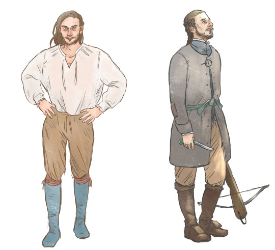
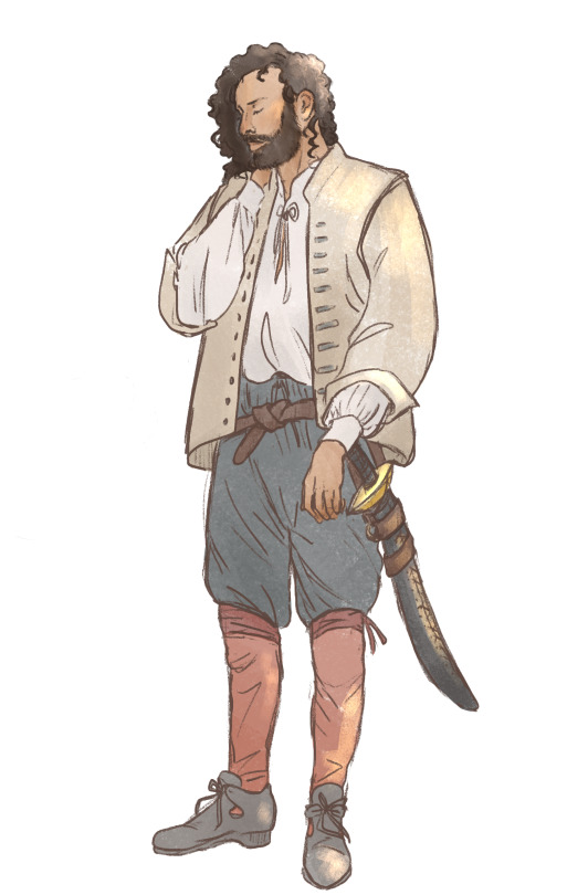
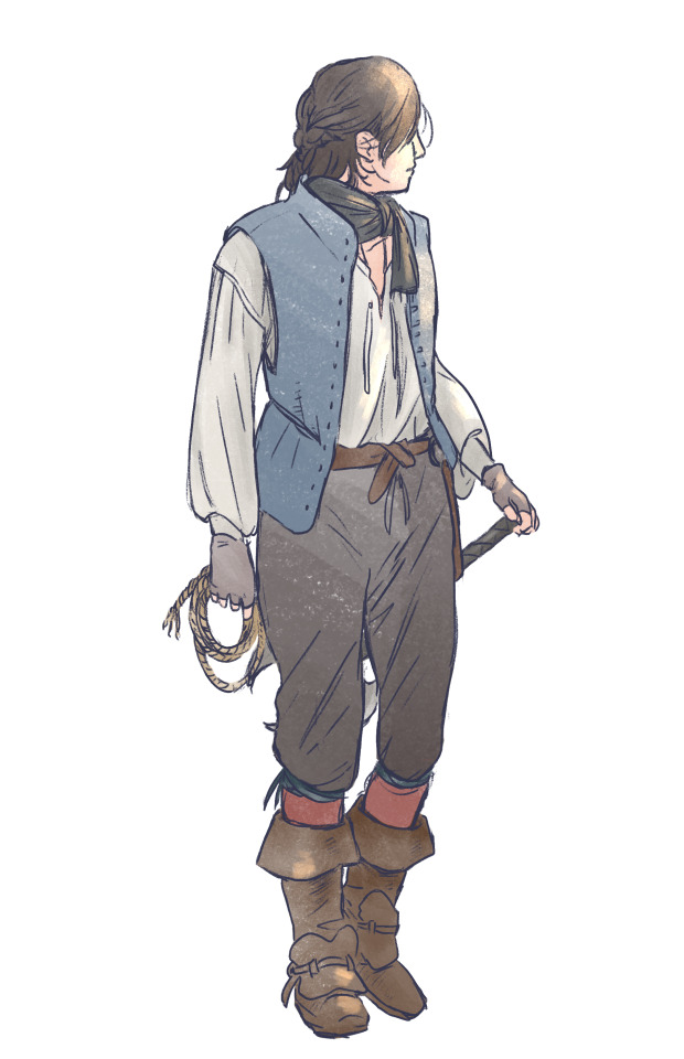
More clothing studies, this time from my fic Axis. I was aiming for authenticity while also trying to have each of their personalities show a little bit in their clothing choices. Two for Nicky, to show his layers.
#tog#the old guard#for reference the fic takes place in 1625 in iceland. i still don't think they're bundled enough though lol.#nicolo di genova#yusuf al kaysani#andromache of scythia#no quynh :(#these were a n i g t m a r e to crop correctly. tumblr why are you like this.#hence the cropping might look a little weird#siggy draws#i think these sketches took a month and a half lol. now i will be quiet about this fic and focus on writing something else.#what do we think about this style? the differently coloured lineart and the slight lighting? and the rough colours?#also i forgot my siggynature on ALL of these but that's ok. you know who i am sdfghf#my new obsession is clothing details i guess!! could always make it more detailed though! with lots of practice i can try.#no real director's commentary on these drawings like i usually write for my sketches asdsfgfd#just that this is mostly what they wear in the fic. add a coat for andy maybe and some mitts for joe.#and more weapons and bags and stuff#can't really see nicky's braids but he's got one big french braid and a few tiny ones on the sides of his head connecting to it.#his hair is like shoulder-blade length. it's about the symbolism!! of not making a change for a long time!! until he does cut it!!#and andy is wearing quynh's necklace under her shirt of course </3#joe rolls his pantaloons above the knee for maximum movement (horseriding) and fashion (gay)#i have a crush on the first nicky sketch like he's so cunty for no reason#well. he's possibly supposed to be having a serious conversation/argument with andy#kudos to the ref picture i used of luca just standing Like That
231 notes
·
View notes
Text
Concept design module work
So here’s to trying to track my work progress and hopefully make some improvements with my work along the way.
For this module, we were supposed to come up with concepts for a game/film idea. I opted to come up with a short film idea as I’m not too much of a creative with regards to gaming, but it’s not like I was any brilliant with stories as well haha. Anywho, the story idea was generally about this rich kid who had some important thing stolen, hence she’s doing her own investigations to figure out who did it. Originally, I had the idea of the stolen thing be something like a gem of sorts, but everything kind of got lost throughout the semester, definitely something I should remember not to do. Gotta keep the work grounded to the original idea or evolve it to a way it still makes sense.
For the first assignment, we had to come up with different variations of 3-5 characters that exist within the universe. The number of characters depended on how complex the style/painting style was. I went with a “simple” style, lineart and some slight shading. Unfortunately wasn’t too confident with painting, else this could probably look way better haha.

These are the design variations I came up with. I guess it’s easy to tell where I lost steam as I worked on the characters, some of these really look pretty half-assed, oops :’)

Up next was colour variations. There wasn’t really a clear goal in my mind about this so I just dropped colours randomly and worked through it in a roundabout way to make all those colours work. Should probably have a clearer colour palette in my mind to save some time.

Sooo here’s the final for the characters. Presentation is truly horrible. My excuse would be that I rushed the work, and upon completing it, it’s easy to just be like “time to just put them all together and leave it be”. Lesson learnt: plan early!
Overall I feel alright about these characters, I feel I could push them further in terms of shapes, explore trying to toy with the scale of stuff on their outfits? I’m not too sure too I guess haha. My favourite one would be Ann the maid. I’ve always struggled with lineart as I’m not the most patient person with my art, so I tend to do the lines quite sloppily. The Huion screen tablet I bought probably helped with my control of the lines, it does feel quite different compared to just drawing on a drawing tablet. Anyway, besides that, I do feel like I did the head for Ann the most justice, a slight head tilt upwards gives the expression so much more “vibe”, imo.
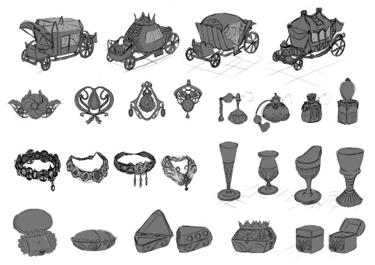
Up next would be the props assignment.... Yikes. Never really jumped into drawing objects much. It is a great way to jump out of my comfort zone and it was pretty fun trying to make shapes work and make sense of the functionality of it. It was a slight overkill here as I’ve done more than what was asked and it did bite me in the ass as we progressed through the assignment.
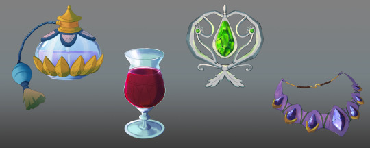
And skipping the colour variations as they’re mostly the same palettes as the characters; if I don’t remember wrongly haha. So this was not the first version of final for the props. In the first one, I’ve coloured and did some shading on all of 6 props I had in the sketches above, but they ended up not looking cohesive. The lecturer pointed it out and I had to agree, it be a mess yo. So after scaling down on the amount to do and observing materials more carefully, this was the best I came up with. So I guess just always observe the material properly and quality > quantity :’)

The last assignment was to come up with an environment piece. So basically I don’t draw anything but humans so the struggle is too real here. Composition wise I had to take way too much reference from actual environment concept pieces from animated films, something I’ll like to change for the new school year! Also, it’s bad when I had to put stuff in just to fill in space, definitely should think of the bigger shapes first and slowly figure out what they are.

Skipping the colours again as they’re not very interesting to me haha. For this final lighting, it was based on a morning/day lighting. Went with a more “blended” rendering. It was tough as I feel that the shading feels muddy in some areas, probably due to the wrong brush and bad pressure control while painting. Another thing is understanding light. It’s still a struggle but as I learn to dissect references into something I can understand, I hope I can do a future piece with much better lighting! Also wow, this really lacks dark shadows considering how bright it is?
0 notes
Last Seen Blogs
bakugoushotwife
Kylee

oddpositivity
All Cryptids Are Valid

usacleanmastergermantown
USA Clean Master

purpleinkandpeacockfeathers
Purple Ink & Peacock Feathers

thatonehawkeye
clint barton