#will create shit graphics on photoshop for minimal pay
Text
Entry #16 - 21/01/2020
Well, it’s safe to say returning back to Cheltenham and the whole dorm life has been fairly bittersweet! I guess I adapted very well when I was back home (and I mean, who wouldn’t when you are blessed enough to not worry about money for that period, and great parents who are willing to help you out as much as possible!) It was quite sad on the final day of coming back here with my dad dropping me off, but at the same time it feels quite nice. Nice to have my privacy back, my own bathroom schedule and be able to use my gaming PC again!
It’s currently 6am as I write this, sadly my sleep got interrupted by a phone notification, turns out a friend was spamming me on Steam so now I am awake. The power of the internet right there folks, being able to wake someone up from thousands of miles away. However, I am not too fussed. My semester starts again today, and my lecture is at 11:15 so it’s not all too bad.
Initially I was kind of freaking out, predominantly due to the fact that my first lecture this week involves group-based work... and I guess I’m not really satisfied with the input that I had put in before Xmas for the group, but oh well. I am hopefully willing to change that with this next lecture coming up.
I want to try and get some organisation into the group. Sort out roles for each group member so we know what we’re doing and contribute more ideas together. I think before Xmas I was just so drained, tired and stressed with all the other assignments that my mind just went completely blank. However, it’s a new year now, new semester and that means I gotta be back on my A game.
So I’m feeling relatively optimistic about that, albeit nervous.. but hey, I’m still here and I’ve managed to get through all this shit before in my life, there’s hardly anything stopping me, other than how negatively my mind perceives me. In all fairness, my mood has been quite good ever since Christmas and my last post. I’m hoping it stays that way! I’m satisfied with the long break I had, and now it’s time to work hard again. This project should be fun anyways.
I don’t imagine this project/assignment will be too time-consuming regardless.. we’ve got 4 months to do it and we’ve got a very very basic concept that runs... I guess we just need to keep adding stuff to it over the next 4 months and see how far we get into it. Least that gives me hopes about time-keeping for the other assignments I’m starting this semester which I’m sure will be just as stressy as the ones I’ve just done :^)
Talking of assignments, my creative skills assignment got graded, the one which heavily involves Photoshop, Illustrator and all that graphic design stuff. I got 68, which was 2 marks off the top criteria.. So I’m happy with that! Considering a pass grade is 40, an extra 28 marks on top of that I’m chuffed with. So that’s kept me very positive recently that my work isn’t utter crap!
I am sorta worried for my other two assignments that are yet to be graded. One assignment which is the creating a game in Unity that I had to request an extension for, I feel like I’m going to get a low grade or not pass at all... trying to write the code myself was so difficult so uh, some sort of it was uh, “referenced” from online, i guess. My 3D modelling assignment I’m also sorta worrying about as I rushed it towards Christmas as I requested an extension for that too. Oh well, I’m going to try not to let it play on my mind...
On a more positive note, I decided to get this student housing thing sorted once and for all. I can’t afford to go back into student halls, and I’ma be real with you, but the flatmates you get can be obnoxious as fuck. Not saying that my current flatmates are like that, but uh, we just live and let live and we don’t really speak to each other. But they like to hog the kitchen a lot, and that annoys me. So I don’t really want to put up with that again next year.
I organised a Discord group thingy between my bf and a friend from the course, so we could get a 3 bed house that’s close to the campus. Thing is, this student house is ideal for me because the rent is so cheap compared to student halls. So if I can get this student house, I’d be able to keep and spend so much more than I get right now. Lets put it this way, in student halls at the moment, I only get £300 to spend across the 3 months. If I was in a student house, on average I’d have just over £1k to save/spend over the 3 months. Yum fucking yum!!! So I really hope to fuc that we can get a place sorted!
I ain’t really got no fear of anything going wrong tbh... we still got quite a bit of time, and there’s still some good choices going around in the area near the university- which is convenient as currently where we stay it is an hour walk to campus, and yeah.... not worth it. I might also mention it to a few friends on the course if they want to also come live with us, but it looks like everyone is sorted... so I think it’s best that we just find a place, inquire, see if we’re happy and then slap the deposit on it.
Conveniently, my dad just got his redundancy money from work and has offered to pay my deposit for me which is a MAJOR help, otherwise I simply would not be able to afford it and live at the same time. So I feel very blessed knowing this. Of course, once we get to the house I am not going to blast any of the money, in fact I might just spend it how I do now, very minimally. Reason being? Overdraft. I gotta get out my overdraft. My bank has started to change the limit of how much is fee-free, and at the moment I can take out up to £2000 and it’s fee-free, but at the end of this year it’s going down to £1500, then the year after it’s £1000, year after is £500 and then so on.
So realistically, it is absolutely in my best interests to go for a student house. I need that money. I have also been looking at costs about doing an internship in Canada, and yes, it is fairly expensive once you count the application fees, flight fees and the fact that the Canadian government want you to prove that you have 2400CAD in your bank to prove that you can sustain yourself in Canada.
I have been looking at the invitation pools for UK residents to take the working holiday visa scheme in Canada, and right now it seems 3k people have signed up, and there’s 6k slots... so... that’s filled some hope in me! I just really hope I get a place!! It is absolutely my dream to work in Canada for the year. I just gotta be on top of my game on December 2020... as I believe that’s when the pools next open. I just hope they don’t mind being there for only a year when the visa grants you two years! But uh, they don’t need to know that hehe... or maybe they do. lol idk.
But yes, a student house is needed in order for all this to be accomplished. I know for a fact I would be more comfortable staying with my bf and a coursemate rather than more random people that I have to awkwardly say hi to when I want to grab my noodles from the kitchen. But yes, I’m estimating that over the second year, I’ll have about £800 or so to spend. That’s amazing. And I want to invest £500 into my overdraft so I can go down to the fee-free amount (£1500), and then do the same for the next instalment so I can go down to £1000, and then save whatever is left from the final instalment to try and sustain myself for if & when I go to Canada. They ask for 2400CAD in your bank, and that’s £1400... I guess as long as I have that in my bank they’ll accept me, and then once I get in I can focus on paying that overdraft off.
I’ve heard internships in Canada pay minimum wage, so if I have extra money in the month that I don’t necessarily need, I’ll send it to my UK bank account and help me get out of that overdraft, as when/if i’m in Canada, the fee-free amount will reduce to £500 or so, therefore I need to get that paid off. I don’t think it should be too difficult, but I’m super relying on these things working out, and lets be real, there’s a very high chance of all this not working out. Though, I won’t allow myself to. I will find a student house. I will save the money I get when I’m at said student house. I will pay my overdraft bit by bit. I will try to save up 2400CAD so I can get accepted into Canada, but the most important part: I will try my best to entice Canadian game studios to accept me..
That last part, that’s going to be tricky I think... I hope I am good enough that they will accept me as their intern. I don’t know really. I still don’t know where I wanna go , but anywhere in Canada I’m happy with: particularly if it’s Toronto or Montreal. Hell, I have still been learning French for just in case I do get a place in Montreal. They speak French there? well heck, so will I with all this time I got to do it. Plus, I’ve been wanting to learn French for a while, but just needed a sort of kick up the butt to say “ok, here’s why you should ACTUALLY do it!” and yea :3
That being said , I would also be happy if I got accepted at a studio in Vancouver.. a bit far and very much behind time-wise from the UK, but hey it’s only for the year, I may as well live it up aye? Of course, I am still banking on myself to get accepted into the pools and be invited by the Canadian gov, then consult jobs/studios all over Canada with my work and stuff, then save up the money to get into Canada, all simultaneously while trying to find a roommate in whichever city I get to (however, this seems like a rather simple one as I’ve already seen many apps that can help find roommates and offers seem to come & go A LOT.)
A roommate would definitely be ideal for me, as it would help split the rent. If I’m going to stay in a city like Vancouver or Toronto, it isn’t really possible for me to sustain myself on minimum wage in these cities. So a roommate is ideal. Besides, I need friends when I get there anyway! lol
I wonder if I’ll look back at this post in a few years and think... “Wow Kurt, you thought it was that easy?” - part of me thinks this goal is far-fetched, another part of me sees it as perfectly accomplishable with the correct amount of time, planning and finances. So really... I don’t know. I would say at the moment, probability is low in the likeliness of me getting in, because my work is still a bit.. questionable, as I am still a fresher after all. So I gotta rely on producing really good work that catches the eyes of employers, host a website with my portfolio on it and send it to just as many Canadian studios as I can and then hope for the best. I just really want this goal, it’s an even more motivating goal than thinking of graduation, honestly!
Welp. I posted a lot on this one, but everything I said here is 100% the things that run through my mind a lot of the nights. I am going to stay optimistic, I’m going to work to the best of my ability and make my creations look appealing, I am going to get that student house so I can be happy financially and secure myself & my goals. Til next time
~mangie

0 notes
Text
Transcript of What’s Podcasting Got To Do With Marketing?
Transcript of What’s Podcasting Got To Do With Marketing? written by John Jantsch read more at Duct Tape Marketing
Back to Podcast
Transcript
John Jantsch: This episode of The Duct Tape Marketing Podcast is brought to you by Klaviyo. Klaviyo is a platform that helps growth-focused eCommerce brands drive more sales with super-targeted, highly relevant email, Facebook and Instagram marketing.
John Jantsch: Hello, and welcome to another episode of the Duct Tape Marketing Podcast. This is John Jantsch. My guest today is Guy Kawasaki. He’s the Chief Evangelist of Canva, a great online design service, and executive fellow of the Haas School Of Business at the University of Cal Berkeley. And he has the distinction of being on my show for about the sixth time, probably. I think we talked about this last time you were on my show. I think I’m the only podcast or to interview you for both versions of Art of the Start.
Guy Kawasaki: And that and a nickel will buy you… Well, not even a cup of coffee, but yeah.
John Jantsch: So, we’re going to talk about a number of things today. It’s been far too long. Guy’s most recent book is called Wise Guy: Lessons From a Life, so we’re going to touch on that. But I always like to get a little update on Canva, so why don’t we start there? As an evangelist, this is your only job, right, is to talk about it?
Guy Kawasaki: Well, I also have four children, but who’s counting? So, I’m the Chief Evangelist of Canva, and for those of you who may not have heard of Canva, it is an online graphics design service based out of Sydney, Australia. And the essence of Canva is that it has democratized designs that basically anyone can create beautiful designs for social media, posters, business cards, presentations, t-shirts, whatever you want. And I’ll just tell you that, in the month of October, Canva made 139 million images, so we make about four or five million images per day at Canva for people all around the world.
John Jantsch: So, there are dozens of folks that have tried to crack that nut. Why do you suppose Canva was so successful? I mean, there are other online design tools that are been around a long time that haven’t been that successful.
Guy Kawasaki: Well, I think that one of the key decisions was that we decided that we’re going to make every conceivable design type, and within a design type, hundreds of templates. So, what I mean by those two words is that, a design type is a square Instagram image, right? A design type is a 16X9 presentation. A design type is a Kindle book cover. So, when you come to Canva you say, “All right, so I want to create a Pinterest pin. I want to create the Etsy store. I want to create the eBay store cover photo. I want to create the cover photo for my LinkedIn account.” And all of those, we have the optimal dimensions already figured out, and within those design types, we have hundreds of templates. So, you find a template that you like, you upload your own photo or you use one of our stock photos, you change the text, and I promise you, in the time it takes to boot Photoshop, you could finish a design in Canva.
John Jantsch: I totally agree with you. I mean, the ease of just saying… For example, if you’re working with a small business client like we do and they are on six different platforms, and you need a header image for each and all the things, every single one is a little different size, and so it’s just so convenient to just go boom, boom, boom, boom, boom. So, I know [inaudible 00:04:04].
Guy Kawasaki: I mean, John, I don’t know if you realize this, but even more convenient than going boom, boom, boom, boom, boom, we have a feature called Magic Resize. And what Magic Resize says is, “Okay, you did the basic design for one. Now, we will resize this for all the other five platforms.”
John Jantsch: Oh, but I don’t know about that because that’s the $10 a month one, right? I’m not going to pay $10 a month [inaudible 00:04:29].
Guy Kawasaki: Oh, John, you’re killing me, John, bro. Your books are free, right?
John Jantsch: No, that’s awesome. So, are they going to stay true, do you think? Or would there be a temptation to say, “Let’s get into audio and video editing,” and all those kinds of things?
Guy Kawasaki: Well, certainly video because we already do that. Going to 16X9 presentations, we’re trying to make it so that mere mortals can have beautiful PowerPoint-like presentations. I don’t know. We would like it so that every graphic in the world is produced by Canva. We’re not shrinking violence at Canva.
John Jantsch: All right, well I guess you just sold me. I’m going to pony up the 10 bucks a month.
Guy Kawasaki: Okay. We can end this now.
John Jantsch: All right, so this is, what, your 14th, 15th book, Wise Guy?
Guy Kawasaki: Yeah. Wise Guy’s number 15. I truly do think it will be my last, also.
John Jantsch: Yeah? Is that because you’re out of things to say or because you’re tired?
Guy Kawasaki: Well shit, I was out of things to say on my third book, so… Well, it’s partially retired, but switching to the next topic, I am now convinced that podcasting is the new book writing. Because, well, the advantage of podcasting is, well, you can be in front of your audience a minimum of 52 times a year. You can change on a dime. So, next week if John Ives says, “I want to be in your show,” you can put them on, right? Whereas, in your book, it takes a year to write a book, it takes six to nine months to publish it, so let’s say two years, and then, it’s done. It’s laid in concrete, and you’re never going to touch it again unless you fix typos. So, you get that initial burst of, I don’t know, maybe for you, five million people buy your first version. But then, some people read it, but it’s never picked up again. Whereas, a podcast, man, you’re in their face every week. That’s so much better.
John Jantsch: Except for What the Plus! I mean, that one lives on forever.
Guy Kawasaki: Well, What the Plus! may have lasted longer than the service, but I digress.
John Jantsch: I completely agree with you on the pod… I mean, there’s so many… You mentioned an obvious benefit, but I mean, the first time you and I met was through this format and I’d like to at least call you a little bit of a friend. You’ve been a [inaudible] of my career over the years, and I think this is where the introduction happened the first time. And I’ve done that with most people.
Guy Kawasaki: But see, I’m an idiot because it took me… I’m just a late bloomer. I took up hockey at 44. I took up surfing at 61. I took a podcasting is 65. I don’t know why people listen to my advice. I clearly don’t know what the hell I’m doing.
John Jantsch: I don’t even have to ask you questions because you’re just going along my proposed questions here, but I was going to ask you that. Was their resistance or was it just literally a matter of, “I just didn’t get around to it”?
Guy Kawasaki: What, the podcasting? Okay. So, there’s the high road answer, and there’s the low road answer. Which answer do you want?
John Jantsch: I want them both, and we’ll balance them out.
Guy Kawasaki: Okay. So, the high road is, I’m at the end of my career, I’ve made a lot of connections. I’ve made a lot of friends. I can tap into that so that I can interview a Jane Goodall, a Margaret Atwood, a Steve Wozniak, Steve Wolfram, Bob Cialdini. I can get to these people because I’ve been dealing with them for years and years. So, I have this tremendous competitive advantage to interview people that many people could not get unless you’re Terry Gross maybe Malcolm Gladwell. And now, I have a much better filter system because I’m so much older that I, theoretically, have acquired some wisdom, so I can ask them the right questions. So, my time has come to do a podcast featuring remarkable people. That’s the high answer. You want to hear the low answer? Well
John Jantsch: Well, let me let you think about the low answer for a minute. So, your podcast is called Guy Kawasaki’s Remarkable People, and that’s, ultimately, what you’re doing. So, the chances of me actually being a guest are pretty minimal, I think.
Guy Kawasaki: Well, I have a test that if somebody asks to be on the podcast, they’re not remarkable enough.
John Jantsch: Yeah. Fair test. So, let’s have the low answer then.
Guy Kawasaki: So, the low answer is, when I came out with Wise Guy, I was a guest on many podcasts. Okay? So, I got to talking to somebody’s podcast where I say, “So, how often do you do this?” One guy said 52 times a year., Another guy said 156 times a year. And I said, “So, what’s your model?” “Well, it’s advertising and sponsorship.” I say, “Okay, so where does the advertising go?” He says, “Well, there’s one or two ads in the pre-roll, there’s one or two ads in the middle, and there’s one or two ads at the end.” And I said, “Well, how many people listen to these things?” “A quarter million.” “How much do you get per ad?” “Well, the ones in the front get 20 grand, the ones in the middle will get 15 grand, and the ones at the end get 10 grand.” So, I’m sitting there doing the math. So, let’s say there’s six of them and they’re doing like 15,000 bucks each on average, and I say, “So, six times 15 is 90. Ninety times 52 is fricking four and a half million bucks. That’s 10 times bigger than any advance for a book I ever got. What the hell am I writing books for?
Guy Kawasaki: Simultaneously, at 65, I just don’t want to travel anymore. I would just like surf, and so I said, “Okay, so maybe I can make my podcast successful. Basically podcasts and surf. I don’t know if I’ll make four and a half million dollars a year, but if I come…” Well, I don’t even need to come close to that to be happy. So, maybe this is my path to retirement and a better life and more surfing. So, that’s the low answer. I did it for the money.
John Jantsch: I want to remind you that this episode is brought to you by Klaviyo. Klaviyo helps you build meaningful customer relationships by listening and understanding cues from your customers, and this allows you to easily turn that information into valuable marketing messages. There’s powerful segmentation, email auto-responders that are ready to go. Great reporting. You learn a little bit about the secret to building customer relationships. They’ve got a really fun series called Klaviyo’s Beyond Black Friday. It’s a docu-series, a lot of fun. Quick lessons. Just head on over to klaviyo.com/BeyondBF, Beyond Black Friday.
John Jantsch: So, we’re recording this in December of 2019, depending upon when people are listening to this, you’ve launched the show already, your first guest, or at least the first show I was able to see was Jane Goodall. A lot of people know her work for years with the apes in Africa. What’s the basis of your relationship with her and that interview?
Guy Kawasaki: Okay. So, about a little more than a year ago, the person who runs the TEDx in Palo Alto, out of the blue asked me if I want to interview Jane Goodall for her at TEDx. And that’s like, “Well, duh. Of course I want to interview Jane Goodall at TEDx.” So, it actually cost me a lot of money because I turned down a speech. I could’ve got paid speech for the same time. I said, “No, I can always get another paid speech, but how often can you interview Jane Goodall?” So, I interviewed Jane Goodall for TEDx, which is on YouTube if people want to see it, and I really became friends with her. Sometimes you just hit it off with a person. Right? And so, we’ve been communicating and stuff like that, and I communicate with her staff. And [inaudible] Fitzpatrick and I, we always help Jane Goodall when she wants to raise money or make something go out on social media.
Guy Kawasaki: And then, I decided to do this podcast, and I said, “Well, I need a spectacular, remarkable person as the first guest. Who could be,” and you weren’t available, “so, who could be better than Jane Goodall?” And so, she was going to be in San Francisco, I recorded her, and yeah, I mean, life is good. It’s good to be Guy Kawasaki sometimes.
John Jantsch: Yeah. Well, I know what you have a good relationship because I’ve seen pictures of her grooming you.
Guy Kawasaki: Yeah. She’s looking for lice in my head.
John Jantsch: Which, I think, was reminiscent of her work in the jungle, wasn’t it?
Guy Kawasaki: Yes. Yes.
John Jantsch: So, who else is up for the show? Who else do you plan to talk to in the upcoming weeks?
Guy Kawasaki: Yeah. So, Jane Goodall is out, so is Phil Zimbardo. Phil Zimbardo is the Stanford psychology professor who did the Stanford prison experiment where kids simulated being guards and prisoners. Next week is Stephen Wolfram. He is the creator of Mathematica and Wolfram Alpha, the search engine. Got a PhD at 20, MacArthur Award at 21. The next week after that is Margaret Atwood, the author of Handmaid’s Tale. And then, believe it or not, we have Wee Man, Wee Man from Jackass, the MTV series and movie. And then, I have Bob Cialdini, who I’m sure you’re heard up because you’re into sales and marketing like I am, so I have Bob Cialdini.
John Jantsch: He’s been on this show. Yeah.
Guy Kawasaki: Yeah, he’s great. So, basically, that’s the kind of people I have. I mean, they pass the remarkable test.
John Jantsch: Yeah. So, what do you have to learn to do this? This is a different format. This is different technology. This is maybe a different skill. What’s it going to take to get Guy Kawasaki to the Remarkable Podcast host?
Guy Kawasaki: Well, I’ve done a lot of panel moderation and stuff and fireside chats, where I’ve been on both sides, so it’s not like, to use a Jane Goodall analogy, it’s not like I was Tarzan and I got off a ship from Africa and now I’m in London and I have to figure everything out. So, I’ve been to this rodeo, maybe wearing a different hat, but I’ve been to this rodeo. And have you listened to the Jane Goodall one?
John Jantsch: I listened to about half of it. Yeah. In preparation for [inaudible 00:15:22].
Guy Kawasaki: Okay. So, you could see that… Well, one is, to tell you the truth, I believe that the role of the podcast or is to make the guests look great. And I also believe that, if you look at the minutes spent who’s talking, it should be about 90/10, or 90 is Jane and 10 is Guy. And so, that’s something, and a lot of people have said, “I really like your podcast, Guy, because you let Jane talk.” I think a lot of podcasts, it’s all about them, right? They’re just talking and talking and talking, and then, finally, the guest gets to say something and then the podcaster gets back on a riff. So, I don’t step on my guests. Now, honestly, I don’t know how to get subscribers or advertisers, but I figure, if I get all these guests and I produce a great podcast, I’m a big believer in, “If you build it, they will come.”
John Jantsch: Well. I think that’s a lot of it. And you’re also doing the networking. You contacted me to tell me about it, and you contacted a lot of people to tell them about it. I mean, that’s kind of Marketing 101, right?
Guy Kawasaki: Well, nothing is easy, right? Well, if you’re Michelle Obama and you started Michelle Obama Remarkable People Podcast, I’m pretty sure you’ll get 5 million subscribers in the first day, but I’m not Michelle Obama.
John Jantsch: Do you listen to podcasts?
Guy Kawasaki: Yes.
John Jantsch: Yeah. What are some of your favorites?
Guy Kawasaki: I listen to Malcolm Gladwell’s Revisionist History, who I’m trying to get as a guest. I listened to Wait Wait… Don’t Tell Me! I listen to Freakonomics. I listen to Joe Rogan. I listen to Terry Gross. I’m a big NPR fan, basically.
John Jantsch: Right, right, right. Yeah. Yeah, you can [inaudible] a lot of those shows have moved to the podcast format, but obviously, there’s still broadcast, as well. Where do you think this is going? The audio… And again, maybe you’re not in the position right now where you want to future cast trends and things because you’re just trying to figure it out to make it work for you, but it seems to me like audio content right now… I mean, podcasts had been around a while, but it seems to me like audio content is really hot and it’s going to get hotter.
Guy Kawasaki: Yes. I think that podcasting is like artificial intelligence. So, artificial intelligence for the last 30 years was going to be the next big thing, right? And finally it is. So, I think we may be there with podcasting. A lot of it is… It’s critical mass. I mean, in a sense, Apple has created a critical mass for podcasting. In the same sense, I think, one of the things I’ve noticed is QR codes, which was supposed to be a big thing, Apple finally made it a real big thing because now when you just put your camera on a QR code, you don’t have to download a QR reader, right? So, all of a sudden, yeah, QR codes makes sense. And I think Apple did the same thing with podcasts, that now that they’ve done so much and they put a podcast player on every iOS device, Apple has created another market.
John Jantsch: Yeah. And I’ve been doing this before, that was the case and that was one of the initial challenges with podcasts. It was hard to show people how to listen.
Guy Kawasaki: Yeah. Yeah.
John Jantsch: Where do you think Spotify fits into this? It seems to me like Spotify is really gaining some traction in the podcast space. Do they take on Apple, or is it just broaden the universe for everyone?
Guy Kawasaki: Hell if I know. I mean, based on two episodes, I don’t consider myself an expert. But Spotify has taken a different position. In a sense, they’re like Netflix, right? So, Netflix just doesn’t share stuff anymore. Netflix has its own series. Right? So, similarly, Amazon Prime, I watch Jack Ryan on Amazon Prime. Amazon Prime owns Jack Ryan, right? And so, Spotify is trying to create content, not just distribute content, and so they’re supposed be making this huge investment in podcasting. And I guess we’ll look back and say, “Wow, that was a genius move,” or we’ll look back and say, “Well, what a dumbass move.” And I don’t know. If Apple said we’re going to be a content creator… Well, they they do that, right? They created that Morning Show for Apple TV and all that, so I guess we’ll see. I don’t know.
John Jantsch: Yeah. I think that’s the direction a lot of people are going ahead, and I wouldn’t be surprised if, just like you are playing the evangelist role for Canva, I’m wondering when companies like that start bringing in somebody like you to be their podcaster or to be their spokesperson as a podcaster.
Guy Kawasaki: Well, funny you should mentioned that because I’m Chief Evangelist of Canva, and I told Canva, I told you know the other people at Canvas, like, “So, right now you have your Canva social media, the Instagram, Facebook, all that, and you have your email lists, but there’s a limit to how many times you can send an email to someone in your registered user database. And that limit is not 52 times a year.” So, I’m making the case that, if we could get my subscriber base up to a million or so, that is a fricking tremendous weapon. So, if Guy Kawasaki’s Remarkable People has a million subscribers and Guy Kawasaki’s Chief Evangelist of Canva, so at an extreme, the pre-roll, the midway, and the end ads could all be for Canva. So, imagine, 52 times a year you can hit a million people with an ad three times. Oh my God. I mean, life is good.
John Jantsch: Absolutely.
Guy Kawasaki: So, yeah.
John Jantsch: So, I think that’s going to be a role that, I think, you start seeing is that whether they’re media companies or just companies seeing it as another channel, I think are going to start buying up people’s reach with the podcast.
Guy Kawasaki: Yeah. Because, I mean, for the very simple reason that you could hit people much more often with a podcast than you can with an email, MailChimp campaign. Accenture did a five or six podcast series with will.i.am, right? And you couldn’t hit your Accenture database six times, or probably maybe 18 times, because there are multiple ads inside the six episodes. There’s no way you could have hit your installed base with 18 email campaigns. Well, first of all, there’s not 18 interesting email campaigns you could do.
John Jantsch: Yeah. And I think that’s the key point, too, is it’s far more engaging content than an email ever will be.
Guy Kawasaki: Well, I mean, in a sense, how does NPR raise money? I mean, you don’t enjoy the pledge drive, right? So, you feel a moral obligation to reciprocate. And similarly, with Wikipedia, you don’t like to see that ugly banner where Jimmy Wales is asking you for money, but because Wikipedia provides such great information and content, you feel a moral obligation to donate. So, you could make the case that if Guy Kawasaki’s Remarkable People has all this great wisdom and advice and inspiration, and then it’s sponsored by Canva, you might feel, “Oh geez, I should help Guy out and use Canva.” That’s the theory anyway.
John Jantsch: Yeah. I think it’s a good theory. Well, Guy, we’ve exhausted our time. It was great catching up with you again, and I wish you luck in this new venture. And I will not ask to be on the show, I will just wait by my email for the invitation, if it should come.
Guy Kawasaki: Well, I hope someday to send you that email.
John Jantsch: All right, well-
Guy Kawasaki: Let’s hope that you have four files.
John Jantsch: Yeah, we’re recording with some new new technology here that I think is going to just be awesome, so I-
Guy Kawasaki: If you don’t have four files, it’s my fault for convincing you to do this, and I will appear again.
John Jantsch: That’s right. All right. Well, I get to say to you, mahalo, then.
Guy Kawasaki: Take care.
from http://bit.ly/2O719G4
0 notes
Text
Fitness Infographics Crush On Instagram. Here’s How To Make A Great One.
You’ve seen it everywhere.
Your friends are doing it.
Your fitness colleagues are doing it.
You might even be doing it, but wanna get better.
Well, you came to the right place because today we’re gonna talk about …
…FITNESS INFOGRAPHICS!
I’m gonna teach you how to create fitness infographics for Instagram to make more money for your business.
Sound good? Good. Let’s just dive right in.
WHY YOU SHOULD DO IT
The great Mark Twain once said, “Whenever you find yourself on the side of the majority, it is time to pause and reflect.”
I love Mr. Clemens, but he never had an Instagram.
Plain n’ simple, infographics on Instagram work.
If done correctly, they are:
Easily discovered on the Explore page (attention-grabbing)
Simple to make after some practice
Digested quickly by your audience
SHAREABLE between other influencers (and followers)
VALUABLE to your audience
Yes, there are many people doing them (and many people NOT doing them), but most are really shitty.
Since you’re reading this article, your infographics may look shitty too, but that’s fine because everyone successful at making them had to go through that stage at some point.
As an example, I will use myself. On April 26, 2017, I had 1,319 followers.
74 likes, 18 saves, and 5 comments.
This was my first ever infographic on May 17th, 2017. Not terrible, but definitely not good.
The background needs to be white. Black background is harder to read (think newspapers – white with black letters).
My green checks are crooked.
My header letters are not big enough to grab your attention while scrolling through the Explore page/your feed.
Lots of writing; could be simplified and more concise.
Needs to be neater and more organized.
Like I said, not terrible. But we can make some improvements.
Let’s jump ahead a little over a year later and see what I’ve done differently.
1,039 likes. 1,300 saves. 15 comments.
2,114 likes. 1,400 saves. 158 comments.
A touch better, yeah?
Do all posts perform this well? Hell no. But it’s an improvement, for sure.
And as of writing this, I’m currently at 12K followers.
I haven’t gained as quickly as some others, but I’ve made progress and I’m happy with the audience I am creating.
I like to put my following in perspective by imagining if all 12,000 of those people were listening to me speak on a stage. That usually does the trick when I feel the need to compare myself to others.
And, let’s be honest, your follower count doesn’t mean dick if those followers aren’t buying shit.
The point is NOT to get more likes or followers.
The point is to make such a large impact on your audience that they are guilted into buying from you.
Again, to use my own clients and pure objective data, these are the stats pulled from all my client analysis forms:
Sure, I put more effort into Instagram than my other social media platforms, but the data is still ridiculous.
It shows you can convert followers into buyers if you market yourself well enough.
Which brings me to the meat and potatoes of this article: the 6 steps to infographic mastery.
STEP 1: Find a creation platform.
You have a few different options here.
If you’re super basic and have minimal graphic design skills, I’d highly recommend using Canva.
It will feel slightly overwhelming at first, but if you watch through the tutorials on the website and play around a little bit, you’ll get the hang of it. I’d also add that I prefer to make the graphics on my laptop. The app works fine, but fat fingers can make it difficult to create with precision.
Aadam Ali just gets it.
If you wanna get fancy or have more tech skillz than I, feel free to use Adobe Photoshop. I’ve never used it, but plenty others have and they love it.
Check out Aadam Ali’s Instagram (@physiqonomics) to see a master at work. I would honestly be doing him a disservice if I called his illustrations “infographics”. They are by far the best drawings on fitness on the Internet.
There is no wrong answer here, just pick one that best suits you and move to step 2.
STEP 2: Idea Creation – What’s the purpose of the infographic?
Alright, let’s not overthink this one.
Don’t get me wrong, you want to spend some time on this, but it can cause paralysis by analysis trying to figure out the PERFECT title for your infographic.
Some questions to ask yourself to overcome this:
What has worked for people similar to your brand/niche? Is there a way you can put a spin on it?
Do you wanna be a contrarian and go the opposite route of what most people say?
Do you want it to be funny? Entertaining? Informative?
Do you want to create a list?
To quote my man crush, Nate Green, before every post ask yourself, “What exactly am I trying to say?” Then at the end of the post, “Did I say what I wanted to?”
If yes, you’re good to go.
The main takeaway with this step: just get started.
Have a rough sketch and start creating. You’ll mold it to your liking as you keep working and, sometimes, you’ll take it in a completely different direction than you intended.
Follow that muse.
STEP 3: Content Creation
There’s only so much I can say in this section. This is where you have to showcase your creative talents and bleed the infographic with your personal brand.
Meaning if you’re primarily targeting women who want to look and feel better, your infographics may look similar to Marci Nevin’s or Leslie Hooper’s:
I actually reached out to Leslie and Marci to give some tips on their success.
Here’s what they had to say:
Leslie Hooper (@hooper.fit) – “Keep it simple. The fewer the words the better. You have three seconds to grab the attention of your audience while competing with thousands of other posts. This may be the first time someone has read anything on your topic, so make sure it’s so basic a third grader could understand it. Bonus points if it elicits an emotional reaction using wit, depth, irony, etc. And please, for the love of god, make sure the text and images are spaced out and centered appropriately. Perhaps Sweet Brown said it best, when the infographic isn’t aesthetically pleasing, “Ain’t nobody got time for that!” It doesn’t matter how mind-blowing the content is. If it’s an eyesore, no one’s paying attention.”
Marci Nevin (@marcinevin) – “My best advice is to keep the graphic as clear and simple as possible. You want it to be eye-catching, but also readable so that it keeps someone’s attention and is easy to digest. For example, “Great Foods For Fat Loss.” I find that lots of white space helps with that. Use a white background, simple graphics and only one or two different colors for the text. Make sure that the text isn’t too small and has enough space between lines. Also, concise lists seem to be really popular.”
But if you’re like me–I target younger men and women who are intermediate/advanced lifters; men are typically more drawn to my personality/brand/interests–you’re going to make infographics like this:
Despite the subtle differences between our content, you’ll notice some similarities:
Each infographic is visually appealing and grabs your attention immediately by pictures or text (BIG CATCHY TITLES) or both.
They are concise. There aren’t long paragraphs of texts. Each one mimics easy-to-read lists.
The images are clear (no borders around the images! Google .png files if possible) and relatable to what the infographic is trying to portray.
The words used are relative to the audience, i.e., most women don’t want to know how to “get big”.
I used green checks in mine, but green checks and red X’s can be useful to quickly distinguish between right and wrong.
Notice the amount of white space. It is even throughout and the infographic is designed efficiently.
This part will take a while to figure out how you want to structure your infographics, but it will develop over time.
Test and learn, test and learn, test and learn.
Step 4 – Refinement
This is where you have to bring out your inner neurotic OCD housewife (think Monica, from Friends).
People are going to give you about 2 seconds to grab their attention on Instagram. Even if the content is amazing, they are going to keep scrolling if you have poor spacing issues, grammar errors, and bland colors.
You’ll wanna match your font and colors to your own personal brand to make your feed aesthetically pleasing.
Make sure to add your watermark to each infographic (people WILL steal them if they’re popular). A good rule of thumb is placing one at the bottom and one in the middle (in case they cut the bottom one off).
These small details can often go overlooked because this is one of the last things you have to do before you’re done, but it is worth the extra time to take your infographic from good to great.
Step 5 – Captions: Where The Magic Happens
If you get anything right, it needs to be this part. This is where you need to be the most YOU possible.
People who absolutely CRUSH this part are Carter Good (@cartergood) and Jordan Syatt (@syattfitness).
If you put 10 captions in front of me from 10 different people, I could easily pick which one was written by Jordan or Carter.
With over 400K followers each, I think it’s a good idea to listen to what they have to say.
I asked them both what advice they would give to making better infographics and they were (not surprisingly) aligned:
Jordan & Carter – “You need to be able to look at the picture and not need to look at the caption to derive the value from the post. Keep the picture simple and use the caption to explain the nitty-gritty. Don’t be afraid to max out the captions. For metrics, look at saves over likes.”
You’ve gotta align your tone of the infographic in your caption: witty, intelligent, snarky, angry, kind, vulnerable, etc.
Always recall, “What am I trying to say? … Did I say it?”
And as I mentioned earlier, people literally spend less than 2 seconds on your IG post before they determine if they wanna keep going.
With that being said, which part of the caption do you think is mega important?
The very first line.
Think about something that would cause you to keep reading.
As for the rest: I challenge you to write a long, compelling caption. You want to prove you’re a good writer? This is the way to do it.
The caption is where people become invested in you and your personality. Not everybody will read to the end and that’s okay, because the ones who do are more likely to buy from you. That’s the goal, remember? The goal isn’t to appease to your childhood friends who are frustrated with your captions that “no one reads.”
Speaking of the goal, you need to write the caption from your perspective as a COACH.
I’m sometimes bad at this, but when I do it right it can be a huge push towards gaining leads. Mention how this infographic applied to a client, how you implement this technique as a coach, etc. It can be easy to just write about the infographic and elaborate what’s in the picture, but always remember the purpose of the post.
Some other tips for captions include:
Don’t write huge blocks of text. Break up each paragraph by only using a few sentences (notice how I’m writing this article).
Use periods or dashes to separate paragraphs in the caption. Quick tip on this: you cannot have any spaces between lines when you try to line break into a new paragraph.
Determine your emoji preference. Some people like to sprinkle in emojis here and there and some people (like me) rarely use emojis. This is your preference and will depend on your tone for the post.
Limit exclamation points. The overlord of this site has written adamantly about this topic.
Don’t overuse ALL CAPS. Again, this can get annoying and sound like you’re CONSTANTLY YELLING AT YOUR AUDIENCE. If it gets repetitive, you take away the emphasis from using a strategically placed all caps word/phrase when it matters.
Call to action. The algorithm changes all the time, but it almost always awards engagement. Asking your audience a question or encouraging a comment can improve impressions on your post. Every once in a while, sneak in a right hook and directly ask your audience to DM you about becoming a client or clicking a link in your bio.
Do your research on popular hashtags to your audience and play around with different amounts. The limit is 30 per post. Put them as your first comment to keep the caption cleaner.
Post to your Instagram Story. This is the icing on the cake. Instagram stories have been booming lately and this is where a large majority will discover your post. Just click the paper airplane icon under your picture (next to comment bubble icon) and click “Add post to your story.”
Do not underestimate the power of a compelling caption. Don’t purposefully try to make the caption long or short, just focus on making it fucking amazing.
Step 6 – Determine Your Frequency
People love to argue about quality or quantity and the answer is always both.
Posting three shitty posts will have shitty engagement. Posting one amazing post will be better than 3 shitty posts. I would recommend putting out as many posts as you can while keeping quality as high as possible.
At the end of the day, it’s gonna come down to how talented you are and prioritizing what your time is worth.
Let’s bring this shit home with another list because everyone likes a good list.
1x, 2x, 3x+ per day. This is going to be individual and you’ve gotta determine what your time is worth. Re-read above.
Leverage others. The great perk of infographics is their shareability. If you wanna post three times a day, try posting two of your own and one of somebody else’s. This also increases the likelihood they will repost yours (but don’t expect them to).
When inspiration and creativity are low, you can repost your old content that has performed well. If you’ve been doing it for a while, you should have a big bank saved up. You can also make tweaks and make them look better than the last time you posted.
Consistency is key. This is cliche, but I don’t care. This is the foundation of making these work.
Figuring the right frequency for you will take some time, but as long as you remain consistent you will find your groove.
The Part Where We Wrap This Up
Look, you don’t HAVE to do infographics.
Many people have great success on Instagram without using infographics.
But can they work for you and put more money in your pocket?
Absolutely.
It’s not going to be a shortcut to success or any shit like that, but if you follow these six steps and truly CARE about the audience you’re helping, it definitely won’t hurt.
Oh yeah, and before we go. Follow me and send me a DM if this helped you.
The post Fitness Infographics Crush On Instagram. Here’s How To Make A Great One. appeared first on Roman Fitness Systems.
https://ift.tt/2NoQAzA
0 notes
Photo


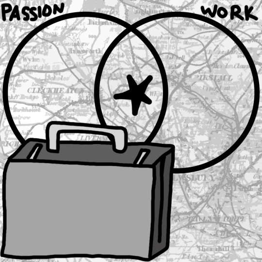


Various Graphics for the Collegian
Salem, OR 2016
Photoshop, scanner
actually really proud of this and how i can see my growth as an (albeit shitty) illustrator. beginning from top left.
#I dont know what the fuck i am doing#they hired me without getting my portfolio#sos#will create shit graphics on photoshop for minimal pay
1 note
·
View note
Last Seen Blogs

deathbynumbers
This is the Way


homuku
homuku

crystalized-dragons
THE ADVENTURE CONTINUES...

clowningfor-adel
Adel Stans