#with the csp thing like brightness to opacity but it didn't work
Photo

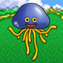
drew my octoling in the template made by meruz :D
#splatoon 3#splat3#splat3n#splatoon#i based the bg off of hagglefish market#i struggled so much with drawing the flingza orz#even now it's still not correct i think but i gave up#also i tried to make the white spaces transparent#with the csp thing like brightness to opacity but it didn't work#so I just drew over the white boxes#kind of embarrassing ngl#i actually think the drawing I did for this came out good#I haven't drawn a bg in a long time#plus coloring was kind of hard#i don't use any multiply or overlay layers#so it was hard trying to get all the colors to be warmed tones#my art#other people's work
9 notes
·
View notes
Note
hey sorry for bothering u but how did u do the gradient texture in the de "sing, muse, of the passion of the pistol" art
not a bother at all!! I LOVE getting questions about my art process so thank you for asking 😁 this got a bit long so i put it under the cut
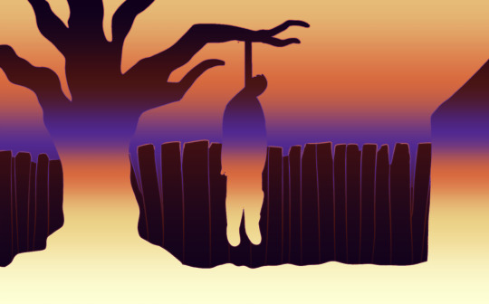
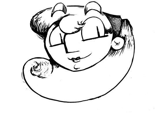
I originally did all those drawings in grayscale, so here's the image without any of the effects on it (and no text so you can see it better):
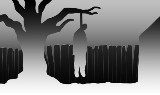
just a simple black and white gradient going one way for the foreground and the same gradient going the opposite way for the background. and the black fence to help break it up.
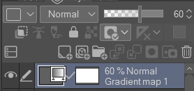
then I put a gradient map over it. I made a post showing how I use gradient maps once, but I didn't actually go into depths about how it works. idk how much you know about gradient maps, but for anyone reading this who wants to know how they work: a gradient map takes the colors that you specify in a gradient like the one below, and then it "maps" those colors to corresponding light and dark values of the image. the left side of the gradient gets mapped to the darkest parts of the image, and the right side gets mapped to the lightest parts.
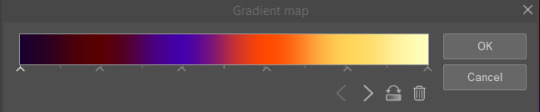
you can put a gradient map over anything you want, you don't have to start with a grayscale image. but since the gradient map only cares about the light/dark values, that's the only thing I worry about when I decide to use one for a piece. you also don't have to make the gradient dark to light like it is here. you'll get some pretty funky results if you put darker colors on the right side of the gradient or lighter on the left.
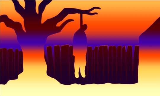
the gradient map is an adjustment layer that gets applied to everything underneath it, so in the final piece I've lowered the opacity of the gradient map layer to 60% to make the colors less intense. I could have just set up the gradient map with more muted colors, but personally I find it easier to use super saturated or intense colors and dial it back from there.
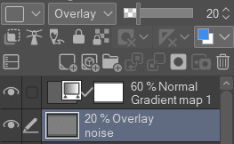
then the texture: in clip studio paint, you can add noise by creating a new layer and selecting filter > render > perlin noise. it will give you a bunch of parameters to adjust, but the only one I ever touch is scale. depending on the size of the canvas I usually set it somewhere between 3 and 10. for this piece I think I set it at 5. it will look like this:
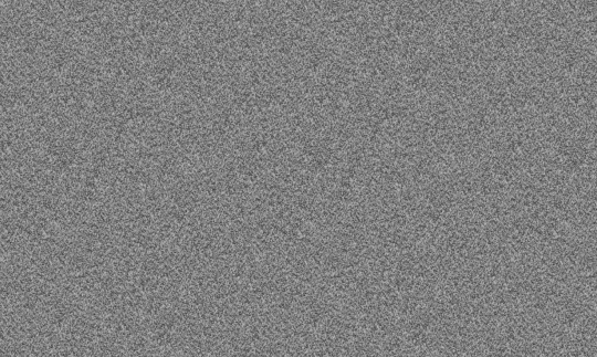
I then set the blending mode of this noise layer to overlay and lower the opacity to 20%. also a protip for adding a noise texture: in csp and sai you can select a layer and then select edit > convert brightness to opacity. this turns all the white parts of a layer transparent and doesn't effect the black parts. depending on the blending mode you use for the noise layer, such as overlay, this can make your noise texture look just a little bit softer and less grittier if that's your desired effect.
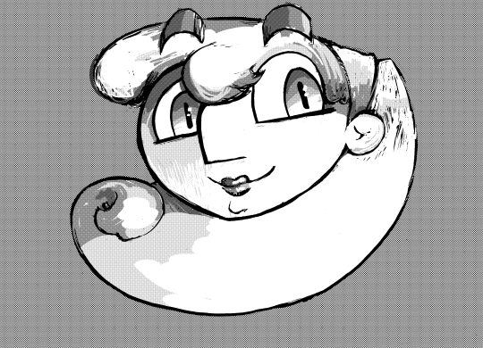
so WITHOUT the gradient map, it now looks like this:
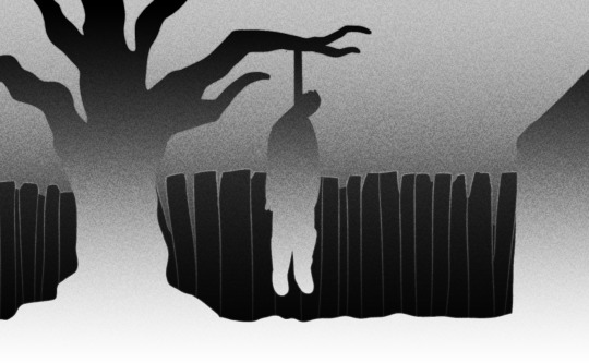
then, I make sure that the noise layer is underneath the gradient map layer so that the gradient map is being applied to it.

y voila! I hid the text layer for this but the text also underneath both the noise and gradient map layers.
hope this helps!!!
5 notes
·
View notes
Text
Applying tutorials to Your Work
Hi! I've got a lot of things cooking back in my studio, but since it's a Wednesday I thought I'd share some helpful-ish advice that I've gained since being an artist since like, middle school.
Tutorials are awesome bits of knowledge! But something I rarely see get addressed is how to add it to your own workflow.
Artist all work differently, so usually after I see a tutorial I make a big canvas by dragging in MS Paint (If you can, some tutorials only work in the program of choice) and start following the tutorial.
For example, I love manga screen tones. I've seen so many tutorials on how to do them in CSP & Paint Tool SAI. Ergo, I wanted to apply this knowledge to my current artwork. I open a huge canvas in CSP. Download the brushes/materials I need and try them out on some line-art I scanned in.
This is how it looked before. I did my usual Black & White trad. inks for lineart and added turn white to opacity feature on.
After following the tutorials as close as possible, here's how it ended up looking.
Because my style is more cartoony/simplistic with cell-shading I applied my grayscale then converted this into screen-tones using a layer feature in CSP.
Now, what if a tutorial doesn't apply well to your particular flow/ style choices? Take what else you've learned from the tutorial & apply it using your established methods.
I didn't use gradients because it looked to different from my usual line art. I didn't use special brushes because it looked too precise. It's okay to fiddle with the key points of the tutorial until you find a good fit.
I like to think of it like class notes - You get the key concepts first. Then, you turn around and apply it through trial and error.
Note that if you haven't found a workflow that you like that it's time to apply the tutorials in high gear.
Half of my art journey was finding what I liked as far as rendering drawings. Do I like cell-shaded work? Do I like realism or more graphic-styled cartoons? Do I like bright colors or muted colors? Etc.
Happy Drawing! :D
#tutorial#art tutorial#art hack#art tip#artist#artist life#artist tut#tut#art flow#artist rendering#apply tutorials#blog post#helpful#steph talks art
0 notes
Last Seen Blogs

briesadler
Once Upon A Time...
hornedbjork
The Blog of Cap'n Bjork
red-midnight
Wintermoon Enchantment