
Statistics
We looked inside some of the posts by taniaeka and here's what we found interesting.
Average Info
Notes Per Post
1
Likes Per Post
1
Reblog Per Post
0
Reply Per Post
0
Time Between Posts
2 days
Number of Posts By Type
Text
17
Last Seen Tumblr Blogs


Fun Fact
China blocked Tumblr because of pornography and censorship problems in 2013.
Text
Final Poster!

Rationale:
My final posters incorporate elements I used in my older poster designs, using the line and dot drawing (a recurring image) as my main focal point. The line with the dots represents the Western Railway Line map (where my site is) and my background features a series of train tickets I created stacked up against each other. The tickets destination switches from Henderson to Grafton and Grafton to Henderson, I did this to represent my experience of taking the train to and from school making my poster more personal to me. My overall intent for designing my poster was to give the viewer a sense of boredom and repetition, using a generic typeface (Arial) to further push this idea. I decided to stick to the colours black and white to give my poster a dull vibe, adding to my intentions. For my animation I animated the words “Next stop” moving from right to left to replicate the way the texts move on the train screens.
0 notes
Text
0 notes


Text
Background explorations


I really liked the Idea I had for this poster so I went ahead and started playing around with different ways to lay it out
0 notes
Text
Poster Developments


I played around with different poster layouts, trying to bring out old designs I had to incorporate them into these new posters. Taking my feedback from Caroline and incorporating them into my own designs. I gave my tickets a drop shadow to give it more depth. I wanted my poster to stay black and white to give the viewer a sense of boredom as it's a feeling I constantly feel when I have to train to and from school.
0 notes


Text


I had a lot of fun making these two, wanting to stick to the feedback I got from Caroline and David about not being literal with my posters I had the idea to have my poster made out of train tickets. I liked the use of repetition in the second poster as it reflects my own personal experience with taking the train to and from school. in my further developments I want to continue using that for my background
0 notes
Text

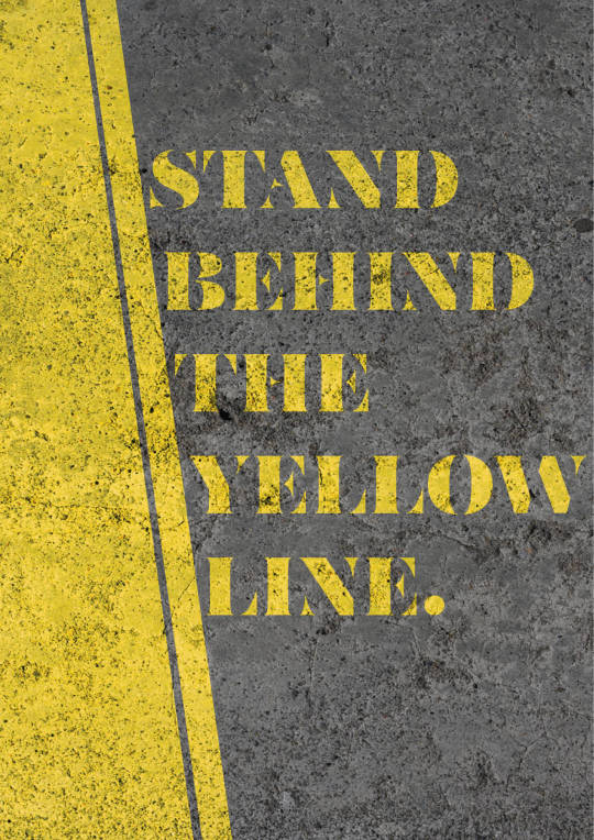


I wanted to try using different words rather than saying my site. I tried to think of different phrases I remembered hearing while at my site and the quote "Stand behind the yellow line" popped up in my head so I went ahead and tried to find different fonts that I remembered seeing around train stations. After that I did simple layouts to try to figure out what I liked most.
Taking the dynamic from the first poster and the layout for the second poster I went ahead and made this development. I really like the way the font is integrated into the texture and the shoe prints on the floor standing behind the yellow line.
0 notes

Text
David Moloney: MakingIt21, David Ormondroyd from Ragged Edge

MakingIt21 is a a series of posters with inspirational quotes by 21 creatives then designed by David Moloney to help boost "inspiration for those who need it most". The text moves back and forth, criss crossing with each other one at a time. "You can't really so anything wrong" in the shape of an 'X' visually implies the message that you can't be wrong. The use of bold black text with the yellow background helps this poster to stand out even without the animation. I feel like this design could really help further my designs with my poster as well as helping me generate new ideas for how I should animate my poster.
0 notes
Text
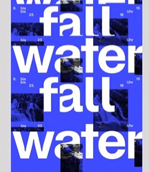


studiofeixen
The use of the bold white font against the bright blue making it easy for the viewer to read as it moves downward to flow like a waterfall. I thought this idea was creative and very literal.
David Moloney: MakingIt21, David Ormondroyd from Ragged Edge
This one instantly caught my eye with the yellow background and the black text moving back and forth. The text "you can't really do anything wrong" while in a "X" shows that you're wrong if you think you're wrong.
mca_australia by Julie Mehretu
The text moving back and forth reminds me of brush strokes. The texts itself looks plain but the background really draws your attention
0 notes
Text
Peer posters


Bree Luca
This poster instantly caught my attention with its use of bold text and colours. I really liked the way the text gets cut off and reappears on the other side, it reminded me of times me and my friends would stop talking mid game to lock in and then carrying on once the round is over. The use of the funky shapes around the poster adds to its appeal and makes this a very interesting poster.
Erolini Teleai Tiapapa Soo
As someone who is familiar with Erolini chosen place of site I thought this was a cool poster. The poster reminds of how Corban Estate used to be a winery before becoming the art Estate it is now. The use of 2 different typefaces to represent the past and present really caught my eyes as well as the use of colour.
Fatimah Zaheer
What initially caught my attention with this poster was the way the text was laid out in the shape of an 'X', I thought this was a cool way to visually express the "Ex" in Exhibit. The use of colours was also eyecatching as it stood out the most to me among other posters.
0 notes
Text
Playing around with different rotations and potionings
1 note
·
View note