
taylormcdonald-rstruction
Taylor McDonald | Rstruction - Reimaging Construction & Demoliti
108 posts
Don't wanna be here? Send us removal request.
Statistics
We looked inside some of the posts by taylormcdonald-rstruction and here's what we found interesting.
Average Info
Notes Per Post
0
Likes Per Post
0
Reblog Per Post
0
Reply Per Post
0
Time Between Posts
10 minutes
Number of Posts By Type
Text
15
Video
2
Last Seen Tumblr Blogs


Fun Fact
Tumblr was created by web developers David Karp and Marco Arment.
Text
Final Reflection
This semester was an extremely challenging semester. I struggled with finding a topic after having to scrap my research from last semester due to ethics requirements. This through a spanner in the works and was extremely overwhelming. Despite having this issue, I managed to settle on a massive problem that was not very well known. I had to iterate my concept and design statement multiple times:
My first impression was that C&D waste could not be reduced unless government intervention was introduced. This was because individuals don’t care or prioritise waste minimisation.
Secondly I focused on what could be done with the waste output, however realised that the solution was not large enough to address the scale of the problem.
Lastly, I decided to help subcontractors achieve their goals/priorities such as productivity and profit. My argument is that enabling them to achieve their priorities would be a result of transparency and proper communication and improved productivity is a result or reduced rework and an increase of profit could be a result of less materials and labour wasted due to rework.
This solution is not as refined as what I would like it to be and due to the complexity of construction is a comprehensive solution that may not be as streamlined as other projects. I think this reflects the scale of the issue I selected. I sill think my prototype needs drastic improvement and several more iterations. I do think my final outcome achieves my aim, which is a massive success!
I did enjoy using the voice typing tool to transcribe audio as majority of my participants were uncomfortable with their audio being recorded. They were worried that they may disclose information that could get them in trouble. This transcription was a good alternative as I was able to get a transcript over the interview without having to take the notes. The issue I had with this though was that the notes were not as accurate as what I thought they would have been.
Areas that I need improve on:
File management, I have a terrible habit of poor file coding and accidentally deleting information which has been an absolute nightmare.
Not being persuaded by users and their opinion. I felt throughout this project I became engulfed by the viewpoints of the people I was testing.
Refining my ideas. I feel like this semester I took a very broad and holistic approach which was ridiculous and which is probably a contributing factor to why I was overwhelmed.
Not getting distracted by smaller components of the issue or other components that may be related to the issue at hand.
Despite all of this, I’m happy with what I’ve completed this semester and will take the many learnings with me into the future.
0 notes
Video
vimeo
Final Pitch Video
Resources:
https://elements.envato.com/construction-building-D7C9BTY
https://elements.envato.com/building-construction-V8CL9XU
https://elements.envato.com/building-construction-ZA6SFMH
https://elements.envato.com/construction-VUH67NC
https://elements.envato.com/relaxing-hip-hop-6V4ERWL
https://elements.envato.com/man-using-tool-fixing-overlaps-on-wall-in-PV3HKQC
https://elements.envato.com/construction-a-businessman-at-a-building-YLK95FN
https://elements.envato.com/young-handyman-or-builder-in-a-warehouse-P6XVJNB
0 notes
Text
Design Analysis
To summarise how successful I was in solving my initial problem I completed an analysis into the different components of PAED and how they meet the requirements of the HMW statements and insights.
https://docs.google.com/spreadsheets/d/1zIesJvgNrDU8SJkMvEymubt1XInGPrRGTYwALQE8b-M/edit#gid=0
0 notes
Video
vimeo
I continued to develop the dashboard experimenting with a shaking motion to display to users that the dashboard could be moved (replicating the experience of iPhone apps). Unfortunately, this made the art-boards glitch out and the drag motion no longer worked. I then experimented with a simple drag and drop and this was quite effective.
vimeo
Whilst this is an improvement on the previous dashboard design I don’t think I have nailed the design properly. Unfortunately, I do not have time to complete any additional user testing sessions before the deadline.
0 notes
Text
Principle Animations


It took a long to animate the final prototypes and it was an extremely challenging process. Whilst principle is a great tool, I found it a struggle to keep on top of the naming conventions of the layers as this controls what prototypes. I think the constant re-labeling was the most time consuming part of the process.
0 notes
Text

I adjusted the workflow view and consolidated the upper module and left hand side module into one view. On the summary page I removed the notifications as it was a repeat of information and put in a graph and two score cards. If these were editable components they would operate in a similar model as the dashboard.
0 notes
Text
Symbols: Modular Components

Above is part of the symbol page for my project and are modules I created to ensure the my design was consistent across the two device sizes. This was a time consuming process to set up, however made putting the prototype together and editing the prototype easier.
0 notes
Text
Storyboard & Script

Waste! It’s one of the largest problems the Construction and Demolition industry faces. It accounts for a whooping 50% of New Zealand’s total waste and has a forecasted growth of 3% per annum. The driving forces behind this terrifying figure, is a combination of poor collaboration, transparency and planning throughout the value chain. And this waste equates to lost profit to contracting firms.
With a variety of roles and varying levels of authority, subcontractors are susceptible to these inefficiencies. They are embedded in traditional processes and rely on physical timesheets, manual data entry, monthly pricing reviews and word of mouth communication to manage their projects. Lastly, financial decisions are based upon personal experience not data insights.
For example Bob, a carpenter needs to know the finishing requirements, but doesn’t always get told. Dylan a Quantity Surveyor misses out on pricing areas due to a lack of communication. And Graeme a project manager needs transparency over the project, but there is no single source of truth. It’s chaotic and a notorious environment for generating rework and waste.
PAED is the disruptive software which resolves these issues. It consolidates all information about a project tasks into a single source of truth and uses data input to create a broader data ecosystem to optimise information flow within a project. By aggregating information, all employees have transparency over the planning and requirements of the project enabling them to complete work right the first time.
Whatever the role or device, PAED is responsive and has catered dashboards depending on the information needed by the user.
PAED uses GPS location to ensure that employees are starting their timesheet while on site, reducing time theft. In addition, carpenters have access to project documents and can attach updates, incident reports and inventory requests through their portal.
Management can view notes, photographs and requests left by the carpenters on the task workflow, and they can also check how the task is tracking against the budget, as well as any Quality Assurance defects logged.
Quality Assurance Specialists and Quantity Surveyors receive push notification once a workflow has been submitted to be reviewed or priced
Unlike other project management software, PAED has been co-created with Construction professionals to alleviate the pain-points in the value chain for subcontractors.
As perplexity and requirements around construction projects increase, PAED enables solid collaboration throughout the value chain. PAED optimises knowledge transfer within projects and minimises delays and rework rates, ultimately decreasing waste production.
Why spend money on rework and wasted materials? Join PAED today.
0 notes
Text
Clock In

I’ve replaced the search bar with the clock in button as it was mentioned as being an issue during my third round of user testing. I think that the point they raised was valid, that last thing I want is for users to waste time looking for how to start their timesheet online. Despite not being brought up during my third round of user testing I decided to further develop my lower navigation bar.

Whilst developing the final prototype I also provided modules to links the employee may need. For example on the left if an employee is sick and needs to apply for annual leave they have the ability to do so. In addition employees who have started their timesheet either sign into a task or tag a task which enables them to quickly access information and send requests from their timesheet state.

0 notes
Text
Card Development

During the third round of user testing I got told that the card design looked cheap, so I spent time developing the symbol so the design could be modular. I realised I still had Montserrat in the prototype for the task number so changed this to Roboto. Below are the final card designs.

0 notes
Text
Script
Today I began working on the script for my pitch video. Below are the points we need to cover in the video:
Identify your target users, including their needs / problems
Describe your target user’s environment to add context
Describe how users currently solve the problem (if at all)
Clearly show your solution will solve the problem
Explain why your solution is better than others
Tell us how your solution is novel / what’s the point difference
I’ve readjusted the structure to suit the story telling method I want to incorporate as part of the pitch. Instead I’ve decided to structure it as follows:
Problem: Identify the problem and community. Give some background and compelling reasons why it is worth solving. You should be able to describe or show the problem you are solving in one or two sentences.
Target Market: Define who is affected by this problem and give some background on your target. (Identify needs / problems).
Current State Analysis: Describe how users currently solve the problem (if at all)
Solution: Describe your solution by explain how your app solves the problem you previously stated.
Underlying magic/technology: describe the features and functions, point of difference
Competitor Analysis: Explain why your solution is better than others. (Potential: describe how you did your competitor analysis).
It’s interesting because whilst my project has been focused on timber waste reduction from construction sites, I can’t use this as angle in the pitch video. This is because I found out in my discovery phase, construction people don’t care about waste. Instead they care about time to cash, stakeholder relations, health and safety, scheduling labour and labour efficiency. As they are the target user’s I will have to create a pitch video which appeals to them – which means I’ll focus on inefficiencies in the current construction process and highlight the consequences such as high wastage, rework etc as outcomes of the current state processes and how the solution can resolve these.
I decided to quickly storyboard what I wanted to say and then built my script and video imagery based upon that. Below is my storyboard.

0 notes
Text
Insights 03

I completed my third round of user testing, and approach the synthesis the same way I did for the previous two sessions - group by question then regroup to generate actionable insights.

Carpenter view/Task 01:
Automatic GPS timesheet: 1 participant said he was concerned that GPS automatic log in would encourage time theft as the works mucked around a lot before getting started in the morning.
2/5 participants believed that I still had too much information on my prototype, and days should be replaced with due soon, etc. Similar reasoning as the previous user testing session.
3/5 participants believed that the Clock in button is difficult to find and counter intuitive. They suggested that perhaps it shouldn’t be hidden, and 1/5 participants suggested it should replace the search bar.
2/3 participants believed that the progress bar was confusing and not accurate, and suggested that it made the design seem cheap.
2/3 participants felt like the design was unrefined
Dashboard/Task 02:
1/5 participants questioned how the layout of the dashboard could be customised and whether modules could be swapped.
Workflow/Task 03:
3/5 participants appreciated the consolidated view. One of the participants believed it would help him save time.
1/5 participants thought the the left and upper module displayed the same information.
1/5 participant highlighted that the ‘Activity Feed’ was called ‘Activity Feedback’.
1/5 participants had an issue with the progress bar, explaining that it could result in misguided decision making.
1/5 participant mentioned that the employee view was missing QA and QS.
4/5 participants explained the benefits of having the employee page (visibility of employee breaches & defects, metrics mean they can asses troublesome builder, the ability for managers to call staff easily and also transparency of who’s working on the task.’
Document Control:
https://docs.google.com/spreadsheets/d/1i8drJfQ8oh8G2u9Cai9lD0pL1SB3H37wFeOV4qKjqvs/edit#gid=0
0 notes


Text
Dashboard Builder

vimeo
This is the third iteration of the dashboard builder. I’ver incorporate colour, visualisations, labels and the ability to close/delete graphs. The animation is still clunky as this stage. Users select the graph they want to modify and it shows them what component the graph is currently set at. They can then choose to change the data input to information they would like to see.
This is an important feature of PAED as it allows management to view real-time reports based upon data input into PAED. This means they can pivot tasks to ensure that they’re on track to meet budget.
0 notes
Text
Website Prototype 3
I’ve refined my prototype drastically and have developed the visual design. Whilst working I pivoted my typeface to Roboto as Montserrat appeared child-like and lacked the professional quality needed. To help increase transparency for the project manger I changed the list view to a Kanban board where the project manager can view items and where they sit (in progress, in review - pricing or QA and what have been completed).
I’ve also used colour coding to notify employees visually of the context and phase a task/project is in. I also created a fixed activity feedback panel, as well as two summary panels. I also included an hour tracker of allocated hours vs hours used and total hours remaining and also included an employee tab. After showing this to my working group they suggested that I changed the timeline page to summary as it no longer had a timeline.
vimeo
0 notes
Text
Mobile Prototype Animation

As seen earlier posts I have begun experimenting with animation in the mobile prototype as I would like to get user feedback on transitions from the final round. As shown below I’ve developed a standard menu navigation bar as the last mobile navigation failed miserably. I’m unsure of whether I should include iconography, however will validate this during user testing.
Navigation Development:

Tap Tab:
Below is an experiment with tapping to navigate between the tabs.
vimeo
Swipe tabs:
Below is an experiment swiping through the tabs. I think swiping may cause issues as I’ll be using the swipe motion to navigate back to screens as opposed to a back button.
vimeo
Clocking In & Out:
Below is a quick animation completed in principle. I’ve kept the additional screens at the end which allow a user to submit workflows, attach documents, etc at the end of the day. I still think the visual design is incongruous, however I will continue to develop this.
vimeo
0 notes
Text
Behaviour of Tabs
Users can navigate between tabs by tapping a tab, or by performing a swipe gesture over content. In my third round of user testing I will need to validate whether people click or swipe to move between tabs. As demonstrated below, I’ve experimented with both tapping and swiping. I believe that the final design output could take both behaviours into consideration in a blended approach.

Tap a tab: Navigating a tab by tapping on it.
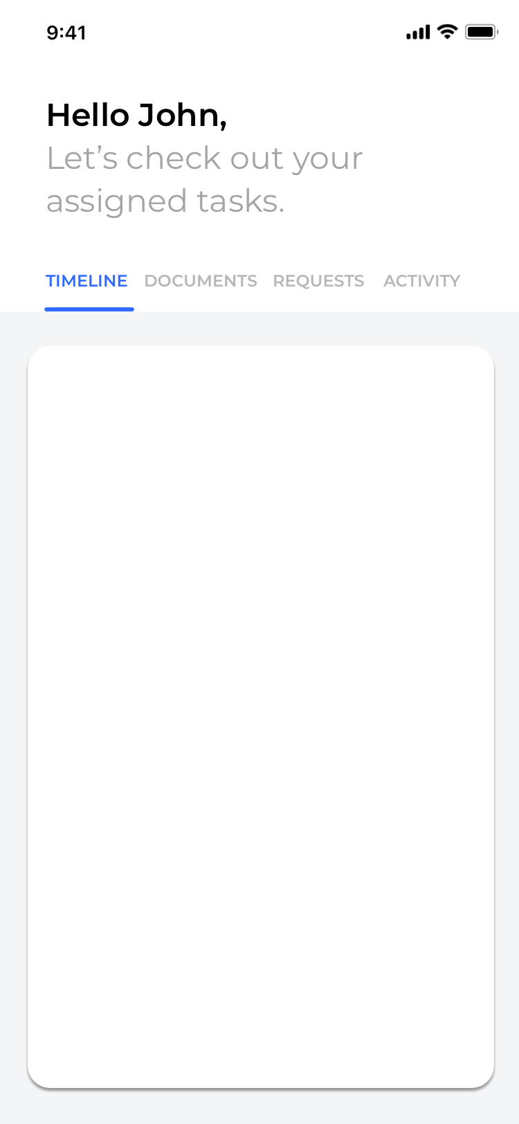

Swipe within the content area: To navigate between the tabs, users can swipe left or right within the content area.
Scrolling
The header on this prototype is large as it incorporates the chatbot as part of the UI. I began experimenting with the scrolling motion after analysing the Spotify scroll. As seen below, when the screen scrolls the chatbot component collapses and the tabs are fixed at the top of the screen. The AI chatbot will return when the user scrolls up to the page again.

0 notes