
Don't wanna be here? Send us removal request.
Statistics
We looked inside some of the posts by taylormcdonaldcreative and here's what we found interesting.
Average Info
Notes Per Post
0
Likes Per Post
0
Reblog Per Post
0
Reply Per Post
0
Time Between Posts
11 hours
Number of Posts By Type
Photo
5
Text
10
Video
2
Last Seen Tumblr Blogs


Fun Fact
Hackers stole 65M passwords from Tumblr in 2013.

Text
Reflective Statement
This was an extremely challenging project this semester, as it was based around delivering an Inflight Entertainment System with Micro-animations. Despite briefly experimenting with Flinto and Principle in semester one, I did not have an in-depth understanding of how to animate with them. Despite being extremely difficult, over the span of this project I was able to develop my animation skill set, and I’m now more confident in my ability to deliver high-fidelity prototypes which have been animated.
My design process began with an in-depth analysis of Air New Zealand’s Inflight Entertainment System, competitors IFE’s as well as an analysis of Netflix. I thought it was important to analyse the product design of Netflix, as they deliver superior user experiences when it comes to viewing movie and television content and that this could be used a benchmark for our designs. Following on from this I created two personas, who I believed reflected polar opposites of users who are likely to interact with IFE. My rationale behind this, is that if you design for the extremes, you cover the people in the middle. Additionally, I conducted a lot of user research out of class, as I feel like the opinions of our peers is biased/skewed and don’t necessarily reflect our older persona.
My partner for this studio paper was Adelaide. It was interesting and challenging working with someone new, because you need to establish team dynamics and figure out where the strengths and weaknesses lie in the team in order to delegate work. I tried to be as considerate as possible, and let Adelaide choose what part she wanted focus on. From early on, we agreed that Adelaide would design and execute the user interface, and that I would concentrate on designing and delivering the user experience and animations. The rationale behind this was that Adelaide had no experience with Flinto or Principle and was quite apprehensive about the use of the software. Additionally, she delivered some exceptional icons and also has a very strong design aesthetic. I was delegated the user experience flow and animations, as they can be developed simultaneously and because I experimented with animations in semester 1.
This unfortunately fell through quickly, as Adelaide preferred to work in Indesign and didn’t convert to Sketch until Week 5. We also struggled to deliver enough content for feedback sessions, because of the division of the work. A lot of the time we were showing the micro-animations that I had worked on, because the user interface had not yet been designed. In retrospect we should have created a project management template, about what was due when, and who was owning that action. This is definitely a learning I will take into the next project. Furthermore, I don’t enjoy confrontation, and found that I ended up having a heavier workload than what I had anticipated. A result of this and also the ambiguous and undefined deadlines forced me into developing and designing the user interface because I needed to trial animations with content.These visual designs we’re supposed to be temporary, as Adelaide was to supposed to develop the final design. Due to time constraints, and the relatively finalised development of the animations the temporary design I created end up becoming the final. This created a disparity in the design, as the purpose of the user interface I had created was intended to showcase the animations with content. This resulted in icons being in the wrong colour, and a variation of the typeface. Adelaide reviewed this and made suggestions about the favourites notification, and subcategories. I then went through and incorporated her feedback into the design. I also spent a lot of time reviewing the Sketch files I had created, as well as Adelaide’s suggestions to ensure we had a consistent user interface. Despite becoming more competent with the Flinto, I found the software to be somewhat limiting. The prototype had to be created in sections due to Flinto’s behaviour based animations (All content needed to be on the artboard - 0% Opacity, so that it could be animated, therefore having multiple experiences on one page would have overload Flinto, and Flinto struggled to cope with some of the pages). I constantly pushed myself to deliver different animations and to iterate upon them.
I’m happy with the final outcome, considering the abundance of hurdles we faced. I think if we had implemented a project management template, then there would have been transparent communication and we would have been able to hold each other accountable for not delivering enough work. Additionally, if we had both been using Sketch from Week 1 we would have been able to collaborate more and deliver superior content, and perhaps more user journeys. Furthermore, this difference in software and lack of user interface output made it different to collaborate and compare work. I felt throughout this process that majority of the time, I was delegated work and told what to do. I also felt as if my opinion and work output was not valued or appreciated. Unfortunately, this was not a collaborative team environment and I often felt very uncomfortable.
To conclude, I’m proud of the final prototype that I created, including the animations. With a fairer division of work, less hierarchal structure and compatible software usage I think we would have been able to achieve more. I think that we were able to achieve a simple and intuitive design, however I still believe there is room for improvement.
0 notes
Video
vimeo
This is fantastic final video that Adelaide created for our design proposal.
0 notes
Text
Working Sections
vimeo
Video 01: Onboarding - Home Screen - Watch Page
This part of the user journey begins by greeting the user with a personalised onboarding screen. They have the option to connect with their device or continue on. Adelaide does not like this feature, so I’ll be removing it. However I think it’s good call out, that Inflight Entertainment units may become redundant as users will opt to use their personal devices. This is driven by users having access to iPads, computers and phones were they can download content from Netflix to watch whilst not connected to the Internet.
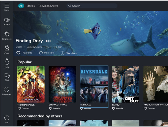
Users are then taken to a redesigned home screen, where the content has been drastically simplified and modernised. Here they can scroll vertically to access the different pages they made need.
Users click on Watch and are then taken to the homepage for viewing movies and television programmes. (N.B. I still need to update the information playing on the screen for this experience). Here the user scrolls vertically, and then horizontally to find and like Jurassic world. They then tab to look at just Television shows, before selecting movies (during this part of the user interaction the trailer in the background changes). They then find Dunkirk - this movie can not be seen when the page loads.
Micro-animations:
Card flip: From my earlier experimentations I thought an engaging way of sorting the content would be by flipping the cards (so each card was dual sided - movie and television shows);
Liking Experience - white outline to filled blue heart;
Favourites list - This was Adelaide’s idea of copying how messenger lets people know they have messages. The benefit of imitating an experience designed by facebook, is that users are familiar with it, and that it doesn’t challenge them. It reinforces the statement that I made earlier about not reinventing the wheel.
vimeo
Video 02: More information about the movies - playing a movie & returning back to the results
For this part of the user journey I looked at showcasing how easy it is for users to view content, and how I’ve attempted to mitigate the risk of people accidentally tapping on the wrong content and then been taken to the wrong page. So the users initially look at Annihilation before seeing the movie Dunkirk that they previously liked. They then go and tap on Dunkirk and the Annihilation trailer automatically closes. They then decide to play the movie and are taken to a new page. The experience ends with them returning back to the homepage.
Micro-animations:
Card transitions: as the trailer pops up the cards shuffle upwards or down, depending on where they are in relation to the trailer. These cards are staggered so they cascade as opposed to move in a straight line.
vimeo
Video 03: Search by Genre
This part of the user journey was to showcase how easy and intuitive it is to search for content by genres. I decided to simplify the design by removing genres from a search menu and use it as search prompts. So the user selects the genres - Comedy and Drama. To showcase how easy it is for them to remove unwanted tags - the user accidentally clicks Crime and then deselects it. They are taken to their search results page, and decided they want to only view Comedy content. They then see Life of the Party and add it to their favourite list, before viewing their favourite list and removing Dunkirk. They then decide to click on more information and presented with more information about the movie and the cast. The main actress is automatically highlighted with information about her underneath.
Micro-animations:
Card transitions: I applied the same card transitions that I had used early. So the search results tilles were dual sided with either Comedy or Drama. Once the user removes drama, the cards flip and only movies within the comedy genre are shown.
Liking Experience - white outline to filled blue heart;
Favourites list - notification
Favourites list expansion - favourites list sliding from the left hand side, and staggered content transition.
Removing a movie - Animating the option to delete a movie from the favourites list.
vimeo
Video 04: Genre and Predictive Search
The user then decides to search Melissa McCarthy after viewing more information about her in the previous experience. They tap M, and Melissa McCarthy’s name is pre-populated as a search item. The rationale behind this was that users found it painful to tap on the screen as they perceive the screens to be glitchy. I thought that a predictive search function would be more intuitive. Additionally if the user didn’t see what they were looking for they could continue to tap the name and predictive searches at the bottom would change.
The user is then taken to the results page. They decide to watch Bridesmaids and double tap to watch it immediately. They are then taken to the movie viewing page, and the movie proceeds to play. The rationale behind double tapping was ensuring that users who were reflected our younger persona could quickly play movies (this has been elaborated on in a previous post).
vimeo
Video 05: Recommending a movie to others
To tie in Adelaide’s suggestion of having a ‘Recommended by Others section’ I suggested that we incorporate this as a post movie watching question. Once the movie reaches the final scene it pauses and asks the user if they would like to recommend the movie to others. They have the option to say no, that they are unsure or yes. There response then populates the movie content for the Recommended section on the homepage.
Microanimations:
Play/Pause - Timing the behaviour to appear once the movie has finished playing, turning the pause button to play.
Animating the options: once a user has answered, the options merge into one and the user is thanked.
0 notes
Text
Further User Testing
vimeo
I got very caught up with User Testing, as I feel like the user testing did not provide enough actionable feedback because:
The prototypes were viewed on a computer screen - interacting with a computer and a tablet screen are different;
The context of which they were tested did no reflect the environment in which the users would actually operate.
As seen above, this was a trial of a search experience. It was interesting to watch how this user (who was unfamiliar with the content and viewing it for the first time) interacted with it. I created a mock-up airplane environment in which I got him to hold the device with one hand, and also put him a certain distance away from the screen to test readability. As part of this experiment I gave him guidance around what he could and couldn't do. It was interesting to note that:
When asked to favourite Life of the Party he went to favourite the movie poster as opposed to the favourite option above the trailer;
When asked to close the favourites list, he was about to swipe/tap on the screen to get it to minimise.
I found it extremely beneficial to trial the content, with users as I worked toward finishing off the prototype. It helped me to further understand the usability of the prototype in relation to it’s environment, as well as analyse the user flow.
0 notes
Photo

Above is a brainstorm I quickly created for Experience 03, showcasing how we could add the favourites list into the experience. From this new user journey flow the user would:
Like the movie in it’s trailer form;
Look at their favourites list;
Remove Dunkirk;
Close their favourites list (before moving onto the more information section).
Below is the medium fidelity prototype that I created, as you can see in this video it’s extremely glitchy as I did not group the components properly. I went to Adelaide to get feedback, and she questioned why the heart was blue. I explained that it was to signify that the user had contents in their favourite list, and she suggested that we should copy how Facebook Messenger shows users that they have messages. I agreed with her on this, and then brainstormed how I could actually animate this.
vimeo
Below is a brainstorm I did, around the different states of the liking experience and what actions would need to coincide with the actual like experience. This brainstorm really helped me to understand how I would create the liking experience behaviour.

From this I was able to develop an improved version of this prototype. As you can see below, the notification/symbol of content being added to the favourites list is through a notification (which expands in size before reducing back to it’s normal size). I also added in a small micro animation of the cross rotating 45 degrees from being a plus to a cross, I think that this design made the experience seem slightly more professional.
vimeo
0 notes
Text
Recommendation Feedback Loop
vimeo
vimeo
Based off Adelaide’s recommendation to include the Recommended by others section, I suggested that we incorporated the feedback loop into our final video. She initially suggested that this could sit within the trailer expansion, however I disagreed as I felt it was a post movie actions/follow up. We ended up both agreeing that it should be at the end of the movie. I designed the screens, and asked Adelaide for feedback. She suggested that we changed the tone, and provided an opt out option for people who didn’t know what they wanted to put down. It was very difficult figuring out how to design and animate this last section, because with a static image the design looked like a random after thought that we came up with. Additionally if the movie was continuing to play in the background it looked like an annoying pop up, that would frustrate users.
To combat this I created a behaviour in Flinto that would appear after the video had stopped playing. This was extremely successful, and an effective way of resolving the movie watching experience. I also payed attention to detail (such as the player pausing once the video had finished).
As you can see above the overlay across the moving image, does not make any sense and would frustrate and confused the users. In contrast the second video made logical sense, and appeared to be more of a friendly feedback loop.
0 notes
Photo


To create a more in-depth experience I suggested that we should look at developing and designing the more information experience. As I was extremely busy I asked Adelaide if she could create a quick mock up of what the more information page could look like. I thought she was successful in achieving a similar visual design. (N.B. The option to favourite actors was temporary, and never intended as the work had been designed off a copy of a previous sketch I uploaded).
Developing upon Adelaide’s work I went and edited some components so that the visual design was identical to previous work. This include adopting the same trailer design used in the preview stage, as well as making the recommended films the same size as all the content(cast/movie posters). I also aded in more information about the actress including her birthday, and a brief synopsis, so viewers had more information to make a decision off.
I think it was really beneficial to add in the more information page, as it provided us with more depth in our user journey. This also set up the next experience (03) nicely as the user then goes and searches Melissa McCarthy.
0 notes
Text
Consistency
It was interesting to note that adding in feature concepts of Adelaide resulted in inconsistency of the design. I realised as I working on the final prototype that from a user point of view it would be very confusing have the same information presented in several different ways. In majority of the prototypes I completed the trailers did not include a mute icon, and that this did not make sense considering that the home screen movie and television trailers both had mute icons.
Furthermore it didn’t make sense to have such little information on the hero trailer on the top of ‘Watch’ page. Adelaide initially put the favourite icon, however I suggested that we added in more details around the year of the movie, the genre, the rating and the film duration. Additionally, I suggested that we gave users the option to view more information about the movie as well as giving them the ability to play the movie.
Adelaide also wanted to add in a Popular, Recommended by others and New Releases section. I thought this was a good idea, but wondered if perhaps these could have been filters that were used in the search.
0 notes
Text
Usability
I decided to go and validate my assumption based around the younger demographic being frustrated about having to watch trailers when they want to watch a movie right away.
Liam Boxall:
This is wicked, I like the double tap. It makes it quick for me, because you know, I might see a movie I want to watch and then I can get right into;
Just feels like it saves me time, I’m super impatient;
It’s good because sometimes those IFE’s are glitchy, so a short cut to play the movie would be great.
Dave MacIntosh
I can see the benefit in this, it’s a great shortcut that I think many people would find beneficial;
Interesting how if you tap twice with longer durations that it closes. That’s helpful, because say for example if I’m scrolling and accidentally tap on the same movie poster I might accidentally play it.
Results:
Despite talking to only two people, there was a general consensus that this was an easy and simple method of skipping major pinpoints:
Accidentally tapping on the wrong content;
Wanting a shortcut to content (immediate gratification)
Side Note:
I think it’s a really good point to call out that the younger demographic (Persona: Sarah) have an ingrained attitude and carnal desire for instant gratification. If the Inflight Entertainment System doesn’t have short cuts or intuitive experiences they will easily become frustrated. This desire for immediate results is driven by four key interactions: texting, Netflix, email and social media. In all these experiences/interactions the waiting time has been removed, and responses are instant. Relating this back to the Inflight Entertainment System we need to ensure that it is designed for both ends of the spectrum so that both the older and younger demographic are comfortable and happy interacting with it.
0 notes
Video
Developing further onto the Search Experience 01 or Experience 03, was the in-depth search of a particular actress. For this example I have used Melissa McCarthy (as she is an actress with an abundance of comedic movies). This experience starts:
This movie starts with the search screen with the comedy tab (the comedy genre tab is taken from the previous user experience, where the user narrowed down that they only wanted to look at comedies);
The user taps on the letter M. Based off qualitative research, I hypothesised that users were very frustrated about the awkward position their arm was forced into relative to the IFE and how they sat; because of this I decided that we should offer predictive search methods to minimise the pinpoint;
The user selects Melissa McCarthy and Proceeds to the results page; I also hypothesised that having to tap on the movies to watch the trailer all the time would be extremely frustrating and I questioned how we could create a short cut experience for people to watch movies quickly. I therefore came up with the concept of allowing users to watch the movie straight away by double tapping.
(Risk Mitigation) Benefits of this include
Users are likely to tap once as opposed to twice by accident;
So if users tap once on the wrong movie a trailer drops down, and it’s easy for them to re-navigate themselves;
Is users accidentally tap on the movie poster and tap on it again inconsequential, it’ll close the trailer up as opposed to play it;
Some users that are younger like our person Sarah will not want to have to watch the trailer for all movies; especially when they know what movie they want to watch - therefore the double tap is their short cut.

Above is an elaboration on the rational and thinking behind the usability functions.
0 notes
Text
Onboard Movie
vimeo
This was the initial onboard experience I created. Users are taken through a journey of 3 pages.
Onboard page: Here we have the motion graphic in the background - and the option for users to connect their device or continue without.
Homepage: I redesigned the homepage to be more modern, hence the difference in tile shapes and scrollable content. I think that this was fresh revamp on the traditional Air New Zealand design. I would also like to credit Grace Davies for her suggestion to add in a weather component. I thought that this was brilliant and added value for the user. Adelaide also suggest that we added a personalised message at the top for the user.
Watch Page: Users are taken to the watch entertainment section, where they have the ability to view: All/Movies/Television. In this section I embedded the content (likes) so that they weren’t present on the first screen.
For Example:
Jurassic World is on the third row of movie tiles, and the user must scroll across to find it; (Displaying vertical and horizontal scrolling)
Dunkirk is on the third row, but only revealed once a user selects movies only on the upper menu bar; (Displaying the card flip and card sort)
Trailer transitions between All&Movie (Same trailer) and Television shows.
Microanimation: Liking. I think the liking micro-animation is an effective way of letting users know that an action has been successful. If the heart did not change colour post like, then the user would likely be confused about whether their action had been successful or not.
I think was an effective initial prototype, however I struggled to animate the heart on the side menu bar. As I’m using Flinto and behaviours for these animations it is very difficult to coincide actions per state. Also, I found that the initial brainstorm that I did for this Experience was extremely helpful in helping me organise the states and the different animations.
Actions:
Figure out how to animate the favourites icon, as a way of notifying users that their movie has been added to favourites list.
0 notes
Text
Search Function
vimeo
This was my first experimentation into the search part 01 of the user journey. I decided that it would be beneficial to show a user accidentally clicking on the wrong genre to showcase how easy it is to remove, and how intuitive the process is. From this the user than searches and their results are shown.
The next part of the journey for them is deciding that they don’t want drama as part of their results list. They then remove it and the card flips to reveal just comedy.
Actions:
I really enjoy this user flow, however I believe we can extend it further. Perhaps showing the favourite list, or showcasing how users can like content in the trailer mode as well.
Brainstorm an improved user flow including a favourite list;
Design favourite list;
Consider animations for the favourite list.
0 notes
Text
Watching a movie
vimeo
This is an extension of the previous experimentation, but also incorporating the movie playing. I think that this is effective in showcasing how simple and easy it is to go and play a movie and then return to the home screen. It also looks at how the transition would work when the user returned to the home screen. I still need to add in the other content and ensure that this is to a better quality.
0 notes
Text
More Info Expansion
vimeo
This was an attempt at creating Experience 02 of the user journey that I previously outlined. This looked at how the user could easily interact with content, and view a trailer, and synopsis before tapping play to watch the movie. Instead of using the conventional star rating, I decided that perhaps we should use reliable third party review services such as IMDB and Rotten Tomatoes to provide ratings. My rational behind this was that users often use IMDB and Rotten Tomatoes to look at the ratings of movies, and perhaps this would give them a more informed opinion about what they wanted to watching.
I also think that the massive play button is ineffective and perhaps there should be a play option in line with: Favourite and More Info. Perhaps I should also show how easy it is for a user to watch a movie, and then return to the main page home screen. To validate the content/information that we are showing next to the trailer I went and got user feedback from an individual who would be similar to our mature persona:
Glen Henderson (62 years old - Frequent Traveler for Holidays)
The info is quite helpful, it’ll help me make up my f**king mind about what movie to watch;
Bugger having to go to a new screen, they take forever to load;
No complaints, keep the good work up champ.
The feedback from Glen may have been vulgar, but was also very helpful. I think that he found that the information provided was enough, and did not overwhelm him. I also think that he was happy about not being forced to go to a new screen as he thought the load time was to long.
Actions to follow:
Fix the Dunkirk Trailer as components are missing;
Trial having play next to favourites and more info;
Experiment with the user going to view the movie, and then returning to the main screen.
0 notes
Photo

I was well aware that in our progression session content was inconsistent. I decided that in order to ensure that my work was consistent amongst all screens that I needed to develop a style tile to refer back to. For the original prototypes I was using Helvetica as the typeface, however Adelaide search on Google Fonts and suggested that we used ‘Nunito’. This was a great suggestion as this typeface was less harsh compared to Helvetica, and also had the same design conventions that we used (rounded corners). This typeface also seemed to be a little less aggressive and clinical compared to Helvetica. Adelaide raised a point that the rounded nature of this typeface made it seem more approachable and friendly.
The colour scheme that I choose was based off Air New Zealand’s blue. I opted for a dark blue/grey colour scheme as opposed to black as it made the UI more modern.
0 notes
Photo


Above are some plans that I did around the experiences, and user journeys we that I think we should show for our final video. Based on Keryn’s feedback I’ve tried to do a deep dive search to showcase the features, and expand on our work. I agree with the feedback that what we showed for the progression session was very superficial and didn’t reflect an actual user journey. I tried to elaborate on this and create a more in-depth user journey.
0 notes