
Don't wanna be here? Send us removal request.
Statistics
We looked inside some of the posts by tculvahouse and here's what we found interesting.
Average Info
Notes Per Post
66
Likes Per Post
60
Reblog Per Post
4
Reply Per Post
2
Time Between Posts
6 months
Number of Posts By Type
Text
17
Last Seen Tumblr Blogs


Fun Fact
Tumblr posted its first advertisements in May 2012 and subsequently earned $13M in revenue.
Text
Kahn and Jefferson

Faithful readers of this not very faithfully tended blog know that I’m fond of Louis Kahn’s Exeter Library. Among architects, it’s an iconic building. Another iconic building, also a library, is the Rotunda at the University of Virginia, designed by Thomas Jefferson.
Jefferson’s library is echoed in Kahn’s. The main reading room of Jefferson’s lies beneath a sky-lit dome, modeled on that of Rome’s Pantheon. The dome is symbolic of the cosmos—Jefferson even thought about painting it to depict the night sky, to aid students in learning astronomy.
Here’s a section of the Rotunda, showing the dome as part of an imagined sphere. As you can see, a person standing in the center of the reading room would be a little below the center of the sphere—the center is a little more than twice the height of a person. This puts the person not quite at the center of the cosmos, but not so far below it.

Kahn’s library for Exeter has no dome, but it is skylit, and it does contain an implied sphere. It’s easy to imagine that the four great circles cut into the concrete inner shell are the places where an invisible sphere intersects it.

At Exeter, the center of the imagined sphere is higher above our heads than at UVA, which reflects a difference in temperament between Kahn and Jefferson. Jefferson was a figure of the Enlightenment, in which the mystery of the universe was seen to be giving way, rather rapidly, to the inquiries of science. Humanity, possessing ever more knowledge, was nearing a place at the center of the cosmos. Kahn, by contrast, regularly paid homage to mystery, to what remains always beyond our reach.
______________________________________________________________
Exterior photo of Exeter Library by Gunnar Klack, CC-BY-SA-4.0. Exterior photo of the Rotunda by Aaron Josephson; interior photo of Exeter Library by Carol M. Highsmith; both photographers have generously released these images to the public domain.
4 notes
·
View notes
Text
'Round the Bend
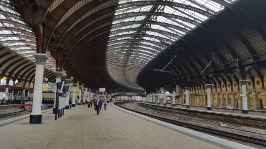
In architecture, a curving vista may suggest movement. Consider the train ride between London Kings Cross and Edinburgh Waverley by way of York.
The tracks at Kings Cross and Waverley are covered by skylit roofs, and so are just three stations in between: York, Darlington, and Newcastle upon Tyne. Each of these has vaulted roofs, curving with the tracks below. York and Newcastle form simple arcs, while Darlington is straight for most of its length, but with a curve at the northern end.

Because the vaults curve, you see them obliquely out the train window, a glimpse of the continuing journey ahead made present and vivid. Even when you're stopped at the platform, your eye carries you on around the bend.

_______________________________________________________________________
Photos, top to bottom: York Station, by ChrisGrady1975 (CC BY-SA 3.0); Darlington Station, by Adambro (CC BY-SA 2.5); Newcastle Central Station, by Russell Wills (CC BY-SA 2.0).
8 notes
·
View notes
Text
Easter Egg Window
Twenty or twenty-five years ago—it’s hard to imagine how the time has flown—I had the opportunity to hide a sort of Easter egg in the main building of California College of the Arts in San Francisco. It’s not a masterwork of architecture, but it does show how one architect thought about a particular problem, so it may be illuminating. (For the non-architect, the most illuminating thing may be how much thinking can go into a very small decision.)
The building was originally built as Greyhound bus lines’ northern California repair shop. There was a great big enclosed space, the size of a football field, in which they fixed the buses, and along the long side of it were two stories of machine shops. As Lorne Buchman, president of CCA when the building was purchased, liked to say, it was the perfect building for a college of art and design. The big, open volume got subdivided into studio spaces, as did the upper, sky-lit floor of the two-story part, and the lower floor of that part became offices and classrooms.
It is a handsome building, thought to be Skidmore Owings & Merrill’s first in San Francisco. The drawings were signed by SOM partner Walter Netsch. The two-story part has continuous bands of steel-framed windows, which extend out from the wall a few inches, adding a layer to it. They look like this:

You’ll notice in the center of this image two window panels with thicker frames. These are the operable panels. They are what are known as “hoppers”: they’re hinged at the bottom and tilt inward to open. The architectural drawing convention for this kind of window looks like this; the point of the “V” is the hinge side:

In a renovation of one of the offices on this floor, a larger room was divided into two smaller ones, one of which—the one next to the entrance—ended up without an operable window:

David Meckel, who at that time was officially Dean of Architectural Studies and effectively Campus Architect, asked me to figure out how to modify that window so that it could open.
The most obvious solution would be to make one of the two lower panels operable, for example like this:

That, however, seemed a little boring, and it would have been the only instance where the operable window wasn’t part of a pair. Here’s what I ended up suggesting, instead:

How did I think about it?
First, I thought it should operate the way the other windows do, so it, too, is a hopper:

At the same time, I had observed that the operable panels of the original windows, taken together, are the same proportion as the pair of larger frames in which they sit, just shrunk:

. . . so I thought that could be echoed in the new window, as well:

That was the logical part.
In the process, though, a couple of amusing things occurred to me. The first is that another way to think about the operable frame in the new window is as if one of the existing frames had been slid over by half:

And, what’s really fun, when you open the window, you discover that the center vertical bar in the operable part (in the trade it’s called a muntin) is independent of the bar above. You don’t expect the two to break apart, but of course they do:
Significant? Not especially, but I like to think it’s an appropriate transformation for this building, because it heightens, just a little bit, the sense of layering that characterizes the original. That’s because, whenever you can think about a pattern in more than one way at a time, or can imagine a part of a pattern shifting or changing size, or when something that you think is part of one thing is actually (or also) part of another, each of those possibilities suggests a new layer.
And, whether or not anyone has noticed it in all these years, it remains available as a tiny lesson-prompt for the architecture students who walk by it every day.

10 notes
·
View notes
Text
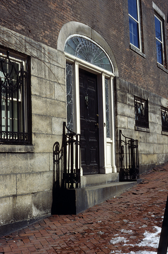
Inner Life, Revealed
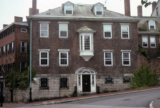
The Eliza Ward house, at 2 George Street in Providence, Rhode Island, dates from 1814. What’s most interesting to me about it is the contrast between its spare, restrained façade and the richly modeled, out-of-scale bay window above the front door.
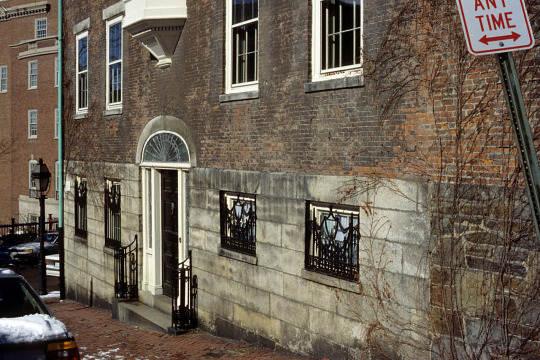
The façade is severely planar. Not only are the finely jointed stone and brick tightly aligned, but the arched window above the door is set into the stonework with almost no relief.
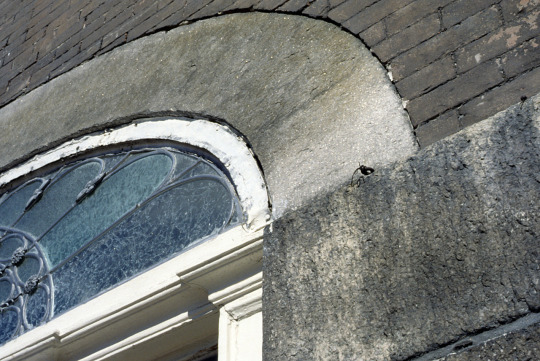
The more deeply set basement windows, in the stone foundation, are covered with ornamental grilles, flush with the stone surface.
All of this is tight up against the sidewalk. Unlike nearby houses with space in front for plantings, the boundary here between the public realm and the private is razor-thin. Only two elements pierce this stern boundary. One is the step between the sidewalk and the door, flanked by tightly curled handrails. It is appropriate that the step crosses the boundary, since this is where you’re meant to pass through it. It’s where the outside world is offered entry.
The other element that breaks the plane of the façade is the bay window. Because it lines up midway between the heights of the two rows of windows to either side, we know it’s at a stair landing.
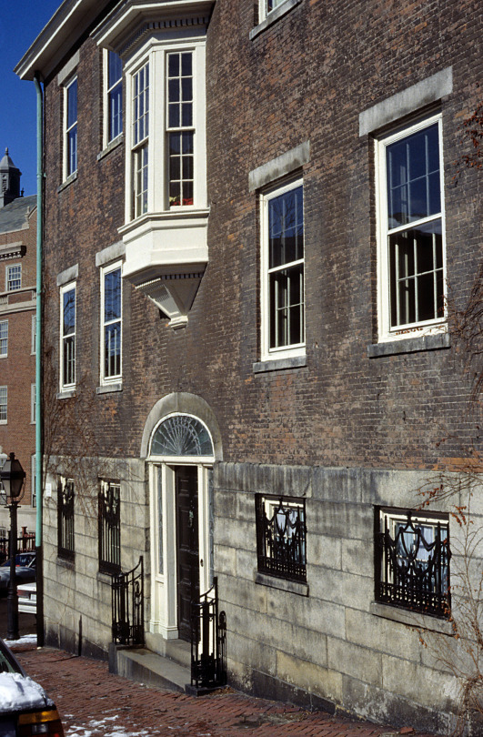
Picture Eliza Ward coming down the stair in the morning. She pauses to look out the bay window, the only one in the house that affords a view up and down the street, to check out the neighborhood before her day begins. Or, again, before retiring, to see that things are quieting down for the night. It’s a special moment in the life of the house.
It is also the only moment where the private life breaks through that taut plane, into the public realm, bringing with it something of the exuberance of the interiors, of which you’d otherwise have no clue. I’ve not seen them in person, but you can find images online. The Library of Congress offers black and white photos taken for the Historic American Buildings Survey (HABS) in 1958; Zillow presents recent color photos. One of the HABS photos gives a pale preview of the original, flamboyant Dufour wallpaper that will knock your socks off in color:
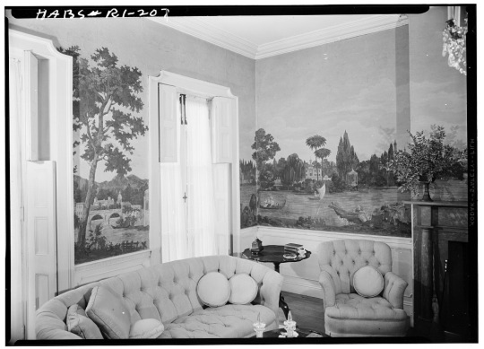
Once you’ve seen the Zillow images—really, they’re worth the visit—the audacity of the bay window makes sense.
7 notes
·
View notes
Text
Facts

The architectural historian-theorist Colin Rowe liked to brandish this quotation: “Facts,” he would say, “are like sacks: they don’t stand up unless you put something in them.”
The remark, from the playwright Luigi Pirandello, refers not to paper grocery bags, which can stand up without anything in them, but to cloth sacks, the kind you can get 25 pounds of rice in at little shops in Chinatown.
Rowe offered the observation as a critique of functionalism. His point was that the bare facts of a functional program—how many square feet you need for the auditorium, that sort of thing—are empty without the cultural knowledge that tells us why those facts matter. We are, after all, not mechanical beings but cultural beings, who deal not in square footages but in pride & suspicion & humor & jealousy & memory & love.
It is a wise observation, and it has been echoed across the intellectual terrain by cultural critics, philosophers, anthropologists, literary theorists, even architects, who have emphasized the cultural situation (some would say construction) of even the most solid-seeming facts.
But we might think a little more about those sacks. Empty, they’re nothing but a vague swirl on the floor. Full, they assume a very particular shape, not as rigid as a rock, but certain enough that, if I asked a bunch of people to draw a cloth sack full of rice, their drawings would look more or less alike. The same holds for facts: the fuller the cultural knowledge informing them, the firmer they become.
I'm afraid, though, that we prefer our facts half full, partly because it doesn’t take as much work or as much time to fill them, partly because a full fact, like a full sack, can be a lot to carry. And we prefer them half full because, in that state, we can make them assume pretty much any shape we want. Poke it this way, pull it that way—whatever.
Not so with full sacks, or full facts, which become ever more closely determined the fuller they get. And many of us are afraid of that, afraid to discover what shape the fully informed fact will take. Architects may be particularly wary, concerned that the facts will overwhelm the imagination—which is where pride & suspicion & humor & jealousy & memory & love play out.
We needn’t be. Louis Kahn said of the Kimbell Art Museum, after its completion, that it felt as if another hand had done it, and that this feeling was a good feeling. The inevitability of the fully informed fact—which is what a good building is, or a good idea in any realm—is not in conflict with the exercise of the imagination. Imagination and the fact, fully formed, converge.

Exterior photo from the Carol M. Highsmith Archive, Library of Congress, Prints and Photographs Division, interior photo by Andreas Praefcke; both have been released into the public domain.
6 notes
·
View notes
Text
The Evolution of Housing in America, 1878-2021

4 notes
·
View notes
Text
An Eye on the Street?
How small can an architectural move be and still make a difference? I’ll show you a tiny one in a simple stucco house in Berkeley: an eave that arches up, ever so slightly, above the second-story window over the entry. Let’s see what it might do.

Here’s how I think about this little arch:
First, it emphasizes the entrance, making it a little grander, a little more formal.
It also echoes the arch above the doorway; in fact, one way you can think about it is that the lift of the arch over the doorway has pushed the eave up, as if the wall were a contour gauge: you push up on the bottom edge, and the top edge rises to match.

That may not be how the person who designed the house thought about it, and the average person probably doesn’t think about walls this way. But it’s how I think about them, as plastic things, things that can be pushed and pulled and shifted and stretched.
I think of roofs the same way, so to me the eave is like the edge of a blanket, lifted up the way a child might lift one, to peek out from under it. I think, too, of a raised eyelid, because I also think of façades as faces. Either way, it suggests someone in the house, or the house itself, looking out, an eye on the street.
Does this eye, this little arch, deter crime? Maybe. Small gestures sometimes do. Years ago, one Sunday afternoon in Providence, Rhode Island, I walked past the RISD Museum and saw the director, Frank Robinson, cleaning the molding around the front door with his handkerchief. He explained that tidiness deterred theft.

With that sense of looking outward comes a suggestion—ever so slight—of the window coming forward, not actually, of course, but a feeling of it coming forward, as the doorway actually draws backward into the house. Without the complication or expense of a bay, the window gains something of the force of a bay and deepens the shallow niche of the doorway. And these two movements together—reaching out while stepping back—are gestures of greeting: one hand outstretched, the other guiding you in. Welcome.
And then there’s the gate, with its curve mirroring the arches of the door and the eave. Together, the three gentle curves—gate, door, and eave—deepen and extend the approach to the house. They instill a sense of anticipation, a greater awareness of the threshold, the moment of greeting. They enforce a sense of dignity—let’s say even an expectation of dignified behavior. Maybe the visitor is moved to straighten his tie before he reaches the door.
_______________________________________________________________________
The photo of the contour gauge is by Tenbergen, licensed under CC BY-SA 3.0.
5 notes
·
View notes
Text
A Place with No Backs
In our current moment, when our political differences stand out so vividly, I’d like to suggest a way of thinking about wholeness in the built environment, as something that might lead us more readily to embrace our collective enterprise. It’s going to take a little longer than most of my posts, but there will be a lot of nice pictures.
I’ll start with a couple by a photographer named Micah Cash, who’s published a book of photographs of the buildings and landscapes of the Tennessee Valley Authority called Dangerous Waters. (He’s more recently produced an equally beautiful study of roadside dining, Waffle House Vistas.)

Micah takes the title of his book from this sign. It’s at Fort Loudoun Dam, on the Tennessee River about 25 miles southwest of Knoxville, halfway between there and Rockwood, the town where I grew up. There are signs like it at most, if not all, of the twenty-some-odd TVA dams, intended as a warning to folks out fishing in small boats, who ease up to where the turbine outflow roils the surface, churning oxygen into the water, which the fish like.

Here’s another one, at Pickwick Landing Dam. It offers a lot to think about. Sober harmonies of hue and tone and texture. Rust cracking the enamel of modernity. A sign ruled for an absent message. A frame within a frame, a view blocked, a working landscape classicized. You needn’t have been to Tennessee to enjoy it. But, as I mentioned, I grew up there. I learned to swim in Watts Bar Lake, and I’ve spent a lot of time on the TVA reservations, so I can tell you something else about this image: I can tell you why the back of a sign is something to take a picture of.
You may know Wallace Stevens’s poem about the jar:
I placed a jar in Tennessee,
And round it was, upon a hill.
It made the slovenly wilderness
Surround that hill . . .
Architects are drawn to this poem because of the license it seems to confer, to insert an isolated object into a landscape and expect it to change everything, to bring a new order to the place. But that’s not how order is brought to most landscapes. Or, anyway, it’s not how it was brought to the landscape of the Tennessee Valley. Order came to that landscape through the pen of a liberal, bow-tie-wearing Republican senator from Nebraska, George W. Norris, who wouldn’t abide Henry Ford buying — for pennies on the dollar — a dam that had been built with taxpayer money to power armament production for World War I.

The tussle over the fate of that earlier dam — Wilson, near Florence, Alabama — sparked the idea of the TVA, but the idea was much bigger. At that point it was the vastest and most coherent physical idea the federal government had ever imagined. Second to the Interstate Highway System, it remains so to this day. More remarkably, it is the only project of its size in the U.S. comprising a natural, rather than a political, territory: the watershed of the Tennessee River, which includes parts of seven states.
The Tennessee Valley Authority was conceived by Norris in 1926 and chartered by Congress in 1933 with lofty goals:
To improve the navigability and to provide for the flood control of the Tennessee River; to provide for reforestation and the proper use of marginal lands in the Tennessee Valley; to provide for the agricultural and industrial development of said valley; to provide for the national defense. . . , and for other purposes.
The “other purposes” included eradicating malaria, which affected thirty percent of people in the region in 1933. Providing for the national defense included the production of much of the weaponry of World War II, including the atomic bomb. Today, the TVA provides not-for-profit electricity — and plenty of good fishing — to more than nine million people.
A lot of benefit, but at great cost: entire towns (and 20,000 graves) relocated, thousands of acres of rich bottomland farms erased.

The families who owned those farms — my grandfather’s, shown above, among them — suffered loss, but it was a necessary loss if cities like Chattanooga were to be spared the floods that periodically tore them apart.

This is Chattanooga in 1917. The city was particularly vulnerable, because it is at a choke point on the Tennessee, where the river had, ages earlier, broken through Walden Ridge, severing Lookout Mountain to the south from Signal Mountain to the north.
To prevent such devastating floods, the TVA made controlled floods: the chain of lakes pushed out from the Tennessee by the nine main-river dams — Fort Loudoun, Watts Bar, Chickamauga, Nickajack, Guntersville, Wheeler, Wilson, Pickwick Landing, and Kentucky.
It was a gargantuan project, and it confronted the TVA with a challenge: to court popular sentiment, first to promote its own agenda and then to support the burgeoning war effort. Toward that end, it enlisted the design professions in a unified program of persuasion — propaganda, if you will — remarkable for its scope and coherence.

Its vision is almost seamless, and so are its landscapes. The typical reservation surrounding one of the dams unfolds gradually for the visitor, the verges becoming progressively tidier, the roadway riding the topography more gracefully than the workaday roads of the wider world.

Every moment is considered, every detail, down to the rungs of a ladder.


There are no loose ends. If there were, there might be room to doubt the rightness of it all. Contingency has been submerged in a landscape that is as inevitable as nature itself. Unlike the rest of the built environment, with its groomed fronts and ratty backs, the TVA has no backs.

Which is why the back of a sign is something to take a picture of.
It’s also a big part of why the TVA has been accepted into the everyday lives of the people who live there, who enjoy it and take pride in it, even those whose families lost places that were dear to them.

It’s an awkward moment to be recommending large-scale, federal infrastructure projects, when the only one on offer is a wall that is anything but uniting. But it’s something to think about: how architecture might contribute to the cohesion of a fractious society.
We live in an entropic universe. Fractiousness is the natural mode. Wholeness is elusive. Cohesion takes work. I would rather architecture contributed to that work.

_______________________________________________________________________
The final two photos are by the amazing photographer Richard Barnes, who took them for The Tennessee Valley Authority: Design and Persuasion, which explores the range of art and design disciplines that contributed to the TVA project. The black and white photos, except those of the Culvahouse farm and of Chattanooga in flood, are by another extraordinary photographer, Charles Krutch, who took some 3,000 images recording the development of the TVA.
An earlier version of this essay appears in Places, as an accompaniment to a portfolio of Micah Cash’s photos.
#architecture#tennessee valley authority#tva#dams#Micah Cash#Richard Barnes#Charles Krutch#persuasion#design
4 notes
·
View notes
Text
Approaching Jackson Square
Cities, being by-and-large large, rarely have well-defined fronts. Chicago has one, facing Lake Michigan. To my mind, the clearest front of Manhattan is the wall of buildings surrounding Central Park — an appropriately inward-facing front.
New Orleans, however, has a decided front, the Mississippi River face of Jackson Square, the former Place d’Armes, with St. Louis Cathedral flanked by the Cabildo and the Presbytere and the square itself embraced by the counterpoised arms of the Pontalba Apartments. It is a picture postcard front, not only because it appears ubiquitously on picture postcards, but also because, other than on postcards, one rarely encounters it head-on. The only conveyances that regularly arrive on Decatur Street at the front of the square are the mule-drawn carriages that offer languorous tours of the Vieux Carrè, the present-day French Quarter.
Pretty much everyone else approaches Jackson Square from Canal Street, where the St. Charles Avenue and Canal Street streetcars run, along with many of the city’s bus lines; and along and beyond which are most of the city’s major hotels. From the streetcar stop, you walk downriver along Chartres (char’-turs) Street through the Quarter, arriving at the Square sidewise. Still, you have that postcard view in your mind as you sidle up to the Cathedral along the face of the Cabildo, even if it’s your first time there.
Urban experience is always made up of such combinations of memory, anticipation and immediate experience. The novelist, literary critic and keen observer of cities William H. Gass has written about what he calls “recursive” experience. He offers an example in the opening passage of Garden, Ashes, a novel by Danilo Kis: “Late in the morning on summer days, my mother would come into the room softly, carrying that tray of hers.” Gass suggests the recursive nature of reading in his approximation of this sentence as we might actually experience it as readers — which is to say, as it echoes its way through our consciousness:
Late in the morning, late in the morning on summer days, my mother, late in the morning on summer days, would come into the room softly, late in the morning on summer days, my mother would be carrying that tray of hers, late in the morning on summer days, when my mother would come into the room, softly, with that tray. (Habitations of the Word, New York: Simon and Schuster, 1985, p. 81)
Equally recursive is any “reading” of the city, with its doubling back of memory and recognition, of increments of expectation, provisional arrival, projection. Such is the case on Chartres Street, where the symmetry of the Cathedral façade, obliquely viewed and opening onto light, suggests the presence of the square before the square itself is seen, and lures the pedestrian with a foretaste of movement onto that axis. (In architecture, movement is implied by fixed forms — indeed, by the most fixed forms: axial, symmetrical forms. The more fixed the referent, the surer our sense of movement, actual or imagined.) The memory and anticipation of the front of the Cathedral accompany the walker in an interplay between the city seen and the city imagined.
_______________________________________________________________________
This post is an excerpt from “Black in Back: Mardi Gras and the racial geography of New Orleans,” published in Places, March 2011. “Black in Back” is one of four articles on New Orleans I have written for Places. You can find the others here.
2 notes
·
View notes
Text
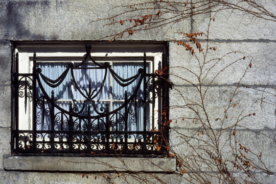
Fronts and Backs

The Royal Crescent in Bath, England, is one of the finest examples of Georgian architecture in the UK and one of the handsomest housing developments anywhere. Built between 1767 and 1774, it was put together in an unusual way: owners purchased a length of the front façade, designed by architect John Wood the Younger, then hired their own architect to design the house that would rise behind it. The upshot is a particularly vivid instance of an almost universal pattern: the difference between front and back. The front of your house is what the public sees, so you put extra effort into making it proper and attractive. In back, you do what is easy and convenient.

There’s an element of conspiracy between the owners and us in how we look at such buildings. It’s not as if we can’t see their backs; we just don’t pay attention to them. But if we look, we’ll notice two sorts of difference between front and back: in form and in materials.
Formally, there’s an orderliness to the front that makes of these thirty townhouses a single thing. It is achieved in three ways: repetition (identical, evenly spaced Ionic columns), geometry (it’s a semi-circle in plan), and symmetry (at the center, one bay is elaborated with doubled columns, an arched window, and sidelights flanking the door). We don’t know for sure where one person’s dwelling ends and the next begins: in some cases, what appear to be two houses are in fact just one, and many of the original townhouses are now divided into flats.

Around back, by contrast, the individual townhouses are clearly distinct. Windows are of different sizes, some are bays. Sheds and greenhouses poke out. The firewalls between townhouses split the roofs and sometimes the walls. Behind the elaborated central doorway, we find not a house, at all, but a hotel.

Another difference is in materials. In front, the stone (which I say more about in an earlier post on nearby Landsdowne Crescent) is finely cut. In back, it sometimes is, but in places the wall is made not of stone but of stones—uncut rocks of various sizes, with the gaps between them filled in with mortar (or not); in some places it is finished with plaster.

These distinctions between front and back are obvious and common, so why dwell on them? Because they represent a principle worth noting, the principle of propriety. You may have heard of the three principles of architecture that the Roman architect Vitruvius articulated: firmitas, utilitas, and venustas, usually translated as firmness, commodity, and delight.
What Vitruvius meant by firmitas—being well-constructed—is clear, and even if we might not agree on what we find delightful, it’s clear what he’s getting at with venustas. What he meant by utilitas is a little more complex. In modern times, we tend to think in terms of what a building is used for: a fire station is shaped differently from a hospital or a factory. In Vitruvius’s day, however, there weren’t fire stations or hospitals or factories. A simple, rectangular room sufficed for most functions, so function was only a part of what went into utilitas.*
More important than functional distinctions were social distinctions. What was appropriate for a temple was not appropriate for a house, and it should be apparent which was which. The greater part of utilitas was propriety.
We see this principle at work in the Royal Crescent, as in most buildings: present a proper face to the public, and you can let things slide around back.
(In a future post, I’ll look at a place where there are no backs.)
_______________________________________________________________________
*For this understanding on the meaning of utilitas, I am indebted to Patrick L. Pinnell, FAIA.
Photo credits, from top to bottom: Christophe Finot, under license CC BY-SA 2.5; Adrian Pingstone, public domain; David Iliff, detail from “A Panoramic View of the Royal Crescent,” under license CC BY-SA 2.5; Adrian Pingstone, detail; Tim Culvahouse.
3 notes
·
View notes
Text
Continuity and Character
I mention in the previous post that the photos of the Citroën and Triumph are from a trip I made to England in the summer of ‘85, which was between my two years in grad school. It was a pivotal experience, because during it the idea that would underlie my thesis began to emerge. As I say in another post, that idea is: “Whenever you put two materials side by side, you have to make a judgement about how similar to each other they should be, or how different.” Another way to say that would be “how continuous they are with one another.” That’s not a thesis; it’s just an observation. The thesis has to do with why such judgements are important and what you can accomplish through them. It’s a thesis about architecture, but those cars and several others contributed quite a lot to it.
Two particularly revealing ones are these Fords, which were parked one right in front of the other, as if they were waiting for me.

As you can see, you can run your hand along the hood and over onto the headlights without hitting an obstacle. There’s a little gap, of course, where the hood opens, but visually it’s a continuous surface. Because it is, the car is all of a piece. It’s simple and smooth and modest. Nothing more modest than a British Ford.
Then someone goes and mounts fog lights on the front. They stand out; in fact, they stick out. He (he’s probably a he, don’t you think?) doesn’t just have brighter lights, he has FOG LIGHTS. It’s no coincidence that his car is red.
Not much to hang an architectural thesis on, and neither complex nor subtle, but it illustrates the notion: continuity makes a thing (in this case a car, but it could be a building or a street or a city), and discontinuity makes a point.
1 note
·
View note
Text
City Car

This is a Citroën DCV. I’m not sure what year; I took the picture in London in 1985. The DCV was produced for forty years, from 1949 to 1990, but the body design didn’t change much. You can see why it’s nicknamed the “Tin Snail.” Tin suggests cheap, and it was, in fact, designed to be inexpensive, but Malcom McKay, writing in Classic & Sports Cars, describes it as “one of the most comfortable cars ever built.” It is also, to my mind, one of the most urban cars ever built. I’ll tell you why.
The shapes of early automobiles derived from the carriages they displaced, as you can see in this 1891 Buckeye Gasoline Buggy, with a funny little wheel to hold up the front, no longer supported by the shafts that would have attached it to the horse.

The Buckeye’s body derived from precedent — from what came before. Precedent is one of many factors that influence design. When a precedent does well what the new design is meant to do, that’s a good thing.
With the car, the carriage model didn’t survive for long. The invention of the pneumatic tire made the ride more comfortable — comfort is another common factor in design — and I suppose the physics of the drive train led to smaller diameter wheels, like those on this 1897 Jeffrey Rambler:

Technological advancement — an invention, such as the internal combustion engine, or the development of a new material, rubber, for instance — is often another factor in design.
I imagine that people also began to find it not so comfortable to sit atop the engine, so it was moved forward to where the horses used to be, as in this 1910 Ford Model T:

Then, as speed increased, car bodies began to be designed with airflow in mind. As with the size of wheels, here physics is a factor. A particularly handsome example is the Triumph TR-4:

This one is a convertible, which makes it decidedly an open-road car. You could say that the countryside is the context for this car, or more specifically its physical context. There is also a cultural context — sportiness and the sexy connotations of sleek muscularity. (There’s a component of cultural context in the early, buggy-like cars, as well: familiarity is a powerful influence.)
In these automobiles, we find several of the factors that influence design, not only of cars, but also of buildings — of anything: precedent, comfort, technological advancement, physics (which is one sort of function), and physical and cultural context.
It’s in the consideration of physical context that we get back to the DCV. With its flat sides, it’s a car that’s shaped to travel city streets. It’s not literally shaved flat to fit through alleys — the fenders belie that notion — but it acknowledges and reflects the building fronts that flank it. The TR-4 doesn’t enjoy being so constrained; the DCV does.
It is an urban car.

2 notes
·
View notes
Text
A Mystery of Time
One of my favorite landscapes is the Scott Outdoor Amphitheater at Swarthmore College, on the Main Line outside of Philadelphia. Designed by Thomas W. Sears and completed in 1942, the amphitheater hosts the college’s commencement ceremonies.

What events take place here at other times of the year, I don’t know, but the seasons change regardless. The surrounding dogwoods bloom in the early spring. In the fall, the tulip poplars that stand in apparent randomness across the grass terraces dapple them with their yellow leaves.
These yearly cycles are one way you encounter time here. Another is in the curious intermingling of the poplars and the stone retaining walls. How old is each, and which came first? It’s not at all clear. You might expect a growing tree to force the wall out of plumb or to dislodge a few stones, but here tree and wall coexist with uncanny deference. It is as if the processes at work were neither biological nor mechanical, but magical, as if a spell had been cast and two landscapes, the human one and the natural one, had simply dissolved into one another. It feels both ancient and fresh, like Tolkien’s Rivendell.
The image is by Simon, via Creative Commons BY-NC-ND 2.0. The original can be found here. Thank you, Simon.
2 notes
·
View notes
Text
The Same, and Different
In 1984, I went to graduate school to study the formal implications of building materials. The question was, “How can the qualities of a material guide what the architect does with it?” At the beginning, I thought the significant qualities were structural ones, like steel’s tensile strength and stone’s compressive strength, which, when used together, suggest forms like the Brooklyn Bridge:

Early on, the director of the program, Donald Watson, offered a prescient observation. He said he thought that, if I followed that path, I’d soon hit a dead end. He was right. If you pursue extremes, the possibilities get pretty narrow pretty fast.
Fortunately, near to hand were Yale’s Collegiate Gothic residential colleges by James Gamble Rogers and its British Art Center by Louis Kahn. What I found fascinating about these buildings weren’t broad structural differences like those between a cable and a pier, but close visual differences like the ones between the concrete frame and the pewter-toned stainless steel infill panels of the British Art Center . . .

. . . or between blocks of stone in Trumbull College . . .

. . . so the thesis ended up being about the interplay of similarities and differences between adjacent materials. The basic idea was that, whenever you put two materials side-by-side, you have to make a judgement about how similar to each other they should be, or how different. The more similar they are, the greater the continuity. Continuity ties things together and makes a place.
Differences are important, too, because without them you couldn’t find the door. In the entryway in Trumbull College, shown above, it’s not just the dark wood of the door itself, or the arched shape. It’s also the spreading out of the lighter, smoother stone across the surface of the building. That’s the interesting part to me, because that lighter stone is both continuous with the wall and distinct from it, at the same time.
See how that happens in a single block of stone, how the carved molding runs continuously through it, tying it into the surrounding wall, while the shape of the block as a whole separates it from the surrounding wall and ties it to the door frame:

The cool thing is that it’s doing all that at once. Cool and profound, because it demonstrates the subtlety and complexity that are possible when, instead of looking for categorical differences — steel is good in tension, concrete is good in compression — you look for overlapping qualities, like texture and tone.
The image of the Brooklyn Bridge is by Postdif, CC BY-SA 3.0.
#architecture#Louis Kahn#James Gamble Rogers#Yale#Trumbull College#British Art Center#materials#Brooklyn Bridge
5 notes
·
View notes
Text
Boxwood and Brick

I passed some boxwood on my walk this morning, and its odor reminded me, as it always does, of the South and (when I’m in an architectural frame of mind) of Thos. Jefferson’s Academical Village, the original precinct of the University of Virginia.
Recollections have a life of their own, and in this instance mine gathered in a remark of Louis Kahn’s that any architect will know: “I asked the brick what it liked, and it said, ‘I like an arch.’” That’s because an arch is a form that enables a four-inch-wide, eight-inch-long chunk of clay to span great distances. An arch is the brick’s superpower.
The reason I recalled Kahn’s remark is on account of an observation that a pal of mine, Christopher Peragine, made when we were undergraduates at Tulane, to the effect that, when Thomas Jefferson asked the brick what it liked, it said, “I like a serpentine wall.”
Serpentine walls aren’t as common as arches, I suppose because of the peculiar demands they put on the arrangement of things to either side of them, whereas arches happen overhead, where they don’t get in the way. (Which is why Charles Moore suggested that it’s usually a good idea, when we’re designing buildings, to keep our myths up off the floor.)
But the serpentine wall is also an application of the brick’s superpower, a sort of arch turned on its side and flipped back and forth. You can build a one-brick-wide serpentine wall in a frost-prone place like Charlottesville, and it will stand there for two hundred years. A straight wall would have to be two bricks wide, which is almost twice as many bricks (I say “almost,” because the serpentine line is longer than the straight one), and even then it’s liable to heave with the frost and topple over. The straight wall is like someone standing with feet together, but the serpentine wall is wide-legged; the width of its stance is the amplitude of its curve.
And the effect is magical . . .
. . . as are these photos by Karen Blaha, who has shared them through Wikimedia Commons, CC BY-SA 2.0. Thank you, Karen.

1 note
·
View note
Text
Yet Again by the Pacific

We spent the recent four-day weekend with two other families at The Sea Ranch, the storied development on the California coast, two-and-a-half hours north of San Francisco. The visit recalled an earlier one, years ago, when my wife and I stayed with friends in one of the seminal buildings there, Condominium 1, designed by MLTW—Charles Moore, Donlyn Lyndon, William Turnbull, and Richard Whitaker. One of those friends was Lisa Findley, with whom I later wrote an article for Harvard Design Magazine about it, “Once Again by the Pacific” (Fall 2001). Here’s an excerpt:
“If you spend only one weekend at the condominium, the unit to rent is Charles Moore’s own, number 9. Here, daylight filters from the skylights and glows on the wood walls. The aedicule, with bed-box above, creates a low, intimate space in front of the fire. On the main level, window seats as wide as single beds flank the bay window, extending out beyond the walls like saddlebags. Let others take the loft beds and the more conventional bedroom (installed for an ailing Moore shortly before his death). Volunteer for the window seat. There is surely no finer place to wake up in the morning, overlooking the edge of the bluff, with the surf surging around huge rocks where sea lions are also waking, as the mist dissolves and the sun breaks through the fog . . . . This place, secure and comfortable, and yet on the edge and also reaching beyond the edge, beckons the moment you arrive.
“And that is the crucial moment, the moment you arrive, since the weekend itself is hardly more than an extended arrival, ending in a last-minute departure. It is not only for the sake of the preservation of the landscape that the condominium does not encourage you to spill out onto the lawn with your Weber grill and your whiffle ball. You have no time for such things. Instead you find, packed into the simple volumes, a complex set of spaces that allows two people to begin a conversation without preliminaries, or a half-dozen people to sit down to a meal in a setting that is contained and yet open, obliquely, to the sea. And you find the window seat. The immediacy of these spaces and their expansion into the landscape are the two poles toward which every design judgment was directed. Juxtaposing enclosure and extension, settling you variously but effortlessly into a bracing landscape, the condominium at The Sea Ranch gives your weekend a most generous shape.”
If you’d like to read more, there’s a PDF of the article at http://www.culvahouse.net/wp-content/10a0/Culvahouse_HDM_Sea-Ranchx.pdf.
#architecture#california#mltw#Charles Moore#Donlyn Lyndon#William Turnbull#Richard Whitaker#The Sea Ranch#Condominium 1#weekend#Pacific#Lisa Findley#Tim Culvahouse#Harvard Design Magazine
1 note
·
View note
Text
The Moving Window Writes
There is an old house in Innerleithen, considered the oldest continually inhabited dwelling in Scotland. The Traquair House website implies that it was built in 1107, but Wikipedia says that “no part of the present building can be dated with certainty before the 15th century.” Whenever it was built, it is fortified, but it’s not quite what you’d call a castle. The front of Traquair House is more or less regular in the disposition of its parts:

There are a couple of errant windows on the principal façade, though, and they hint at something that is even more strongly suggested around back:

. . . which is that a nice, tidy idea has been muddled by happenstance, as if people actually lived there. And, more: that, as they moved about, the windows, for a while, moved with them.
1 note
·
View note