
Don't wanna be here? Send us removal request.
Statistics
We looked inside some of the posts by term1itmedia and here's what we found interesting.
Average Info
Notes Per Post
0
Likes Per Post
0
Reblog Per Post
0
Reply Per Post
0
Time Between Posts
3 days
Number of Posts By Type
Text
17
Last Seen Tumblr Blogs


Fun Fact
Tumblr Inc. is using 66 technologies for its website.
Text
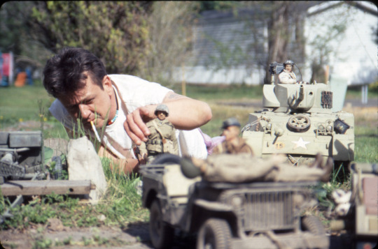
Progression of Model Making - Weeks 7-12
PHEW! It has been a very busy second half to Term 1 here at Interactive Media. Now for the moment I’ve been building up to this entire time... THE MODELS!
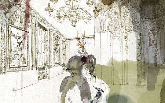
Freak Show Model
For this term’s project, we were taught how to make a super-sculpie model. I don’t have the full process on me as I’m very forgetful of things, but here is all that I have captured.
The first step, cage. We did this by using a special wire that we could bend and form a “cage” with. This is to secure the foil we add afterwards, which goes inside the cage so it doesn’t fall out. After caging and foiling, we had to encase it in one or two folds of foil to make sure everything stays put. That, and we needed to get the appropriate shape for our model.

After coating it with super-sculpie (the horns are foil towers which I embedded into the caged foil), I had to coat it again as some parts were still view-able through the first coat.

After the second coat of super-sculpie, I had to use tools to shape the wide mouth, the eyes and the scales. I don’t know the official name of the tool, but it looks something like this:
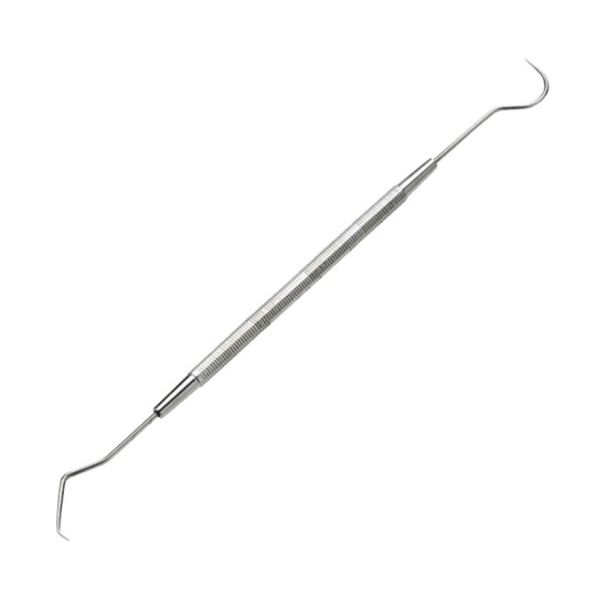
I called it “The Dentist’s Tool” as it looks similar to a dental probe.
Anyway, I used it to make the marks and shapes within the model itself.

After that, I had to use the rigid part of it (the middle part with the bulgy pattern) to make it look scaly. This is what it looks like, next to it’s backstory. The last two lines are obstructed: “But something has been found that could be it...”
Yes, we had to come up with a backstory and name for this model to give it more life. I chose the name of “The Annihilation” as it was the scariest name I could think of.
NOTE: This was before I have watched the film of Annihilation. I knew nothing about said film while making up the name for this model. Any other similarity is purely coincidental and unintentional.

Alongside the details, I had to come up with imaginary stats for it. Since this is a model of a fictional giant basilisk that is 2,000 miles from head to tail, I had to come up with stats that made sense for something that enormous... except the Speed, which is entirely made up from imagination.

After finishing off all of the final details and coats of paint (painted it mostly black, made the teeth white and made the eyes green), we have an imaginary model! However, there was one more thing I had to do... the stand.
Because I didn’t want to ruin the progress I made on it throughout the course of 5 weeks, I chose to glue it to a made-up trophy shield instead. This is what it looks like on said shield (which is also painted to give it more age and mystery).
Mechanical 3D Workshop Construction
We swapped from collages to 3D workshop modelling during this half of the term. During this time, we used a variety of machines, such as saws, drills, a sander, a bender and an anvil (I didn’t use the last two in my model).
Before we could get cracking on using machinery, we had to come up with a concept as to how we would make the model move, and how it would look. I chose to go simple as this is my first time using this kind of technology (however I did do TECH in middle school, but that was ages ago so I forgot everything), so I made a random number generator with wooden wheels and... nails. A LOT of nails.

For my mechanical build, I also had to use a LOT of wood. Like, 95% of my build is nothing but wood.

In my plan, it shows that I needed a metal rod to be able to spin the wheels with a handle. However, that plan failed as the wheels didn’t turn with the rod, so I stuck with a hand-handling plan B. This is what the build looked like un-touched when first assembled from the ground up. The stands eventually broke from hammering the nails in, so I used the thicker ones you see here. The stands have a hole drilled through the middle of them so a rod of metal can easily go through (this took a lot of tinkering).
Another problem I had faced was the wheels. Making the wheels was easy, but fitting them onto the rod wasn’t. I had to make many modifications to it with the drill, including moving the drill around the hole as it was in action to make the hole wider. That is why the “spin rod and the wheels go with it” plan failed, as the hole was too big.

Eventually, I got the hand-handling plan B working.

The major brick in the wall was the entirety of the superstructure. I had to find a few more thin pieces of wood, which was difficult as I didn’t feel like cutting them by hand and risk breaking some, or cutting myself (I had no accidents during this process).
Eventually I found enough pieces of wood to finish it off. As soon as they were nailed in and fully assembled, I had to paint it... including the unpainted wood with my lettering on it. This really discouraged me a bit but I pushed forward and...

This is the result. The term “RNG” stands for “Random Number Generation”. It is used a lot in video games, so there is a good example why I chose to use RNG instead of Random Number Generator. That, and I wanted it to look attracting with big letters instead of small-sized words.
Should you ever get indecisive on what number between 0 and 999 you want to pick, use this mechanical build instead. It will decide for you.
So, that is my entire second term summed up alongside the Movie Making project (find out more above a load of other posts I have made), and it has been an incredibly busy, but fun time. I really enjoyed it and I look forward to what 2019 brings in as a fresh start to the year.
Though I know one thing for certain, the next digital projects we do is... well, you’ll just have to find out, won’t you?
Until then, have a Merry Christmas and a Happy New Year!
Oh, and one more thing, this is the last post on THIS blog. You can catch me on term2itmedia from now, as this blog is entirely dedicated to Term 1, and I wish to keep all three terms in their own individual blogs.
0 notes
Text
Research - Amanda Visell, Gothic Horror Genre and Science vs Folklore
Amanda Visell is a toy constructor who makes toys and sculptures that are done with basic and complex shapes.

With this sculpture, you can see a tall reindeer made out of very simple shapes, such as cuboids and trapezoids. However, the antlers, ears and the little girl beside it are made of more complex polygon shapes, which were wood-cut and then painted afterwards.

In this sculpture, you can see a re-enactment of someone chopping wood off of a tree stump using a giant axe. It is further detailed by the amount of paintwork on the tree stump and the part that has been chopped off.

As I said at the beginning of this post, Amanda does toys as well. These are found under Vinyl Figures on her official website (http://www.amandavisell.com).
On this vinyl figure is what looks like a circular person drinking on top of a pink elephant. There is a black pattern with what looks like alcohol on the elephant near the back-end of it’s body, and a light-pink semi-circle for its ear.

On this vinyl figure set is a giant (what looks like a) dinosaur with a girl trapped inside, who is standing next to a campfire opposite someone else who looks like they’re looking for the missing person. Amanda’s figures have some from of mystery to them, and that is why I like them. It is always fun to brainstorm what could’ve happened that lead to the eventual scenario that is being rendered by the models.
Gothic Horror Genre
Gothic Horror Genre is a type of mixed genre that incorporates horror, fiction and death. It originated in 1764, with The Castle of Otranto, and has been further developed ever since. Some famous examples of gothic horror are Dracula and Frankenstein, both of which have a horrific backstory to them, such as multiple body corpse assembly for Frankenstein. Or Dracula, who turns evil as soon as sunset falls, and remains that way until the sun rises again.
Why do we use it in literature, movies or games? It could be to make the movie or game more entertaining to watch as some people like live monsters, CGI or robotic. For literature, it gives a good sense of shock to the reader as such a monster doesn’t exist in real life, and for them to fear it if they do.
Science vs Folklore
Science and folklore are two different things. Science is the truth about what happens by knowledge and experiments, and folklore is a belief to either discourage or to entertain, otherwise known as mythology.
An example of folklore is with a plant known as Deadly Nightshade, which is a poisonous plant with berries that are produced in early autumn. The folklore behind it is that the plant is said to be the property of the devil, so anyone picking the berries better have prepared to look the devil in the eye, as he would make a visit to anyone willing to steal his berries. However, this doesn’t happen, as anyone picking the berries may get poisoned, which is probably why they “better prepare” as it is “deadly”.
An example of science is the theory of evolution. Take the Acacia tree for example. Giraffes would usually eat the stuff on the branches. However, the plants grew wise to the fact they would do this, so they evolved to allow a poisonous spore to spread when the giraffe eats the branch. However, this didn’t work well as it would only spread in one direction, making it easily avoidable. So the plant evolved again to make it so any nearby trees and around them are affected as well by the spore, deterring the animal from eating the plant ever again. The same thing can be said for other plants such as roses or stinging nettles, as they have evolved to grow hurtful modifications to them to deter the animal or person trying to get rid of it, or eat it.
0 notes
Text
Research - Pablo Ferro and Saul Bass + Catch Me If You Can Film Review
Pablo Ferro and Saul Bass are graphic designers and title sequence designers.
Pablo Ferro
Pablo Ferro not only designed title sequences for other films, he also founded his own company; “Pablo Ferro Films”.
For other films, he did work for Men in Black, Philadelphia and A Clockwork Orange.
Here is his title sequence of Men in Black:
youtube
As you can see, it starts out in CGI space with spacecraft flying past, with long stretched out text appearing as the credits. As the camera descends down to an Earth-like landscape, the credits continue to obstruct everything else. It then follows a dragonfly while the credits still roll.
It is an impressive title sequence for a 1997 film, as back then, technology was not as advanced as it is today. I believe, if one has experience in editing video, they can easily recreate this title sequence.
Saul Bass
Unlike Pablo, Saul did not found his own company, because he never had his own. He also worked on designs for film posters and logos. He did title sequences for other’s films such as Ocean’s 11, Vertigo and Around the World in Eighty Days.
Here is his title sequence of Ocean’s 11 (it repeats at 3:10, no idea why!):
youtube
As you can see, the sequence starts out by using a digital-like stop-motion counting up to eleven, alongside credits rolling. As the credits roll past the 11 mark, many patterns are formed, such as the infinity symbol, a cinematic screen, an arrow, a slot machine and even dice rolling.
For a 1960′s film, you would expect there to be a lot of stutter. And there is. But there are animated films and other title sequences from those times (and even earlier!) that are faster moving.
Because technology was nowhere near as complicated in the ‘90s, it was very difficult to make stop-motion sequences as back then, personal computers did not exist until 1975.
Catch Me If You Can Film Review
I have only just seen this film on the day I'm writing this, so my opinions may be a bit vague. First of all, the animation is brilliant in the opening sequence. And as I progressed through this film, it felt a bit repetitive at times. Like, that same time period kept appearing (a weird sequence like 1969, 1966 and then 1969 again). I get this is a time-travelling sequence film that is based off of a true story, so I can't really complain about that. More repetitive sequences included an army of men pointing guns at empty space or breaking down doors, the main guy (cannot remember his name) and Carl trying to escape from the bad guys and forge more cheques. Again, this film is based off of a true story, so many repetitions of cheque forging is kind of mandatory for a film like this. Of course they are fake, so it never really happened WHILE filming, but it DID happen to the same guy that we were told about during this film. Near the end of the film, I felt like the film was going to loop back around to the beginning, creating an infinite loop. And to be honest, I'm kind of glad it didn't, because films/books/whatever-else that loop indefinitely does not really make it any more interesting. Do I recommend this film to someone? Only if they're into crime films or true story documentaries. This isn't for the people who dislike either.
0 notes
Text
Research - Basilisks and Ray Harryhausen
Basilisks are legendary mythical serpents that are said to cause instant death with a single glance against their victim.
One of such examples of basilisks is the model used in Harry Potter and the Chamber of Secrets:
(do excuse the subtitles, I didn’t make this video or repost it anywhere)
youtube
As you can see, the model is not computer generated, but is a moving robot built from the ground up. Personally, I like how they have done it, because if you have ever tried to CGI a basilisk or any other living mythical creature like a dragon, it is a very tedious process as it requires a lot of materials and shaping, which most people aren't capable of doing.
However, this does not mean that all basilisks look like the one from Harry Potter. Basilisks are actually part of family to lizards and not serpents. Unlike the myth, these basilisks do not instantly kill their victims, because they have none and they don’t have the power to do so.
Here is one of such lizard. It is a real picture.

Here are some concepts of basilisk that people have come up with:

An old-time illustration. Couldn’t find out the artist.

This seems more like an accurate depiction of the basilisk. While we may be wrong, it is a good concept for fantasy art.
Ray Harryhausen
Ray Harryhausen was an early model artist and visual effects creator (born 1920, died 2013). He was known for creating visual effects for Clash of the Titans (1981 film, not the reboot), The Beast from 20,000 Fathoms and Mysterious Island.
Here are some examples of his models:

A very muscular wolf man being, shielded skeleton and a dinosaur. (from left to right)

More dinosaurs.

The same wolf man being and the dinosaur he created on expedition in a museum. (couldn’t find out which one)
For his incredible work, he was paid tribute to in a few feature-length works, such as Monsters Inc, Corpse Bride and in an episode of Gravity Falls.
His work has inspired others for their work, such as Steven Spielberg (director of Jurassic Park), Nick Park (director and animator of Wallace and Gromit), George Lucas (director of Star Wars) and Tim Burton (director of Nightmare Before Christmas).
His models are very brilliantly designed, with all of the detail and scale, and that is why I like them. There is nothing wrong with his models... at least from what I can see.
0 notes
Text
Research - Mechanical Toys + Annihilation Film Review
Mechanical toys are... well, toys. But what is special about these kinds of toys is that they have a movement mechanism which allows for morphing, modification and even spinning.
Ballerina Spinning
youtube
An example of this is where someone turns a handle on the side of the box that the mechanism is inside of. When they do, something either inside the box or on top of it moves in some way. In this example you can see someone turning a handle to make a ballerina spin around. This can be done indefinitely (at least until a jam somehow occurs).
How this is done: There are cogs inside of the box that are connected to a long wooden rod that spins when the handle is turned. When that rod spins, the first cog moves. When the first cog hits the second cog, the second cog moves to, along with anything attached to it.
Rubik’s Cube
The Rubik’s Cube has a unique mechanism that allows for all six faces to turn.

How this is done: The central spider in the middle (commonly called ‘the core’) is what holds everything together. Without it, everything would fall apart no matter how careful the holder is. However, the core is not all that is responsible for holding everything together.
The 6 central pieces are connected to the core with a screw (or a rivet in some models), and then a lid is placed on top of the piece to ensure the screw isn’t exposed. In some cases, the lid can be removed with a sharp tool to access the screw underneath, allowing for adjustment to the tension (friction) on the cube. Some Rubik’s cube models use rivets instead of screws, making them impossible to adjust, no matter how many rotations are made.
The 12 edge pieces have two hooks on the underside of them which fit in-between two central pieces. If you’re lost in what I’m saying:

You can see the edges fit in there easily. However, if the cube is loose enough, they’ll fall back out if held incorrectly upon re-assembly.
The 8 corner pieces hook underneath the edge pieces and the central pieces, making them really difficult to remove on their own. This is because they have a cubic extension on one of their corners, which allows them to stay in place.
On some larger Rubik’s cube models (such as the 4x4 and 5x5 models), there are extra outer pieces that hook onto the inner edges and pieces. Something to note is that some even-layer cubes (4, 6, 8, etc), use the mechanism of the odd-layer cube just above it (a 4x4 can use a 5x5 mechanism, etc), meaning there are the same amount of pieces in a 6x6 as there are in a 7x7, except the very middle layer in a 7x7 is hidden below the two middle layers in a 6x6.
Some “speed cube” models have very complicated mechanisms to reduce the likelihood of pieces flying out of the cube, such as edges that clip into other edges and central pieces, making them really difficult to disassemble without breaking them.
Annihilation Film Review
So, Annihilation. Possibly one of the most interesting films I've seen, but at the same time it was rather boring. Yes, it is a Netflix original, but there a few things about it that I don't like. One of which is the ending of the film. It has a Blade Runner 2049 vibe to it, meaning it takes forever to get through. Yes, there are some parts in it that drive it forward, but it takes too long. That is probably why it didn't make much money ($20,000,000 in the box office, as opposed to their $40,000,000 budget), but I could be wrong. Another scene I was particularly disgusted by was the part where the man gets cut open revealing some sort of worm inside. I had to shield my eyes during this scene as I'm very easily disgusted by gore. While there isn't much blood or gore in the film, that scene really takes the cake and then some. Another scene I had to shield my eyes from is the 'bear comes in room and kills the women' scene. While it wasn't major compared to the other example, it was very disturbing. I also feel that the film is kind of repetitive as some clips get replayed a fair bit (like the bed scenes), but not too much so I'm letting that become something I'm OK with. One thing I particularly like about this film is that it shows a major fact in science, mitosis (the process of cell division), and how it uses it to create an alien creature with about 100,000 of them. TL;DR, the film is alright, but fairly gory, boring and repetitive. I give this film a 3 out of 10. The only upsides are the monster designs and visual graphics.
0 notes
Text
Research - Trailers Part 3 (Final)
Continuing from the previous two posts on the matter with two more trailers.
youtube
Frozen’s trailer is more dramatic by starting out calm, but then gets to the dark parts quicker by using a very fast transition from the calm to the drama, with many different film events happening, such as Olaf coming to life, the entire land freezing and the snow monster.
youtube
And finally, Scott Pilgrim vs The World. I can see this trailer has two halves with different genres, with the first being romance and the second being action. While it shows no major details in the film such as death of characters, it does show that Scott has to defeat SEVEN evil people to be in love with Ramona.
Out of all of these trailers, I find them very convincing. Even though I’ve seen 9 out of 10 of the films (Mortal Engines I haven’t seen), they are still a good lure for viewers who are into the genre associated with the film itself.
0 notes
Text
Research - Trailers Part 2
Looking at eight more trailers for research, but looking at five in this post due to the Links limit...
In case you never read my previous post;
Trailers (or Teasers/Sneak Peeks) are an amalgamation of clips from the movie (or a made-up scene that is canon to the film in some way) that give the viewer a sense of what the movie is like.
youtube
The Matrix’s trailer features some calm moments at first, but then flying slow-motion gunshot scenes start to play in the virtual world associated with it, along with some narration about the film, like “No one can be told what The Matrix is. You have to see it for yourself.”, which is also a motivational line to get the viewer to see the full movie at release.
youtube
Titanic’s trailer is more of a spoiler as it features only some of the most important scenes, such as the drawing discovery, ship sinking and Rose’s attempted suicide. While this is classed as an official trailer, it should really be known as “Titanic but it’s only 4 minutes”.
youtube
Jurassic Park’s trailer is not NEARLY as spoil-y as Titanic, or even the Matrix. It only features very minor scenes, such as negotiation in the control room, entering Jurassic Park and dinosaur encounters.
youtube
Elysium’s trailer features very minor details about the film as well, like the post-apocalyptic Earth, the character walking to work, slow-motion gun fights and the ship crashing.
youtube
Monsters University’s trailer features the reason why it exists as a ‘prequel’, by starting with it’s successor, Monsters Inc, before winding backwards to the entirety of the film where Mike meets Sulley and goes through education and mishaps.
To be continued...
0 notes
Text
The Big Lebowski Film Review
OK, I hate to give my opinion on this film, but I’m afraid that this film is not my mostly cup of tea. The majority of it involves swearing, which just isn't funny. Sure, it can be funny one or two times, but if you use it constantly, it is going to get boring. VERY boring. The film was also fairly repetitive as well, as some sequences kept repeating without end. I’m talking about the House scene, the Bowling scene, Car Park scene, and then the next scene that comes after that which I forgot about. It all seems like an endless loop, which gets boring throughout the film. And while some of the lines in the film are fairly funny, I did notice a lot of sex references in this film, which I’m very easily disgusted by. It’s not due to them being vulgar, but because there are too many of them in the film for me to get the joke. Speaking of which, while the nudity in the film is very minor, there is too much in the film that I don’t like to even care for it, even by minute 50. And is this film really about a rug? I get it is meant to be about a bowler who owes money to someone as well, but the rug is mentioned too much. That is why I think this film is so boring and irrelevant when it comes to funny jokes. Not to mention the fourth wall break at the end. To cut things short, this is my 2nd most disliked film, only beaten by Blade Runner 2049. Maybe because this was just a first watch, so if I were to watch it again, I might change my mind. But until then, my verdict still stands.
0 notes
Text
Progression of Movie Making - Weeks 7-10
Phew, it has been a really busy three weeks. And all those three weeks have all had to do with movie making in some way. So, I thought today, in this post, I thought I’d go through the process of making such trailers as well as a detailed guide on poster design.
Movie Process
Step 1 - Planning
The first step to making a movie is to have a plan. Planning involves an idea to start off with. For mine, I chose to make a movie based around an apocalyptic blood moon, but you can use any idea that comes to mind first.
What makes planning so difficult is that there has to be a reason why you chose this or this. The reason why I chose mine is because for one, it was the first idea that came to my mind. Secondly, it was pretty much the only thing I could think of that was feasible for me unless I wanted to spent hundreds of hours adding 3D models in Cinema4D and After Effects (which I’m not capable of doing).
This was a big problem for me as I had little to no choice but to do live action sequences and only some scenes with feasible effects and additions. But this was a good decision for me as I don’t particularly like projects as hard as a real 1-hour movie, even though we were only set to do a movie that was between 60-90 seconds.
But in the end, whatever you plan to do depends on your aspirations and management. Never go overboard and recreate a Harry Potter movie if you plan to. You won’t get very far.
Step 2 - Storyboarding
Storyboarding is the next major step. You’ve got your ideas, but how will you execute those ideas to get the results you intend? This is where storyboarding comes into play, as you’ll plan out shot by shot what you’re making.
But this isn’t going to be easy either. Alongside instructions and shot plans, you’ll also need to gather any props that you may need for production. Depending on what prop you may need, it may be difficult to get hold of one of them. Whether it’d be a custom-made stone structure or another thing that may take a lot of time or money to get, make sure you double-check before order.
In my movie trailer, I didn’t need many props at all as I only had a torch and a borrowed dagger (another prop that another student had on the day which was essential). The reason why I ended up borrowing it is because I didn't plan ahead and got one during the Halloween season.
While you could simply get as many of the same prop as possible, you’re essentially wasting your time and resources by not using some of them. So unless you’re a collector or have a group of actors using them, do not get more than one of the same prop.
Always plan ahead with the storyboard.
Step 3 - Production!
Production is the biggest step in your movie trailer. This is where you execute all of your ideas that you can do up to this point. But this is one of the hardest parts as well, so don’t go all in thinking you’d get it done in under a minute. You won’t.
Most importantly during this point, stick to your storyboard, that is where all your plans are alongside any note sheets you’ve got with you. This is vital to your production.
So, at this point, you will need to have done your plan, your storyboard, organising props and any actors you may need and LOCATION. I mean, filming it within the comfort of your home is certainly an option, but why not a camp site or empty field? Every student in my class went to a scout site as that is where we were heading for the production as there is so many opportunities there, such as a forest, river, beach and more, so I had no choice. I could’ve shot from elsewhere, but I chose to do it from the scout site.
But the most important thing you need for production, is a camera. Without that, how will you do production? At this point and haven’t done anything yet? You should’ve prepared.
Step 4 - Editing
So you have done your production and all scenes have been shot - nice one! Now you just need to compile it into the movie/trailer that you’ve dreamed about making. This is the fun part, as you get to experiment with multiple different shots.
For my movie trailer, I have chosen to shoot each scene at least three or four times, so I have a high chance of choosing a good shot for one scene.
However many times you shoot a scene is up to you, go wild. But having just one shot of the scene isn’t really going to work in the long run as you’ll end up with an odd looking video if cases aren’t right, unless you’re specifically aiming for that output... but why?
The next two paragraphs only apply if you are making a trailer, disregard them if you’re making a normal video or a full movie.
While editing, you may want to consider having music in the background to give the trailer more power and drama. Using stock music is an option, or you can make your own if you know how. For mine, I have chosen to use music from another source (if you’re curious, the music I used is the dream music from The Stanley Parable), but you can use any music you want as long as you have the capabilities to get it.
If you’re editing a trailer, you should also have subtitle cards in-between different scenes (such as “IT’S OVER” or “HE’S BACK”), as well as the logo and release date at the end. Just the season and year is good enough (such as “SUMMER 2019″ or “THIS SUMMER”), many trailers have that.
There are many editing softwares out there, but for my trailer I used Adobe Premiere Pro and Adobe After Effects. You can use any software you can get hold of, but be aware of limitations when it comes to trying out those free trials.
Step 5 - It’s all done, now what?
So now that you’re done editing, what you do next is up to you;
Publishing - If you publish this online, make sure you give credit to all sources, unless you have somehow managed to do everything yourself. And don’t try and make money from it if you use any copyrighted material, it isn’t yours. You can purchase licenses to use some copyrighted material in commercial use, but this isn’t always the case as some companies are more strict than others.
If you publish this to a movie company or other commercial use, you will have to get the appropriate licenses to use any copyrighted products in your video, unless again, you have done everything on your own.
Keep it to yourself if you’re in doubt of legal publishing. It is better to be safe than to be sorry. For me, I’ve only published it unlisted on YouTube (see previous posts for more details) and won’t publish it anywhere else. I’m just going to keep it to myself. I only put it on YouTube so I can always have somewhere where I can view it.
So that is how you make a movie, at least from my point of view. Whatever else happens during that time depends on you.
Poster Design
Making a poster is not easy, but also not too hard. Use my poster for reference:

This is a simple layout, so I’ll break it up for you:
Supreme Blood Moon = Title. The title is ALWAYS important.
You’ll need a teaser picture on the poster as well so you can base the colours and theme of the overlays on it. It can be a made-up picture, such as just the moon or just a dagger. Just keep it relevant to the film!
A super moon like no other = Subtitle. It is optional, you don’t need one, but it is best to do so for drama or mystery.
Credits at the bottom are also essential, because how else will the people know who is going to be in the film? Who is the cameraman? Who is the director?
Coming to theatres OCTOBER 6TH = Release date. Again, you can use just the season and year if you’re not good at making a rough estimate.
L Pictures = Movie company logo. You WILL need that on there too. Without it, how will people find out what company made the film? Pixar? Universal? Who knows without it?
However you manage the poster is up to you, but be aware of the mandatory details for it, as listed above.
Now you know all of the basics, you can make some awesome movies or posters for yourself, your friends and fans or everyone!
0 notes
Text
Research - Freak Show Artists + Inception Film Review
In this post, I’ll be looking at 4 different artists along with 3 other interesting things.
Starting out with this, the novel of Mortal Engines.
Mortal Engines is an English novel written by Philip Reeve in 2001 and is soon becoming it’s own film. It is about post-apocalyptic London which has to be saved before the world runs out of resources and humanity is completely wiped out.
youtube
After watching the trailer for the film, I can say I’m VERY excited for it. It looks like an action-based, plot-to-take-down-baddies kind of film, which is what I like. Before you ask me, I don’t even know why I like it. I just do.
Next up, Industrial Revolution.
The Industrial Revolution was a heavy transition into factory processes that took place between 1760 and mid-1800s, which has gone from hand-made products to machines, which allowed automatic production of material or product. This was a big turning point in manufacturing, and a great decision too. Without it, companies would have a lot more workers than they do today.
Thirdly, Steampunk!
Steampunk is a sub-genre of science-fiction that contains machinery based off of 19th-century mechanical steam-powered construction (such as old steam trains).

Here is an example. Here you can see a man wearing old-time technology to make him look like a cyborg (I talked about cyborgs in a previous blog post, find that to learn about them/my thoughts on them).

Here is another example. Here you can see someone, again, dressed up with some mechanical technology, but with a twist. It is incorporated into the quiver on their back, their bow, their arm and even their bullet-proof vest. This is all made up with bent metal, gears and rivets to make it look like something out of an 1800s era.
Personally, I LOVE this style. I love it because it gives you many ideas for projects based around the kind, such as a sci-fi portrait or game (see Warframe for extra details).
Now, enough about non-artist related stuff and onto actual artists, beginning with P.T. Barnum.
This is where the Freak Show theme comes in, as this goes back to Victorian times.
This is one of his book covers, which was drawn. It looks like an endless parade of circus animals, such as dressed up elephants. Oddly enough, he founded a circus, known as the Barnum & Bailey Circus (1871-2017).
I’m not really into book cover art styles, so I’m afraid I’m going to have to disregard this as a good one from my point of view, since I never really read books.
Ugggh, am I seriously going to judge people by their looks on this next one?

Joseph Merrick
Joseph Merrick is more commonly known as The Elephant Man as his face is deformed, making him look like an elephant. It is further reinforced by skin patterns on certain parts of his body:

So you can see why they call him the Elephant Man, as he was exhibited at a freak show. I’m not particularly okay with judging someone by their looks, so I’m going to disregard my thoughts on him.
Siamese Twins

-sigh- Here we are again...
Siamese Twins (or Conjoined Twins) are two humans merged together to look like one individual body. It was featured in American Horror Story: Freak Show and this is how they did it.
youtube
While it may look real, don’t be fooled. It is mainly green-screening and layering. It is very genius the way they did it instead of having real conjoined twins (as that is EXTREMELY rare).
Again, I don’t like to judge by looks, but the way they did it in American Horror Story is truly amazing. I have no thoughts on it, but if I had to decide, I would like it.
And finally, Penny Dreadfuls...
Penny Dreadfuls are cheap story/comic books that were produced during the 1800s. The reason why they were called Penny Dreadfuls is because they were only worth one penny, which makes sense as not many people were many wealthy back then compared to now.


Here are some examples of Penny Dreadfuls. In the first picture, you can see what looks like a hunter riding a horse while fighting off another hunter, and in the second picture is a group of men in a graveyard trying to fight off what looks like a ripoff Batman.
Again, I don’t read books. But I do like the covers as it almost gives off a spoiler to what happens in the book. Some books, such as Of Mice and Men just have a random object on the front giving no indication what the book is about.
So, I guess that is it.
Inception Film Review?
Oh... whoops. Anyway, here it is:
Inception was possibly one of the greater films that I have ever seen. Some of my favourite scenes are the ones that involve explosions, as I like the special effects behind it. But what keeps me from watching this film again is the VERY slow ending. When the van falls off the bridge and falls into the water at a really slow motion, I’ve honestly never felt so on edge while watching it, as during that time there are too many other scenes going on, such as infinity dreams or anti-gravity. Speaking of infinity dreams, it is an interesting concept within a film. Someone dreaming within a dream reminds me of The Matrix somehow, I don’t know why. But what I REALLY love about this film is the special effects to make the world look like a giant inverted cube (when the city folds). And the illusions as well, such as the infinite stairs. Too bad it gets spoiled when the magic behind it is shown (I’m not going to put it here so I can keep the element of surprise). Nevertheless, Inception is a good film. MUCH better than some other action films I have watched, like Elysium, Blade Runner and The Pacifier. I personally don't think there is another film out there that can top the action in this one. Well, maybe some other films with a small portion of action, but those don't really count as they're not action-based films. So, looking for an action film? Pick Inception.
0 notes
Text
Project 8 Continued (Day 2)
So, this is the second day of film editing. Before we could get back into our major film edit, we had to do a quick side task in Cinema 4D, which was how to import 3D models into video footage.

The process began in Adobe After Effects, where we had to apply a 3D Camera Tracker effect to get the exact points in the video where the object was to stay.


After we have applied that, we ended up with a lot of points in the video that looks like X-shaped confetti. Once we have selected a point and added a Null and Camera, we moved into Cinema 4D.


Before we made the object fixed to the position, we had to add a model to the scene. I chose a billiard’s table. Don’t even ask.
Next, we had to add a background with the video as a Material for it. This was done in the following manner: Material ==> Drag video onto it

So that was done. But now we had to do a very difficult task, adding shadow and lighting.

This was done with a Plane, a Light and a lot of technical issues here and there (such as the plane showing up but that was because I didn’t click the Render icon).

And so, after the final scale, this was the final result, a billiard’s table in the middle of a scout site!
Now, onto the film...
youtube
It is finally done. And alongside that, a poster for it...

As for research on movie posters, that is another post for another time.
Anyway, I want to document a big change that happened with the film. One of the scenes (the bathroom scene) was too ‘white’ and didn’t really fit the filter that the film had (which was red-ish).
If you don’t already know, the film is made of many Tint effects and crop-zooms. The tint filters took place from the part where the Moon passes through the beacon and turns red.
This took a LOT of editing over the two days. And I’m very happy with the result, alongside the poster and ident (the beginning clip with L Pictures) I made with it.
I hope to work on a fake DVD cover for it next week, along with any other major tasks that have to be done for our fake film.
0 notes
Text
Scott Pilgrim vs The World - Film Review
OK, starting out, this is my new number one favourite film. Not just because it is based around a game, but because of the special effects and the unique style the film is made in. That unique style is what makes this film stand out, the onomatopoeia actually shown in words whenever a sound is made, facts being shown like it is a documentary of sorts and the arcade video game graphics like points, life and coin spillage. While the climax of the film seemed very tight as you forget about something that happened earlier, it does counter with an epic finish. While I can say that not everyone will enjoy the film as some aren’t into comics or video games, it is a great film for someone who likes either of those two forms of entertainment. At the time of the film’s release, it also came out with a game based around the film, which makes me even more happier about it as I am into games (not so much with comics). There are not many films out there based in this style, but this is certainly one of them. It is a film that has a lot of potential. Potential that you cannot miss out on. If one were to miss out on this film, I wouldn't blame them if they have enough by minute number 40. If you're one of those people who are heavily into comics, video games or action, I would suggest picking it up.
0 notes
Text
Project 8 - THE TRAILER!
So, the Night Shoot went incredibly well. We went to a scout site to take footage for our production, which took place between 10AM - 10PM. I can say, this is a project worth doing. The only downside is, if you live far away, you’ll be staying up beyond 1AM. Luckily you can compensate for that by getting an early night the next day.

So far, I'm at this point. Because of my previous experience with Adobe Premiere and After Effects, I am VERY far into this. Much further than anybody else, as a matter of fact.
The only thing I’ve done in After Effects so far creating the beacon-like light effect in the night sky, as you see in the picture above.
How did I do it? I made a Shape layer over the video and then added some effects to the shape, which required me to adjust the centres of some layers since light is going where it shouldn’t go (right below the beacon).
In Premiere, the story is a LOT bigger. The first thing I did was download soundtrack off of YouTube (if you’re curious, it is the dream music from The Stanley Parable reboot) and add that in.
Next, I added the raw video footage. Because I wanted to base my project around a blood moon, this required me to tint most of the clips RED, which again, is an effect in Premiere. I could have done it in After Effects, but since I found it in Premiere first, I used it there instead.
After the raw video footage was added, I added some subtitle cards (the bits of text you see throughout a trailer such as “THIS WINTER” or “HE’S BACK”). I won’t show what I did with them as it will spoil the trailer and I want to put it out when it is complete, as well as the rest of the video clips in the project.
I honestly thought this would take much longer since I have over 35 minutes worth of footage, but since I located the spots that I needed within the source files, this is where I am at now. It’s coming...
0 notes
Text
Research - Francesca Woodman, Gregory Crewdson, Anna Gaskell, Kyle Cooper + Trailers and Storyboards
Francesca Woodman is a photographer who makes photos of herself in black and white, and often in old houses with wooden floors and tattered walls to give them a scary and mysterious theme.

In this picture, Francesca is in such a position that you can only see her leg and foot the first time you see it. This is because her dress and face camouflage extremely well with the wall behind her.
It is a very ingenious way of making ghost pictures, as transparency is kind of mandatory for such pictures (ghosts frequently appear transparent, unless you’re watching a cartoon).

This picture was taken while Francesca was moving down towards the floor, making it look like she is moving at an incredible speed.
I personally like that style of art because it is not only is mysterious, but also allows creativity with costume and set design to be taken into account.
Gregory Crewdson
Gregory Crewdson is another photographer with mysterious traits in his pictures. This time, it is up to the viewer to decide what is happening as no visible solution can be seen within said pictures.

In this one for example, there is a girl sitting on the bed looking down at a baby (who appears to be naked for some reason). Other than that, you can see a snowy porch and an open bathroom door. Is the girl looking at the baby and deciding whether to flush it down the toilet, or is the baby NOT hers? The answer is not easy to figure out, and that is what I like about Gregory’s pictures. They have so much mystery that even the most experienced detectives cannot figure it out.

Another one I like is this one. In this picture, you can see a taxi with a door open (which also appears to be driving off) a woman holding what looks like a coat, and a house with it’s lights on. The mystery behind this picture lies within all three of these visible objects. Where is the taxi going? Where is the woman going? Who is in the house? What is the purpose of this picture? I can give a very little hint, the last question is easier to answer than the other three.
Anna Gaskell
Anna Gaskell is, you guessed it, ANOTHER photographer with a mysterious theme.

In this picture, you can see what looks like a woman giving her boyfriend(?) the kiss of life. BUT, is she really? It could also be her attempting to suffocate the poor man by holding his nose shut so he can’t breathe. Just like Francesca’s and Gregory’s pictures, the mystery behind these pictures is unsolvable.

In this picture, you can see what looks like two girls laying on top of each other. But why are they doing that? Is it because they’re attempting to wrestle each other or just for the sake of it? How Anna’s pictures appear depends on your thoughts. If you have good thoughts, the outcome of your review of the picture will look like something nice is happening, but if not, things will get very dark.
Kyle Cooper
Kyle Cooper is NOT a photographer I’m covering in this post, but instead he is a storyboard artist for title sequences.

Here, you can see his storyboard for the title sequence in Se7en, which, if you’ve never seen it, looks like this:
youtube
When I watch the title sequence for Se7en (or Seven if you’re lazy), I cannot see ANY resemblance to the storyboard. Maybe it was an alternate take or last-minute change? I don’t know.
Talking of Storyboards...
Storyboards are frame-by-frame illustration plans for certain scenes in a movie or trailer. Usually, creating a storyboard is instrumental in making a film in some way. Even if it just remains as a concept art, when people want to make a film about it one day, they know what to go off of.
If you watch Special Features on certain DVDs, there is sometimes an option for you to look at the storyboards that went into planning the movie out. But on some DVDs, this is usually absent (not there) because... maybe the company who made it doesn’t want to have their storyboards stolen and used by another company as their own? That is my guess, anyway.
It is usually seen in this format:

The rectangle above the 4 lines (which are underneath it) is the picture to be drawn and planned out, with text saying what is happening within the lines (or sometimes box) underneath it. For example, if I wanted to make a movie of someone nearly getting hit by a car, I would draw the first frame as the car heading towards the person, and in the next frame I’d draw them dodging the car. Of course, I would have to put text underneath said frames to tell the reader what is happening such as “Car moves toward person, person is terrified” and “Person jumps, car misses them”.
Storyboards aren’t just used for real live shots in movies, they’re also used in planning title sequences (see above for Se7en storyboard) or animation.
And finally, Trailers...
Trailers (or Teasers, Sneak Peeks) are teaser videos that show clips from a certain movie (or a made-up scene that is canon to the film in some way) to give the viewer a look at the movie before they decide whether or not to go and see it.
youtube
(I would recommend watching it with subtitles as the audio quality is a bit bad, making some words really difficult to understand.)
Back to the Future’s trailer includes narration (which gives a sense of drama to the film, this is sometimes done with title cards), clips and the film title at the very end.
youtube
This was the trailer for the final Harry Potter movie. Again, clips from the movie, title card intervals in between clips, and... music?
Some trailers have separate music made for them, like Harry Potter and the Deathly Hallows for example. The music you hear in the trailer is NOT in the final movie, but it DOES match the theme of the movie.
In Back to the Future, a rock song is used in the trailer, while in Harry Potter, an orchestration is used in the trailer.
Storyboards and trailers are very helpful for your film’s promotion, so if you plan to make a film, DO THEM BOTH!
0 notes
Text
Project 7 - Movie Making
OK, this is more of a practice video to test our camera skills for the Night Shoot next week, which we will need a good amount for.
In this project, we learned how to use a Nikon camera (specifically, the Nikon D3200). This also involved us having to go out in groups and film three different things; An interview to test our audio levels, a green screen shot to test our editing skills with keying out colours (I, being a previous Media student, have experience in this) and just 20 seconds of random footage.
We also learned how to control EXPOSURE in the process, as during the filming time with my group, the video output was a bit dark. But that is fine, because if we had it over-exposed, we can’t make it any better and it would always remain a white rectangle of nothing. So we can have it under-exposed, but not too much.
GREEN SCREEN
Green screening is a process where effects are applied to remove a background of solid colour, which is frequently green. As we have shot a green screen video with the camera practice, we had to edit it to get rid of the green background and replace it with something else. I chose a picture of a beach off of Google Images.
But, here was the catch. I chose to do it in both After Effects AND Premiere Pro (which are Adobe software), since the process is pretty much the same in both.
This one is made in Premiere Pro:

As you can see, it is greatly clear when opposed to the one made in After Effects:

It is VERY grainy. I have tried what I could to get rid of it, but that ended up worse by cutting down the edge of Jack and Gabriella (the two I worked with in the group).
As for the interview and random footage:
youtube
In order, they are the green screen shot, interview and the 20 random seconds.
I honestly feel like I could’ve done better on all of them, but this is a practice overall, so it doesn’t matter. What matters is that we do it right when the time comes...
0 notes
Text
Last Day Research - Daniel Egneus, Daniel Libeskind, Chapman Brothers Hell Series, Adalberto Abbate, Laika Studios, Pedro Medieros, Olly Moss and Matt Taylor
So, these are artists I forgot to look at during the 6 week first half of the term, so here they are.
Daniel Egneus
Daniel Egneus’s works are composed of outlined (and sometimes filled) drawings. The first picture is a luxury room with what looks like a woman holding something on her shoulder with a bird right behind her, and the second picture looks like London with floating houses held up by flying elephants above it.
I’m OK with Daniel E’s works, but I don’t like them that much because there isn’t enough colour and detail. The luxury room has a lot of detail, but it is quite absent within the London-lookalike.
Daniel Libeskind
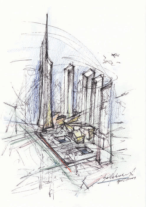
Daniel Libeskind’s works are comprised of master plans, or architecture. The first picture is a plan of the Denver Art Museum with the room layout and stairs planning, while the second one is just a depiction of the World Trade Center, possibly about what it will look like after being rebuilt.
I like his Denver Art Museum work, but the World Trade Center one is a bit too messy. I get it is meant to be a drawing, but with a lot of lines and squiggles all over the place, it is very difficult to see in the middle of the image.
Chapman Brothers

The Chapman Brothers are model makers and photographers. They both take the style of Lori Nix and Jonah Samson (which you can learn more about in a previous post I made on them).
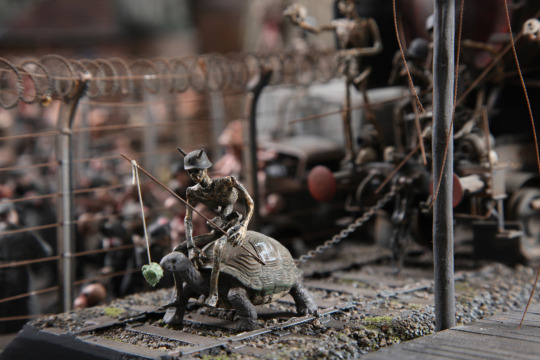
The Hell Series is one of their greatest works and that is what I had to look at. The first picture is of a skeleton baiting a turtle to pull a train with a crowd watching, and the second picture is of an area of war with a tank of men and many bodies of soldiers.
For both of these works, I’d say they are good, because of the detail and saturation. Because this was done with two people, these are bigger. If it was only one person alone, it would’ve taken them a lot more time.
Adalberto Abbate

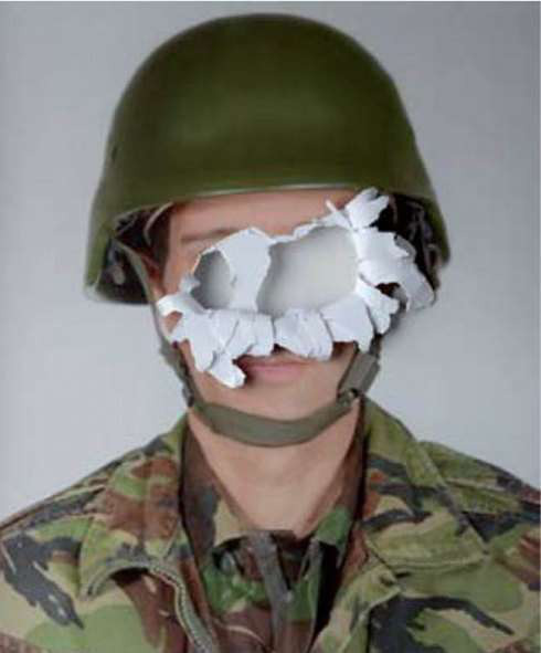
Adalberto Abbate does make pictures from the ground up like the other artists I’ve shown, but he also makes self-portraits of people (stock images) with their faces ripped out of the picture, concealing their identities.
Because little to no effort is required to make something like this, I have no opinions for it. If I had to, I would say I don’t like it because it is too easy to do.
Laika Studios
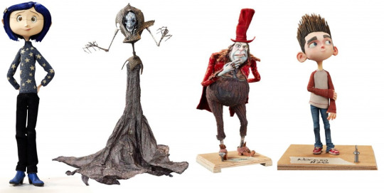

Laika Studios does models for stop-motion animations. The first picture is four of their models from movies (cannot find out which ones), and the second picture is of a skeleton that they have built and is exhibited in their studio!
Already, I’m loving them because of how accurate they are to animated movies nowadays (particularly ones like Inside Out or The Emoji Movie). If I were to try and make some of these myself, I’d probably give up about a quarter of the way through because of how difficult they are to make. Well, maybe not difficult, but time-consuming.
Mark Hogancamp
Mark Hogancamp does modelling photography, just like the Chapman Brothers, in the style of Lori Nix and Jonah Samson. The first picture is of one of his pictures that he has taken with a model tank and 3 action men wearing war outfit.
The second picture is of him actually making the photo by moving things carefully, placing objects where they should be and then taking the final picture, which is exactly how these are made.
I like these works because of how good the models look (close to a perfect human being), as well as the appropriate-ness for the scenery that is used with it, like the 3 men near a lake.
Pedro Medieros

Pedro Medieros is a pixel artist who creates GIF animations of tutorials for sprite animation. The first GIF is of how to make a death animation and a take-hit animation, while the second GIF is of how to make pixel clusters (shading and light additions on pixel art objects).
This one is particularly interesting because I’ve tried to do so with my coin that I have made back in Digital Project 1, and I think I did a good job of it.
In case you never saw it, here it is:

This was the only GIF I was able to do within that time and it took quite a while to do. If I had more time during that day, I would’ve made another one.
Jimbo Phillips
Jimbo Phillips is a graphic design artist who does heavily distorted pictures of objects to make them look like something out of a horror movie. The first picture is of an octopus turned into a giant monster and the second picture is of a human skull heavily edited to look like a zombie with a brain exploding out of it’s head and one of it’s eyes popping out.
Personally, I don’t like them as they are too gruesome for my liking. Don’t get me wrong, they do look great, but I don’t like them.
Olly Moss and Matt Taylor
To finish off this absolutely ridiculous post of research, Olly Moss and Matt Taylor are book/movie poster illustrators.
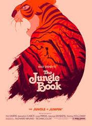
The first one of Olly’s is The Jungle Book, which is made of Shere Khan. However, imprinted upon his tiger pattern is the jungle itself with Mowgli (the boy) and Kaa (the snake) in the trees.
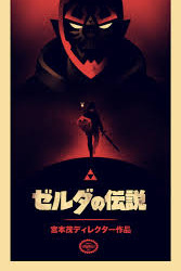
The second picture is of what looks like a Japanese film with someone looking into a cauldron, but outside of the smoke/steam is a person running forwards with a sword in their hand.
It is a VERY ingenious print, and that is why I like it. Making a shape of something and then filling it with another pattern relevant to the final product is a great way of advertising, particularly for horror films.
But that is just Olly Moss. Now for Matt Taylor...
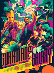
Matt’s works consist of a more colourful variation of advertising. For the first picture, he uses the Guardians of the Galaxy banner, but turns the colours into something crazy by only having a limited palette. For example, if you were to make a rainbow but limit yourself to only red, blue, white and yellow, then you’ll be limiting yourself out from the other colours.
I don’t particularly like Matt’s style as it is quite difficult to see what is going on in the picture outside of the title of the film, but I do love Olly’s as you can actually get a good spoiler out of looking at the poster of the film/book/whatever.
Model Reasoning
Before I end off this post, I’m going to have to include what is the backstory of the model (the Megavolt model, which you can more about in the post below this one).
Think of this as Frankenstein (the story). In the backstory of the model, there was a line saying; “In an attempt to fix the problem, an even greater power outage was caused instead, exploding machines and killing everyone inside”, which hints at something wrong.
In Frankenstein, the mad scientist was making a person come alive by collecting various body parts from corpses and putting them all together on one body that he made from the ground up. After attempting to bring it to life, he immediately regretted his decision as it turned out to be a zombie.
Of course, this wouldn’t be a real project without some research alongside it, so I found a picture of an abandoned lab from a film:
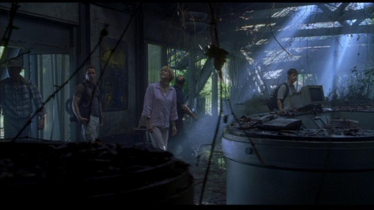
This is the InGen Compound from Jurassic Park 3. I’ve only seen the first movie so please don’t give me any spoilers. It was originally a lab to keep dinosaurs until they grew, but then eventually, they ran into problems with the dinosaurs and so the lab has been abandoned. This could be the lab that was used in the first film where the dinosaur eggs hatched.
youtube
Here is a clip I have found on YouTube, where they explore the lab and get ambushed by a Raptor.
These ideas didn’t inspire me as I came up with the final idea myself for my model, but these are good none-the-less, as it gives a backstory as to why it was left abandoned in the first place.
So, that’s it. The research is (hopefully) done.
0 notes
Text
Progress of Illustration - Weeks 1-6

Wow, what a half term! This year has been a blast so far with all of the crazy activities that we have been doing, from making pixel arts to making full illustrations! The time has whizzed by so fast, I cannot even imagine it.
As an end-of-half-term present, I’m sharing my progress through the Illustration parts of the previous 6 weeks.
Project 1 - Collages (16th September - 23rd September)

The first project we had to do was to make a collage. This specific collage is to make a scene out of cutouts and rips from magazines. Most of us did a mountain range, myself included. How did I do this, you may ask?
Well, first of all, I had to find a few pictures within a magazine of sorts (they are holiday ad magazines) and rip them out of the page they were on (or cut them). After that, we had to lay them out in a specific way we preferred.
Because I chose to do a mountain range, this was quite a challenge. I had a few mountain pictures, a waterfall picture and a rock picture. But eventually I found a good set-up.
After the cut-and-stick part, we had to draw the image. Because I cannot draw a good picture from looking at something, I had to trace it. I only messed up once, so I went in the next week saying “I’m doing this again”. And so I did.
After the cut-stick-and-trace, we had to photocopy it. And now we’re here, at the end of the project with these two results.
Project 2 - City-scapes (30th September)
The day we were watching Blade Runner 2049, we had to make a city-scape as a reference to the film (there are a LOT of tall buildings in Blade Runner).
To do that, we didn’t build a huge model like WETA Workshop did, no no no. We used motherboards from scrapped computers, because they have a lot of parts on them that appears big and small.

After that, we had to DRAW it.

Not a very accurate drawing, but we didn’t have to make it perfect anyway.
Project 3 - Cyborgs (2nd October)

After watching The Matrix on this day, we had to make a Cyborg character in reference to the film. However, we did have an issue. The movie stopped working about halfway through the film, so we had to make do with some example pictures projected onto the whiteboard.
As you can see, I’ve made 3 cyborgs, which is what we were told to do. The first one is rubbish to me as it isn’t a very good cyborg (cyborgs don’t have a giant disc drive sticking out of their mouth), but the other two (lower ones) compensated for that. I did them from scratch with absolutely no basis images. If that sounds like it was tedious, you would be right.
Project 4 - Vehicle Set Design

-deep breath out- The finale to the first-half of the term... set designs!
After watching Elysium, we had to make a vehicle set design in relation to the ones in the film. This took me about 30 hours to complete as I was very short of ideas without having close resemblance to someone else’s (any similarity within my works is purely coincidental and unintentional).
I chose to do a cross between the planet Saturn and a mother-ship. The results? It created this spectacular finale you see here, a set design for a planet-ship that can house over three billion people!
Because this is a set design, we had to give it a name, an object name and a backstory. And finally, because of the sheer size of the fictional vehicle, I chose to do a scale reference to other planets in the Solar System, including the (not-a-planet) Sun!
Mortal Engines Project
You heard me right. Mortal Engines. For this project, we had to make a cast out of plaster and clay for one of our biggest displays, a 3D model!


Also made with pieces from a motherboard (which I cut off as I’m incredibly strong), this is the final result. I chose to do this as it was the first idea that came to mind. That, and I’m also into “abandoned places that have been untouched for years or even decades”.
So, 100% completion for the first half of the term. Next term is Film Making and Visual Effects. I’m going to enjoy this, I know that for a fact!
0 notes