Statistics
We looked inside some of the posts by tessasayers-blog and here's what we found interesting.
Average Info
Notes Per Post
0
Likes Per Post
0
Reblog Per Post
0
Reply Per Post
0
Time Between Posts
5 days
Number of Posts By Type
Photo
16
Text
1
Last Seen Tumblr Blogs


Fun Fact
Total funding amounts to $125.3M.
Photo


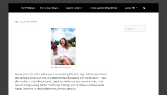
I wanted to make a personal portfolio that would attract future employers and show off my personality. I also wanted something that is simple and easy to navigate and showed off all my work. I chose the colors of my website to match the colors of my resume and logo. I really liked the way they looked on my resume and thought it was a good mix of fun and girly, but also seriousness. I am proud of the work I have done, so I tried to include as much as I could and I tried to put something on every page. When you click on one the sites I’ve written for there is a paragraph about what I did and learned and hyper links to the different sports I covered while I was there. And there are also hyperlinks on the subpages to go to all of my articles. My url is tsayers.com (my real name is Teresa, but I go by tessa, so I thought tsayers made it easy no matter how I introduced myself to someone.)
0 notes


Photo
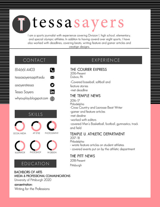
For my resume, I want to keep it simple. I’m going to go with a pink-peach, gray and black color scheme. I want it to catch the employer’s attention, but also not take away from anything and have them miss something important. For my logo, I thought it would be cool incorporate something with “say” because it’s part of my last name and it would be for writing so it would be a good, clever way for me to stand out to an employer. But I am still messing around with the logo
0 notes
Photo


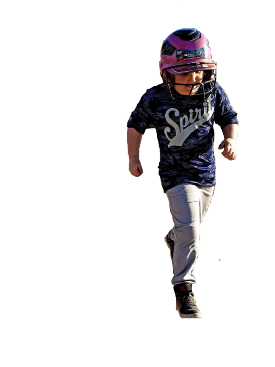
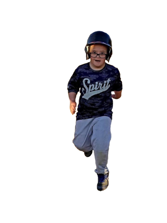
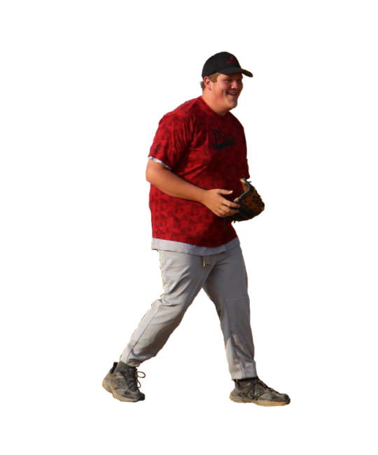
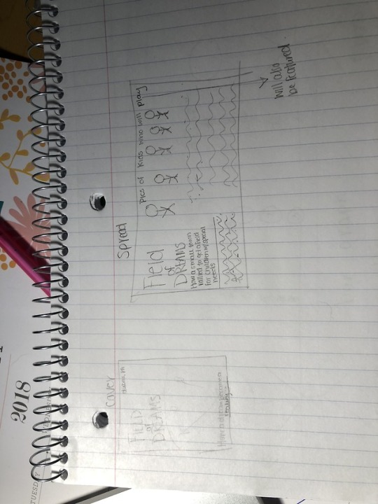
My home town recently built a miracle league field, a baseball field for children with special needs. They are calling it the field of dreams and it has gotten a lot of attention lately, so I made up the magazine for my hometown. I made the focus of it the new field and those who are playing on it.
I wanted to keep the cover simple and eye catching. i didn’t add any teasers to it because i didn’t want to take away from the picture and I felt that with the title was attention getting enough.
In the spread, i took another picture of the field and used the same text fro the title. I was going to change the text, but I thought keeping it the same as the one on the cover would make sure people knew it was the same. The children in the pictures all play on the field and are a part of the baseball league, I wanted to get a mix of players and different actions. I put them where I did because I thought it made the text flow together and still made the pictures stand out.
0 notes


Photo
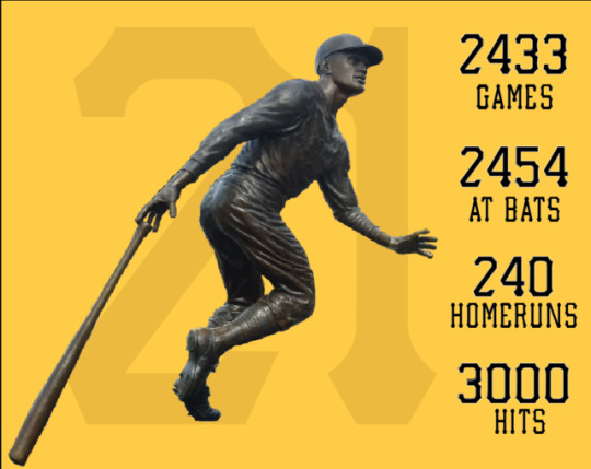
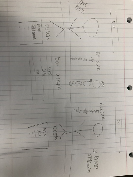
I chose to focus my stackable graphic on Roberto Clemente and the stats i highlighted in the column and row graphs. Instead of doing his first nine years, i expanded it to show his career numbers. I chose these data points because i knew it would be easy for people to understand and they could read it and comprehend it quickly.
I also decided not to use Roberto’s name like i did in the info graphic, so instead i put his number behind him. I thought his name would make it too wordy and i would rather use his picture. Because there was less data I went with the Pittsburgh Pirates font the whole way just so people would associate him with the Pirates just by the font and colors, so I didn’t have to include the logo. I also thought it made the 21 in the back stand out more.
0 notes
Photo

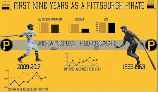
For my infographic, I compared Andrew McCutchen and Roberto Clemente’s first nine years as a Pittsburgh Pirate. Both have been compared as being the “face of the franchise” because of that, I wanted to look closer at their numbers. McCutchen was traded this off season, so it made it even more interesting looking at their numbers to say “What if the Pirates would have traded Roberto Clemente after nine years?” I thought it was interesting just to compare them in a way that isn’t often done.
I based my design off of the Pirates’ gold and black colors. I made my background gold because I thought white would be too boring and I wasn’t sure how to cutouts would show up on the black and I thought the graphs would standout moron the gold. I originally had the dark yellow on the graphs as gray, but i added transparency and I thought it added a good difference and once again allowed the gray stipe in the middle to standout more. The typeface for the title and names is the same type face that is on the front of the Pirates’ jerseys, the type face used for the graph titles is the typeface used for the names on the back of their jerseys. I knew these fonts went together and a sports fan would be able to recognize them. To design my graphs i put at bats and games played on the outside and the categories that went hand and hand with those in the inside. There were also more at bats and games played so I thought it made it easier to see with the longer numbers going horizontal. I stuck with the basics on my graphs so people who aren’t super sports fans would be able to quickly look at the graph titles and have an idea of what was being talked about and not have to go into google to look anything up. I also added the starts with the numbers so people would be able to tell the colors of the graphs apart (McCutchen’s 22 is colored in with the gold, while Roberto’s is colored in while the black.)
0 notes


Photo
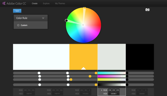
info graphic color palette, based off the Pittsburgh Pirates
0 notes
Text
Info Graphic Content Outline
Andrew Mccutcheon and Roberto Clementes first nine years as a Pittsburgh Pirate
Andrew McCutchen CF
Pirated 2009-2017
Bats R, throws R
MVP (2013), 5x All-Star, Gold Glove
Career averages (9 years):
Games: 1346
PA: 5829
AB: 5033
R: 814
H: 1468
Double: 292
Triple: 44
HR: 203
RBI: 725
SB: 171
BB: 685
SO: 1038
BA: .291
OPS: .866
SLG: .487
WAR: 40.0
Roberto Clemente RF
Pirates 1955-1972
Bats R Throws R
18 seasons, Hall of Fame, MVP, 15x All Star (4 in first nine years)
First 9 season average (1955-1963)
Games: 1213
PA: 5016
AB: 4699
R: 646
H: 1422
Double: 214
Triple: 75
HR: 92
RBI: 570
SB: 44
BB: 240
SO: 523
BA: .303
OPS: .776
SLG: .439
0 notes
Photo

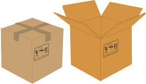
I wanted to tell the story of a girl getting a puppy as a gift through my gif. I tried to move the girl’s arm to as the present is opening to show her surprise about reviving this gift. I put the dog in close proximity of the box and the girl to show they were related and part of the same picture. I also thought the colors worked well together because the red made the box stand out and also worked with the colors of the girl’s dress.
0 notes