
Don't wanna be here? Send us removal request.
Statistics
We looked inside some of the posts by thear and here's what we found interesting.
Average Info
Notes Per Post
3
Likes Per Post
2
Reblog Per Post
0
Reply Per Post
1
Time Between Posts
3 days
Number of Posts By Type
Text
17
Last Seen Tumblr Blogs


Fun Fact
Mobile Tumblr US users spend an average of 4.04 minutes per session on the app.


Text

Final Design
This will be my final design. I didn't change much from the last development because I still want to keep it simple. I added the wavy effect into my texts as I mentioned earlier to make it look like it is floating on top of the water. I changed the green background to the same one as development two because the one that I use last time didn't match with the white and the blue colours. In this one I added some numbers, those number represent the year which I moved to nz and Auckland. The numbers on the second poster is how old I was when I moved to nz and the age I am right now.
2 notes
·
View notes
Text

development 5
For this development I changed the colour of the background to a darker blue. I also add shadow to each word, I did this because I want the texts to seem like it is floating on top of the water. In the second poster I have add the silver fern to represents NZ more and it also because the bottom part feels empty. For the final poster I think I will add more texts and try to make the texts wavy to make it look like it is floating on water.
0 notes
Text

Development 4
In this development I wanted to make it look like a book. Where's the first poster is the cover, and the second poster is the inside of the book. I also changed the colours to make it match with each other because the one I did before looked off. I changed the font as well to a brush effect looking for the first poster. The second one is like a curly handwritten font. For the second poster I think I will need to develop it more since the bottom part is a bit plain. Since my background is blue for the water, I could add some shadow to the texts and make it wavy.
0 notes
Text

development 3
For this development I decided to add the colour and change the font. I also change the layout of the texts to make it easier to read and understand. I choice blue and green since it relates to the natural world. I wanted the green to represent trees and the blue to represent the ocean. I think I'm not going to change where I placed the text for the first poster since I already like the way it look. For the second one I'll try to make it more readable and more like a poem (change font).
0 notes
Text
Development 2
This is the development 2 which I have refined from development 1. As I said before, I wanted the two posters to look the same or very similar to each other. What I did in this design is I use the same colour background, same font, and put a boarder around it. I wanted to put the boarder with it because I wanted it to look like a book or some type of letter. Since the writing I put on it is a poem. I think this poster is a bit boring and it not eye-catching and also the words are a bit hard to read, you will have to come up close to be able to. Next time I could add another colour to make it stand out more.
0 notes
Text

Development 1
This is the development which I did from the final poster. The poster which I submitted for the final one, I didn't like it. So, I wanted to make something different. In this poster I just want to make something simple. I don't think these two-poster match since the background colour and the font is very different, and on the right poster there are flowers, on the left it only just font melting down. Next time I could try to make the two posters match and maybe take away the melting part since it like horror, but the word is happy. I will also take the flowers away since it is distracting from the text.
0 notes
Text

Motion poster research
The poster's designer divided the page into four separate sections, each containing one letter. Every letter, I've noticed, has a distinct motion. For instance, the "L" appears at the upper right corner of the page. whereas the centre is where the "O" starts. Additionally, the letter "v" forms a v shape at the top of the page. They only employ half of the letter "E" I've noticed that the designer of this poster changed the colours of each letter, which may create different feelings in the viewer and add visual interest. Colour changes could be used to produce an exciting and involving effect. The aspects can be highlighted, and different feelings can be conveyed through colour changes. This could draw viewers in and make the poster stand out.
0 notes
Text

Motion poster research
In this poster, I have noticed that the designer made use of the primary colours, which are red, blue, and yellow. The designer used different shapes, like a circle, a square, and a triangle, and different colours for each of the shapes. The circle will fall first, followed by the square and the triangle, but all of the shapes will come to a complete stop and then fall all together. I think that this poster is successful because it is really easy to read because the writing is all in one place. The poster is about the fall of modernism. I like the way the designer makes the shape fall to show the message of the fall of modernism.
0 notes
Text
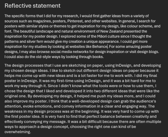

Reflective Statement
I had written my reflective statement using the Week 8 slides to help me.
0 notes


Text


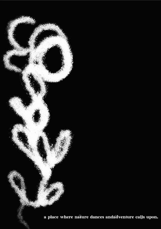
Development 2
This is the second development of my poster. It still needs a lot to be changed. The first poster is like a close-up of the rose, and the second one is the second part of the rose. I made it like that because I wanted the first part of the rose at the beginning of the text and the bottom of the rose at the end of the last sentence. I also changed the font colour to red because white, black, and red represents Māori culture. Next time I would change the layout and maybe add in a different rose because this one is hard to see what it is.
0 notes
Text

Development 1:
This is start of my design. I wasn't sure of what I should put on it and how I should design it and development it. It a bit hard to design two posters that look similar to each other than just designing one poster. I used only two colours which is black and white to create a classic and timeless look. I didn't use the whole page because I wanted to leave some space. When the poster is connected together you will see the flower being in the centre together and I placed the texts at the edge of the page. The second poster I decided to only use one sentence because I wanted to make it look like the last sentence in a book.
0 notes
Text


SDL: INTERPRETATION
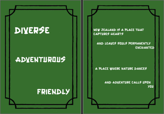
1. For the first poster, I chose one word from the activity that we did in class, like the mapping one, and I just lay it out in the middle of the page, going in like different directions. I put it in the middle because I wanted the attention to be seen there. And I placed the texts in a different direction because it will be boring if it were to be in order. Next time maybe I could add in some colors or use some different font.
2. For the second design, I wanted to make it messy but also readable. I liked how this is turned out because of how everything is fitted in together. During the time I made this poster, the only thing that was very difficult was making the text in the circle because when I wrote the texts on the line I couldn't delete the line without deleting everything too. I wanted to add something new, so I changed the i to an exclamation mark. Next time I could add in more at the top right of the page so it doesn't look too blank.
3. The last poster I covered the whole page with my texts because I like it when the pages is covered. I placed the full text word in the background so it is still easy to read and made the text in yellow. All of the other letters that covered the page is from the text word. I'm not sure how I could improve this poster next time, but I don't like how it currently looks.
0 notes

Text

Formative
This is a plan for some colours ideas for my final poster. I also wrote the reason why I chose to match those colours together. Most of their colours is to represent things in New Zealand like nature etc. This is just some ideas for the poster I might use and might not use it
0 notes