
Sophie Maher c3286921 | Blog for Assessment 1 in Design Contexts (DESN1002) | Refer to 'Tags' for easier navigation
Don't wanna be here? Send us removal request.
Statistics
We looked inside some of the posts by thedesigndoula-blog and here's what we found interesting.
Average Info
Notes Per Post
3
Likes Per Post
3
Reblog Per Post
0
Reply Per Post
0
Time Between Posts
3 days
Number of Posts By Type
Text
17
Last Seen Tumblr Blogs


Fun Fact
Kazakhstan’s Minister of Communications and Informatics has blocked the Tumblr site because it contained 60 sites of terrorism, extremism, and pornography in 2015.
Text
Pecha Kucha Peer Review #2 ‘CAMP’

For my second pecha kucha peer review, I have chosen the presentation on ‘CAMP’. Just like my last review, I will use the review sheet given in class to structure this post so it doesn’t become overwhelming.
Visual Presentation;
The slides for this Pecha Kucha were also constructed very well. They were creative and eye capturing. They showed different images to show what CAMP is as I didn’t know what it was beforehand. Personally, I really liked how she used a dark background to make the colours of the CAMP costumes pop. However, I will admit that some slides were slightly overwhelming. Overall it was aesthetically pleasing.
Verbal Presentation;
Once again, she spoke very quickly like most of us and she became out of sync with her slides. However, she managed to compose herself and get herself back in sync. Her voice was confident and clear and her communication skills were great!
Clear argument/structure;
The structure of her Pecha Kucha was mostly clear but became a little overwhelming and slightly inconsistent. I found it a little hard to keep up with her points and found it confusing at times. However, when I did keep up I was able to understand her argument and found it interesting. Her introduction and conclusion were very clear but could have expressed her points more prominently. Her passion of the subject was also very present. Overall, her presentation was very interesting and engaging.
Evidence of research;
Her depth of research was great as she provided us with various facts that were extensive. I liked how she discussed the timeline of CAMP and how it came to be. Her research of its history was comprehensive and clearly supported her argument. If I had to give any feedback in this category, I would only say to show us some more research from journal articles??
Other comments;
I generally think that her presentation was really interesting. It was insightful to learn about something new that isn’t well known.
Image reference; https://www.instyle.com/fashion/kardashians-met-gala-camp-2019
0 notes
Text
Pecha Kucha Peer Review #1 Sustainable Fashion

For my first pecha kucha peer review, I have chosen the presentation on ‘Sustainable Fashion’. I will use the review sheet given in class to structure this post so it doesn’t become overwhelming.
Visual Presentation;
The slides for this pecha kucha were amazing! They were creative as well as simplistic. They weren’t over complicated and showed the points spoken clearly. Personally, I really liked the way she used icons and symbols to get her points across. For example when she was explaining how much waste is created by textiles in Newcastle alone, she compared it to a certain amount of humpback whales and used a small info-graphic to show us visually (and it was scary how many whales it added up to). I also liked the way she kept her slides limited such as when she just had three dollar signs ($$$) on a slide when she was talking about costs. It taught me that slides don’t have to show every detail of what your’e discussing and that they can be extremely simplistic whilst still be effective.
Verbal Presentation;
This is where most of us went downhill when presenting our pecha kuchas as we were all obviously nervous. Like others, she spoke very fast trying to fit all of her information in before the next slide came up. However, she was very clear and loud enough for the whole class to hear. The only thing that she could have done better is make more eye contact with the class (but i can see why she had trouble doing so).
Clear argument/structure;
The structure of her pecha kucha was very clear and was consistent. The points she made flowed into each other and I felt everyone could understand what she was discussing. Her introduction and conclusion were very clear and got her main points across straight away. Her passion of the subject was also very present and I was able to see how much she cared about her topic. Overall, her presentation was very interesting and engaging.
Evidence of research;
Her depth of research was excellent as she discussed various facts that not many people knew about without looking further into the topic. Using info-graphics and presenting various sources also show us that she made the effort to go and find these facts and quotes to support her main points. Personally, I think she did a great job covering her points with prominent research.
Other comments;
I generally think that her presentation was outstanding. I was engaged and found her chosen topic very interesting. I went away from it thinking about how she said we can help reduce textile waste and be more sustainable within fashion. It has inspired me to be more aware when buying clothes and wanting to make an effort to reduce such waste.
Image reference; https://www.ncgreenpower.org/sustainable-fashion-upcylce-clothes/
0 notes
Text
Pecha Kucha Self Reflection

I presented my Pecha Kucha today and I must say I am very glad that its out of the way.
I’m proud of myself because I’m slowly getting more confident in situations like these, although I’m still a nervous wreck whilst presenting. I am happy that my timing worked out perfectly and I didn't speak out of line with my slides. I tried to make eye contact as much as I could and tried to keep my voice loud (apparently I speak quietly in general).
When giving feedback to myself, I now know that my slides weren't the most appealing after seeing some extremely creative ones from other students. The next presentation opportunity I have, I am going to aim to construct my slides in a more professional way. I also noted that I need to work on appropriate language for different topics as Sally mentioned that some of the words I used to describe aspects of my presentation were out of context.
As for tutor feedback, Sally enjoyed my topic as she had never heard of Carlos Grangel before and was able to learn a lot about him. However, she suggested that I could have scratched about 20% of my written content as it was a bit overwhelming. An important point she made was to focus on one particular character of his instead of giving a general overview (It was my attempt at trying to show a variety of his work) so I will keep that in mind for next time.
Overall, I’m fairly pleased with this assessment although I know I could have done a lot better. Obviously I am still learning how to give a perfect presentation and I can see that each time I am improving, even if its only a little bit.I want to do the best I can in every situation so I can become successful after graduation, so next time I am going to try harder and continue to until I succeed.
2 notes
·
View notes
Text
Week 8 Lecture - Post Digital

“The state of being in which you assume the digital instead of marveling at it”
This quote from the twitter example from the Lecture and the topic in general is extremely interesting when looked at in depth. Before this tutorial I never really thought about us living in a post-digital world and how it really is different.
After some brief thought, I realized technology and digital media really is expected by this era rather than being excited about it as if it were new. It’s slightly scary that children these days expect to have an iPad and expensive tech before they are 10 whereas people my age as kids played outside and video games were a treat.
I was also wondering what the next ‘step’ is if we are already in ‘post-digital’. I found an online article by Zahra Bahrololoumi called “ We’re already in a post-digital era, so what comes next?”. She discusses how being post-digital effects businesses and whats going to happen next regarding them. She states “ We’re past the point where companies can simply ride the investment wave by buying technology”, suggesting businesses must expect new change soon as we are accustomed to this new tech. Bahrololoumi says that is is instead “the means to changing the world around them” focusing on ‘what do they want, how do I create that, how do I protect their interests?’.
I find this really interesting as I am curious to see what the next big phase is whether it be focusing on how people use the tech personally or introducing even newer tech.
References:
Article - https://www.techradar.com/au/news/were-already-in-a-post-digital-era-so-what-comes-next
Image - https://www.cmo.com/features/articles/2016/4/28/marketers-urged-to-become-post-digital-at-forrester-event.html#gs.4a1gr5
0 notes
Text
Week 7 Tutorial - AR
I was unable to attend the tutorial this week as an urgency came up, therefore Sally told me to use some Augmented Reality apps and critique if they are useful or entertaining.
First I downloaded ‘Ghost Snap AR Horror Survival’ which is an AR game where you walk around your house finding ghosts to take pictures of and try not do die doing it. This seemed like a find idea but sadly the game was very broken and didn't exactly work. I also tried downloading the HP Reveal app from the tutorial brief but for some reason that app was also broken and didn't run on my phone.
So I downloaded ‘Knightfall AR season 2′ which is a battle action AR game where the battle field is literally right in front of you. (see first image)

I thought this was pretty cool as you use your camera to aim at enemies and do different interactions. This game was very entertaining and it keeps users engaged and excited. Was it useful? it depends on what context. Its useful to allow everyday users to experience AR and educated them surrounding it. The content on the game isn't exactly useful or educational, besides some ancient history facts embedded within the game.

Overall AR is a useful way to allow users to experience different scenarios and can be used for various reasons like games or training simulations. If there were more mobile games that use AR they would be highly admirable.
0 notes
Text
Week 7 Lecture - Analogue to Digital
Further Research on April Greiman
April Greiman, Trans-media artist, allowed designers to experiment with design on the computer and see it as a tool. In 1984, computers were only seen as industry machines and were considered an embarrassment as an art form. She was schooled by the New Wave master Wolfgang Weingart,who together introduced New Wave to American Post modern design.
New Wave design “challenged the notion of modernist ordering systems” and used typography and image placement to create these post modern designs. Aprils work is famous for the experimentation with 3D components and her use of image placement.
One of her designs, ‘Does it make sense?’ “became an instant industry-benchmark and forced the design world to sit up and take notice of the contributions computers could provide.” (http://idsgn.org/posts/design-discussions-april-greiman-on-technology/)

I find her work very interesting to look at. Her designs are brightly colourful and easily captures my eye. When presented in this weeks lecture, I fell in love with her work right away. I highly admire the way she combines various images and typography in a way that is almost futuristic. Overall I think she is a great designer, especially for the era she started working in.

References:
https://www.aiga.org/medalist-aprilgreiman
http://aprilgreiman.com/
https://www.famousgraphicdesigners.org/april-greiman
image 1: http://www.tm-research-archive.ch/interviews/april-greiman/
Image 2: https://www.pinterest.com.au/pin/565201821963351085/?lp=true
Image 3: https://www.cooperhewitt.org/2017/08/30/26363/
0 notes
Text
Week 6 Tutorial/Reading
Most of this tutorial was getting feedback for our Pecha Kucha progress and designing mood-boards for different scenarios, So there isn’t exactly much to document this week.

Whilst waiting for feedback, my group was required to design a mood-board for a restaurant. We came up with a laid back, yet professional theme situated on the water front within Newcastle. We kept our colour palette warm including red, orange and purple to make it appealing in the warmer months. Our restaurant was aimed at customers from young adults to middle aged adults. Since we were using magazines to create our mood-board, we were limited in what we could find/use to convey our idea to the class. Overall, the class liked our idea and said we captured it well.
As for my Pecha Kucha feedback, Sally said that my slides so far are comprehensive. However, I need to focus on the main points and give more to the introduction, otherwise I may run out of time to address all of my points. I feel a little ‘scrambled’ working on my presentation currently, but hopefully I can make my main points strong and keep it organised.
0 notes
Text
Week 6 Lecture - Visual Identity

Discussing visual identity during this weeks lecture was highly interesting as I learnt that coca cola has a bigger identity than most expected. I never knew coca cola was the reason why Santa looks the way he does today. Before coke’s depiction of Santa, he was a white and blue version of St Nicholas. (see image below)

It is fascinating that coke can have such a huge impact simply from its expertise of advertising. Coca cola’s advertising has been one of the most successful since it began in 1886. It’s Ads have been creative and engaging for viewers, easily converting them into customers. Coke is depicted in a positive, social way within their ads and is what draws people into buying their products. I found this interesting because after some thought, I've noticed that a lot of advertisements depict their products in a similar way, usually being fairly successful.

Overall, it is significant to see how using advertising in a certain way can make a brand, product or company etc have an easily recognizable visual identity and become well known internationally.
References:
https://www.pinterest.com.au/pin/320037117263024296/?lp=true
https://www.outerbankschristmas.com/store/p230/Coca-Cola_Santa_Coke_Machine_Ornament.html#/
https://www.pinterest.com.au/pin/609323024556812604/?lp=true
0 notes
Text
Week 5 Tutorial/Reading
WARNING, DISTURBING CONTENT, DISCRETION ADVISED
During this weeks tutorial we were in groups of three and each had to explore specific questions and present our findings. My group had to reflect on part of the sontang reading where she discusses capturing the hidden realities of others such as those living in poverty. Our focus was to find out when its appropriate to take photographs of people in poverty and when it was inappropriate.
My group easily found some very confronting images of poverty and quickly came up with various reasons on why it can be inappropriate. It can be inappropriate because it can be invasive and degrading to the people being photographed and can also have a negative impact on others. For example, the photo of a little refugee boy lying dead on the beaches of Greece in an attempt to flee his hell of a country to find peace and shelter. This can be inappropriate as it is highly confronting to see the lifeless body of a little boy trying to survive.
The only appropriate examples we could find are images for charity, such as Ed Sherran wearing red noses with African kids in poverty. Its images like these that creates false sense of reality and hide the truth of the pain of living in poverty.

Image reference:
https://www.theguardian.com/world/2015/sep/02/shocking-image-of-drowned-syrian-boy-shows-tragic-plight-of-refugees
0 notes
Text
Week 5 Lecture - Photography

During the lecture this week I discovered the concept of ‘Pictorialism” whilst it was discussed within the lecture. I found this concept highly interesting as it was unique for its time era. Pictorialism is “an approach to photography that emphasizes beauty of subject matter, tonality, and composition rather than the documentation of reality“. This is interesting because photography of that era only focused on capturing the subject literally, only as a way of getting a portrait quickly compared to the lengthy technique of painting.
After doing a little bit of research, I found a picotiralist artist Henry Peach Robinson. He was best known for his pioneering technique of combination printing joining multiple negatives or prints to form a single image; an early example of photomontage. I have attached some examples of his work to showcase his techniques.

References for images:
https://en.wikipedia.org/wiki/Henry_Peach_Robinson
https://www.ngv.vic.gov.au/explore/collection/work/10703/
0 notes
Text
Week 4 Tutorial/Reading
I wasn’t able to make this weeks tutorial as I am sick but I made sure to do this weeks activities.
Activity one - Instructions on how to boil:

Drawing how to boil an egg without words was somewhat difficult but i believe I captured it well enough for people to understand. It is interesting that info graphics can hold such universal information without words or much context.
Activity two - discussion of reading:
This reading was insightful as it allowed me to understand how Isotypes work and how Otto Neurath used them to convey statistics to everyday people. I feel that it is important to understand Isotypes and the significance of them as they are still used today in places such as work sites and schools. They are extremely important as they communicate universally to a wide range of people. This allows them to convey very important messages and instructional information.
I apologies for the unprofessional response within this blog post, I am feeling very under the weather.
0 notes
Text
Week 4 Lecture - Simplicity

Observing the topic of the legacy of Swiss international style, I was able to see how the use of pictograms can pave the way for simple, user friendly and easy to understand design in various ways. It was interesting to learn how simplistic forms of information design revolutionized graphic design. This lead me to further light research on how designers of the early era focused on using monochromatic schemes, neutral approaches and layout.

I have found some images that use the techniques discussed within the lecture so I can see how designers put them into practice. Seeing the experimentation through the use of icons and simplistic images without text (in most cases) to convey information. Overall, I think its significant to see this kind of visual communication in this form as it still impacts design today.
Reference:
https://www.pinterest.com.au/pin/200902833350702229/?lp=true
https://wolfsonianfiulibrary.wordpress.com/2015/06/06/pictograms-graphic-statistics-for-social-action-in-new-deal-america-some-newly-catalogued-and-digitized-items-in-the-wolfsonian-library/
0 notes
Text
Chosen Topic for Pecha Kucha


After discussing and confirming my topic ideas for my Pecha Kucha during the week 3 tutorial, I have decided on character designer, Carlos Grangel.
I have chosen Grangel as I wish to let others know how his traditional techniques and practices are significant in terms of gaining characters with extreme detail and expression. So much in fact that his characters feel realistic and play their roles perfectly.
Now that I have confirmed my topic with my tutor, I shall begin my research and apply it to my Pecha Kucha slides. I look forward to researching this topic as character design is one of my main passions and that Grangle’s characters are some of my favorites.
References for images:
http://carlos-grangel-interview.blogspot.com/
https://www.trojan-unicorn.com/main-event/knights/carlos-grangel/thu-2019
https://www.pinterest.com.au/tidapn/carlos-grangel/
1 note
·
View note
Text
Week 3 Tutorial

Whilst discussing the reading within our groups, my group members and I critiqued this weeks reading focusing on question ‘how did modernism aim to change the world and was it successful’. We were able to cohesively discuss factors such as how modernism is associated with healthiness and cleanliness, especially for that era, as well as how it is successful however it can be unsuccessful sometimes. Overall we came up with the examples of comparison between old century houses that were constantly dirty and full of disease and the modernist house that was easy to clean and avoided diseases. I wont go into full detail otherwise this post will be an essay.
Discussing Semiotics as a class was also extremely insightful as it allowed me to understand how to deconstruct and put meaning to various forms of design. Using the formula of the signifier and the signified / denotation and connotation, my group and I were able to deconstruct WWII propaganda posters and therefore were able to gain a deeper understanding of the meanings behind them and why they are significant.
Overall, this tutorial was interesting and allowed me to come out of it with a better understanding of semiotics as i didn’t know what it was beforehand. I shall use this whenever i need to deconstruct forms of design including my own.
Reference for image:
https://www.zazzle.com/of_course_i_can_vintage_wwii_propaganda_poster-228593176260460270
0 notes
Text
Week 3 Lecture - Modernism

It was very interesting seeing how people started figuring out type hierarchy, symbolism and colour meaning within design through the WWII propaganda posters. I studied modern history in my senior years of high school so i already knew quite a lot about propaganda posters as it was on of our topics we studied. It was insightful being able to apply my knowledge to the design factors of this topic and study them in a new way. I was able to piece together factors that made me realize the purpose of something within the posters whether it be the colours or typography.
It was also very interesting viewing and discussing the way information/communication design came about in WWII. I never knew that WWII was the start of design in purpose to communicate ideas visually, not just in posters. Instructional posters and images such as what to do in an air raid or gas attack were very insightful as it allowed me to perceive the concept of information design from the source.
Overall, I enjoyed being able to learn new things about the topics i have studied previously and also to be able to see the birth of different forms of design. I believe it is highly important to know this sort of design history in order to apply it to our own designs.
0 notes
Text
Week 2 Lecture

This weeks lecture was a little confusing to me. As we followed on from Gutenberg, We discussed early type in the form of presses and woodblocks etc. This was nothing new as we had already covered this topic in depth in Typography, therefore I felt slightly disconnected as I already knew the content.
However, I did learn from the topic of lithography. I found it extremely interesting and a unique way of transferring images multiple times without fault. This lead me to find other designers and artist that use or used this technique. I found various users such as June Wayne, Mel Hunter and Zao Wou-ki who all used lithography beautifully for their artworks.
This lecture was also confusing in terms of seeing things in different perspectives such as “this is not a pipe” and the relevance of Mona Lisa. It also scared me how we are using technology so much that we have abandoned old activities such as photo albums.
References:
https://medium.com/lefkosh/art-analysis-this-is-not-a-pipe-d64bd8be06bb (Image)
https://www.sothebys.com/en/articles/21-facts-about-zao-wou-ki
https://www.junewayne.gallery/
http://www.artnet.com/artists/mel-hunter/
0 notes
Text
Week 2 Tutorial

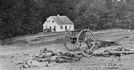
Today's tutorial consisted of assessment briefs and a couple of activities. One activity was to discuss, research and present a topic given to us by the tutor in regards to the reading. My group were given the topic of Matthew Brandy and how he was important as an early photographer. My group and I found out that he took photographs in the civil war (which was not mentioned in the reading) and that he was one of the first photographers to take images of battles and corpses, shocking the citizens of that era. This is why he was so significant as a photographer as he challenged society and was able to shed a new perspective on war where others romanticized it beforehand. It was intriguing doing quick research in under half an hour while working with others, resulting in a lot of useful information. I feel like this activity may come in handy for future practices and is very insightful.
It was very interesting seeing others presentations on topics such the industrial revolution, the great exhibition and other topics discussed lightly in the reading. It encouraged me to consider the aspects of the start of design, especially graphic design when researching or critiquing design history.
As for the reading itself, I found that it almost repeated itself a lot and was quite long for its content. If it did not repeat itself on topics such as printing, it could have been condensed and more relevant. However, it was very informative and allowed me to understand the beginnings of design in more depth. It was interesting to see how technology has advanced and how the perspective on advertising has changed compared to modern society.
References for images:
https://www.seeker.com/civil-war-photography-slide-show-1766136631.html
https://prologue.blogs.archives.gov/2014/10/21/three-mathew-brady-photographs/
0 notes