
Statistics
We looked inside some of the posts by theemucat and here's what we found interesting.
Average Info
Notes Per Post
195K
Likes Per Post
126K
Reblog Per Post
68K
Reply Per Post
56
Time Between Posts
19 days
Number of Posts By Type
Text
16
Note
1
Last Seen Tumblr Blogs


Fun Fact
Tumblr has 4 main sources of revenue.
Text

it's that time of the year again, isn't it?
Prepare your ocs, I'll be fighting on the side of Fossils! (probably)
> my artfight profile <
3K notes
·
View notes
Text

I'M RATTLING MY BONES AT YOU! >:D
#artfight#artfight2025#art fight 2025#team fossils#fossils vs crystals#artfight fossils#fossils 2025#artists on tumblr#digital art
3 notes
·
View notes
Note
could you please do a tutorial on how you do your risograph style drawings? they look so cool 😭😭


15K notes
·
View notes
Text

finished cyberpunk
28 notes
·
View notes
Text
okay i'm back from the movies let's talk about screen and multiply layers

you can read part 1 of this series of tutorial posts where i mostly talk about gradient maps here.
now we're going to talk about the other layer effects. i feel like these ones are already pretty commonly known, but i've also been using them for like 15 years so it's very easy to assume everyone knows everything but actually i'm just old. anyway.
the panel up top is where we're starting from. i've got a nice blue color gradient applied, and everything looks a bit more harmonious. but...... those inks are pretty harsh, especially in contrast to the background, where there's no black inks at all. i'd like everything to come together a little more.
you can do this with a gradient map, if the darkest value is set higher than black. but since we're not using the gradient map at 100% (it's just 30%) the black isn't really affected by it. so it just stays black.
what a screen layer will do--and this is in practice, i don't know what it's actually mathematically doing--is turn your darkest value into whatever color is on the screen layer. so this is what a screen layer set to 100% would do to this panel. (NOTE: all the layers applied in this post are clipped to a folder containing just the characters. they are not affecting the backgrounds, they'll just affect the characters. the gradient map does affect everything)
That's Pretty Blue! the color that neeta's hair currently appears is the color of the layer. everything else is lightened up and also made a little more blue. and this doesn't look terrible, but screen layers will pretty much always make your art a bit lighter, because it's trying to make its color the darkest color. tbh it's great for fog effects and making your blacks light enough that a texture can show up in them. but let's turn it down a bit, to 40%.

hey nice. everything is still a bit lighter, but neeta and emery's hair isn't as sharp against the background. still enough that they stand out as the most important things in the panel, but not so much that they feel pasted overtop. it's a bit like putting some atmospheric perspective between you, the reader, and the characters. there's air in the image. (and why it's good for fog!)
but i want it just a little darker to make up for the lightening up that happened. i don't think i actually need to explain multiply layers, because everyone has definitely used those for shading at one point or another. but here i'm using a very very light blue over the entire characters. i'm not using it for shadows, but to make everything a bit blue.
now it really feels like they're in a room. the only pure white is the speech bubble and gutters. their eyes/teeth/glasses will still read as white, but they are not white. everything is at least a Little blue, so everything is unified.
and that panel above is what the final looks like! let's look at it side by side with just the gradient map.

neat! it would be perfectly acceptable to stop with just the gradient map, if you value high contrast black inks and characters popping off the page. i... don't! i like the air that's generated by going a little bit lighter overall. it has a nice matte effect, which is why i'm very glad my book was printed on matte paper.
and that's why hunger's bite looks so good. you should buy it and read it
344 notes
·
View notes
Text

How I Made the Colors in Hunger's Bite So Good
first of all: buy my book. buy it and look at the colors. (if you cannot buy the book, ask for it at your local library or i GUESS you can look at these spreads i posted)
we're gonna talk about colors, but more specifically we're going to talk about overlays. if you're an artist you are probably familiar with overlays. we love our overlays. we love to color a picture and then at the very last minute go 'hm. looks bad. i'm going to put a yellowish overlay on it to make it look less bad :)'
do not do this.
i mean you can, and it'll work sometimes, but all you're really doing is tricking your brain into thinking different is better. you've been staring at the image for potentially several hours. none of the choices you made at the beginning mean anything to you anymore. you're just finishing what you started. one of the big reasons you might look at your art and go 'man, this doesn't look that good' is because You drew it and are intimately familiar with it. you know all the flaws and mistakes because You made them and You know what your vision was. one of the great frustrations with art is that the piece in your head doesn't look like something you actually made. you want it to look like somebody else did it, so you can enjoy it as a viewer, not as the creator.
so when you put that overlay on, and suddenly the image looks very different, your brain will go 'this doesn't look like the thing i've been staring at for 2-3 hours! this is different! now it's good!'
and again, sometimes it Is good. but do you actually understand why it's good? or is it just different?
okay so what am i supposed to do smart guy
i'm glad you asked. the trick to making overlays work is to have them on from the start. this requires knowing what mood you want to convey in your scene from the very beginning. hopefully you know what mood you want to convey. you do, right? and i don't just mean happy or sad, i also mean safe, threatened, familiar, strange, soft and harsh. blue is not always sad. green is not always healthy. yellow/orange are not the only way to convey a companionable warmth.
okay did you pick the mood? do you have an idea of what color you want to use to represent that mood? great. i'm gonna use blue to convey the cool, clean white of a ship's maintenance corridor without making things literally white. and i'm going to stick in two characters whose color palettes consist of bright yellow, brown, and wine red. awesome. i definitely know how those colors would behave under blue lighting.
(here's the thing: no i don't.) this is where a gradient map correction layer comes in. i want my page to be Blue. alright. let's make a gradient map that's Blue.

a gradient map is basically just A Gradient with specific colors connected to specific values. you have your darkest values on the left, and your lighter values on the right. at 100% opacity, this gradient map layer will read the value of anything below it and go 'okay this bit is this dark, so it should be This shade of blue. and this bit is this light, so it should be This shade of blue'.

kind of like a hue or color layer except determined by a gradient rather than one color, so it could also go 'this is light, so it's green' and 'this is dark, so it's purple'. it's math. i don't really get it either. but anyway this is probably not what you want if you want your characters' palettes to be recognizable. emery's sweater is supposed to be a wine red! neeta's skin should be brown, and her shirt should be yellow. these are their Key Colors. generally, i want them to be recognizable. so let's lower that opacity down.

nice! you can definitely now see that emery's sweater is red and neeta's shirt is yellow. and everything is relatively balanced. nothing is too saturated, nothing is significantly brighter than anything else. it's all got a little bit of blue in it. but i've skipped the step of actually picking your colors. because here's the thing with gradient maps.

they hate you and want to fight. when working with gradient maps you must imagine there is a monkey sitting on your shoulder dumping paint in every time you pick a color. the monkey has a tube of blue and he is going to put that blue into everything you paint, but it's not normal paint. it doesn't mix, it overtakes. it won't turn something yellow into green, it will turn it blue. it wants everything to be blue. if you want something to look like the color it's supposed to be, you will have to make it extremely saturated under the layer to essentially fight the paint monkey's blue. hence, emery's sweater is a BRIGHT red, so it will look a little more purpley under the blue. and neeta's skin is very orange, so it can be dulled down into a soft brown.
this is the sort of thing you will have to learn by feel, because it will be different with every gradient map, especially if you start getting into weird ones that aren't monochromatic. you want to know one of my favorite maps to use?

i have memorized where on the value scale all of these colors appear. i can color something using only shades of gray when i have this filter on. i am evolved. if you want to use gradient maps effectively, you'll have to get a lot of practice.
anyway this post got really long and i'm about to go to a movie so i'll talk about how to use screen/multiply/overlay layers later. but gradient maps are the main tool i used to make hunger's bite's palettes so unified across scenes. but you can see way above how they work to turn insane saturated colors into the nice harmonies--and the trick is that i'll never see those saturated colors while i'm working. because i have accepted the paint pouring monkey into my heart, and i trust him. except when i'm coloring wick's coat. holy mother of god every gradient map hated that man's purple coat.
824 notes
·
View notes
Text
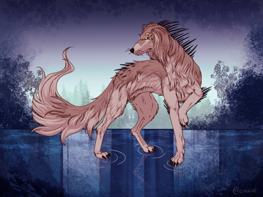
A little gift art for @venfaaniik <3
Miili the dreamhound.
7 notes
·
View notes
Text
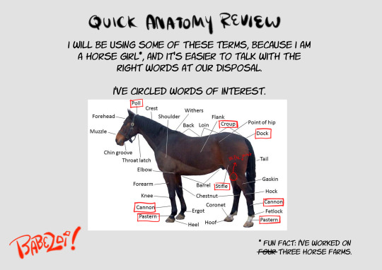
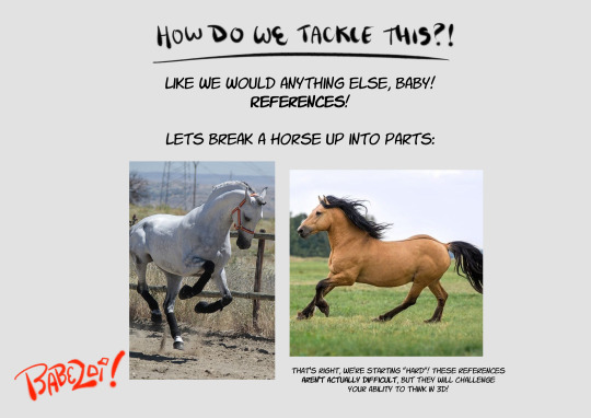
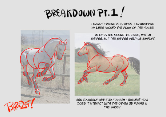
how to draw horses(for the discerning horse girl)
i spent two years working in barns to give you this information. use it wisely
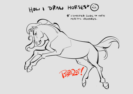
view all 16 parts under the cut!
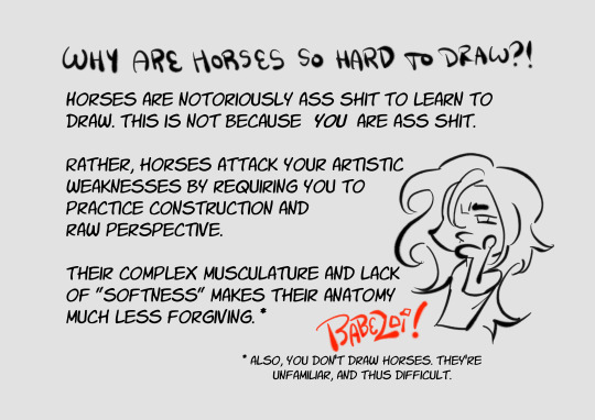
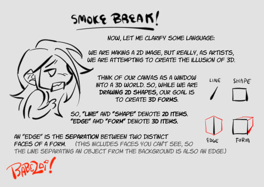
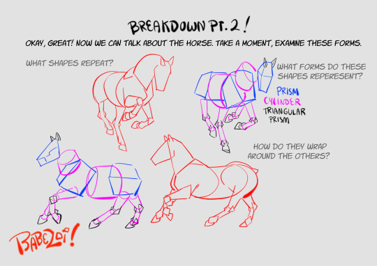
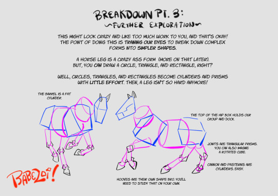
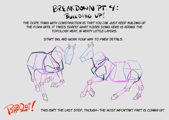
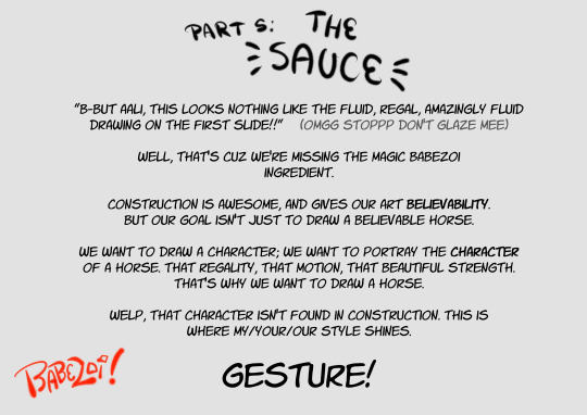
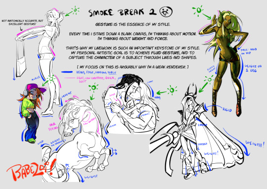
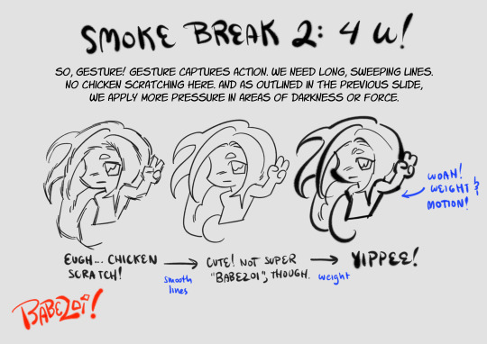
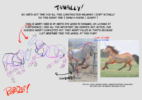
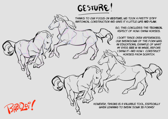
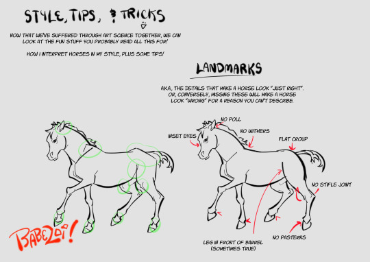
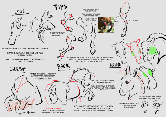
hopefully this guide will inspire you to draw the cowboys you've always dreamed of
12K notes
·
View notes
Text
They rock the outfits 👀
Faust can't beliEVE you did this to him agAIN. He thought he was SAFE!

drew them with borrowed outfits
8 notes
·
View notes
Text

Finally finished a piece I started ages ago Ozzi reading in a tree…treeding.
(This was originally just a little sketch for fun, but I just...kept going, lol.)
4 notes
·
View notes
Text
Thanks you @undinoble for the tag :>
@venfaaniik and anyone else who wants to :3
Picrew train!!
Do this picrew : and tag people!!
(not my picrew credit to artist!!)
@megaroniandcheez @fish-nailed-to-a-cross @justobsessedwithvic @cheesesandwjch @milltheinfinity @illiteratesblog @le-dormeur-du-val @that-one-xachster @hermy-97 @ladyloss-blog and anyone else who wants to join!
677 notes
·
View notes
Text

Do you think he cares who it was who did this to him?
Inspired by this video:
--- Something about this poor little crane hurt my heart. He doesn't know about politics, war, or pollution. And yet, he suffers from them.
2 notes
·
View notes
Text
New Faraway Discord!
I'm starting to see enough interest in the series that I've made a group to better connect with it's supporters :)
Clicky here!

4 notes
·
View notes
Text

El-ahrairah
"All the world will be your enemy, Prince of a Thousand enemies. And when they catch you, they will kill you. But first they must catch you; digger, listener, runner, Prince with the swift warning. Be cunning, and full of tricks, and your people will never be destroyed."
--- I watched Watership Down again.
146 notes
·
View notes
Text
⭐ So you want to learn pixel art? ⭐
🔹 Part 1 of ??? - The Basics!
Hello, my name is Tofu and I'm a professional pixel artist. I have been supporting myself with freelance pixel art since 2020, when I was let go from my job during the pandemic.


My progress, from 2017 to 2024. IMO the only thing that really matters is time and effort, not some kind of natural talent for art.
This guide will not be comprehensive, as nobody should be expected to read allat. Instead I will lean heavily on my own experience, and share what worked for me, so take everything with a grain of salt. This is a guide, not a tutorial. Cheers!
🔹 Do I need money?
NO!!! Pixel art is one of the most accessible mediums out there.
I still use a mouse because I prefer it to a tablet! You won't be at any disadvantage here if you can't afford the best hardware or software.
Because our canvases are typically very small, you don't need a good PC to run a good brush engine or anything like that.
✨Did you know? One of the most skilled and beloved pixel artists uses MS PAINT! Wow!!
🔹 What software should I use?
Here are some of the most popular programs I see my friends and peers using. Stars show how much I recommend the software for beginners! ⭐
💰 Paid options:
⭐⭐⭐ Aseprite (for PC) - $19.99
This is what I and many other pixel artists use. You may find when applying to jobs that they require some knowledge of Aseprite. Since it has become so popular, companies like that you can swap raw files between artists.
Aseprite is amazingly customizable, with custom skins, scripts and extensions on Itch.io, both free and paid.
If you have ever used any art software before, it has most of the same features and should feel fairly familiar to use. It features a robust animation suite and a tilemap feature, which have saved me thousands of hours of labour in my work. The software is also being updated all the time, and the developers listen to the users. I really recommend Aseprite!
⭐ Photoshop (for PC) - Monthly $$
A decent option for those who already are used to the PS interface. Requires some setup to get it ready for pixel-perfect art, but there are plenty of tutorials for doing so.
Animation is also much more tedious on PS which you may want to consider before investing time!
⭐⭐ ProMotion NG (for PC) - $19.00
An advanced and powerful software which has many features Aseprite does not, including Colour Cycling and animated tiles.
⭐⭐⭐ Pixquare (for iOS) - $7.99 - $19.99 (30% off with code 'tofu'!!)
Probably the best app available for iPad users, in active development, with new features added all the time.

Look! My buddy Jon recommends it highly, and uses it often.
One cool thing about Pixquare is that it takes Aseprite raw files! Many of my friends use it to work on the same project, both in their office and on the go.
⭐ Procreate (for iOS) - $12.99
If you have access to Procreate already, it's a decent option to get used to doing pixel art. It does however require some setup. Artist Pixebo is famously using Procreate, and they have tutorials of their own if you want to learn.
⭐⭐ ReSprite iOS and Android. (free trial, but:) $19.99 premium or $$ monthly
ReSprite is VERY similar in terms of UI to Aseprite, so I can recommend it. They just launched their Android release!
🆓 Free options:
⭐⭐⭐ Libresprite (for PC)
Libresprite is an alternative to Aseprite. It is very, very similar, to the point where documentation for Aseprite will be helpful to Libresprite users.
⭐⭐ Pixilart (for PC and mobile)
A free in-browser app, and also a mobile app! It is tied to the website Pixilart, where artists upload and share their work. A good option for those also looking to get involved in a community.
⭐⭐ Dotpict (for mobile)
Dotpict is similar to Pixilart, with a mobile app tied to a website, but it's a Japanese service. Did you know that in Japanese, pixel art is called 'Dot Art'? Dotpict can be a great way to connect with a different community of pixel artists! They also have prompts and challenges often.
🔹 So I got my software, now what?
◽Nice! Now it's time for the basics of pixel art.
❗ WAIT ❗ Before this section, I want to add a little disclaimer. All of these rules/guidelines can be broken at will, and some 'no-nos' can look amazing when done intentionally.
The pixel-art fundamentals can be exceedingly helpful to new artists, who may feel lost or overwhelmed by choice. But if you feel they restrict you too harshly, don't force yourself! At the end of the day it's your art, and you shouldn't try to contort yourself into what people think a pixel artist 'should be'. What matters is your own artistic expression. 💕👍
◽Phew! With that out of the way...
🔸"The Rules"
There are few hard 'rules' of pixel art, mostly about scaling and exporting. Some of these things will frequently trip up newbies if they aren't aware, and are easy to overlook.
🔹Scaling method
There are a couple ways of scaling your art. The default in most art programs, and the entire internet, is Bi-linear scaling, which usually works out fine for most purposes. But as pixel artists, we need a different method.


Both are scaled up x10. See the difference?
On the left is scaled using Bilinear, and on the right is using Nearest-Neighbor. We love seeing those pixels stay crisp and clean, so we use nearest-neighbor.
(Most pixel-art programs have nearest-neighbor enabled by default! So this may not apply to you, but it's important to know.)
🔹Mixels
Mixels are when there are different (mixed) pixel sizes in the same image.

Here I have scaled up my art- the left is 200%, and the right is 150%. Yuck!
As we can see, the "pixel" sizes end up different. We generally try to scale our work by multiples of 100 - 200%, 300% etc. rather than 150%. At larger scales however, the minute differences in pixel sizes are hardly noticeable!
Mixels are also sometimes seen when an artist scales up their work, then continues drawing on it with a 1 pixel brush.

Many would say that this is not great looking! This type of pixels can be indicative of a beginner artist. But there are plenty of creative pixel artists out there who mixels intentionally, making something modern and cool.
🔹Saving Your Files
We usually save our still images as .PNGs as they don’t create any JPEG artifacts or loss of quality. It's a little hard to see here, but there are some artifacts, and it looks a little blurry. It also makes the art very hard to work with if we are importing a JPEG.

For animations .GIF is good, but be careful of the 256 colour limit. Try to avoid using too many blending mode layers or gradients when working with animations. If you aren’t careful, your animation could flash afterwards, as the .GIF tries to reduce colours wherever it can. It doesn’t look great!

Here's an old piece from 2021 where I experienced .GIF lossiness, because I used gradients and transparency, resulting in way too many colours.
🔹Pixel Art Fundamentals - Techniques and Jargon
❗❗Confused about Jaggies? Anti-Aliasing? Banding? Dithering? THIS THREAD is for you❗❗
As far as I'm concerned, this is THE tutorial of all time for understanding pixel art. These are techniques created and named by the community of people who actually put the list together, some of the best pixel artists alive currently. Please read it!!
🔸How To Learn
Okay, so you have your software, and you're all ready to start. But maybe you need some more guidance? Try these tutorials and resources! It can be helpful to work along with a tutorial until you build your confidence up.
⭐⭐ Pixel Logic (A Digital Book) - $10 A very comprehensive visual guide book by a very skilled and established artist in the industry. I own a copy myself.
⭐⭐⭐ StudioMiniBoss - free A collection of visual tutorials, by the artist that worked on Celeste! When starting out, if I got stuck, I would go and scour his tutorials and see how he did it.
⭐ Lospec Tutorials - free A very large collection of various tutorials from all over the internet. There is a lot to sift through here if you have the time.
⭐⭐⭐ Cyangmou's Tutorials - free (tipping optional) Cyangmou is one of the most respected and accomplished modern pixel artists, and he has amassed a HUGE collection of free and incredibly well-educated visual tutorials. He also hosts an educational stream every week on Twitch called 'pixelart for beginners'.
⭐⭐⭐ Youtube Tutorials - free There are hundreds, if not thousands of tutorials on YouTube, but it can be tricky to find the good ones. My personal recommendations are MortMort, Brandon, and AdamCYounis- these guys really know what they're talking about!
🔸 How to choose a canvas size
When looking at pixel art turorials, we may see people suggest things like 16x16, 32x32 and 64x64. These are standard sizes for pixel art games with tiles. However, if you're just making a drawing, you don't necessarily need to use a standard canvas size like that.
What I like to think about when choosing a canvas size for my illustrations is 'what features do I think it is important to represent?' And make my canvas as small as possible, while still leaving room for my most important elements.
Imagine I have characters in a scene like this:
I made my canvas as small as possible (232 x 314), but just big enough to represent the features and have them be recognizable (it's Good Omens fanart 😤)!! If I had made it any bigger, I would be working on it for ever, due to how much more foliage I would have to render.
If you want to do an illustration and you're not sure, just start at somewhere around 100x100 - 200x200 and go from there.
It's perfectly okay to crop your canvas, or scale it up, or crunch your art down at any point if you think you need a different size. I do it all the time! It only takes a bit of cleanup to get you back to where you were.
🔸Where To Post
Outside of just regular socials, Twitter, Tumblr, Deviantart, Instagram etc, there are a few places that lean more towards pixel art that you might not have heard of.
⭐ Lospec Lospec is a low-res focused art website. Some pieces get given a 'monthly masterpiece' award. Not incredibly active, but I believe there are more features being added often.
⭐⭐ Pixilart Pixilart is a very popular pixel art community, with an app tied to it. The community tends to lean on the young side, so this is a low-pressure place to post with an relaxed vibe.
⭐⭐ Pixeljoint Pixeljoint is one of the big, old-school pixel art websites. You can only upload your art unscaled (1x) because there is a built-in zoom viewer. It has a bit of a reputation for being elitist (back in the 00s it was), but in my experience it's not like that any more. This is a fine place for a pixel artist to post if they are really interested in learning, and the history. The Hall of Fame has some of the most famous / impressive pixel art pieces that paved the way for the work we are doing today.
⭐⭐⭐ Cafe Dot Cafe Dot is my art server so I'm a little biased here. 🍵 It was created during the recent social media turbulence. We wanted a place to post art with no algorithms, and no NFT or AI chuds. We have a heavy no-self-promotion rule, and are more interested in community than skill or exclusivity. The other thing is that we have some kind of verification system- you must apply to be a Creator before you can post in the Art feed, or use voice. This helps combat the people who just want to self-promo and dip, or cause trouble, as well as weed out AI/NFT people. Until then, you are still welcome to post in any of the threads or channels. There is a lot to do in Cafe Dot. I host events weekly, so check the threads!
⭐⭐/r/pixelart The pixel art subreddit is pretty active! I've also heard some of my friends found work through posting here, so it's worth a try if you're looking. However, it is still Reddit- so if you're sensitive to rude people, or criticism you didn't ask for, you may want to avoid this one. Lol
🔸 Where To Find Work
You need money? I got you! As someone who mostly gets scouted on social media, I can share a few tips with you:
Put your email / portfolio in your bio Recruiters don't have all that much time to find artists, make it as easy as possible for someone to find your important information!
Clean up your profile If your profile feed is all full of memes, most people will just tab out rather than sift through. Doesn't apply as much to Tumblr if you have an art tag people can look at.
Post regularly, and repost Activity beats everything in the social media game. It's like rolling the dice, and the more you post the more chances you have. You have to have no shame, it's all business baby
Outside of just posting regularly and hoping people reach out to you, it can be hard to know where to look. Here are a few places you can sign up to and post around on.
/r/INAT INAT (I Need A Team) is a subreddit for finding a team to work with. You can post your portfolio here, or browse for people who need artists.
/r/GameDevClassifieds Same as above, but specifically for game-related projects.
Remote Game Jobs / Work With Indies Like Indeed but for game jobs. Browse them often, or get email notifications.
VGen VGen is a website specifically for commissions. You need a code from another verified artist before you can upgrade your account and sell, so ask around on social media or ask your friends. Once your account is upgraded, you can make a 'menu' of services people can purchase, and they send you an offer which you are able to accept, decline, or counter.
The evil websites of doom: Fiverr and Upwork I don't recommend them!! They take a big cut of your profit, and the sites are teeming with NFT and AI people hoping to make a quick buck. The site is also extremely oversaturated and competitive, resulting in a race to the bottom (the cheapest, the fastest, doing the most for the least). Imagine the kind of clients who go to these websites, looking for the cheapest option. But if you're really desperate...
🔸 Community
I do really recommend getting involved in a community. Finding like-minded friends can help you stay motivated to keep drawing. One day, those friends you met when you were just starting out may become your peers in the industry. Making friends is a game changer!
Discord servers Nowadays, the forums of old are mostly abandoned, and people split off into many different servers. Cafe Dot, Pixel Art Discord (PAD), and if you can stomach scrolling past all the AI slop, you can browse Discord servers here.
Twitch Streams Twitch has kind of a bad reputation for being home to some of the more edgy gamers online, but the pixel art community is extremely welcoming and inclusive. Some of the people I met on Twitch are my friends to this day, and we've even worked together on different projects! Browse pixel art streams here, or follow some I recommend: NickWoz, JDZombi, CupOhJoe, GrayLure, LumpyTouch, FrankiePixelShow, MortMort, Sodor, NateyCakes, NyuraKim, ShinySeabass, I could go on for ever really... There are a lot of good eggs on Pixel Art Twitch.
🔸 Other Helpful Websites
Palettes Lospec has a huge collection of user-made palettes, for any artist who has trouble choosing their colours, or just wants to try something fun. Rejected Palettes is full of palettes that didn't quite make it onto Lospec, ran by people who believe there are no bad colours.
The Spriters Resource TSR is an incredible website where users can upload spritesheets and tilesets from games. You can browse for your favourite childhood game, and see how they made it! This website has helped me so much in understanding how game assets come together in a scene.
VGMaps Similar to the above, except there are entire maps laid out how they would be played. This is incredible if you have to do level design, or for mocking up a scene for fun.
Game UI Database Not pixel-art specific, but UI is a very challenging part of graphics, so this site can be a game-changer for finding good references!
Retronator A digital newspaper for pixel-art lovers! New game releases, tutorials, and artworks!
Itch.io A website where people can upload, games, assets, tools... An amazing hub for game devs and game fans alike. A few of my favourite tools: Tiled, PICO-8, Pixel Composer, Juice FX, Magic Pencil for Aseprite
🔸 The End?
This is just part 1 for now, so please drop me a follow to see any more guides I release in the future. I plan on doing some writeups on how I choose colours, how to practise, and more!
I'm not an expert by any means, but everything I did to get to where I am is outlined in this guide. Pixel art is my passion, my job and my hobby! I want pixel art to be recognized everywhere as an art-form, a medium of its own outside of game-art or computer graphics!

This guide took me a long time, and took a lot of research and experience. Consider following me or supporting me if you are feeling generous.
And good luck to all the fledgling pixel artists, I hope you'll continue and have fun. I hope my guide helped you, and don't hesitate to send me an ask if you have any questions! 💕
My other tutorials (so far): How to draw Simple Grass for a game Hue Shifting
28K notes
·
View notes
Text
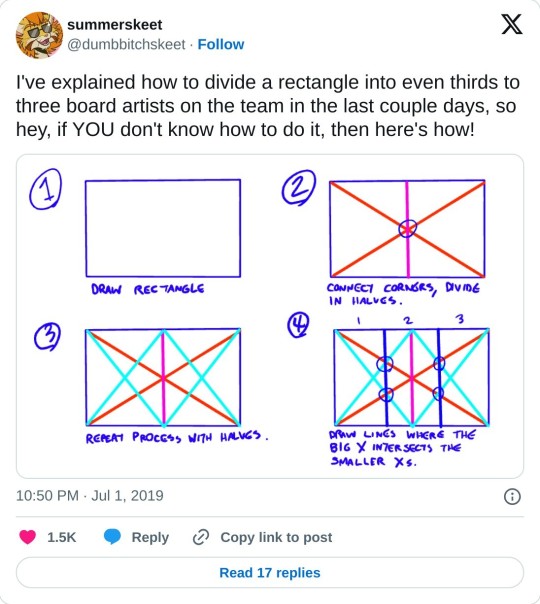
really helpful technique ^ once you know how to divide by halves and thirds it makes drawing evenly spaced things in perspective waaay easier:


134K notes
·
View notes
Text

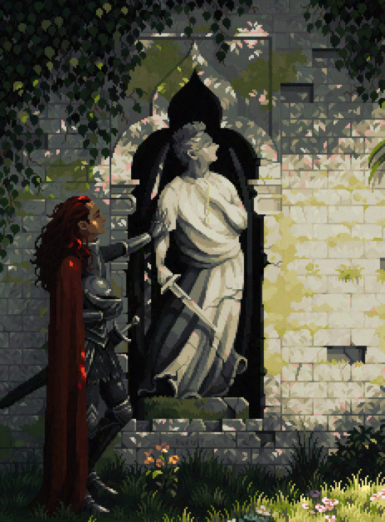
The first Artfight attack this year landed on @theemucat's Goddess of the Whalefall
12 notes
·
View notes