
The Fat Pitch is written by Urban Carmel, a former McKinsey consultant and a president of UBS Securities in Asia.
Don't wanna be here? Send us removal request.
Statistics
We looked inside some of the posts by thefatpitch and here's what we found interesting.
Average Info
Notes Per Post
81
Likes Per Post
55
Reblog Per Post
23
Reply Per Post
3
Time Between Posts
9 days
Number of Posts By Type
Text
17
Last Seen Tumblr Blogs


Fun Fact
Tumblr’s reach among the 26-to-35-year-olds in the US is 11%.
Text
Equities Poised to Rebound

Our last several posts have emphasized several points:
Strong uptrends (like this one) weaken before they reverse, meaning the current sell off is unlikely to lead directly into a major correction.
Even years with powerful returns (like 2013) experience multiple drawdowns of 3-8% along the way, meaning the current sell off was due and is perfectly normal.
There are a number of compelling studies suggesting that 2017 will continue to be a good year for US equities, meaning equities will likely end the year higher.
Read more on these points here and here.
SPX ended the week at 2328, 3% off it's all-time high (ATH) made on March 1. That is a very mild drawdown. Our post last week argued that a sell off to at least the 2300 area (4% off the ATH) was likely. From that respect, a lower low is likely to still lie ahead. That post ishere.
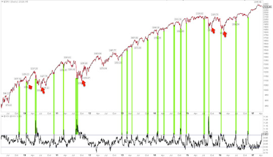
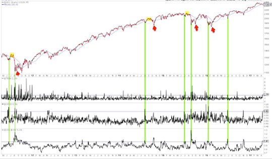
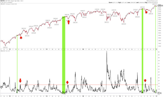
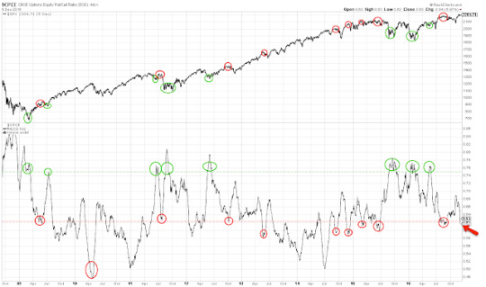
There were a number of notable short-term extremes in sentiment, breadth and volatility reached on Thursday that suggest a rebound in equities is ahead. Let's review these.
First, the equity-only put/call ratio reached a rare extreme on Thursday, with nearly as many puts as calls being traded on the day. That has happened only about a dozen times in the past 8 years. All of these have been at or near a short-term low in SPX (green lines). A rebound is likely ahead. That rebound might not last long, however: note that in several instances, the low was retested or exceeded in the days/weeks ahead (red arrows). Enlarge any chart by clicking on it.
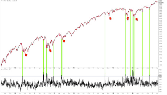
Second, Trin (also called the Arms Index) closed above 2.0 on Thursday. Trin is a breadth indicator derived by dividing the advance-decline ratio for issues by that for volume. A close over 2 means that down-volume was twice down-issues; in other words, stocks fell on relatively high volume.
A spike higher in Trin like yesterday's can often be near a low in equities. That is particularly true when the spike higher in Trin has occurred after several days of selling, like now. In this case, a high in Trin marks capitulation. A relevant post on this indicator is here.
Similar spikes in Trin over the past 5 years are shown below. A rebound is likely ahead. But, like the put/call ratio discussed above, that rebound might not last long: note that in several instances, the low was retested or exceeded in the days/weeks ahead (red arrows). Take last September as an example: SPX rebounded to its 50-dma (blue line) before falling further into the November low.
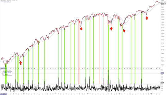
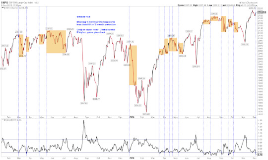
The third short-term extreme reached on Thursday was in the volatility term structure: when one-month protection is trading at a premium to three-month protection, equities have been at or near a point of reversal higher. Similar instances over the past 8 years are show below (green lines). Like the other two studies above, it is notable that the low was retested or exceeded in the days/weeks ahead in several instances (red arrows).
When the volatility term structure is in its current configuration and SPX is also near a 52-week high, equities have been higher 2-4 weeks later in all cases except one over the past decade (from Dana Lyons).
Finally, the VIX spiked up 24% this week, an extreme given that SPX lost only 1%. VIX has closed outside its upper Bollinger Band 4 days in a row. This has happened only 17 times since the year 2000, and in all cases except one, SPX was higher 2 days later by an average of more than 3% (from Kora Reddy).
In summary, there were a number of short-term extremes reached on Thursday. Moreover, these all happened on the same day, which is even less usual. Prior instances are shown below (green lines). A rebound looks likely, but that doesn't necessarily mean that a lower low isn't ahead: again, it's notable that several of these failed in the days/weeks ahead (red arrows). Three cases where the rebound ended after the 50-dma (blue line) was retested are highlighted in yellow.
Uptrends "impulse" higher as buyers chase the indices. But over the past 3 weeks, SPY has lost $3.7 overnight while the index itself is only marginally lower. There is no incentive to chase price if almost every day starts lower than the prior close. It will be a positive sign if this pattern starts to change.
It will also be a good sign if the SPX can regain its 50-dma and then regain its (falling) 13-ema. Uptrends are partially defined by the ability to stay overbought, so following momentum indicators (like RSI(5)) will be a good tell.
In short, the best approach is to continue to monitor the market and adjust our expectations as new patterns and behavior emerge.
That said, it's a good guess that SPX has further downside ahead. The charts below are from last week: when SPX losses momentum (vertical lines), it then typically falls to its 20-wma or lower Bollinger (arrows), implying a move to 2300 to 2200, respectively (first chart). Those price levels correspond to strong support from last autumn and winter (second chart).
On the calendar this week: earnings reports start in earnest; housing starts and permit and industrial production are on Tuesday; and options expiration is on Friday.
9 notes
·
View notes
Text
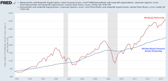
This indicator is at the same level as at the start of the 2007 bear market

Chances are you have seen a chart like the one below. It shows US households' equity ownership as a proportion of total household financial assets (blue line) versus the stock market (red line). The message is usually this: US households now own more equity than at the stock market peak in 2007. It's a sign that another bear market is imminent. Enlarge any chart by clicking on it.
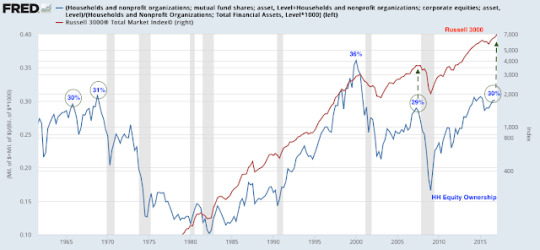
Is it a sign the bull market is at an end? The short answer is no.
It's true that households' "equity proportion" of their financial assets equalled 29% in June 2007 and that it is now 30%. It's also true that bull market peaks in both early 1966 and late 1968 corresponded to the equity proportion reaching 30% and 31%, respectively. Aside from the 1998-2000 tech bubble blow off top, that 30% area has seemed to be where bull markets have died.
But there are two problems with this line of thinking.
The first is empirical. In the past 50 years, the equity proportion has reached this level only 5 times. It was a bull market peak three times (1966, 1968 and 2007) and it was nothing two times (1998 and 2013). A small sample size with a success rate close to a coin toss is statistical noise.
The 29% equity proportion level was reached in late 1997; between 1998 and 2000, SPX gained another 60% (total return basis). The 29% equity proportion was also reached in December 2013. Since then, SPX has gained another 40%. Foregoing an equity return of 40-60% in order to avoid a loss of 22-36% (1966 and 1968 bear markets, respectively) makes this measure of risk even less useful.
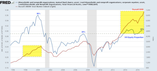
Moreover, two of the biggest bear markets in the past 50 years started when the equity proportion was well below 29%. In late 1973, the equity proportion was only 23%; SPX fell almost 50% in the next 11 months. The 1987 crash occurred when the equity proportion was just 18%.
So to summarize, bear markets have started when the equity proportion was much lower than now and strong bull markets have continued much higher over a period of years from the current level. This makes this measurement effectively useless at predicting turns in the stock market.
The second, and bigger, problem with the equity proportion is that it doesn't represent what its proponents believe it represents. The explicit interpretation of this chart is that investors' appetite for stocks is saturated when their equity ownership reaches 30% of their total financial assets. With no fuel left to propel the market higher, investors then sell stock into a bear market. And when their equity ownership reaches an exhaustive low, equities bottom and then begin a new bull market.
To believe this rationale, you have to believe than investors are highly rationale and have impeccable market timing. You would have to believe that at tops, investors immediately start to reduce their shareholdings; and at bottoms, they immediately start to reaccumulate shares. These curves fit so tightly together, buying and selling correspond almost perfectly with the indices' movements up and down.
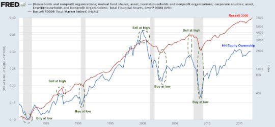
But all available research shows the opposite to be true, that the average investor has terrible market timing, buying too much near tops and refusing to buy near bottoms. This is the main reason why the average investor so dramatically underperforms the indices over time (data from Black Rock).

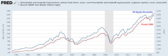
So why do these curves seem to follow each other so closely? Because they are both are measuring the same thing.
Households' equity ownership is a function of the market value of their holding plus their net purchases. As the indices rise, so does the value of their equity ownership. As markets plummet, so does the value of households' equity ownership. The chart below compares the value of their equity holdings (which is the numerator in the "equity proportion"; blue line) to the Russell 3000 (red line). It's nearly a perfect match because these two curves are measuring the same thing: the value of the stock market
If the value of households' equity ownership were mostly driven by buying and selling stocks, then we should have seen massive selling of equity mutual funds and ETFs from late 2007 to early 2009. We didn't. Between September 2007 (SPX peaked in October 2007) and February 2009 (SPX bottomed in March 2009), investors actually added $35b in new money to equity funds. During those 17 months, more months had inflows (9) than outflows (8).
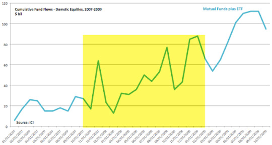
During this period, money continued to flow into index mutual funds and ETFs. Actively managed mutual funds lost funds, but the total amount added to equity funds rose (data from ICI).
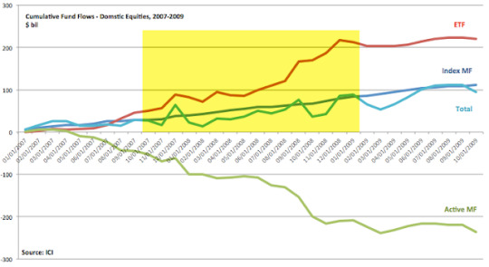
This is significant. The theory is that investors are too exuberant when the equity proportion reaches 30%, that they have effectively used up all of their risk appetite and thus the fuel needed to propel the market higher. But that is clearly not the case. Investors continued to add to equity funds even after the 30% level had been reached. The proportion only fell because the value of their existing holdings fell.
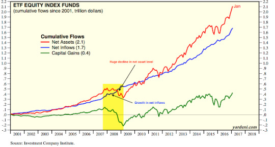
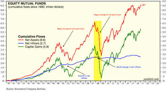
The importance of the stock market itself in determining the value of households' equity ownership (net assets) is apparent in the next two charts. On net basis, investors added new money to funds but the net asset value plummeted as the bear market unfolded. Net assets have since rebounded much more strongly than fund inflows would imply (data from Yardeni).
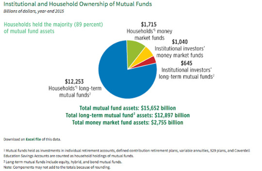
It's true that (1) more than just households buy these equity funds and (2) households also own individual stocks, not just funds. But the importance of these funds is clear. Households own 89% of total mutual fund assets. While ETFs are growing rapidly, mutual fund assets were still about 85% of total fund assets in 2015 (data from ICI).
Households' equity proportion of their financial assets oscillates up in bull markets and then down in bear markets almost exclusively due to the value of their equities, driven overwhelmingly by the value of the indices themselves. Households' other financial assets (primarily fixed income and cash equivalents, which form the denominator in the "equity proportion") have risen fairly steadily over time (blue line). This causes the equity proportion to rise over 30% and then fall under 15%.
None of this is say that investors today are not bullish or that stock valuations are not high. There is good data to support both of these conclusions. There is also good reason to suspect that longer term equity returns are lower when equity valuations and sentiment are high (read our take on this here).
The equity proportion of households' financial assets adds little to this: it's measuring the same thing as the appreciation of the stock market itself. You would expect the equity proportion to be high after an 8 year bull market and low after a bear market. That equity bull markets in the past 50 years have historically ended when the equity proportion was 18%, 23%, 30% and 36% - and that equities have gained another 40-60% after the purportedly significant 30% level has been reached - tells you how little value this measure adds.
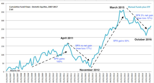
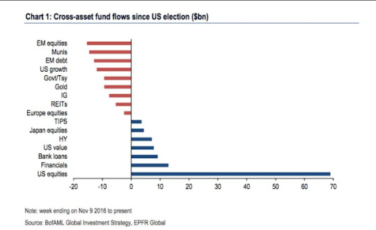
A final point: it might seem strange that equity fund flows can be positive during a bear market. But we have seen something like this throughout the past decade. Since 2009, the best equity market performance has taken place when fund flows are strongly positive. That can be seen in the chart below: strong inflows in 2009-11 and 2013-14 coincided with gains of 100% and 50% in SPX, respectively. Fund outflows between April 2011 and November 2012 coincided with the indices producing no net gains and suffering a near bear market in August 2011. The same happened between March 2015 and October 2016: almost no net gains and several large drawdowns of more than 10%. The strong rally in the SPX since the election coincides with $65b in net inflows (data from ICI).
2 notes
·
View notes
Text
Who Might Be Surprised After the Coming Rate Hike

On Wednesday March 15, the FOMC is likely to raise the federal funds rate (FFR) for the third time during the current economic expansion. We wrote about what to expect ahead of the first rate hike here and the second rate hike here.
The Fed chair and its governors have very clearly signaled their intentions in advance of this meeting. The market places the probability of rate hike at over 90%. In just over a week, 10 year treasury yields have jumped 30 basis points (bp) to their highest level since December 15.
Why has the Fed telegraphed their intentions to the market so clearly? Doesn't this tie the FOMC's hands should interim data make a FFR hike unnecessary?
The FOMC has learned that surprising the market with a FFR hike is a very bad idea. With the SPX rising 15% since the election, a surprise would likely catalyze a big drop. Here are two examples of how this has happened in the past.
The 1966 bear market is one of only two bear markets since the 1940s that occurred outside of a recession. The approximate cause: the FFR was rapidly and unexpectedly raised from 4% to 6% (read more here).
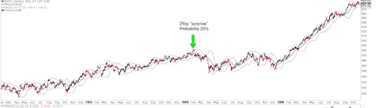
More recently, the FOMC surprised the market with just a 25 bp FFR hike in February 1994. Going into the meeting, the market put only a 20% probability of a hike. What happened next? The SPX fell 10% in the next two months. So keeping the market constantly prepared for a possible change in the FFR has been the FOMC's modus operandi for a long time.
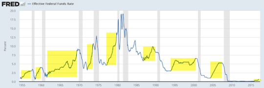
It's important to put the upcoming rise in the FFR in context. There is, to be clear, very little risk that any FFR hike is likely to choke the economy's expansion. In the past 60 years, the lowest effective FFR which has coincided with the start of a recession is 3%. The current rate is 0.65%. Outside the current expansion, the current rate is the lowest since 1958.
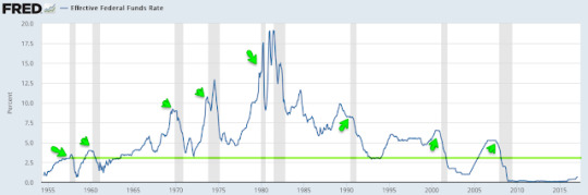
In addition, each expansion in the past 60 years has been accompanied by dramatic and sustained increases in the FFR before the economy has stumbled. We are very far from this situation right now. If equities continue the small correction that started in the past week, it won't be due to the FOMC's decision to raise the FFR by 25-50 bp.
The latest month's macro economic data continues to be mostly good. The risk of a recession-induced bear market in equities remains low. A fresh post on the latest data is here.
A solid macro foundation is important, as equity bear markets almost always take place within the context of an economic decline (read more about this here).
While a hike in the FFR itself is unlikely to have a meaningful fundamental impact on equities, it's worth noting the equity action after the first two hikes this cycle.
The first FFR hike was in December 2015 (vertical line on the left); the rally in SPX had already stalled 7 months earlier, pressured by falling earnings and oil prices. For those reasons, not the hike in the FFR, SPX dropped 12% over the next two months. The second hike was in December 2016, a month after the election (vertical line on the right). SPX chopped sideways over the next 6 weeks.
Commodities are typically the biggest winner during a rising interest rate environment, and that has been the case so far this time as well. A new uptrend in industrial commodities started with the hike in the FFR in December 2015. That should make sense: a rising FFR indicates solid growth and rising inflation expectations, both of which raise demand for commodities used in production. Note the short-lived negative reaction in commodities immediately after both FFR hikes.
The dollar has sold after the last two rate hikes. We have noted the bullish extreme in dollar sentiment into both rate hikes (here). The dollar has risen in anticipation of higher rates and then sold off once those higher rates were realized.
The most interesting asset class at the time of a FFR hike is treasuries. Yields fell dramatically in the 6 months after the FOMC raised the FFR for the first time in December 2015 (vertical line to the left). Again, the context was economic fears heightened by falling oil prices and weak inflation data. That makes the second rate hike on December 15, 2016 so interesting. 10 year yields dropped immediately (vertical line on the right). Until Fed speakers started talking up the rate hike a week ago, yields remained in decline. All of that was reversed in just the last 8 sessions and yields are now exactly where they were on December 15th.
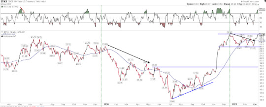
This is noteworthy because yields falling after the FOMC starts raising rates is decidedly not what has typically happened in the past.
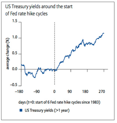
The next two charts below look at the start of every FFR hike cycle since 1983. The first chart shows how treasury yields have typically risen after these rate hikes (from Allianz).
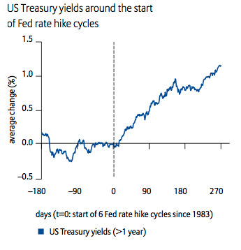
The second chart shows 10 year yields with vertical lines drawn to show the timing for the start of each FFR cycle since 1983. Yields have a strong tendency to rise with the FFR. Again, that shouldn't be a surprise as a higher FFR indicates solid growth and rising inflation expectations, both of which tend to raise yields.
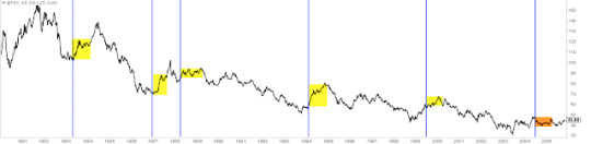
But there was a notable change in the pattern starting with the FFR hike cycle during the last expansion in the 2000s (orange shading in the chart above). The FOMC raised the FFR 17 times between June 2004 and June 2006 (green vertical lines in the chart below). 10 year yields mostly fell after these FFR increases. Between the first rate hike and the 14th, yields had declined on a net basis. Yields, in fact, did not even bottom until the 9th rate hike. Most of the overall gain in yields during 2004 and 2006 took place in the final 5 months of the cycle (rising 90 bp). The final FFR hike (labelled #17) marked the high in yields which has still not been surpassed in the subsequent 10 years.
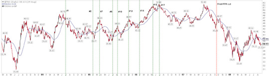
Macro data was fine during this period. Personal consumption ranged between annual growth of 2.5% and 4.5%; this is generally higher than it has been during this cycle (the latest data shows growth of 2.7% yoy). But, like now, core inflation was muted: at the start of the rate cycle, PCE was 2% and rose only to 2.3% by the end of the cycle two years later (blue line).
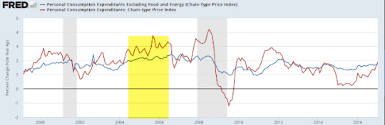
That makes this week's FOMC meeting interesting. Treasury yields have moved up in anticipation of a rate hike, yet, as the chart above shows, core inflation is still 1.9%, barely higher than it was a year ago (1.7%).Treasury yields fell after the last two FFR hikes just as they also most often fell during the 2004-06 cycle as inflation remained muted. So, are rates likely to fall again after next week's FFR hike?
The technical picture is mixed. On the one hand, "price" tends to resolve in the direction of the trend. Yields have risen strongly since the summer 2016 and have since consolidated over the past 3 months. Normally, we would expect yields to continue in the direction of their trend, meaning higher.
On the other hand, yields have had a very clear pattern over most of the past 20 years: a momentum high (RSI near or over 90; black arrow) followed by a "price" high (red arrow), after which yields mostly fell.
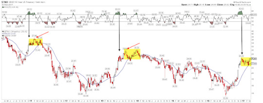
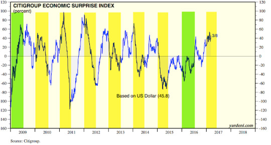
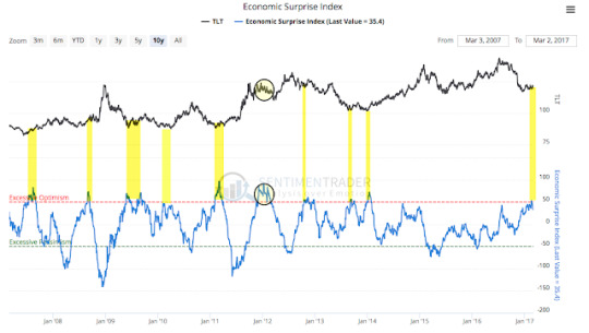
What further makes a rise in yields suspect is this: the FOMC is expected to raise rates just as macro expectations are at their most optimistic relative to underlying economic data in the past 3 years. Macro expectations are frequently mean reverting; that make sense as investors and prognosticators can get too far ahead (or too far behind) the actual data, leading to disappointment (or an upside surprise).
In the current expansion, expectations have most often started the year too optimistic and then declined into mid-year (yellow shading). 2009 and 2016 were exceptions, beginning weakly and then moving higher (green shading).
When, like now, expectations are very optimistic, treasury yields tend to fall. Treasury prices move opposite yields and so they rise (TLT is shown in the upper panel). That is what happened at several points during the 2004-06 expansion, some of which coincided with a FFR hike (as indicated by a #).
The same pattern of excess optimism coinciding with a decline in yields (and thus a rise in TLT) has generally occurred in the period since then.
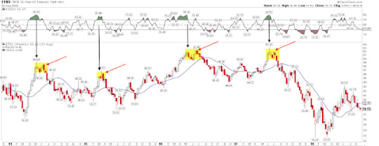
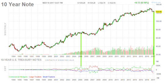
The final point making a sustained rise in yields suspect is that commercial bond traders (who are considered the 'smart money') now have the largest long position in the 10 year note in history (green line, lower panel). They have mostly been right, with note prices rising subsequently (upper panel).
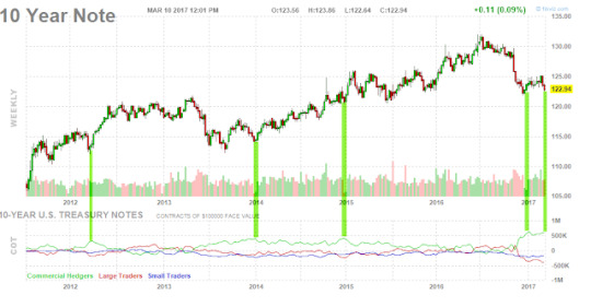
In fact, the only time when commercial traders were comparably long the 10 year was March 2005, ahead of a 3 month rally in notes. TLT rose more than 10% by May 2005.
The long lens of history suggests that yields should rise with a rising FFR and with improved growth and inflation. Yields are also low relative to their level a decade ago when inflation was at a similar level. That is the consensus view of what will happen now as well. That may well be right, but recent history, as well as the commercial traders who are most often right, suggest that the consensus will be surprised.
4 notes
·
View notes
Text
Favorable Outlook For US Equities

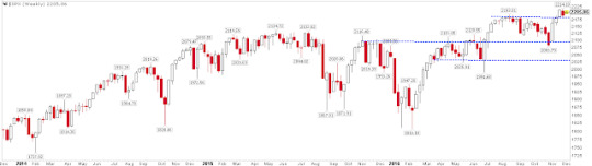
All of the US equity indices made new all-time highs again last week. Treasuries were the biggest winner. A drawdown of at least 5-8% in SPX is odds-on before year year end, but there are a number of compelling studies suggesting that 2017 will probably continue to be a good year for US equities.
On Friday, SPX and DJIA made new all-time highs (ATH). During the week, COMPQ, NDX, RUT and NYSE also made new ATHs. All the indices moving to new highs together suggests that this is a broadly based rally. The trend remains up.
For the week, SPX and DJIA gained 1%. NDX notched a 0.4% gain and RUT closed lower. The biggest gain came from treasuries, with TLT gaining 1.4%. We continue to like the set up in treasuries, as explained in detail last week (here).
Little has changed from last week's summary. Instead of repeating those the same messages, we'll highlight four new studies that show a favorable longer term outlook for US equities.
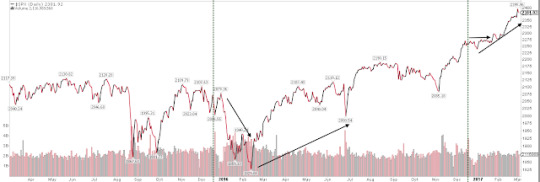
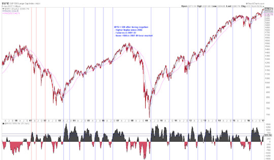
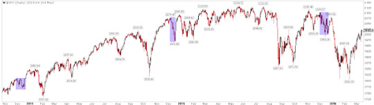
First, SPX has now gone 76 days since the last 3% drawdown ended on November 4, right before the US election. That is the longest streak since July 2006 to February 2007, when the SPX went 150 days without a 3% drawdown. The chart below shows the duration and magnitude of the current rally relative to other long streaks in the past 14 years (yellow highlighting equals the current rally). Enlarge any chart by clicking on it.
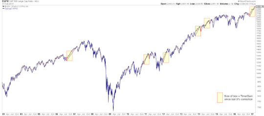
The message from this chart is twofold.
First, the current uninterrupted rally is rare and extended from a historical perspective, but these periods can last much longer.
Second, when the current uptrend ends, it is not likely to lead directly into a more significant downturn. Momentum like this weakens before it reverses. In each of the cases highlighted above, after a 3-5% drawdown, SPX either continued higher or retested the prior high before falling lower. Mid-2011, 2012 and 2014 are recent examples of the latter case (shown below). That would be our expectation now as well.
Second, the current rally is perhaps most pronounced in the Dow Industrials. DJIA has closed at new ATH the past 11 days in a row. The streak has only extended to 12-13 days twice since 1900. Of the 14 similar streaks, the DJIA closed higher after 1 or 3 months 11 times (79%). It also closed higher after 6 or 12 months 11 times. In other words, the upward momentum most often continued in the months following the end of the streak (from Ryan Detrick).
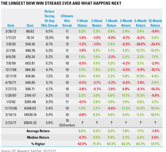
In the chart above, note that the only outright failure was 44 years ago, in 1973. This period coincides with the 1973-74 oil embargo. Within 4 months, the price of crude oil quadrupled, causing the US economy to plummet into the 1973-75 recession. A repeat of that scenario now is not likely.
One of the other long streaks ended in January 1987. In October of that year, the SPX crashed 30%. It was devastating, but note that between the end of the streak in January and the start of the crash in October, SPX rose a further 30%. In other words, the upward momentum lasted another 9 months.
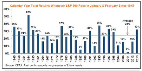
The third long term study relates to seasonality. Specifically, with two days left in February, the SPX has risen almost 6% YTD. In the 27 prior instances since 1945 that SPX has been up in both January and February, it has closed up for the full year all 27 times. The average full year gain was 24%; in only 2 cases was full year gain less 10% (from CFRA).
That doesn't mean that the index didn't experience turbulence in the next 10 months. In the 16 occurrences since 1980, SPX had a median intra-year drawdown of 8% (those 16 cases are highlighted in yellow). With the index up 6% YTD, a drawdown of median size could take the SPX into negative territory for the year (from JPM).
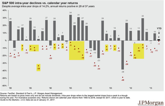
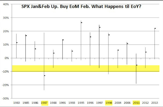
What happened if you bought the close on the last day of February and held until year-end? In most cases (14 of 16, or 88%), SPX closed higher, often by more than 10%. But in half the cases, there was an intra-year drawdown of at least 5% and more than 10% in three memorable years (1987, 1998 and 2011; from @Minion_of_Gozer).
Based on the strong start to the year, returns are likely to be positive through year end but a drawdown of at least 5-8% before then is also odds-on. Buy the dip.
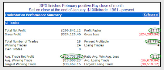
In a related study that examines positive closes in February, the next 11 months saw net gains 86% of the time (24 of 28 years since 1961). The profit factor (gains divided by losses) is 13, which is very attractive (from Rob Hanna).
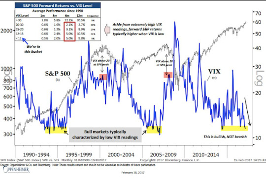
The fourth study with longer term implications relates to volatility. Much has been made of the persistently low level of the Vix. The three most recent bull markets have each been characterized by a persistently low Vix. Historical instances are severely limited, but a low Vix has been a positive sign for the SPX. The market did not peak in either 2000 or 2007 until Vix had climbed, over the course of years, to more than 25. Since 1990, when the Vix has been below 12, SPX has returned 5% and 10% over the next 6 and 12 months, respectively (from Ari Wald).
It's true that current market valuations are unattractive, a headwind we have raised when discussing earnings (read further here). But keep in mind that overvaluation has been a very bad mechanism for market timing. The correlation between valuations and forward one-year returns is nearly zero. Investors rightly indicated that the SPX was fully valued in late 2014; since then, it has gained another 25% (from Yardeni).
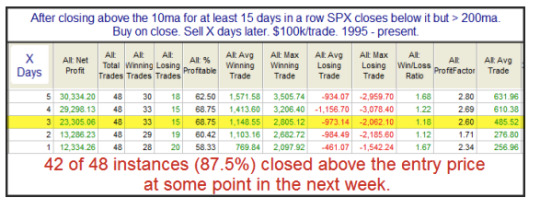
A final note on the current market: SPX has closed above its 5 and 10-dma for 15 days in a row. This is an exceptional period of strength. It can continue longer. Importantly, the first close below these averages is likely to be aggressively bought, something to watch for should the streak end this week (from Rob Hanna).
In summary, there are a number of compelling studies suggesting that 2017 will probably continue to be a good year for US equities. In addition to the four such studies reviewed in this post, add in rebounding equity fund flows and positively trending macro data. All of that said, a drawdown of at least 5-8% in SPX is odds-on before year year end. Our summary last week suggests that drawdown could happen sooner than many investors current believe is likely (read further here).
The calendar is heavy for the week ahead. Durable Goods on Monday; GDP on Tuesday; and Personal Consumption on Wednesday. NFP is the following Friday, March 10.
2 notes
·
View notes
Text
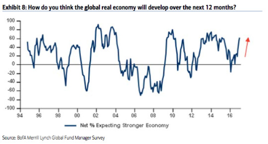
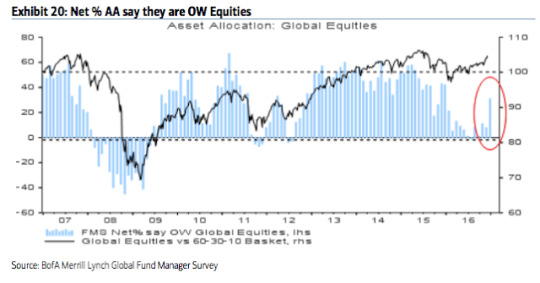
Fund managers dump bonds and emerging markets

Global equities are nearly 25% higher than in February 2016. A tailwind for this rally has been the bearish positioning of investors, with fund managers persistently shunning equities in exchange for holding cash.
That's no longer the case. Fund managers became bullish again in December, and remain so now. Optimism towards the economy has surged to a 2-year high. Cash remains in favor (a positive) but global equity allocations are now back above neutral for the first time in a year. Another push higher and excessive bullish sentiment will become a headwind. The main exception to this is emerging markets, which are now out of favor and a contrarian long.
Findings in the bond market are of greatest interest. Fund managers' allocations to global bonds are now at prior capitulation lows. Moreover, inflation and growth expectations have jumped to the highest level since early 2011, after which US 10-year yields fell in half over the next several months.
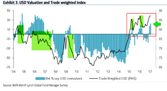
The dollar is now considered the most overvalued in the past 10 years. Under similar conditions, the dollar has fallen in value in the month(s) ahead.
Among the various ways of measuring investor sentiment, the BAML survey of global fund managers is one of the better as the results reflect how managers are allocated in various asset classes. These managers oversee a combined $500b in assets.
Let's review the highlights from the past month.
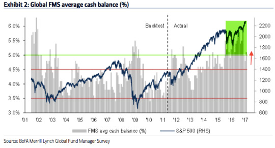
Cash: Fund managers' cash levels dropped from 5.8% in October to 5.1% in January; cash is up slightly from December. Recall that 5.8% was the highest cash level since November 2001. Cash remained above 5% for almost all of 2016, the longest stretch of elevated cash in the survey's history. Some of the tailwind behind the rally is now gone but cash is still supportive of further gains in equities. A significant further drop in cash in the month ahead, however, would be bearish. Enlarge any image by clicking on it.
Global equities: Fund managers were just +5% overweight equities at their low in February 2016; since 2009, allocations had only been lower in mid-2011 and mid-2012, periods which were notable bottoms for equity prices during this bull market. Allocations in January have jumped to +39% overweight, a 13-month high. This is now slightly above neutral (0.4 standard deviation above the long term mean). Over +50% overweight has historically been bearish (dashed line).
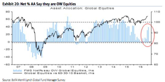
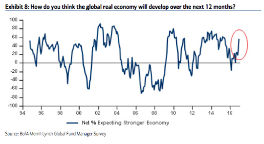
In February 2016, 16% of fund managers expected a weaker economy in the next 12 months, the lowest since December 2011. They are now optimistic: 62% expect a stronger economy in the next year, a 2-year high. Pessimism explained their prior low allocation to equities and high allocation to cash; that has now changed.
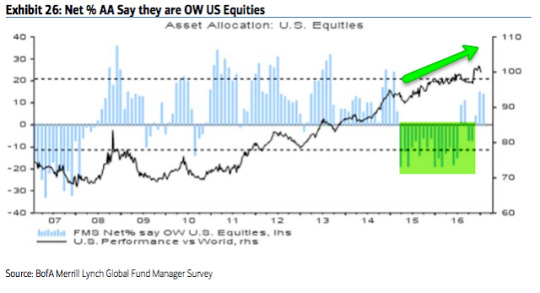
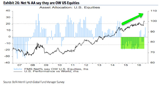
US equities: US exposure had been near an 8 year low during the past year and a half, during which US equities outperformed. US equities have been under-owned. That's changed. In January, fund managers were +14% overweight (the same as last month). This is 0.9 standard deviations above its long term mean. Bearish sentiment is no longer a tailwind for US equities. Above +20% overweight and sentiment would become a headwind (dashed line). Close, but not yet.
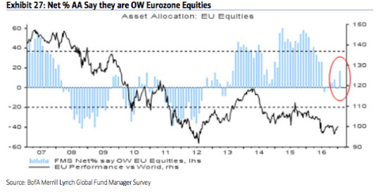
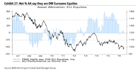
European equities: Fund managers had been excessively overweight European equities for more than a year in 2015-16, during which time EZ equities underperformed. That changed in July, with the region becoming underweighted for the first time in 3 years. That improved to +17% overweight in January. This is neutral (0.1 standard deviations above its long term mean).
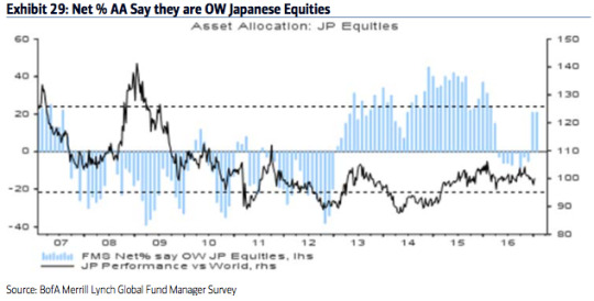
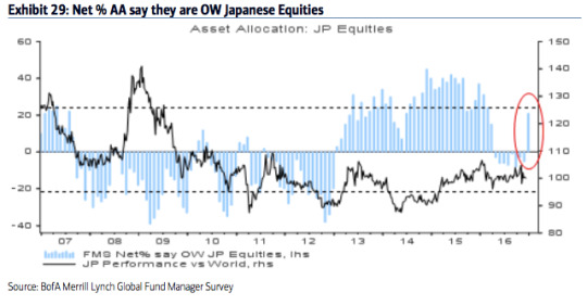
Japanese equities: Allocations to Japan had been falling in 2016 after excessive bullishness in 2015. Allocations fell to -8% underweight in September, the lowest since December 2012. Now, allocations have jumped back to +21% overweight. This is 0.6 standard deviations above its long term mean. Bullish sentiment is close to becoming a headwind (dashed line)
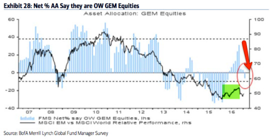
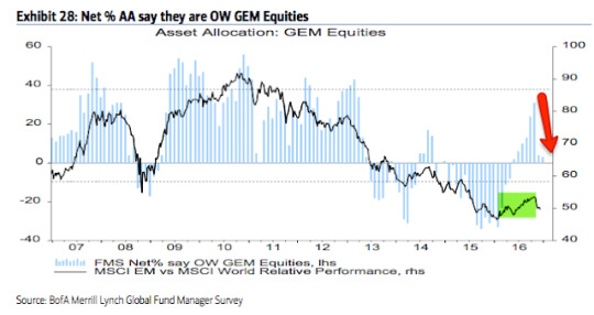
Emerging markets equities: In October, we said "the contrarian long in emerging markets is over." A brief recap: in January 2016, allocations to emerging markets fell to their second lowest in the survey's history (-33% underweight). As the region outperformed in 2016, allocations rose to +31% overweight in October, the highest in 3-1/2 years. That made the region the consensus long. Emerging equities then dropped 10% in the next two months. Allocations are now -6% underweight. This is 1.1 standard deviations below its long term mean. The region is now a contrarian long again.
Global bonds: Fund managers are -63% underweight bonds, a fall from -35% in July (which was near a 3-1/2 year high allocation). This is 1.1 standard deviations below its long term mean. A capitulation low in the past has often occurred when bonds were -60% underweight (red arrows and dashed line). In other words, bonds are now a contrarian long. Note the failure in 2013.
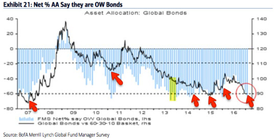
Of note, fund managers' inflation and growth expectations have jumped to the highest level since early 2011. This explains some of the sell off in bonds in the past several months. It's notable that yields fell (bond prices rose) under similar circumstances in 2011 (highlights).
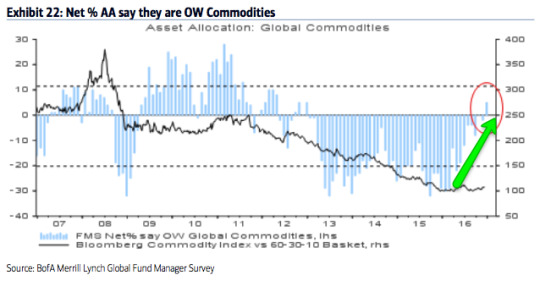
Commodities: Allocations to commodities are now near a 4-year high (+3% overweight). This 0.5 standard deviations above its long term mean. In comparison, in February, allocations were near one of the lowest levels in the survey's history (-29% underweight). The improvement in commodity allocations goes together with increased macro optimism.

Sectors: Relative to history, managers remain overweight cash, but less so than in the past year and a half. Like last month, managers are now more overweight equities than bonds, a change from the past several months. The allocation to equities would be higher if it were not for underweighted positions in emerging markets and the UK. US equities are overweighted relative to history.
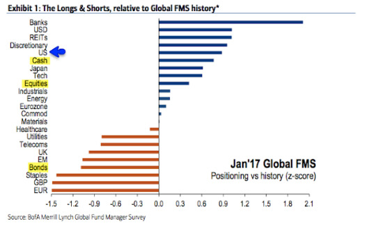
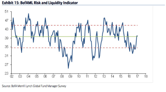
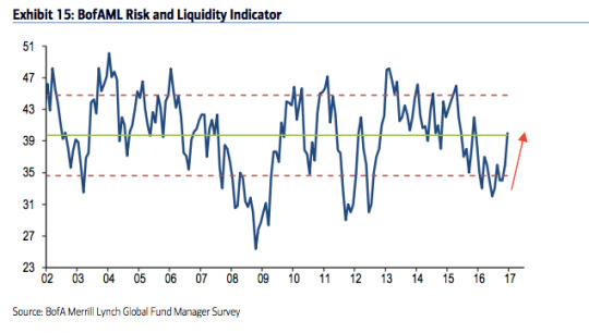
Fund managers' risk appetite had been well below the mean during 2016; during the current bull market, risk appetite had only been materially lower in mid-2011 and 2012, relative lows from which equities rose strongly in the following months. That has now changed, with risk appetite at 13-month highs and neutral relative to the long term mean. Risk appetite is the average of fund managers cash, investment horizon and investment risk (e.g., equity allocation and sector weighting).
Dollar: Since 2004, fund managers surveyed by BAML have been very good at determining when the dollar is overvalued. In March 2015, they viewed it as overvalued for the first time since 2009; the dollar index fell from 100 to 93 in the next two months. In late 2015, they again viewed the dollar as overvalued and the index lost 7%. Fund managers view the dollar as overvalued now again (and by the highest amount in 10 years). Under similar conditions (highlighted in green), the dollar has fallen in value in the month(s) ahead.
13 notes
·
View notes
Text
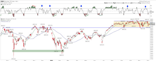
New equity highs but watchout for volatility

Today, SPX, DJIA, COMPQ and NDX have all made new all-time highs (ATH). All of the moving averages, from 5-d to 200-d, are rising for each of the respective indices. This is the definition of an uptrending equity market. Enlarge any chart by clicking on it.

The trend higher is supported by mostly good breadth. All of the cyclical (pro-growth) sectors are near one-year highs (green shading). The laggards are the defensive sectors.
Similarly, the Summation Index (NYSI) has regained the +500 level after having been negative two months ago. When equities are up trending (i.e., above their rising 200-d), this set up has led to longer term gains in equities (blue vertical lines). That doesn't preclude a near term drop, however, as seen in November 2014.
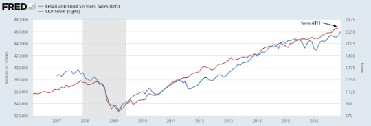
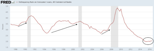
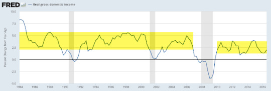
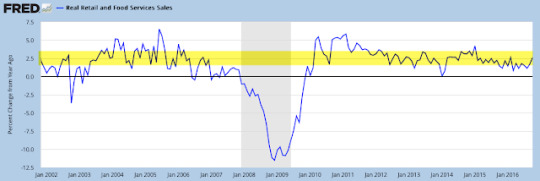
The trend higher in US equities is also supported by mostly positive macro data (a new post on this is here). Total employment, real disposable income per capita, real personal consumption and real retail sales are all at new highs. In the past year, hourly wages have increased at the fastest pace in nearly 8 years (second chart). Consumer loan delinquency rates are at a 30-year low (third chart). In short, the equity market is entering 2017 on a relatively solid economic foundation.

Notably, most Wall Street strategists are cautious about the upside potential for equities in 2017. The range of forecasts is for a 3-5% gain. The SPX has nearly reached the year end target for almost half of these strategists (from Barron's).
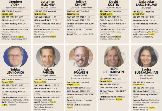
(Side note: 8 of 10 strategists favor financials in 2017, while all except one think staples should be avoided. These look like very crowded trades).
Historically, gains of less than 5% - in other words, a modest year - are the exception. Since 1980, the SPX has posted an annual gain 76% of the time, and when it gains, it does so by more than 5% 82% of the time. Similarly, when the market falls, it does so by more than 5% 75% of the time. In short, if equities are set up for a positive year - and that's the way it looks right now - then most of these strategists are likely too conservative (from JPM).
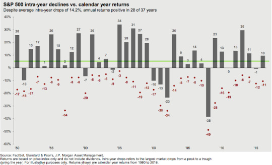
Stating the obvious, positive years don't occur without some drama along the way. In the chart above, every year except one has had an intra-year drawdown of more than 5%, and the average is nearly 15%. Expect 2017 to be no different.
While Wall Street is cautious on the year, it is difficult to argue that investors have not become overly bullish in the short term. This suggests that the drama for equity markets is likely to come sooner than many currently expect.
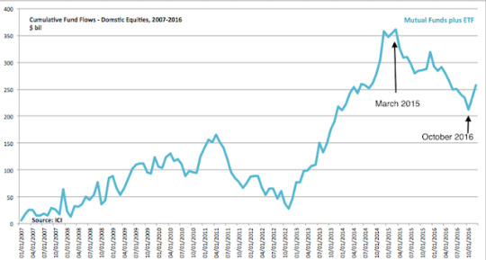
After 1-1/2 years of equity fund outflows, inflows have totaled about $50b in the past two months (first chart, from ICI). Fund flow data from BAML is even more lopsided in favor of US equities (second chart).
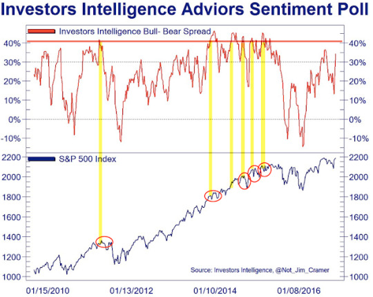
Similarly, bulls outnumber bears among investment advisors polled by Investors Intelligence by more than a 3:1 margin (the spread is 42%). It can become more extreme (top panel) but this has been where SPX trading has become choppier and gains have been given back (lower panel; from Not Jim Cramer).
As equities have gained, volatility has dropped to an extreme. In the past 20 years, the volatility index has rarely been lower. It can go lower, but normally current levels are near a point of reversion (lower panel). The biggest exception was the 5 month period from October 2006 to February 2007, during which SPX gained another 7% before all of these gains were given back. A reversion in volatility soon, or subsequent gains in SPX given back later, is the likely set up now as well.

The trading range in SPX has contracted to a relative extreme in the past month (lower panel). When this has happened in the past, volatility has typically increased by 50-100% within a month (red boxes, middle panel). As volatility usually moves opposite to equity prices, SPX has usually chopped and then fallen (top panel).

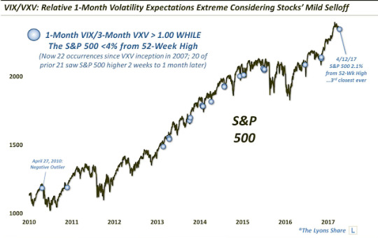
1-month protection is now trading at less than 80% of 3-month protection. Normally, SPX has tended to chop sideways for the next 1-2 weeks with any gains given back (shading). The sole exception in the past 3 years was in early December (red arrow).

Net, there's a set-up for volatility to spike higher. With equities trading at ATHs today, there is no price reversal to trade against. A price reversal could be marked by a high wick candle or by price closing under it's 5-d and the slope of the 5-d flattening and then inverting. Importantly, neither of these has happened yet.
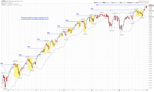
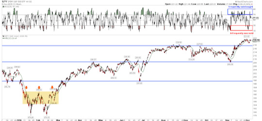
SPX is less than 1% from 2300. These "round numbers" have reliably been resistance zones during SPX's advance, with the index reacting by at least 2-3% and often more. A fall to the Bollinger mid-band implies a 4% drawdown. On this basis, the short-term risk-reward for longs is now unfavorable.
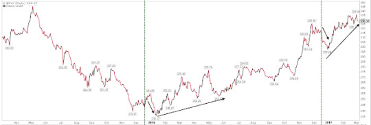
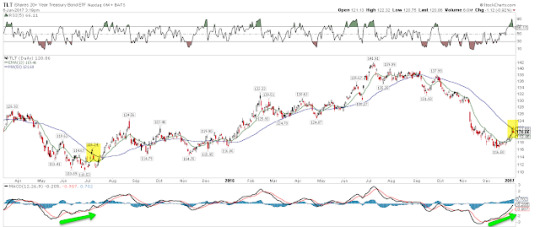
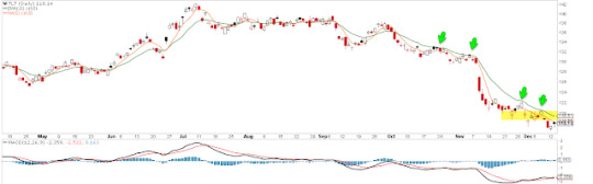
Lastly, before the holidays we wrote about the potential for treasury yields to reverse (that post is here). TLT has since gained about 3% and is testing it's falling 50-d for the first time since September. That should be a point of reaction (shading). A second close above, with the 50-d flattening, would a positive sign for further gains in TLT.
In summary, US equities are starting the year at new all-time highs. The rally is supported by healthy breadth and a relatively solid economic foundation. The biggest watchout is volatility, which has fallen to an extreme. A mean reversion in volatility is odds-on and that is normally unfavorable, short term, for equities.
1 note
·
View note
Text
Are investors set up for a surprise in the bond market?

The FOMC will likely raise the target for the federal funds rates later today. We discussed the affect of rate increases on various asset classes a year ago when the FOMC enacted their first rate increase since 2006. The general conclusion was that equities, commodities and bond yields all rose in the subsequent months. That post is here.
Those conclusions were mostly right. The one exception was bond yields. On the day of the rate increase in December 2015, 10 year yields in the US hit 2.33% (arrow). That was the high until November 2016, 11 months later. In the interim, yields fell 100 basis points over the next half year.
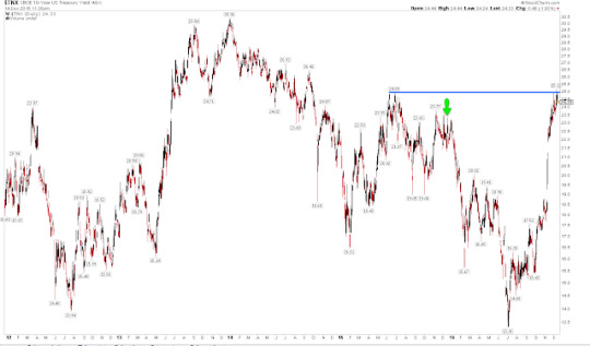
That was unexpected. Yields had risen from 1.9% in October and from 1.6% in January 2015. In the six prior rate hike cycles since 1983, yields had continued to rise after the FOMC decision (data from Allianz).
Treasury yields have again risen strongly ahead of today's FOMC meeting, although the 10-year yield is only 10 basis points higher than a year ago. Expectations are they will continue to rise. Might investors be wrong once again?
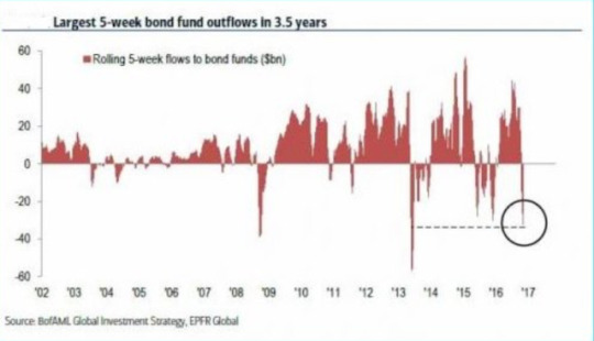
Money flows out of bond funds have recently been one of the most extremely negative in the past 15 years (from BAML).
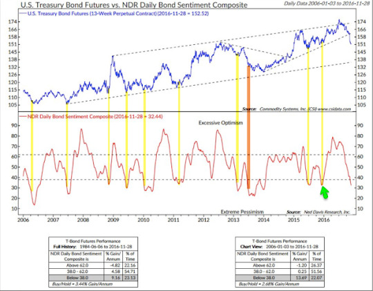
Overall investor bond sentiment is as bearish as it was a year ago (arrow). Over the past 10 years, similar levels of bearish bond sentiment (lower panel) have mostly coincided with a rebound in bond prices (upper panel; from NDR).
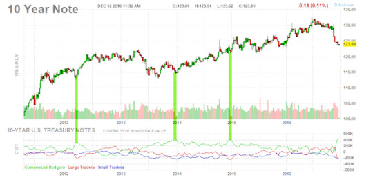
Commercial bond traders (considered the 'smart money') are taking the contrarian view. They now have the largest long position in at least 5 years (green line, lower panel). They have mostly been right, with bond prices rising subsequently (upper panel).
Bond breadth momentum, using the same formula investors use in calculating the McClellan oscillator NYMO for stocks, is also at a decade long extreme (lower panel). Prior extremes like this have mostly been near at least a short term turning point in bond prices (upper panel; from Tom McClellan).
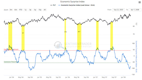
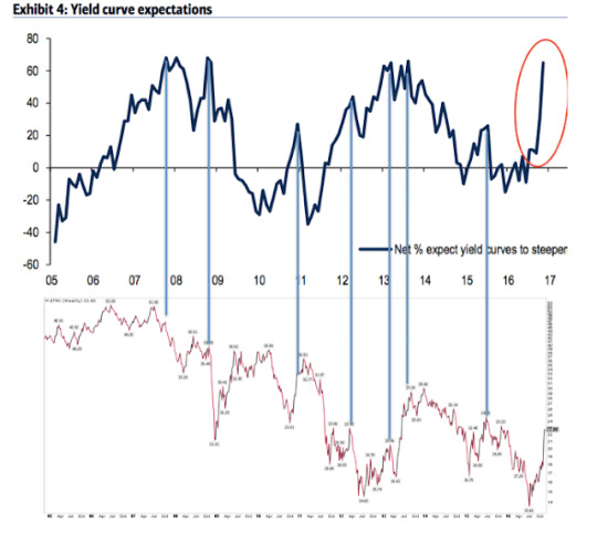
Fund managers surveyed by BAML now have their largest underweight position in bonds since last December. These fund managers' inflation expectations have jumped to the highest level in 12-1/2 years (upper panel). It's notable that current levels have marked at least a short-term reversal point in yields in the past (lower panel; a new post on this can be found here).

Similarly, there has been a massive increase in the percentage of these fund managers who believe the yield curve will steepen in the next year (upper panel). This is now at the highest level in 3-1/4 years. Similar cases, at either a high level or following a steep increase, have led to at least a short-term reversion lower in yields (lower panel).

The intermediate trend in yields is higher: the US 10-year yield is near the highs from July 2015, a year and half ago. The main bond ETF, TLT, has fallen about 15% in the past two months and is below falling 5-d, 20-d and 50-d moving averages. The first sign of a short term change in trend will likely be consecutive closes above its 13-ema (green line). This has been where short rallies have failed since September (arrows).
Bond yields usually rise as the FOMC raises rates. This is one of the mostly strongly held consensus views in the market right now. A year ago, investors also thought yields were set to rise; instead they fell over the next half year. Might investors be wrong now once again? There is a good set up for investors to be surprised; what is missing is a visible sign in bond prices.
1 note
·
View note
Text
Fund managers finally turn optimistic

Global equities are more than 20% higher than in February. A tailwind for this rally has been the bearish positioning of investors, with fund managers persistently shunning equities in exchange for holding cash. This was in stark contrast to 2013, 2014 and early 2015, during which fund managers were heavily overweight equities and underweight cash and bonds.
Fund managers have finally become bullish again. Optimism towards the economy has surged to a 19-month high. Cash remains in favor (although levels dropped significantly in the past two months) but global equity allocations are now back to neutral for the first time in a year.
Bearish sentiment had been a persistent tailwind for US equities in the past year and a half. That's no longer the case. Another push higher and excessive bullish sentiment will become a headwind. Global equity allocations would already be excessively bullish if not for Europe, where sentiment has dropped. Emerging markets became the consensus long in October and the region has since been pummeled. Those markets are now in the process of resetting.
Findings in the bond market are of greatest interest. Fund managers' allocations to bonds are near prior capitulation lows. Moreover, inflation expectations have jumped to the highest level in 12-1/2 years and expectations that the yield curve will steepen are the highest in 3-1/4 years. When this has happened in the past, yields have been near a point of reversal lower, at least short-term.
The dollar is now considered the third most overvalued in the past 10 years. Under similar conditions, the dollar has fallen in value in the month(s) ahead.
Among the various ways of measuring investor sentiment, the BAML survey of global fund managers is one of the better as the results reflect how managers are allocated in various asset classes. These managers oversee a combined $500b in assets.
The data should be viewed mostly from a contrarian perspective; that is, when equities fall in price, allocations to cash go higher and allocations to equities go lower as investors become bearish, setting up a buy signal. When prices rise, the opposite occurs, setting up a sell signal. We did a recap of this pattern in December 2014 (post).
Let's review the highlights from the past month.
Cash: Fund managers' cash levels dropped from 5.8% in October to 4.8% in December. That is a big drop for two months, but recall that 5.8% was the highest cash level since November 2001. Cash has remained above 5% for all of 2016, the longest stretch of elevated cash in the survey's history. A good amount of the tailwind behind the rally is now gone but cash is still supportive of further gains in equities. A significant further drop in cash in the month ahead, however, would be bearish. Enlarge any image by clicking on it.
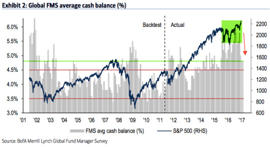
Global equities: Fund managers were just +5% overweight equities at their low in February; since 2009, allocations had only been lower in mid-2011 and mid-2012, periods which were notable bottoms for equity prices during this bull market. Allocations in December have jumped to +31% overweight, a 12-month high. This is now neutral (0.1 standard deviation above the long term mean). Over +50% overweight has historically been bearish (dashed line).
In February, 16% of fund managers expected a weaker economy in the next 12 months, the lowest since December 2011. They are now optimistic: 57% expect a stronger economy in the next year, a 19-month high. Pessimism explained their prior low allocation to equities and high allocation to cash; that has now flipped.
US equities: US exposure had been near an 8 year low during the past year and a half, during which US equities outperformed. US equities have been under-owned. That's changed. In December, fund managers were +15% overweight. This is 0.9 standard deviations above its long term mean. Bearish sentiment is no longer a tailwind for US equities. Above +20% overweight and sentiment would become a headwind (dashed line). Close, but not yet.
European equities: Fund managers had been excessively overweight European equities for more than a year in 2015-16, during which time EZ equities underperformed. That changed in July, with the region becoming underweighted for the first time in 3 years. That improved to +8% overweight in November before falling back to -1% underweight in December. This is 0.6 standard deviations below its long term mean, a slight contrarian long opportunity.
Japanese equities Allocations to Japan had been falling in 2016 after excessive bullishness in 2015. Allocations fell to -8% underweight in September, the lowest since December 2012. Now, allocations have jumped back to +21% overweight. This is 0.6 standard deviations above its long term mean. Bullish sentiment is close to becoming a headwind (dashed line)
Emerging markets equities: We said in October, "the contrarian long in emerging markets is over." A brief recap: in January 2016, allocations to emerging markets fell to their second lowest in the survey's history (-33% underweight). As the region outperformed in 2016, allocations rose to +31% overweight in October, the highest in 3-1/2 years. That made the region the consensus long. Emerging equities have dropped sharply in the past two months. Allocations are now +3% overweight. This is 0.7 standard deviations below its long term mean. The region is no longer the consensus long and probably in the process of resetting for the next push higher.
Global bonds: Fund managers are -58% underweight bonds, a fall from -35% in July (which was near a 3-1/2 year high allocation). This is 0.8 standard deviations below its long term mean. A capitulation low in the past has often occurred when bonds were -60% underweight (red arrows and dashed line).
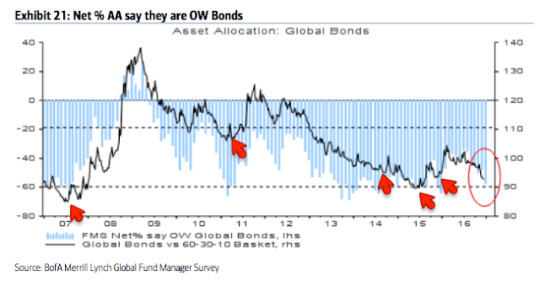
Of note, fund managers' inflation expectations have jumped to the highest level in 12-1/2 years. This explains some of the sell off in bonds in the past several months. It's notable that current levels have marked at least a short-term reversal point in yields in the past.
Similarly, in the past two months, there has been a massive increase in the percentage of fund managers who believe the yield curve will steepen in the next year. This is now at the highest level in 3-1/4 years. Similar cases, at either a high level or following a steep increase, have led to at least a short-term reversion lower in yields.
Commodities: Allocations to commodities are now at a 4-year high (+5% overweight). This 0.5 standard deviations above its long term mean. In comparison, in February, allocations were near one of the lowest levels in the survey's history (-29% underweight). The improvement in commodity allocations goes together with increased macro optimism.
Sectors: Relative to history, managers remain overweight cash, but much less so than in the past year and a half. For the first time in many months, managers are more weight equities than bonds. The allocation to equities would be higher if it were not for underweighted positions in emerging markets and Europe. US equities are overweighted relative to history.

Fund managers' risk appetite had been well below the mean during 2016; during the current bull market, risk appetite had only been materially lower in mid-2011 and 2012, relative lows from which equities rose strongly in the following months. That has now changed, with risk appetite at 13-month highs and neutral relative to the long term mean. Risk appetite is the average of fund managers cash, investment horizon and investment risk (e.g., equity allocation and sector weighting).
Dollar: Since 2006, fund managers surveyed by BAML have been very good at determining when the dollar is overvalued. In March 2015, they viewed it as overvalued for the first time since 2009; the dollar index fell from 100 to 93 in the next two months. In late 2015, they again viewed the dollar as overvalued and the index lost 7%. In November and December, fund managers view the dollar as overvalued for the first time since April 2016 (and by the the third highest amount in 10 years), during which time the index has gained more than 7%. Under similar conditions (highlighted in green), the dollar has fallen in value in the month(s) ahead.

2 notes
·
View notes
Text
Why stocks might fall in the next 2 weeks

In the past week, SPX, DJIA and RUT have all made new all-time highs (ATH). Each is within 1% of those highs today. All of their respective moving averages, from 5-d to 200-d, are rising. This is the definition of an uptrending equity market. Enlarge any chart by clicking on it.
The trend higher is not perfect. It rarely is. In this case, the technology-heavy Nasdaq index is lagging. In particular, NDX is presently below a flat 50-d. It led out of the February low, gaining 25% through October, so it could be consolidating those gains. It has largely moved sideways since August. Note how NDX has not been able to remain overbought in the past 4 months (top panel).
It's hard to find fault in breadth. All 6 cyclical sectors (financials, technology, discretionary, industrials, energy and materials) have recently made 1-year highs. The equal-weight SPX index is at an 18-month high relative to the market capitalization-weighted index. The laggards are defensive sectors (healthcare, utilities and staples).

The macro environment is supportive of longer term gains in US equities (a recent post on this is here).
Valuations are rich. This is a potential long-term headwind. But sales and earnings are once again growing after a false "earnings recession" brought about by the collapse in the price of oil. By some measures, profit margins are at a new high (a recent post on this is here).

So, is the coast is clear? Not quite.
Volatility has plunged by half since the election. That in itself is not a headwind, but 1-month protection is now trading at less than 80% of 3-month protection for the first time since September. When this has happened in the past, SPX has tended to chop sideways for the next 1-2 weeks; any gains have tended to be given back (shading).
Moreover, investors are leaning towards excessive short-term bullishness (longer term bullishness, as measured by equity fund flows and fund manager cash, are supportive of further gains in equities; read further here and here). The trailing 1-month equity-only put/call ratio is now at a level where every rally since August 2014 has stalled.
Importantly, the equity-only put/call ratio could continue to fall. In the chart above, it is clear that this has happened many times in the past prior to August 2014. It takes bulls to make a bull market. This is not a mechanical set up.
December is well-known for having a bullish seasonal bias. But those gains have, on average, accrued in the second half of the month. The period from now and for the next 1-2 weeks has typically been weak (from Stock Almanac).
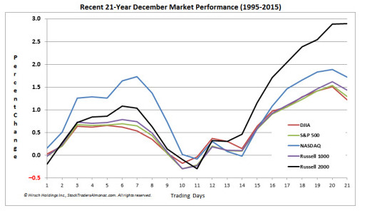
That pattern has been the case, for example, the past several years. Declines have been between 3% and 5% (blue shading). A similar drop now would bring SPX to its 50-d at around 2150. The last exception was in 2011 (green shading); in that year, SPX had ended a 5% drop on November 30th.
So, there's a set-up for US equities to be weak (or to at least trade sideways) in the next few weeks. With equities trading higher again today, there is no price reversal to trade against. A price reversal could be marked by a high wick candle or by price closing under it's 5-d and the slope of the 5-d flattening and then inverting. Importantly, neither of these has happened yet. On a hourly basis, the index has remained more frequently 'overbought' and infrequently 'oversold' in the past month. This is a sign of strength in trend (top panel).
4 notes
·
View notes
Text
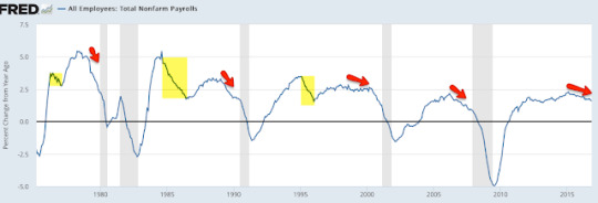
Employment growth is slowing

The macro data from the past month continues to mostly point to positive growth. On balance, the evidence suggests the imminent onset of a recession is unlikely.
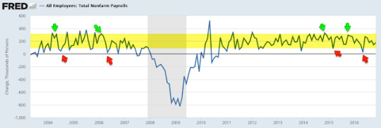
That said, there are some signs of weakness creeping into the data. Most importantly, employment growth is decelerating, from over 2% last year to 1.6% now. Housing starts and permits have flattened over the past year. There is nothing alarming in any of this but it is noteworthy that expansions weaken before they end, and these are signs of some weakening that bear monitoring closely.
Overall, the main positives from the recent data are in employment, consumption growth and housing:
Monthly employment gains have averaged 188,000 during the past year, with annual growth of 1.6% yoy. Full-time employment is leading.
Recent compensation growth is near the highest in 7 years: 2.5% yoy in November.
Most measures of demand show 3-4% nominal growth. Real personal consumption growth in October was 2.8%. Retail sales reached a new all-time high in October, growing 2.6% yoy.
Housing sales are near a 9 year high. Starts made a new 9 year high in October.
The core inflation rate has remained near 2% since November 2015.
The main negatives are concentrated in the manufacturing sector (which accounts for less than 10% of employment):
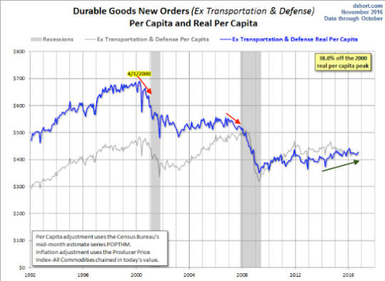
Core durable goods growth rose 1.0% yoy in October. It was weak during the winter of 2015 and it has not rebounded since.
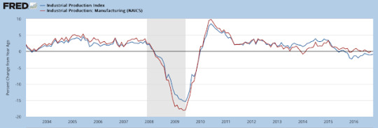
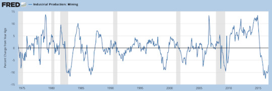
Industrial production has also been weak, falling -1.0% yoy due to weakness in mining (oil and coal). The manufacturing component grew +0.1% yoy.
Employment and Wages
The November non-farm payroll was 178,000 new employees less 2,000 in revisions.
In the past 12 months, the average monthly gain in employment was 188,000.
Monthly NFP prints are normally volatile. Since 2004, NFP prints near 300,000 have been followed by ones near or under 100,000. That has been a pattern during every bull market; NFP was negative in 1993, 1995, 1996 and 1997. The low prints of 84,000 in March 2015 and 24,000 in May 2016 fit the historical pattern. This is normal, not unusual or unexpected.
Why is there so much volatility? Leave aside the data collection, seasonal adjustment and weather issues; appreciate that a "beat" or a "miss" of 80,000 workers in a monthly NFP report is equal to just 0.05% of the US workforce.
For this reason, it's better to look at the trend; in November, trend employment growth was 1.6% yoy. Until this spring, annual growth had been the highest since the 1990s. Ahead of a recession, employment growth will likely markedly fall (arrows). Continued deceleration in employment growth in the coming months is therefore a critical watch out.
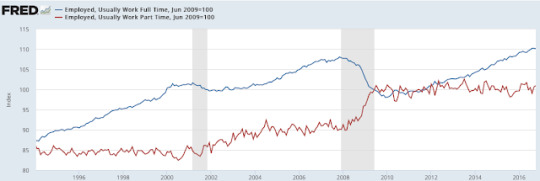
Employment has been been driven by full-time jobs, which are at a new all-time high (blue line), not part-time jobs (red line).
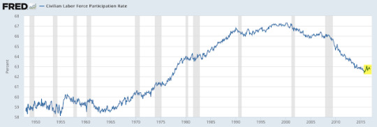
The labor force participation rate (the percentage of the population over 16 that is either working or looking for work) has been falling. This has little to do with the current recovery; the participation rate has been falling for more than 16 years. Participation is falling as baby boomers retire, exactly as participation started to rise in the mid-1960s as this group entered the workforce. Another driver is women, whose participation rate increased from about 30% in the 1950s to a peak of 60% in 1999.
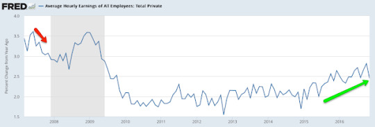
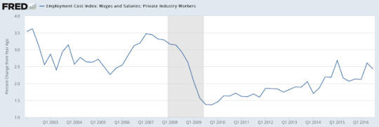
Average hourly earnings growth was 2.5% yoy in November, near the highest growth rate in 7 years. This is a positive trend, showing demand for more workers. Sustained acceleration in wages would be a big positive for consumption and investment that would further fuel employment.
Similarly, 3Q16 employment cost index shows compensation growth was 2.4% yoy. This is near the highest growth rate since the recession.
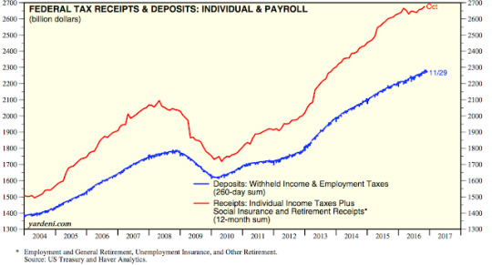
For those who doubt the accuracy of the BLS employment data, federal tax receipts have also been rising to a new high (red line), a sign of better employment and wages (from Yardeni).
Inflation
Despite steady employment growth, inflation remains stuck near the Fed's target of 2%. But note: CPI and PCE are finally beginning to tick higher.
CPI (blue line) was 1.6% last month. The more important core CPI (excluding more volatile food and energy; red line) grew 2.2%, among the highest levels since 2008 although still just oscillating near 2%.
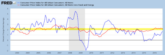
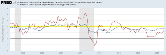
The Fed prefers to use personal consumption expenditures (PCE) to measure inflation; total and core PCE were 1.4% and 1.7% yoy, respectively, last month. Neither has been above 2% since 2Q 2012.
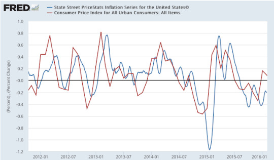
For some reason, many mistrust CPI and PCE. MIT publishes an independent price index (called the billion prices index). It has tracked both CPI and PCE closely.
Demand
Regardless of which data is used, real demand has been growing at about 1.5-3%, equal to about 3-4% nominal.
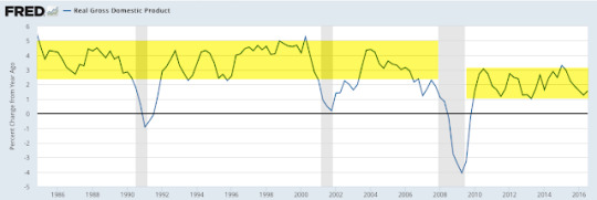
Real (inflation adjusted) GDP growth through 3Q16 was 1.6% yoy. 2.5-5% was common during prior expansionary periods since 1980.
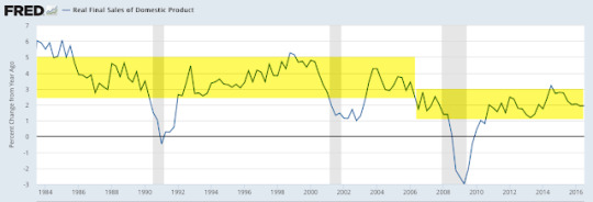
Stripping out the changes in GDP due to inventory produces "real final sales". This is a better measure of consumption growth than total GDP. In 3Q16, this grew 1.9% yoy. A sustained break above 2.5% would be noteworthy.
Similarly, the "real personal consumption expenditures" component of GDP ( defined), the component which accounts for about 70% of GDP, grew at 2.7% yoy in 3Q16. The last eight quarters have seen the highest persistent growth rate since 2006. This is approaching the 3-5% that was common in prior expansionary periods after 1980.
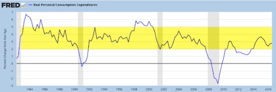
On a monthly basis, the growth in real personal consumption expenditures was 2.8% yoy in October.

Real GDI growth in 3Q16 was 2.0% yoy.
Real retail sales reached a new all-time high in October, with annual growth of 2.6% yoy. The range has generally been centered around 2.5% yoy for most of the past 20 years.
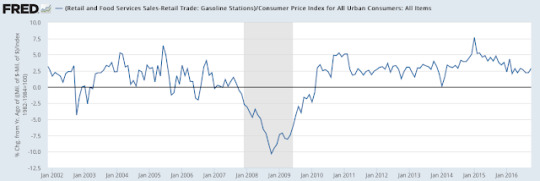
Retail sales in the past year have been strongly affected by the large fall in the price of gasoline. Real retail sales at gasoline stations fell by 1% yoy after having fallen more than 20% yoy earlier this year. Real retail sales excluding gas stations grew 2.9% in October.
The main negatives in the macro data are concentrated in the manufacturing sector, as the next several slides show. It's important to note that manufacturing accounts for less than 10% of US employment, so these measures are of lesser importance.
Core durable goods orders (excluding military, so that it measures consumption, and transportation, which is highly volatile) rose 1.0% yoy (nominal) in October. Weakness in durable goods has not been a useful predictor of broader economic weakness in the past (arrows).
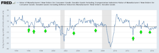
This is a nominal measure and thus negatively impacted by the weak inflation rate. On a real basis, growth continues to trend weakly higher (blue line is real; gray line is nominal; chart from Doug Short).
Industrial production growth fell -1.0% in October. The more important manufacturing component (excluding mining and oil/gas extraction; red line) was flat yoy. It's a volatile series: manufacturing growth was lower at points in both 2013 and 2014 before rebounding strongly.
Weakness in total industrial production is concentrated in the mining sector, which fell 7% yoy in October; the past year had the worst annual fall in more than 40 years. It is not unusual for this part of industrial production to plummet outside of recessions.
Housing
Housing sales in July reached a new 9 year high and remained near those levels in October. Housing starts made a new 9 year high in October. Overall levels of construction and sales are small relative to prior bull markets but the trend is higher.
First, new houses sold was 563,000 in October, slightly lower than July's sales which were at the highest level in the past 9 years. Growth was 18% over the past year after rising 1% yoy in October 2015.
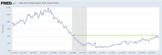
Second, overall starts made a new 9 year high in October. Prior to October, growth in starts had flattened over the previous 18 months.
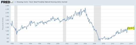
Building permits have been increasing every month since March, although the overall trend in growth has been flattening since April 2015 (red line).

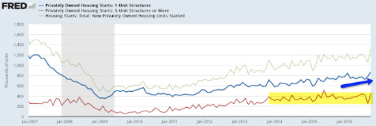
Single family housing starts (blue line) were the highest since the recession in October. Multi-unit housing starts (red line) are flat over the past three years; this has been a drag on overall starts.
Summary
In summary, the major macro data so far suggest positive, but slow, growth. This is consistent with corporate sales growth. SPX sales growth the past year has been positive but only about 2% (nominal).
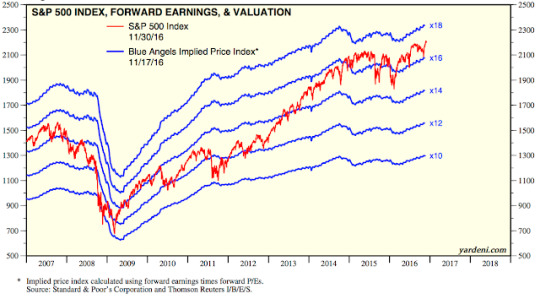
With valuations now well above average, the current pace of growth is likely to be the limiting factor for equity appreciation. This is important, as the consensus expects earnings to grow about 1% in 2016 (chart from Yardeni).
Modest growth should not be a surprise. This is the classic pattern in the years following a financial crisis like the one experienced in 2008-09. Unlike typical cyclical expansions, consumers have reduced their relative debt, and this has constrained their consumption.
There has been a tendency for macro data to underperform expectations in the first half of the year and beat expectations in the second half. For the first time since 2009, macro expectations were below zero to start the year and have been positive most of the second half of the year.
3 notes
·
View notes
Text
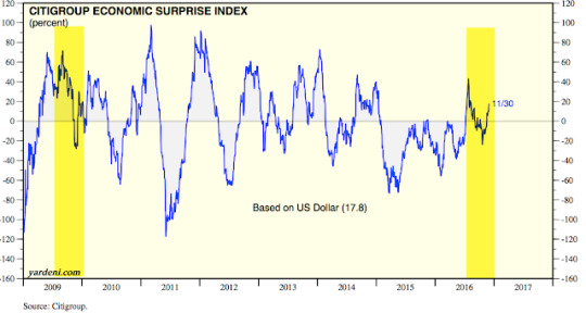
What happened to the earnings recession?

A year ago, profits for companies in the S&P had declined 15% year over year (yoy). Sales were 3% lower. Margins had fallen more than 100 basis points. The consensus believed all of this signaled the start of a recession in the US.
The chart below was from Barclays at the start of the 2016, who said that big drops in profitability like those last year have coincided with a recession 5 of the last 6 times since 1973 (read further here). Enlarge any chart by clicking on it.
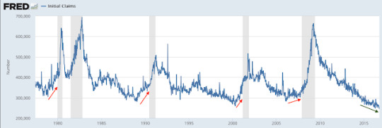
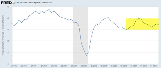
How have these dire prognoses for the US worked out? In a word: terrible. Jobless claims are at more than a 40 year low (first chart below) and retail sales are at an all-time high. US demand growth, measured a number of different ways, has been about 3-4% nominal yoy during the past two years (second chart below). There has been no marked deterioration in domestic consumption or employment.
So is the resilience of the US economy in the face of deteriorating sales and profits a surprise? Not at all. We wrote about this at the time saying that there was little in corporate reports to suggest that a recession was imminent (that post is here). Events since then bear this analysis out and provide a lesson in how to objectively read quarterly earnings reports.
Let's review the latest corporate reports. More than 90% of the S&P 500 has reported their sales and earnings for 3Q16.
Overall sales are 2.4% higher than a year ago. This is the best sales growth since 4Q14 - almost 2 year ago. On a trailing 12-month basis (TTM), sales are just 0.2% higher yoy, but it's the first annual rise on a TTM-basis in the past 5 quarters (all financial data in this post is from S&P).
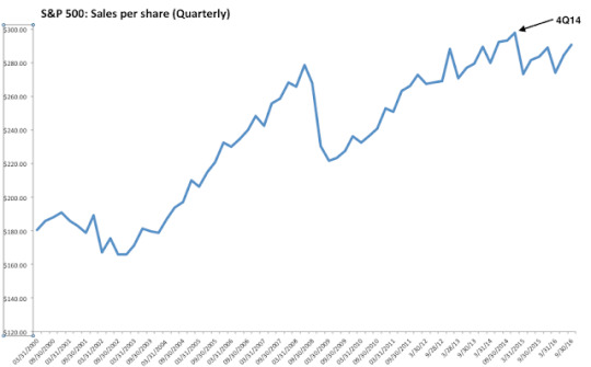
In the chart above, note that overall S&P sales are still about 2% lower than their peak in 4Q14. Why has sales growth been sluggish?
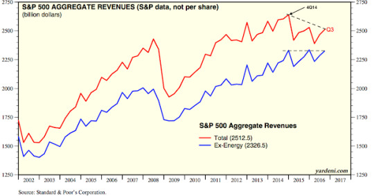
It's primarily due to oil prices, which peaked at the end of 2Q14 and then fell 70% before bottoming in February 2016. Energy sector sales fell by 60% between mid-2014 and early 2016 (red line). This has had a substantial impact on overall sales, as energy was one of the largest sectors in the S&P in mid-2014. Materials sales have also fallen, but the sector is very small.

If overall S&P sales since 2014 were indicating widespread economic weakness, then we should have expected to see declining sales growth in many sectors, not just in energy and materials. We didn't.
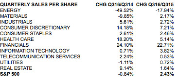
In the past two years, industrial sector sales are up 6%, discretionary sales are up 14%, health care sales are up 18% and financials sales are up 24%. Outside of energy and materials, only utilities have seen a decline, a loss of a mere 1% (middle column).
Excluding the energy sector, the combined sales of the other sectors in the S&P are back at their prior highs from 2014 and 2015 (blue line). Simply stated: corporate sales never indicated widespread weakness in the economy (from Yardeni).
Let's now look at earnings.
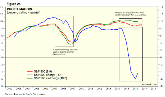
Overall EPS (GAAP-basis) are 11.5% higher than a year ago. This is the best EPS growth since 3Q14 two years ago. But on a trailing 12-month basis (TTM), EPS are 1.2% lower yoy. TTM EPS are still negative because yoy EPS declined six quarters in a row between 3Q14 and 1Q16.

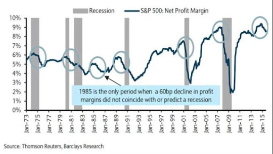
Given the forgoing discussion on sales growth, it should come as no surprise that corporate profitability peaked right before the rapid fall in energy prices. In 3Q14, profit margins were 10.1%; that fell to a low of 8% in 4Q15.
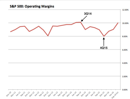
In the chart above, note that margins have now rebounded to 10.0%. That's right, overall profit margins are right back at their prior highs from 2014. How is this possible?
For most sectors, margins expanded between 3Q14 and 3Q16 (second column). The big outlier was energy. Energy had an outsized affect on overall margins and falsely indicated a high risk of recession.
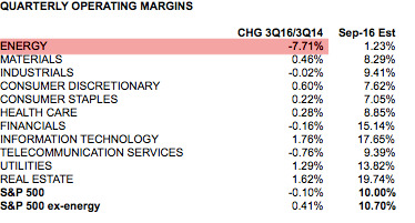
Recall that sales growth for energy companies fell by 60% between mid-2014 and early 2016. Even with flat margins, energy profits would have also fallen 60%. But energy profit margins fell from 9% in 3Q14 to negative 11% in 4Q15. This one sector was the source for nearly all of the decline in the overall margins from 3Q14 to 4Q15.
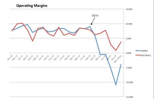
Without the negative drag from energy, total margins for the S&P are now higher (10.7%) than they were in 3Q14 (10.3%). Margins are at a new high.

Nearly all of the interim weakness in profitability was related to weakness in energy. That the other sectors showed continued strength was a very strong indication that corporate results were not indicative of an imminent recession (from Yardeni).
Over the past two years, there have been several knocks on the practice of excluding energy from the other sectors. Most of these miss a basic truth: that in the past, large drops in energy sales and profits have falsely signaled economic risks that did not then materialize.
We detailed all of these issues in the past (here). Below is a quick recap:
Excluding energy is not "like excluding technology in 2000 or financials in 2007". Technology and financial stocks were in a bubble in 2000 and 2007, respectively; their market capitalization weighting in the S&P reached an extreme ahead of both of the subsequent bear markets. That was not at all the case for energy in 2014.
The environment since 2014 is nothing like 2006-07 because financial excesses in the banking sector are completely unlike excesses in energy or any other sector. Banks that are excessively leveraged are at risk of failure; when they retrench, lending to the rest of the economy is reduced, creating a drop in investment and consumption and a recession. Banks are a source of systemic risk; other sectors are not.
Lower gas prices do not materially impact other consumer spending. Gas represents only 5% of a typical family's consumer spending.
Lower oil prices don't have a notable positive impact on margins for most of the other large sectors. The importance of oil as an input cost is too minor. Note that most facility energy is produced using coal, natural gas, nuclear power and renewables.
That the drop in energy since 2014 once again has not resulted in an economic recession shows that excluding energy in an analysis of sales and profits was right.
Let's also update two other misconceptions about earnings.
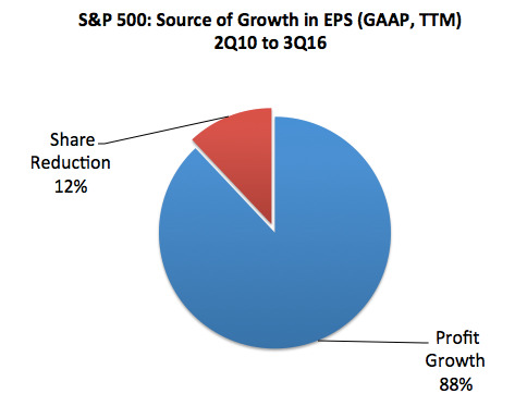
The first is that corporate buybacks have been the main source of profit growth. This is false; almost 90% of the growth in earnings in the S&P since 2010 has come from better profits, not share reductions. This is a topic we have specifically addressed before (most recently here).
The second misconception is that "operating earnings" have abnormally deviated from earnings based on GAAP in recent quarters. It is true that earnings are both overstated and smoothed on an operating basis, but that has been the case over several decades. This is not new.

The difference between operating and GAAP earnings is now about 12%, which is close to the median over the past 25 years. Operating earnings overstated profits by much more in the 1990s bull market and earlier in the current bull market. The biggest differences have always been during bear markets.

In summary, S&P profits have grown 12% in the past year. Sales are 2.4% higher. By some measures, profit margins are at new highs. Why were the critics, who expected weak sales and profits a year ago to be a signal of an imminent recession, wrong? They confused a collapse in one sector - energy, where sales dropped by 60% - with a general decline in all sectors. Energy was considered the same as financials in 2007-08; events since then show that it is nothing like financials.
Where critics have a valid point is valuation. Even excluding the troubled energy sector, valuations were rich at the end of 2014 and remain so today. These valuations are at the same level as in mid-2007 when the prior bull market ended (from Yardeni).
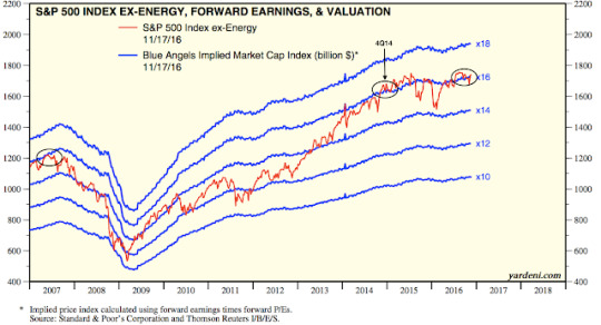
With economic growth of 3-4% (nominal), it will likely take exuberance among investors to propel S&P price appreciation at a significantly faster annual clip. Why? When investors become bullish (blue line), valuations rise (red line). Investors have most recently been pessimistic; they are now neutral. If oil prices and the dollar stabilize, earnings growth may be only 3-5% TTM yoy but valuations could push the equity market much higher (from Yardeni).

2 notes
·
View notes
Text
China and Regulations Did Not Kill Manufacturing Jobs in the US

The Economist:
In the early postwar decades, the American economy grew at a healthy clip. Millions of Americans earned a middle class wage by working in manufacturing. In recent decades, rising inequality and the stagnation of middle class earnings have generated a wave of nostalgia for the postwar economy, and for manufacturing employment in particular. If only America hadn't lost its manufacturing edge, all would be well.
You might reasonably guess that manufacturing in the US is in a secular downtrend. It's not. Real output is at an all-time high (ATH). It has nearly doubled in the past 30 years.

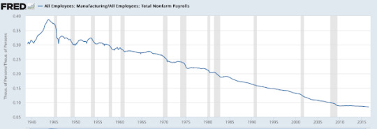
Why then do we believe otherwise? The answer is manufacturing employment, which has been in a long term secular decline. Manufacturing employment peaked in 1979. Today, it is about half of those levels.

Increasing global trade is not the primary culprit in the decline in US manufacturing employment. Again, output is at an ATH. Manufacturing jobs have fallen with new technology and other means for increasing productivity. The number of employees needed to make the same output has more than halved in the past 30 years.
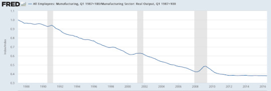
Bear in mind that the complexity of products being produced has increased during this time. The increase in productivity is much more stunning when you look at within the same industries.
Take steel production, for example. In the 1950s, it took 5000 workers to produce the same tonnage of steel that can today be produced with just 400 workers.
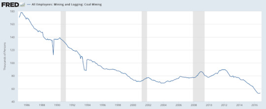
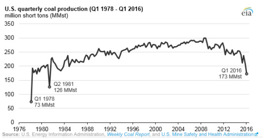
Coal is another example. Employment in coal mining today is about 60,000 workers, less than 1/3 of the levels 30 years ago. Yet since the early 1980s, output is about the same, having reached its ATH as recently as 2008.
The US economy has not been driven by manufacturing employment in decades. In 1953, more than 30% of total employment was in manufacturing. Today, it is about 8%.
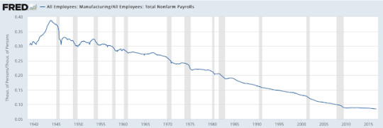
The downtrend in the importance of manufacturing employment is more than 70 years old. No amount of deregulation, dollar devaluation or protectionist/isolationist policies will resurrect employment in manufacturing industries. As The Economist summarizes:
The manufacturing employment downtrend predates the end of Bretton Woods. It predates the union-crushing, deregulating era of the late 1970s and early 1980s. It predates the era of Japanese dominance, the rise of the Asian tigers, and the recent surge in Chinese growth. A plunging dollar, a "get tough" approach to China, and an embrace of industrial policy won't reverse this trend.
4 notes
·
View notes
Text
Does A New President Bring A New Recession?

Will 2017 bring a recession? The calendar says it's likely.
The Great Recession officially ended in June 2009, 7-1/2 years ago. That is already a long time without a recession. Since 1900, the US has stayed out of a recession longer only two other times: the 1960s (9 years) and the 1990s (10 years).
There have been 23 recessions since 1900, and 21 of them have taken place within 8-1/2 years of the prior one's end. So, the historical odds based on the calendar say the next recession is likely to start in 2017 (21/23 = 91%).
Notably, the time between recessions has been expanding over time. At the turn of the 20th century, recessions took place very other year. They now take place nearly every other decade. Consider the following:
Between 1900 and 1928: a recession every 1 year and 10 months.
Between 1929 and 1949: a recession every 3 years and 8 months.
Since 1950: a recession every 5 years and 9 months.
Since 1990: a recession every 8 years.
If you are thinking that recessions used to be short and shallow and now they are less frequent but deeper, you are exactly wrong. GDP fell 5% during the Great Recession. Between 1880 and 1928, economic activity fell an average of about 20% with each recession. At least 3 were worse than the Great Depression.
It's worth stressing that the timing of each recession has little to do with the election of a new president. Before Truman, at least one recession began during every presidency. Since then, there have been 5 presidencies where a recession never started after their election until they left office (Truman, Kennedy, Johnson, Clinton, Obama). In other words, in the past 67 years, in only about half of the presidencies has a new recession started (6/11 = 55%).
The following table lists every newly elected president in the past 120 years and the time between their inauguration and the start of the next recession. Based on this, the next recession either started a year ago or will not occur at all during the Trump presidency. That is not a very useful predictor.
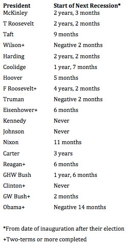
Using only two term presidencies substantially lowers the sample size but doesn't change the result. Prior to Obama, there have only been 6 complete two term presidencies since Ulysses S. Grant 140 years ago (Wilson, FDR, Eisenhower, Reagan, Clinton and Bush). That's a small sample and in two cases a recession did not start during the term of the next elected president (Truman and Kennedy). Those odds are approaching random.
We have previously discussed other fallacies surrounding presidential cycles. Year 3 of a presidential term is supposed to the best for the stock market, gaining an average of 22% since 1950. In the 60 years prior to 2015, it had never been negative. We wrote about this before Obama's second 3rd year started, saying that the stock market was unlikely to follow the historically bullish pattern. In the event, the S&P lost 1% in Year 3 (that post is here).
Why did this presidential cycle set up fail? Because the year of the presidential term is irrelevant. What is important is what the stock market has done in the prior two years. Good years in the stock market follow bad years. 86% of the time, a recession or bear market has taken place in the two years prior to Year 3. That's why the market often rallies in Year 3. The presidential cycle on its own is irrelevant.
Nevertheless, given the propensity for recessions to occur every 8 years or so, a recession in the next year seems likely. Is it a slam dunk? No way.
Australia has not had a recession since 1991, 25 years ago. Poland has gone 21 years and South Korea has gone 18 years without a recession (data from WSJ).
If nothing else, appreciate that expansions don't blindly follow the calendar or die at some predetermined definition of old age. Like Year 3 of the presidential cycle for the stock market, there is more to it than that.
Why might this expansion cycle continue longer in the US?
For starters, the current recovery in the US has been slow growing, in part due to consumer's deleveraging (first chart below) and discretionary fiscal spending from the government being restrained (second chart). A change in either of these could keep the current expansion moving forward through 2017 and beyond. Moreover, the cause of the Great Recession was different than any other recession in the past 80 years. It was also far deeper. It's therefore conceivable that the recovery will also be much different than other post-war recoveries.

More to the point, there are better ways to forecast the next recession than counting months on a calendar or focusing on changes in the presidency. How?
By monitoring changes in the macro data. A persistent slow down in retail sales, housing consumption, employment growth and other macro indicators will likely be a better method for indicating when a recession is becoming more likely. This is the stuff that matters most; the calendar and presidential terms are demonstrably inadequate on their own. Our regular commentary on the macro environment can be found here.
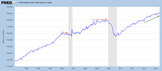
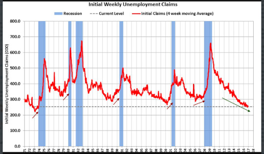
The most important point of this post is this: the danger in relying solely on a calendar or a change in the presidency to forecast a recession is that it makes a recession in 2017 appear to be a fait accompli. It's not, and believing it is closes your mind to other possibilities. Maintaining a mind open to changes in the data and the opportunities they present is the essence of successful investing.
5 notes
·
View notes
Text
Fund managers expect higher inflation. That has been bad for yields

Among the various ways of measuring investor sentiment, the BAML survey of global fund managers is one of the better as the results reflect how managers are allocated in various asset classes. These managers oversee a combined $600b in assets.
The data should be viewed mostly from a contrarian perspective; that is, when equities fall in price, allocations to cash go higher and allocations to equities go lower as investors become bearish, setting up a buy signal. When prices rise, the opposite occurs, setting up a sell signal. We did a recap of this pattern in December 2014 (post).
Let's review the highlights from the past month.
Cash: Fund managers' cash levels dropped from 5.8% in October to 5% in November. That is a big drop for one month but recall that 5.8% was the highest cash level since November 2001. Cash has remained above 5% for all of 2016, the longest stretch of elevated cash in the survey's history. Some of the wind behind the rally has faded but cash remains supportive of further gains in equities. A significant further drop in cash in the month ahead, however, would be bearish. Enlarge any image by clicking on it.
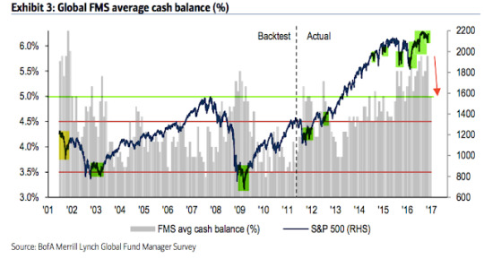
Global equities: Fund managers were just +5% overweight equities at their low in February; since 2009, allocations had only been lower in mid-2011 and mid-2012, periods which were notable bottoms for equity prices during this bull market. Allocations in November are only marginally higher, at +8% overweight. This is 0.8 standard deviations below the long term mean and supportive of further gains in equities in the month(s) ahead.
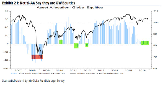
In February, 16% of fund managers expected a weaker economy in the next 12 months, the lowest since December 2011. Investors are still pessimistic, with only 35% expecting a stronger economy in the next year, but expectations are moving higher (the current month is the highest in a year). This explains the persistent low allocations to equities and high allocations to cash.
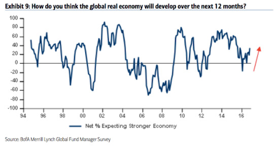
US equities: US exposure had been near an 8 year low during the past year and a half, during which US equities outperformed. US equities have been under-owned. After rising for two months this summer, allocations fell again to -7% underweight in both September and October. In November, fund managers were just +4% overweight. This is 0.4 standard deviations below its long term mean. Bearish sentiment remains a tailwind for US equities.

European equities: Fund managers had been excessively overweight European equities for more than a year in 2015-16, during which time EZ equities underperformed. That changed in July, with the region becoming underweighted for the first time in 3 years. That improved slightly to +5% overweight in both September and October and to +8% overweight in November. This is 0.3 standard deviations below its long term mean; it's now close to neutral. EZ equities have outperformed in the past 5 months since becoming underweighted.
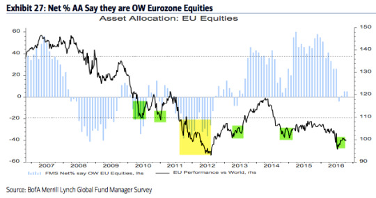
Japanese equities: Allocations to Japan have been falling in 2016 as the region has underperformed. Allocations fell to -8% underweight in September, the lowest since December 2012, before rising slightly to -5% underweight in November. This is 0.4 standard deviations below its long term mean.
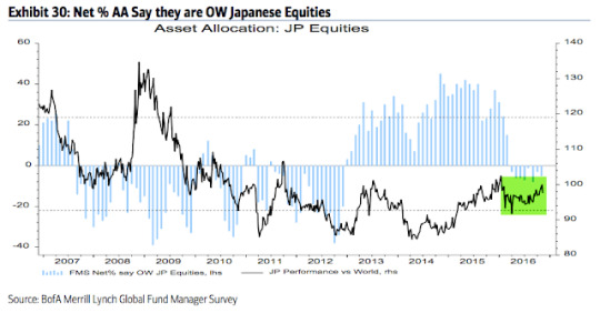
Emerging markets equities: As we said last month, "the contrarian long in emerging markets is over." A brief recap: in January, allocations to emerging markets fell to their second lowest in the survey's history (-33% underweight), an extreme comparable only to early-2014 from which the region began to strongly outperform. As the region outperformed the rest of the world again in 2016, allocations rose to +31% overweight in October, the highest in 3-1/2 years. That made the region the consensus long. Emerging equities have dropped sharply in the past month. Allocations are now +4% overweight. This is 0.6 standard deviations below its long term mean. The region is no longer the consensus long and probably in the process of resetting for the next push higher.
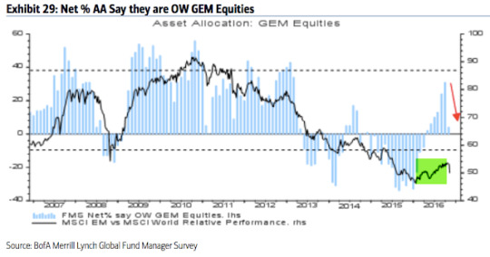
Global bonds: Fund managers are -48% underweight bonds, a fall from -35% in July (which was near a 3-1/2 year high allocation). This is neutral relative to the long term mean. Bonds outperformed in the 10 months before the current equity rally began in February, as allocations increased from -64% underweight in December (a 2-year low; green shading). They have since underperformed. Bonds are already out of favor but a capitulation low in the past has sometimes occurred when bonds were -60% underweight (red shading).
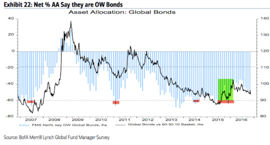
Of note, fund managers' inflation expectations have jumped to the highest level in 12-1/2 years. This explains some of the sell off in bonds in the past several months. It's notable that current levels have marked at least a short-term reversal point in yields in the past.

Similarly, in the past month, there was a massive increase in the percentage of fund managers who believe the yield curve will steepen in the next year. This is now at the highest level in 3-1/4 years. Similar cases, at either a high level or following a steep increase, have led to at least a short-term reversion lower in yields.

Commodities: Allocations to commodities rose to a 4-year high last month and remain there this month (-2% underweight). This is neutral relative to the long term mean. In comparison, in February, allocations were near one of the lowest levels in the survey's history (-29% underweight). The improvement in commodity allocations usually goes together with that for emerging market equities.
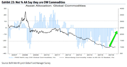
Sectors: Relative to history, managers are extremely overweight cash. They are more weighted towards bonds than equities. Overall, this is very defensive positioning.
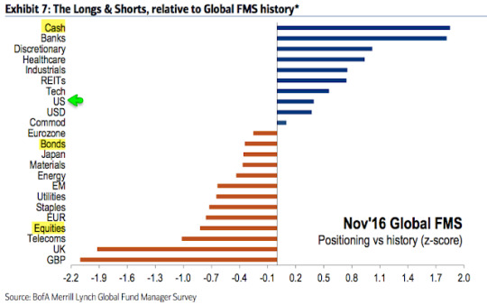
Dollar: Since 2006, fund managers surveyed by BAML have been very good at determining when the dollar is overvalued. In March 2015, they viewed it as overvalued for the first time since 2009; the dollar index fell from 100 to 93 in the next two months. In late 2015, they again viewed the dollar as overvalued and the index lost 7%. This month, fund managers view the dollar as overvalued for the first time since April 2016, during which time the index has gained more than 7%. Under similar conditions (highlighted in green), the dollar has fallen in value in the month(s) ahead.

1 note
·
View note
Text
Big Gains In Small Stocks

The Russell 2000 (RUT) index of small cap stocks is at a new all-time high today. This new high is coming after the index has risen more than 13% over the past 10 days.
We think of strong gains in a short period of time as the initiation of a new uptrend. In other words, stocks fall hard into a capitulatory low and then reverse. The strong "impulse" higher from the low means that investors are switching sides and chasing price higher. That momentum most often continues into the weeks ahead. This is how new uptrends typically begin.
That's not always the case; there are exceptions, but there are exceptions to every pattern in the markets. Still, the odds overwhelming favor further upside: according to Ryan Detrick, RUT has risen more than 13% in a 10 day period 21 times before. In all but one, the index was even higher a month later. Since 1991, the median gain was 3%.
Which makes the current rise over the past 10 days an historical anomaly. The chart below looks at prior gains of 13% over 10 days since 1991. All occurred during or after a bear market. In each case, the gain of 13% either started at a significant low or was within a just few weeks one. Enlarge any image by clicking on it.
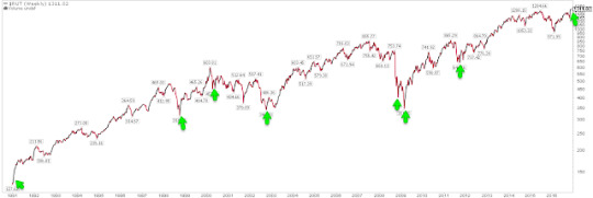
In comparison, the current rally started 9 months after RUT made a significant low, in February 2016. The index was more than 20% higher than that when the current gain of 13% started on November 3.
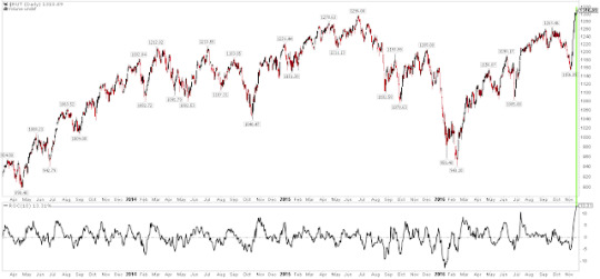
Let's look at the other 9 cases since 1991.
1991 was a bear market low and the strong gains in RUT initiated a fresh bull market during which the index tripled.
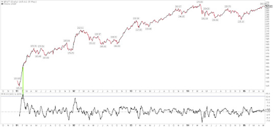
That was also the case in 1998. RUT had fallen 40% in the prior 5 months before doubling in the next 1-1/2 years (first green line in the chart below).
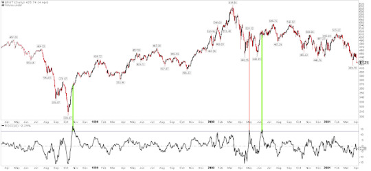
The next bear market started in 2000. After falling 25%, RUT shot up 13% May 2000. That was a false bottom (red line in the chart above). In June, the index shot up again and continued another 6% higher until September; that month, the bottom fell out of the Nasdaq, sending all the indices lower with RUT losing 40% in the next 2 years (second green line).
The subsequent bear market low, in October 2002, was also marked by a strong kickoff rally in RUT and the initiation of a new bull market, during which RUT eventually gained 140%.
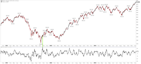
Like the 2000 bear market, the one that ended in 2009 was marked by a false rally before the final low. Unlike May 2000, RUT continued another 16% higher in December 2008 (first green line). Of course, March 2009 initiated a new bull market, during RUT doubled in the next 2 years (second green line).
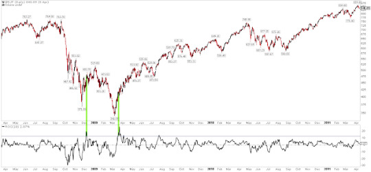
The final example comes from October 2011. Like 1998, RUT had fallen 40% in 4 months before impulsing higher. The index doubled in the next 2 years.
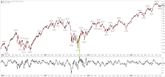
So what does this mean for RUT (and the other indices) now?
Again, in 20 of 21 (95%) prior examples, this "impulse" pattern sent RUT higher a month later, by a median of 3%. Add to that positive end of year seasonality and that investor sentiment was very bearish a month ago when the indices were heading into their lows, and the likelihood is that RUT adds to these gains through December (read further here).
It's worth stressing again, however, that the current case is very different from the others. RUT was at a significant low during or after a bear market in each of the others; in comparison, RUT is now already at a new high. On balance, the evidence suggests higher prices are ahead, but a strong gain like this into new highs has the slight whiff of euphoric capitulation.
1 note
·
View note
Text
About That "Secular Low in Yields"

Perhaps the most prevalent storyline in the markets over the past several years has been the long term secular decline in interest rates. Not just in the United States, but worldwide, low economic growth and persistently weak inflation has contributed to falling sovereign yields.
Interest rates have historically moved in cycles. On a relative basis, yields were as low as they are now for most of the period between 1900 and 1960 (the 10 year is currently 2.2%). Rates rose for 20 years until 1920 and then fell for 30 years into the 1950s. Then came a long secular rise in rates until 1980. That 30 year period has been followed by one even longer, as rates have cycled down over the past 4 decades. Enlarge any image by clicking on it.
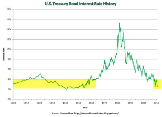
Over the past several weeks (and especially since last week's election), some smart money managers have declared that the secular decline in yields is now over and that rates are beginning a long term move higher. Read Ray Dalio's views here.
They might be right. It is, objectively, too early to say.
In the chart above, notice that the change from a secular decline to a secular rise in rates 60 years ago did not take place overnight. For some 15 years in the 1940s and 1950s, rates oscillated between 2-3% before finally moving sustainably higher.
If you're thinking "but that was 60 years ago", you have just put your finger on the main problem with trying to pin point a secular change. By definition, they don't take place very often, during which time the world has massively changed.
We'll know in hindsight, but if yields are now in a secular uptrend, the change in direction will probably once again take time to unfold. Right now, it suddenly looks like higher yields are a one-way bet. It's probably a better bet that "the market" will obscure the change in the long-term trend through fluctuations in the short-term trend.
How so?
30 year yields are very much in a falling channel. In July, yields bottomed at 2.1%; they're now almost 3%. They could rise further to 4% and still be in a declining secular pattern. If a nearly 200 basis point change seems like a lot, recall that yields fell by that amount (from 4% to 2.2%) during calendar 2014.
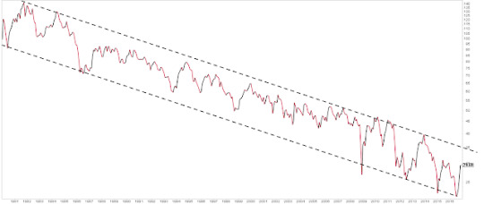
It's also important to realize that the 1200 basis point rise in rates between 1960 and 1980 was extreme. Again, the secular rise in rates between 1900 and 1920 was a relatively minor 200 basis points. A secular rise now might be similarly minor. Overtime, it might just look like rates are moving within the yellow shaded band (first chart above).
The current rise in yields began this summer from the bottom of a 35 year declining channel (chart above). At that point, the momentum of decline had reached an extreme that had previously been close to a low in yields at least 7 other times in the past (in the chart below, top panel and green line). Like now, yields rebounded higher each time (arrows).
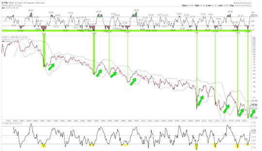
Objectively, yields could now just be reacting to an "oversold low" as they have many times before. It's too early to say otherwise.
It's worth pointing out the importance of investor psychology in the movement of rates over the short term (measured in months). Right now, the prevailing opinion is that a secular low occurred this summer. Well, what did money managers think about this at the time of that low? In short, they didn't believe it at all.
In July when the 30 year dropped to 2.1%, fund managers surveyed by BAML had their highest exposure to bonds in more than 3-1/2 years. Just 2% believed that the global economy would improve over the next 12-months (chart below). In other words, they were convinced that yields would continue to move lower. Instead, they reversed much higher. That pattern of swinging investor psychology has played out consistently over the past decade and at each inflection point, yields have reversed (numbers in red are US 30-year yields). Read more about this in a post from July here.
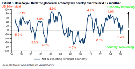
Momentum has room to run higher, carrying yields higher. Momentum is just starting to reach an extreme now (red line and top panel). This has sometimes been the top for yields but yields have just as often continued higher. In the past 35 years, most of the move higher in yields has taken place by the time momentum reaches current levels. In mid-2013, yields moved 40 basis points higher over the next 6 months before turning lower. In other words, don't count on a quick resolution to the debate about a secular low.
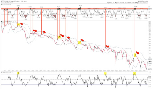
Investor positioning and sentiment suggests the change in the relative performance of bonds (down) versus equities (up) should continue longer.
Over the past 18 months, investors' money has been flowing consistently out of equity funds. On a net basis, about $130b has left domestic equity mutual funds and ETFs. You can track that data every week here (chart below uses data from ICI).
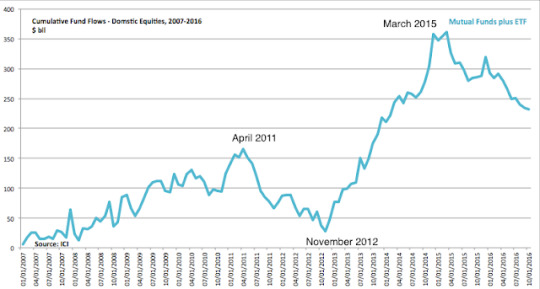
The dates on the chart have been meaningful for SPX. The equity index fell about 17% in the 6 months following the April 2011 peak in equity flows. The index then rose about 50% from the November 2012 low in equity flows to the March 2015 high. Since March 2015, equity flows have been negative and the equity index has been oscillating near 2100, making little net progress.
Those fund outflows have recently become extreme. The 10-week moving average is the lowest ever. It's a small sample, but after similar cases, SPX has always moved higher (arrows). The first arrow might look like it preceded a tiny rally, but SPX moved more than 8% higher in two months. A similar move now would put the index near 2275 (data from Lipper; chart from Sentimentrader).
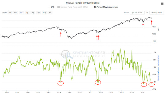
Schwab looks at the same equity fund flow data but over a trailing 12 month basis (orange line). Again, the sample size is small but their view is that this correlates well with the next 5 year change in equity prices (blue line).

As an aside, the evidence suggests that equity outflows have been mostly due to retail investors exiting. Fund flows for institutional investors has been mostly flat since early 2015 (data from the Fed).

Where has the money that has left equity funds gone? Mostly to bond funds.
In the past 45 weeks, during which equity funds have seen outflows 82% of the time, bond funds have seen inflows 71% of the time. The data is even more skewed than that because in many of those weeks, equity inflows and bond outflows were tiny.
Until July/August, favoring bonds over stocks made sense as bonds had been outperforming since early 2015. Recall, the 30-year yield marked its low in July. But since then, equities have outperformed, and since the election, bonds have been routed.
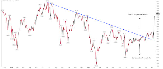
Money usually follows performance. It's a good guess that fund flows might soon begin to favor equities. If past is prologue, then equities should continue to gain and bonds should continue to sell.
The most recent data on fund managers' investment allocations agrees with the fund flow data. Last month, allocations to equities relative to bonds, commodities and cash were near the lows formed in mid-2010, 2011 and 2012. Equities moved higher and bonds moved lower (yields moved higher) at those junctures. Read more on this here (data from BAML).
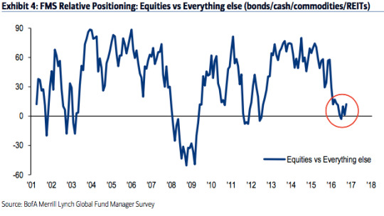
One final word on equity fund flows. We will know in hindsight, but it seems unlikely the recent equity fund outflows are due to demographics. Boomers reached retirement age starting in 2011 but there was a large increase in retirement age Americans starting already in 2005. We should have seen equity outflows start earlier if demographic forces were predominant. More on demographic shifts in a new post here (data from Doug Short).

To summarize: In July, fund managers' had their highest exposure to bonds in 3-1/2 years. In other words, they expected yields to keep falling. Instead, yields reversed higher and have since risen so sharply that several smart money managers now say that a new secular uptrend in yields is taking place. That is a big call, given that the foregoing secular downtrend has lasted more than 35 years.
Over the past 18 months, investors' money has been flowing consistently out of equity funds. Where has that money gone? Mostly to bond funds. Money usually follows performance, so it's a good guess that fund flows might soon begin to favor equities. If past is prologue, then equities should gain and bond yields should continue to rise. Whether that will constitute the start to a new secular uptrend for yields it is far too early to say.
23 notes
·
View notes
Text
The Boomers Have Already Been Overtaken By The Millennials

Nearly 20 years ago, investors started becoming concerned about the aging demographic profile in the United States. The concern was understandable: the largest birth cohort in the nation's history was close to entering retirement. Between 1940 and 1950, the number of births per year in the US increased by a massive 45%, and that group would begin retiring in 2005. Enlarge any chart by clicking on it (data from Doug Short).
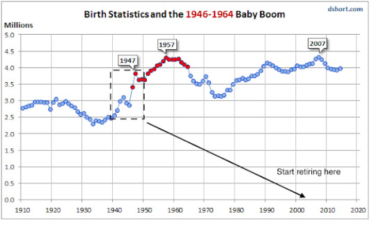
An aging population consumes and produces less, draws down savings and equity holdings and requires greater publicly-funded services. Japan had already started feeling the ill affects of a rapidly aging population and the fear was that the US was destined to be next.
What happened instead was this: an average of 3 million Boomers entered retirement every year starting in 2005, but the population of the country grew by nearly the same amount. Between 2005 and 2015, the total population of the US increased by more than 25 million.
As a proportion of the total, retired Americans has increased. That should surprise no one. Not only are Boomers reaching retirement, but successive birth cohorts are living longer. But the impact has been relatively minor. Retirement-age Americans have increased from 12.3% of the population in 2005 to 14.8% in 2015.
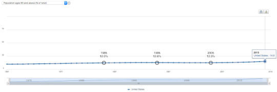
Importantly, the working-age population in the US increased by 7% (15 million workers) during the past decade. In Japan, the working-age population declined by 10%. The two countries had the same dependency ratio (proportion of retirement age to working age populations) in 1991. By 2015, the dependency ratio had more than doubled in Japan, to 43%; in the US, it barely increased, from 19% to just 22%.
Immigration accounts for some of the differences. The more important aspect is this: the Millennial and Gen Z birth cohorts (those born after 1980 through early 2000s; definitions are not universally agreed on) are as large as the Boomers. About 4 million were born in each cohort each year. Starting this year, Millennials are the largest living cohort in America, overtaking the remaining Boomers (data from Pew).
Consequently, as late Boomers enter retirement-age over the next decade (left-side in chart below), nearly the same number of Millennials and Gen Z'ers will be entering the working-age population (right-side). These will not be perfectly offsetting (again, successive generations are living longer), but the burden of supporting an aging population will fall on a working population that is also growing (data from Doug Short).

None of is to say that the US will not become older. It will. But the US is not like many other advanced economies and the impact will likely be far less. The cohort following the Boomers (Gen X) is a much smaller group than that following the Millennials (the appropriately named "Post-Millennials"). Gen Xers start to retire in 2030 but Post-Millennials already begin to reach working age in the next few years (data from Pew; article here).
American's aged 20 to 39 declined in the mid-1990s until about 2010. Since then, that age group has been growing strongly. Based on the birth cohorts presented above, the 20 to 39 age group will continue growing strongly past 2060. Not only is this a prime working age group but one which heavily consumes housing and other goods as they pass through their reproductive and household formation years (data from Calculated Risk, here).
The upshot, to paraphrase Bill McBride, is this: "Demographics is a key driver of economic growth. Most people focus on the aging of the baby boomer generation. But by 2020, eight of the top ten largest cohorts (five year age groups) will be under 40, and by 2030 the top 11 cohorts will be the youngest 11 cohorts. The movement of these younger cohorts into the prime working age is a key economic story in coming years."
4 notes
·
View notes