
therosesanctuary
MajoHime
♒23🏺|✨bring me Roses🌹✨
4622 posts
Don't wanna be here? Send us removal request.
Last Seen Blogs

blu-birdz
I Re-Upload Sims 4 CC,If Ya Like My Style I Gotcha

nikitamakarov
Neo

henr12ue-blog
Sem título

t0xiicw0rld
Angel

gccfood-blog
Gunn Culinary Club
Text
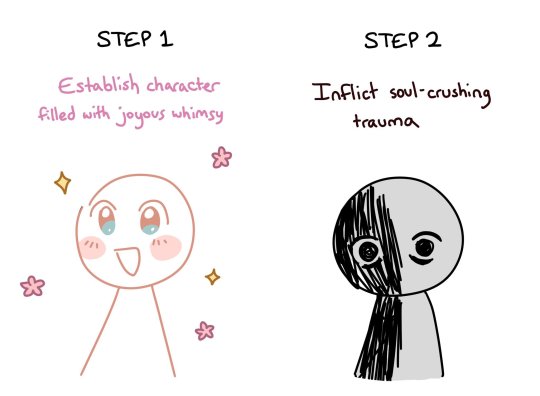
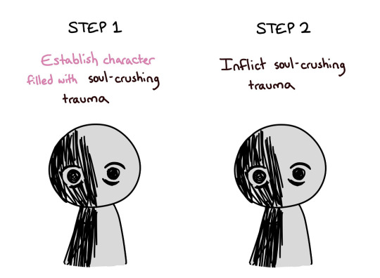
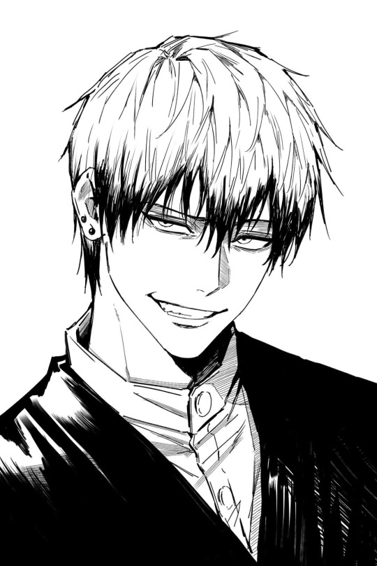
A SIGN TO INVEST IN NERDY EMO MEN CS LOOK AT THIS ONE 😈🫵
6K notes
·
View notes

Text
"I cant draw" then do it bad who gives a fuck.....
164K notes
·
View notes

Text
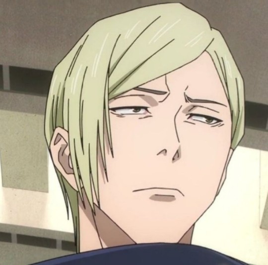
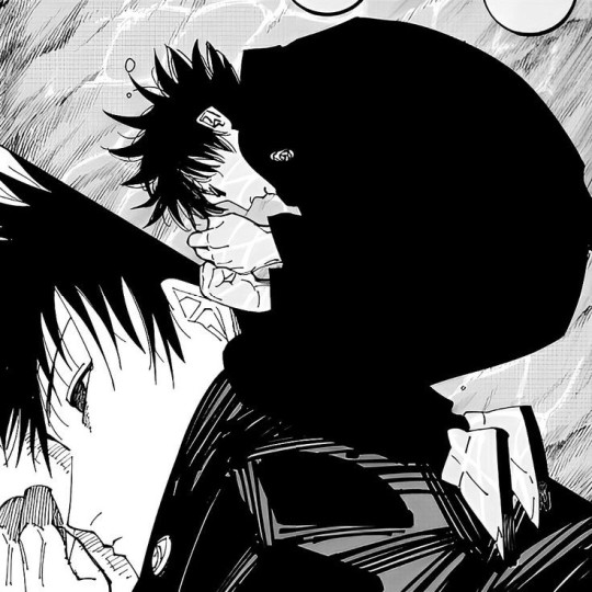
naoya is fine with his damn mouth closed but i know exactly how to shut it
art by: @sso_s__ on twt!

3K notes
·
View notes
Text
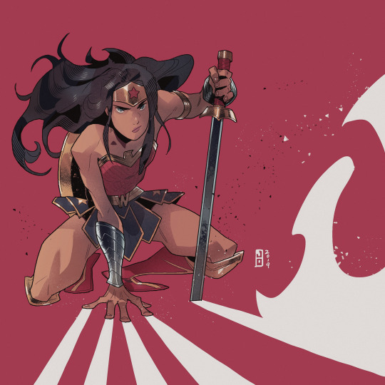
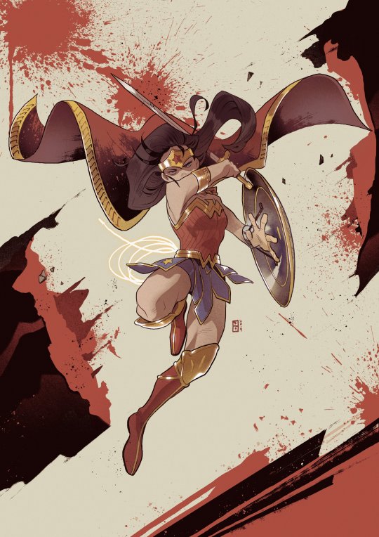
★ 【조철홍】 「 wonder woman 」 ☆
✔ republished w/permission
⊳ ⊳ follow me on twitter
632 notes
·
View notes
Text
we need to talk abt noritoshi kamo more and no i don’t mean kenjaku btw!
his character is SO fascinating and he’s literally so doomed by the narrative and i wanna kiss him so hard bc of it!!! :3
from the time his mother decided it’d be silly to name her son after the most notoriously evil sorcerer in history all the way up until kenjaku basically saying he’s useless and would be a horrible clan head, this dude has NOT had a good time 😭😭😭
bc imagine your entire life trying to be this PERFECT perfect heir. your mother literally left you because she believed you’d thrive more without her and you decide to be this perfect heir for HER. and come to find out you were never really meant to be the clan head .
do u know how SICK that is??? especially considering he never knew who he was named after and how much of a stain the previous noritoshi kamo left on not just the kamo clan, but the whole damn sorcerer world…
like shit toshi fight BACK! 😭😭😭
101 notes
·
View notes
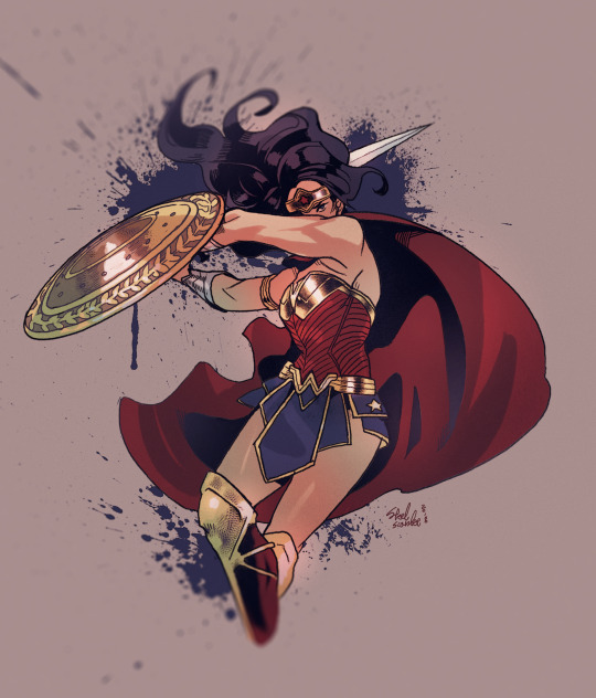
Text

★ 【SEBU】 「 Sailor Moon 」 ☆
✔ reprinting permitted (3.5.24)
⊳ ⊳ follow me on twitter
108 notes
·
View notes


Text
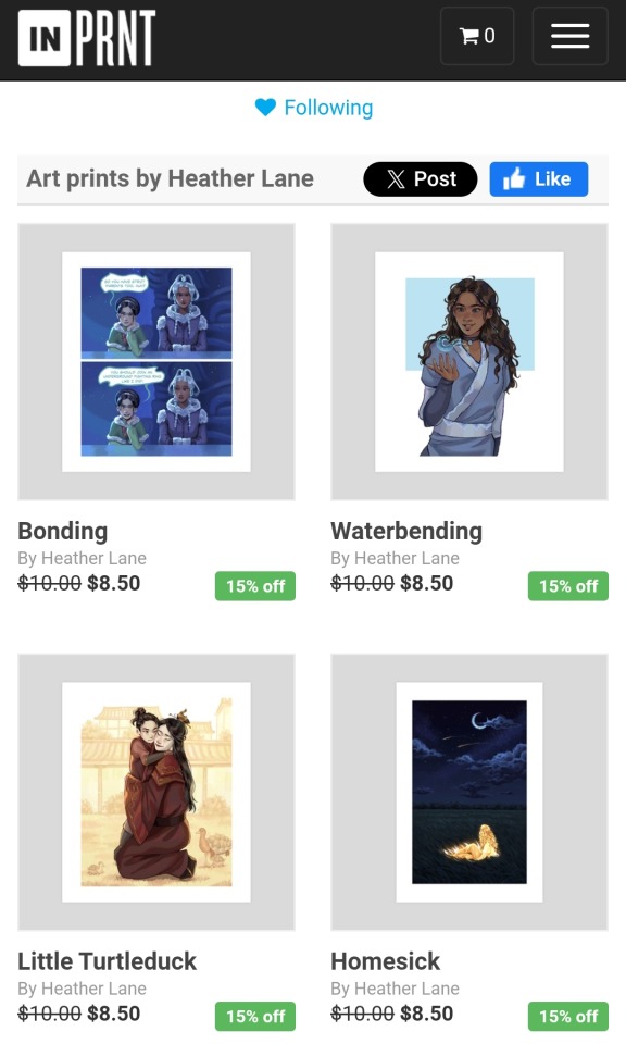
Hi!!! I've updated my inprnt shop with some of my new atla art if anyones interested!
Link here and in my bio!
66 notes
·
View notes
Text
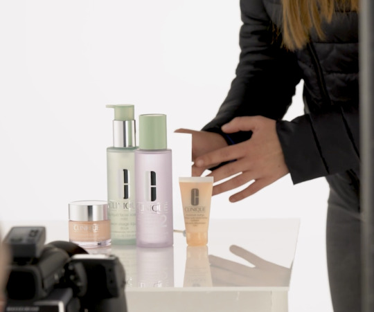
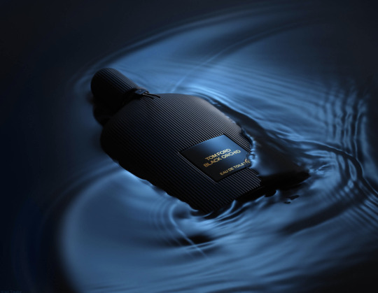
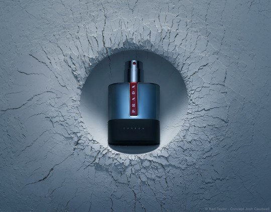
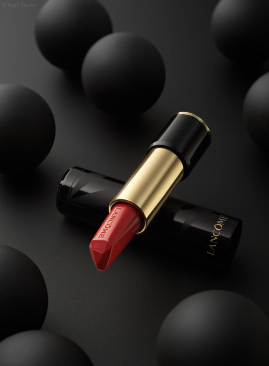
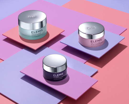
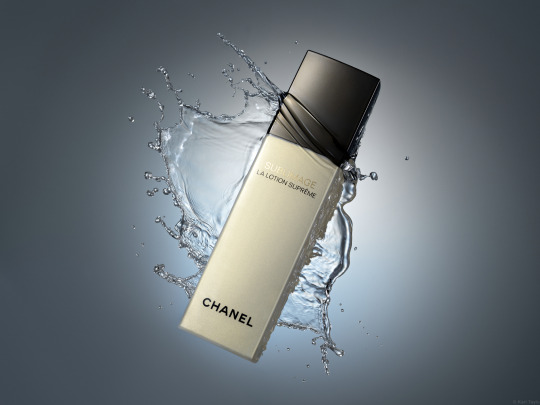
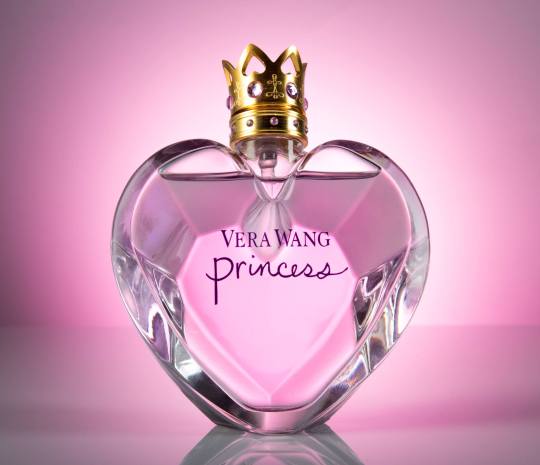
Remember this joke?
Well, I am going to do something similar only with photography. This is a photo someone took for an Amazon review of their Clinique products.
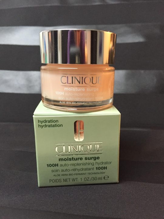
Honestly, it is not a terrible photo. They did some staging. They have an interesting background. All of the labels are legible. It is properly exposed. This would be a perfectly acceptable product photo for an Etsy page.
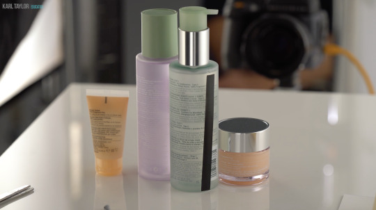
I've been taking these advanced photography courses in preparation for whenever I am able to create a new studio in the house. And my teacher is a photography badass. I just watched a 6 hour class on how to recreate a professional Clinique ad. And at first glance it looks deceptively simple. It's just some skin care products being splashed with a little water.
Which is why I wanted you to see an average person for reference.
This is what Karl Taylor came up with.
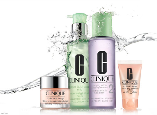
And I don't think I've learned so much about photography in one tutorial before.
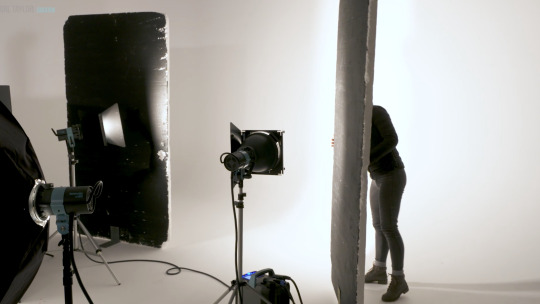
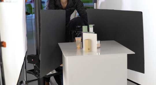
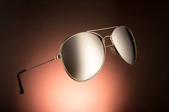
Product photography is just loads and loads of problem solving. You have to light the chrome caps with a gradient. Which requires giant diffusion scrims.

Those big white panels are literally only there for the two chrome caps.
You need a pure white background, but you can't let light spill all over the studio, so you put up giant black light blockers.
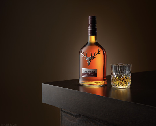
And you have to add another light just for the orange bottle on the right.

Oh, and if you want the bottles to glow, well, you have to hide a silver reflector behind them.
But you still want the edges of the bottles to be darker so they have some contrast. So you add some black tape to the sides.
And in order for the reflective labels to have bold black lettering, you have to reflect black cards into them.
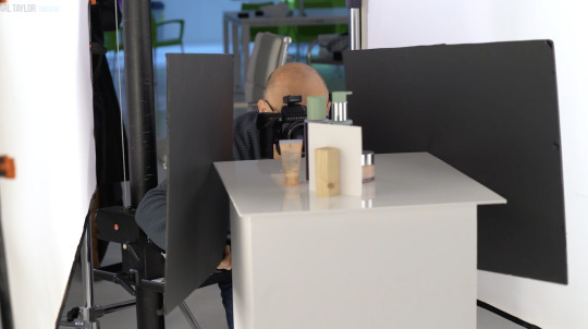
Ack! Karl's beautiful bald head is showing up in the chrome caps! He must put on the naughty blanket.
And once you get every aspect of every bottle perfectly lit, you finally get to yeet some water at it all.

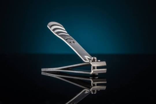
I don't love product photography because I have a weird obsession to help greedy corporations make their wares look more beautiful. I love it because it is a complicated and challenging new puzzle every time. Every product is a different shape and requires a different technique to make it look its best.
I don't know if I will be able to live up to Karl's standards.

This is about the level I was at in 2017 before I quit photography.
I have so much more knowledge in my brain now. I'm really hoping I can surpass that.
8K notes
·
View notes