
Last Seen Blogs

mrmichaelchadler
Michael D. Chandler Tumblr
vivien-1211
Just me, myself and I
taikawaltiti
marvel icons
wildlental
Documenting the wildlife of the Lental region

mustang-sally
slow ride
Text
March 28 (Mon)- Received permission via Email to use Andy Everson’s “Every Child Matters” logo in my assignment, had also send a high resolution copy via email.
March 29-31- :(
April 2 (Sat)- Received permission from Kent Monkman’s Studio Administrator Carolyn Gordan to use “The Scream” of “The Scoop.”
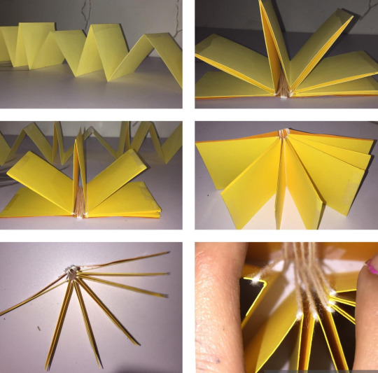
April 3 (Sun)- assembled parts of the book with the supplies I had on hand.


April 4 (Mon)- Went shopping for mor supplies and worked on images on Illustrator.
April 6 (Wed)- In Class. Carolyn Gordan had sent me images of both in high resolution.
0 notes
Text
March 21 (Mon)- I began to make a 2x2 prototype of the mechanics of a pop up book with materials I found at the reserve’s daycare center as I babysat 9 kids for a few hours, so the mothers could help out with making food for a feast we have after we have the burial process.
March 22 (Tues)- Funeral.
March 23 (Wed)- I got home, and continued writing in my blog and uploaded pictures of my prototype. I also began sending emails to certain artists for information & made some calls to local printing places to see what's the absolute longest length of paper I could print something on. Thinking about an accordion fold on extremely long sheet of paper, for a cleaner look, however will limit the book in size or should I use separate sheets for each. Going separate will allow the book to be bigger however I would need to find a way to clean up the edges. I am also watching video’s about how to make pop up books, and have downloaded this nifty PDF called “The Pop-Up Book.”
March 24 (Thurs)- continued to look at ideas on Pinterest, Youtube, that pdf that I downloaded.
March 25 (Fri)- I emailed:
Andy Everson, whom created the logo for “Every Child Matters.”

Kent Monkman, an artist that often painting scenes of Western European and American art history, I am very interested in his artworks
The Scream
https://www.denverartmuseum.org/en/object/2017.93
The Scoop
https://www.cbc.ca/artsprojects/the2010s/kent-monkman-the-scoop
-Both artists are First Nations men from Canada.
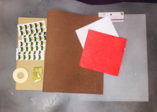
March 26 (Sat)- Went out shopping for supplies. Will post a pic of them at a later time.
0 notes
Text
The Political Type Assignment #3
March 16 (Wed)- Class was introduced to the last assignment. We went over some pictures during lecture about Brazil being forced into getting rid of all exterior advertisement. We then reviewed pictures of graphic agitation, For example, an ad that duplicated Trumps signature “T” formed them in a particular lay out for the negative space to look like a swastika. Lastly were shown examples of previous students projects. One that got my attention was the one about endangered species, and the clothing label one. The instructor made the remark that he really enjoyed the “surprise” concept of one particular project. Which a student made wedding invitations and he was excited that he had gotten invited. Upon opening the invitation he realized that it was an invitation card based on the awareness on child brides, a tradition that still happens in certain countries.
Since the purpose of assignment was to convey something that would agitate people, or make them think about your concept. I immediately thought about the 215 residential school children's bodies found in a mass grave in May 2021. Since this discovery more residential school properties have been searched and the numbers have grown into the 10 000′s. There are 2 reasons I chose this topic. One, it seems like people have already forgotten this horrific discovery, and two, I myself live with intergenerational trauma. My Dad and both sets of grandparents were taken and placed into residential schools. My mom, however, went to “Day School,” which basically meant she could go home after school, but she does talk about the abuse she faced at home, as well as school from students and teachers.
During Class time I drew up several ideas and was initially going to do a art installation, of a rug and a child’s arm reaching out from underneath, expressing that these residential school kids were “Swept under the rug.” After class I sat with these two idea’s, a surprise element and residential schools.
March 17 (Thurs)- I decided that wanted to make a children’s pop up book but with a dark twist within.
March 18 (Fri)- Had to go to Maple Creek, for a family emergency.
March 19 (Sat)- I went into Maple Creek’s local Salvation Army and purchased the biggest book I could find, which was about cosmetology and was only 0.50 cents. I then ripped the book apart to figure out what kind of materials I would need to make the book.

0 notes
Photo


Picture 3, were my first set of sketches that I drew, and then I decided to draw on graph paper to keep clean lines and balance.
0 notes
Text
For this assignment we were asked to go around the city and study examples of type specimens around the city. These specimens had to be at least 40 years old. I toured downtown and the type’s that caught my eye were the Assiniboia Inn and the Monarch. I myself was never had the chance to see the inside of the Assiniboia In, as I wasn’t legal age, but when I was 6 I do recall standing in the foyer of the bar trying to either yell at mom or my aunties that we (my twin and I) were sick of sitting in the vehicle. However, I did get the chance to go inside the Monarch, I remember the ceiling. It was one of them old timey detailed relief ceilings. For the assignment I decided to go with the Assiniboia Inn. Another requirement for the assignment was it had to somewhat coincide with our first assignment, I did Graffiti and Street art in Medicine Hat. Since the Assiniboia Inn’s sign already kind looked like “block” style of graffiti lettering, I drew up some examples of an “A” in bubble, and wild style, I also drew some examples just for fun. One in particular got some attention, it was an “A” that had taken on the form of a wine or beer bottle, so I decided to head in that direction. Over the next few classes I drew up some sketches, I looked at some vectors on adobe. I initially was going with alcohol... everything. Then over the weekend I totally flipped my decision and just created a bunch of bottles formed into the letters of the alphabet. I have the visual process in adobe, but a short story version is.
I made 3 artboards 4″x 24″ and then I typed out A-Z, Layers on Adobe labelled as such, in Bold Bauhaus since the “A” of the Assiniboia Inn kind of looked like a Bauhaus “A.”
I then traced each letter and added a bottle top, that I found on adobe, to the top of each letter.
I placed each letter in order into 5 rows, and centrally placed on the 17x23 artboard. I titled it “Bottlephabet.”
0 notes
Text
Typography Class Blog
Photo Essay Info I tried my hardest not to take photos of the obvious, but it was difficult, especially when most graffiti are text based. Also, I have been told that I am not very witty by many people, lol. For all the images I found it easiest to use the Properties Presets, after adding the black and white layer. Then using the color toggles to find the right shades and highlights. Palatino Linotype- Page(s) 1, 2, 13 All Headers 4, 6, 8, 9, 10, 11, 12, 13, 14, 15, 16, 17, 18, 20, 21 Elephant- Page 3 tried Ravie but switched to Elephant, because it looked my consistent with the G in the photo. Inspired by Bauhaus 93- Page 5 I tried to find a font that was squarish, but Bauhaus just looked better, and redesigned it in illustrator using the pen tool. Cooper Black- Page 6 This type suited the bold B in the tag “SBR.” Graffiti vector font- Page 7 I wanted a particular font to show separation to highlight the change in direction. I could not find one in the InDesign font selections, so I found one in Adobe stock. Script MT Bold- Page 12 I liked how it looked like cursive and matched the “S.” Ravie- Page 13 I chose this font as ii matched the graphic words “Street” and “Art.” Franklin Gothic Heavy- Page 14 I felt like this font matched the “St” of the street sign. Stencil- Page 15 Pretty self-explanatory, used the stencil font to match the spray-painted stencil “S.” Inspired by Book Antique font- Page 16 I used this font because it had square serifs and then I redesigned it in illustrator using the pen tool to go with the metal awning bars on the building. Snap ITC- Page 17 This font had the most cartoonish characteristics that correlated with the character. Algerian- Page 19 This font had a 3D effect that I was looking for. Magneto- Page 21 I liked how it looked like cursive and matched the “M” that the man's hands form. Alhambra- Page 22 I tried too many fonts to list that would match the “A,” and settled for Alhambra. Graffiti vector font- Page 23 I wanted a particular font to signify the ending. Calibri- Page 24 I used Calibri as the font as we are supposed to either use Times New Roman or Calibri in most essays. I figured I should keep the rules and keep it simple. While I was in hospital, I didn't have the chance to find two examples of Swiss Style or International Typographic Style. I was not even aloud to get up to use the bathroom on my own, as I was on “fall watch” and could not even pick up book up due to being too weak. Jan 10, 2022
Met online for 1st class and went over outline.
Jan 12, 2022
Met in person & got acquainted with peers. We were given the 1st assignment. I immediately had several ideas. Such as Mental health crisis, the opiate crisis, Indigenous culture within the city. We were instructed to think about topics that we already have knowledge of. I started to think about my traditional upbringing and the Saamis Teepee.
Jan 15, 2022
Started researching the Saamis Teepee, while keeping my culture in mind, but they didn’t correlate with one another.
Saamis Teepee
https://mysteriesofcanada.com/?s=Saamis+Teepee
https://www.tourismmedicinehat.com/facilities/saamis-tepee
Cree Tradition's
http://fourdirectionsteachings.com/transcripts/cree.html
https://hanblechiadesigns.wordpress.com/2015/02/12/the-tipi-the-connection-to-the-physical-and-spiritual/
https://powwowtimes.ca/indigenous-education-alberta-tipi-teachings/
Jan 17, 2022
Lecture on typo graphics of the New York Times Magazine. We were shown the difference in paper grains and creap. I had more ideas for the 1st assignment, this time it was about the Miywasin center.
http://miywasincentre.net/
Jan 18, 2021
Thought to myself, “Do I really want to do a photo essay on an organization? Especially with the covid regulations...” So, I sat with myself and asked, “What is something I enjoy, while I’m out and about?”
Jan 19, 2022
I was absent from class as I fell while shoveling the sidewalk on Jan 18 and could not move. So, I sat and internalized, as I am constantly thinking and doing thought-based ideas such as people watching and pareidolia, thought about how I could incorporate these ideas into a photo essay.
Jan 23, 2022
Just started taking pictures around the city but did not get too far due to back pain.
Jan 24, 2022
Reviewed examples of typo essay pictures & pondered topics for assignment 1.
Jan 25, 2022
Reviewed assignment requirements and thought about all the public art pieces in Medicine Hat. www.southernalberta.com
Jan 27, 2022
I decided to do the 1st assignment on graffiti, because not only do I enjoy looking at graffiti, but I also used to partake in this illegal activity as a teenager. The Stencil picture that I used in my photo essay was my “tag.”
Feb 30, 2022
I was in contact with someone with covid on Feb 6, so I decided not to attend class. Made a stencil.
Feb 2, 2022
Absent- I felt ill but continued to research my graffiti topic.
https://www.pressreader.com/canada/medicine-hat-news/20190708/textview
https://global-uploads.webflow.com/618aa61796ecd9e90379f593/618aa61796ecd9d83679f80c_All-Walking-Tours.pdf
https://www.eden-gallery.com/news/graffiti-styles
https://www.graffiti-empire.com/graffiti-styles/
https://linda-hoang.com/updated-guide-to-instagrammable-walls-of-medicine-hat/
Book- Graffiti World: Street Art from Five Continents by Nicholas Ganz, and Tristan Manco.
Thesis- Melissa Hughes, “Street Art & Graffiti Art: Developing an Understanding.” http://scholarworks.gsu.edu/art_design_theses/50
Feb 6-15, 2022
I fell extremely ill, was admitted into the hospital and was either dazed or unconscious for much of this time. I was diagnosed with thyrotoxic crisis or thyroid storm.
1 note
·
View note