MDC Freshman Art Pathway ART1203C 3D Design, ART1330C Figure Drawing FD2, and ART1300C Drawing Student Prof: Alena Fresquet "The thermometer of success is merely the jealousy of the malcontents."-Salvador Dali
Don't wanna be here? Send us removal request.
Text
FIGURE DRAWING ART 1330C PORTFOLIO
GESTURE (SECOND DAY OF CLASS)

CONTOUR (2ND DAY CLASS)

BLIND CONTOUR/POSE
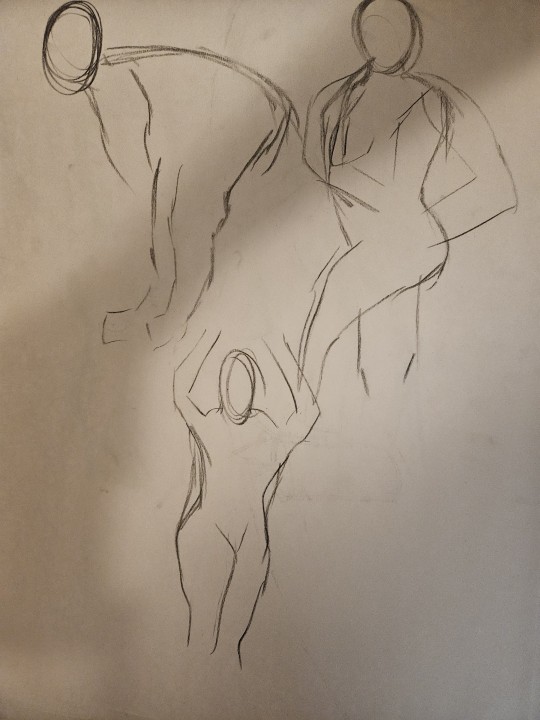
5MIN POSE

EGGS

BLIND CONTOUR HANDS

SKULL STUDIES

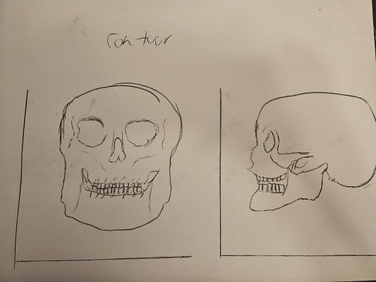

SPINE/RIBCAGE STUDY

SKELETON STUDIES
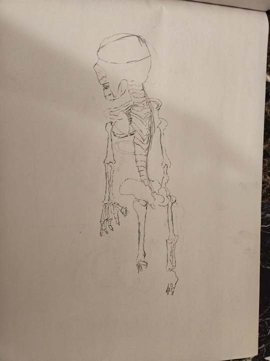
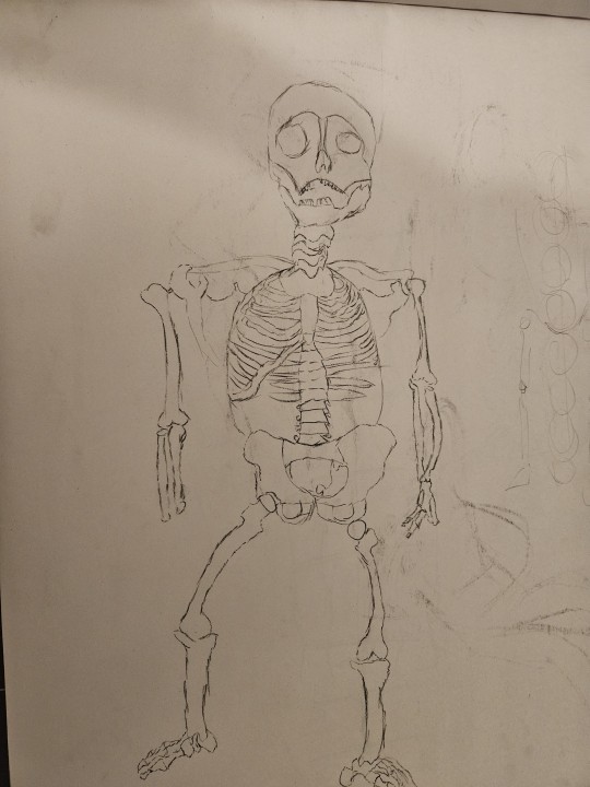


PEER PORTRAIT

3 VIEWS SELF PORTRAIT

PERSPECTIVE STUDIES/COLOR (3 FIGURES)

MIDTERM AND ARTIST STATEMENT MIDTERM TITLE: "The Birds Sing Eyes"
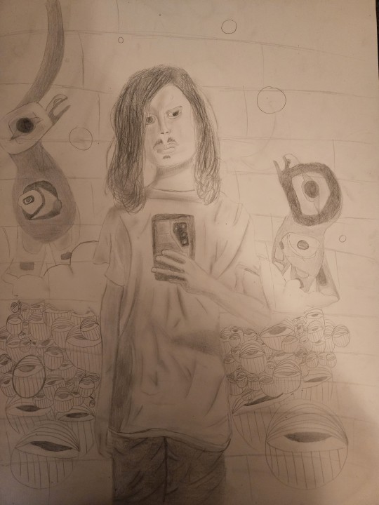
ARTIST STATEMENT: The approach for this midterm was to create a piece that showcased me in some sort of dream world. Initially this panned out in a way that didn't make much sense, so I was prompted to make it like a mural. Upon researching Wynwood art murals, I came across murals of some birds and murals of some eyes. This gave me the idea to intertwine my South American culture and my roots with some aspects of my mental workings. The eyes are meant to represent the constant expectations that are placed on me and the anxieties that come from that. The clouds represent my tendency to daydream, and the birds my desire to fly while simultaneously reflecting my South American roots. One initial challenge I faced was getting the background in on time. I ran out of time when it came to the background so when I was prompted extra time to correct these issues I was able to overcome that obstacle. I am overall very satisfied with the figure and found myself to still admire how I did that to this day as it is not something to my skill level, not at the time I began the midterm anyways.
MUSEUM INSPIRED

FINAL AND ARTIST STATEMENT: FINAL TITLE: "Sands in the Red"

ARTIST STATEMENT: The approach for this final assignment was to comment on the post pandemic struggle. To this end, this painting has figures outlined in blue to represent a shield, a sort of aura or distance from the other figures. They are also painted in red with distorted faces to represent turmoil post pandemic and the challenges that's faced for the economy, for jobs, and for life in society. The distorted faces simultaneously represent the fact we are more distant than ever post pandemic. We don't go outside as much, we don't interact as much, and instead, we rely on technology. I chose the sand as a landscape and framed it the color of the sand to represent almost a dream-like world, a cyberspace to further hone in the theme of technology and our desire to go outside. One challenge I faced was simply that I ran out of time. At first, this piece was highly abstract and it didn't make away with the whites of the canvas and looked extremely unfinished unpolished and not like painting. I overcame this by redoing the painting and instead going for a more linear approach to depict the same abstract figures in a more defined, perspective driven way. OVERALL STATEMENT: Figure Drawing as a learning experience tended to be even tougher than Drawing at times. I've never worked with anatomy and being consistent with proportions was an especially gruesome task for me. However, Figure Drawing produced what I believe was the best artwork from me out of the two classes, which surprised me. My goals and expectations post-semester and into my future endeavors is that I will be able to produce figures even more proficiently in this space, and that I will become more consistent as a figure artist if I ever tackle this type of art ever again. I saw myself sprout into an artist of my own in this class, something which I cannot echo when it comes to the Drawing class. My favorite materials in this class was paint. This is because it allowed me to create highly abstract yet grounded figures that conveyed emotions through the muddied combinations of color I chose at given moments. It allowed me to express more emotion than I ever would've been able to with any of the other materials in this class. My favorite assignment in this class was actually the midterm, however. This is because it was one of my most expressive works and it allowed my figure drawing skills to shine through, a skill I didn't think I would have when I began doing this midterm. A challenge I faced in this class was my inexperience with drawing figures. At first, even drawing skulls or a head shape was challenging. But as I kept doing assignments in this class, I overcame this with practice and built experience that allowed the processes of figure drawing to become engraved in my art.
0 notes
Text
DRAWING ART 1300C PORTFOLIO
BOXES 1ST DAY

GESTURE DRAWING WEEK 2

GESTURE DRAWING LATER IN THE SEMESTER
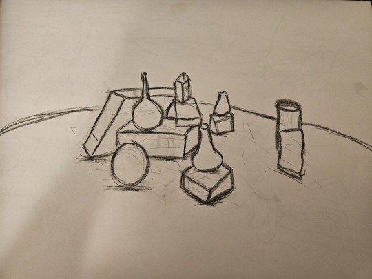
CONTOUR DRAWING
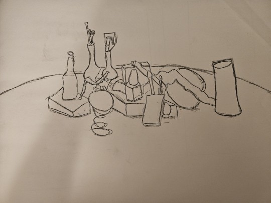
NEGATIVE/POSITIVE ASSIGNMENT
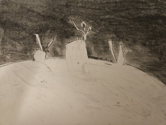
BLIND CONTOUR
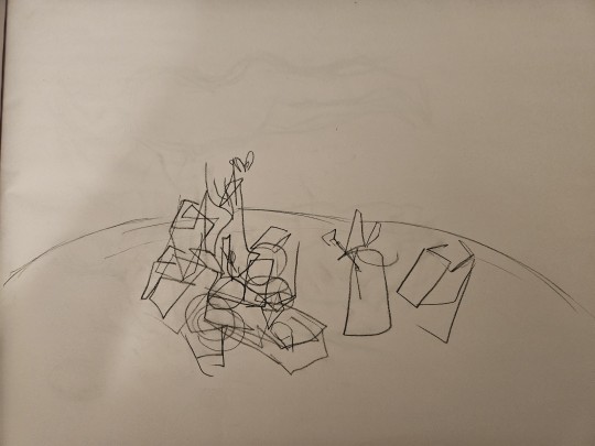
COMPOSITION ANALYSIS

CROSS CONTOUR
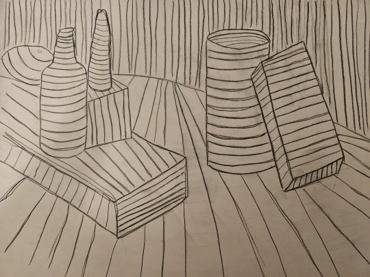
CROSS HATCHING
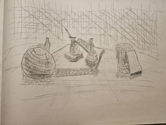
INK ASSIGNMENT
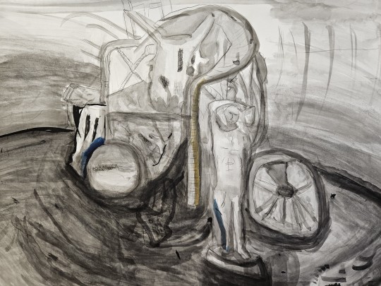
INK ASSIGNMENT W/ COLOR
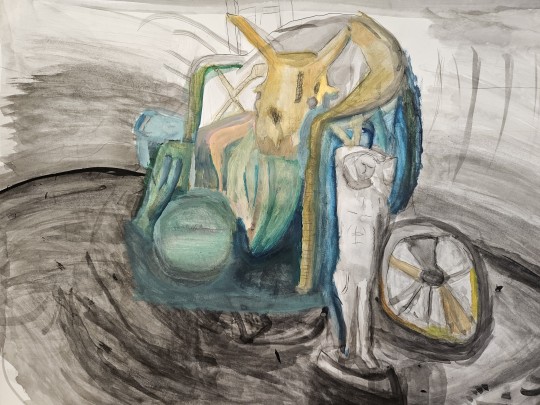
MUSEUM
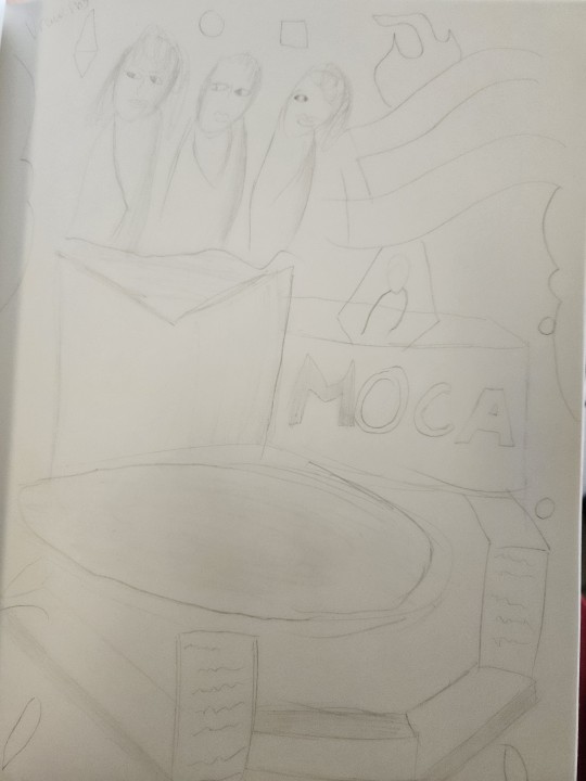
MIDTERM AND ARTIST STATEMENT MIDTERM TITLE: "Creek"
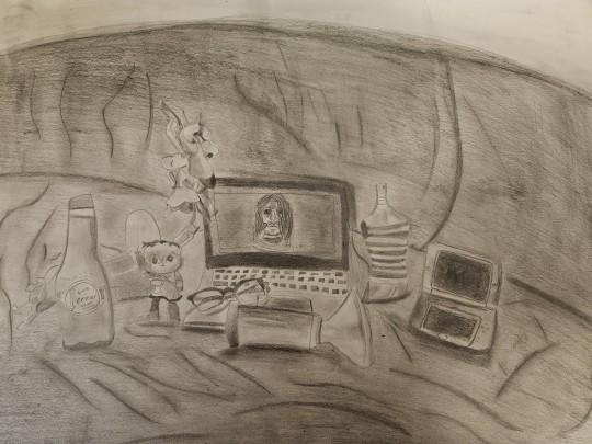
ARTIST STATEMENT: The overall approach for this midterm was to create a still life that evoked a sense of eeriness and distortion. My experience was rough as I initially ran out of time and resorted to smudging to shade. This was pointed out to me and as a result I went back and changed the smudging into proper value. I was overall satisfied with the final product but I do not believe it is what it could've been.
FINAL AND ARTIST STATEMENT FINAL TITLE: "Housed In"
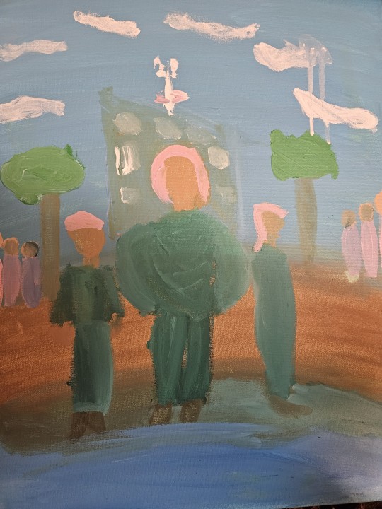
ARTIST STATEMENT: The approach for this assignment was to create a piece centered around Article 20 of the Human Rights, which was the right to peaceful assembly and association and the right to not be compelled to belong to an association. I thought about creating a group of figures in the forefront that pertained to the same organization and place them under a building that represented the article to frame them as compelled to belong to said organization and not being allowed to leave, something the article does not allow. Furthermore, I wanted to have several figures off to each end of the painting separated by nature to represent the natural existence of peaceful groups of people that fall under the article's rights. The environment is meant to be very natural to create the impression where the organization and the building stick out like a sore thumb to represent the unlawfulness of it. I experienced challenges in that initially the painting was washed out and underpainted and too abstract to make any sort of sense, I had the idea and the ambition but not the skill to translate those ideas to a canvas. I overcame this by stripping down my approach to be more logistical to the concept and by removing the whites of the canvas right away.
OVERALL STATEMENT: My learning experience this semester was rough. I have basically never drawn more than a cube in my life, so this class and Figure Drawing were my first experiences with art on a serious professional level period. At first I was concerned that I wouldn't meet the standards of the course, and although a lot of those challenges presented themselves to me on numerous occasions, I still strived to overcome that inexperience with ambition and ideas. I expect on coming semesters and past my graduation to become even more proficient at the skills this class has fostered in me. My favorite material to use in class was ink, and this was because it allowed me to create abstract value forms that largely reflected the style I aspire to follow in my artform in the coming years. My favorite assignment in class was the composition analysis, because it allowed these smaller sections of the still life to come together to form this geometrically complex and grandiose piece that I still think is one of my best works in the class to this day. Some obstacles I faced were my inability to grasp materials on the first go, as this was my first time using paint, ink, charcoal, and other given materials. As time went on I overcame this by simply practicing and doing the assignments and class work, and the more I did, the more I became used to each material.
0 notes
Text
3D DESIGN ART1203C PORTFOLIO
MOVIE NOTES DAY ONE: Looking into the 6 videos and the works from these various visionaries and artists, a common recurring theme was the tendency for the art's concept and its omniscience spilling into the real world. For example, Louise Nevelson's metal sculptures being incorporated into nature, or the many reflections of ideas present in nature by Joseph Cornell's assortment of organic materials. A lot of these works tend to utilize organic layouts, materials, concepts, or emphasize mortality the vulnerability of the human soul or the fragility and beauty of nature. A lot of these works are created to reflect societal conflicts as in the case of Betye Saar's works reflecting the struggles of slavery and history, or they are created to reflect nature or the human mind. These materials are largely assembled from their own brains funnily enough, as these concepts first take root in the human creative mind. The physical materials oftentimes come from junkyards, the streets, the home, or other places where assortments of discarded and reusable items can be found. A lot of these items are in touch with nature, further emphasizing the mortal and fragile concepts these pieces attempt to convey. Betye Saar for example, collected her items from the nature around her and used them to signify human emotion, again honing in down on the themes of the human soul and the outside world. ASSEMBLAGE PROGRESS PHOTOS


ASSEMBLAGE FINISHED PRODUCT TITLE: "In the House of Cards" and "In the House of Finality"

ARTIST STATEMENT:
The assignment I first approached by considering whether household items would even make the cut here. I knew I wanted to go with a theme pertaining to time, or with a house, because I wanted to depict houses as symbols of time, like a home being long lost or modern depending on the things that surround it, to depict time. I went about choosing objects by looking at the industrial and the natural. I seeked items that depicted urban industrialization but also items that depicted nature and fragility. For example, the gear and the clocks represent urban industrialization while the tree stumps and the mirrors represent nature and fragility. I intended to balance these differently across the pieces to highlight an overpowering natural landscape in the symmetrical piece and an overpowering industrial sprawl in the asymmetrical piece. I used black for both pieces to highlight that the imbalance of nature and technology is similarly reflective of the same world and the same things we coexist with. In the asymmetrical piece I highlighted a sort of chaos that isn't present in the symmetrical order of the symmetrical piece, thus making obvious the symmetries of both pieces. My assignment is successfully completed as the depictions of passing time and differing in balance between the urban and the natural effectively come to life in the different symmetry and arrangement of objects. In that case I believe the assignment is complete. What I enjoyed mosty about doing this work was putting the items together. I often found that some items would move by themselves and create a vision I hadn't considered prior, like with the clock in the asymmetrical piece that fell off to the side by complete accident but ended up being in the final product.
SOAP CARVING PROGRESS PHOTOS


SOAP CARVING PHOTOSHOOT AND ARTIST STATEMENT TITLE: "Linear"


ARTIST STATEMENT: My experience with carving was an initially stressful yet hypnotic one. My first soap ended up being a dud after I carved it too inward, and this soap is my 2nd attempt, and my success. I was stressing too much over the little details the first time around, and letting myself flow free of worries allowed this form to take shape.
EPHEMERAL ART PROGRESS PHOTOS


EPHEMERAL ART FINISHED PRODUCT AND ARTIST STATEMENT TITLE: "Chariot"


ARTIST STATEMENT: My experience with making ephemeral art was a rather rocky one as my first piece unfortunately was too triangular. In overcoming this obstacle, my approach became to create an organic form devoid of non-natural shapes. As the sculpture began to take form it began to resemble an organic rollercoaster and also resemble what looked like a carriage horse, or a fantasy chariot, hence the name.
CERAMIC ART PROGRESS PHOTOS TITLE: "Mystic Eye"


MUSEUM STUDIES AND NOTES NOTES: Materials changed as objects moved to the foreground to create emphasis. In the case of Juan Francisco Elso's Por America (Jose Marti), objects in the foreground displayed a separate quality to the figure in the sculpture, engaging us with the emptiness and difference/contrast surrounding said sculpture. Michael Richards, Element from Tar and Feather, evoked a mystery in sense of odd and unknown that also grabbed me. OVERALL STATEMENT: My learning experience throughout the semester was rather interesting as I have never done any hands on arts and crafts in my life. Considering this the experience I built from this class has me expecting nothing more but more experience as I graduate and move on to my endeavors and as I move to my next semester. It only fills me with hope that the techniques I learned in this class will invigorate my future work. My favorite materials were the sticks for the ephemeral art as scouting for sticks and putting them together was a blissful interesting engaging and fun experience. My favorite assignment was the assemblage as it best allowed me to exercise my passion for composition in design, and it also allowed to come up with one of the most drawn out logistical non abstract yet abstract concepts in the entire semester. Some learning obstacles I faced were my inexperience in the subject and in the craft. I overcame these through hard work determination and constant research which allowed me to perfect my techniques and produce a final product. For example, I have never worked with clay and the ceramics assignment proved a particular challenge. After trial and error and countless viewings of the tutorial videos, I was able to come up with a product. The additive process involves adding pieces or putting them together to create a form, like with the ceramic piece. The subtractive process involves subtracting from a given material via carving or sculpting to achieve a form, like with the soap. The constructive process involves using shapes to construct a form. Critical thinking involves really thinking through the logistics of the piece, whether it be the concept or the approach which is used to create form. My favorite process was the subtractive process, as it allowed me to create a form over the course of the time in which I worked on the soap which I felt satisfied with and came out to be organic and not driven by any thoughts of processes. I would recommend this course to others as it allows you to exercise composition skills and it allows you to foster your instincts in creating forms by going with the flow. It also helps you become acquainted with the idea of arts and crafts and hands on techniques, allowing you to become a better 3 dimensional artist and allowing you to break out of the box of 2 dimensions.
0 notes
Text

Figure Drawing ART1330C FD2 Midterm Self Portrait #2 3/17/2024
0 notes
Text


ART 1330C FD2, ART1300C Drawing, and ART1203C 3D MOCA Sketches and overall notes Notes: What captivated me most about the artworks was the use of framing to place emphasis on different elements of an artwork. For example the bleak dark landscape of Lorraine O'Grady's The Fir Palm puts emphasis on the otherwise more defined tree, which captivated me at first. Likewise on Jamea Richmond-Edwards' Mother and Child, it is composed in such a way the mother takes focus while the child is off to the side of the composition and that seemed like an interesting artistic choice. Sculpture-wise, the use of wood had me in shock for the most part. It never occurred to me the use of wood to craft a human hand would create such a sense of connection with nature. Likewise, the use of it to craft Juan Francisco Elso's La ceiba y La palma created this sense of dread when I looked at the piece no other tree out in the real world ever evoked in me. The explosions of color in Jamea Richmon-Edwards' artwork creates a sense of culture and wonder like no other. The bleakness of certain artworks like Albert Chong's Natural Mystic create a sense of bleak despair that starkly contrasts Jamea's works. The use of color in the works of the museum left an impression on me. I am connected to the message of works such as Juan Francisco Elso's Belkis Ayon & Angel Ramirez because of the origins these people have in Havana, where part of my family originates from.
0 notes
Text

Drawing Class ART1300C Drawing (Narrative, inspired by Jamea Richmond-Edwards and her incorporation of multiple abstract figures amongst cultural/nonabstract symbolism)
0 notes
Text

Figure Class ART1330C FD2 Drawing With Multiple Figures (Abstract Geometrical, Inspired by Jamea Richmond Edwards' Collage Figures)
0 notes
Text


ART 1203C Museum MOCA Studies 3/17/2024 Notes/Other Studies: Materials changed as objects moved to the foreground to create emphasis. In the case of Juan Francisco Elso's Por America (Jose Marti), objects in the foreground displayed a separate quality to the figure in the sculpture, engaging us with the emptiness and difference/contrast surrounding said sculpture. Michael Richards, Element from Tar and Feather, evoked a mystery in sense of odd and unknown that also grabbed me.
0 notes
Text

FIGURE DRAWING FD2 ART1330C MIDTERM SELF PORTRAIT 3/3/2024
0 notes


