Text
XKit Rewritten
The enhancement suite for Tumblr's new web interface.
Features
Block all instances of any specific post
Get unread counts on your followed tags
Trim long threads down for readability
Adjust the volume on audio & video posts
And more! Check out the full features list on the wiki
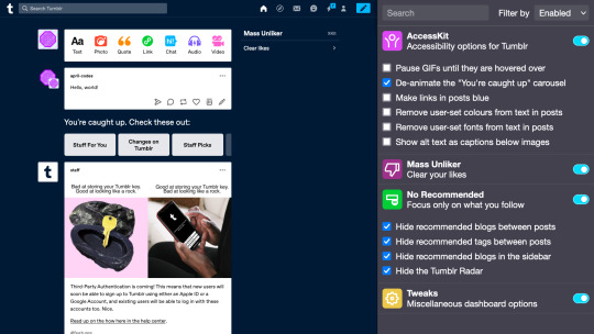
Screenshots


Installation
Get this extension for Firefox
View on the Chrome Web Store
Usage
Click the addon icon in your browser toolbar to open the control panel.
To enable a feature, click the toggle switch to the right of its information
To configure a feature, click its information or the white space containing it
56K notes
·
View notes
Text
So my therapist has been helping me get to grips with my ADHD, and also the concept that I’m not shit at being an adult, I just can’t do things the way everyone has always told me to do them. Like every single “organize your life” books have always left me wanting to cry with frustration, and after I got hold of a copy of Organizing Solutions for People with ADHD by Susan Pinsky I realized that was because they primarily focus on “aesthetic” over “function”. And the function of most standard “organize your life books” is to “make things look Show Home Perfect”.
So the standard “hide all your unsightly things by doing xyz” may look nice for the first week or so, but by the end of the week it’ll look like a tornado made of pure inhuman frustration ripped through the house as I try to find the fucking advil.
To give you an example of the kind of hell I’ve been fumbling my way through the last 20 odd years: dishes will be washed and left in the drying wrack but never put away. Which means I can’t wash more dishes, which means dishes pile up, which means I can’t make food, which means I don’t eat, which means my CFS gets worse, which means I don’t have the energy to put the dishes away, and so on so forth until I have a meltdown, cry to ETD (who also likely has ADHD but has never had it confirmed) about how I can’t cope with life, and then we fix it for a while, but inevitably end up back at square one within about a week.
Pinsky’s solution to this was “remove an obstacle between you and your goal, if that means taking all the doors off your kitchen cabinets to make things easier, so be it.”
And lemme tell you, fucking revolutionary.
Laundry never ends up in the hamper??? why???? is it a closed hamper??? Remove the lid. Throw it out the window. Clothes are now miraculously finding their way into the hamper??? Rejoice????
Mail ends up spread out over every available flat surface? Put a sorting station right where your mail arrives. Put a shredder or “junk” basket under it. Shred or dump the junk immediately. Realize you only actually have two real letters that need attention, feel less overwhelmed, pay your bills on time.
Like I’m not saying this book is miraculous, but it did help me realize that I was effectively torturing myself by trying to conform to certain ideals of “perfect house keeping”, and presenting a certain image rather than just allowing myself to live in my space as effectively as possible. And why? Why was I doing that? Cause people with different lives and capabilities are perceived as the norm? Fuck that. If this was a physical problem I wouldn’t be forcing myself to conform to an ableist standard, so why am I doing it with this?
My lived space will never look a certain way, and that’s okay. It will never look show home perfect, and that’s okay. It will likely always be cluttered and eclectic where nothing matches, and that’s okay. Sometimes I will have odd socks on because sorting them out required too much mental energy, and that’s okay. Actually fuck sorting socks, just buy all your socks in the same color. Problem solved. Boring sure, but also one less thing to do, which means more time to hyper fixate on fun things. Which really, what else is my life for if not to write screeds and screeds of vampire shit posts, I ask you.
86K notes
·
View notes
Photo

01. change your mind / by arianagrandes
so i asked my followers if they wanted me to start making themes again and what they want, they get. so here’s my first theme in a very, very long while. there are a lot of meta options (maybe too many) and it’s very customizable. for a full list of my terms and conditions, as well as some credits, click here!
static preview / code (raw)
some features:
540px wide photosets
220px wide sidebar
optional sidebar image
optional custom scrollbar
custom font selections, including body font & an accent font
custom font & accent size selection
custom font weight selection
custom body & accent letter-spacing
custom border radius
custom text transform
up to three custom sidebar links
please like / reblog if using. (✿◠‿◠)
696 notes
·
View notes
Text
Color Synonyms
White
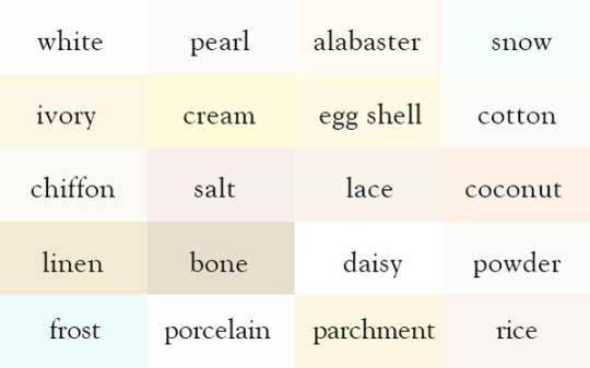
also: pale; blanched; sallow; pallid; waxen; spectral; translucent; albino;
Grey
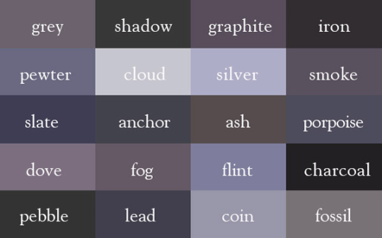
also: dust; stone; pepper;
Black

also: coal; slate; dusky; ebon; shadow; murky;
Tan
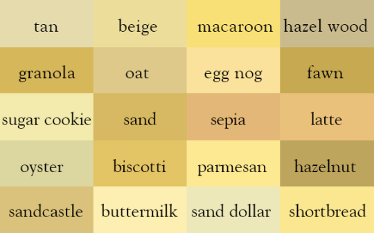
also: flesh; khaki; cream; tawny;
Brown
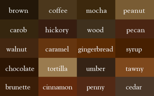
also: henna; russet; sepia; chestnut; cocoa; drab; bronze;
Red
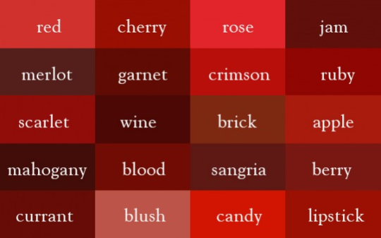
also: terracotta ; rouge; carmine; fire-engine; ruddy
Orange
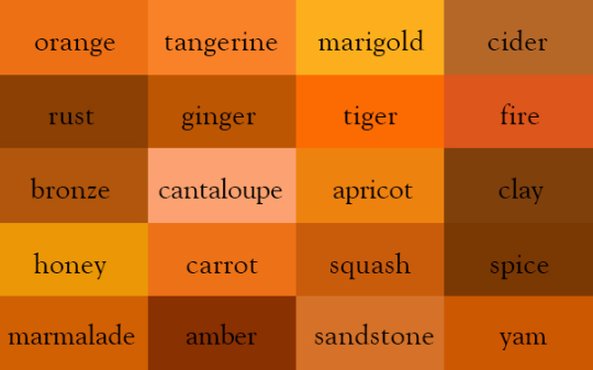
also: pumpkin ; rust ;
Yellow

also: sunny; amber; saffron; hay; straw; platinum;
Green
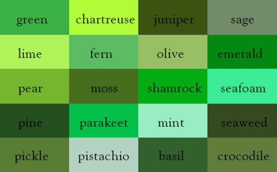
also: viridescent; grass; jade; forest;
Blue
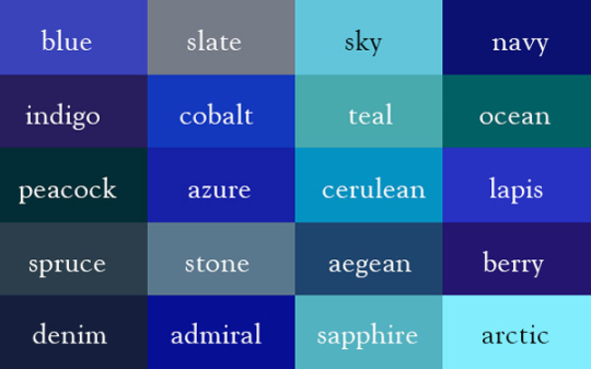
also: turquoise; cyan; ultramarine; royal; aqua; aquamarine;
Purple
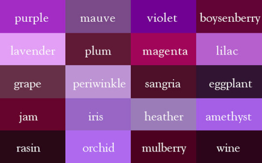
also: berry; amaranthine;
Pink

also: flushed; candy; cherry blossom; petal pink ;
—– source: http://ingridsundberg.com/
—–additional synonyms added by me
241K notes
·
View notes
Text
some fucking resources for all ur writing fuckin needs
* body language masterlist
* a translator that doesn’t eat ass like google translate does
* a reverse dictionary for when ur brain freezes
* 550 words to say instead of fuckin said
* 638 character traits for when ur brain freezes again
* some more body language help
(hope this helps some ppl)
227K notes
·
View notes
Text
site that you can type in the definition of a word and get the word
site for when you can only remember part of a word/its definition
site that gives you words that rhyme with a word
site that gives you synonyms and antonyms
1M notes
·
View notes
Text
WHY DID NO ONE TELL ME ABOUT PRO WRITING AID BEFORE?! THIS THING IS FUCKING GLORIOUS. HOLY SHIT. LOOK AT THIS.

IT GIVES YOU A WHOLE DAMN REPORT ON YOUR WRITING AND WALKS YOU THROUGH HOW TO MAKE IT BETTER AND WHY IT IS SUGGESTING CHANGES. THIS IS JUST A TINY CHUNK OF THE HUGE REPORT IT GAVE ME ON THE FIRST CHAPTER OF ONE OF MY PROJECTS. I AM IN LOVE.
AND IT WORKS WITH SCRIVENER. AND IT IS AFFORDABLE.
WHY DID NO ONE TELL ME?!
62K notes
·
View notes
Text
“How arw you paying for photoshop” im not LMAO
440K notes
·
View notes
Text
OH MY GOD whyyyy did no one tell me you’re supposed to send thank-yous after interviews?? Why would I do that???
“Thank you for this incredibly stressful 30 minutes that I have had to re-structure my entire day around and which will give me anxiety poos for the next 24 hours.”
I HATE ETIQUETTE IT’S THE MOST IMPOSSIBLE THING FOR ME TO LEARN WITHOUT SOMEONE DIRECTLY TELLING ME THIS SHIT
445K notes
·
View notes
Photo
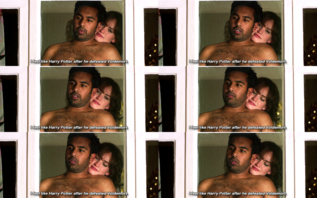


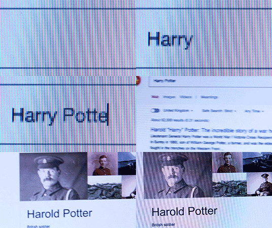
Yesterday (2019) dir. Danny Boyle
96K notes
·
View notes
Text
on today’s episode of “Hozier liked”

30K notes
·
View notes
Text
Writer friends, I discovered a fun website today. It’s called “I Write Like” and here’s the description: Check which famous writer you write like with this statistical analysis tool, which analyzes your word choice and writing style and compares them with those of the famous writers. Let me know which autor you got!
82K notes
·
View notes
Text
site that you can type in the definition of a word and get the word
site for when you can only remember part of a word/its definition
site that gives you words that rhyme with a word
site that gives you synonyms and antonyms
1M notes
·
View notes
Photo
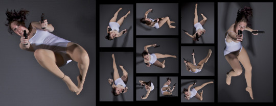
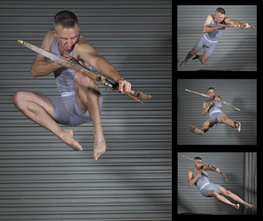
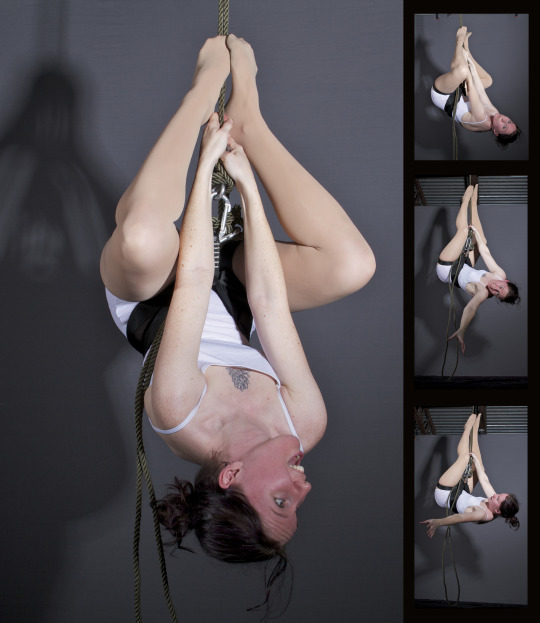
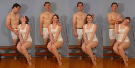
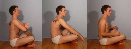
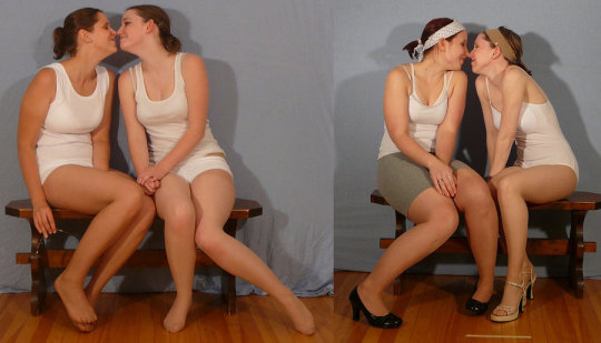
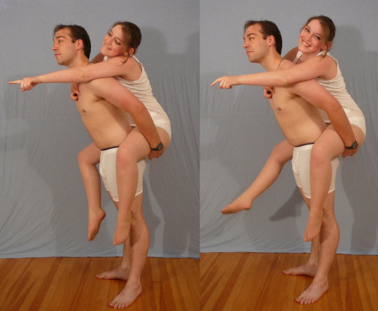
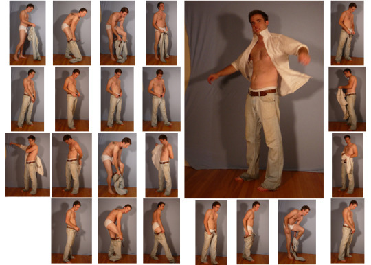
SenshiStock’s gallery consists of millions of pictures that are free to use as reference.
General Drawing Poses Sit and Kneel Dramatic and Reaching Drawing Poses Magic and Hogwarts Drawing Poses Staff Weapon Pose Reference Hammer, Axe and Bat Pose Reference Sword Weapon Drawing Reference Small Bladed Weapon Pose Reference Gun Weapon Pose Reference Bow and Arrow Archery Stock Foreshortening and Perspective Poses Dynamic Flying Falling Action Poses Deafeated or Laying Drawing Poses Magic Crystal Magical Girl Wand Weapon Transformations and Dance Cards Back Pose Reference Pin Up Inspired Poses for Drawing Performances Poses Life in General Poses Fights and Fighting Pose Reference Leaning Poses Classic Sailor Senshi Poses Wings Sailor Moon Villains Pairs Romance or Couples Pose Reference All the Male Stock Hanging Stock Drawing Reference Three or More Groups Instruments Mirrors Whip Technobabble
439K notes
·
View notes
Text
I MADE AN ART MASTERPOST
Bodies:
how to draw arms
*Hands*
How To Draw Hands
hands hands hands
more hands
another hand tutorial
How to draw butts&thighs
draw knees
draw feet
Kneeling + Sitting ref
Body anatomy help
The male torso
Muscular male with bow stock photos
Lots of Stuff
All about the human body
Pose studies
100+ anatomy references
Sitting poses
pose reference blo
realistic woman body ref
male body
Pose Maker
Poses
hundreds of pose references wowie
a guide to figure drawin
torso reference
How to draw penis
Penis ref
Kissing ref
Faces:
Drawing expressions
Creating expression
Avoiding same face
How to draw faces
*Heads
Heads&Angles
contouring and highlightin
drawing eyes
*How To Draw Noses
drawing ears
how to draw profiles
*How To Draw Lip
lips ref
lip tutorial
Hair:
Hair tutorial
Hair+Fur
how to draw curls
*How To Draw Hair
Clothes:
Drawing clothe folding
How to draw folds
Folding ref
how to draw jeans
hat ref
*How To Draw Fabric Folds/Creases
how to draw shoes/feet
hecka lot of clothing refs
Other (Person Related):
Flower crown tutorial
Drawing horse/animal legs on humans
Anatomy of mutant humans
Mass art ref
Drawing human wings
draw wings
*How To Draw Cuts And Bruises
wings
Other (non-specific):
How to draw ice
Drawing clouds
Creature design
Tutorial masterpost (100+)
How to colour
Drawing ref masterpost (10+)
paint blood
shadow help
draw grass
I made this most for my own benefit to organize this stuff, and have no idea how to make a masterpost!
186K notes
·
View notes
Photo
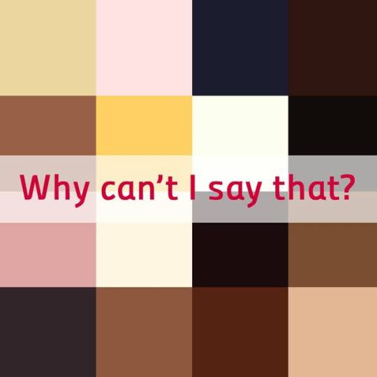
Avoiding Racism for Writers - Coffee, Honey and other Color Don’ts
Author Alex K Thorne (@mermaidandthedrunks) answers the question, “Why can’t I say that? It’s not offensive to compare someone to delicious chocolate!” and discusses how to avoid unintentional racism and harmful stereotypes in your writing:
[Read full article here]
No decent, thoughtful human being wants to be accused of racism. Most decent, thoughtful human beings are guilty of racism.
Of course, it’s usually unconscious, and it’s often hard to keep track of evolving language and social movements, of phrases in the vernacular that were perfectly acceptable ten years ago but are now taboo (and vice-versa).
As writers, albeit pros or fanfic writers, or everyone in between, we use our words as tools, as toys, and sometimes, as weapons. It’s our responsibility to listen to new conversations, to keep abreast of the ever-changing socio-political climate, and above all, to think before we ink.
There are some wonderfully evocative ways to describe people of color without being unintentionally racist or having to sacrifice your creative integrity.When writing about a character of colour (ESPECIALLY if you’re a white author), visit sites such as:
@writingwithcolor
@weareallmixedup
@thisisnotafrica
@thisisnotlatinx
5K notes
·
View notes
Text
How I make book covers + tips for you!
Hey people of Earth!
Around this time last year, I mentioned I would have a video up on how I make book covers/cover making tips, and to summarize: I did not do the thing, and this year old script is still sitting in my drafts.
SO, I thought I’d kill two birds with one stone and post a written version of these tips! Going to get straight into this because I imagine this will be rather long!
This post will be divided into 6 parts: finding inspiration, concept art, incorporating elements of design, composition, tools and software, and resources. Feel free to skip around to whatever section interests you most!
***Before we get started, really quick disclaimer. I am in no way a professional cover designer. Cover design is merely something I picked up on my own, and I don’t have any formal education/credentials in graphic design. So of course take my advice with that in mind. These are also just my personal thoughts and opinions. So take everything with a grain of salt!
1. Finding Inspiration

What’s the deal?
A really great way to start out in design
Finding cover designs or designers you admire may help you see what works technically
Helps nail down a style you like
In turn, can help you find your cover design style
What should you do?
Look at covers in your genre!
Whenever I design a cover, I take a scroll through Goodreads to pick up some inspiration in designs I personally love
I also love walking around my bookstore and taking a look at physical copies
Find a cover design you like, and point out the specific reasons you like it
Example:
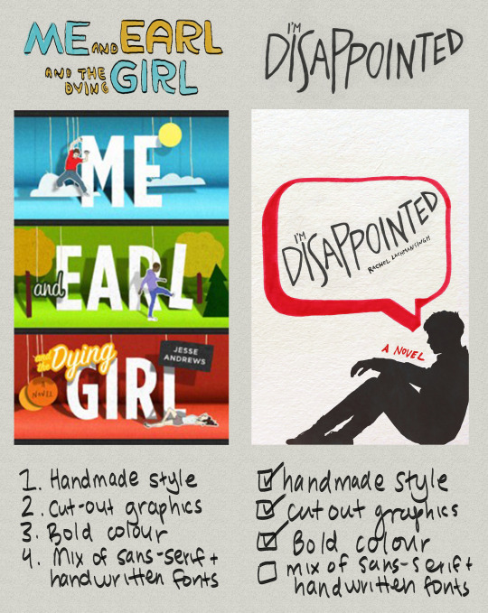
Me and Earl and the Dying Girl was actually not an inspo cover for this edition of I’M DISAPPOINTED, but as you can see, things I liked from it spilled over into my own design. By pointing out aspects of graphic design you like, you’ll better be able to understand your style as a cover artist.
Some personal thoughts:
I like covers that include a textured backgrounds, as seen in the collage below:
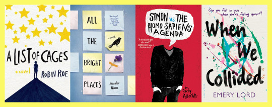
So for the I’M DISAPPOINTED cover above, I included a textured background. I also love handwritten fonts/lettering, which I include in almost all of my book covers.
What I did:

Off-white colour from A List of Cages and Holding Up The Universe
Silhouette from Painless and previous cover design of I’m Disappointed
Speech bubble from Simon VS the Homo Sapiens Agenda and Say What You Will
Marker texture from A List of Cages
Obviously my thought process wasn’t to put 4 covers in a blender and thus create my product, ha, this is just an example for the ease of understanding!
2. Concept art

What’s the deal?
Coming up with concept art is a super important part of designing a successful book cover.
Acts as the skeleton of your book cover
Your book cover’s roadmap
Saves time/effort
Similar to an outline for a novel.
Can be a very quick sketch, or full fledged design
I like keeping my concept art quick, but if this is your first cover, making a more detailed mockup can help.
What should you do?
Sketch out book cover ideas once you get them/take notes of concepts you’d like to explore
If you can’t come up with concepts, take a look at your inspiration folder and pull concepts/ideas from covers you love
This does not mean copying another book cover (this is notttt a good idea!). BUT, pulling inspiration from elements you like on a cover can be helpful in generating your own concepts
You don’t have to come up with concept art (sometimes winging it works!) but I do recommend jotting notes down, and drawing out loose sketches when applicable!
Keep a list of ideas for book covers as you accumulate them (almost like a little vault of concepts lol) and reference them in the future!
Take a look at as many book covers as you can and make a list of elements you like and don’t like
This is one of the easiest ways to accumulate ideas/concepts!
Example:
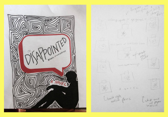
^^^ Concept art for two book covers
Likes and dislikes in book covers:
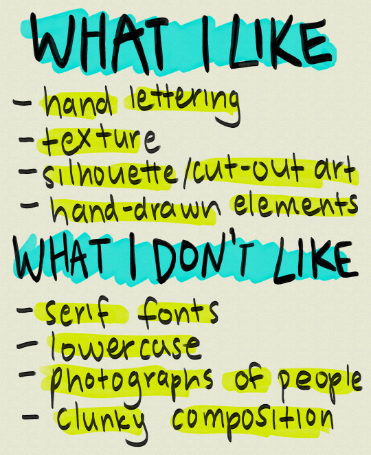
Of course this list is not my be all and end all (nor should it be), and obviously, I still use these things (besides clunky composition I hope!) in some designs!
3. Incorporating the elements of design

What’s the deal?
There are 7 elements of design: line, shape, texture, form, space, value, and colour.
These sometimes vary depending on where you look, but this is what I was taught, so I’m going to be working off that!
Examples:
I’m going to go through them really quickly via an assignment I did for my comm tech class
Keep in mind this assignment is 2 years old and is only meant to give you an idea of what these elements are
1. Line

Line is probably the most important element of design as every piece of art starts with one.
There are various types of lines. You can have curved lines, straight lines, vertical lines, horizontal lines and so on.
2. Shape
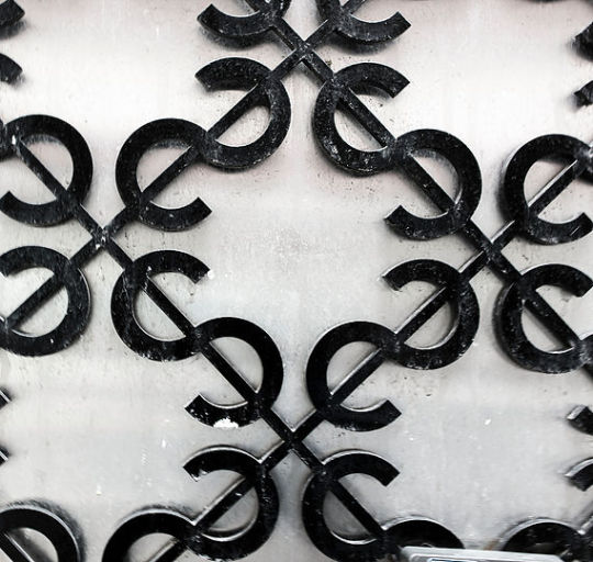
You can have more mathematical, geometric shapes, or more abstract, free form shapes.
3. Texture
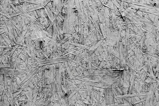
Texture is the feel of a particular surface.
Texture in my opinion is one of the most important elements when it comes to graphic design, especially book covers.
My favourite thing to see in book covers is texture, whether that be paper textures like construction paper, crumpled paper, wallpaper, lace, wall textures, paint textures, or marker textures
Texture adds depth to designs, and if there’s any element of design you focus on in this post, I’d highly recommend it be this one.
(i’m biased but still)
4. Form
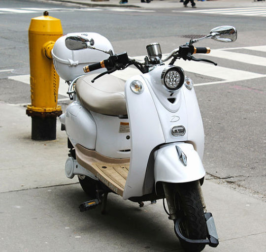
Form is almost like shape, except instead of flat objects, we’re dealing with 3-dimensional objects.
I don’t often use it in my covers since I like drawings and flat shapes in my designs, but if you want to include objects on your cover, or any sort of 3D shape, this would be form.
5. Space
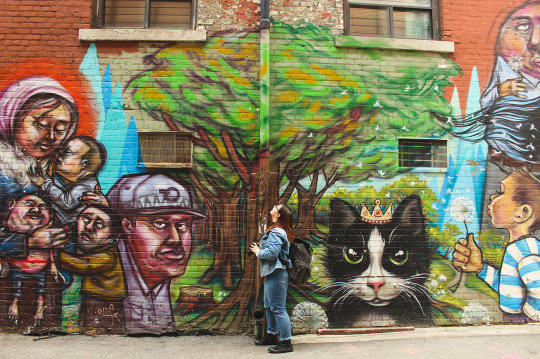
The distance around an object, to put it simply
Space in covers can help emphasize what’s important, and what is less important, or can draw attention to a particular piece of your design.
Examples of space:
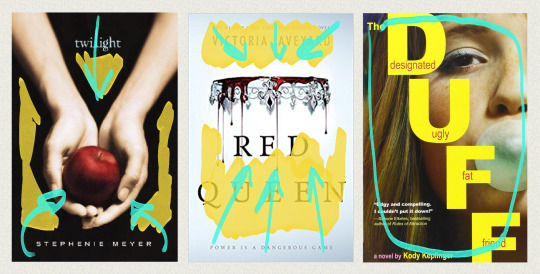
Colour coding: yellow = space, teal = focal point/movement of viewer’s eye
In Twilight, the black space helps emphasize the main image, the hands holding the apple.
This also occurs in the Red Queen book covers. The empty space around the crown draws attention immediately to the focal point
You can also lack space. In The Duff, the girl’s face is the only thing you can see on the cover.
6. Value
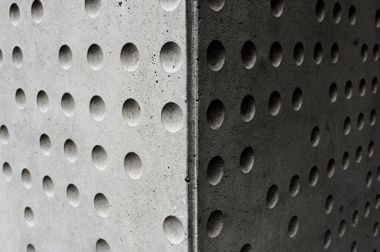
Is determined by how much light or dark is incorporated into design.
Example of value:
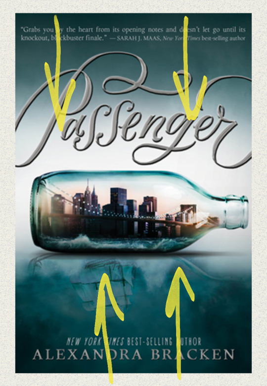
A great example of value in book covers is on Alexandra Bracken’s Passenger. As you can see, the green at the top fades down in a gradient as more white is added to the centre.
7. Colour
Light reflecting off objects
Can make certain elements of your design stand out
Why should you incorporate the elements of design into your designs?
Adds layers of depth to your work
Thus can take your cover-making skills to another level
Can help in producing ideas
4. Composition:

What’s the deal?
In my opinion, can make or break a design
Can mean clutter of things, OR too much or too little space between elements
Title placement
Composition is sometimes subjective from design to design
What you can do:
Pay close attention to detail and spacing
Look out for natural shapes in your design you can fit elements into
Watch the linked video from Mango Street (one of my favourite photography channels) on composition
While photography and design are two different things, the tips in this video can also be applied to various ideas in design such as headroom and leading lines
youtube
Examples:
*Before I get into this, I want to make it clear that these examples are exaggerations for the purpose of showing you good and bad composition. If you make these mistakes, that doesn’t mean your design is bad, and again, I’m no professional. This comes from what I believe could be considered bad composition, but trust your gut.
Example 1: Stick People
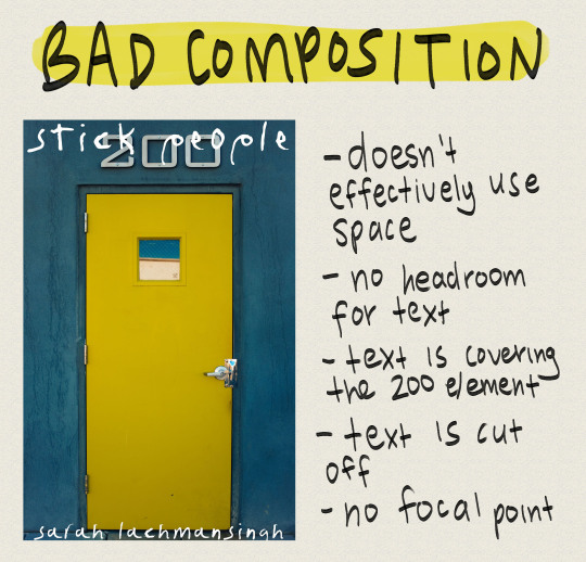
doesn’t effectively use space
no headroom for text
text is covering 200 element (looks very clunky)
text is cut off
No focal point
Can’t read the title
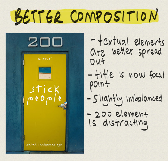
Textual elements are better spread out
Title is now focal point
Slightly imbalanced
200 element is distracting
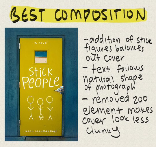
Addition of stick figures balances out cover
Text follows natural shape of photograph
Removed 200 element makes cover look less clunky
Example 2: Sixteen Cents
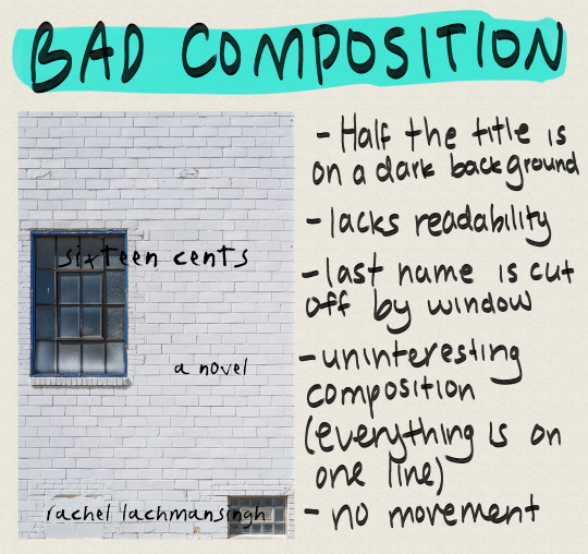
Half the title is on a dark background
Lacks readability
Last name is cut off by window
Uninteresting composition (everything is on one line)
No movement
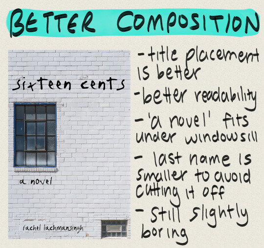
Title placement is better
Better readability
‘A novel’ fits under windowsill
Last name is smaller to avoid cutting it off
Still slightly boring
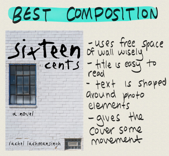
Uses free space of wall wisely
Title is easy to read
Text is shaped around photo elements
Gives the cover some movement
Example 3: Fostered
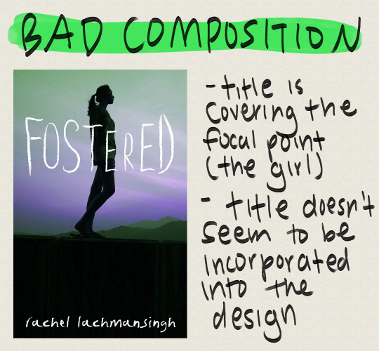
Title is covering the focal point (the girl)
Title doesn’t seem to be incorporated into the design
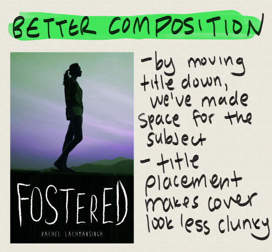
By moving title down, we’ve made space for the subject
Title placement makes cover look less clunky
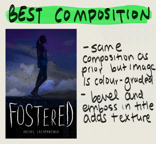
Same composition as prior but image is colour-graded
Embossed title adds texture/depth
I’ve mentioned this a few times in this post: focal point. What is it?
FOCAL POINT:
Is defined as the main attraction of your book cover
This is where you want your readers’ eyes to focus
Focal points can sometimes define themselves in areas where more contrast happens to be
Doesn’t have to be the centre of the page.
Keep focal point in mind for composition because if you put it in the wrong spot, you could end up drawing your readers’ attention to the wrong area of the cover.
The point of most interest in a cover is the focal point, so if you want a particular subject of your book cover, such as a person, to stand out make sure you don’t make the other areas of the cover too high contrast or busy.
Framing subjects also helps, so be creative!
The human eye tends to focus on areas with increased contrast so keep this in mind
Examples:
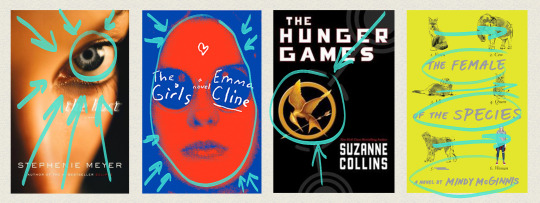
The Host
The camera has focused on the eye of the model, with the nose bridge and forehead shadowing each corner of the cover
Helps lead eye to focal point (the eye)
The Girls
Blue around the edges encircles the focal point (the girl), leading the viewer’s eye directly to her
Girl is also scarlet in colour, contrasting the background
The Hunger Games
Grey outlines on the cover lead straight to the mockingjay
Mockingjay is bright gold in comparison to the black background
Creates contrast, thus viewer’s eye is lead there
The Female of the Species
‘Straight’ composition
No particular focal point, viewer’s eye instead moves horizontally across the design
What should you do?
Use the natural shapes and outlines in your design/photo to fill your cover
Use your space wisely (see examples above)
Use leading lines to draw attention to your focal point
Manipulate text to fill empty spaces
5. Tools and software

You do not need Photoshop to make a good book cover
I made my first book covers in GIMP, a free image manipulation program (kinda like Photoshop’s little brother)
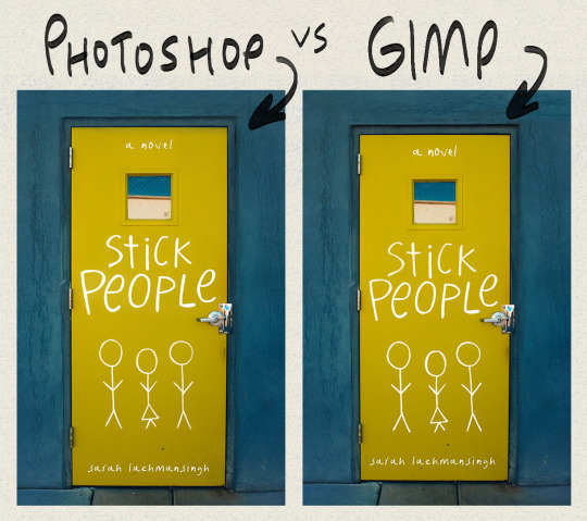
This is the stick people cover I made in photoshop, and the same cover made in GIMP.
Other tools you may want to use are CreateSpace’s cover templates.
You can find these through CreateSpace OR Bookow (my personal fave)
OPTIONAL (what I use):
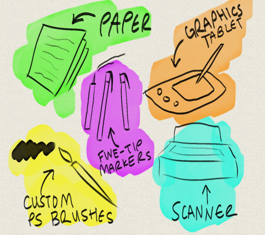
Graphics tablet
I use the Huion H610 which I really enjoy!
I use this to hand letter, draw silhouettes, create concept art, and so on
Paper and my Faber Castell India Ink Artist Pens.
These are fine tip markers, and are what I used to create the text on I’m Disappointed
Thin sharpies and pens will also do the job, and you can always clean any mistakes up in photoshop or gimp.
A scanner so I can transfer what I’ve hand drawn onto my computer
If you don’t have a scanner you can take a clear photograph on a camera or phone
I also use a few custom marker brushes that now come with the 2018 version of Photoshop
The main one I use is Kyle’s AM - Watercolour Paper from the art markers set (you have to load these into Photoshop, but if you have PS 2018, you should have access to ‘em).
(I’ve lettered everything in this post with that brush)
6. Resources

Here’s a list of amazing resources you might need when making your own book covers!
1. Stock image websites
Check out THIS post for a master list of my favourite stock photo websites!
Stocksnap.io
Unsplash.com
Pixabay.com
2. Dafont
Is my main source for finding fonts
3. Goodreads
A huge resource I use to find cover inspiration
I’ll often browse the new releases section to look at new covers and so on
Easy way to narrow down the genre of cover you’re looking for, as well as the age category
4. Keyboard shortcuts
Check out a masterlist for Photoshop HERE
GIMP masterlist HERE
Makes workflow super efficient
My fave I highly recommend in Photoshop is ctrl > shift > alt > e (merge all layers into new layer)
I’ve made TWO custom shortcuts: ctrl > shift > o is now open as layer, and ctrl > shift > alt > r is now rasterize layer (these save so much time!)
So to conclude this post, I’m going to list out some of my favourite tips when it comes to cover making (sort of a reiteration of this post)
Add texture!
Texture is a super easy way to add dimension to your book cover
Try lettering with a paper and marker when starting out
I find this a lot easier than digital lettering!
Google is your friendddd
If you can’t figure out how to do something in Photoshop or GIMP, the internet is a vast depository of information!
Pay attention to detail
Cover design is alllll about the small details. Making sure you’ve centred something properly can seriously help in making your cover go from amateur to whoaaa who made thatttt
Get a second opinion
Been looking at your screen for 8 hours straight? Ask someone you know what they think of your design! I find this has sparked a lot of secondhand ideas!
If it doesn’t work out, doesn’t mean it was a fail
If a particular concept just doesn’t work, don’t worry! As you practice you’ll get better, and you can always revisit the concept for another novel!
EDIT: a really great suggestion from @sarahkelsiwrites: print out your design if you need a fresh perspective! You’d be surprised by what you notice on screen VS off!
So that’s it for this post! I hope this was helpful for some of you guys, I know it was looooong overdue. If it helped you out, let me know, and if you have any questions, feel free to send ‘em my way! :))
–Rachel
13K notes
·
View notes