Photo

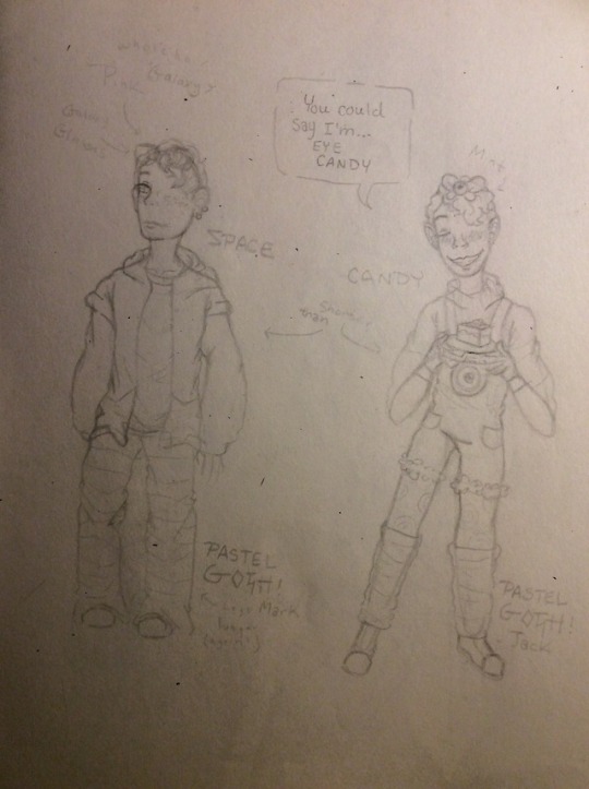
Sorry I haven’t posted in a while, but life is pretty hectic like that! Hopefully I can get back into posting more often but we shall see! (Life is very mysterious in that way)
These two drawings were done a year apart. It’s cool to see how much I’ve improved over time! (I still have a long way to go!!!)
#septicart#jacksepticeye#Sean McLoughlin#art is hard#digital art#art improvement#three eyed clover draws
11 notes
·
View notes
Photo
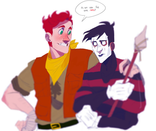
what if one of DSs adventure mode levels was a realy long summer which one needs to spend being a camp counselor looking after max and the gang
(@grey-aria ‘ s designs for those sweet buns)
489 notes
·
View notes
Text
no one knows whether over the garden wall qualifies as a movie or as a tv show but thats fine bc that just means its my favorite movie AND its my favorite show
16K notes
·
View notes
Photo


been re-watching One Punch Man lately.
9K notes
·
View notes
Text
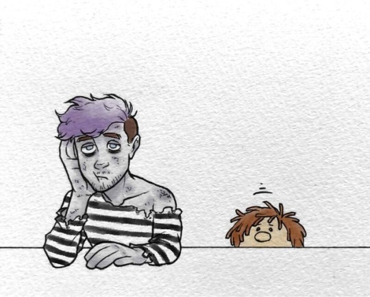
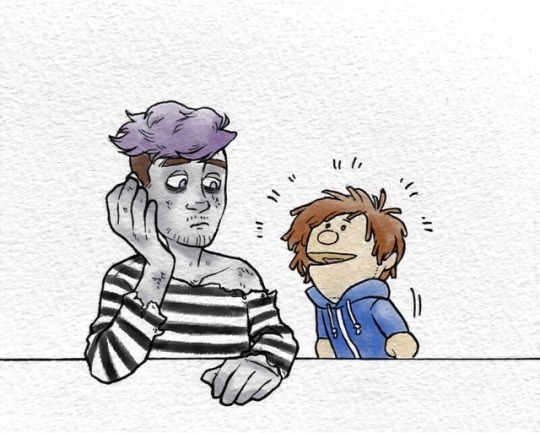
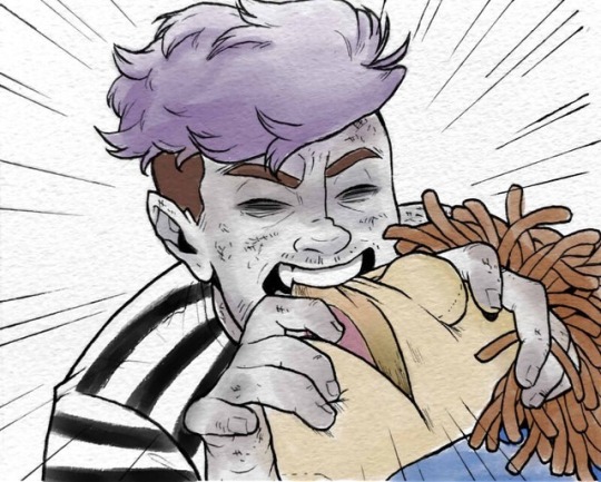
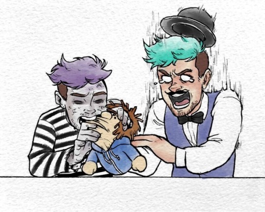
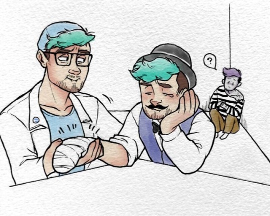
Robbie is a curious boy.
Another little collab with @veykun !! XD
3K notes
·
View notes
Photo
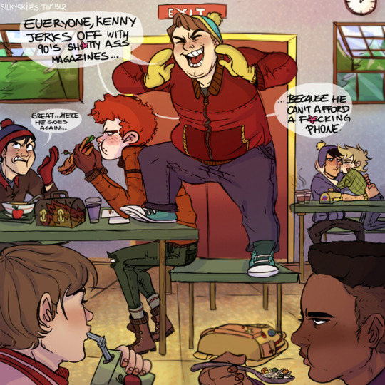
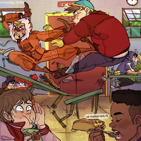
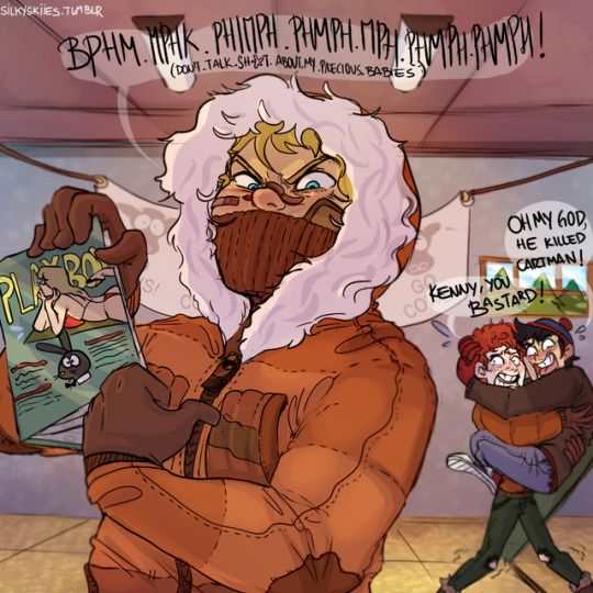
“WASTED” 😂💕”
Never insult Kenny’s magazines!
I was chatting with my beloved friend Lucii (total sweet heart) while doodling this💕
13K notes
·
View notes
Photo
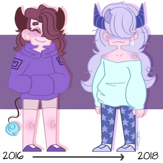
Persona’s through the ages!
1 note
·
View note
Photo

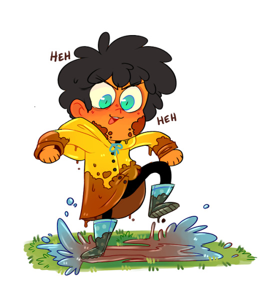
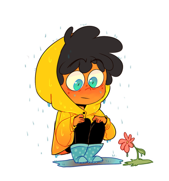
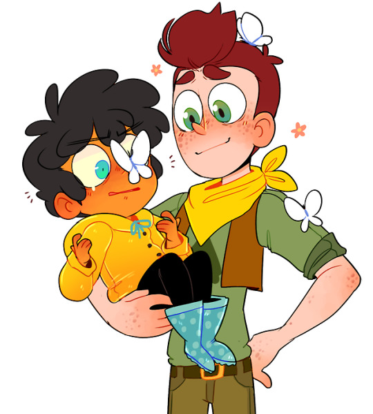
Son and father enjoying the rainy weather UvU
12K notes
·
View notes
Note
Hello, it's 5:30 in the morning and I was just looking for things to distract me until I could fall back to sleep and you drawing BEAUTIFUL ART for the fic that made me cry FOR HOURS IS NOT HELPING but by god if I didn't read it through 20 times
lookit all these poor suffering early morning peoples i’m so gomen. being up early is enough pain all on it’s own what have i DONE
….. actually i think i have some shit here i can post that’ll help things
33 notes
·
View notes
Note
your comic of long haired mob and reigen is AMAZING! if you dont mind me asking, how did you make the colors in your comics look uniform (ie: blue in that one comic) and yet still recognizable of their original/normal color palettes, did you use a layer mode? or something else?
OKAY THIS IS. a challenging question to answer, even though it’s easy in practice.
The Doozy ABoT comic is a bit of an exception to the rule of how I color in general, but I can show you a glimpse into how that color process went. Also I use Sai for everything listed.
I’m using a picture I haven’t colored/merged yet to show what I mean, since you need to keep the lineart separate for my process to work. You can see how I color lineart here. Here it’s just at 30% lumi&shade.

Ya start with ur flats. Rad. (and always have backup flats on a duplicated layer)

getcha some faded blue set on a grouped screen layer.

Some faded blue on a multiply layer
(this is where i divulge from how i usually color comics, to be continued below **)

Because the comic was a night scene, i leave the darks/contrast as is, since you lose a majority of it in dark scenes, and just apply an orange screen layer where the light’s gonna hit them.

select the inverse of that (with some space to give that weird shade-line in my stuff) and add some more blue on a screen layer and viola! you got my basic process for coloring that comic. and you didn’t even have to do much to preserve the original color palettes in people’s minds.

**back to how i normally color comics (here i used faded purple on my screen/multiply layers)
your average scene is very well lit, so it’s important to show the regular contrast as is. so – you get your sucker all done up, then

you adjust the brightness/contrast/color deepen until it reflects the difference you started with. now u have your original set of hues looking like it got passed through a purple color filter, but functioning better imo.

I personally like it a little toned down, so I add back in some of that reserve flat layer. I eyeball it, but this was around 52% opacity.

Multiply layer where your shades go. (with more faded purple)

Luminosity layer on top of the shades to make that solid line in my darks I was talkin about. (with even more faded purple)

And you can have an optional screen layer in the highlights (by selecting the inverse of your shade layer.) Here I used yellow bc why not.

That is the other important thing about my art. My shades and highlights are kept to 1-2 colors. Here it’s orange and green

Here it’s blue and red. The simplicity looks better to my eyes.
aight you made it to the bottom go treat urself to smth nice
4K notes
·
View notes
Photo


Cinematic Parallels:
One Piece Episode 356 (2008) - Steven Universe Episode 151 (2018)
7K notes
·
View notes
Photo


A cute little flower field guide
Artist: @orange-pie
319 notes
·
View notes
Photo
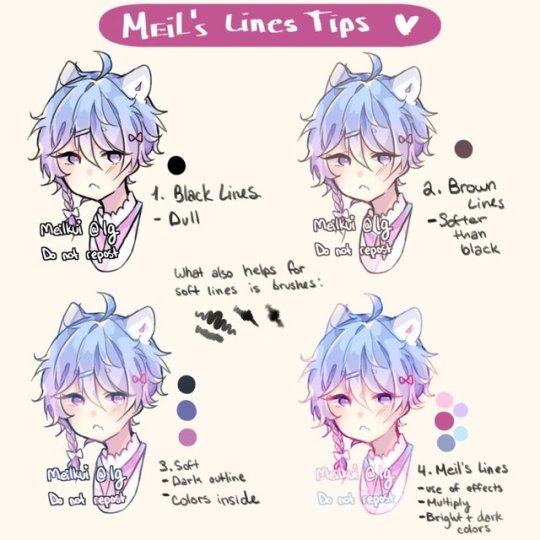
Lineart Tips by Meelkui
Buy the artist a coffee!
7K notes
·
View notes


