
Statistics
We looked inside some of the posts by throughtheeraswithlibs and here's what we found interesting.
Average Info
Notes Per Post
1
Likes Per Post
1
Reblog Per Post
0
Reply Per Post
0
Time Between Posts
17 hours
Number of Posts By Type
Text
17
Last Seen Tumblr Blogs


Fun Fact
In 2020, Tumblr had 29.4 million users in the US.
Text
SELF EVALUATION
My self evaluation to reflect on my journey through Unit 2.
0 notes
Text
‘FUNK’ SS22 COMMERCIAL
youtube
Videos included : YOUTUBE. (2018) The Beatles STUDIO BLOOPERS. [Online] Available from: https://youtu.be/NZd3R2iw4cA. [Accessed: 5th February 2022].
1 note
·
View note
Text
ILLUSTRATION - DESIGNING SKETCHBOOK PAGES
A more simplistic sketchbook layout, documenting my design draft ideas. I really enjoy the effect of the pull-the-tab effect revealing a redeveloped idea, as it adds a different, more interactive aspect to my sketchbook which is more enticing for people to look at, whilst highlighting my own creativity and imaginative thought processes.
0 notes
Text
ILLUSTRATION - DESIGNING SKETCHBOOK PAGES
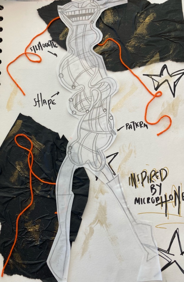
Some additional sketchbook pages displaying my design drafts, portraying a messier effect using tissue paper and a pop of colour through orange thread.
0 notes
Text
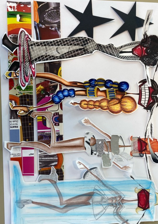
FINAL DESIGN BOARDS
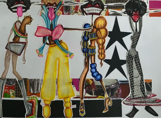
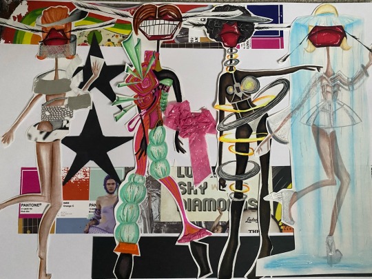
Here are my final design boards, I altered the arrangement whilst still maintaining the exact same idea for the two boards just to highlight more variation. Along with this, I designed my press release based on my design board layouts to match the overall vibe in my portfolio which fabricates a more professional look for my future. I really love the layout of each of my design boards and press release as it hints at a perfect amount of colour and vibrancy whilst adding a more in-trend modern aspect to a sixties mood through elements of black stars and strips to tie it all together. I altered my finalised press release design slightly, through spacing the stars out more and eradicating the red outline, due to the fact that it looked too cramped with the strips of design board, and the red outline didn't harmonise with the overall layout. Therefore I wanted to make the design of my press release more simplistic to fit in much better with my design boards.
0 notes
Text
CONSTRUCTING MY DESIGN BOARDS
IDEA 1
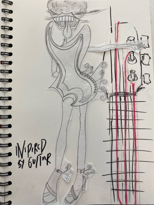
Here is my first design board idea, experimenting with different layouts to see which one best complimented my designs, I cut out long strips of my collection moodboard which is swimming with colour and inspiration as to where I was influenced to create my designs. Therefore the idea of using elements of my mood board really accentuates the chic vibe of the collection, meanwhile I also wanted my theme of stars, to run through my portfolio, therefore I chose to reference an essence of them through my design boards, which I believe projects a cool effect, which reflects my brand.
IDEA 2
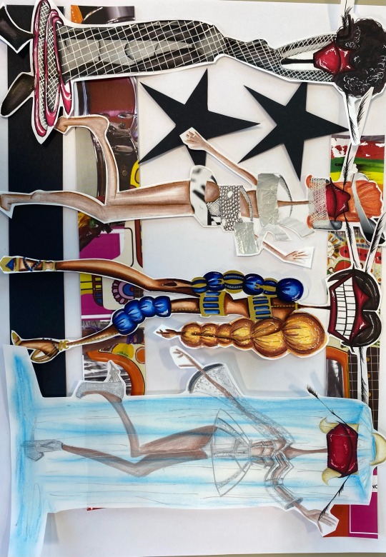
Here is my final idea for my design board as I absolutely love the look it projects. From Idea 1, I wanted to reference the black stars with an extra black strip of card as it brings the piece together whilst complimenting these black stars. I also switched around my composition of my mood board strips to spread out the design board more which doesn't distract away from the designs, but still reflects the overall vibe of the collection.
IDEA 3
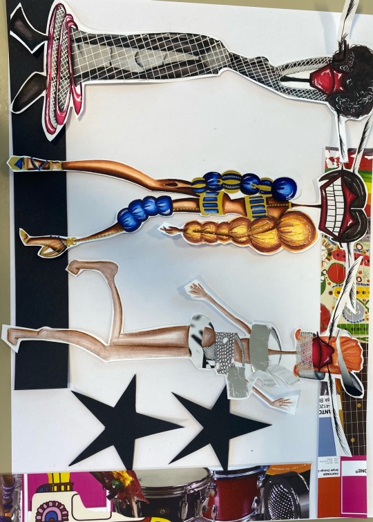
Here is my final compositional layout of my design board, I really enjoy the idea of this design board, however it isn't practical, due to the fact that I wanted 4 of my designs to fit onto a board, which waste necessarily possible with this composition, as it would cover the stars as well as looking too cramped.
0 notes
Text
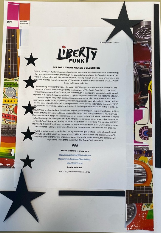
MARKETING - FINALISED PRESS RELEASE

Based on my previous experimentation with different layouts for my press release, I really loved the electric vibe of the stars. However I wanted to create a more professional inspired press release which still maintained this funk. Therefore I chose to use elements of the stars which incorporating a red outline into the colour scheme to harmonise with the red lips my logo. I really love this layout, as it doesn't distract from the text entirely through its simplicity, but still projects this cool and trendy aspect of my collection.
0 notes
Text
PATTERN CUTTING - MY FINAL GARMENT + EVALUATION
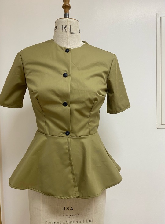
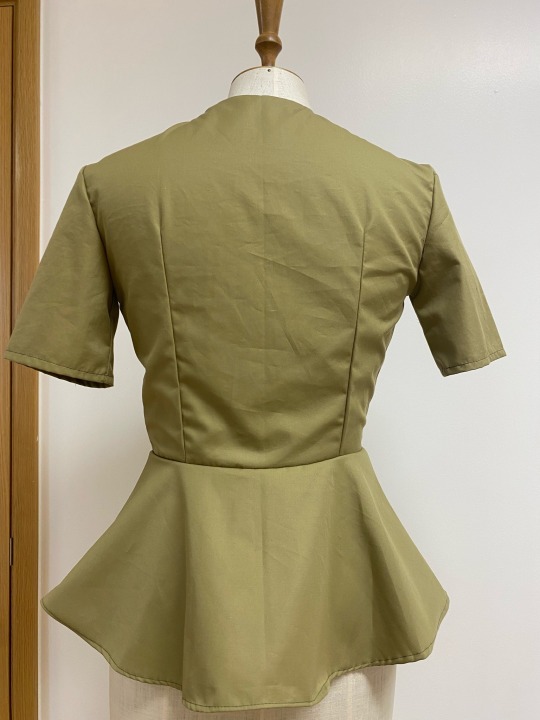
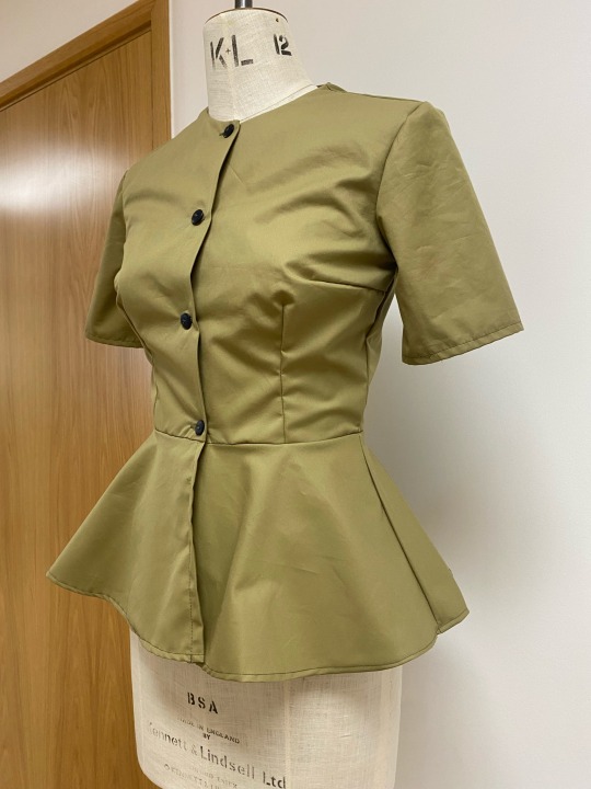
Overall, I am really impressed with the progression I have made from my toile, advancing to my final garment in 100% cotton. From my toile, I was enabled to recollect certain mistakes such as developing more precision, which was my target for this unit which allowed me to nurture my technical knowledge, to prepare me for my final garment. Additionally, I wrote a method which helpfully aided me to complete my final garment independently, which ignited lots of confidence within me to construct a garment toile and finished product in Unit 3, assisted by a precisely detailed method of construction. Moreover, I took skills across from my toile to my final garment such as, maintaining a precise stitch throughout my production and consistently developing my garment technology knowledge, as well as introducing new machinery which expanded my skill range. A part which I was particularly happy with was the progression of adding sleeves into the garment. A frustrating process, which demonstrated my initiative to persist, the process of adding sleeves to my garment was a new part of unit 2, after adapting to one method, I learnt that it wasn’t particularly the best suitable for me, therefore my pattern cutting tutor displayed a new technique which definitely highlighted the evolution of sleeves from my toile to my final garment as I eased the fabric of the sleeve into the bodice which constructed a smooth edge . Although my skill of adding sleeves into a garment isn’t perfected, I feel as though I have climbed a step of this step ladder of confidence, and am keen to perfect my capability throughout the course. Furthermore, it is proven that my final garment is a large stepping stone from my toile, due to the fact that my toile didn’t actually fit my mannequin, however through easing the fabric on my peplum to create an ensured fit, I was able to make my final garment fit perfectly to the mannequin. Unit 2 has definitely drawn my attention to little details in a garment which all compose to create the smooth edges, the clean and finished look and most importantly a beautifully produced garment inside and out. Something I would’ve liked to have perfected was the peplum lining up to the bodice. Where the back peplum and front peplum meet, I wanted to display this smooth transition from the seams of the peplum to the side seams of the bodice, however one seam is slightly off, compared to the other which precisely fits, which I believe is something connected to the size of my back peplum best pattern, which if I perhaps altered slightly, it would develop this smooth transition. Despite this, I am really proud of myself for adapting from my toile, and evaluating what I could’ve done better, to produce my final garment, as it has really amplified my confidence in garment technology further and has nurtured my technical mind, which is an essential for garment production.
0 notes
Text
ILLUSTRATION - DESIGNING MY FINAL COLLECTION
My final design of my 8 piece design collection was my Eleanor Rigby piece. A very experimental design, I evaluated my method of applying pastels and decided to continue with my pastel idea, despite it not being my strongest media, I wanted to highlight my ability to inflate my media application and my willingness to push the boundaries. Based on my previous experimentation, I learnt I didn’t want the blue to be as intense, as I wanted the design to project a more magical look whilst using the symbolism of the blue as sadness.
0 notes
Text
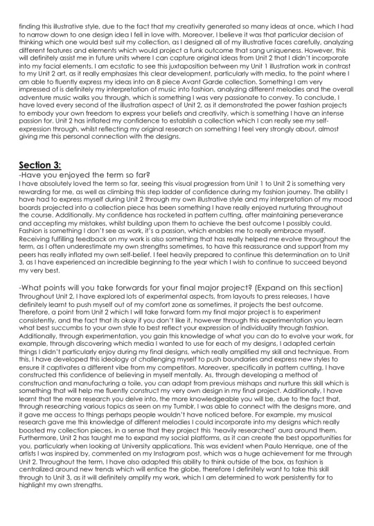
ILLUSTRATION - DESIGNING MY FINAL COLLECTION
A more: behind the scenes style video, I wanted to replicate the original design as seen on the right, but refine my detail through really exaggerating this shadow and dimension which incorporates lots of realism into my piece. I am really happy with the outcome of this design, as through my development you can see this improvement through the smallest changes such as the coloured pencil shading in the guitar part of the design.
0 notes
Text
ILLUSTRATION - DESIGNING MY FINAL COLLECTION
Here is the final processes of me adding my final tweaks to my design, emphasizing its textural aspects through adding hints gems and tissue paper to embody the analysis behind the song “Lucy In The Sky With Diamonds”. Created using a variation of pro markers and coloured pencil, I incorporated essences from both experimentation pieces to project this cool psychedelic design which is probably one of my favourite I’ve fabricated throughout my collection.
0 notes
Text
MARKETING - PLANNING MY COMMERCIAL
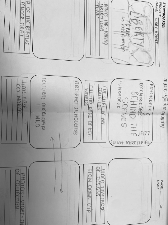
Allowing my imagination to explode onto a page, I mapped a general structure for my final Unit 2 commercial ,exploring different techniques which will amplify the effectiveness of my collection. Additionally, I researched different music alternatives which would highlight the funk and groove of my design pieces. I wanted to ensure I wouldn’t get copyrighted, therefore I have requested my dad to play a Beatles song on his electric guitar, which will certainly integrate a cool aspect into my commercial. Moreover, after creating a YouTube playlist, I concluded that the song I wanted to use was “Hold Your Hand” by The Beatles, as it perfectly links to a YouTube clip I plan on incorporating in the beginning of my commercial.
0 notes
Text
A BIG ACHIEVEMENT!
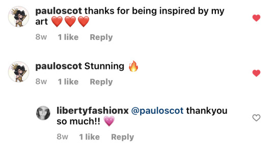
Following one of my artist mashups, I was heavily inspired by Paulo Henrique, who commented on my work, which was a big achievement of mine through unit 2!!
0 notes
Text
ILLUSTRATION - DESIGNING MY FINAL COLLECTION
Here is part 2 of developing my final yellow submarine piece.
0 notes
Text
ILLUSTRATION - DESIGNING MY FINAL COLLECTION
Here is the first part of my design process of my yellow submarine collection piece, using watercolour to embody the textural aspect of a balloon inspired fabric. Then using darker shades, I added lots of dimension whilst still leaving lighter areas, as I didn’t want to draw away from the fabric idea. Then using pro markers, I incorporated a more realistic effect which enhanced the different oversized shapes which I really enjoy the look of.
0 notes
Text
ILLUSTRATION - DESIGNING MY FINAL COLLECTION
I worked on using a darker shade of pro marker for the skin tone, as I wanted to embrace more diversity throughout my collection, therefore, I slightly altered the colour combinations initially. Then using watercolour, I added darker tones to embrace shadow and dimension, complimenting this with silver pen to highlight this textural aspect that is heavily exaggerated through this piece.
0 notes
Text
ILLUSTRATION - DESIGNING MY FINAL COLLECTION
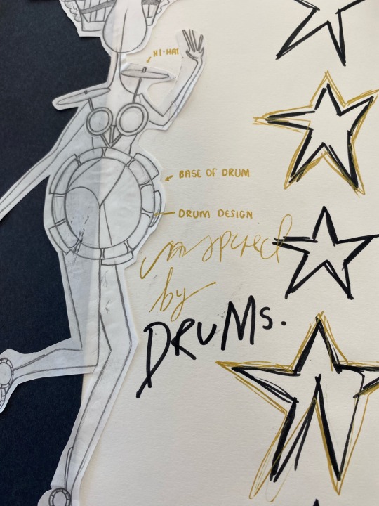
Here is the final processes of me designing my collage piece, incorporating different elements from my development research to project the best outcome. I really loved the tin foil effect therefore I wanted this to be a main effect, making sure I incorporated this into the bigger parts of the illustration. I then cut out images from magazine pieces, using tracing paper to ensure I achieved precise cut outs. Using pro markers and silver pen, I created a textural aspect through cross hatching to fill in any spaces which I left free, as I didn’t want to over complicate the illustration through using too many collaging elements.
0 notes