
Don't wanna be here? Send us removal request.
Statistics
We looked inside some of the posts by tianxinwang-iris and here's what we found interesting.
Average Info
Notes Per Post
0
Likes Per Post
0
Reblog Per Post
0
Reply Per Post
0
Time Between Posts
2 days
Number of Posts By Type
Text
17
Last Seen Tumblr Blogs


Fun Fact
US Tumblr user growth rate is estimated to slow down to 4.1%.


Text


The final product of exercise 4, two of the same but painted in different colors, the different colors let the two paintings show different emotions, one is lonely and emo, the other is bright and sunny.
0 notes


Text
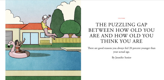
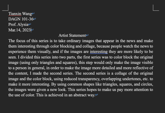
This is my final selection of news and images for project 3
0 notes
Text
After reading Josef Albers
The word realism implies the opposite of pre-expressionism. In Albers' view art is like life, and the act of color, like man, is first self-realization and then the realization of a relationship with others. In Albers' work, he tries to bring the extremes of independence and interdependence together. A color can be placed in other colors and thus lose its identity. Red can appear to be green, or look like a gas - dematerialized. Gray can look black, depending on what is around it. This is called "performing color" by Albers. He works with the same painting, the same color over and over again, for countless times. Often, he uses three or four colors in a single painting. By changing just one color, a completely different climate is created, even though all the other colors in the work remain the same in area and tone. The two separate colors do not overlap in any way; the three colors are created through interaction. Each borrows from the other and gives to the other. Where they meet, where they intersect, a new color is created. In science, one plus one is two, but in art, it can be three. He often has to paint a picture ten times before he comes to an understanding. I usually started with a very small sketch; then it was painting after painting until he realized what he was after. In Albers' paintings, line is not important, but in his linear structures he uses it for interactive purposes. According to most color systems, harmony depends on the arrangement of the colors in a system. Further, first of all, harmony is not the main purpose of color. Dissonance is as important in color as it is in music. Secondly, each color can be paired with other colors if the right amount is available. This, of course, led to a new understanding of color. Albers believes that art itself cannot be taught, but much can be done to open the eyes and minds of students to meaningful forms. Teaching can prepare the way for revealing and evoking insight. Albers' words always keep a white border because he wants his paintings to have a beginning and an end. However, this does allow the paintings to look larger than they are.
0 notes


Text


This is the final version of my sketch, and the layout of the three versions of the book cover: the triad color scheme version painted with paint, the bezold colored scheme version cut and pasted with color-aid, and a monochromatic scheme painted with paint The three versions of the book cover layouts are the triad color scheme version painted with paint, the bezold colored scheme version cut and pasted with color-aid, and a monochromatic scheme painted with paint with single color varied values.
0 notes

Text


This is my exercise 4, I chose pomegranate as my color picker, it was too hard to find a background color for it.
0 notes
Text


This is my final exercise 3, for the first group I have not understood clearly at first, it is actually a set of similar colors, and then change the background, talk about the background color for its complementary color.
0 notes
Text


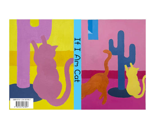
I changed the legs in the original drawing into a cat scratching board in the shape of a cactus. The original legs kind of stole the focus from the cat, but after changing it into a cat scratching board, it was much better. Then I chose the part of the kitten playing with the cat scratching board and enlarged it to be the reverse side of my book cover.
0 notes
Text

This is a sketch of my book cover. I designed three different versions and I think they are all cute and kind of hard to pick. I still prefer the version with the cat climbing on the human leg.
0 notes
Text

This is my third exercise, I used colored pencils to paint the pattern with different colors, they were divided into three groups of two sheets each, the first group picked one color, and in the second sheet I changed it to its opposite color on the color wheel. The second group was to change the color VALUE, that is, to add some black to each color. The third group is to change the position of each color differently. This is a very interesting process, but a little hand-intensive, coloring with colored pencils painted my hands so tired.
0 notes
Text


This is the color wheel of the first project, the mosaic put together with color aid and the final painting put together with some messy stuff.
When doing this color wheel, I was not good at picking out a lot of different cool and warm colors because I hadn't picked out enough colors for the painting originally, and they were all roughly somewhat similar. Then there is this collage, I originally wanted to use small beads and stones to put together, but too time-consuming and small beads are not enough, so I used some plastic bags, scrap paper and flower petals. Finally, this mosaic with color aid, really interesting step but really look at my eyes are almost blurred.

0 notes