
tjkelsey-kvb217
Tegan Kelsey
KVB217 Art Blog 2024
7 posts
Don't wanna be here? Send us removal request.
Last Seen Blogs

lufesabika
Untitled

h-godrej-blog
hamlet

all-rock-and-roll-is-homosexual
Steal me a savage subservient son

karenfordonte
Caring For Donte
Text
Entry 7
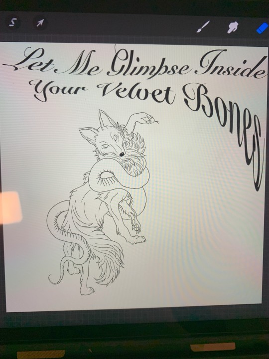
'Fox and Snake'
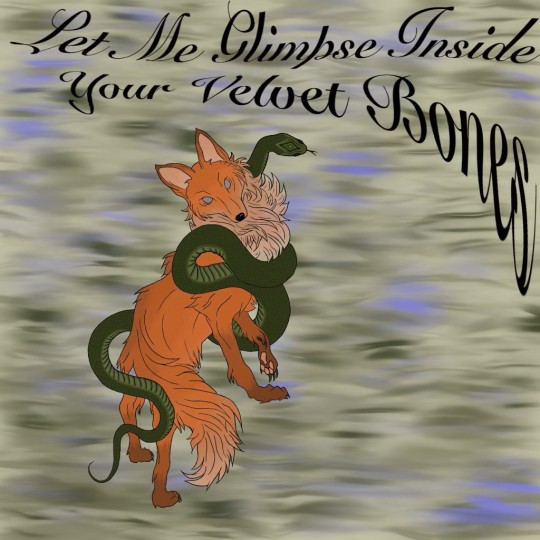
Experimenting with procreate and digital drawing I found animal inspiration on Pinterest so I know the figures and shapes correctly or as good as I want them to look.
The quote I incorporated is by Edgar Allen Poe and I quite like that his work can be rather dark and has a mysteriousness to it. To add to the quote I also wanted a gorgeous old style running writing because it suited best.
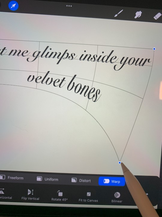
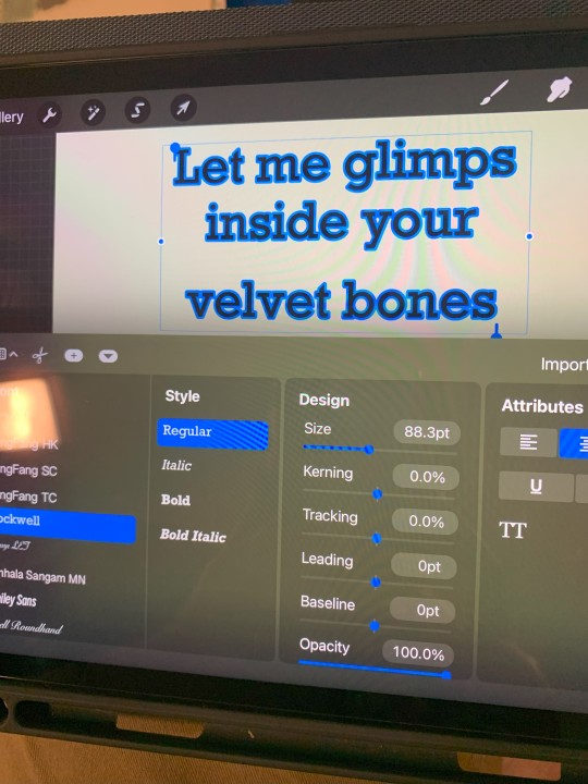
I also wanted the quote to be more than just straight text in the art so I experimented with warping the text and changing the shape of the quote.
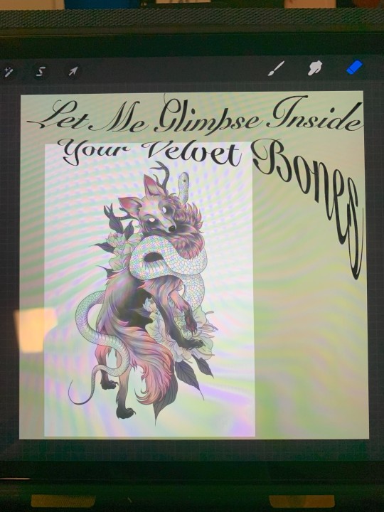
This part of the process felt like I was fully cheating or stealing so I tried really hard to make the work my own. I traced just the main lines of the fox and snake because I really wanted the 'correct shape'. Normally if I 'copy' a design or drawing from Pinterest I just draw my version by only looking at the original image. With digital art I was able to copy it over and create layers and trace the original image.
I did change the snakes head and neck in an attempt to make it my own and because I didn't like the original angle the head was drawn at. Also I wasn't including the flowers from the original artwork.
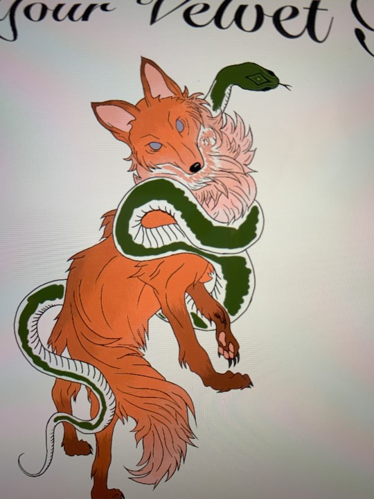
I'm sure that when drawing digitally they're is a fill shape with colour button but I wanted the fur to look more real than just a colour so I spent a while finding the exact shades I wanted and drew each stroke myself, the way fur would look.
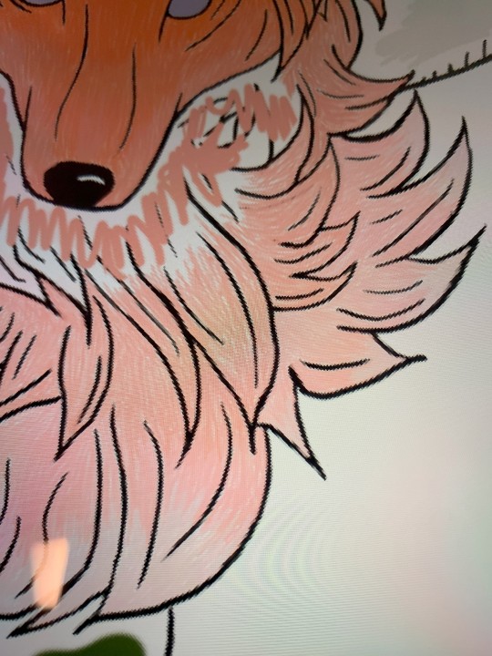
When picking the colours I scribbled in the area each would go and then when I got to that section I drew each individual line. This added to the realism and texture.
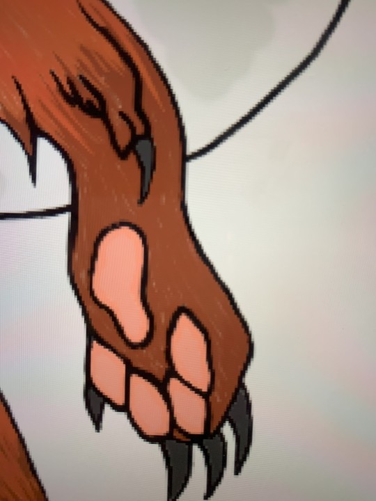
Overall I wasn't very happy with the final look of this digital drawing and in future maybe having it enlarged and printed in high quality would fix this. Although it just didn't end up looking as good as I'd hoped. I have other possible digital drawing plans that I'll continue to work on as well.
Inspiring Artists;
Beth Cavener
Cavener explains ‘On the surface, these figures are simply feral and domestic individuals suspended in a moment of tension. Beneath the surface, however, they embody the consequences of human fear, apathy, aggression, and misunderstanding.’ (Cavener, B. 2012) The feral nature of these sculptures are eye catching bringing attention to the detail and effort put into these artworks. Using animals to convey very human experiences allows audiences to take in the art more without judging and dismissing the way people do with human emotions.
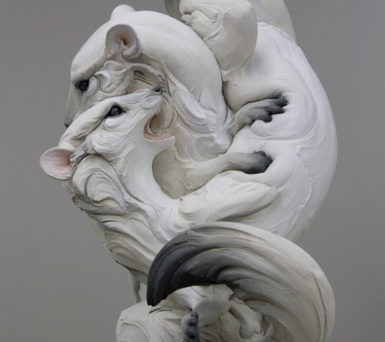
'Don't go' - 2017
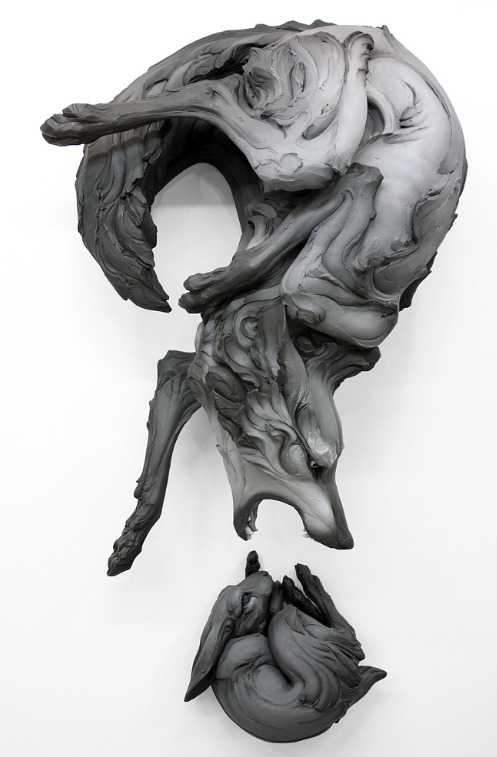
'The Question That Devours' - 2012
I especially love the works she sculpts that include wolves, but all the animals she sculpt look so realistic!
0 notes
Text
Entry 6
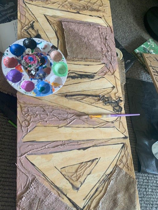
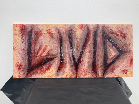
'LIVID'
SFX artwork on a wooden canvas instead of using skin my new SFX process so the artwork can last longer. This artwork I wanted to test out the same techniques as SFX but without the main materials.

Started by writing the words and using liquid glue and hessian fabric I created base layers and texture giving it a more skin like look.

My messy work space and loose plan that also was more of a experimental create and decide as I go technique.
I was pulling at the hessian to get loose threads and found other 'hair like' texture I wanted it to represent women hair and fabric that women in more olden times were mostly forced into for careers.

I was using the glue to layer the board so that when I created the carved letters they would look deeper. Normally for SFX I would of used synthetic modeling wax or liquid latex for this part. But for a work of this scale I wanted to save money and try glue.
Then I needed it to look more like human skin but this proved more difficult then I thought it would be. Finding a skin tone similar to mine to make it look real.
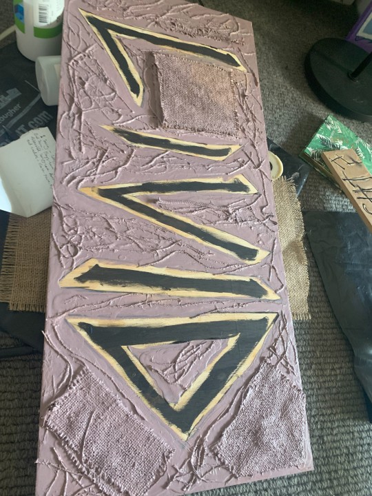
I also started created depth in the letters making them look more carved and realistic. I would normally use shades of black and brown from an army paint pallet. For this piece I tested out shades of black, grey and purples to make a more bruised, raw, fresh cut look.

Continuing to test out different shades of purple and creating a more skin tone look while adding texture with each paint layer. I was getting closer to the right skin like look.

Finally getting somewhere with the realistic look of the art and the work was looking like a bruised old scar that never quite heeled. This work really was about embodying feminine rage into the artwork.

Then I started adding shades of deep reds and richer purples and started adding fake blood to the art. getting closer to the finish and it is looking better and better.
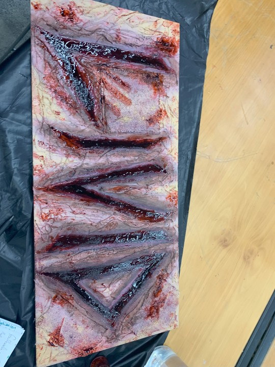
Final touches adding lots of blood and glue and reds to make it horrific and real.

Displayed against the white gallery wall on a stool and the tarp that I used as my desk/backdrop worked really well in the final display. The tarp adds to the horror dead body look of the work.
I love the way 'fresh' (fake) blood looks with flash photography because it really catches that wet look.

Close up of the details in the final display and I could not be happier with how this artwork looks finished.

Loving the way the (fake) blood drips down the art as it wasn't finished drying when I stood it up for display it could naturally drip.

Using the hessian fabric worked really well for creating a realistic skin like texture and with the fake blood it really brought the work together.
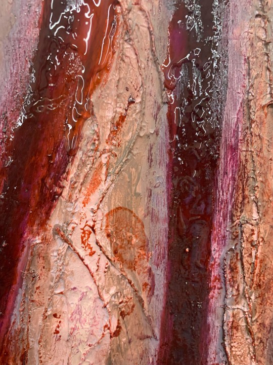
When adding the finale touches I also started painting my fingers with the fake blood and leaving finger prints throughout the work as something extra. Also giving it more of a human touch as you can partially see the handprint.

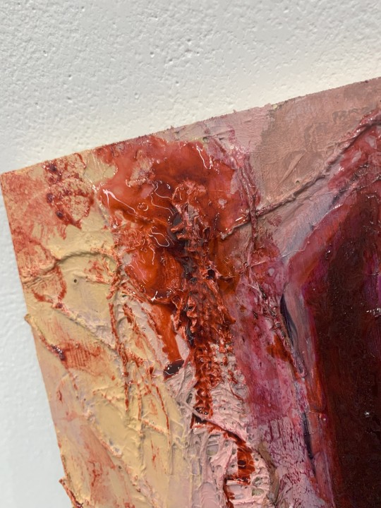
More details of the skin colouring, the rawness and the bruising and the blood.
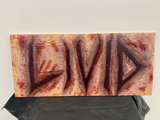
Really happy with how this turned out and it looked great with the tarp as part of the gallery installation.
This work was also started with just a small 'doodle' that I created with torn paper and a dying texter. I nailed it to the gallery wall on this angle because the jaggered angle of the lettering suits the angle in display and the messiness of only using one nail works well for the small artwork.

Inspiration for this week;
Artist - Siobhan Aideen Kaufman
She most recently has been creating detailed horrific grotesque paintings with oils and acrylics, her artwork focuses on portraiture.
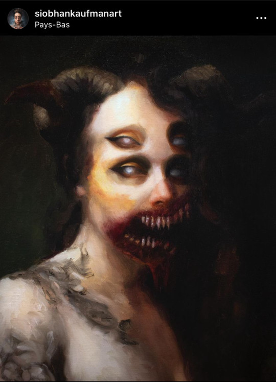
'Horrified'
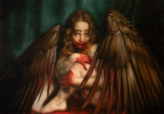
'Fallen Angel'
0 notes
Text
Entry 5
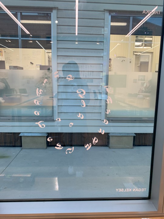
Window Commission
I was prompted to find a quote regarding windows and doors, my first thought being 'Turn the key, Open the door' this didn't feel right and often in the making stage I'm always asking myself if it feels right. Does this go with the art? Is this what I'm trying to convey?
I preferred the phrase 'Through the looking glass' and I knew I'd heard that somewhere, of course ... Alice in Wonderland!
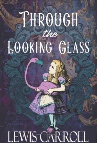
Looking glass is an older word for mirror and this seems to fit the description of the task quite well as we're decorating windows.
Originally I wanted to show all the craziness that is seen in the films and book so I was going to use different fonts for every letter.
This wasn't going to work because a few of the fonts I worried parts would be too thin for the cutting process. So I choose a nice running writing to work with.
This font worked well with the composition.
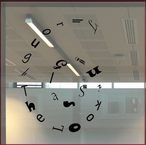
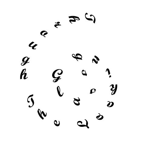
In creating the design I inserted a spiral using the 'spiral tool' then used the 'vertical type on a path tool' and played around with the exact placement I liked.
It will look something like this when installed but in white colouring, as the cutting machine prints all window commissions.
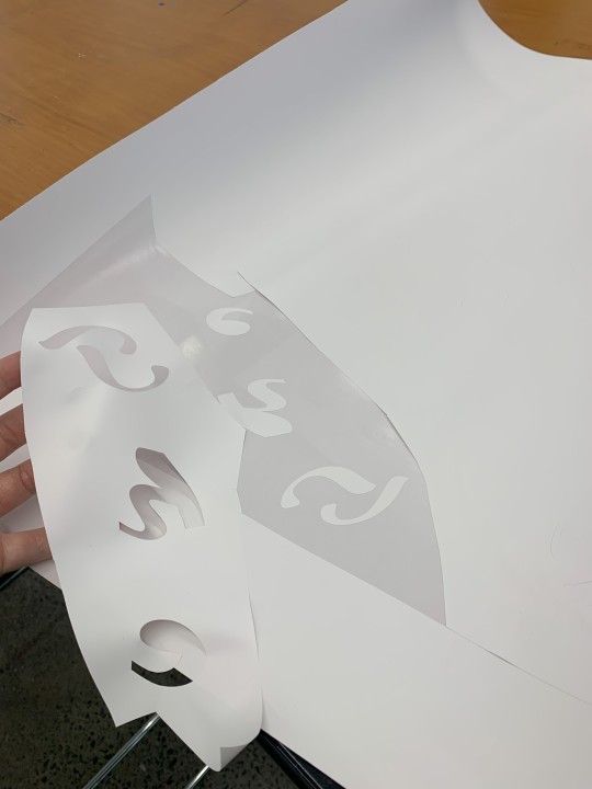
next was to peal off all parts of the print that weren't going to be part of the window piece.
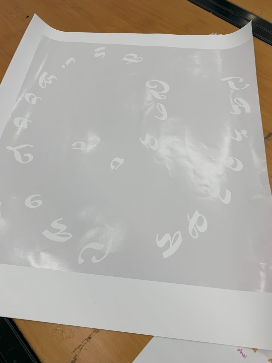
I'm glad I went with this font it looked very aesthetic and suited the quote very well while also taking away from the 'Alice in Wonderland' feel of it.
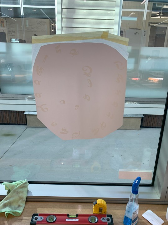
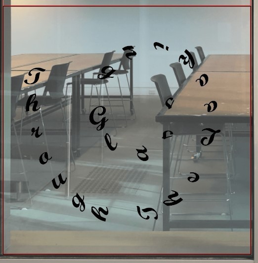
I really liked how the design looked on the window, as it was a circular spiral I didn't need it to measure the exact spot for it making application easier.
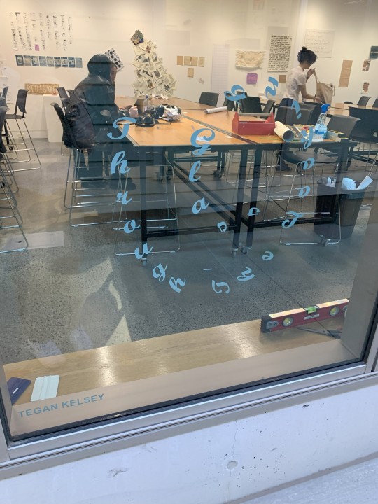
Finally the design looked just as I had hoped and I'm really happy with the outcome. Also it was a relief to see that everyone's artworks for this task looked all very different and unique.
Inspiration;
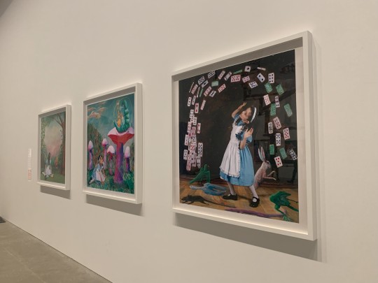
I was lucky enough to finally visit the fairy tales exhibition at GOMA before it ended and there was a large section on Alice in Wonderland! Including paintings, an interactive spinning artwork and costumes from the live action movie.
These paintings are by artist, Polixeni Papapetrou in her 2024 Wonderland collection. This is only 3 of the collection there are 16 paintings in total. She photographs her daughter in wonderland through the series.
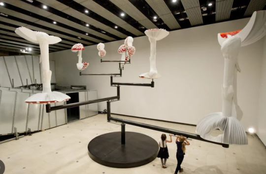
Carsten Holler, German artist was included in this part of the fairy tales exhibit with his 2015 artwork 'Flying Mushrooms'. Audiences are invited to hold the handles and slowly walk and the many parts of the artwork spin in circles.
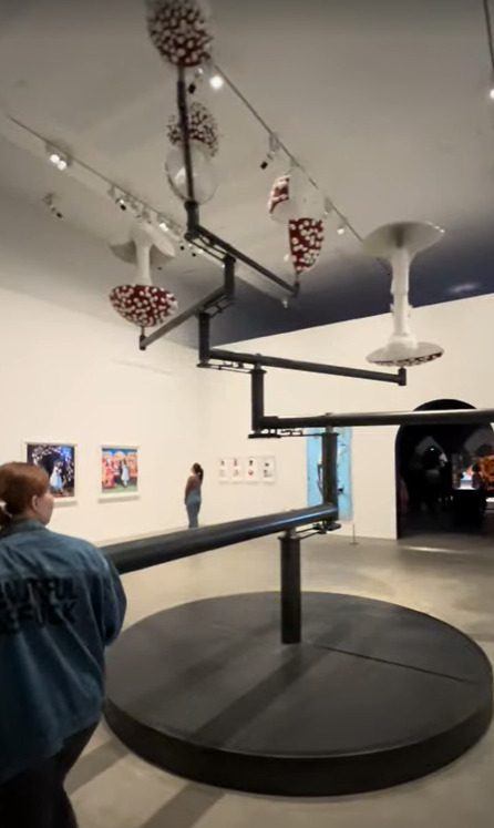
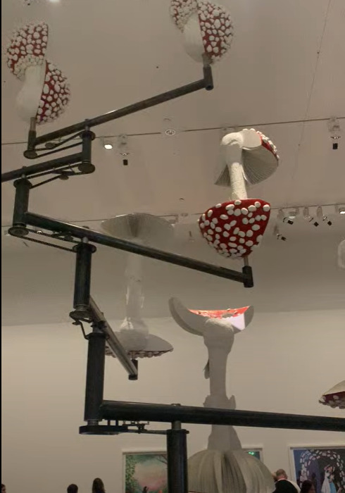
My own photos of the artwork aren't of very good quality so here is a better one.
0 notes
Text
Entry 4
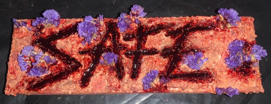
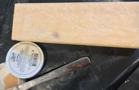
'Safe'
I enjoy experimenting with SFX makeup and gore. Creating juxtaposition between the horrific gruesome nature of the art and the delicate beautiful parts of the work. This is my second attempt of SFX on a non-skin canvas and I love how it turned out.
Planning this work out I knew that I wanted to create another work with the SFX makeup but use something other than skin for the canvas.
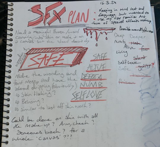
Materials I used were; a piece of wood, pencil, synthetic modeling wax, liquid latex, army paint, eye shadows, dried flowers, fake blood, glue, food colouring, and more fake blood.
After finding the correct wood and devising a plan I sketched the first option.
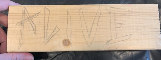
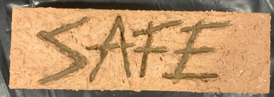
'Alive' didn't sound right and I wanted the art to be much darker, the text being 'Alive' felt too hopeful. I choose the word 'Safe' afterwards and it felt like the right option.
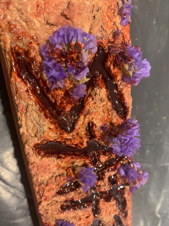
Next I used synthetic modeling clay to lay down a bumpy base.
Then I carved the word into the clay and slightly deeper, scratching the wood. next was to layer on the liquid latex dabbing and pulling at it to ensure it would dry textured like creepy human skin.
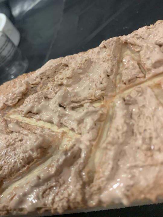
Layering the liquid latex gave the art dimension. Then I used army face paint to make the writing look deeper and darker the 'cuts' this material is good because it's thick, doesn't need to dry like paint and can be blended well.
Next I used eye shadow to create an irritated red look and bruises around the writing and edges of the piece of wood also in the 'cuts' to give more depth.
This should hopefully make the latex skin look more like realistic skin. I then added more army paint and came to the decision to add these dried purple flowers.
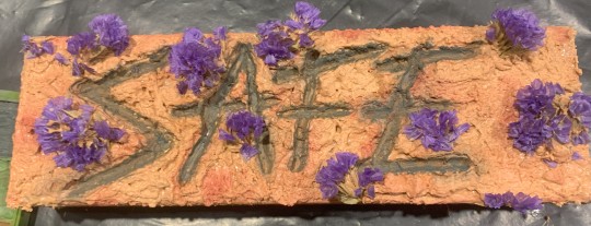
Which when dried actually had thorn like leaves and I felt this added more to the juxtaposition of the work blending beauty with pain and gore. These flowers were given to me by my partner and by incorporating them it is almost impossible to see the supposed dark meaning added to the artwork. flowers from a partner with 'blood, gore' and 'cuts' could be interpreted as an artwork bring light to domestic abuse.
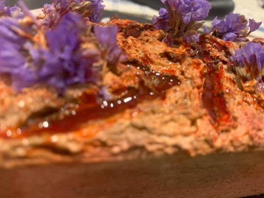
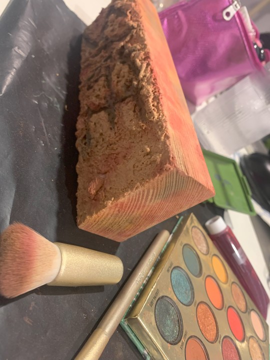
I then added the first layer of fake blood which I wasn't sure would work very well. This is a cheaper fake blood I own which dries and cracks off, staining skin. So I used it as a base layer.
The other fake blood I own is a much better quality for makeup on skin it takes ages to dry and looks wet and realistic as fresh blood would. Only problem is that on a non-skin canvas the fake blood doesn't dry almost at all.
So, I created a mixture with glue, food colouring and a little bit of the good quality fake blood in hopes that it would dry but still look wet for display. Always looking like it was freshly carved.
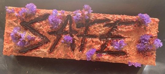
Another part of SFX art that I've discovered is my preferred photography method. Dim room lighting with a camera flash on for the photo. this makes the 'blood' look the most realistic.
0 notes
Text
Entry 3
Testing out the Ai generative backgrounds I gave the word prompt - "The sky grows dark, the black over the blue, yet the stars still dare, shine for you" This generated these;
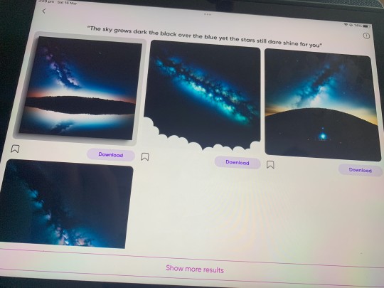
Honestly one of these starry sky backgrounds would of been perfect for the Shakespeare quote.
What quote I really wanted to use though was 'Can you remember who you were before the world told you who to be?' I feel like this would be one of the quotes that Jenny Holzer would of used creating more context with where she put her work forcing viewers to see it take it in and making them think.
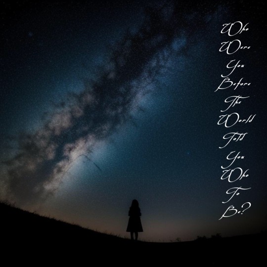
When writing out the quote for the art piece I realized that I didn't like the length of it so I shortened it to 'Who were you before the world told you who to be?' it isn't that much shorter but I like this version better.
The use of the young girl in the middle reminds people of an innocent carefree childhood before they had to step out into the world and become perhaps someone that the didn’t want to be.
Continuing with poetry I want to look into Shakespeare's and Edgar Allen Poe's work more for possible artworks
0 notes
Text
Entry 2
Required to make an A4 digital art piece I choose to experiment with pics art, finding a background that I felt would make the art pretty and having this galaxy as the background makes the art feel opened up with endless possibilities allowing viewers to think more.
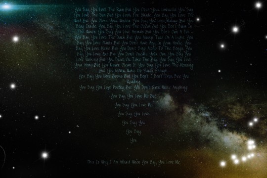
I found the quote from Shakespeare work, then I altered it wanting to quote to go on and on for what feels like forever.
The original;
You say that you love the rain but you open your umbrella.
You say you love the sun but you find a shadow.
You say you love the wind but you close your windows.
This is why I am afraid when you say you love me.
As much as I enjoyed making this artwork, If I were to display it I would change quite a lot. The galaxy chosen here looks messy and I know if I looked hard enough I could find a better one. The font and writing it’s just not right, I looked for ages changing the font, size, positioning and this felt the closest to right but looking at it now in reflection I want to change a lot.
0 notes
Text
Entry 1 - Art Blog
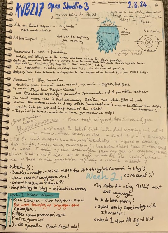
"Art is not rocket science ... It's much harder" - Mark Webb
NO MORE IMPOSTER SYNDROM
Open Studio Tut 1:
Given 15mins and a word at random create an art piece using only paper of different colours, scissors, and glue.
Poststructuralism -
Expresses the belief that individual meaning and values are taken from ones milieu. my understanding of this is that truth is a concept. I felt the need to express how everyone's 'individuality' is inspired or stolen by their trends, events, news, and generation. To make this artwork I took my knowledge of how to make origami claws that would tear at or angle towards the center where the 'milieu' is. This artwork was a quick starter one and used to fill up the space on the wall, after seeing how the dark blue and black claws on the green background hung to the wall I realized they made even better shadows. under the installed wall piece the claws created shadows making the extend and be more menacing, enhancing the artwork.
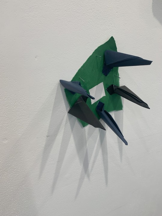
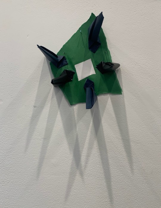
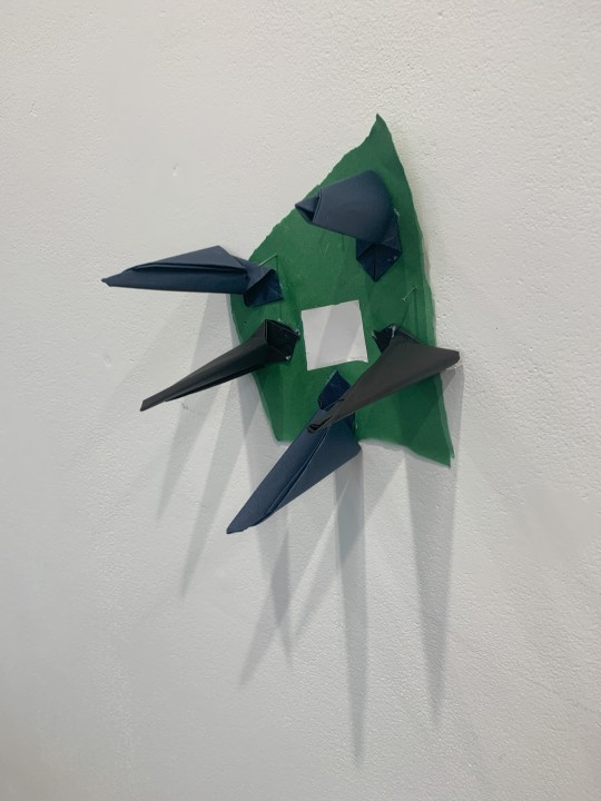
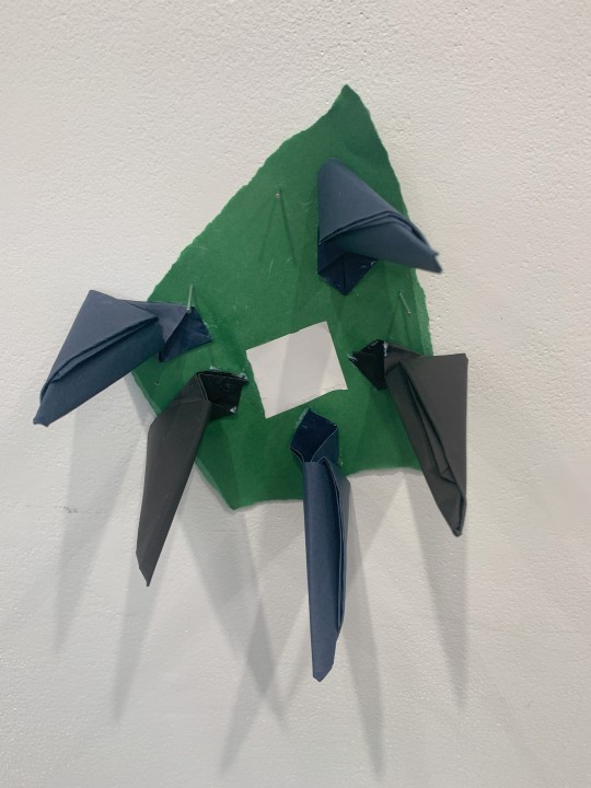
The white center represents what everyone's individuality is inspired by and the claws angle in towards that taking from it representing everyone. The messy edges of the green paper contrasts with the neat folded lines of the claws. Once the art was on the wall I could really see the vision come to life, when I was making it on the table rushing around with only 15mins it didn't look very good. I've also purposely used longer wall pins to add to the messy feel of it and they added shadows. On the wall the shadows made form the lighting and the claws complete the artwork expanding it past just paper and glue.
Upon further observations I even noticed that the art piece even looks like a hand curling in on itself, defeated.
Also included is my Art book planning for week 1
1 note
·
View note