
Don't wanna be here? Send us removal request.
Statistics
We looked inside some of the posts by tl2dplatformer and here's what we found interesting.
Average Info
Notes Per Post
0
Likes Per Post
0
Reblog Per Post
0
Reply Per Post
0
Time Between Posts
2 days
Number of Posts By Type
Text
17
Last Seen Tumblr Blogs


Fun Fact
28.6 is the average number of monthly visits per US mobile user.
Text
Research
The next research that I had to put on my blog is about three websites and the materials they have when it comes to, colour palettes, animations and character design. This is a piece of research that I did a while ago, but hadn't put on my blog yet.
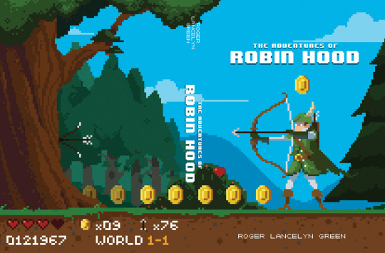
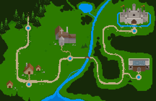
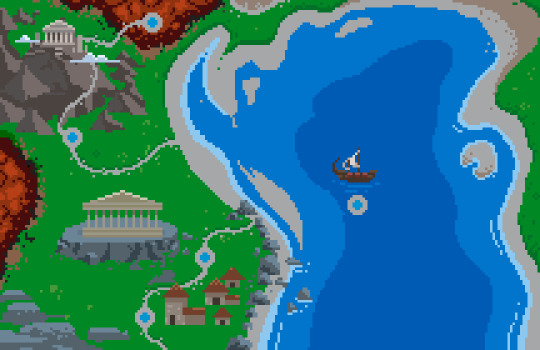
The first site that I looked at was Michael Myers and his pixel art, on his site he has a lot of different projects like animations, character designs and also some works aren't pixel art. The first part of this website that I looked at was his puffin pixels project, which is a piece of work that involves him making covers for classic books and using pixel art to create them. He also made end paper maps for them.
The adventures of Robin Hood:
Tales of the Greek Heroes:
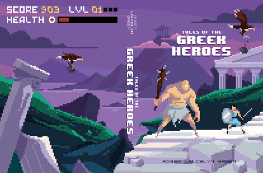
There were 8 in total and each of them were really cool and had an interesting and unique idea as its for a classic book cover. They each have a really good colour palette that suits its really well, and have a a simple but efficient idea for what is happening on the front cover. I also love the maps, for what I'm assuming is the chapters of the book, as it shows where it starts and how the story progresses without revealing what events cause it to evolve.

The next piece that I looked at on his website was the X-Men: Apocalypse Adult Swim ad spot. This piece of pixel art and animation was for adult swim, which has a lot of pixel art projects, and this one is really detailed with a cool theme. I like the accuracy of the characters and how in depth their suits, I also like how they are all similar with the white eyes, even if they have no mask on. The animation that is done is detailed and has really dynamic movements.
The next site that I looked at was Lospec and its a site that offers colour palettes and also shows off pixel art. I started off on this site by looking at some of the colour palettes and the variety of them and interesting ones that caught my eye.
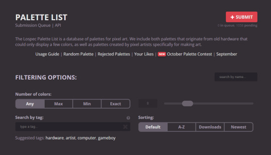
One thing that I really liked about this site was how you could filter your searches really easily and that you could submit your own colour palette.

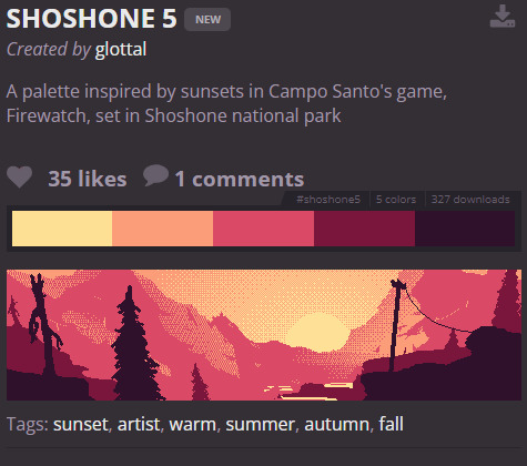

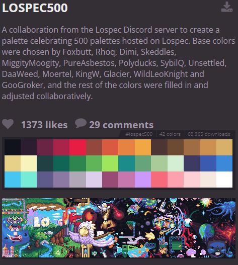
This site has an amazing variety of colour palettes, and I like how it shows you the art made using them.
0 notes
Text
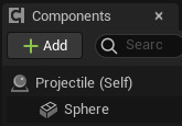
Projectiles
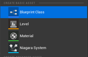
Now that I have made my enemies and their patrol points, the next thing that I need to make is projectiles. So I went into the content drawer and right clicked inside to open up a basic asset option, then I pressed on blueprint class and selected actor, then I labelled this projectile.

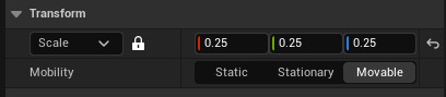
After I had created this, I added a sphere from the components area and scaled it down to 0.25, as this size makes it visible and obvious what it is, without being too big.
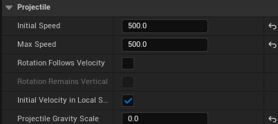
I then added projectile movement, which was in the components panel and I searched it up and put it into the tab, as this would change the speed of the projectile. Now on the side, on the details panel, I changed the initial and max speed of it to 500 on both of them, and I also changed the projectile gravity scale to 0.
After I had added and changed what needed to be changed, I went into the event graph and had to add some nodes. In this piece of code I used two nodes that were already in the graph. So I grabbed Event BeginPlay and added delay to connect to it, then I grabbed Event ActorBeginOverlap and connected that to destroy. Once these four nodes were in, I connected the delay to the destroy node.
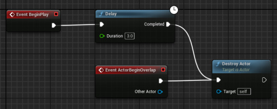
This piece of code works in the way that when you shoot a bullet, or whatever projectile in the game is, it will destroy itself in 3 seconds, if it's not hit something.
The next thing that I had to do after I finished the code in the projectile event graph, was making it go in the correct direction, and make it come from my character.
0 notes
Text
Enemy and enemy patrol
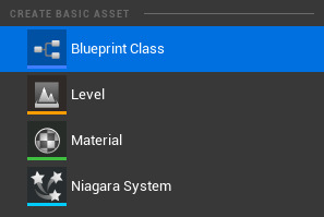
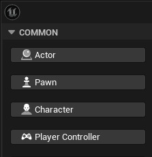
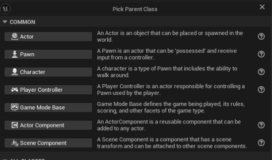
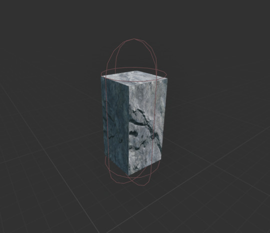
The next thing I needed to add into my game was enemies, so I just made a quick enemy and an enemy patrol. I had help to make this as there was a enemy patrol guide in the 2D brief for code. So to begin with I had to do what I do every time, and I right clicked in the content drawer and clicked on a new blueprint class and I made it a character class, I then opened it and just added a cube to make a temporary enemy. With this cube I changed the scale, length and material.
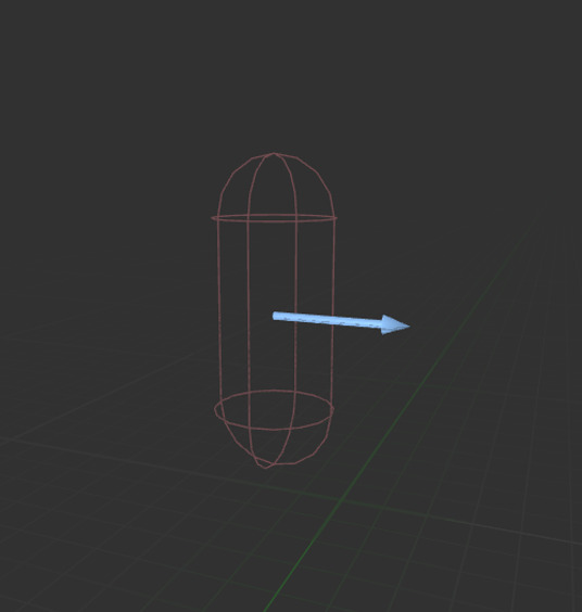
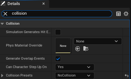
With this cube I went into the details panel and made it so there was no collision and then I left the capsule component as it was. I added an arrow in the viewport and this is just so the character is facing a certain direction.
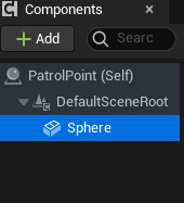
Now before I added the code into the event graph for the enemy, I needed to make another blueprint class. So I went back into the content drawer and right clicked again, but instead of making the parent class a character, I made it a pawn. I labelled this new pawn 'PatrolPoint' and this would be the area the enemy could walk around in, and when they hit one of these points they do a 180 and it will loop.
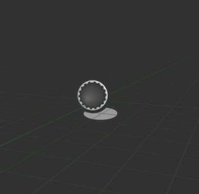
I After I made it, I went into the viewport and added a sphere, I scaled it down to 0.75 to make it a normal size. I then found the sphere on the components panel on the top left of the screen and then dragged it into the default scene root, this gave it a perfect outline.
I changed the collision of the sphere in the details panel, It was 'BlockAllDynamic' before, but I made it 'OverlapAllDynamic'.
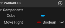
I then went back to the enemy blueprint, and went into the event graph, from there I created a new variable and called it move right, this had to be a Boolean variable so it could be true or false. After I made this variable, I started on the code to make the sure the enemy could walk. The nodes that I needed were in the enemy patrol guide, so It was very easy to add in and I didn't have any issues. In every event graph, there are pre existing nodes that are very useful. One of them in this event graph was 'Event ActorBeginOverlap', I dragged a line off of this and added 'Cast to PatrolPoint' which is the pawn I made that has the boundaries for the enemy to walk around in. I then dragged in my new Boolean variable and selected get move right, after I added a branch which is a true or false node. I then dragged in my Boolean variable again and added 2 set move rights in. All I had left to do was connect the code together and put in the correct details.
The first node is saying that when the actor, being the enemy in this instance, overlaps with the patrol point, as its being casted to it, the patrol point when see if the actor has collided with it. If the actor has, it will detect the movement of them, and change the direction it walks in.
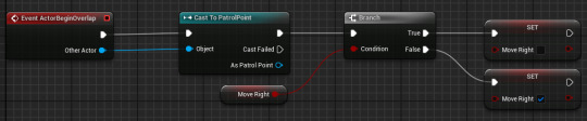
After this, I made a float variable and called it movement speed, and changed the default speed to 10, this is the speed of the cube. Now to make it so this would be connected to the enemy, I made another piece of code that would finish off the movement in the enemy event graph. This again was in the enemy patrol guide, so it was easy to understand. I used another pre existing node in the event graph, event tick, and I connected it a branch with the condition in the branch being move right. I then dragged in my new variable, movement speed, and selected get movement speed. After it was a node, I dragged off a string from it and connected it to a multiply node I added in. I then I added two add movement input nodes and connected the branch and multiply to both of them, one being for moving right and the other one being for moving left. This is because one of them is for if it's true that the character is moving right, and the other one is false. I then added two set actor rotation nodes and connected one to each add movement input. I wouldn't of of been able to do this by myself easily or at all, but I understand how it works now, as it constantly asking if the character is moving in one direction and if there at a point where they need to rotate, but also how fast they travel while doing these movements.
0 notes
Text
Researching Animations
I have some research on animations that I hadn't uploaded to the blog, so I am going to put my previous thoughts on each video, and what I took from each one.
youtube
Crash Bandicoot has a huge variety of death animations that are unique and are very cool overall. The thing that I like the most is how environment orientated they are, which is what you expect, but its cool to see that it makes sure to be fairly accurate and makes it a realistic death for the area the character is in. Such as in water the character would obviously only drown, but there would be different animation before drowning, and they are all unique and not commonly used. There are many animations in this video that inspired me for my death animation. I wanted to include a range of death animations in my game, but as its the first project and I'll be making more games with more freedom, I will include more in another game of mine I make.
youtube
This video shows lots of idle animations from a variety of games, and it reveals how different idle animations are depending on the character. Like if they are unrealistic and more cartoony, they will have a more unrealistic animation, but some will just be a random animation out of boredom. A lot of these idle animation are cool, but I didn't want to make anything too complicated straight away, so I didn't take too many ideas from these animations. But as well as the death animations, I also want to make something similar when I make another game in the future.
youtube
Sonic has evolved a lot when it comes to jumping. The majority of this change being from 2D to 3D and the angles of the jump, but also powerups while jumping and how the environment affects his jump. For example, in different sonic games there are many different aspects that could affect the jump, like dashing mid-jump or being carried in the air by tails and then jumping off. There are lots of different jump animations with Sonic, and is a simple animation, with just him spinning around in a ball, but it would be complicated for me to make in my 2D platformer. I've made a very simple jump animation and it isn't as good as a Sonic jump, but I could always look at his jump animations, as well as others for another game.
0 notes
Text
Creating a death screen
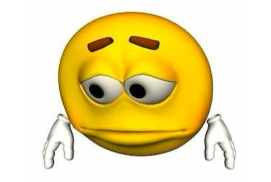
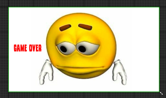
The next thing that I needed to do after making my HUD was to make a title and death screen, so I decided to do a death screen first as in my opinion a game needs a death screen more than a title one. I just decided to make a quick one that was only a random image to signify that the player is dead, along with text. So I made another Widget Blueprint and and another canvas inside of this, from there I went to google and picked an image of my choice, which I just picked a sad face.
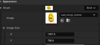
I then imported this into the content drawer and moved it into my death screen folder. After I had imported it in, I went back into my canvas and put an image box into it, then on the right hand side of the screen on the details panel under appearance, there was an option to change the image. So I clicked on my one and added it in.
I then added my text, which I used the same font as I did in my HUD and used the colour red. I made it read 'Game Over' and put it onto the left of the screen so it didn't clash with the sad face.
After I made this, I compiled it and made a new level called 'dead'. In this level I needed to add my death screen and make it so when I die this level appears and I just need to click to restart. So I started making new blueprint classes to make a pawn and a game over, game mode. I started off by making a pawn and labelled it 'MenuPawn', I then went into the event graph for this and added nodes that made it so when I click any key, the first level re-opens. This would make it like a menu screen and acted like it so that when you die it would appear like one and you just need to click.
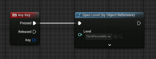
Now I needed to make it so that the death screen and the pawn are connected, because it means that if I click the death screen with the sad face it will take me back to level 1. So to make this work, I then made a game over, game mode which means it can change how the level works. So I went into the class defaults of it and I changed the default pawn to the one I just made, this made it so they were connected and so it follows the code we put in the pawn. This means that when I add this game mode to this level, it would work and take one click for me respawn. But before I could add this to be the game mode, I had to make it so the death screen would appear when the level opens. I did this by opening the level's blueprint and adding nodes that would make it show up when the level is opened.
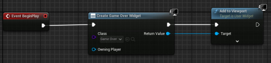
The first node is 'Event BeginPlay' which means when the level is started up, then I connected it to the next node which was 'create game over widget', then inside this I made it the death screen to make sure that it was the thing that was shown. Then the final part of it was 'add to viewport' which would show it. After I had finished with this piece of code, I went onto the main level area, and on the right hand side of the screen there is a part called 'World Settings'. From there I went down and found 'game mode', and underneath there was an option called game mode override, which is where I put it the game mode that I made recently that was connected to the pawn. This then finished the death screen off, and when I change it, all I have to do is make a new widget blueprint and make it so the create game over widget node picks the new one to show the player when they die.
0 notes
Text
Making a HUD
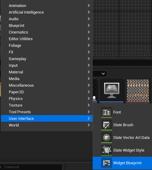
I needed to start making a HUD in my game, but it will just be a basic, quick one with small details, until later on when I add more and improve it altogether. The first thing that I did to make the HUD was open the content drawer and right click inside, this opened a list of options and I clicked on user interface. This then opened up another list, and from these options I clicked on widget blueprint.
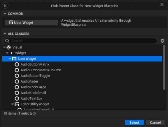
After I had clicked on that, it opened up a tab that made me pick a parent class for the widget blueprint, but I just had to click on 'UserWidget' and select it.
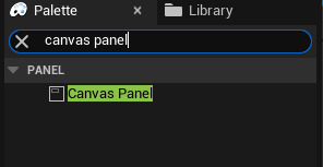
This then saved into the content drawer and I renamed it HUD and I decided to make a new folder for this to keep it separate and organized from the other blueprints. Once I had done this, I opened it up and it was viewport screen like with other blueprints, but it was empty and I had to add a canvas panel. To do this I searched it up in the top left under search panel, and I dragged it into the main area.
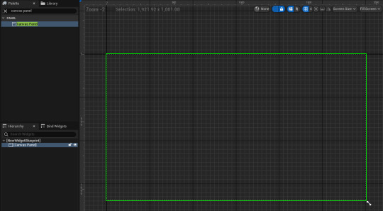
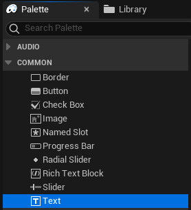
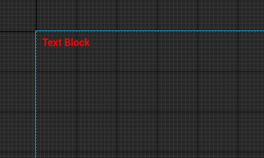
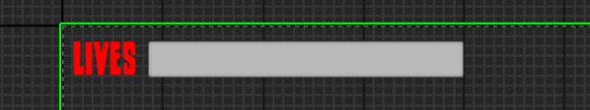
This is what it looks like and it represents the main screen you have when playing the game. From here, I added text by clicking on the text option in the top left of the screen in the list and added it in.
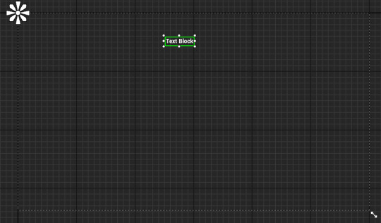
After I had dragged this in I wanted to change the position of it, so I moved it over to top left of the canvas. I also wanted to change the size and colour of it, so I looked on the right hand side of the screen for the appearance tab, and on there I went onto the colour and opacity option, and I changed the text to red. I then went beneath that to font option list, and I changed the font size from 24 to 30.
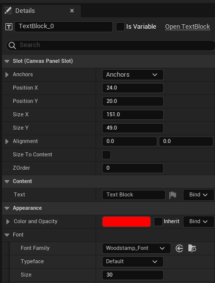
Now after I finished with the position, size and colour, I needed to add a quick photo into the canvas to get an understanding of what making a proper HUD for a game would be like. So I just quickly just grabbed a PNG image of Rick Grimes and put him into the bottom left hand side of the canvas. This was easy to import and was just like how I would import other files, like from photoshop. So after I had downloaded the PNG file and imported it into the content drawer, I just changed the size and put it into position.
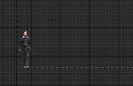
Now after this , I needed to get a font and change what the text says, so I went onto Dafont and just quickly picked a font as this is only a first draft and doesn't need much time spent on it. I downloaded a font called Woodstamp and extracted it in files, after I had done this I imported it into the content drawer and this made it so it was an option to pick when opening the font list in the HUD widget blueprint.

As this is the first font that I have imported into unreal, it was the only option other than default. I'm pleased with my font choice as it was only a quick decision, and I think that it works well in the position. The next thing I had to do was to make sure it worked when playing the game, so to make this happen I went into the third person character event graph and found the 'Event BeginPlay' node in the 'Add Input Mapping' area.
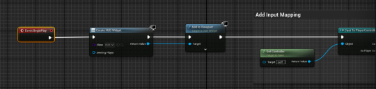
The 'Event BeginPlay' node is to make sure as soon as the game is started, it runs whatever is put into it and keeps it there until the game has ended. So I added the create HUD widget node from there and this made it so the HUD widget that I have just made will be used when playing my game.
I then added this piece of code into the graph for the HUD widget. The first node detects how much score the character has and applies it to the top of the screen, the next node helps with this as it uses the nodes in the third person character event graph, which is where I keep my score, and it tells the first node how much is in there. The next pieces of code are just for appearance, as it just changes it from just showing a single number as the score, to 'score:' then showing a number after. Another thing that I had to do before it would work well was remove the print strings from the score event graph. This print string was the thing that was telling me how much score I had before I made the HUD, but now the HUD tells me how much score I have all game, but the print string pops up for about 5 seconds every time I pick up a coin and it gets in the way. So I went into the coin event graph and removed it.
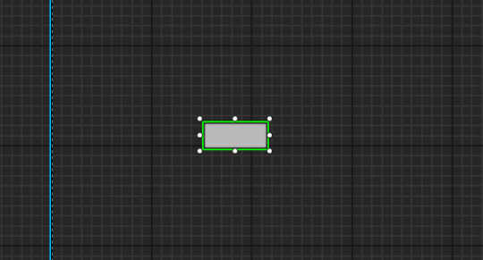
A little bit later I added a health bar to make it easier to see what health the character has, this was really easy and in the exact same area where my current HUD is. I went back onto the search bar on the top left and searched progress bar and dragged it onto the canvas, which gave me a basic grey rectangle, so I adjusted the size of it by just dragging the points, which is something that I couldn't do with the text.
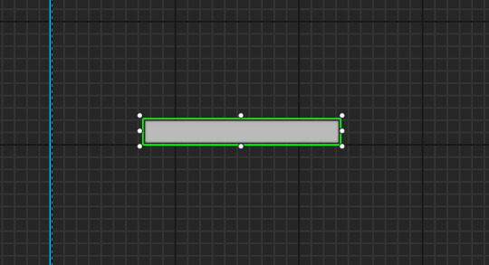
I then moved this into the top left of the canvas, as when I've researched and looked through some game HUDs, I like that position of the health bar in the top left in side scrollers. I also moved the score to the top right of the canvas, but that might be temporary as I think it might look nice below the health bar, but I'll move it around and test what might be better. So in the top left now I have text that says 'lives' so the health bar is really recognizable.
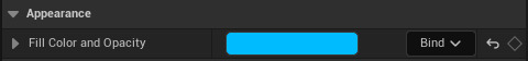
On the right hand side of the screen, on the details panel, there is an appearance option that has a fill colour and opacity bar inside of it, this bar uses 0-1 to adjust how full it is. Next to this I clicked on the bind but button like I did with the text score and it opened up the graph for this progress bar.
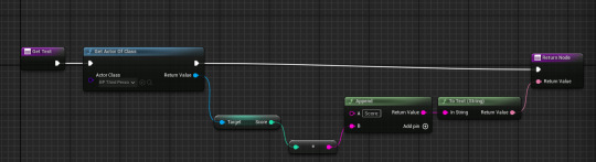
After I opened the graph, there were two nodes already inside, 'get percent' and 'return node'. I needed to use both of these nodes, so I kept them in, but I moved 'return node' further left as it was the last one needed in the sequence. Now after I moved the original two nodes, I added more that made sure the progress bar was connected to the character's health, so to do this I did a very similar piece of code like I did with the score.
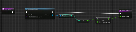
The first node is 'get percent' and this wants to find out what percentage of the bar should be full according the character's health, so I connected this to 'get actor of class' and selected the actor class as the third person character. From there, I dragged the return value off the node and added 'Get HP' from the target. The next part was the only thing that was different for everyone and needed changing, as the next node I added was divide, and for this you needed to change the amount inside to the max amount of lives your character has, mine has 3 so I divided the health bar into 3 parts. Then the final node, which I connected 'get actor of class' and 'divide' into, was return node, which would send the amount of health into the health bar.
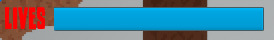
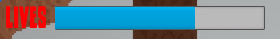
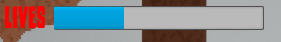
The health bar works all good when I tested it in game, and it has no issues overall. The only thing that I want to change is the design, which I'm sure I'll be able to soon, when I go more in depth, but as this is only the first game made in this course, it obviously would be simple and doesn't have to be much more than it currently is.
0 notes
Text
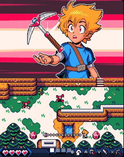
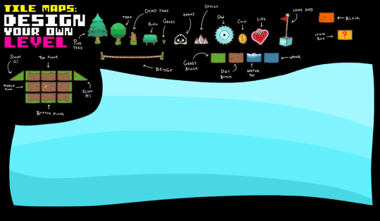
Adding the Tile Map
What is a Tile Map?
A tile map is a technique of designing a 2D game, which involves creating the game's world, levels or details out of small images called tiles.
I've made my tile map in photoshop, using a grid to get the correct measurements of 32x32 for each tile, which is the scale I made my character.
This is my level before I started making my tile map. I wanted top change things about it, so when creating my tile map I kept in mind different platforms and obstacles.
I've made some platforms and a couple other details in my tile map, but I haven't completed it yet. However, I need to add a base design for my level, so I'm going to update it after I have added all the current details and designs I have into my level.
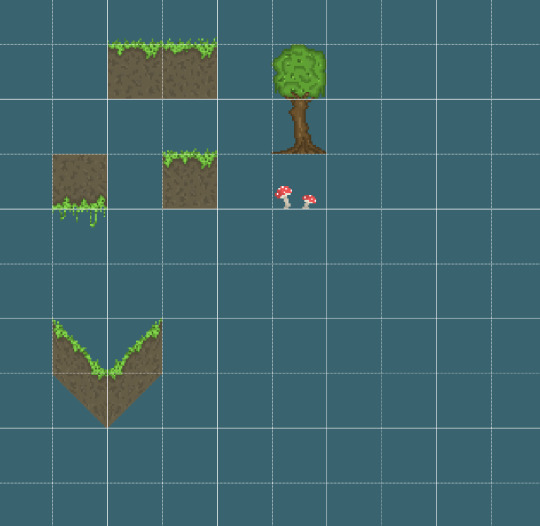
These are the only things I have right now, and I think they are alright, but I wanted to achieve a nature style that didn't look like another games. However, that is difficult as I'm restricted to pixel art only.
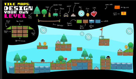
Now I need to add this into my level and make it so they are the main platforms and are across the whole level. So the first thing I did was export this as a PNG, so there isn't a background on it when imported in my level, and then saved it in my files. From there, I opened up my project in Unreal Engine and opened up the content drawer, and then imported my tile map in.
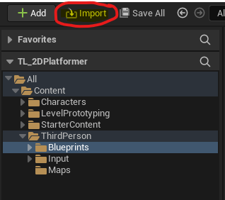
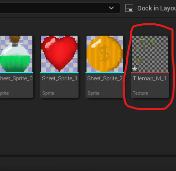
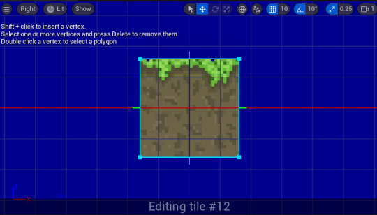
Once my tile map was in the content drawer, I right clicked on it, pressed on sprite actions and applied paper 2D texture settings to it, this was to make sure it had a PNG background instead of a white one. After I applied that, I right clicked on it again, went back into sprite actions and then created a tile set.
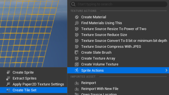
This would then create tile set in the content drawer that I could click on and it would open up a page that would allow me to apply hitboxes onto the objects that I made.
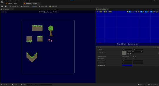
This page had a few options of collisions I could add, such as box, polygon and circle. These options are enough for what I was making and were easy to use, as you just click on an object and click add box, and it would add a collision.
So I started to add a few hitboxes on my objects in prep for adding them into my level.
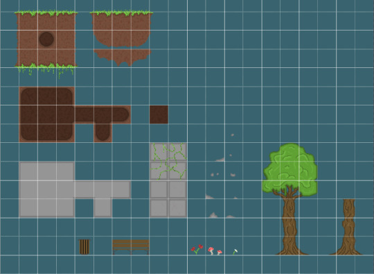
Before I added this tile set into my level though, I had enough time to add more to it in photoshop, so I decided to add a lot. I added rocks, stone blocks, caves, flowers, benches etc. I wanted to achieve a level that was like a park with a calm atmosphere, which is why I added these things that are commonly found in parks. I also changed the colours around a bit, most recognizably in the soil, making it more brown.
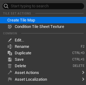
After I had finished my tile map and I imported it into the the content drawer, I right clicked on it and I clicked on the option, create tile set. This then opened up a page that would let , me design my level by adding in the blocks in my tile map. So now that I've fully finished a level 1 tile map, and its the only level that I'll have time to do before this project is over and our work will be assessed. So I added it into my game, just using the same method as I did for my one before.
I did change my map around quite a lot, but I'm happier with this version and I think it was a better choice to have the first level simple, as that's what most sides scroller games would be like.
0 notes
Text
Research
I had some research to catch up on as it is for pixel art. As I've already made my character, this research doesn't help with that part of my progress in making my game, but it will help for making my tile map. I had to research 4 people and their designs for pixel art, this is to understand different ideas portrayed in pixel art and what different styles are like. Also, to pick what stands out and how they use these unique things, and how I can use a similar ideas in my game.
The first site that I visited and looked into was Army of Trolls, which is the portfolio by Gary Lucken. Gary animates his pixel art and his work is heavily influenced by video games, pop culture and toys, as he has many Japanese toys and old 2D video games in his office. He has worked with many clients such as: BBC, Disney, Maker Studios, Mojang, UsTwo, Sony, Edge magazine, Wired, GQ, Dorling Kindersly, Kano and many more.
This is some of his work for a personal project of his, Magic Mallet, and its different to the style he uses majority of the time, as in this piece he uses black outlines for every part and for the characters he uses both black and white outlines. This is obvious for the characters to make them stand out from the background, while still following the black outline on every thing. As this is a personal project of his, I believe he wanted to use a different style that he's not really used to, so he could have a different experience making a game and have a different experience making it. I like the look of this piece, as it follows an exact rule all over the level. and its quite simple with some details, like in the characters.
This a piece of work he made for Pixelcount Studios, for their game Kynseed. This is a really detailed piece with lots of use of nature and uses animations to make it stand out and make the player really focus on what is going on around them. As this is for another studio, it wouldn't be his exact style of pixel art, but it's still a cool piece and I like the use of nature.
He also made promotional artwork for the London Games Fest, which was used in 2016 and 2017. This is a piece of work that I really like as it shows London being taken over by pixel art and characters, to show and promote what stuff will be presented by game developers.
He's also done many other pieces of pixel art work that is really cool, but these pieces are the ones that stand out the most to me, as they are all different and display different things.
The next site that I looked was Octavi Navarro Arts & Games, which is a small indie studio based in Barcelona. The person Octavi Navarro is a pixel artist and developer who has worked on games and has many pieces of his own work.
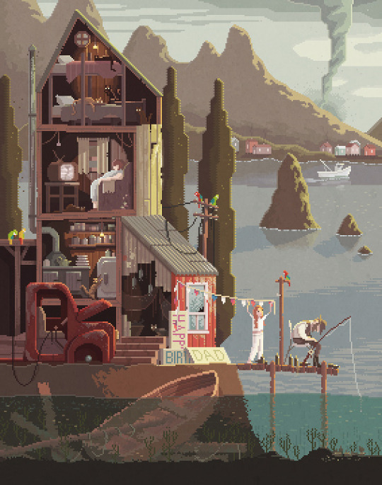
This is a great piece of his work and I really like the style used, which is a familiar style across all of his work. He called this piece 'The Fisherman's Daughter' and it shows small things, allowing us to understand what is happening why the title is called that. With this piece and all of his other work, for his character he uses black dots for eyes and in this one, he doesn't add any thing to show there is a nose. Most of his work have different themes, but have the same style and idea, with the contrast of the inside to the outside. In this piece of work, we can see a calm, relaxed atmosphere right outside the house, with a fisherman and someone who his most likely his daughter, but in the distance there is a tornado behind the mountains that could be heading in that direction. But inside the house it is more calm and quiet with not much going on compared to outside.
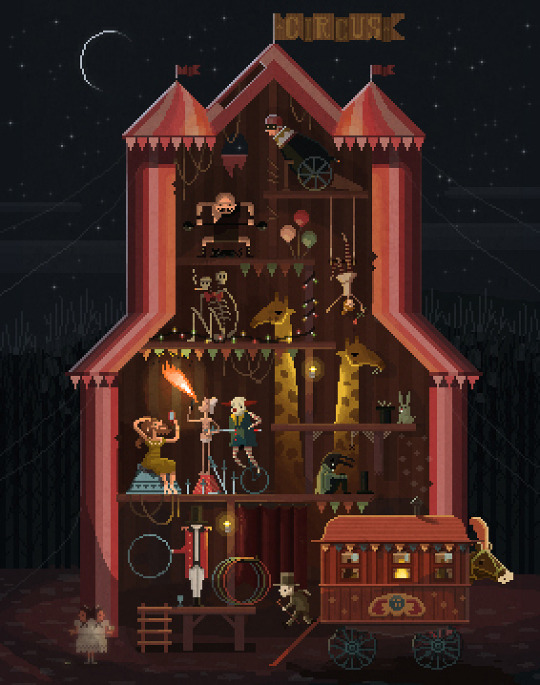
This is another piece of his work that's similar to the previous one, as there is a contrast between the outside and the inside. This piece is called 'Midnight Carnival' and it's a different theme, but follows the same idea and exposes the difference between two close areas. With this one it just shows it shows a pitch black midnight sky with nothing going on outside, but on the inside it shows a colourful and crazy circus with tons of different people and acts, even a giraffe. In this piece and some other pieces though, there are noses on the people, but his nose design is just another pixel added on to the face. Octavi Navarro only shows noses with a character side profile, that is the only time and will not add noses to a character with a front profile/view. But something different in this piece is that on the clown he added a red nose even though its not a side profile, this is an exception obviously as the red nose would be obvious from all angles. Navarro still used black dots for all the people's eyes, as he does in every piece of work.
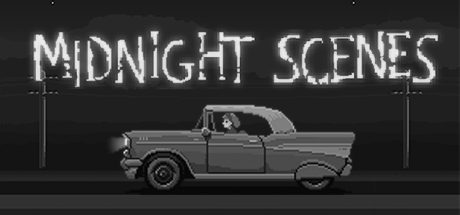
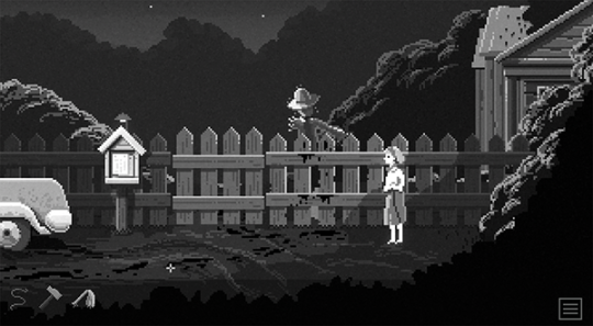
This is one of the games that this studio has made, and this specific one is a game series that has 5 games of it. This game follows the protagonist, a girl names Claire Barnes, who discovers the horrors and secrets of a deserted road in the dark. She discovers these horrors as she tries to resume her journey after an unexpected obstacles appeared in front of her car. This is a story driven, short adventure game that only uses black and white pixel art, which I think adds a more creepy atmosphere to it. With the only black and white colour palette, it reminds me of Limbo, especially as it's a side scroller that is about a character exploring and finding horrors. Something I like about Octavi Navarro is that all of his style is consistent, and even in his games he uses two black dots for the character's eyes, and only one pixel for a nose. The studio have made a few other games as well which follow the same style, all of them being horror. I think that is to do with the contrast of the outside and inside world, and how Navarro presents it in his normal work; It creates an eerie atmosphere that is used well for a horror game, but cannot really be used for a pixel art photo. So when this studio makes a game, they can use the same idea, but add a better horror atmosphere with things like a soundtrack for it to be more creepy.
The next site that I visited was Derek Yu pixel art gallery. Derek Yu is an American video game designer and artist who has worked on popular projects like Spelunky. Yu started playing games on an Atari 2600 and he and his friend started mapping out simple games on paper, just when they were in the second grade. Yu has designed and co-designed several award winning games, most notable being Spelunky, Aquaria and Eternal Daughter. This site that I got a link to is actually a site that isn't Derek Yu's work, but pixel art from retro games that he likes. So I'll cover this site partly, but will mostly show his actual work.
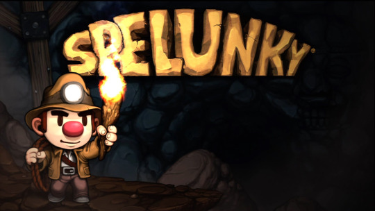
Spelunky is a game that was released in 2008 and is a 2D Platformer. This is a game that is really helpful to take inspiration from, and has many features that I personally want to use in my game. It has enemies of varying sizes which are animals or monsters you might typically find in a cave, but to combat these enemies there are useful weapons, like bombs, guns, climbing gear and archeological artifacts. These enemies could kill the character quickly and were difficult to challenge, and Yu knew this, so he made it that way on purpose, as the player would behave and play in unique ways and think more about their actions when playing.
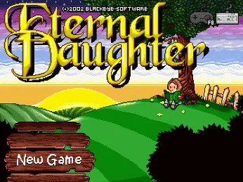
Eternal Daughter is another game by Yu, it is another platformer and was released in 2002. It took Yu around two years to make this game and was a homage to some of his favourite games from his younger years, like Super Metroid and Castlevania: SOTN. Yu said himself that the gameplay is similar, but the characters, the world and the story are all their own.
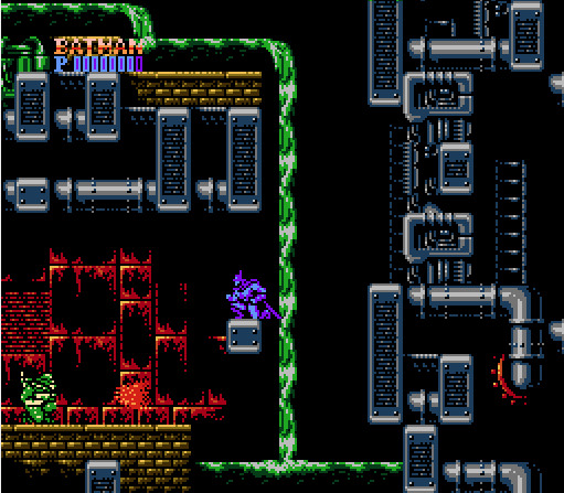
-Batman (Famicom/NES). Sunsoft, 1990
-Marvel vs. Capcom: Clash of Super Heroes (Arcade). Capcom, 1998
In the site that I was given, Derek Yu has put pixel art from retro games that he likes, and a thing I noticed is how much majority of the pieces varies. It goes from simple pixel art with not too much detail, to heavily detailed pieces.
The next person that I researched was Johan Vinet who is another pixel artist who learned how to make it on an Atari 1040STF with 16 colours. Vinet is Canadian and owns Canari Games, which is an independent video game studio created in Montreal 2018. Vinet has worked on many indie games such as Flinthook, Mercenary Kings Reloaded, Shovel Knight Showdown, Rivals Of Aether. But Canari Games released it's first game, Lunark, in March 2023. On this page that I've been given, its pretty much all about his game Castaway, but I will also research more games of his to put in.
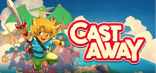
Castaway is a pixel art minigame that uses the measurements 16x16 for each tile. This game is cool in my opinion as its really simple and has a range of different parts about it, like with the style and terrain. It has a short family friendly story about a character whos ship has crashed on an island and his dog was taken by hostile creatures.

This the studios first game and it follows a character
0 notes
Text
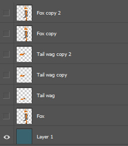
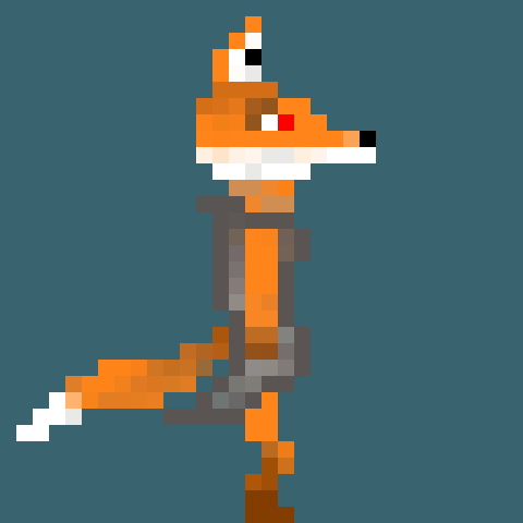
Character Animations
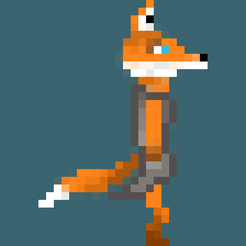
The first animations that I made for my character was walking, as its the base mechanic for any sides scroller. I wanted to achieve a simplistic walk that only consisted of a few frames, which is what many other character walk cycles are, and it worked out pretty well. As I made my fox a full on side profile It made it a bit more difficult to animate it, but it was still fairly simple and I managed to get a walk cycle in 4 frames.
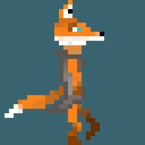
I decided to add extra details to the walk cycle to make it feel less static, as I made the arm swing back and forth and the tail move up and down. These two things aren't necessary, but add more to it and make it feel like a completed walk cycle. I am quite happy with the result and I think it works well and the fact its simple, makes it good.
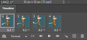
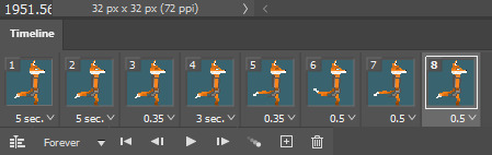
These are the only four frames used in the end. I did have a problem at one point of trying to make the walk look fluid and natural, as I had lots of frames and the first frame was awkward and didn't really match with the end frame when it looped back round. But I managed to fix this by cutting down on the amount of frames, as before I had around 8 frames which wasn't needed and made it more complicated than it had to be.
Below is most of the layers I used to create the original walk cycle with the 8 frames, but after I went down to 4 majority of these frames weren't needed.
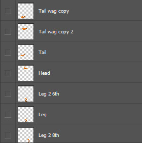
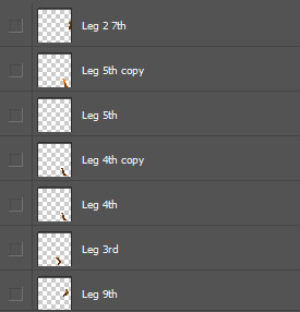
The next animation that I made for my character being idle. I didn't want to do anything too complicated like some games do when the character is idle, but something that feels natural and normal for my character. I again didn't want to use many frames as I just wanted a simple idle animation, and I think I made a decent one with 8 frames. However if I get a chance in the future, I might add some more to this, like an arm swing or my fox laying down etc.
I think it is an alright idle animation, especially as I wasn't trying to do much. I think the blinking and the tail wag were the best options as it feels like something an actual fox would do when being still. Although it repeats itself quite quickly, I personally don't think that it feels too repetitive. I think it feels natural and looks good when in the game, so overall I'm happy with how it turned out.
These are the 8 frames used and I added delays onto each one to make it feel more natural rather than coded. It was very easy to make and didn't take much time as it was just creating a couple of extra layers and adding movement, like a tail moving which was just a new tail I made.
Below is the layers that I used, there are only a few as all there is to it was one layer where the fox's eyes are shut, a few layers with the fox's tail in a different positions and then the regular 32x32 fox.
The third animation that I created was the death animation. This one took me a while as I wanted to get a decent looking death. I decided to use quite a few frames so it could be more fluid and better looking overall, and it took 15 frames altogether.
This is another one that is slower in the actual game and looks better when actually being used, rather than a fast gif to look at. I decided to do a disintegrating style as it is simple and also looks good. It did take me a little while though, but I think it was worth it as I'm happy with how it looks. I also made the fox's eye red to represent blood and show damage.
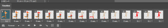
These are all the frames and they were all fairly simple to make, just a bit time consuming. I added some delays, one on the first frame, and some on the last frames. This was to make it feel slower and to allow you to realize what is happening. But overall I'm happy with the finished result.
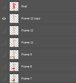
I don't have the original layers that I made for this animation, but I made a lot of this animation just in the frames after I flattened them into layers.
0 notes
Text
Researching pixel artists and animators
The first person I researched was Waneella, who animates pixel art. Waneella uses subtle animations in their pixel art which gives a calm atmosphere and less to take on all at once. When looking into her work, she has her own style and theme which is consistent for a lot of her projects, which is cities being abandoned and left as they were. There is no sign of human life in her work and the only moving objects or things is nature, litter etc.
This is some of her pixel art with no animations and all of them are the same theme with no humans in sight. Majority of her work includes nature, which might be to do with the fact that humans aren't there to destroy it so it's now growing in a city. The design is a little bit different in some of her work, but mostly looks the same and is consistent.
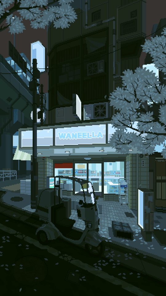

This is just a couple of animated pixel art gifs that she has done, and there is is really subtle, small movements. Like in the left one the leaves are falling and in the right one the cloth material is moving. These details make it feel calm and relaxed; especially as there is no humans, because if there were humans in Waneella's work, I believe there would be more movement from static things.
Overall she has a really detailed style that goes into depth with a lot of objects/things, nature is a really important part of her work as it fills the emptiness that is a result of no humans.
The next person that I researched was Paul Robertson, who has a unique style with ridiculous ideas. He animates pixel art and has a lots of recognizable work, like working on a pixel art intro for The Simpsons, animating for Gravity Falls, often animates gifs or shorts for Adult Swim etc. But with his own original work, he has many unique characters or objects that that stand out. His style is consistent throughout his work, even if its a project for somebody else with normal things/characters, and its what makes his work popular. He has worked on feature films, short films, contributed to tv and has worked on many video games.

This is some of his work and they all have a similar look and feel while still being very weird and different. All the colours compliment each other in his pixel art and they also match the theme. The design looks the same amongst majority of his work and because it's so unique and ridiculous, it works and stands out.

0 notes
Text
Using a tile map to design a level
I'm using a tile map to design a quick level in photoshop, this wont go towards my actual game but is practice. This base template is limited down to only a few basic things needed for a side scroller, so my levels will have more.
I'm happy with the end result as its a simple and short level which doesn't use too much. I want to improve upon this and use a similar concept for when I make my actual level, like the nature, use of spikes and placement of coins a the heart. The main thing I want to include though is the nature, as I do want a pretty heavy nature orientated game to suit my character the best.
0 notes
Text
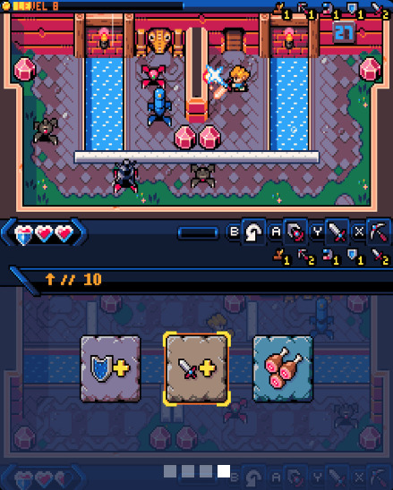
Healing
In my game I wanted to add potions and hearts as the two sources of healing, but I wanted to make them rare and not able to be used all the time, to make the game feel fair and balanced. I have already made these two pickups for my game and added them to some areas which turned out good. But my character starts off with 5 health and if they picked up a potion or a heart it would take their total health over 5, which was stackable, meaning it could keep going up and up. So I added events in the event graph that made it so the character could only pick it up if they had less than 5 health, but if the character does have 5 health and tried to pick it up, it wont allow them to and it wont go towards the health and will stay on the ground.
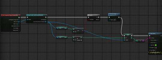
This took me a while as I did it by myself and was still trying to figure out how some events work, as on so many attempts only a few things worked, and usually the character would still pick it up even when on 5 health. But now that it works and I've added it into my level I think it works well.
0 notes
Text
Researching character animations
The next animation that I want to make is walking for my fox character. So to make sure I make what I want, I researched walking animations to see how they are done and which ones catch my eye.
youtube
I watched this video that explains the difference in male and females walk cycle, this is really important to make the character your using feel right and make it match what type of character they are. This also applies to other characteristics such as weight, height and age, (however, these aspects wont affect my character too much). Also, another thing that could affect how a character would walk is their emotions, like if they are sad they will slow down their walking, drag their feet and put their head down.
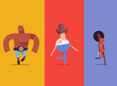
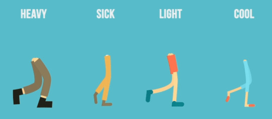
These photos were originally gifs explaining different styles of walking and how they looked. The on on the left explains weight and how the lighter your character is, the more their legs will move and will be more flexible. Whereas, the heavier they are, the less flexible they will be. The photo on the right just shows different types of walking and how certain people/characters would walk.
The then made the first animation for my character, which was walking. I did this one first as it's the base mechanic for any side scroller and wouldn't look right if my character moved without functioning legs. I looked at walk cycles from the sources above and other places and tried to take inspiration from how some other game characters move.
Most walk cycles only use a few frames that repeat themselves very quickly, which is something that I wanted to do with my character. The one that I have done is similar to the walk cycle above, as on each step my character moves up and down when their leg is moved up or down; and only consists of a few frames.
0 notes
Text
Making animations
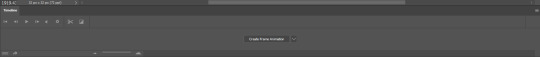
To start off I had to get the tab open that allowed me to create frame animations. So I clicked on window at the top and then on 'Timeline'.
This then opened up the create frame animation tab.
This is the tab that I will have to make every animation in, such as my pickups and my character.
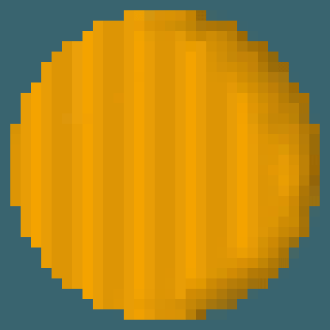
The first animation I made was my coin rotating around, this took me a little while as I had to make many layers and frames. For each frame, I had to get rid of a segment of the coin and draw a few new parts in, to make it seem like the same coin in each frame. But after I had animated my coin to turn 90 degrees, I just copied previous frames and rotated them to save so much time.
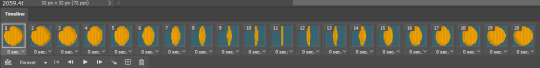
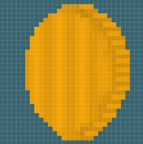
This is the final result of my animation and I'm happy with how it turned out, but it did take me some time to complete.
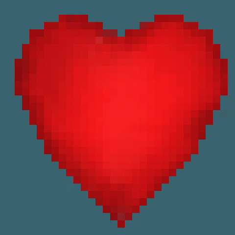
The second animation I made was a heart pickup beating, this took barely any time and didn't use many frames or layers. I just copied the previous layer and made it a little bigger or smaller to make it seem like it was beating. I made it quite a slow heartbeat to make it feel more smooth.
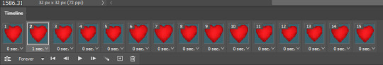
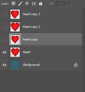
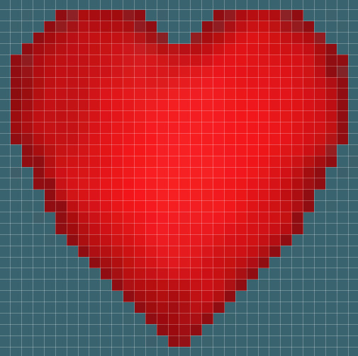
This is the final result and I think it will look good in game as a health pickup. However, I might add an extra frame at the end of the heartbeat to make it ease back into the original state a bit more smoothly.
0 notes
Text
Creating a sprite sheet
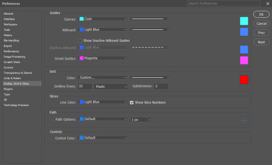
I had to make a sprite sheet for my items to put into my 2D Platformer. To do this I had to make a new project in photoshop, I made the measurements on the canvas 96 pixels wide and 32 pixels as the height, this is because I had 3 items to add as I haven't completed some yet as I wasn't in for a day. Then I went to the top of the screen and opened up the edit tab and then clicked on preferences, from there it opened up another list where I opened guides, grids and slices.
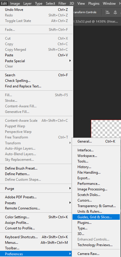
After this it opened up a tab that allowed me add a grid and edit the size and colour. I made it 32 pixels as this was the canvas size that I was using for my items, and then made the grid colour red to make it recognizable.
I then clicked on the ok button and it added the grid into place, from there I copy and pasted my three finished items in and adjusted them to fit the grid.
After this I had to import my sprite sheet into Unreal Engine, so I saved the project and opened up my 2D Platformer in Unreal, from here I had to open up the content drawer and go into the blueprints and then I clicked on import a file. I then found my file and imported it in.
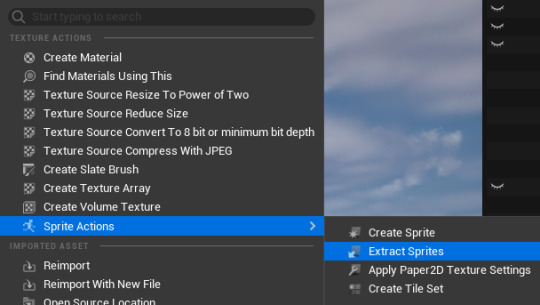
After my sprite sheet was in the content drawer, I right clicked on it and it opened up a list that included sprite actions, I clicked on that and then another option called extract sprite came up.
0 notes
Text
Pixel Art pickups
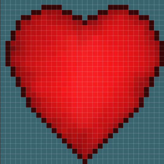
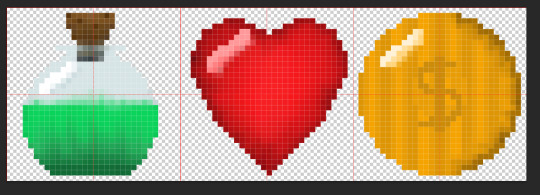
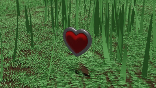
This is my heart pickup which gives health which is in the 32x32 format. I plan to make this 1 health as the character starts off with 3 health. But I wont make these too common too make the player not rely on these to survive.
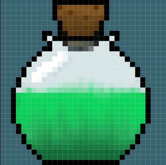
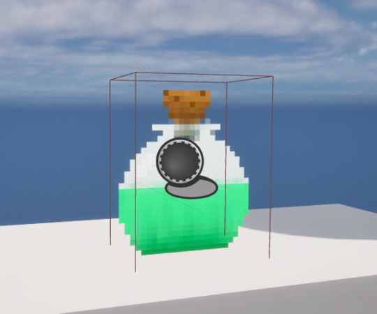
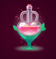
This is my health potion in the 32x32 pixel art format. I want to make it so these do not appear often as I plan to make it heal to 3 full hearts. I want to make multiple of these that heal differently or have effects on the character.
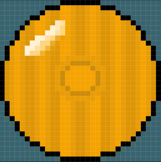
This is the coin that I will use in the 32x32 pixel art format. I wanted to keep it fairly simple to match the other pickups that I have made currently and I think it works for what I'm trying achieve.
0 notes
Text
Mood Board for pickups
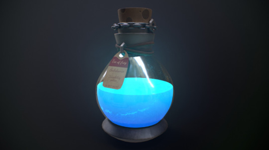
I decided that for health pickups in my game I will use potions and hearts as the main sources of healing. These options are quite common, well known and used for healing in many games, which is why I picked them because people will know they are to heal themselves with and use them. Also, with the potions I could add some dangerous ones that will cause damage to the player rather than heal, and the player has to be careful to see which ones are dangerous. I don't want to make these heals to common on each level and will only place on each level depending on the length.
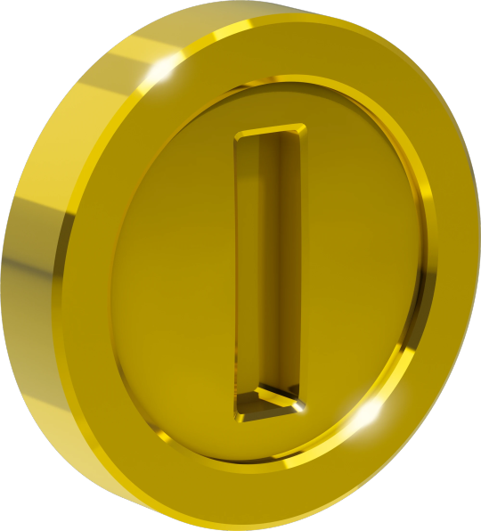
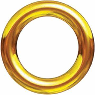
With coins in a game, I want to make a unique design, other games have coins which you can recognize straight away. Like above with coins from the Mario games and Rings from the Sonic games. I want to make my own style of coin while still taking inspiration from already existing video game coins to get a good looking coin. I also want to add quite a few coins per level and make it so you have to collect all of them to carry on through to the next level. I mentioned the side scroller Leo's Fortune in my summer project and I want to use coins like they are used in that game, as there isn't too many and in most areas there is a trail of coins you pickup in one go.
0 notes