
Don't wanna be here? Send us removal request.
Statistics
We looked inside some of the posts by tleec-blog1 and here's what we found interesting.
Average Info
Notes Per Post
1
Likes Per Post
1
Reblog Per Post
0
Reply Per Post
0
Time Between Posts
7 days
Number of Posts By Type
Photo
5
Last Seen Tumblr Blogs


Fun Fact
Tumblr Inc. is funded by 13 investors.
Photo

1. The underlying agenda this visualization has is to encourage people to study more. I can see this when it says “study tips”, these helpful tips encourage students to study harder. This visualization also encourages students to seek out higher education as well.
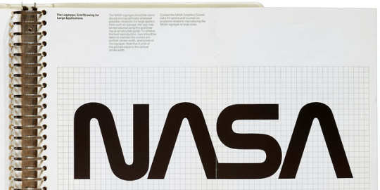
2. The relationship between the elements is that it all has a very flowed texture, as iff all the letters could be connected. At the same time, the As in the image are not complete, implying simplicity within the design. The brand achieves consistency by using this same graphic style for an extended amount of time. They also achieves this by putting this logo on practically everything the company owns. Lastly they do this by pairing this with the American Flag, as this is a section of our government and in part, embodies the intellectual advancement of America and the world.
0 notes
Photo


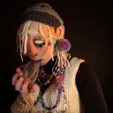
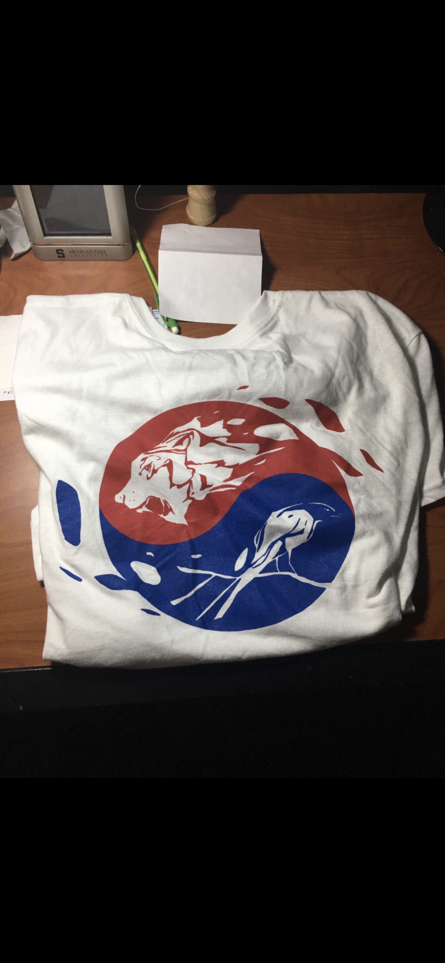
1. This photo’s denotative meaning is an image representing KSA, the Korean Student Association. You can see this clearly with the letters K, S, and A in the image. As well as this you can see the yinyang icon in the background from the Korean Flag, which may be the most iconic part of the image.
2. The connotative part of the photo is the hidden meaning behind this symbol. It shows the idea of living a balanced lifestyle and that has a lot to do with how we wish to conduct KSA. We live in a society where we want equality, but we may not share the same cultural values. Finding balance between these is the goal of KSA and a large part of our lifestyles of being Korean-American.
3. The icon of this image is myself. I say this simply because this is a picture of me.
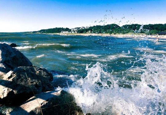
4. This photo’s indexical’s function is from the waves. The strong waves imply that there is a strong wind present. This changes the entire mood of the photo where the sky is blue and clear and so are the waves, but they violently crash implying some type of tension.
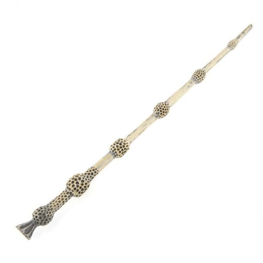
5. This next’s photo’s symbolic function is being “the most powerful wand” in the Harry Potter Universe. It is Dumbledore’s wand throughout the film series, but it symbolized so much more. With how he carried himself with such grace, but having the most powerful weapon in its time, it meant a lot for the development of his character.
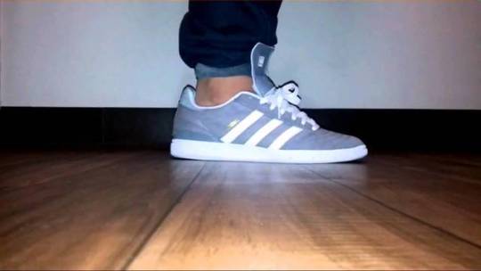
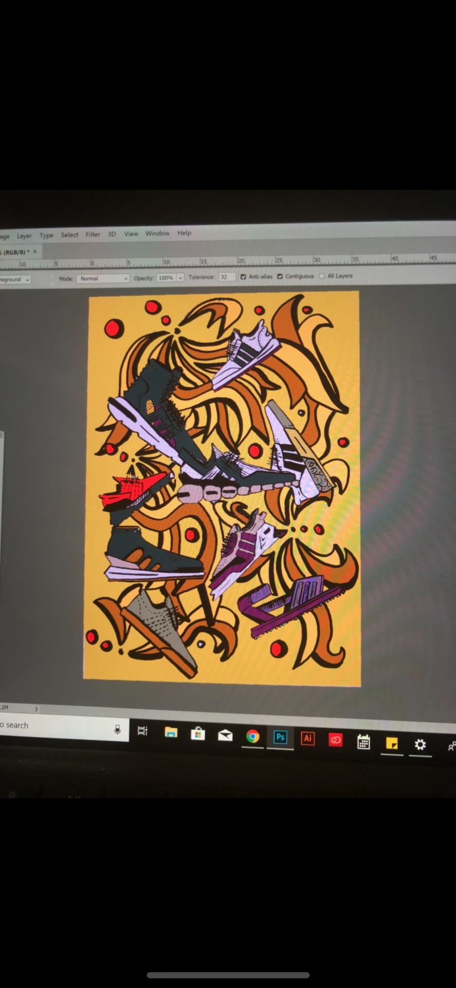
6. The picture of these shoes are called the Busenitz. These shoes were modeled after the indor soccer shoe, Samba. Adidas pays respect to their roots in soccer by modeling the shoes after a past successful model in their market. I would call this a past style because it recycles something that was stylish in the past and it turned out to be one of Adidas’ top selling skateboarding shoes.
0 notes
Photo
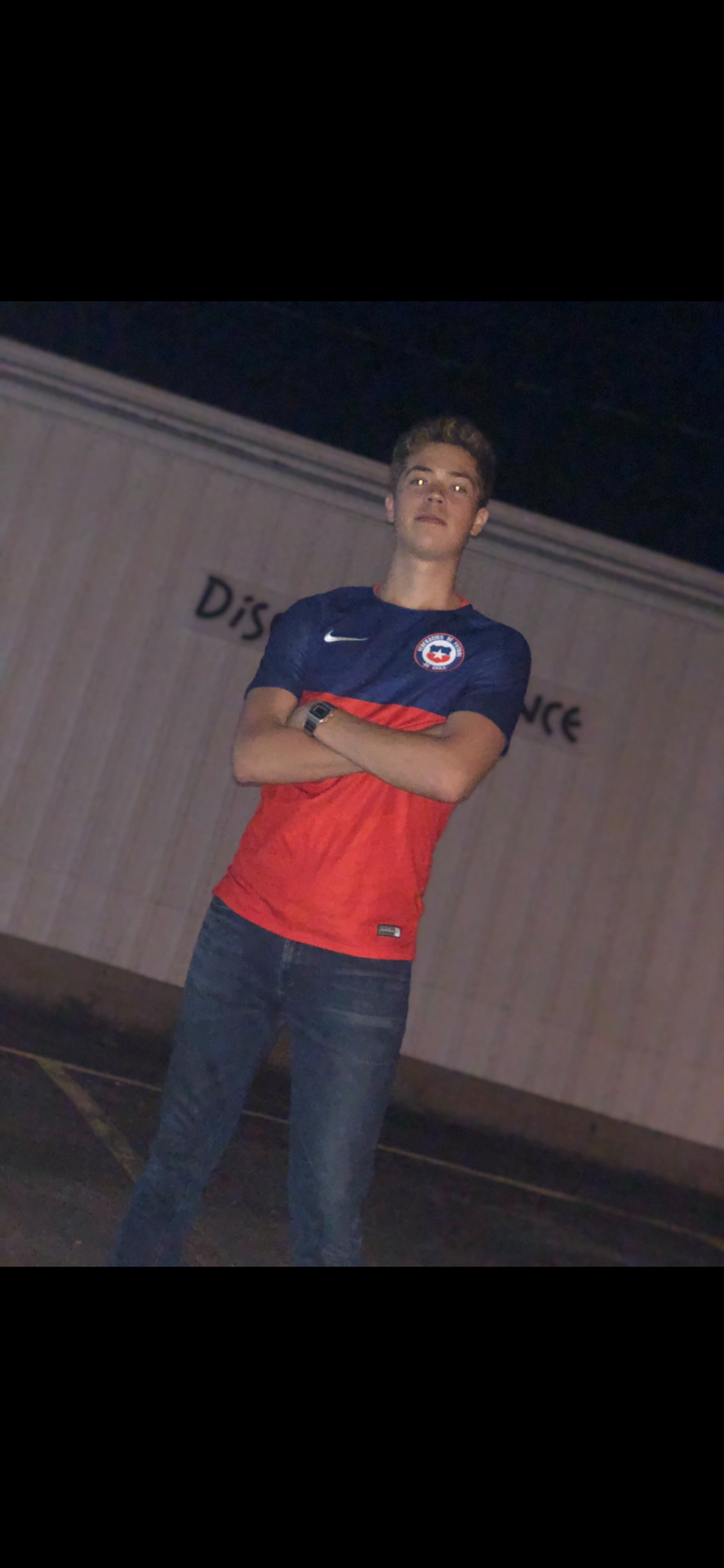
1. The photo I took of my friend Matias is a good example of complementary colors. The colors are used to make a bold statement of the Chilean Flag displayed on a T-Shirt. The boldness of the two colors draws my eye from cold to warm colors.
2. The photo I took of a graphic I created recently is a good example of analogous colors. It brings variety of colors to the image, but not overwhelming the viewer by having them fairly close on the color wheel.
3. The last picture I took at the Holland State park. The picture captures cool colors we may see in our every day lives like the sky and the water. In this photo I am trying to communicate the juxtaposition between the violent water and the peaceful, clear sky, but at the same time relating them with them both being cool colors.
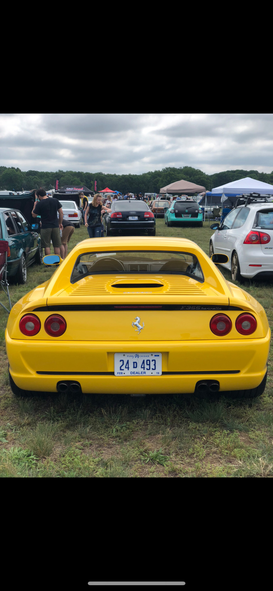
4. The picture of the car is made of warm colors. I believe who ever painted the car wanted to emphasize the luxury and the eliteness of the vehicle. They want whoever looks at this vehicle to stare and appreciate the fine piece of machinery.
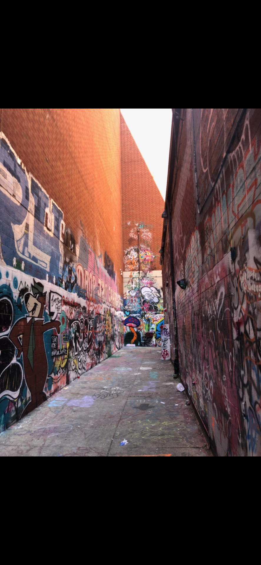
5. The graffiti wall that I took a picture of from Ann Arbor us a good example of a contrast in color. Each one of the pieces of art on the wall attempts to set itself apart from the others whether it be with value, saturation, or anything else. It all has the simple purpose to be recognized, but all work well together to balance each other out.
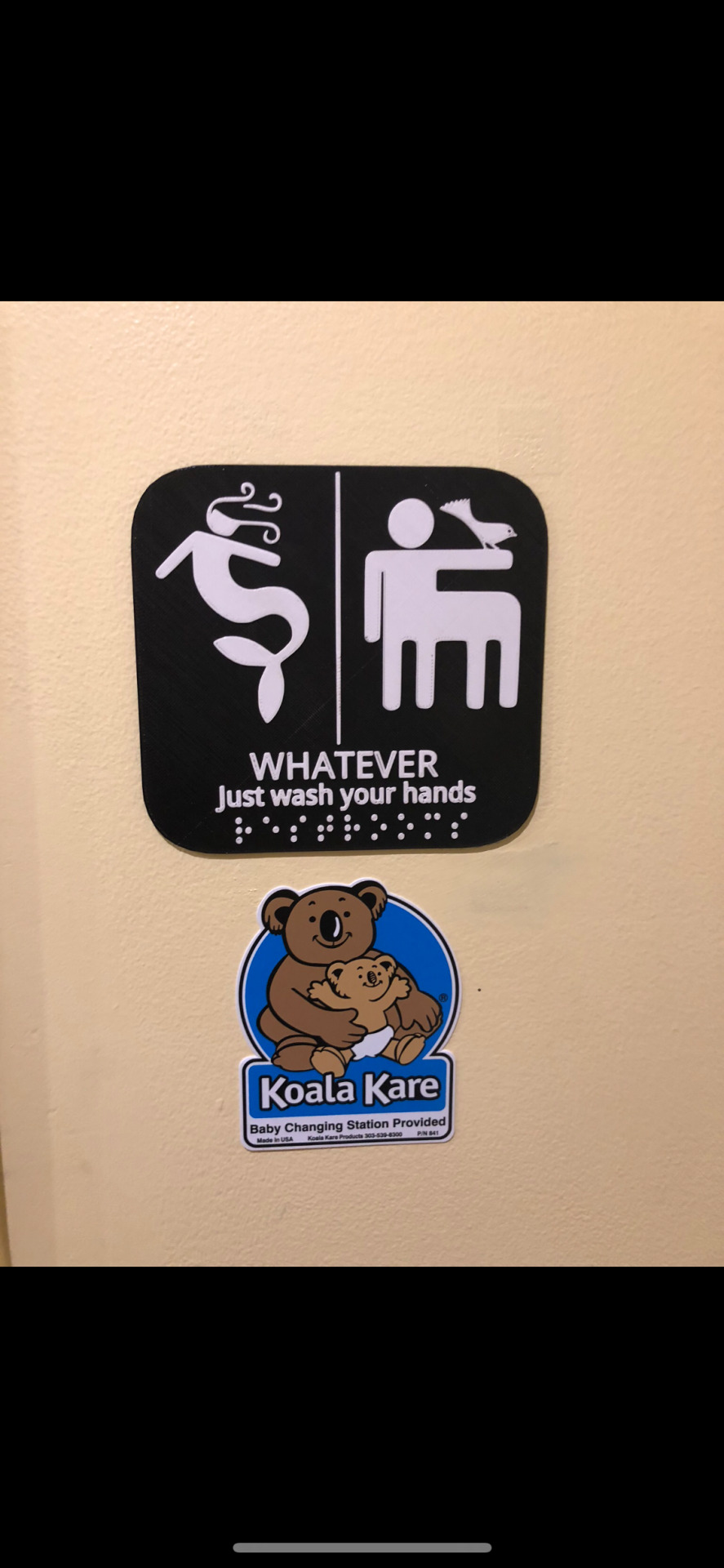
6. The bathroom sign is a good example of proximity. hen looking at the waves surrounding the head of the mermaid, our eye groups those waves together to make them connected in order for us to perceive it as hair.
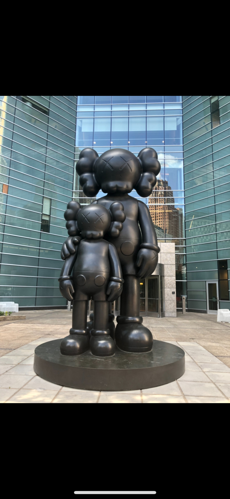
8. The KAWS statue in Detroit is a good example of something reflecting on history in order to communicate. KAWS has a rich history in Detroit, Michigan and although he is a very versatile artist now, he respects his roots with creating characters such as the one displayed in the photo. I believe he is trying to tell us to respect our roots and the journey we take.
0 notes
Photo
All five of these images I believe show a good example of contrast.
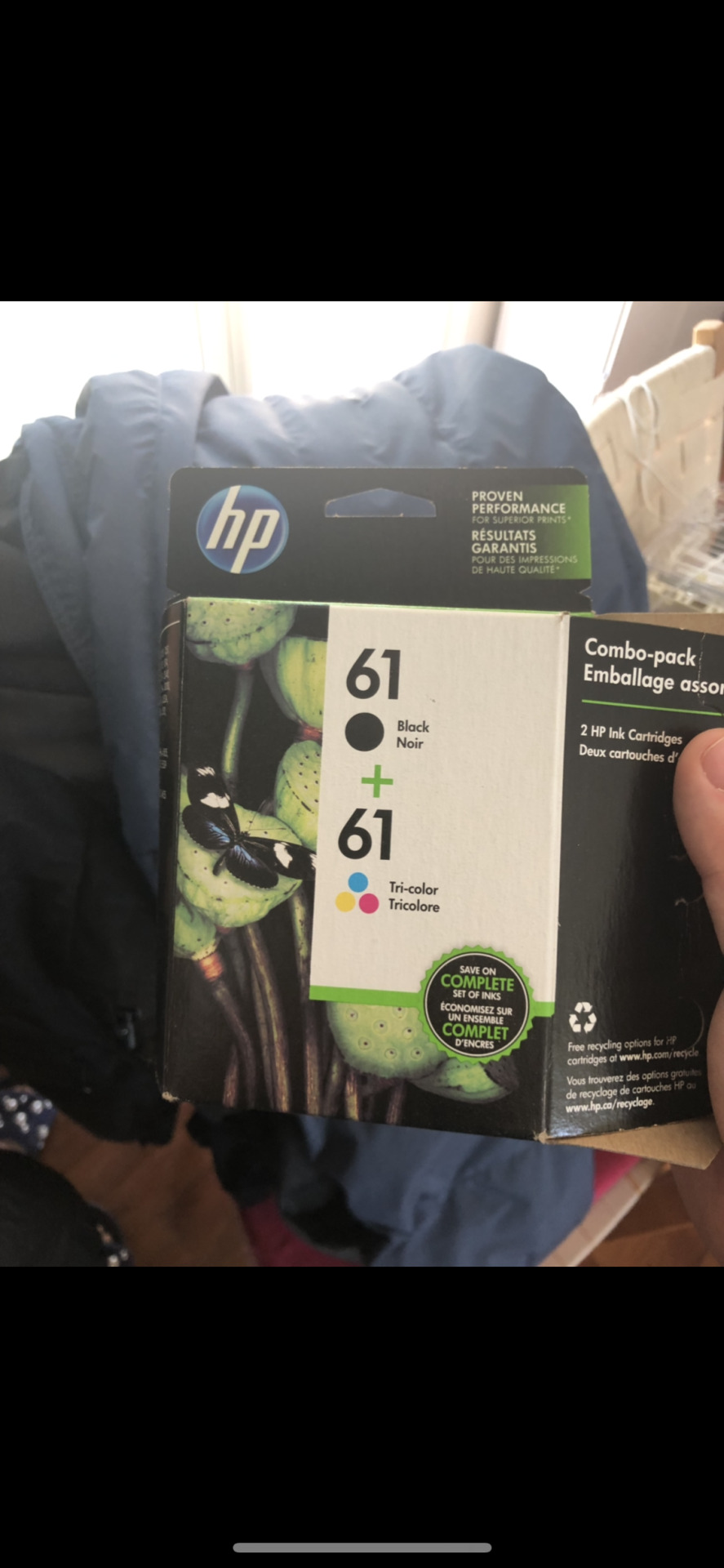
1. The first image shows a high contrast between its dark and light colors, emphasizing the color and saturation of the non black colors. This is used to make good advertisement for printer ink.
2. This is a KSA logo that I designed about a year back. I believe it naturally had la contrast with the classic red-blue ting-yang korean flag symbol. I decided to create even more contrast by adding the saber tooth tiger on the top and a frail bird on the bottom.
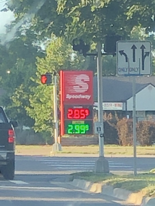
3. I believe the classic speedway logo is a good example of the changing of value. Making it appear to be moving from one side to another the idea of “constant motion” or movement is a good advertising strategy for a company that fuels our vehicles.
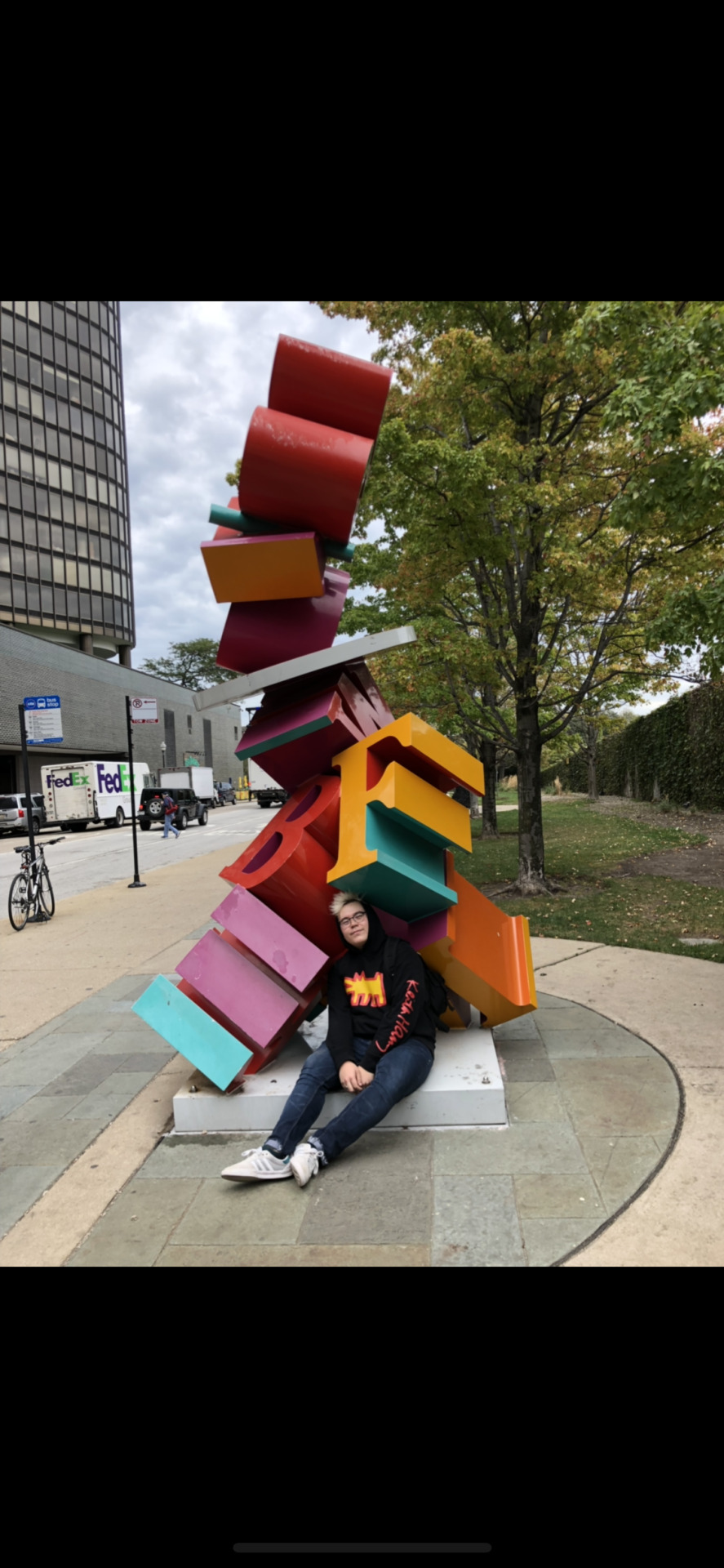
4. This is a sculpture I found downtown Chicago. Regrettably, I do not know the name of this sculpture but I really appreciate how the artist chose to incorporate weight as a value to this sculpture. Having the letters unevenly balanced creates an unsatisfying contrast the keeps viewers looking.
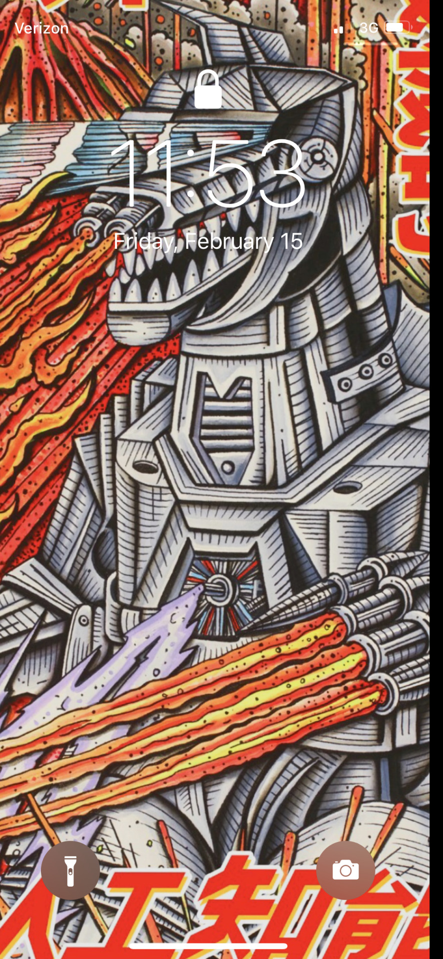
5. This is a screenshot of what my wallpaper used to be. This is a Godzilla concept graphic created by the artist Teddy or ““Boost God”. I think this is a creative way of making contrast by the means of juxtaposing straight or almost perfect lines to complete imperfect lines, or lines that are not straight and uneven. It comes together to be a great piece of work.
0 notes
Photo
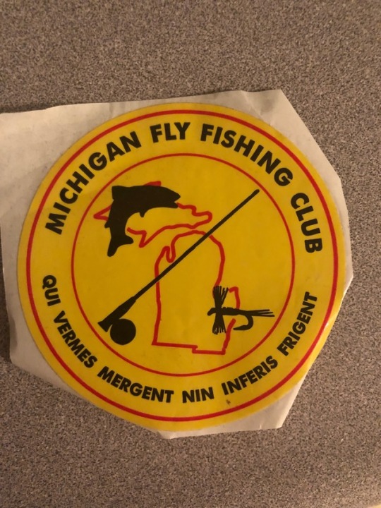
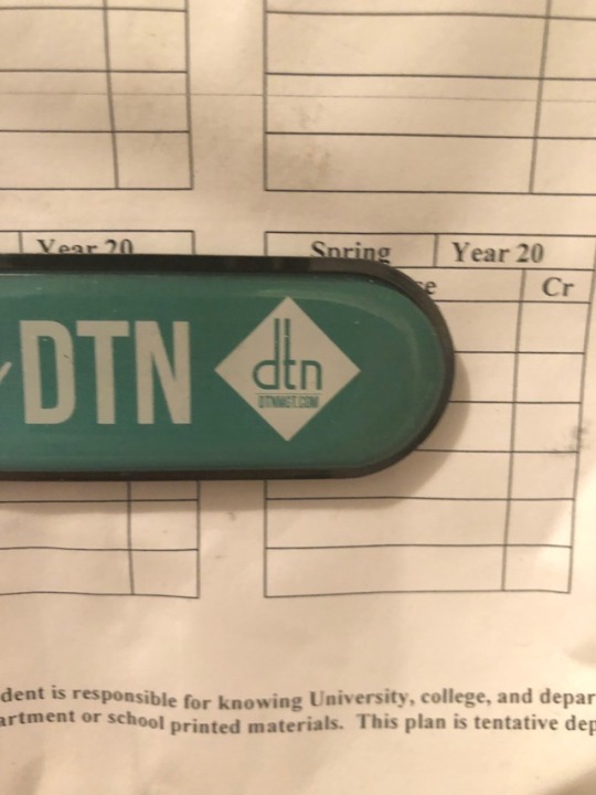
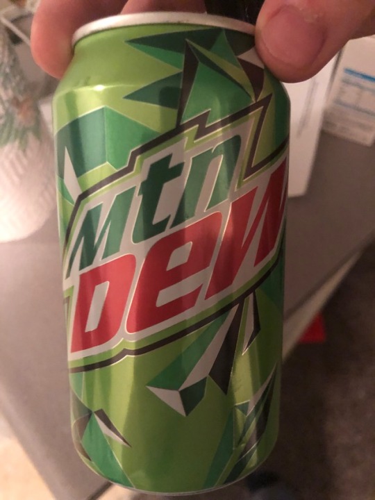
I believe all of these images are good examples of graphic design. Here is my reasoning for the following photos in order.
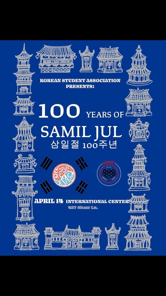
1. This is a screenshot of a poster I made myself for my club for the purpose of advertising our event. I believe the message was clear but at the same time was not too “in your face”. The images surrounding the characters pay homage towards the Korean culture it represents.
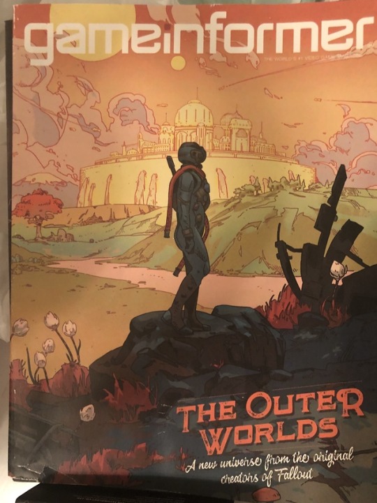
2. This is an old cover of gameinformer I had in my apartment. It clearly advertises the name of the company, but also advertises the game it represents as well. Because the game that is advertised is supposed to represent a “newer style” to the gaming industry, the unique textures in the graphics bring an interest to a viewer that entices the reader.
3. I really liked this graphic because it brings the iconic michigan logo with a distortion using other symbols that make it clear and concise. Even if the image was not surrounded by the letters, the symbols in the logo give me a very good understanding of what the group represents.
4. This is the logo for the dtn leasing company. It is not my favorite logo to be honest, but it is a clear and simple use of basic shapes and typography. It’s able to represent a large company while using a small and simple logo.
5. Here is the iconic Mountain Dew logo. It is “revamped” with a creative use of geometric shapes. I really like this because it represents Mountain Dew as a “sharp” and “edgy” company. I believe this is a very proper way to advertise for a soda company.
1 note
·
View note