Creative media production project // skate and destroy
Don't wanna be here? Send us removal request.
Text
progress//
My main issue with my film was the differing quality of footage sent from across the world. To solve this I leveraged a glitchy and pixelated aesthetic, particularly in the intro. This aesthetic consistency helps the non-HD footage feel less out of place.
Helping most through my editing process was my organised use of files and Premiere Pro. I had footage in specific folders and used many sequences so I could find what I needed when I needed it.
I settled on the name "ecumene".
//
The clothing line was more straight forward with my renaming of a many pieces and creation of four new designs.
I am very happy with both products.
//
0 notes
Text
Collab update//
Super rad news.
My mate Kez who filmed for Uganda Skateboard Union, Independent, and Skate Aid, has allowed me to use some footage he shot in Uganda. The bro Yuta has sent me some heaavvyy clips of his skating in both Perth and Melbourne.
Skate Ukraine are also keen to send footage. Homies who taught me to skate in Cambridge are sending clips and skaters from Whangamatā and Whitianga are also.
Also got skate footage coming from Ohio and live music clips from a hardcore band out of Boise, Idaho.
Super thankful for everyone's support and contribution and stoked to combine it with my footage to edit a unique vid.
escape
0 notes
Text


concept updates//
WIP ofc
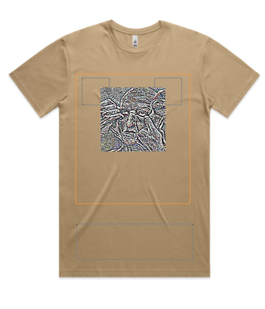
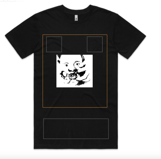
I like the front of the sand shirt and the back of the plum shirt but the text on the back of the sand shirt and the front of the plum shirt looks cheap. I need to take these concepts to a better software.
0 notes
Text
cool shit people sell


Cool product/fashion design both inside and outside of the realm of skateboarding//
The Sci-Fi tee resonates with the digital reality Gen Z have been raised immersed within, and how we had to adapt to scams via media literacy and critical consumption.
The Sci-Fi deck resonates with the theme of escape and uses lighting, silhouette, and texture effectively.
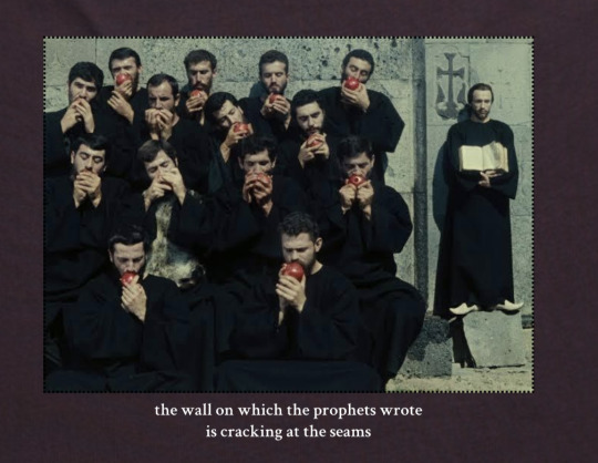
The other two tees are from Melbourne designer Perks and Mini (P.A.M.). The HELL Tee uses airbrushing well for a rusted, burnt aesthetic while its typography is bold and attention-grabbing. The film stills tee is a really cool concept and could uniquely be adapted to skateboarding.
//
0 notes
Text

An example of good web design for a skate brand//
Love the Neoliberal Hellscape in the top right and the image of crashing out as you enter the website.
I would go for something more minimalist and less user-friendly. More media-heavy and more layers to navigate through on the site for a sense of narrative and exclusivity before arriving at a specific end point e.g. a product.
Might have to copy the "you are visitor number x" idea if I eventually make a website.
//
0 notes
Text
still image
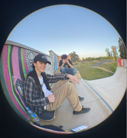
some rad photographers and designers have shown interest in helping with photography and potential web design assets. also have a contact in a printing company who could quote a potential line of tees//
0 notes
Text
update //
From the magazine side of things I've been connecting with plenty of local musicians. In my filmmaking I'm now working with a musician and a painter too.
Knowing artists in these different mediums, asw as tattoo and graffiti, should really help bring the multimodality, community, and counterculture to escape.
Would be rad to skate to local music in our video parts.
//
0 notes
Text
direction refinement
To clean up the mess of a social direction, I'm going to focus only on one issue. This issue will be ethical manufacturing & sustainable fashion.
The solution is simple: find a company using sustainable material & with an ethical, carbon neutral, supply chain.
I still aim to work alongside Gaza Skate Team & promote the Waikato skate scene. These plans are incidental to the fact that skate crews often partner up & that the skate industry runs on a sponsorship-based model, rather than being an overarching brand goal or issue. With regard to these outcomes, I mainly just wanna give my mates cool clothes if I can & support a skate crew lacking awareness due to circumstances far beyond their control.
Despite my goal being sustainability & ethical manufacturing, the aesthetic of the brand will not virtue signal this but rather express our image as it is within the world of skate media.
//
We may be an escape from unethical praxis in the skate industry, but we are also an escape from monotonous & uninspired skate media.
0 notes
Text
melbourne photography & other pics
To be used as inspo for concepts & potential content//
0 notes
Text
initial project proposal draft (4k words)

#gilles deleuze#deleuze and guattari#skate or die#skate punk#skateboarding#skate and destroy#project progress#proposal#marketing#marketingdigital
0 notes
Text
very early & draft concepts made entirely within a custom t-shirt website//


#grunge#edgy aesthetic#skateboarding#skateboard#skate or die#skate and destroy#skate punk#queer artist
0 notes
Text
My previous personal and group video projects, mainly skate videos, so I can reuse the techniques I liked, and set a level from which to improve.
//
Annotations:
Hugh Bday 1: I like the fish eye and use of fire but needs more sound design in post.
Looking Glass 2 Scenes: I really the over-stimulating intro montage, very much something I want to be intensified so it is synonymous with escape. I really like the ryhtm of that montage and use of uncomfortable audiovisuals (maggots crawling and mud sounds), notably the layered duplication of footage with one layer inverted and offset in its timing to result in footage that shows change over time. The closest to my desired escape editing style but is unfinished (missing an entire scene) and hasn't been colour-graded so could be improved. The uncomfortable, claustrophobic, atmosphere that confronts the viewer with their human condition is precisely my goal with escape in its entirety.
Melbourne April 2024 b2b: Some cool use of layering and CharliXCX's hyperpop track would resonate with a queer audience. The outfits are along the line of escape's new-wave edgy aesthetic. The use of multimedia - bringing in an old film format - matches the multimodal and metamodern positioning of escape. The kaleidoscope comes across as adolescent and not in a trendy way.
Melbourne 1: Some cool music but not creative enough - too linear. I like the skating that interacts uniquely with it's environment such as the springy pole jam.
The Electric Boogaloo Number Two: Was made in three hours. Lacks necessary rhythm due to a time crunch on sound mixing. If the audio was synced to the action would be better.
TikTok Auckland Edit: Cool spots but minimal editing. Really like the graffiti at the park.
Watching Willow Final: Narrative based so not my personal jam. Shots drag on too long & the video can pull at strings for plot devices. Some great acting & cool shots though.
Westgate 2024: I used a beat made by a BMXer mate of mine who's involved in the local music scene. Some cool movements across the frame too, such as the plane & man in hi-vis. I like the intersection of skating & local music subcultures.
Xmas Eve 2023: My longest skate production to date. I spent about 4 months gathering the footage alongside friends & then two months editing it. Really inconsistent colour grading (some mates filmed with filters on) but a cool level of involvement between the audience & those on camera. Watching it feels like hanging out with your friends in the last summer of high school. A very bittersweet & nostalgic tone for me personally.
0 notes
Text

escape skate brand initial mind map
//focus on cultural positioning and use of mediums
1 note
·
View note
