
Don't wanna be here? Send us removal request.
Statistics
We looked inside some of the posts by tobymansell and here's what we found interesting.
Average Info
Notes Per Post
0
Likes Per Post
0
Reblog Per Post
0
Reply Per Post
0
Time Between Posts
8 days
Number of Posts By Type
Text
14
Video
2
Photo
1
Last Seen Tumblr Blogs


Fun Fact
In 2020, Tumblr had 29.4 million users in the US.
Text
Inanimate objects final reflective thoughts
I learned a lot of skills when completing my inanimate objects film, as this was my first attempt at a fully finished stop-motion film. Some of these skills include de-rigging, making a title/credit sequence and editing in Aftereffects. I struggled with the de-rigging, as the blank plate photo I had taken was in the wrong resolution, so after I re-edited it, it wasn't perfect, so became very obvious where I put the masks. I have learned the importance of planning everything perfectly and making sure everything is in the correct resolution and positioned correctly before I start shooting. I think the sound adds a nice effect to the piece, as it makes it more immersive. I think the royalty free song at the end was a good comedic touch that gave a funny. element to my piece. I think my credit and title sequences are smoothly edited and flow well with the piece. I also think it gave me good practice with animating, as I think some of the frames are too jumpy, and the illusion that the cup and pen are alive is lost a little. I also have gotten better with using the rigs. I now know how delicate to be when animating to make sure everything runs together smoothly
0 notes
Video
tumblr
This is my final iteration for my first motion graphic. I think this a successful experiment. After some feedback, I changed my background idea from the mandala, as it was suggested it would distract the eye too much, and it would be hard to make using only 3 colours. I chose vines instead, because nature gives the impression of well-being. I also wanted to experiment with new tools on AE. Green, orange and pink are also all very warm happy colours that express well-being.
0 notes
Text
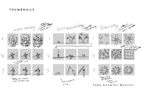
Thumbnails for motion graphics.
I wanted to explore a few ideas for every topic area, so I can then pick through the best ones, and take them forward to iterate on a 3 panel board. I especially like the monk idea, as I think this clearly shows well-being, and will be a good test of my after effects skills.
0 notes
Text
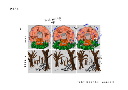
3 Panel ideas for motion graphics.
I decided to go for the monk, as after some feedback in a tutorial, it was suggested that loop 2 would be hard to achieve, using only 3 colours. As this is suppose to be a simple task, I just wanted to clearly show well-being and I think a monk praying is perfect for that. I may come back to the bottom idea in the future, when I want to do something more complicated.
0 notes
Text
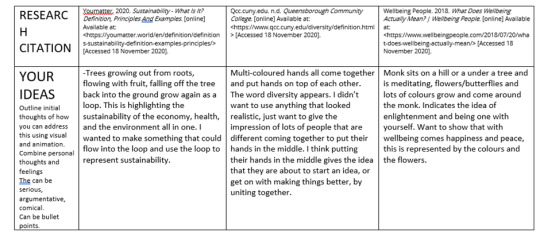
Research for Motion graphic
This is the research I made when deciding upon a motion graphic idea. I decided to take the ideas of sustainability and welbeing forward.
0 notes
Video
tumblr
This is my second motion graphic. For the first graphic, I chose well-being, so I wanted to pick something different. I felt like I had some good ideas for environmental impact, so I decided on over-fishing, as I felt like I could execute it well. After some group feedback, I decided to change the fishing rod, and add more details to make it more obvious what it was, as it was just a white pole before.
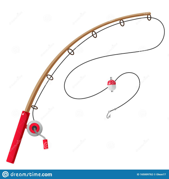
This is the reference image I used when working on the fishing line.
The main thing i worked on with this was making sure the line looked like it was being thrown back, and forward, and I spent a while figuring out how to ease the timing of the shape to make it bend realistically. I think this was successful. I wish I had spent more time at the end of the graphic, making it end at the start, so it makes a continuous loop. This is something I shall bear in mind for next time, but because I didnt know aftereffects very well I was learning as I was creating, so I didnt set up the movements correctly enough to do that.
0 notes
Text
Final puppet reflective thoughts
I am overall very happy with how my stop-motion puppet turned out. I don't think he is perfect, however I have learned a lot about how to prepare and plan for unforeseen hurdles. Because I decided to choose a very human-like, Laika inspired puppet, it means that mistakes and imperfections are very noticeable, such as the un-straight seamlines of his coat. I think the thread and my needles were too big, so it made it quite time consuming and hard to sew the clothes. I had not really made clothes before, and it was fun experimenting with sewing, I think I have taught myself a lot about what kind of templates I need, and different sewing techniques. I have realised that the best way to overcome most of these issues is to plan out every aspect with research and iteration before I start working on the final piece. I struggled when coming to a decision on how to make his neck, because I needed to make it flexible, and the same colour as his face, otherwise it would look unrealistic and noticeable. I decided to use unbaked sculpy for the neck, taking inspiration from classic clay-mation. After seeing how the colour of the Sugru came out on the hands, I didnt want to use it for the neck, as the hands are far away, so less noticeable when it is a different colour, however the neck blends directly into the face. This makes it slightly problematic when animating or moving the puppet, as the unbaked sculpy doesn't flex very well. However I think it blends well and looks good. I think I need to experiment with making shoes, using real leather and cloth, so they are sturdy and flexible, because they look good, but the baked sculpy is too fragile, and makes his walk look unrealistic. I also need to research different hand making techniques, even experiment with casting silicone into a mould and make some professional standard hands. I also think I was over confident with the amount of fingers I made, and should have compromised the human 5 digits, as it would have made it a lot less intricate.
0 notes
Text
motion graphics test 2
For my second motion graphics experiment, I decided on making it about the environmental impact of over-fishing. I wanted this to be light hearted and clear, as the brief was very specific. We could only use 3 colours, and simple shapes. These are some inspirational photos i used when coming up with the look of my graphic. i used elements from a few of these.
0 notes
Text
Hands
https://www.youtube.com/watch?v=wCW9ffsUUT4&ab_channel=MichaelParks
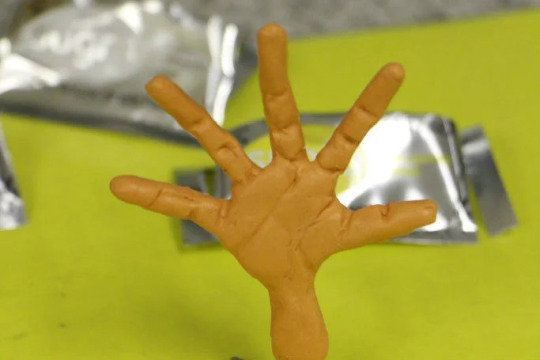
When researching ways to make my puppets hands, I needed to find a material that I could work with at home, due to the government restrictions. I came across this stop-motion artist called Michael parks who suggested using Sugru, a mouldable glue as a cheaper and easier o work version of silicon, which is what is used when casting hands for real stop-motion films. After watching his video and looking into the pros and cons I decided that I would experiment with it for my puppet. I thought it was relatively easy to mould it to the wire skeleton, however something I have learned for next time is to make a hand with less digits, or make them bigger because I found it very intricate and hard. If I was casting moulds with liquid silicone, it wouldnt be a problem trying to mould into all the nooks and crannies'. I will use Sugru again, but I did think it wasnt as soft as I was hoping, and started to crumble fast. It also wasn't as flexible as I was hoping, and started to crack when it was dry after a small amount of use. Ive realised that it is better for bigger, more simple things, such as a tail, as its not mouldable enough for finer, smaller details. I also found the colouring a problem, as it only came in a few basic colours that were hard to mix and make the same tone. As a result, I think the face and the two hands are slightly off colour. If I was going to make this again, I will plan out the materials I am going to use before I start crafting, and will make sure I use the same for anything that is the same, such as skin to keep my puppet consistent. I have also learned to attach the finished hands after I finish making the rest of the body, because it was very awkward working on details of the hands, and getting his clothes on. I've researched different ways I can do this for next time, as it was already too late to do this at the time. next time I will use pieces of rubber tubing as the joints, and when im ready to attach the hands, ill put put the wire into the tubes.
0 notes
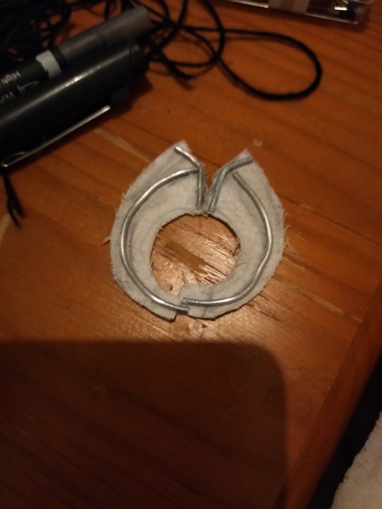
Text
Shoe Design
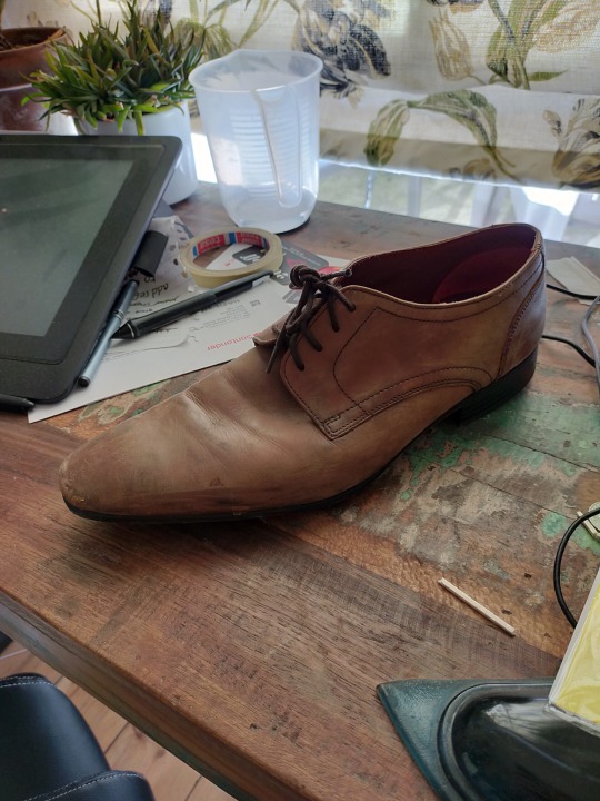
When designing his shoes I realised that I made a silly mistake which created a problem I had to overcome. I put all of the milliput on the ends of the wire to make the skeleton of his hands and feet before putting on his clothes. In terms of the feet, I had decided to use supersculpy to mould the shoes, however it needs to be baked, and I only realised this after sculpting the shoes on the puppet. I quickly came up with the solution, I cut the wire at the ankles and completely took the feet off, after which I baked, painted, and glossed the shoes. When attaching them back on, I tried to research different puppet making techniques, which included using rubber tubing as a non permanent joint. Unfortunately I couldnt find such material, so improvised using millput. This was successful and strong, however I think I lost some mobility at the ankles. This was the same for the feet, as I had specifically left gaps in the feet so they could move more realistically. Unfortunately, the balsa wood I bought was too fragile to work with, so when I made the shoes with superscuply, that mobility was lost. If I was going to do this again, I would make the shoes out of a softer material, but still with some rigidity. I think maybe real leather would work better, and using real string or wire for the laces so they can also be moved independently. I also chose sculpy because it is very easy to get intricate detailing, and it is quite heavy, which was important for the feet, so his weight would be balanced and stand up on his own, so If I was to make the feet using a softer material next time, I will still need to consider weight, and make sure they arnt too light, by adding in a weight to the shoes. I would also make the hands and feet separately next time, and attach them to the finished puppet at the end. I think this would make it far less tedious to sculpt fine details when its already attached, and it will mean I dont encounter issues when trying to put clothes on, or bake clay.

This was a shoe I found and used as a reference when moulding my shoes. I didnt want to copy it exactly, I just wanted to check how the seams line up, and where the darker and lighter parts would be on a used shoe.
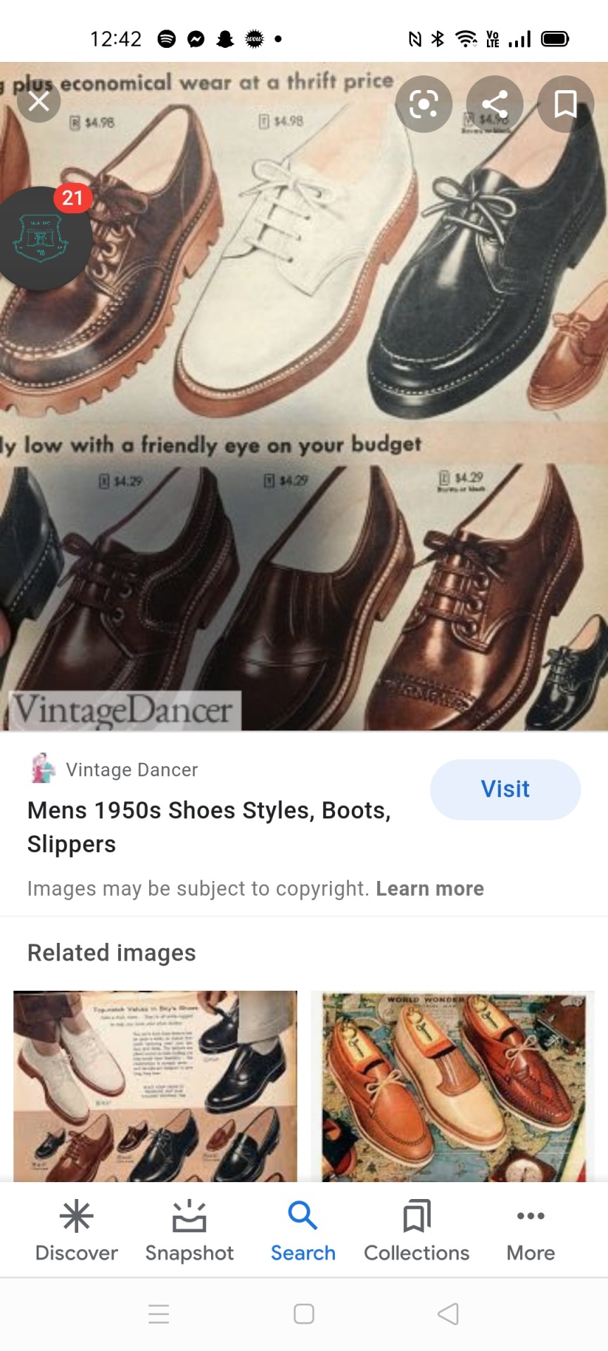
These were some reference images I used from the internet to get a feel for what look I wanted. I wanted to keep it simple and not distracting, but still had a sense of sophistication, and fashion of the 50s.

I chose the colour brown, as it was quite a common shoe colour in the 50s, and I didnt like the harshness of black, especially considering the rest of his outfit is quite light coloured, so I also wanted something that would match. I painted in imperfections into the shoe as well, to give it a worn look. I think this goes with my character, as he is someone who doesnt care if his shoes are messy. I wanted to give the impression that he was a man who had a head full of thoughts, he wouldnt have time to be thinking he needed clean shoes. I also added a PVA water gloss, just to give it a leather feel.

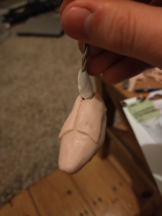
This was the process of me attaching the finished shoes onto the wire frame. I used milliput for this, and had to cut through the layers of foam the attach the feet the wire underneath, before rewrapping it.
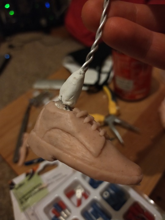


This last photo I have added to show the steps leading up to designing the shoe. I used tinfoil as the core, because it is light, durable and flexible.
0 notes
Text
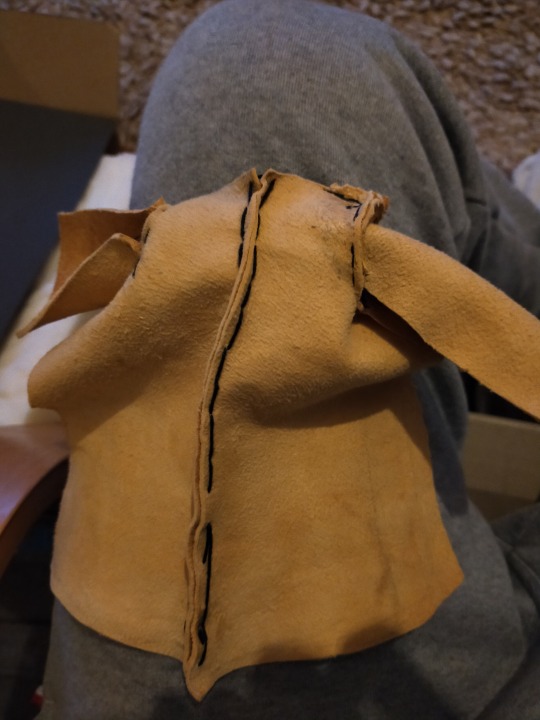
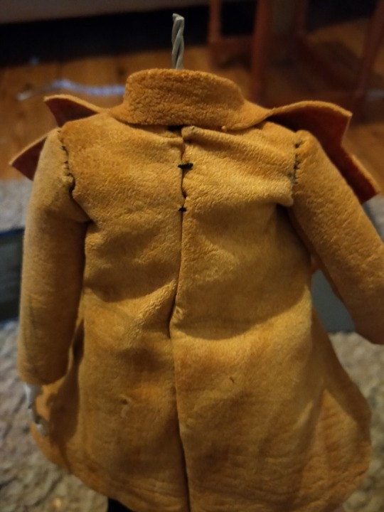
Designing his coat
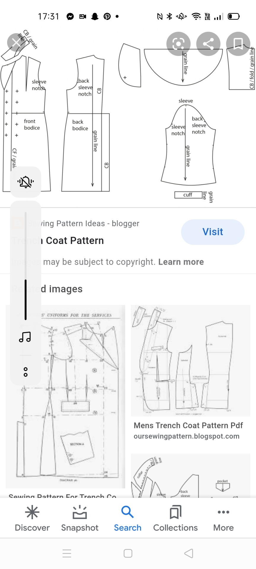
Below are a series of reference photos I used when trying to figure out the shapes I needed for making a trench coat. Below that is my method photos.
The reason I decided on a trench coat, was that I wanted a coat that screams 50′s fashion, and was used similarly in ‘Shutter Island’, a film I have been using for some reference. I could also source brown leather easily in the form of chamois. I also loved the illusive, investigative tone a trench coat gave, and thought it was the prefect balance of sophistication and mystery.
What I found a challenge was intricately hand-sewing such a thick material, I found it a struggle to push the needle through accurately and thus have been left with imperfect lines. However, I still feel like this adds to the ‘home-made’ feel. I also struggled to attach the arms of the coat with the jacket being on, as I had already made the hands, So I was limited by having to sew the jacket onto the model. I ended up gluing the fabric together at the bottom, and just tried to make it as seamless as possible. I think it worked at well with limited gaps in the end. One thing I have learned for next time is to plan out all the parts and methods I am going to use, so I don't run into issues where i cant put the coat on. Next time I make a puppet, I will be sure to only add the hands and feet at the end, to reduce problems.
One thing I did add to inside of the coat was some aluminium wire that run along the inside edge. I added this, so the jacket would be able to be opened and closed, and remain still when contorted to any shape. I think this would help a lot when shooting, as it reduces the ‘boiling’ effects, and it means I can make it seem more life-like with subtle moves to his coat as he was walking, or if it was windy. It also adds rigidity to the coat, and makes it feel more realistic.


0 notes
Text
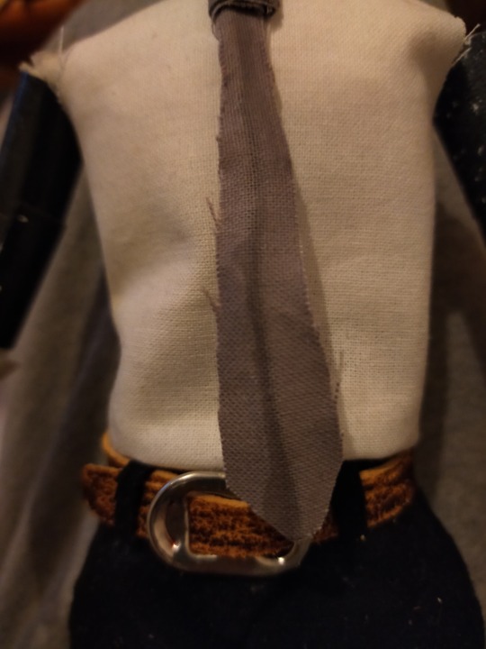
Creating his tie
I wanted to make a tie that gave an element of formality, mixed with mystery and melancholy. I settled on this warm grey, as I didn't want anything to bold or garish. and wanted to make sure I made a big wide tie, and a Windsor knot
Below is a quote from this website: https://www.tie-a-tie.net/the-evolution-of-the-necktie/
1930-1939 During the Art Deco movement of the 1930s, neckties became wider and often displayed bold Art Deco patterns and designs. Men also wore their ties a bit shorter and commonly tied them with a Windsor knot – a tie knot that the Duke of Windsor invented during this time.
I used this as reference when designing the shape of the tie, as even though he is set in the 50s, and the fashion for the 50s was a slimmer, sleek look, I wanted to give a small indication that this wasnt a man who was trying to keep up with the latest trends, he has enough to think about rather than the shape of his tie, arguably the most fashionable statement of his outfit. I wanted to give the impression that he was a man who was set in his ways and who has lost the energy to care.
I glued it to a piece of aluminium wire before attaching it so I could have free movement of the tie when making a shot or scene, without the tie moving, for example, if it was windy. It works well and supports the tie, however because I used PVA, it bled through the thin fabric, and gives it a stain on the front. If I needed to make this again, I would make sure I layered the fabric, to prevent it from bleeding, or used a less wet glue.

0 notes
Text
Trouser design
Below is a reference I used when trying to figure out the particular shapes I need to make when designing trousers for a male body.
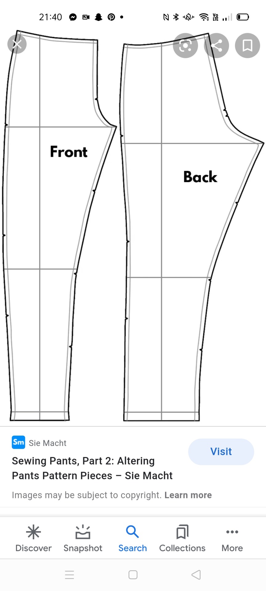


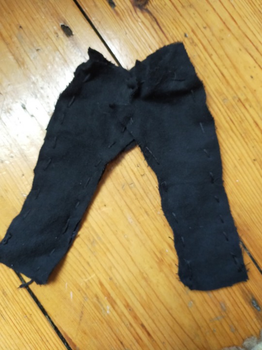
My original plan and sketch was to have grey trousers, as I felt like these were more in keeping with a doctor look, and looked better with a brown coat. Unfortunately, I did not have enough grey fabric to make his trousers, so I used black instead. I don’t think this has too much affect on the look of my character, but a benefit of using the black fabric, was that it was softer, and made it easer to sew with. A challenge I faced was being new to sewing, and trying to create an inner seam along the edge, so I could turn it inside out and it wouldn't have the stiches on the outside. I found it quite intricate at first, and had to iterate a few times, as the fabric wasn't big enough to fit, or I wasn't happy with the straightness of the line.
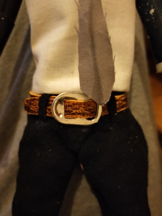
After getting the trousers on, I was happy with how they looked, but felt like there was a lot of room at the waist. I solved this by making a functional belt that discretely masked the folds at the top to give the impression that the trousers were a slim fit. I used a tab from a can as the buckle, as I felt like it fit the purpose well, looked like it could be a buckle, and I liked the fact I was sourcing materials that were recycled. I also made loops for the belt to sit in. Even though the trousers didn't look perfect, I quite liked aesthetic of imperfection as a reminder that I am making a stop-motion puppet, and these imperfections can be an indication to the viewer that it is hand-made. This is taking direct inspiration from Aardman, as even though they previously used plasticine, they use silicone plastic as the base for their models, but purposely leave a finger print or two on the puppets, so the viewer doesn't forget that its homemade and real.
https://sewoverit.co.uk/ultimate-trousers-sewalong-no-4-sewing-the-seams/ - This was an instructional article on the basics of sewing trousers that I used for reference.
0 notes
Text
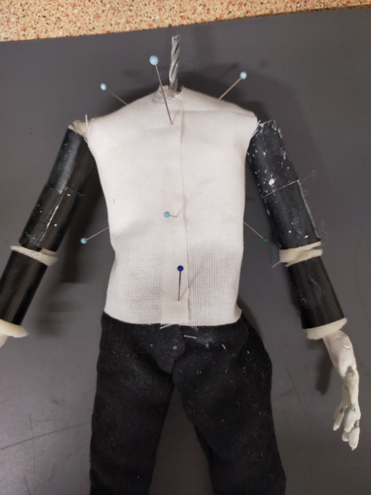
Clothes Design
This is the process I undertook when creating the shirt for my puppet. I had a slight issue after the wire in his arm snapped. After I repaired it with milliput, I wrapped the torso in bandage to add more volume without adding too much weight, and to add some support.
I used a test piece of linin fabric to make his shirt.
I wanted to go for neutral colours so it fitted with his gloomy aesthetic, and to keep with fashion from the 50s. Also, if he was a doctor, his uniform would have been something fairly formal. A challenge I faced when making this was the collar. I knew it needed to be made from the same fabric to give the illusion that it is all one sewed piece. However it was very soft, so I used a piece of wire to give it shape, and then covered it in PVA glue so it remained stiff even after I had removed the wire. This worked better than expected as not only did it retain the shape, it also had some flexibility to it, and moved more like natural fabric.
https://vintagedancer.com/1950s/mens-1950s-clothing-history-casual/ - This is where I sourced some 50s clothes inspiration.


0 notes
Text
Dr Skør
The link below is the dictionary definition of the word skør. When looking into what to call my character, I liked this Danish word as it means crazy or fragile. I thought this was a nice element of foreshadowing, and I thought the name sounded sinister.
https://en.bab.la/dictionary/danish-english/sk%C3%B8r
0 notes
Photo

This was some balsa wood that I bought for his feet, as my lecturer Barry explained that it is a good material to use. When it arrived however, it was all in very long measurements, and was too soft to support itself like this. So I've rethought how to do it, and after I sew the trousers on, I’ll sculpt the shoes out of a combination of milliput and supersculpy
0 notes
