Statistics
We looked inside some of the posts by tomisgar and here's what we found interesting.
Average Info
Notes Per Post
6
Likes Per Post
4
Reblog Per Post
2
Reply Per Post
0
Time Between Posts
14 hours
Number of Posts By Type
Text
17
Last Seen Tumblr Blogs


Fun Fact
If you dial 1-866-584-6757, you can leave an audio post for your followers.
Text
Evaluation
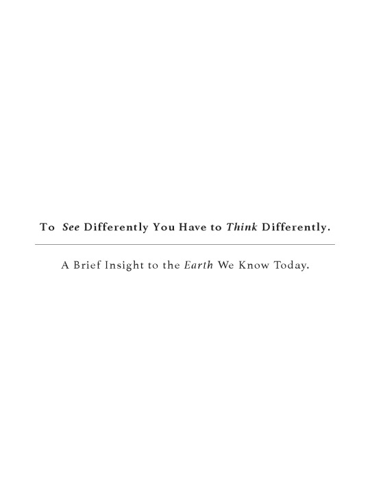
The final major project. At the beginning of the project I wanted to create an editorial piece, something like a coffee table book, that would focus on three different mediums; fashion, product design and typography. This was inspired by architect and fashion designer, Virgil Abloh’s IKEA collaboration that I featured in my dissertation ‘The Unique Development of Virgil Abloh’s Brand Identity Through Contemporary Culture, Early Influences and Collaboration.’ However this idea never came to fruition as I didn’t really have a solid basis to go off of, plus I also wanted to show off more of an illustrative piece since that aspect of my identity has developed over the years at AUB and with this being my final project I felt like I should do something I was experienced with so that the design would be the best it can be.
Coming out of the first tutorial with a few ideas, I set out to research something that I could create some illustrative content for whilst still keeping with the editorial idea that I had prior. Since my illustration style is based around sarcasm and humour, I wanted to find a semi-serious topic that I could either mock or present in a new light.
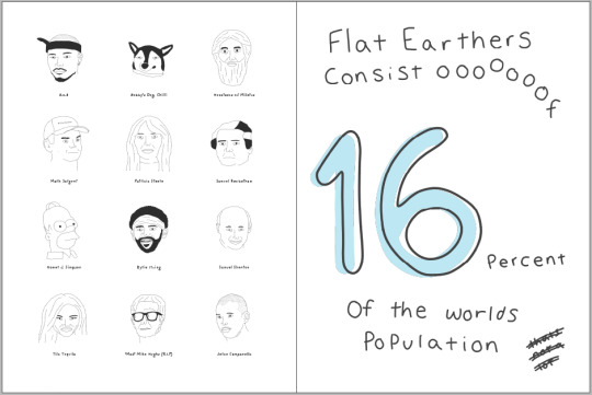
My first instinct was to use something I like to call ‘honest truths.’ Honest truths are basically everyday criticisms that people want to ignore, for example; money want make you happy or time is the real currency, but I ended up hating the research I found for this and thought this topic is kind of boring to look at. This led me to researching into conspiracy theories because I personally find conspiracy theories fascinating to read no matter how stupid some of them may be, and who doesn’t love a good conspiracy theory. Some research that solidified my idea was the ‘Parcast Podcast’ hosted by Molly Brandenburg & Carter Roy, as they have two episodes on a lot of different conspiracy theories from Area 51 to Princess Diana’s death, with the two narrators stating fact from fiction and laying out each theory in its rawest form. Whilst listening to a few of these podcasts I drew up a few characters / designs that related to said podcast. Not really having anything to go off from there, I decided to do a bit more research into the subject matter.
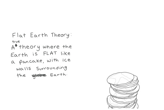
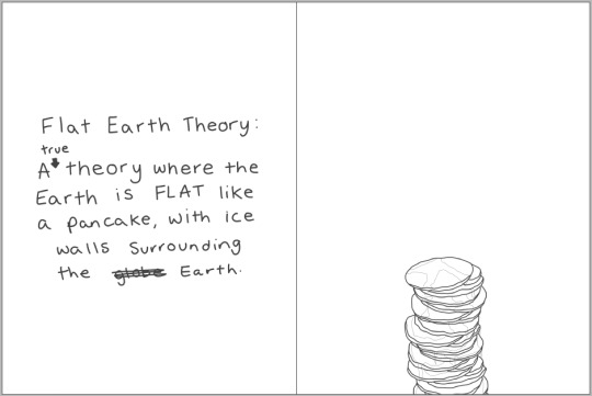
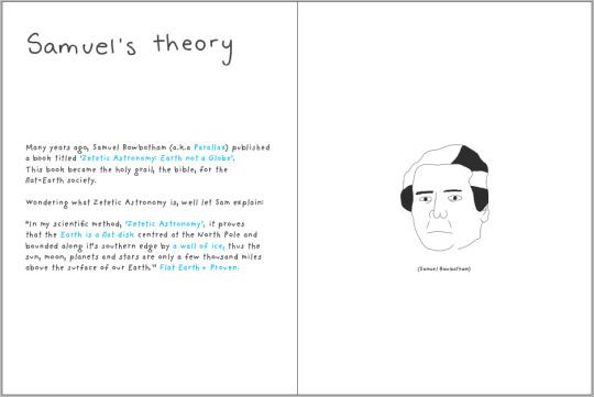
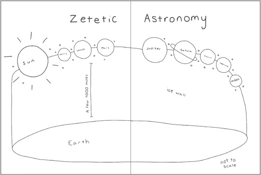
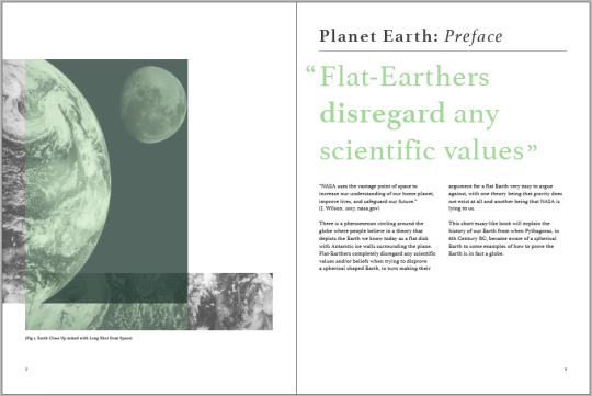
I had an idea where I would make a series of short books explaining each theory and shows the fact from fiction in the theories. I went to Wikipedia to look at a list of potential theories I could select however this was too broad of an idea to complete in the time frame I had, so I was advised to pick one theory that I liked the most and focus on that one. This led to me choosing the flat Earth theory as the basis of my project.
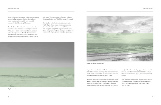
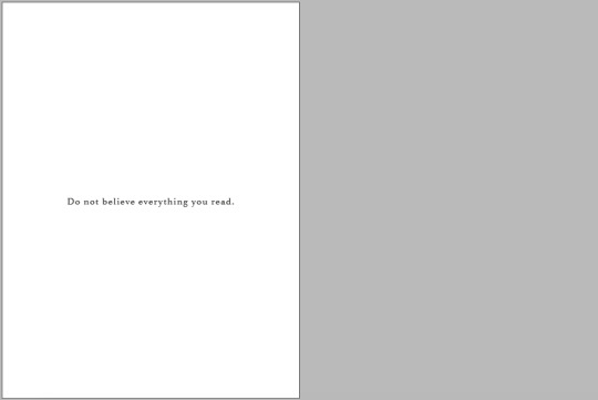
The flat Earth theory, a theory that suggests that the Earth is a flat plane with ice walls surrounding the exterior. When researching into flat Earth, and why so many people believe in it, I thought that it was such an outrageous theory that an illustrated, editorial piece would suit the theory the best, being able to exaggerate my drawings in a sarcastic yet humours way. My initial idea for this project, including the flat Earth theory, was based off of this quote by Joseph Uscinski “If you can get people to ironically question systems like NASA... and the scientific process in general, you can... get them to question those things for real” meaning I wanted to create something that people would read then question said theory and maybe getting people to believe in such a questionable theory. However, my idea developed into more of a project about open-mindfulness and getting my target audience to be more accepting of other people ideas no matter how dumb it may seem. From there I started creating collages of different ‘scenes’ that would instigate and inspire further ideas. I used multiple different magazines to create these collages. This wasn’t as successful as I had hoped, but down the line in the project the pancake collage became an inspiration for an illustration. I did some more research into the theory, stumbling upon a “rap battle” between American rapper B.o.B and Astrophysicist Neil deGrasse Tyson, with B.o.B being for the flat Earth theory and Tyson being against the theory, proving B.o.B wrong. This inspired some small experimental pieces that developed into the future design that I finished on, a for and against type editorial piece.
This idea of a for and against type editorial piece was a strong enough idea for me to start creating layouts with different mediums. I started off with creating a Marianna Mooney inspired, typographic design which I thought was really effective yet lacked motivation and content, so it looked good but wasn’t exactly what I wanted. This is when I started questioning if I even wanted to do flat Earth theory as I felt like there wasn’t much to use that would fill an entire book. I also wasn’t referring back to my Learning Agreement that outlined what I was doing, which in hindsight was a bad thing to do. I was listening to the flat Earth ‘Parcast’ podcast and they kept referring back to this idea that NASA ‘lies’ about the research they do, which is one of the main reasonings that flat-Earthers use to defend their statements. This gave me an idea, that was way off topic, to create a for and against editorial design relating to the idea of NASA lying, this included flat Earth and the 1969 Moon Landings in which many people, to this day, believe was a hoax. I was advised in a tutorial, even though the experiment I created for this idea was well received, to stick with the flat Earth side.
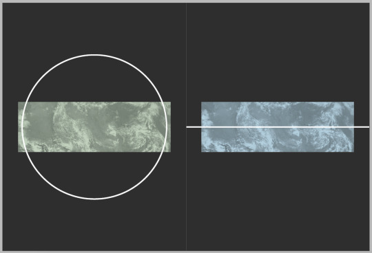
To briefly summaries (otherwise this evaluation will go on for way too long), coming out of this tutorial I re-evaluated what I was doing, looked back at my edited learning agreement, and decided to challenge myself and continue with the flat Earth theory, to an eventual successful design that you see as the final piece. Obviously, I created a lot of experiments between the last tutorial and the final piece (evident in the process book), with one main struggle being that the editorial design was difficult to layout because the way I wanted people to read both books was that they are read at the same time, which meant I had to match up both sides. So, with this and the fact that the research I did didn’t exactly match it was a challenge to create. This was until I realised, I could do a ‘Z’ shaped book, which is what my final piece would look like if the Coronavirus wasn’t present. This is shown, however, in an example I created with the materials I had at hand.
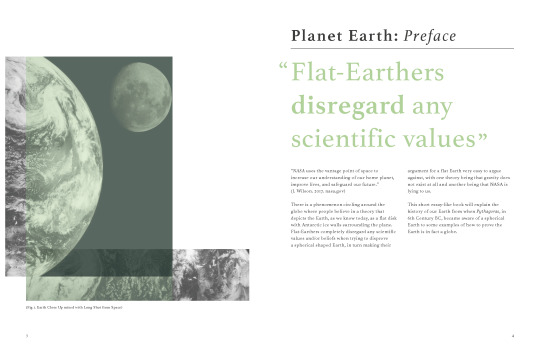
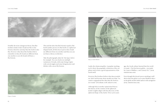
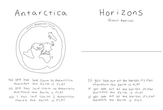
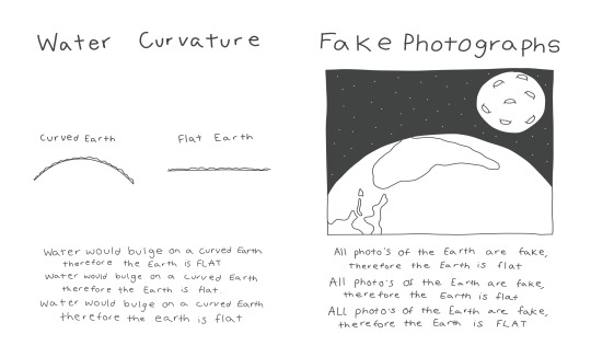
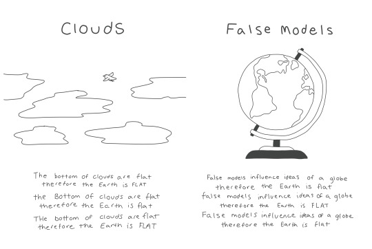
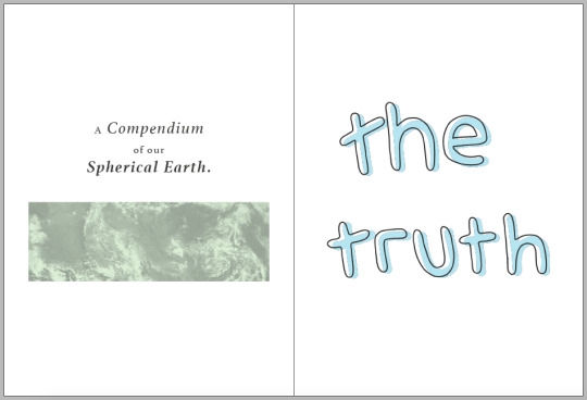
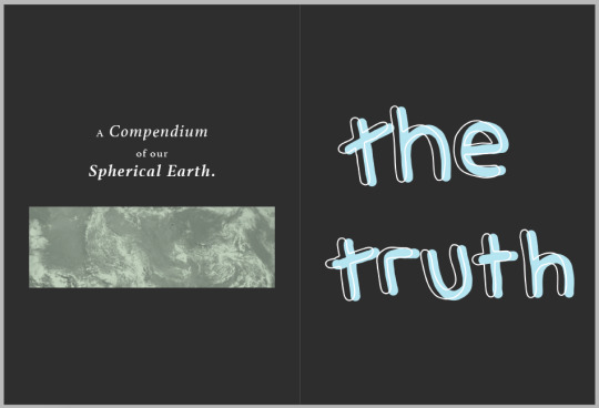
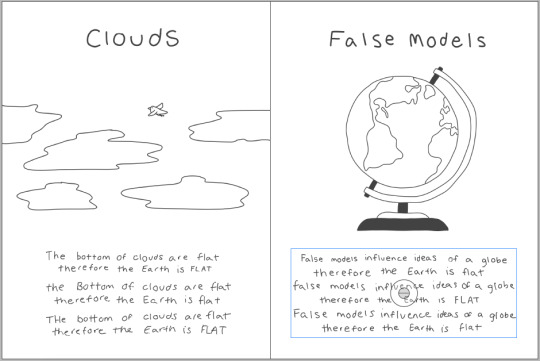
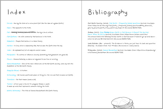
If I had to describe the two different sides to the book I would say the scientific side or to use its proper title, ‘A Compendium to our Spherical Earth’, is an academic textbook inspired design with a minimalistic layout approach, presenting the reader with the facts about how the Earth is spherical and the history of this. On the other hand, the flat Earth side or ‘the truth’, is the complete opposite, it has a humorous approach mixed with repetition to represent the way flat-Earthers repeat their argument when others try to prove them wrong. The other aspect that ‘the truth’ side has is the lack of editorial rules which pays homage to flat-Earthers completely disregarding any scientific values and/or evidence. Another way you could summaries this project is the book gets the audience to think; ‘do I want to read the truth but it looks really long and boring to read, or do I read the dumb theory but it’s fun to read and more visually appealing’, relating back to that idea of being open-minded in a non-serious sense.
Overall, I am really pleased with my final outcome to the final major project, it’s just a shame that I may not get the chance to fully create this design due to the Coronavirus. If I were to ever revisit or do this project again I think I would experiment with an animation, even though I keep saying I never want to do an animation, looking back at previous ones I’ve created I actually really appreciate the time and effort put into them. I think I would also play around with the idea of conspiracy theories as a whole, for example creating an animation/editorial piece that would instruct someone on how to create their own conspiracy in a comedic way, obviously.
3 notes
·
View notes
Text
Final Design
Scientific Side
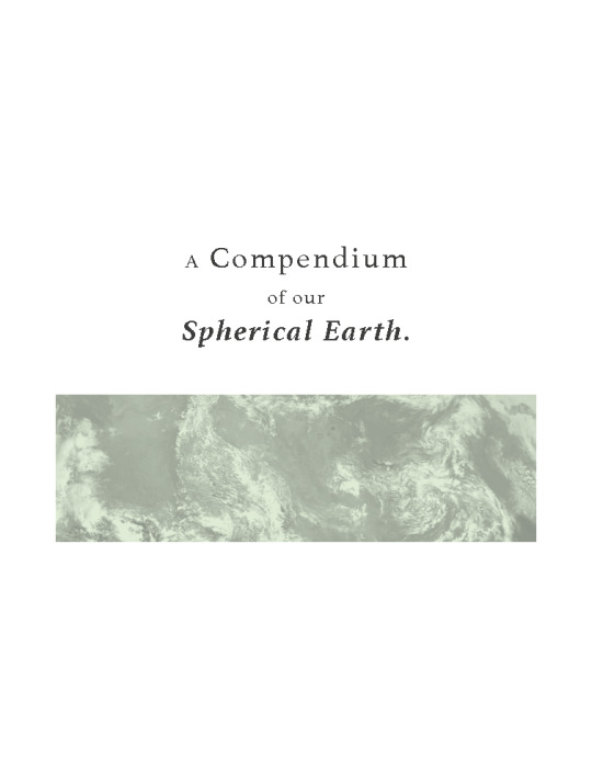
Took the main text off of the photograph for an easier read, overlaying the green text on the photo.


1 note
·
View note
Text
Final Design
Flat Earth Side
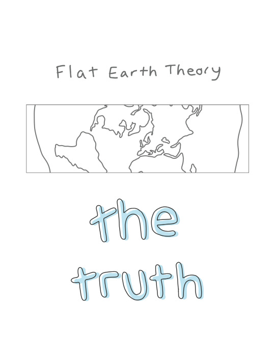
I changed up the front cover to sarcastically imitate the front cover of the scientific side.
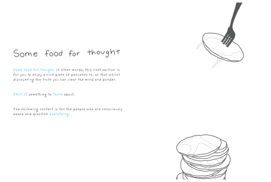
I made the pancakes a lot bigger and shortened the stack so they fit better on the page, this is shown in the other pancake sections as well.
0 notes
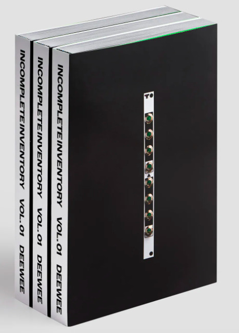
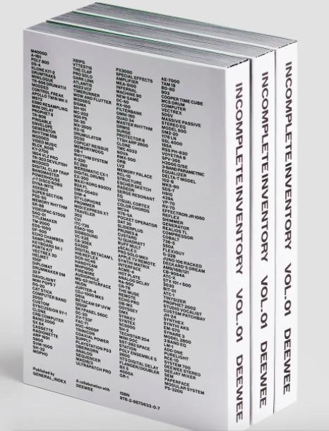
Text
Magpie Studio
D&AD Annual / Manual
“For this years D&AD Annual the idea was to create two publications that could act more like a ‘manual’ for creativity. Taking the iconic book and redesigning it in a way that could both teach as well as recognise creativity. The D&AD Manual will inspire the next generations of creatives and feed back into the D&AD Annual.”
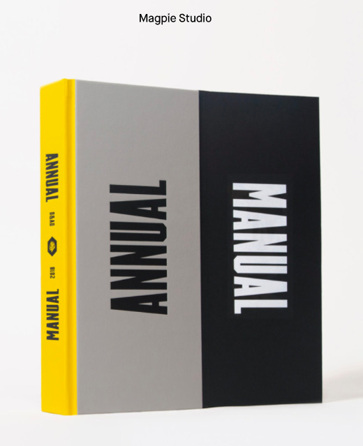
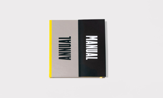
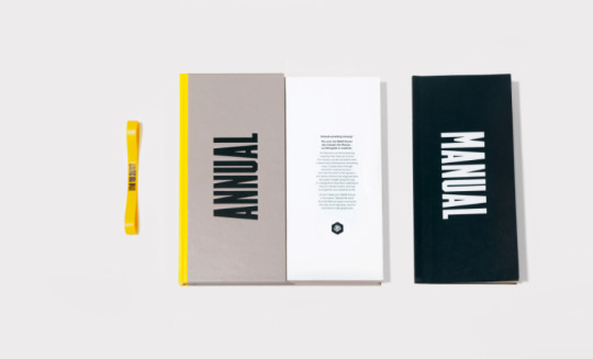
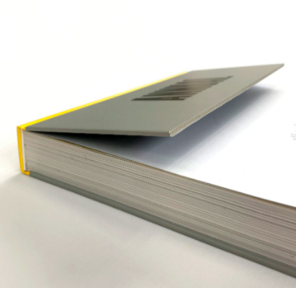
Another D&AD Annual. This design is a good example of two books in one, similar to my final major project. Since it’s near the end of the project I won’t be able to experiment with this style, however I do feel like this could work with my project, it would get rid of a lot of the white space my project has, something that I don’t mind my project having.
0 notes
Text
Tutorial
13.05.2020
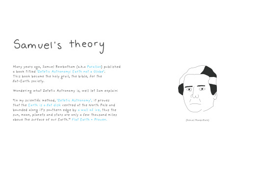
The last tutorial was brief yet rewarding. I only have a few things to tweak such as the pancakes being too small. I also need to create a few display pages that will show off how the book will look like since I am not able to create the final piece physically.
Display pages - to show final piece
The truth - flat earth
Large less pancakes BIGGER
Sam theory gap
Thought bubble?
Illustration on front cover flat Earth
Line length - flat earth
0 notes
Text
Front Covers
Cover Experimentation
I didn’t particularly like the previous front cover I made for the prototyped design so, with inspiration from some previous research, I created these few variations.
The two above are my favourites that I had created. The flat Earth side was inspired by Richard Turley’s D&AD Annual mainly being inspired by the large text dominating the front, with the scientific side having a more generic style that would both fit with the characteristics of a textbook style and stick with the running theme that is evident throughout.
These two were inspired by a previous experiment (experiment 3) I created where I used a minimalistic approach. I do like these designs however I don’t feel that they both really capture the style I am going for within each book.
0 notes
Text
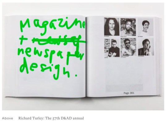
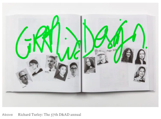
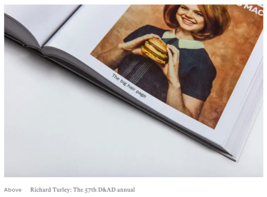
Richard Turley
2019's D&AD Annual inspired by “doubt and vulnerability” // Written by Laura Snoad // 03.10.2020
“Wieden + Kennedy’s global creative director Richard Turley has designed the 57th D&AD annual, aiming to make the publication feel “feel warm and human.”
The annual, which collects together work by the D&AD Pencil winners, features handwritten lime green scrawl throughout, with a tongue-in-cheek cover that reads “You are really important.” Elsewhere category names sit vertically on the edges of the pages, playfully slinking round corners, and page numbers have been given equally mischievous treatment. Page 292, for example, has been replaced with “292.999999r”, and others read “Another page” or “[Page Number Goes Here]”.
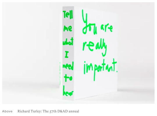
I really like this front cover for D&AD’s 57th annual for it’s punk-style, hand written text and how it compliments the entire annual being in this style. When looking through the images for this book I saw a lot of similarities between Turley’s work and my own, a sarcastic yet comedic style mixed with a rough and ready approach. I think I might experiment with something similar for the flat Earth side of my project, sticking with the theme that is used throughout the inside.
1 note
·
View note
Text
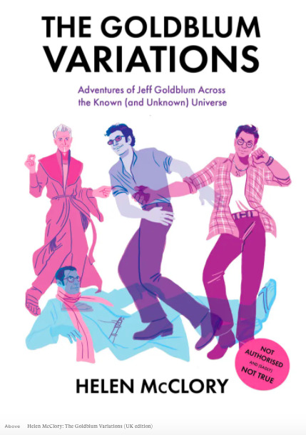
The Goldblum Variations
By author Helen McClory & Illustrated by Jem Milton (U.K Edition) // Written by Jenny Brewer // 24.10.2020
“The book follows Goldblum, and alternate versions of Goldblum, as he travels through the known and unknown universe on various fictional adventures... This latest run of the 96-page book has two different cover illustrations, which for the UK edition is created by Jem Milton.”
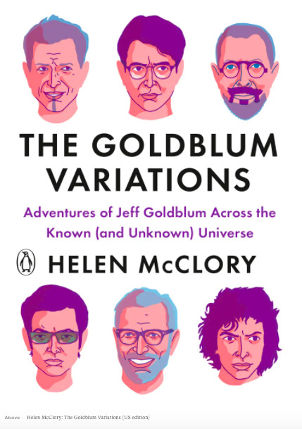
I’m not sure who illustrated the U.S edition, however this is the design that caught my eye. This design is something I could experiment with for my editorial piece. I feel like this would work better for the flat Earth side as opposed to the scientific side, I had done some illustrations for the scientific side which I could use for the purpose of this idea, however it wouldn’t correlate with the interior of the book, which is all photographs.
1 note
·
View note
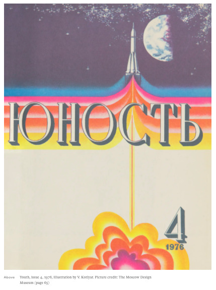
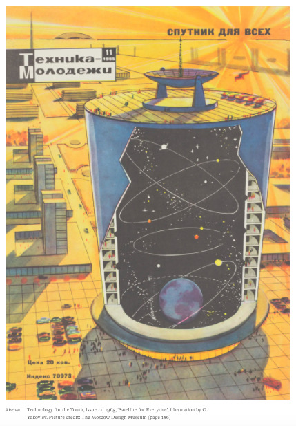
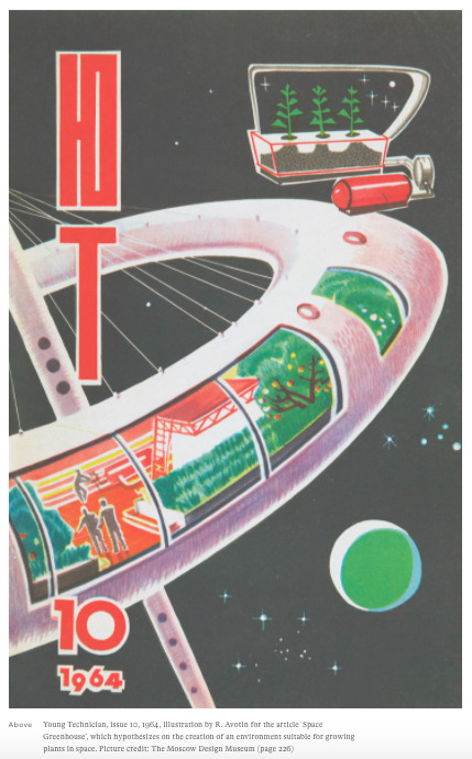
Text
Soviet Space Graphics
A cosmic journey to Cold War-era Russia // Written by Ayla Angelos // 31.03.2020
“Comprising more than 250 illustrations, the book has been compiled and curated by Alexandra Sankova, the director and founder of the Moscow Design Museum, established in 2012 with the aim to preserve and celebrate the rich design heritage of Russia.”
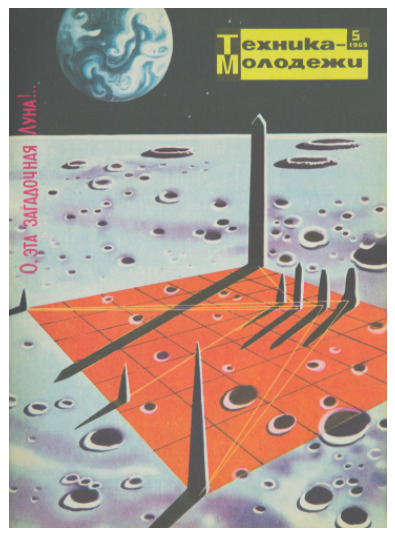
I wasn’t too happy with the front covers for my editorial project, so I went to itsnicethat.com for some inspiration, coming across this piece by Soviet Space Graphics. I really like the vintage look all of these designs have, this is something that I could experiment with using some of the found imagery from the NASA gallery. As for the flat Earth side, I could potentially illustrate something similar to what I create for the scientific side.
0 notes
Text
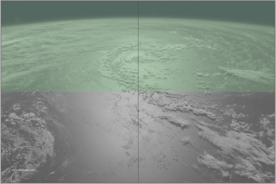
The Book
Example of how the final outcome would look like w/o Rona
Because of the Coronavirus I won’t be able to create my final piece to it’s best, however what I could do was create this prototype with the materials that I had at hand. There were a few minor changes I had to make and work around to be able to get this book completed, one being the printer that I used wasn’t able to print double sided so I had to print a spread one by one flipping the paper every other spread, this meant that unfortunately the pages didn’t align properly with one another so I couldn’t trim them to the desired size.


Some other hiccups I encountered were that I had to cut the book down with scissors so the edges of the book aren’t perfect. Also the paper stock I was using was just standard, so that meant it was very thin, being able to see through to the other side.


I’m still not sure I really like the front cover of both the books, I feel like I could create something more visually appealing, something I will have to do some research into. Even though it isn’t the exact style I was going for, I still like the way this prototype has come out. If I were given the opportunity to create this book in better circumstances I would create a hard back cover with a black material to represent a space-like appearance. I am also going to change the front cover, however I most likely won’t have time to re-create this book with the new cover on the top.
0 notes
Text
Development
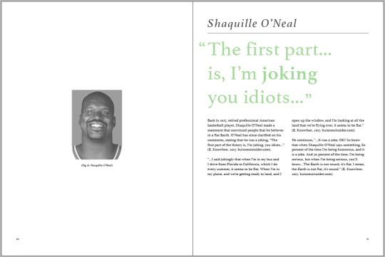
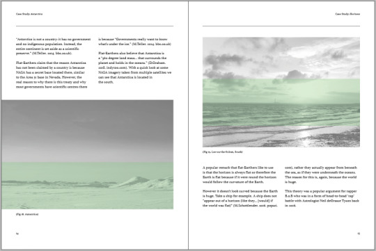
Experiment 6 // Work in Progress // Flat Earth Side
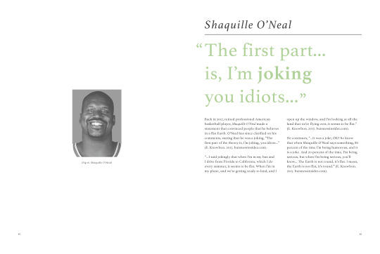
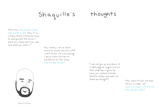
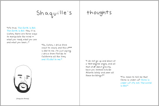
I also changed up the layout for some of the spreads on the flat Earth side of the project. The most obvious change is Shaquille O’Neal’s part, it was suggested that I try to play around with the design a bit so that the text looks more like it is a thought of Shaq’s instead of just placed text.
I also got rid of a few pancakes for a smaller stack and removed the fork, replacing it somewhere further in the project to represent someone eating the pancakes whilst looking through the book.
I added a bit more text into this spread to give the ‘quote’ some more context.
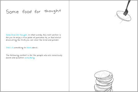
Here’s the fork.
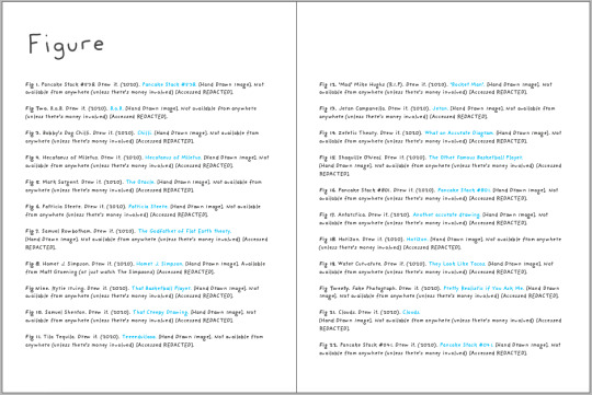
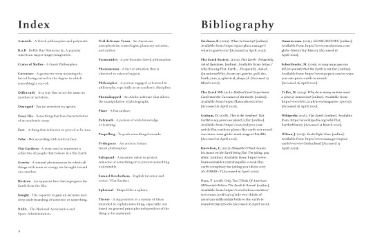
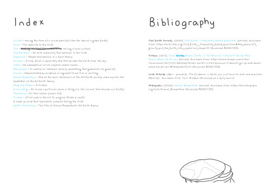
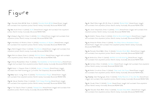
I added a bibliography and figure list to this project so that it matches with the scientific side, however there wasn’t much to go on for these lists so I ended up doing a more sarcastic version to match with the tone of voice throughout the book.
0 notes
Text
Development
Experiment 6 // Work in Progress // Factual Section
Inspired by the works of Lou Stoppard and B.A.M., mentioned in a previous blog post, I decided to revisit the layout for both of my design, with a bigger emphasis on the scientific/factual side to my project. I felt that this side, although looked like a generic ‘textbook’, was lacking any sort of form and diversity in the way it was presented.
I ended up switching from a three column to a two column layout, which I think makes the format look a lot more aesthetically pleasing. I also got rid of the repetitive titles throughout the document so that the sections flow better into one another.
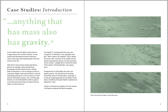
This section is what I changed the most due to the dull, repetitive nature of the layout before. I really like the way these spreads have eventually turned out with a nice contrast between the photos and the text.

0 notes
Text
Odd Publications
A Tweet History // Written by Daniel Milroy Maher // 31.07.2019
“This colossal book takes 600 pages worth of a user’s tweets and transforms them, along with the format of Twitter itself, into a historical printed artefact. In doing so, Jaap and Darien interrogate the same ideas of information overload, data excess, and the ramifications of being overwhelmed by such things.”
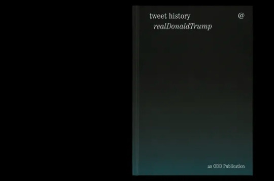
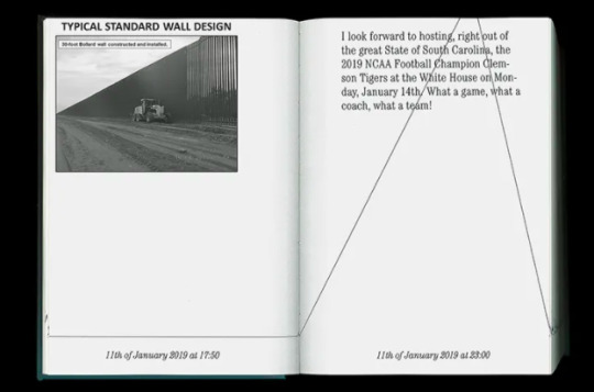
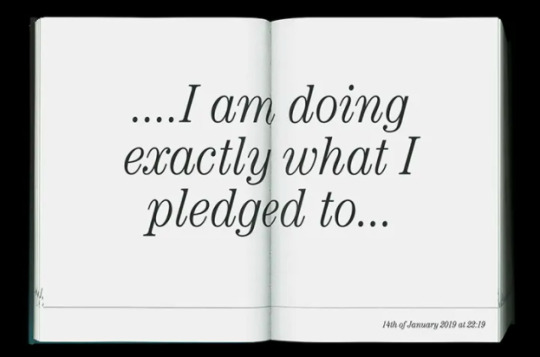
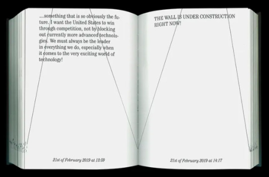
I really like the way this editorial project handles large type with minimalistic, white space. I especially like the spread that has the large text directly in the middle, this is something I could play around with in my own design, on either side, if I have the time.
0 notes
Text
The Bon Ton
Its catalogue design for the Tate’s alternative Andy Warhol exhibition // Written by Jyni Ong // 19.03.2020
“The Bon Ton designed the catalogue for the new Andy Warhol exhibition – currently showing slash on hold at the moment – at London’s Tate Modern. A huge undertaking for any designer due to the gravitas of the artist, whose work is synonymous with the pop art movement, Amy and Amélie were understandably “over the moon but also slightly intimidated” when they received the brief.”
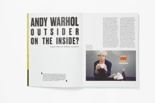
I like the dense and compact layout this project has. I feel like this may work well for my project however it could get very repetitive seeing the same layout over and over, something that my own design unfortunately has.
0 notes
Text
B.A.M.
Designs new Lou Stoppard book on swimming pools // Written by Matt Alagiah // 01.04.2020
“Lou Stoppard and B.A.M. have combined to produce the perfect offering for our cooped-up times. POOLS – or, to give it its full title, POOLS: Lounging, Diving, Floating, Dreaming: Picturing Life at the Swimming Pool – is a new book focused on swimming pools in photography, spanning various disciplines from fashion to art to architecture.”

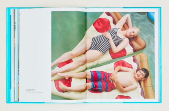
Advised in my recent tutorial, I should play around with the positioning of the photography on the scientific side of the project. I really like the layouts of these designs, I like the way the picture is the main focus with small paragraphs detailing what the image is. Now since I have a lot of information on my project I need to find a way I can have this feeling whilst still having the information at hand. I also like the vibrant, washed colours used in this project, something I might do for my process book.
0 notes
Text
Ill-Studio
A subjective encyclopaedia of all human knowledge all in one place // Written by Jyni Ong // 29.04.2020
“It took a while to accurately articulate the project, but now, with the creation of General_Index, it finally found its place. “This year, we felt it was time for us to change,” Leonard adds, and from now on, the studio’s product collaborations and self-initiated projects will be released under the umbrella of General_Index. It encompasses the creative ethos of the studio’s work, capturing how “personal projects feed the commissioned ones and vice versa.” And with the creation of General_Index, the encyclopaedia allows Ill-Studio to spontaneously release new ideas and objects under one single entity.“
This particular piece from Ill-Studio’s collection has inspired a minimalistic approach to the front cover of my editorial project. The idea is that I have the front cover for both sides the same so that you won’t know what one you are reading until opening the book, perhaps maybe just a ‘flatline’ to represent both the flat Earth and the repeated line pattern used in the scientific side.
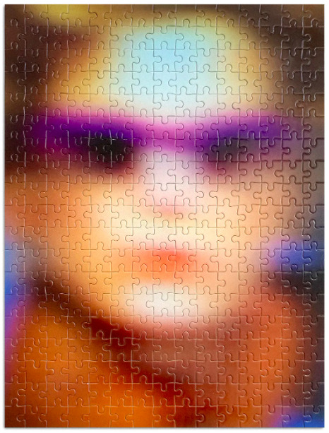
Even though this isn’t a project that directly relates to my own project, I really like these stills taken from the project, especially the puzzle above. I also really like the typographic heavy back cover for the design, something I think would’ve been effective on my own design however since the back of one book will be the other this wouldn’t be possible to do.
0 notes
Text
Tutorial
05.05.2020
This tutorial was really helpful. It gave me an insight on further tweaks I need to change in order for my project to be the best it can.
Pancakes - less, bigger, smaller fork
Flip text?
Shorten column width / two paragraph - flat earth side
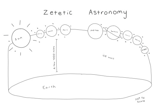
Centre spine - zetetic - planet size
Black & white print
Flip Shaquille - paragraph - different thought bubbles
Some food - eating the pancakes - metaphor
Hanging quotes - scientific
8 point on 11
Flip the pages
Case??
Book design - it’s nice that
Editorial furniture - tailoring to the sections
Lexicon
Figures / bibliography on Flat earth side
Two columns
0 notes