
tomrogers-viscom
Tom Rogers
Level 6 - BA Visual CommunicationA collection of research, idea generation, development and outcomes.
567 posts
Don't wanna be here? Send us removal request.
Last Seen Blogs
curirta
♫♩♩
cservenkaedit
Edit Cservenka

certainbonkdeputyhands
제목 없음

ng-potd
National Geographic - Photo of the Day
superemeralds
「I am not your hero.」
Text
Major Project - Time Management Adjustment.
Due to issues out of my control (3D printing time), I have rearranged some of the dates I aim to get tasks done, see below.
Friday 26th: Develop poster and social media assets. Redesign comment box lid. Design comment card holder.
Saturday 27th: Update Process Book. Begin final crit slides.
Sunday 28th: Develop Process Book. Update Tumblr.
Monday 29th: Cut comment box lid. Tidy up Laser Set. Poster test prints (2nd test prints). Comment card holder test print.
Tuesday 30th: Tidy up Laser Set. Continue to construct zoetrope. Print comment card holder.
Wednesday 1st: Finish zoetrope constriction. Final Critique
Thursday 2nd: Film Stopmotion Video. Take promotional imagery.
Friday 3rd: Begin to edit video.
Saturday 4th: Continue to edit video.
Sunday 5th: Refine and develop final assets.
Monday 6th: Finalise assets. Update Process book.
Tuesday 7th: Complete process book.
Wednesday 8th: Sign up tutorial. Print process book. Refine final assets
Thursday 9th: Bind process book. Refine final assets.
Friday 10th: Compile assets for submission. Create PDF Portfolio.
Saturday 11th: Final Tumblr update. Finalise portfolio website.
Sunday 12th: Finalise bibliography and list of figures.
Monday 13th: HAND IN 10AM
LO2
0 notes
Text
Major Project - Laser Cut Set 1
I got the first 6 prints of the 3D models, see below.
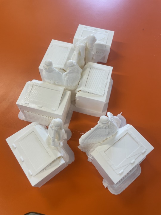
I then tidied them up and added to the zoetrope.
The process of getting this final batch is really slow as they are being made on the ultimaker (this was due to aesthetic reasons to match the welder characters and create differentiation from the grey bandsaw characters). There have also been issues with the workshop running out of white filament, meaning we are currently waiting on a new delivery.
I am ensuring everything I can do apart from the laser models is constructed and prepared for when I shoot the video, to speed up the process once I receive the models.
LO2
0 notes
Text
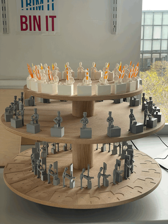
Major Project - Construction 3
Today I printed the zoetrope details after tweaking them slightly due to the error made when the carousel was CNC routed.
Jordy printed them on the large format printer, I then cut them out and attached them to the zoetrope using double sided tape, see below.

LO2
0 notes
Text
Major Project - Laser Cut Box 2
Rich spoke with me about the idea of making it into a comments box with a slit in the top. This idea seemed stronger than a plinth as it interacts further with the audience.
I liked the idea and decided to create comment cards encouraging viewers to think about what they may want to make in the innovation studio, with prompts at the bottom to subtly inform what inductions are available. Indesign can be seen below.
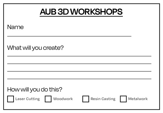

I then printed them using colours relating to the AUB branding and my posters, see below.
INSERT IMAGE
I then added them to the box, see below.
INSERT IMAGE
LO2
0 notes
Text
Major Project - Laser Cut Box 1
I used Adobe Illustrator to create a laser cut file for the plinth mockup. This is a mockup to show how the print would look scaled down.


The rectangle with 4 black (etched) rectangles inside of it is to test how ink may sit in the engraved sections should the text not be readable enough.
Below can be seen the process on the laser cutter.
I then constructed the box, see below.
INSERT IMAGE HERE
I really like how it looks in clear plastic as it creates a more visually interesting piece whilst the engraved sections are still easily legible.
LO2
0 notes
Text
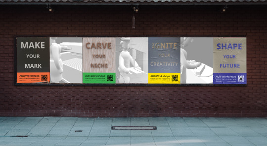
Major Project - Poster Mockups
Below can be an example of how the posters can be presented. Using a mix of imagery and test, I can highlight both the video and the mix of 3D building techniques.
LO2
0 notes
Text
Major Project - Poster Designs 2
Using the 3D modelled text from the previous post, I redesigned the posters to incorporate more text, see below.


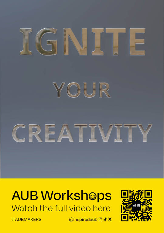
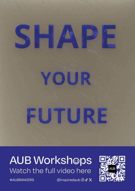
I think the resin one is particularly effective as it looks fairly realistic. The wood and metal posters need some reworking to look more realistic. The laser cut needs completely redesigning to look more like the engraving effect on acrylic.
LO2
0 notes
Text
Major Project - Plinth Mockup
Following from the 1-1 tutorial (previous post) I began to mock-up how a plinth for the zoetrope would look in 3D. I used Womp3D to create a mockup, see below.
LO2
0 notes
Text
Major Project - 1-1 Tutorial
Today I had a tutorial with Ciaran to discuss how the assets would complement the zoetrope. I was struggling to get the poster and social media assets to tie in with the theme of the zoetrope.
He suggested I celebrate the fact it's an exhibition piece and create a plinth for the zoetrope to be placed on. This would be made using different materials relating to each induction.
He also told me I could think bigger and consider how the piece could be enlarged to create a statement piece for the university. We discussed how this could be mocked up using laser-cut card of the AUB buildings to give perspective. I, however, don't think I will be moving in this direction as I feel it is overworking what is already a strong concept.
We discussed using text in the posters rather than imagery. My concern was that by not using imagery it may not relate contextually to my video. We discussed that if the text was made using 3D practices, then it would link back further into my concept.
LO3
0 notes
Text
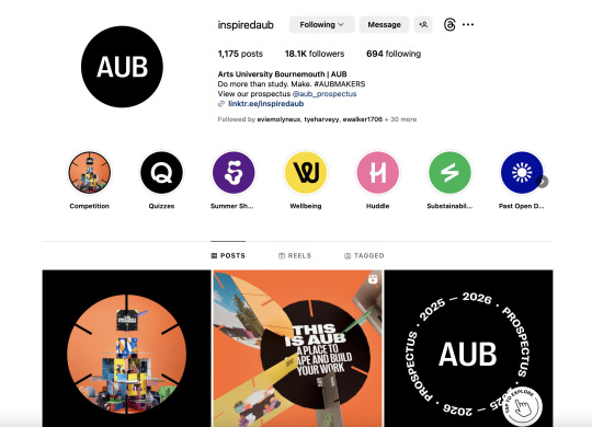
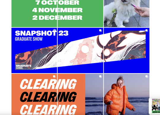
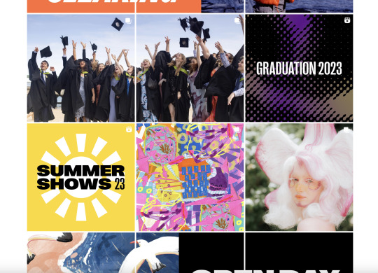
Major Project - AUB Branding Research.
Since I am designing for AUB, I intend for my assets to be used across their social media pages and across campus. I conducted research into current AUB branding seen below.
Fist I looked at their social media pages:
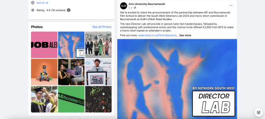
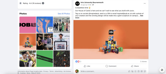
Instagram:

Facebook:

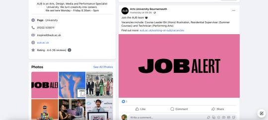
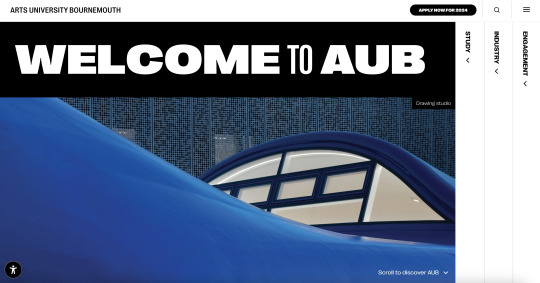
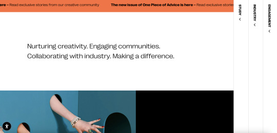
The looked at their website:
LO1
0 notes
Text
Major Project - Construction 2
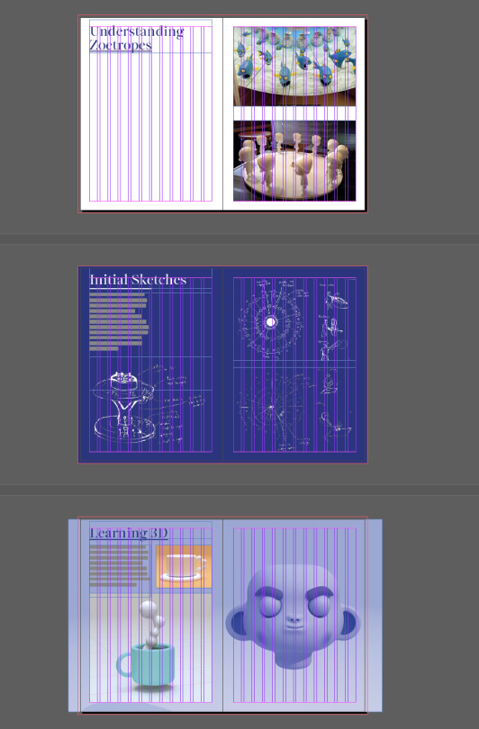
Today I continued to construct the zoetrope, adding the resin characters and bandsaw characters. I am still waiting on the laser cutting models, which hopefully I should receive at the end of this week.
Below can be seen the construction progress.
Below can be seen the turntable spinning in its current state.
LO2
0 notes
Text
Major Project - Social Media Assets 1
I began to mock-up some social media assets using the 3D model images.

I then experimented creating some gifs, seen below.

LO2
0 notes
Text
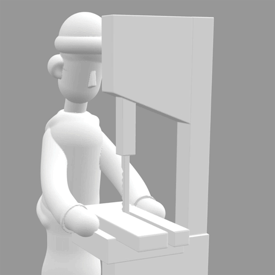
Major Project - Construction 1
Today I received back the CNC routed carousel I designed, seen below. There was an error by the technicians when cutting meaning that the diameter is 6mm smaller than I originally planned. Luckily the pockets for the characters to be placed in are still correct, so it's just a case of tweaking the printed detail assets to ensure they still fit as intended. I also had to compromise on the engraving depth from my requested 0.5mm to 1mm due to machine capabilities.
After testing the 3D models against the carousel, I realised the tolerance I allowed was slightly too large on all the models, especially the bandsaw. This was fine as I could align the models against 2 engraved edges to ensure the characters still remained in the correct place.
Below can be seen the construction so far, using wood glue to hold the characters and support poles in place.


Below can be seen the zoetrope so far when rotating.
LO2
0 notes
Text
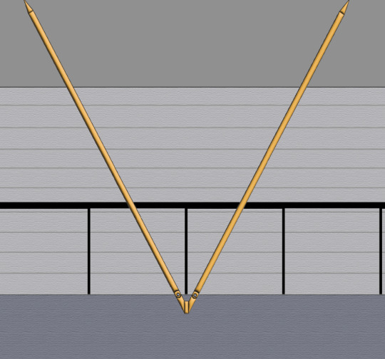
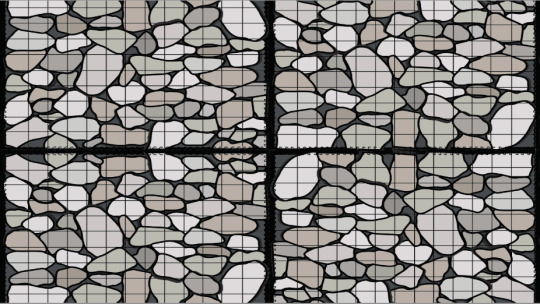
Major Project - Zoetrope Details 3
I continued to refine the zoetrope details illustration. After speaking with my course mates I got the feedback that the support pole illustration was too simple and didn't look 3D in comparison to the stone illustration. I rectified this my using 3D inflation effects in Adobe Illustrator.
I also adjusted the design, so that it could fit better with the 20 frames of the zoetrope. For example, there are 20 stone blocks across the illustration. Similarly there are 10 support poles and 40 bars on the fence. This is done to ensure that the illustration fits with the each 3D Model, and will also act as a guide when filming to ensure everything is lined up.
The refined illustrations can be seen below.


LO2
0 notes
Text
Major Project - Zoetrope Test 2
Today I did a test using stop motion using the same camera settings and setup as I intend to use for the shooting of the final video.
I used the a flash trigger attached to the Sony camera to clearly capture the images. Using the remote for turntable, I manually adjusted each frame into place. Camera settings used: ISO 100, F2.8, 1/200sec, 16:9 ratio.
Below can be seen the example using the characters in their raw state.
youtube
Below can be seen the example using the painted characters.
youtube
I did this test to see which characters looked best. Whilst the painted characters made the features more prominent, I found that I preferred the characters in their raw state as the details and print lines were more prominent. Leaving the characters in their raw state highlights the way they have been manufactured, which leans back into my goals for the project.
I like the outcomes considering they are tests. The jolting of the characters is because they were placed by hand and using bluetac. Once I have the large carousel and attach using glue in exact positions, I think this issue will be resolved. When you focus on the spinning of the turntable itself, it looks fairly smooth (thanks to the tripod setup used).
LO2
0 notes
Text
Major Project - Process Book Test Print
I printed a test print of the translate+transform unit from my process book, seen below.

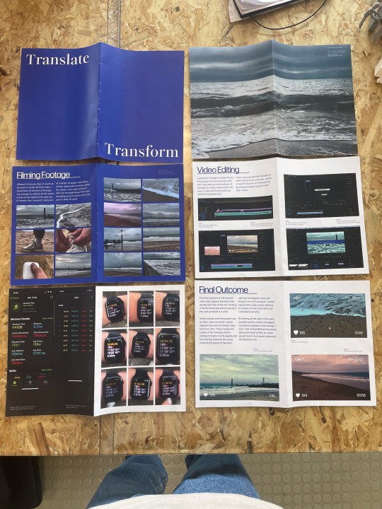
I realised I could reduce the size of the body copy to give the elements on the page room to breathe as it was quite large when printed.
I also feel the pages could benefit from a more elevated design and more variation (especially the research pages).
0 notes
Text
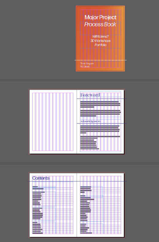
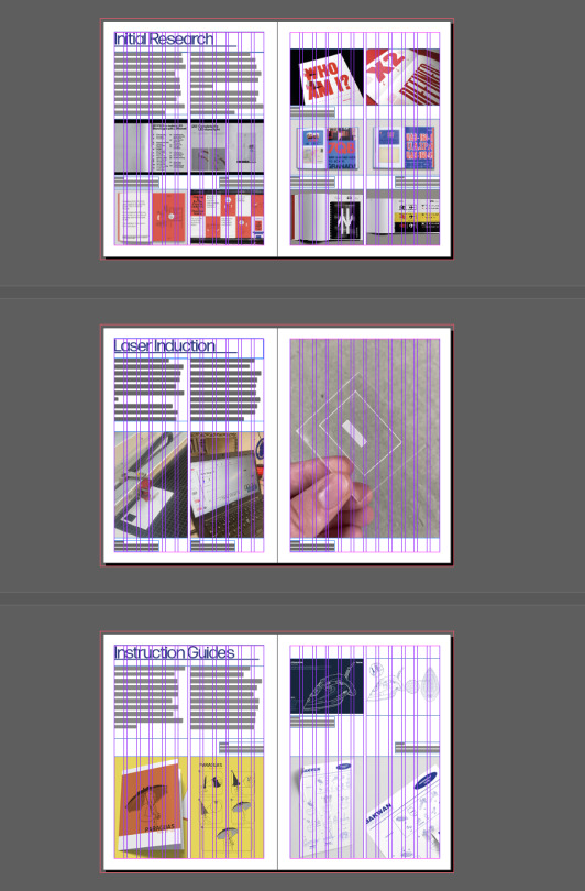
Major Project - Process Book Development + Updates
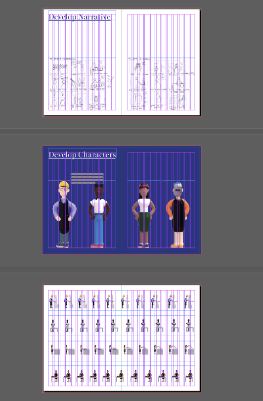
Below can be seen the the process book in its current state. I wrote text for Translate+Transform and MP Part One.
I developed the visual aesthetic to look closer to my projects aesthetic. Since my 3D Workshops project will use AUB branding to fit my learning agreement, I will be using a visual aesthetic inspired by my weekly tutorial presentations.
Below can be seen the development so far.


LO2/LO4
0 notes