
tor-design
Tor Robinson's Design
Workbook
Hi! This blog was my workbook for my undergraduate degree in Design Innovation.
If you'd like to see my latest work, please go to my website:
torrobinson.co.nz
415 posts
Don't wanna be here? Send us removal request.
Last Seen Blogs
diabolicalrat
Rat Nation

jegulusfics
fanfic archive

skifvolkov
Larry the wolf
moonexplorers
let's go!
prowlsart
NonbinaryRobot
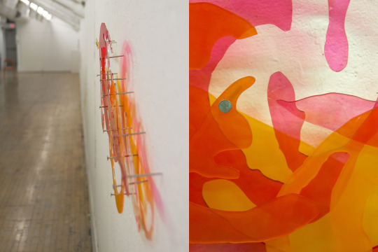
Photo
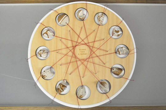
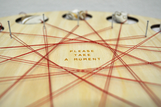
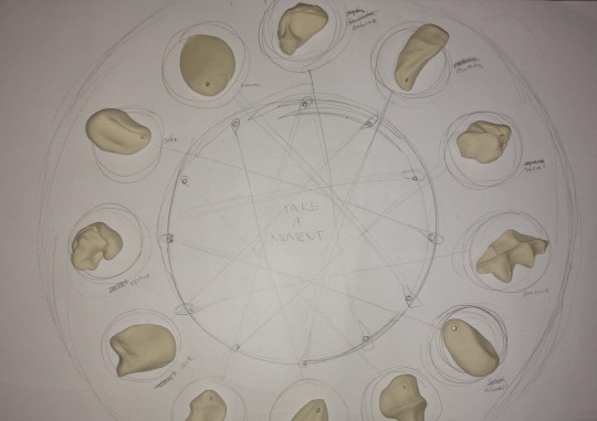
MOMENTS
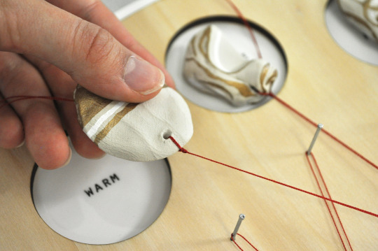
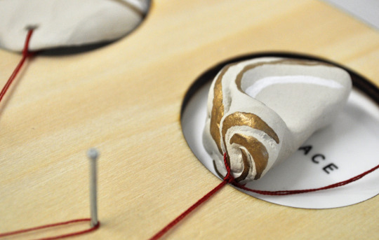
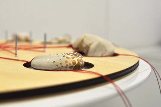
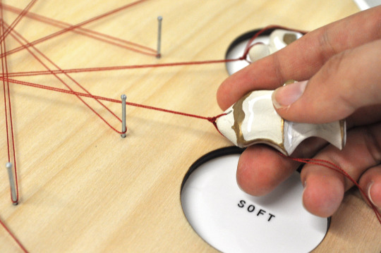
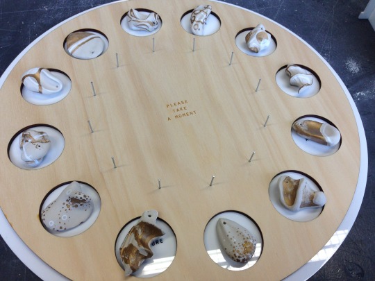
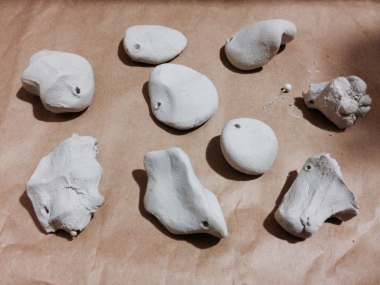
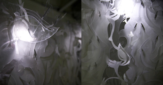
Photos of my final manifestation. The viewer is invited to “take a moment” literally, by taking one of the clay forms away with them to continue the experience and story of the crafted objects. This work is heavily inspired by Walter Benjamin and Edmund de Waal, who explore the value of craft and how it relates to storytelling and memory. The clay forms highlight the importance and value of the human hand through the use of gold leaf. While alluding to de Waal’s Japanese netsuke, the string also references weaving, and the meditative rhythm that is found in most traditional craft.
You can read about my conceptual concerns, my manifesto, and see my design process in my CCDN331 Project 4 tag.
5 notes
·
View notes
Photo
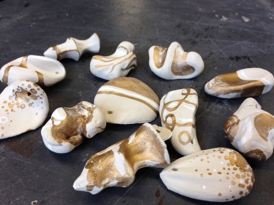
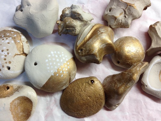
My final painted clay forms! I placed them how I planned, then figured out the lengths of thread needed to make the woven central pattern as tight as possible. You’ll see how the string looks in the final photos. It was a really interesting process to see how I could use the gold leaf and white paint to create a variety of patterns and textures, while still expressing the descriptive word for each “moment”.
2 notes
·
View notes
Photo
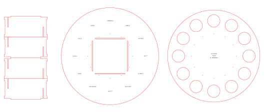
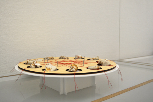
Here you can see various stages during the process of creating the base. Once I decided on doing that way of presentation, I planned it out to scale with the clay models on a large sheet of paper, then translated it into Illustrator to be lasercut. I decided to use white acrylic with pine as I thought it looked nice and clean, with the pine giving it a more natural touch to tie in with the clay models. I also decided to have the plate raised on a sort of pedestal to reinforce the idea of the “moments” being precious things to treasure and value.
2 notes
·
View notes
Photo
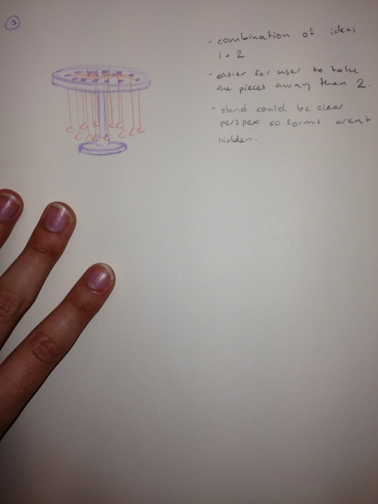
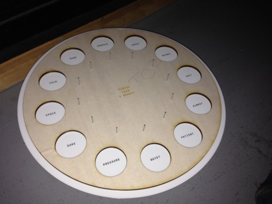
Here you can see the different ideas I had for displaying the clay forms. I want my material to be taken away by the audience to create continued moments and experiences after they left my hands. Therefore I needed something that would express the “moments” absence once they have been taken. Next to the pictures you can see my notes about the pros and cons of each form of display. I decided to use the first idea as I could have a word describing each “moment” in the cavities the models are displayed in. I also thought this would be a great way to tie in another very relevant idea from Walter Benjamin, about weaving and how it relates to memory and storytelling. The strings attached to each “moment” would crisscross over each other, so the viewer has to affect the form of the woven pattern when they take a model.
0 notes
Photo
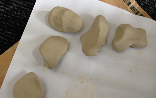
In the top photo you can see my second lot of clay experiments, done at a slightly larger scale. Having them bigger allows you to really show the influence of the hand better, but having them smaller makes them seem more precious and delicate. I decided to go in between these and my earlier iterations for the final models.
After that I experimented with varnish and a gold leaf paint on my very first forms. I tried different ways of applying the gold leaf, trying out things like dry-brush and finger painting. I decided that the varnish made the clay darker and more plasticky feeling, so instead I decided to use a little bit of white paint as well as gold to make the final models seem brighter, and not use any varnish.
In the lower photo you can see some of my final models. I also made notes about different words I could use to describe the experience I had while making each one. I also tried making some models that incorporated the string more, but I decided that made the focus on how the form was shaped by the string instead of how it was shaped by my hands - so I decided to use simple holes like you see here.
0 notes
Photo
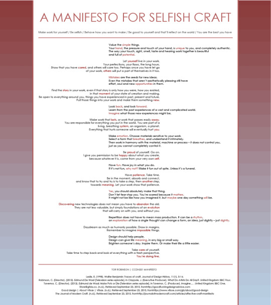
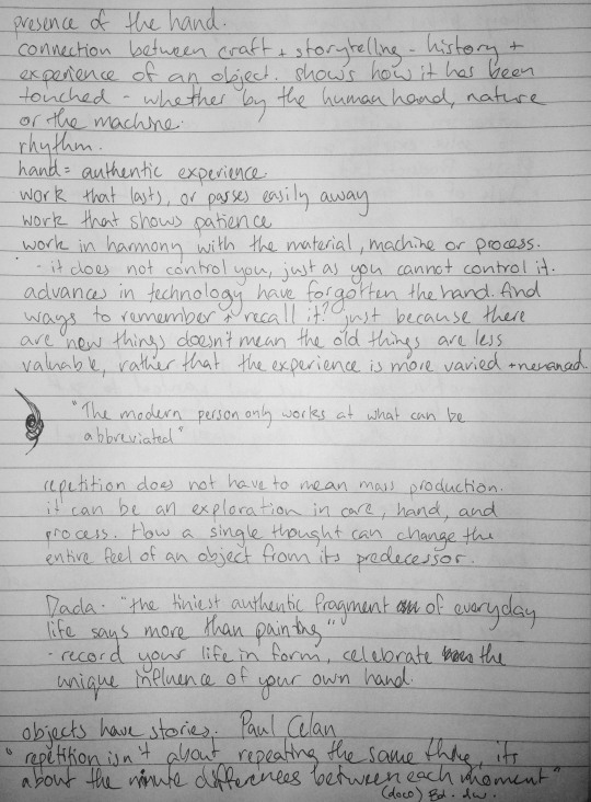
A MANIFESTO FOR SELFISH CRAFT
Value the simple things.Your hand, the pressure and touch of your hand, is unique to you, and completely authentic. The way your touch, sight, smell, taste and hearing work together is beautiful and full of potential.
Let yourself live in your work. Your perfections, your flaws, the long hours. Show that you have cared, and others will care too. Perhaps once you have let go of your work, others will put a part of themselves in it too.
Mistakes are the seeds for new ideas. Even the mistakes that aren’t aesthetically pleasing still have effort, soul and new opportunities in them.
Find the story in your work, even if that story is only how you were, how you existed, in that moment of your state of creation and making. Be open to everything around you, things you have experienced in past, present and future. Pull those things into your work and make them something new.
Look back, and look forward. Learn from the past experiences of a vast and complicated world. Imagine what those new experiences might be.
Make work that lasts, or work that passes easily away. You are responsible for everything you put in the world. You are part of a living, breathing system, an organism, a planet. Everything that hurts someone will eventually hurt you.
Make emotion. Choose materials sensitive to your work. Select a form that breathes, and understand it intimately. Then work in harmony with the material, machine or process – it does not control you, just as you cannot completely control it.
Be proud of yourself. Go on. I give you permission to be happy about what you create, because whatever it is, came from your very own self.
Have fun. Have joy in what you do. If it’s not fun, why not? Make it fun out of spite. Unless it’s a funeral.
Have patience. Take time. Be in the moment, absorb and connect, and know that to try and try is to take a step, then another step, towards meaning. Let your work show that patience.
Yes, you should absolutely make that thing. Don’t let fear stop you. You’re scared because it matters. It might not be like how you imagined it, but maybe one day something will be.
Discovering new technologies does not mean you have to abandon the old. They are not less valuable, but simply foundations of an evolution that will carry on with you, and without you.
Repetition does not have to mean mass production. It can be a rhythm, an exploration of how a single thought can change a form, an idea, just slightly - just slightly.
Daydream as much as humanly possible. Draw in margins. Remember to imagine impossible things.
Design should help people. Design can give life meaning, in any big or small way. Brighten someone’s day. Inspire them. Or make their life a little easier.
Take care of yourself. Take time to step back and look at everything with a fresh perspective. You’re doing fine.
Leslie, E. (1998). Walter Benjamin: Traces of craft. Journal of Design History, 11(1), 5-14.
Robinson, C. (Director). (2013). Edmund De Waal [Television series episode]. In Claypole, J. (Executive Producer), What Do Artists Do All Day?. United Kingdom: BBC Four.
Tavernor, C. (Director). (2013). Edmund de Waal: Make Pots or Die [Television series episode]. In Tavernor, C. (Producer). Imagine… . United Kingdom: BBC One.
[email protected]. (n.d.). Retrieved September 23, 2015, fromhttp://goodfuckingdesignadvice.com
Good design | About Vitsoe | Vitsoe. (n.d.). Retrieved September 23, 2015, fromhttps://www.vitsoe.com/gb/about/good-design
The Journal of Modern Craft. (n.d.). Retrieved September 23, 2015, fromhttp://journalofmoderncraft.com/articles/affective-craft-manifesto
1 note
·
View note
Photo
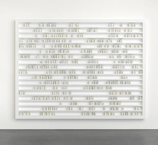
Here you can see some of the different inspirations for my manifestation. At the top is the strongest inspiration, “Breathturn” by Edmund de Waal. In the documentaries I watched on him, he spoke how the pieces are arranged like poetry, or music, the collection of these varying moments speaking with each other and the spaces between them.
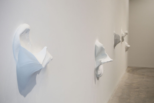
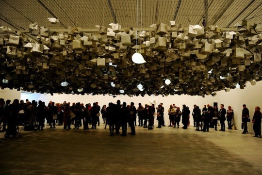
Secondly, you can see a piece by Alwar Balasubramanian called “Nothing from my Hands”, which I saw when I went to the Sydney Biennale in 2012. As I was playing the clay I suddenly remembered this piece, and how these huge forms describe the tiny spaces created inside your hand. This also made me remember an installation which was in the same gallery room. This suspended collection of origami is by Pinaree Sanpitak called “Anything Can Break” and definitely helped me to think of how I could display my collection of clay pieces. It’s a strange train of thought that lead me to these different pieces, but they each totally make sense in helping me see what I can communicate about the value of craft and the hand.
1 note
·
View note
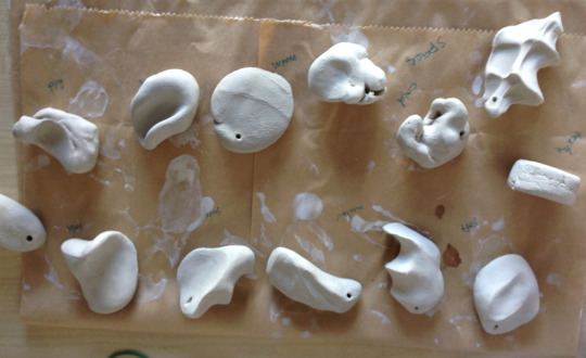
Photo
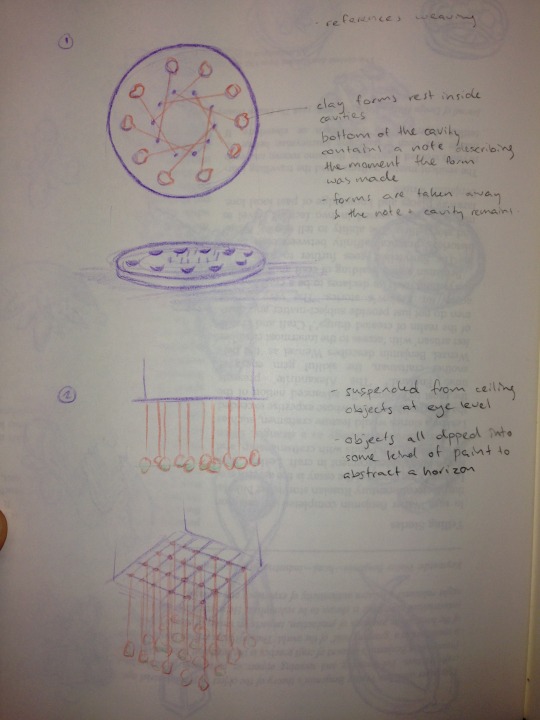
Here are some clay form tests I made over the weekend. I'm not sure if I should try to make them all the same, and see how they cary by chance, or just make whatever form I feel like at the time.
At the moment I like the idea of hanging them from something - kind of like a very minimalist chandelier - so they're all suspended at the same level, rather like moments should be. I think this would make such simple forms carry a greater importance, especially if they were suspended at eyeline.
I'm thinking of painting them partially, either with white or black paint, or maybe with gold paint or gold leaf. I think the paint would also heighten the percieved value of the works, showing the importance of simple touch. Perhaps, if they were suspended all at one level, it would be interesting if I could dip them in paint at exactly the right amount so they could share a kind of horizon-level. This would also abstract the form and make the viewer see the objects in different ways.
I also like the idea of having these as the items the viewer can take away, so the collection is gradually reduced over time as the items are taken away to continue new moments and experiences with the user, rather like talismans or the Edmund de Waal's Japanese netsuke. Alternatively, maybe I could leave out clay or plasticene for the viewer to take away for themselves, or add to the collection by creating another layer below the suspended ones on an exhibition cube.
0 notes
Photo
In order to discover the different ways I can talk about craft in my manifesto, I have been looking at the works of different notable people who also explore these ideas. The most notable person is Walter Benjamin. I read Esther Leslie's article "Walter Benjamin: Traces of Craft" which gave me a great and thoughtful interpretation of the different issues he touches on throughout his works.
I also looked at the work of Edmund de Waal, who is a ceramic artist and writer. He makes countless iterations of pots, describing them as moments and lines of a poem. I think there's something really beautiful about how he manages to explore the calmness of a material that so easily reflects your touch.
For my manifesto I'm thinking of taking inspiration from de Waal's work by making small clay forms and exploring the many ways the clay can change just by small changes in touch. These small items would be little collections of moments which could be displayed in many different ways.
0 notes
Photo
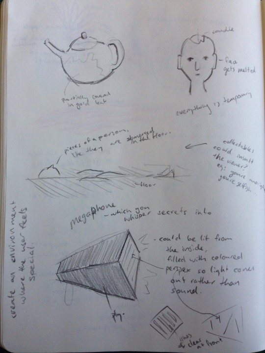
Here's a quick photo of the different ideas I have for a manifestation. I came up with them at various times this year, so it's really a matter of thinking about these and how I can get them to meet with the ideas I have in my manifestation.
0 notes
Photo
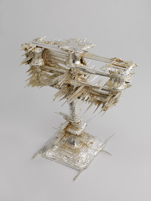
For my manifesto I am leaning towards expressing how new technologies can blend with old ideas of craft. I think this candlestick by Geoffrey Mann is a great example of the distortion created when using digital technologies in conjunction with an old fashioned method of craft.
I also really enjoyed these videos - one is from the Getty Museum, about the process of making illuminated manuscripts, which took thousands of hours as well as a great level of talent and craft. The other is part of a series of videos from the Boston Museum of Fine Arts, which guides you through the traditional techniques of making furniture. The one I have linked to explored the labourious process of guilding furniture, which is nowadays wasteful and frivolous.
https://www.youtube.com/watch?v=nuNfdHNTv9o
https://www.youtube.com/watch?v=HC6PUDG7gjs
These are great precedents for helping me to develop my manifesto and to see how I could create a manifestation out of that. These videos show how much time and care used to be put into objects that were such crucial parts of our lives. Nowadays this process is manufactured, with books and furniture being created on an assembly line.
1 note
·
View note
Text
Draft Manifesto
Here’s my manifesto so far, I’m experimenting a little with language, I want to get a balance of genuine, poetic advice and a bit of humour/irony.
--
Be a positive influence on the world, in whatever way possible. Make things, say things, be your best.
Design should help people. Design can give life meaning, in any big or small way. Brighten someone’s day. Inspire them. Or make their life a little easier.
If someone starts complaining about KIDS THESE DAYS, punch them in the face with the hand holding your iPhone 5, which you never let go of, ever. I NEED IT.
Conversely, interact with things in the physical world once in a while. Van Gogh’s Starry Night looks way different in the flesh. There are gaps between the brush marks! How cool! You could read a book, touch the pages and smell it. Or if your eyes hurt from working at a computer screen all day because this life requires you to design on a computer 24/7, close your eyes. Hold the book in your RSI-plagued hands and listen to the audiobook.
There are naturally positive and negatives to everything. Be aware of them both, and make informed decisions.
HAVE FUN. If it’s not fun, why not? Make it fun out of spite. Unless it’s a funeral.
Mistakes are the seeds for new ideas. Even the mistakes that aren’t aesthetically pleasing still have effort, soul and new opportunities in them.
YOLO. ABSOLUTELY MAKE THAT THING. It might not be like how you imagined it, but maybe one day something will be.
Make emotion. Choose materials sensitive to your work. Select a form that breathes.
Be proud of yourself. Go on. I give you permission to be happy about what you create, because whatever it is, came from your very own self.
You are responsible for everything you put in the world. You are part of a living, breathing system, an organism, a planet. Everything that hurts someone will eventually hurt you.
To every rule, there is an “if” and a “but”. Use your common sense. Look critically at the rulebook life gives you. Test the boundaries like the unruly teenager you really are.
Reinterpret “form follows function”. Do you want to make something with sparkly flowery bits and nice colours? Does it make you happy? That’s pretty functional.
Look back, and look forward. Learn from the past experiences of a vast and complicated world. Imagine what those new experiences might be.
Please remember that you are a bit dumb. That’s ok, everyone else is too, to more or less of a degree! You are not supposed to be perfect. If you knew everything, that would be sad and boring.
Daydream as much as humanly possible. Draw in margins.
Take care of yourself. Take time to step back and look at everything with a fresh perspective.
Those sleepy bedtime ideas are great. Write them down. Record weird voice memos to your future self. Most of this high-quality advice was thought up in the wee hours of the morning.
[email protected]. (n.d.). Retrieved September 23, 2015, from http://goodfuckingdesignadvice.com
Good design | About Vitsœ | Vitsœ. (n.d.). Retrieved September 23, 2015, from https://www.vitsoe.com/gb/about/good-design
The Journal of Modern Craft. (n.d.). Retrieved September 23, 2015, from http://journalofmoderncraft.com/articles/affective-craft-manifesto
2 notes
·
View notes
Photo
I’ve spent some time updating my Behance portfolio this week. Now you can see the work I made while on exchange in the USA - go take a look!
https://www.behance.net/torrobinson
1 note
·
View note
Text
In my essay for Project 3 I have chosen to explore how the 3D printing revolution can change craft and society. This combines the topics of “machine + human hand” with “makers vs. designers + the new industrial revolution”. As a female industrial designer currently experiencing this move towards 3D printing, I think this will be a very relevant topic of inquiry.
I’ve also begun to consider how this new industrial revolution will affect craft, as it blends into this new and accessible manufacturing process. If craft is considered a feminine, less relevant form of design, will 3D printing change this through the popularisation of a new craft? Or will 3D printing eventually be sidelined and dismissed as a trend, like many crafts before it?
I chose to select four sources to review, as two are written by the same author, with the latter following up on the initial paper’s research.
Bibliography
Lipson, H., & Kurman, M. (2013). Fabricated: The New World Of 3D Printing. Indianapolis, Indiana: Wiley.
This book contains a chapter titled “Nimble manufacturing: Good, fast and cheap”. In this chapter, Lipson and Kurman discuss the difference between a 3D printer and mass production. They then discuss the benefits of these differences and how it relates to the artisan. In fact, a 3D printer has the benefit of automation and accuracy while also having the versatility of the artisan. The 3D printer could hugely benefit someone who cannot afford to produce a batch of products, instead printing them for the demand.
Bratich, J., & Brush, H. (2011). Fabricating Activism: Craft-Work, Popular Culture, Gender. Utopian Studies, 22(2), 233-260.
This article explores the practice of fabriculture and how this resurgence will affect craft’s feminine perception. This article particularly interests me as it illustrates some very relevant links with the advent of industrialism and capitalism and how it relates to feminism. Much of the article then goes on to explore the perception and the digital spaces of knitting circles in society, and the concept of craftivism. However the introduction does lay an interesting groundwork with some questions I’d like to raise about the possibility of a relationship between the new industrial revolution and how that will affect feminine craft.
Zoran, A., & Buechley, L. (2013). Hybrid Reassemblage: An Exploration of Craft, Digital Fabrication and Artifact Uniqueness. Leonardo, 46(1), 4-10.
This article discusses an MIT project which explores the way broken things can be repaired with 3D printing. This customisation merges 3D printing with craft through a process of restoration. It gives 3D printing a new purpose, something that seperates it from other processes as something sensitive and reactionary. This celebration of the broken is most commonly seen in a Japanese form of Wabi-sabi, where broken pottery was mended by filling the cracks with gold. This subversion brings up some interesting thoughts that could be used in my essay - is this revitalisation just as meaningful when gold is replaced with a digital print? Does this change the meaning of value?
Zoran, A. (2013). Hybrid Basketry: Interweaving Digital Practice within Contemporary Craft. Leonardo, 46(4), 324-331.
Zoran then builds on these concepts by applying the technology of 3D printing to basketry, a skill that most definitely falls under the definition of an overlooked craft. Zoran first prints the skeleton of the basket, or warp, then 3D prints a long thread that gradually shifts from hard to flexible. He then manually weaves this weft to the warp, practicing a craft even when utilising digital technology. Zoran then goes on to design more complex baskets that require a greater deal of skill in the assembly or craft of the final object. Zoran will be a good example of a designer who is exploring the boundaries of 3D printing to literally craft a product.
1 note
·
View note
Video
vimeo
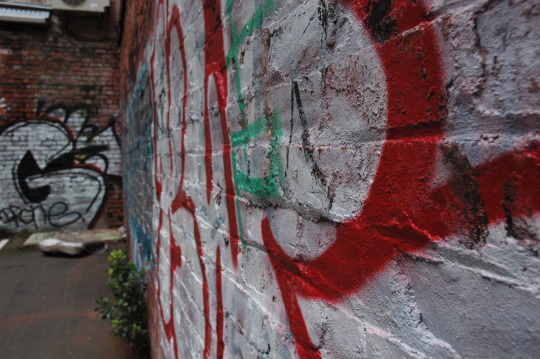
CCDN331 Project 2 Final Photo Essay
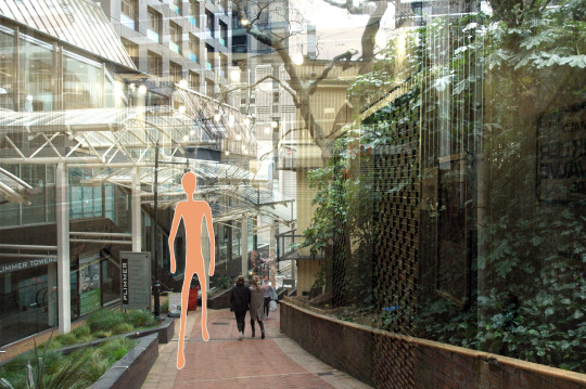
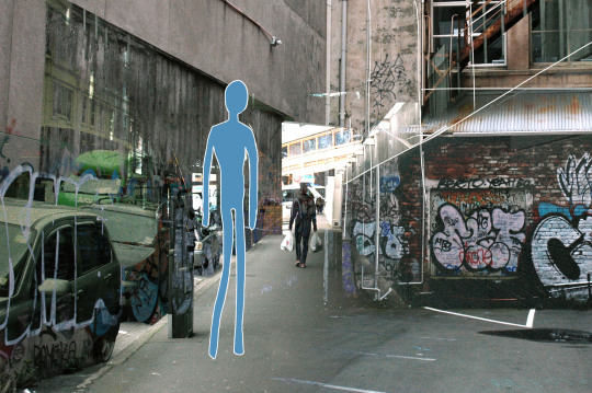
In my final project I explored the personification of the flaneur, a person separate from the rules governing a city. I imagined colourful, simplified humanoid creatures who roam the transitory, “inbetween” places. These creatures have a naïve yet slightly ominous air, as a being who uses often unfriendly places as their home, undisturbed by the graffiti of human presence.
Photos of their habitat are overlaid with each other, creating blended generalisations of these places. My original attempt at the simplification of these transitory places was entirely compositional, but it did not communicate my true intention, nor did it show my voice. I feel that this final blending of spaces instead generalises the “inbetween” conceptually, rather than visually. Indeed, this method of simplification was in my very first reading on the flaneur. Certeau explores the representation of the city as a panorama, a totalisation of the complex “immense texturology” which separates the viewer from the everyday workings of the city (2009, p. 247).
These concepts of a flaneur-like creature separated from a concept-city was furthermore enhanced in my choice of soundtrack. I used the sounds created by installation piece “Wall Street Sound Machine”, an instrument that produces such different sounds to its original purpose in life. I then combined this with the waterphone, an eerie and unusual instrument that highlights the sometimes threatening nature of the dark alleyway. The characters in these photos have a great freedom, but they also live on the outskirts of society – and they are not entirely friendly.
Certeau, M. (2009). Walking In The City. In Brody, D., Design Studies: A Reader. Oxford: Berg.
0 notes
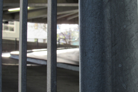
Photo
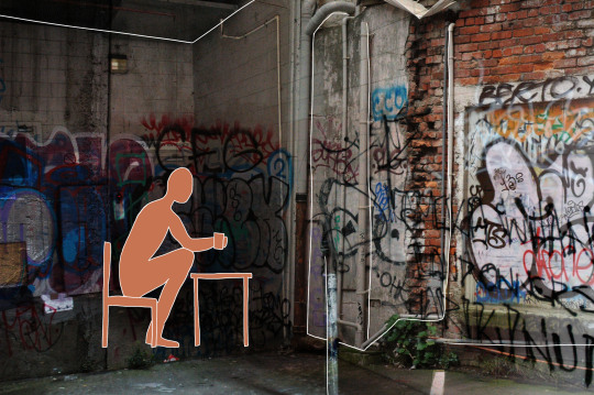
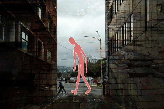
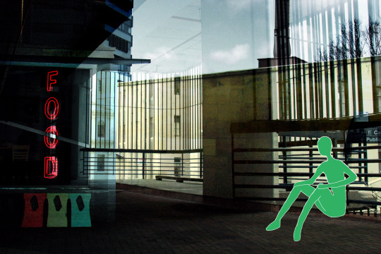
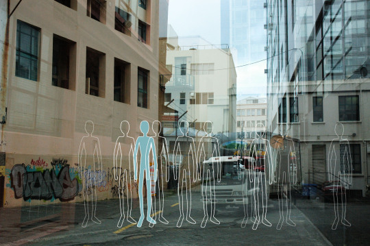
CCDN331 Project 2 Final Images
My final images for the video. Everything started to work when I started overlaying photos, making “inbetweens of the inbetween”. I had experimented with this technique in my first year photographics paper but this time I wanted to see how I could make locations seem real but also slightly seperated and not quite-there, a lot like the characters in the photos.
I’m considering adding a texture to the colour of the people so they don’t seem so simple. However keeping them simple also increases the contrast in how separate they are.
1 note
·
View note
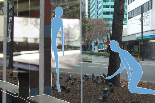
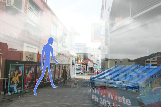
Photo
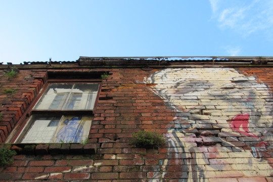

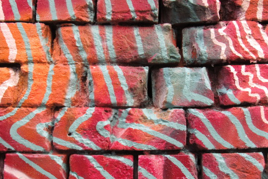
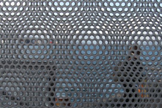
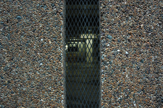
CCDN331 Project 2 favourite “Simplifying the inbetween” photos
1 note
·
View note