Don't wanna be here? Send us removal request.
Statistics
We looked inside some of the posts by traibm1 and here's what we found interesting.
Average Info
Notes Per Post
1
Likes Per Post
1
Reblog Per Post
0
Reply Per Post
0
Time Between Posts
9 days
Number of Posts By Type
Text
17
Last Seen Tumblr Blogs


Fun Fact
Tumblr Inc. has $15.1M in annual revenue.
Text
FUNDI'S: CLASS 2 PART 2
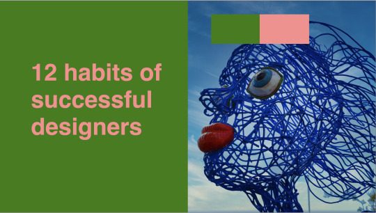
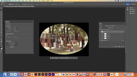
For the final slide, we wanted to create a duotone slide.
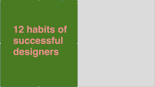
This is what we started with:

We then grabbed the green rectangle in the background, and went to the control menu in the top and wrote this in the width category:
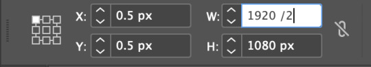
For some reason you can just do math in the text box, which is pretty helpful. Kinda random but pretty helpful. This is what we ended up with:
Next we pasted the image that we wanted for the right half of the image in.
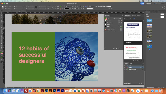
We thought that we image was kind of leading interest away from the text, since there was more going on in the image, and it was facing the opposite direction, so using the control menu at the top again, we flipped it around. We also created a color scheme with a couple square so that we could copy and paste it into photoshop for the next step.
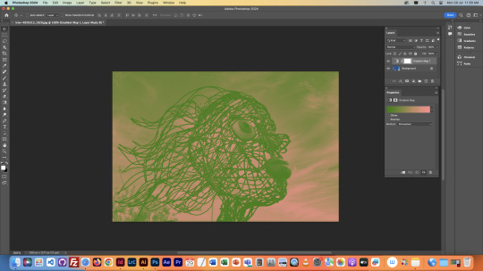
After opening the original image in photoshop, we grabbed our colour scheme and selected both colours as foreground and background.


Then we pressed the gradient map tool in the same section of the layers menu as the curves, and this is what we got:
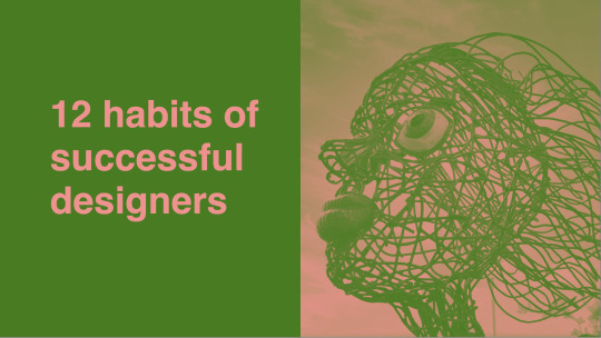
We then used the gradient map menu to adjust the colours until we had gotten what we wanted for the slideshow.

I just adjusted until everything in the image was clear enough.
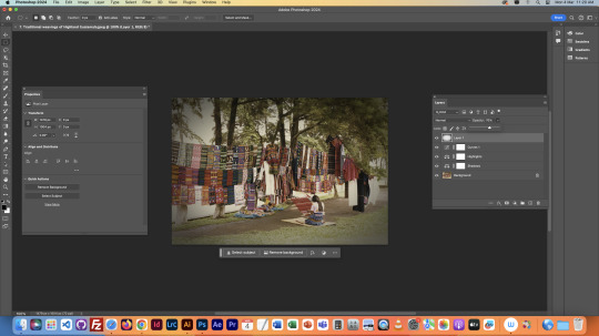
This is what it looked like in the end:
This was the final task for this class.
Overall this class was super helpful, I learnt lots of new stuff that I'm going to apply to my Owheo park slideshow in Quinn's class. Honestly quite the lifesaver of a class because I had no idea what I was gonna do yet, but this has given me some ideas.
0 notes
Text
FUNDI'S: CLASS 2 PART 1
So we started off by having a read off of moodle about readability and legibility. We also just learnt lots of good tips for making our slideshow in Quinn's class.
So today we were learning to make image adjustments on photoshop and to layer images and text on each other.


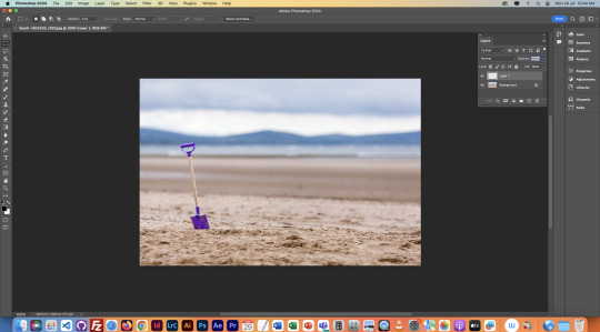
We got given this InDesign Document and a bunch of images in a folder, which we would be using for this class. As you can see it was a bunch of blank slides with text. We also opened up all the menus we would need to be using frequently.


The first thing we did was light on dark. The text is light, the background is dark (relatively). During this we learnt how to adjust image size in InDesign. Images in InDesign have a frame and the actual image inside of it, so you have to work these two things together. The image can be moved around inside and outside the frame, but only what is inside the frame will show up. CMND + SHIFT + CLICK = Crop image and frame together. V = Move image and frame. A = Move image inside of frame.

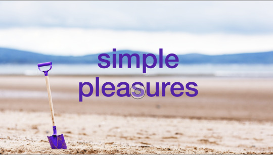
Next we did dark on light. Same process as before, placing the image in, either by dragging it from the finder app or using File > Place. We then made the text match the colour of the shovel with the eyedropper tool, just to give the image more unison. Then we took the image onto photoshop to make it a little lighter, so the text is easier to read.
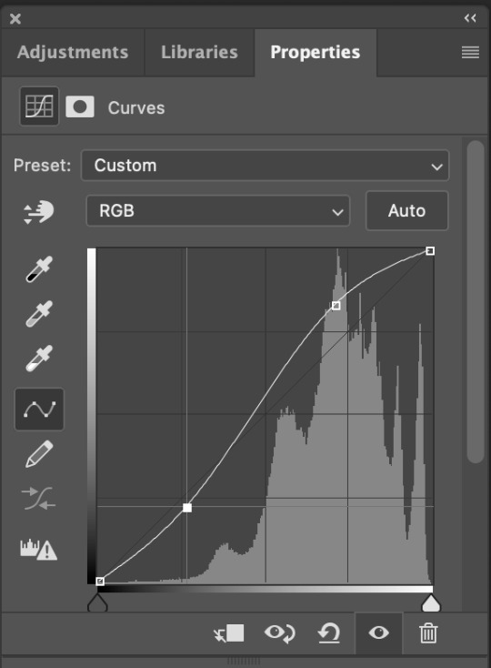
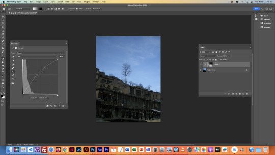
We used the Curves menu on a new layer to edit the image. Layer adjustments mean we can edit the image without overriding it. So if we want we can click the eye symbol on the layer with edits and it'll turn the image back to the original, meaning we can turn on and off the edits with a click of a button, rather than them being imbedded in the image on the base layer.
We adjusted the curves levels to the shown values up above, and the image turned out like this:
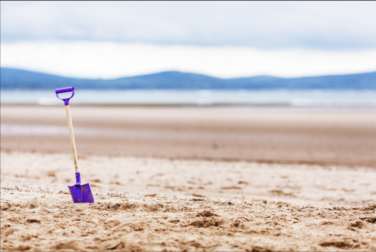
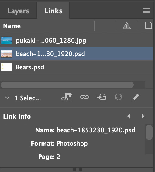
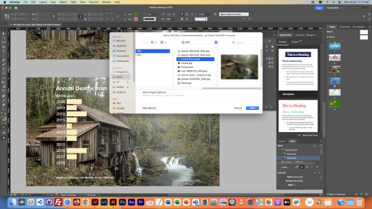
Next we went back into InDesign and headed to the links panel. Now there wasn't any updates needed to the image as we saved a new copy (so we still had the original available) but we needed to replace it. We clicked the chain link symbol at the bottom of the links menu and found the new image and selected it.
Then it was already in the same position as the old one, and this page was done.
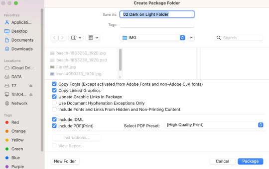
Next we learnt about the Package command. This is a quality of life command that creates a folder in wherever you may choose that includes everything you would need to edit the current project. It creates a folder including the file, and all the links it currently has inside of it. This is handy in case you need to move computers and want to keep all the links.

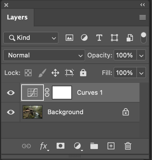
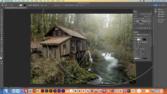
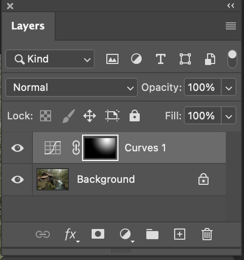
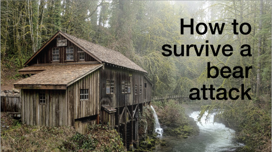
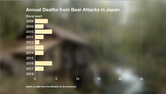
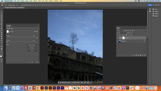
Next we moved to creating a Dark on Local Light slide. We got an image of a forest to put dark text over, but the text didn't look too great on it. So we decided to create some light in the image so the text looked better sitting on top.
First we used Curves again to brighten the image as a whole. Then after this we went onto the layer mask of the Curves and made a gradient. Honestly I'm still not 100% sure how to explain layer masks, but pretty much the gradient applied itself to the curves and then created the result below:

After this we repeated the same process from before to put the new image into the InDesign document.
The next slide we wanted to have the same background but very blurry, as the two slides are related to each other, so it's like a smooth transition between them that links them together. We duplicated the background and moved it down to the next slide.

Then we went back onto photoshop and removed the curves layer from before, then went onto the filters section at the top of the screen, and selected Gaussian Blur.
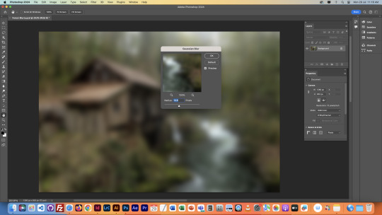
This menu allowed us to control how blurry we wanted the image to be. We chose a value and then saved it out and added it to the InDesign document.
This is how it ended up. I like this transition I think it flows really well in a slideshow from title to information.
The next image we got was wayyyy too short for our slide, so we took it to photoshop to edit it with Content Aware Fill.
We first adjusted the image size to what we wanted it to be.
Then we used the crop tool with Content Aware Fill selected at the top, and extended the image.
After a bit of loading, this is what we got.
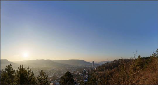
This looks pretty seamless, but that's because it was a simple thing to fill in, just a small gradient on a clear blue sky. But still, I think this is very cool.
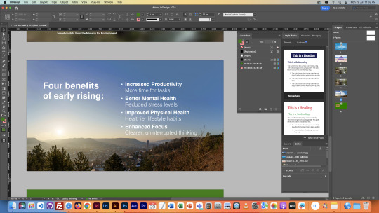
We then brought the image into the InDesign file with the usual process.
CONTINUED IN PART TWO
0 notes
Text
Software: Nursery Rhyme Book
So I decided to stick with the same font as before for the book. I think it helped me decide what style I wanted to create the book in, which ended up being in a sort of chilrens drawing/crayon/doodle style. I always liked this style of picture book when I was younger, so I thought it'd be cool to try it out.
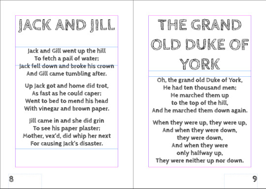
So firstly I pasted the nursery rhymes into my book, and arranged them on their pages. This involved not only positioning, but editing the lines of text so that they weren't too short or long.


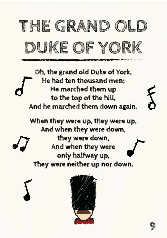
The next thing I did was create an image for each rhyme in the style of the book that I chose. We only had to draw two of them ourselves, but I decided to do them all so that there was proper consistency throughout the book. I decided to draw something relevant to each rhyme, so for example: 3 bags of black wool for Baa Baa Black Sheep. Here is some process photos of my creation of the drawing for The Grand Old Duke of York:


For all my drawings, I used a scratchier looking brush style, but I forgot what it was called. I created the outlines first, and then would scribble over each sections with their respective colours, and then erase anything outside the lines. I would've prefered drawing in photoshop, but we had to use illustrator, but it kinda makes sense since illustrator uses vectors.

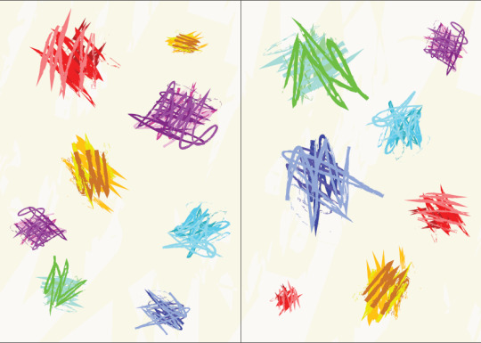
Next I quickly made the end pages. I felt they needed colour, so I made a pattern with colourful scribbles. Very simple, but I think it does the job well.

Next I made the contents page. This was relatively simple too, just ended up drawing another little sketch of a magnifying glass, because I wanted to draw something to do with searching for the page. Then I added the text above it and a title and it was done. This was also the point I made the background Offwhite. I didn't want a plain white background because it just looked too lazy.

Next I added some more texture to the background just to give it some sort of colour. Colour makes things more interesting for the kids reading it, so I thought it'd be a good addition.
Next I created some musical note drawings to put around the text of the rhymes. I just thought it was on theme because nursery rhymes have rhythm. It also just adds something to the pages to make them more interesting.


After this, I made the front and back covers. The front cover has a kid reading a book, as this is a kids book. Then I added some music notes around the kid. Then for the back cover I just put some musical notes on the back. I thought about putting a synopsis, but there honestly isn't much to write about, so I kept it purely visual. Then I added the title to the front page, because I forgot it at first.
Then the book was finished. Here is all the pages in order:


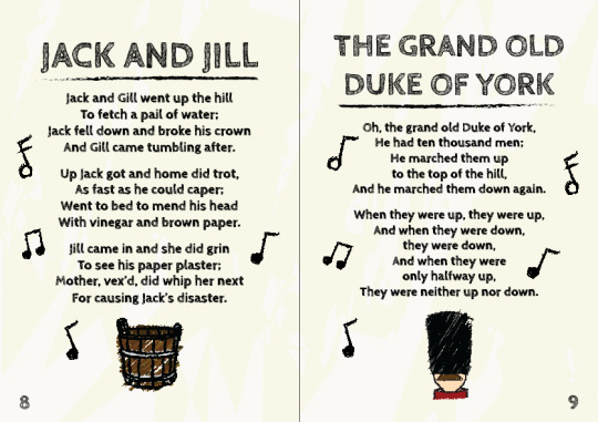

I think it turned out decent in the end. There is most definitely room for improvement in lots of aspects, such as page composition, but for the time we had I think it was pretty good overall. I like the doodle style, I especially liked the Tom Gates books as a kid, so that kind of inspired what I wanted to create. This book has a more crayon looking style, but the inspiration was still there.
If I was to do it again, I think I'd do a more clean style, more cartoony rather than doodling, I think it'd be fun to try that out as opposed to this style.
0 notes
Text
Semester 2: Software
We started the second round of Software classes by recapping what we learned about InDesign. We have got the task of designing a book for nursery rhymes/children's stories. This is pretty much to test us on how well we can present text and images in a book form, so we can then use the same techniques to create a slideshow for our designs in the other Fundi class.

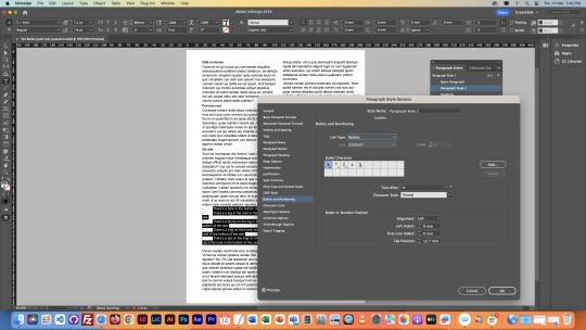
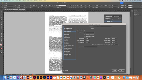
First we went over paragraph styles again, and familiarised ourselves with the paragraph style options menu. Pretty much we just went over what paragraph style presets do, which is saving settings so you can apply them later on quickly, and to specified sections of text. It also means you can edit all these sections of text at the same time by editing the paragraph style.
Then we went over parent pages again, and made page numbers for our pages. Parent pages are pretty much like preset pages, so you can make changes to these pages, and all pages that are highlighted with the parent pages label (in this case, A) will also show the changes. But, you can only edit these changes on the parent page, not the other pages.
Next we went over the None pages again, which remove parent pages from the selected page. This is done by dragging a None page over the page you want to remove the parent from. This is useful for covers, which shouldn't have a page number, and therefore should be separated from the pages inside a book.
We then learnt about the usefulness of soft returns. We can use soft returns by holding Shift and pressing Enter. This allow us to send text to the next line down without creating a new paragraph, like a hard return would.
The difference is shown below, Soft return above, Hard return below:


As you can see, I changed the paragraph style once for each block of text, but in the one with the hard return, only some of it changed, because InDesign sees the text before and after the hard return as different paragraphs, but up above it sees the text before and after the soft return as the same paragraph.
We also learnt about different things in the paragraph styles menu such as "Space After" which lets us set the space in-between paragraphs.
I applied the same amount of Space After to both blocks of text, but there's a difference because of the soft and hard returns:

As you can see, the hard return was split apart, since the two blocks of text are seen as different paragraphs. But up above with the soft return, nothing has changed, because it is all one paragraph, you'd only see the space after once another paragraph is created below it.
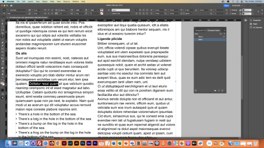
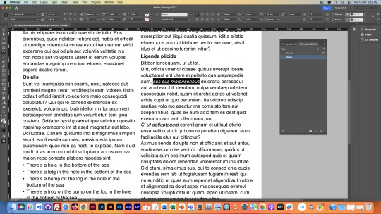
Next we selected our 5 nursery rhymes for our books, I chose:
Ring-a-Ring o' Roses Baa, Baa, Black Sheep Jack and Jill Humpty Dumpty The Grand Old Duke of York
Next I decided on a font. I have decided to use a font called Cabin Sketch, which looks like this:

This could change in the future, but I like it for now.
That's all for the first day.
0 notes
Text
Ninth Class
In this lesson we learnt about page layout way more in depth. We started off by creating a lot of pages to see how the layers are positioned inside of InDesign, as you can see, it’s structured like a book. This helps to show what your final product will be laid out like.

We then created a Front Cover and a Back Cover, literally just by typing those phrases on the first and last pages.
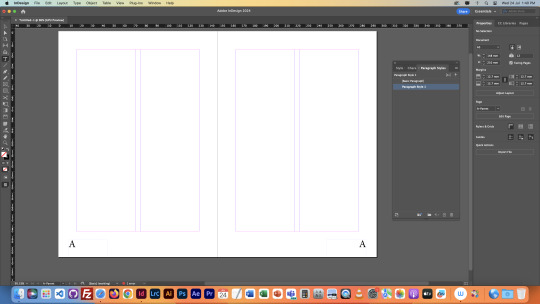
Next we learnt about parent pages. Parent pages are pretty much what you use if you want to make changes to every single page. Whatever you put in these pages, goes into every page. So, we used this feature to create page numbers for each page. But we couldn’t have every page saying “page 1” or “page 2” or so on, so we had to insert a symbol onto the parent page which makes each page present the number allocated to it.
But we didn’t want numbers on the cover pages, so we used the feature above the parent pages called “[None]” pages. If you drag this onto a page, it will nullify the effects of the parent page. This therefore removed the page numbers from our cover pages.

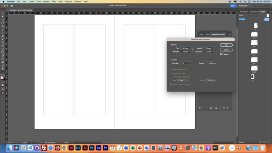
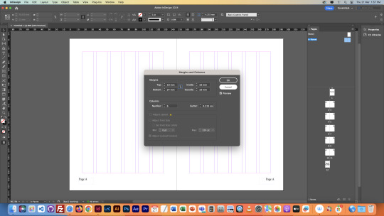
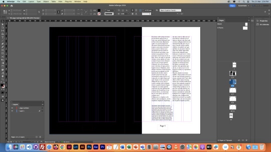
Next we edited the size of our margins, and added 6 columns onto our pages. We did both of these things using the parent pages. We then repositioned our pages numbers into the centre of the pages, as it looked better. Then we went onto our first set of pages to mess around with text and image placement and orientation.


We tried many techniques, we messed around with text and image size, page layout, column numbers and more.
We then learnt how to invert the page number colours, but only for pages that it was necessary. This was done by creating a new set of parent pages, and inverting the text colour on these parent pages, and then applying the parent pages onto the pages where they were necessary, the same way we used the [None] pages.


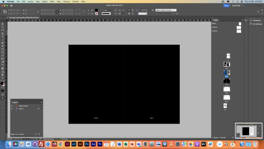
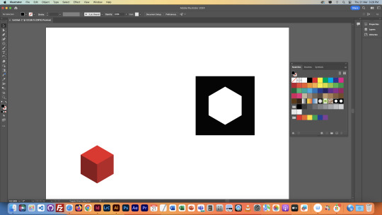
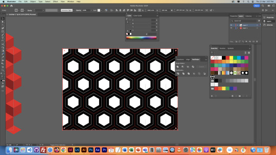
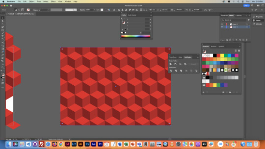
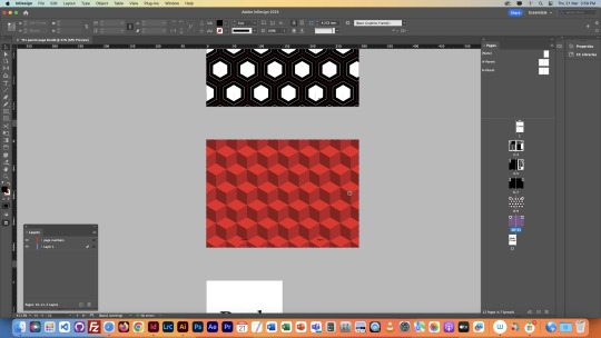
We then went onto Illustrator. We used illustrator to create End Pages. These are the pages at the beginning and end of books that consist of a repeating pattern. They kind of look like a wallpaper.
We created it by creating an object, and then turning it into a swatch, and applying the swatch into a shape, which repeated the shape infinitely. We then pasted the final product into InDesign, to finalise the End Page.


Here's another end page I messed around with
That finished the final lesson, I learnt a lot from this class so I’m quite happy with the experience overall.
NOTES

0 notes
Text
Eighth Class Part 2
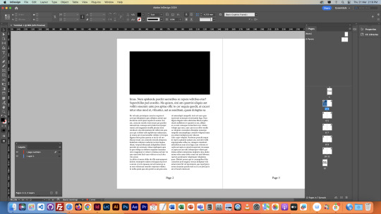
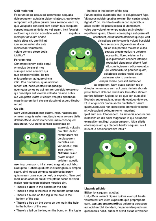
Next we went about fitting images onto a page. Editing images inside of InDesign is interesting, as there is a frame, and an image within the frame. You can resize the image, but it'll be cropped within the frame. You can also resize the frame, but it'll crop the image. To resize an image and a frame together, you must hold shift whilst resizing. The frame is highlighted in blue, and the image in orange.
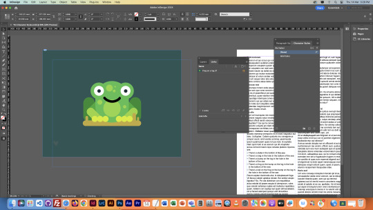
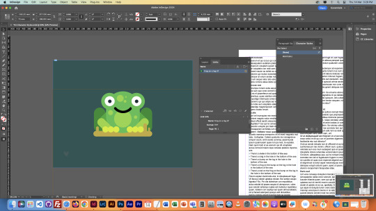
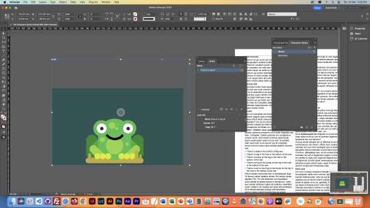
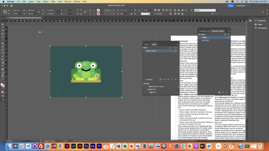
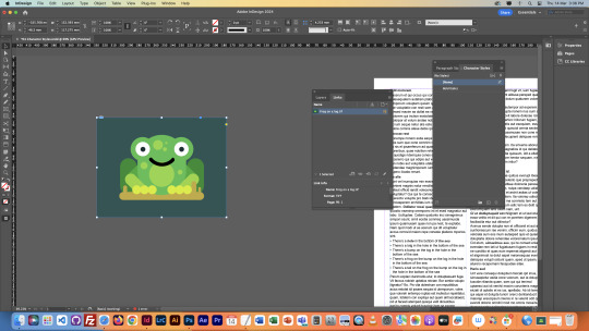
We then used the image resizing to fit it into the page, but then we realised the text was just under it. We used the text wrapping feature to wrap the text around the image, and then used adjustments to create the perfect gaps between the images and the text.
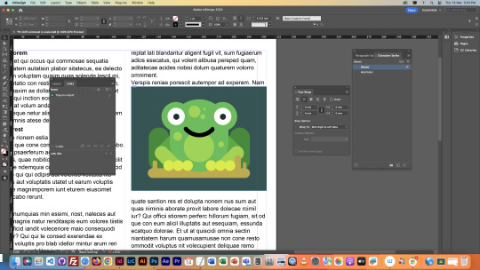
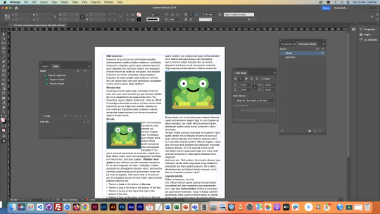
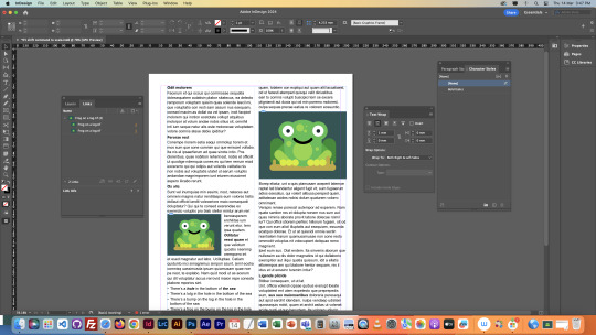
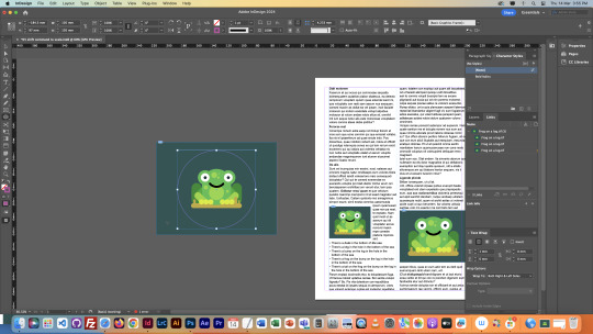
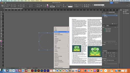
We then tried to create a circular image, we did this by creating a good sized ellipse around the frog, and then pasting the image into the ellipse, making the ellipse into the frame of the image. We then inserted into the text, and used the wrap around shape text wrapping to wrap the text around it.
Finally the document was finished as shown below. This was pretty interesting, as I never knew Adobe InDesign even existed, so this was a completely new experience for me. I'm glad I've learnt how to navigate it at a basic level though, as it definitely seems like a very helpful tool for graphic design.
NOTES

0 notes
Text
Eighth Class
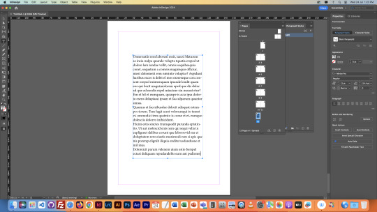
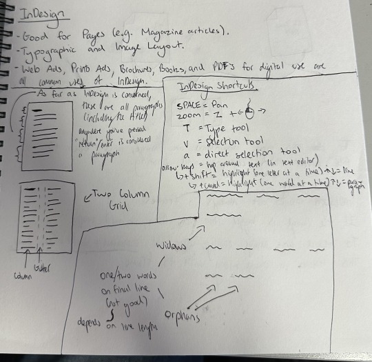
Our eights Fundimentals Class surrounded Adobe InDesign. This software is very good for page design, which is what we learnt about in this lesson. Firstly, we opened it up, and learnt about columns. We split our page into two columns, and then filled it up with filler text. The filler text is all in latin, so I have no idea what any of it meant. We then changed the font to arial, to make it simpler to use.

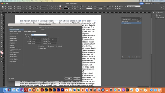
We then edited the paragraphs within the text. Inside of InDesign, a paragraph is defined as the text from when you press enter at the end of a previous paragraph, to where you press enter and the end of the current paragraph. Because of this, you can have individual "Paragraph Styles" for each paragraph. We needed to get rid of "Widows" and "Orphans" at the end of paragraphs. Widows and Orphans are the name for one or two words respectively that may be hanging off the bottom of a paragraph, so we edited paragraphs individually to make them look a bit cleaner. We also learnt specific buttons for more precise text highlighting, which are in my notes at the end of this post.
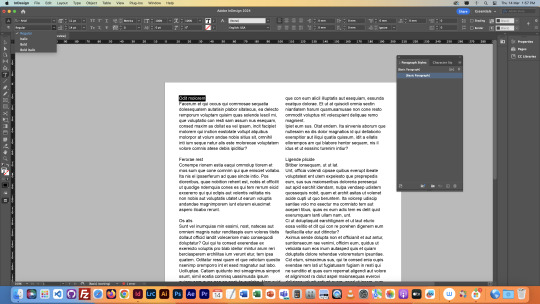
With Widow Without Widow


We then got rid of hyphenation in our text, meaning when a word is too long for a sentence, so it gets split onto the next line with a hyphenation. Getting rid of this makes the text much easier to read, and much cleaner to look at overall. After getting rid of Hyphenation, we added headings to sections of our text. We bolded the headings to make them stand out, and then appropriately spaced them from each section of the text. We did all this by creating a new Paragraph Style specifically for headings, and applying it to all the text we wanted to have as headings.


Next we added a section with Bullet Points. Bullet Points are used to list. We did this again with the Paragraph Style menu, by making a new paragraph style specifically for the sections we wanted to bullet points. We then tweaked our paragraph style to make sure the bullet points fit in properly with the rest of the text.


We then went onto text styles. This allowed us to make styles like the paragraph styles, but for specific sections of text, like a couple of words. We did this with Italics, which are the slanted words. We also made them bold just to make them easier to see within the text, just for this example.

Next we learnt about images inside of InDesign. The first thing we learnt was a space saving technique, which summed up is to pretty much never copy and paste images into things, but rather download the image and then open it inside of the programme we use. This saves space, and also means when you edit the image in another software, the edits show up in every other software. This is shown in the images below. We demonstrated this with Photoshop and InDesign.


Continued in Part 2...
0 notes
Text
Seventh Class/Composition Homework
The seventh class was sort of a check up. We just had to check on our Tumblr blogs to see if they were up to standard. Mine was seemingly good so I used the time to work on the homework from the previous class.
I added new shapes to photos of my friends using the same techniques and tools as the jumping man from the previous class, and then brought them onto the same image, and added a background. Here are the original photos, along with the process of editing and finished product:


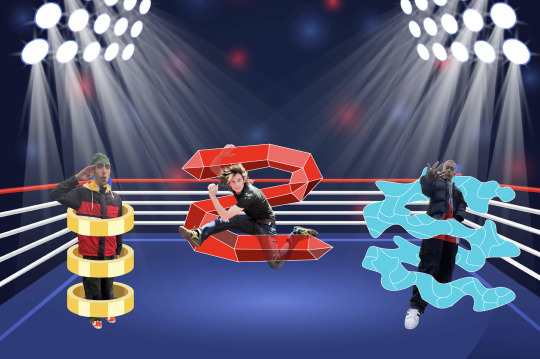
I don't really know what I was going for here to be honest. Looks kinda goofy but it was good practice and I learnt new techniques, especially making the rings around the left character. I think the right guy wins the fight.
0 notes
Text
Sixth Class
Today's class was about compositing. Mixing elements into one image. We started off the same as last class, recapping or Marquees, filling areas, and masks. We learned new stuff about selections though, about how whilst creating a Marquee, holding the Shift key will add to the current selection, and holding Option will remove from it. These keys remain the same for most selection techniques.

Here is some photos of the masks we messed around with:
We learned here that when making a mask of a layer with a selection active, only the area within the selection is actually affected, which is what happened in the previous lesson with the bird wing.
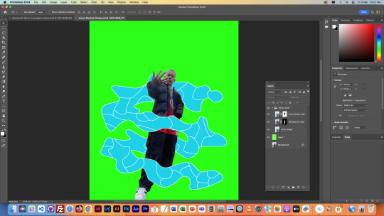
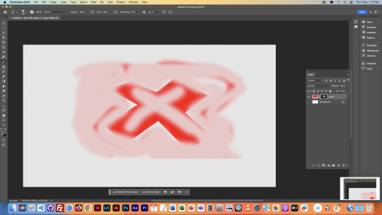
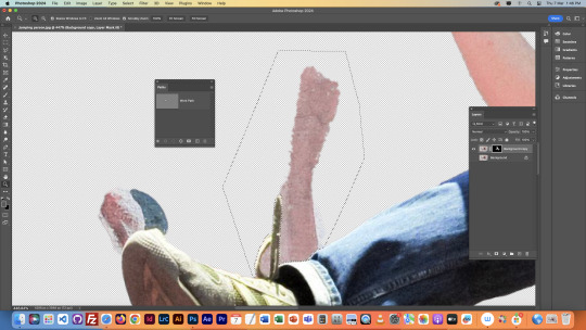
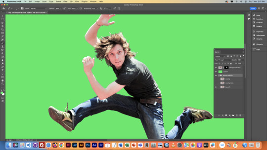
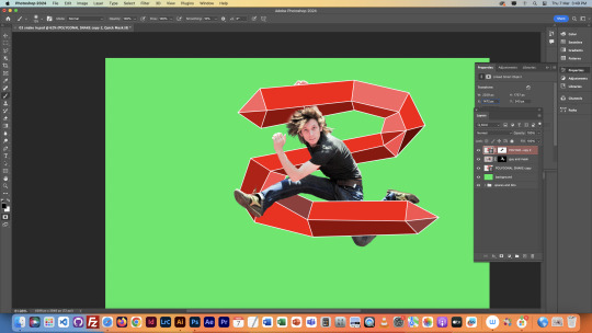
Next we began on the main project that took up the majority of this lesson. We used the object selector to cut the jumping figure out of this image on a new layer. We then realised that the object selector did a not so ideal job with selecting it, and that we would have to make precise adjustments to fix the cutout. We began fixing it by fixing the area around the messed up shoe and shoelace. We did this with the polygonal lasso tool, and the pen tool.
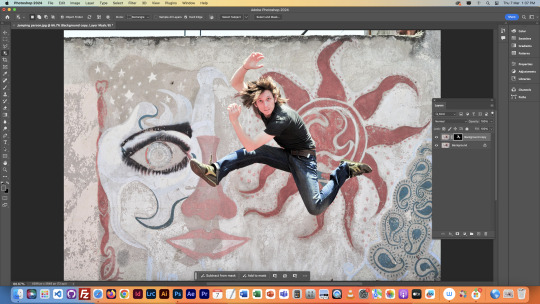
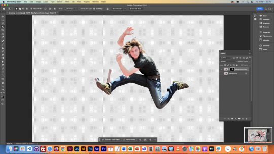
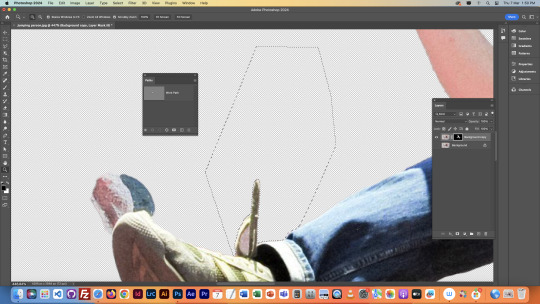
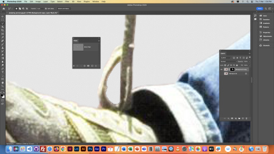

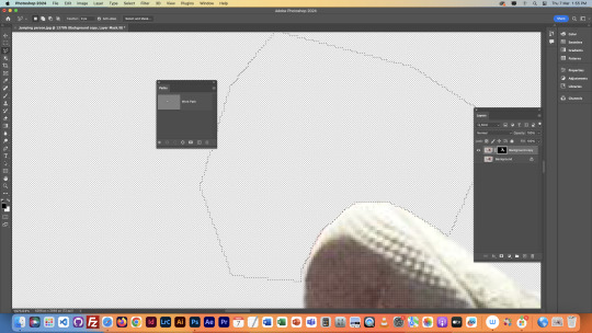

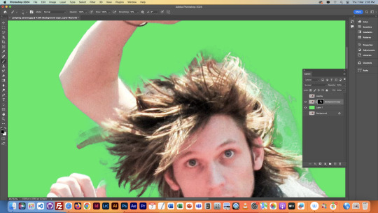
We then fixed the arm sticking out the top, both of the hands, and painstakingly fixed the hair. This part was done with the brush tool, and the mask we had created of this shape on this layer. It took ages, but was worth the result. We also put it on a green screen like the previous class as it makes it easier to see what we're working with. We also made an overlay layer so we could toggle it to compare our cutout with the original image.


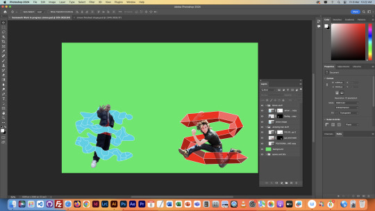
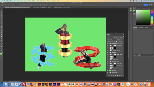
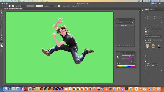
We then sorted our layers out in photoshop, and then brought our image into Illustrator. We created an S-shaped line over the man, brought the image back into photoshop, and used layering, masks, and our brush tool to make the line go around the man, rather than on top.

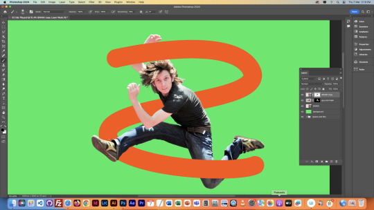
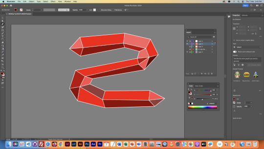
The shape above was just a tester, we went back into Illustrator and created a new shape. Same sort of S, but just with more going on. Mine ended up being a red polygonal thing. We then put this shape around the man in Photoshop, and lowered some of the opacity so we could see the man through the shape whilst still having it in front of him.


We would then finish by adding a new background, but I didn't have time in the end. Still, this was quite a challenge, but I enjoyed it, and am happy with how it turned out.
NOTES

0 notes
Text
Fifth Class Part 2
We then blurred the end of the feathers with the blur tool, so that the edge didn't look too cleanly cut, and also made the wings look like they were snapped from in motion.


Next, we lowered the opacity of our brush tool, and used our mask to adjust the light levels on parts of the bird. This allowed us to match the lighting to the new background better. We also used the Polygonal lasso to adjust some of the shape, like on the beak.

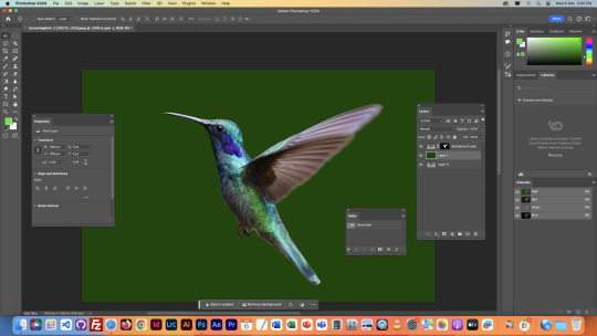
Finally, we flipped the bird around, and pasted it onto the new background. Then we moved it into place to make it fit in.
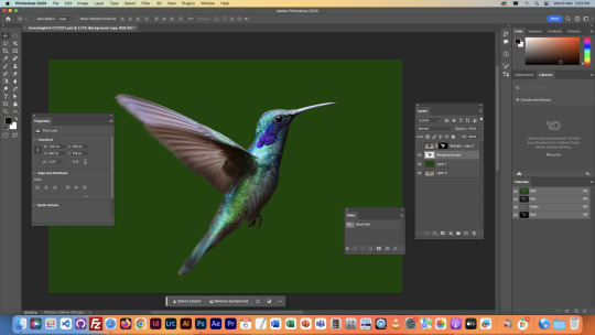


This last image was challenging, but I'm happy with how it turned out in the end.
NOTES

0 notes
Text
Fifth Class Part 1
This class started off with learning about Masks. Masks help to hide parts of an image cleanly without being destructive. We also messed around with Marquee's as well, which are tools to help select a shape/area. We also used commands to fill selected areas with colour, as shown below, and other commands to change locations. All commands will be in the notes at the bottom of Part 2 of this post.


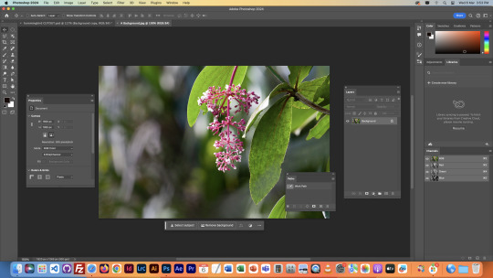
The majority of this class was learning how to select a certain area/object in an image so you can isolate it to edit it. This next task involved selection using a rectangular marquee, and then blending the area around it using a layer mask. (There was originally only one boat in the image - the closest one).


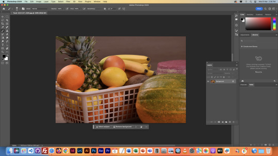
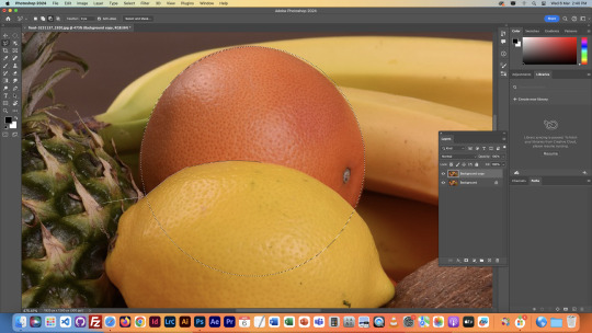
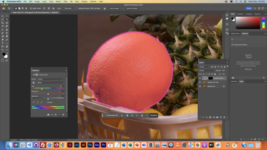
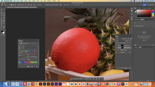
The next image was a basket of fruits, in which we learned about the Polygonal Lasso tool, and the Object Selector tool. Both ways to select objects with Photoshop. We used this to isolate fruits to change their colour with the saturation and hue tools. The polygonal lasso tool is much more labour intensive (even though it's very simple) than the object selector, but it is much more specific and accurate, as you are able to control it fully.


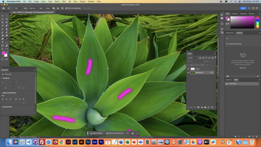
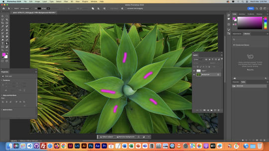
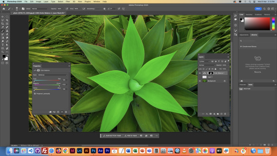
The next image involved selection using the pen tool. As it is very similar to the pen tool in Illustrator, it didn't take too long to figure out, it just involved outlining the shape with curve points and broken points, then using the direct selection tool to adjust the segments as needed. We did this on the top layer of leaves on a plant so we could isolate them from the other leaves. We then messed around with the colour balance tool to show the area we had selected.


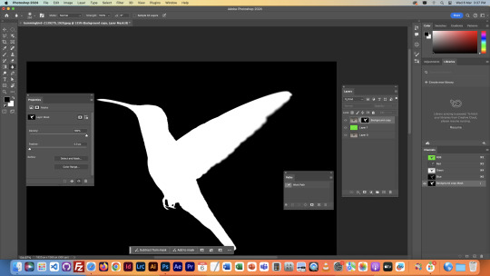
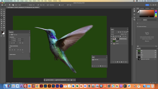
The final image was the most complicated of the lot. It involved cutting out a moving Hummingbird from a photo, and then adding onto a new background whilst making it look clean. We first used the object selector to create a mask with the shape of the Hummingbird on a new layer. We then put a type of green screen layer behind the bird so we could see what we were doing in the next part.
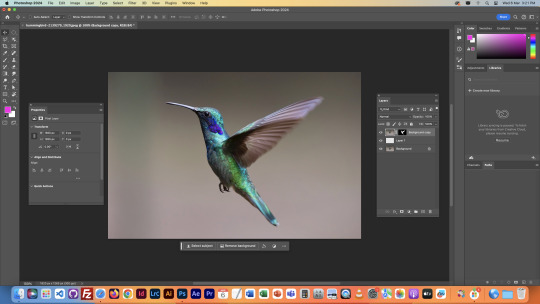


We then used the pen tool to define the shape of the wing better, as the object selector didn't do a perfect job of it. We then applied this shape onto the mask by using the brush tool to shape it out in the mask. We also had to invert the selection in some parts of the brushing, in order to get the colours right.


0 notes
Text
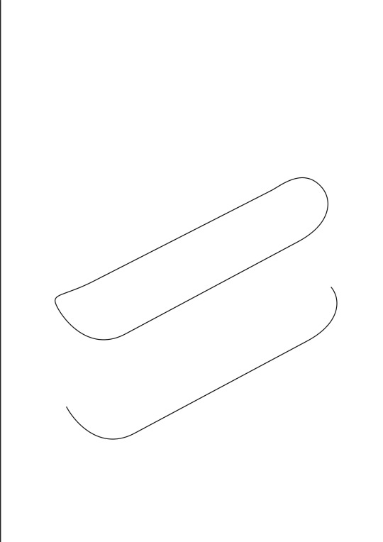
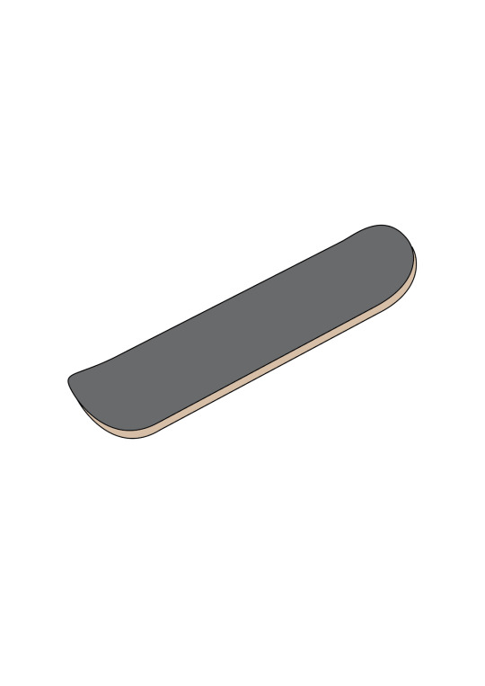
HOMEWORK TASK: OBJECT DRAWING
We had a homework task to draw an object of our choice, I chose to draw a skateboard, since its relatively simple and I like them.
Below is my planning, including my notes and a reference image of a drawn skateboard I found online.


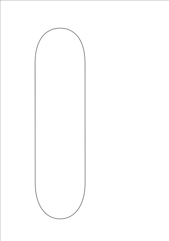
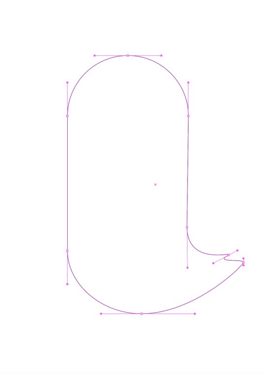
I started off similarly to the penguin, getting a circle and splitting it in half, and then joining the two gaps to create a pill shape. This was the base shape for the deck of the board


This part didnt take long since I'd done it before.
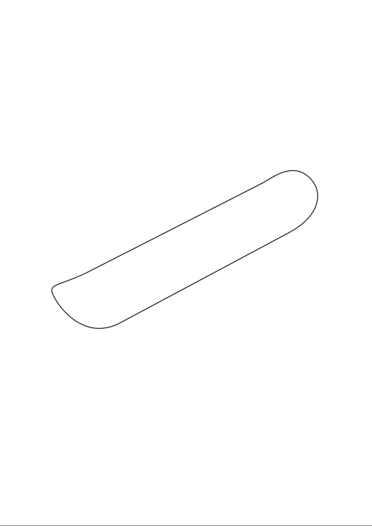
Next I shaped the object into the shape of a skateboard deck. This just involved messing around with gizmo's and the anchor points on the shape until it turned into the shape I was looking for. I didn't end up needing to add any extra anchor points.
I then did something similar to what we did for the penguin foot, which was duplicating the shape to add another layer to it, giving it depth. Once I added colour it was looking exactly how I had envisioned it. I then grouped the two shapes together so they would move together when I selected them.
Next I started to make the wheels, making an assortment of different shapes to layer on top of one another, eventually making a wheel.
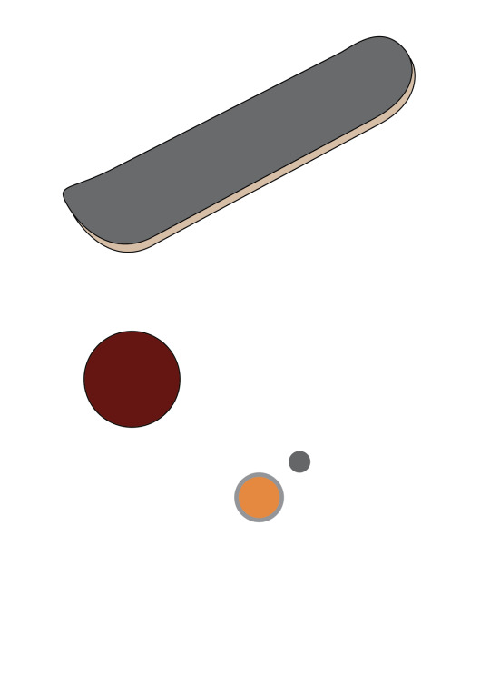
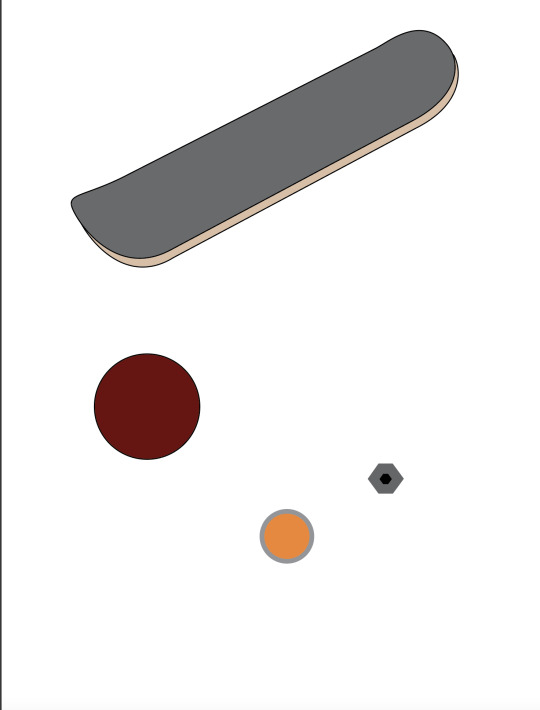
Once I had a 2D wheel I was happy with, I did the same thing I did with the deck, and gave it depth. This made it look much better in my opinion I also grouped the shapes together to make sure they didn't seperate.
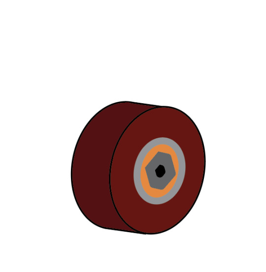
I then connected the wheels to the board, and decided to add some bolts which are how the trucks connect to the board, although you cannot see the trucks in my image.
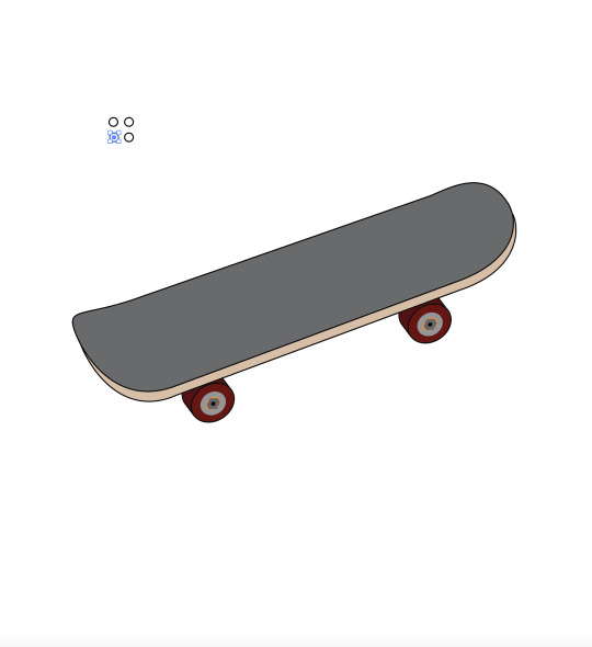
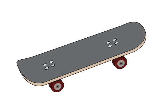
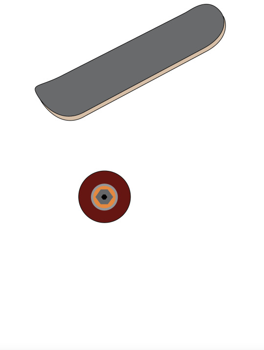
This was my final product. Honestly, it's not that good, but I think I've defintely progressed in using Adobe Illustrator compared to when I first started my course. I need to properly learn how to add shadows and more detail to things, since I'm definitely lacking in that department, especially in this drawing. I also could've made the bolts on the wheels and deck more 3D to create more depth and detail. Hopefully as the course continues I'll get that skill locked in aswell.
0 notes
Text
CLASS 4 HOMEWORK: COLOUR CORRECTION
We got homework to find 4 images that needed colour correction, 2 with colour and 2 black & white, and to correct them. Here are my images below, and reasons why I thought they needed correction.
The left side is before correction, the right is after.

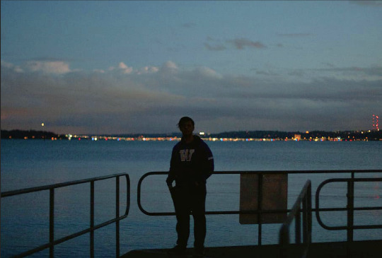
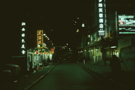

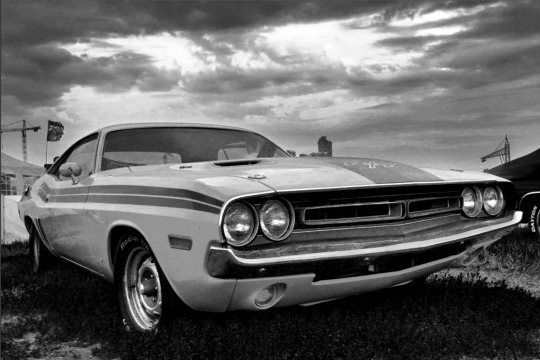


IMAGE 1 I think this image needed correcting because it was dark, and sort of reddish. Though the red may have been because of the sunset that I suspect is present outside of the image, I felt it would look a lot more natural and fitting for the ocean environment behind it to be a bit more bluey/green. I also wanted to brighten the foreground, as you can't really see what's going on all too well.
IMAGE 2 This image seemed overexposed. The brightness of the dark environment made it grainy, so I darkened the areas of shadow whilst making the light areas more prominent, but also keeping a good blend of colour between them. This made the image much clearer, pretty much removing all of the grain.
IMAGE 3 The third image wasn't too bad by itself, but I reckon darkening the shadows makes the car look more badass and strong, whilst also defining the clouds and the environment in the background. It also creates more contrast between the levels of light within the image.
IMAGE 4 The final image was very oversaturated. It may have been done on purpose to give the photo a sort of old fashioned look, but it did make the image very grainy, like the second image. Darkening the shadows in this image allowed for much more definition, although I may have darkened it a little too much, as there were some areas lost to the darkness, like the back of the main figures neck.
0 notes
Text
Fourth Class
The fourth class began with recapping everything we had learnt about anchor points in Adobe Illustrator. This didn't take too long as we just messed around making shapes for a short while. This was when our time on Illustrator ended, and we moved along to learn how to use Adobe Photoshop.
We were given a series of images that needed to be edited in some sort of way. We found that all of the images needed colour correction, which was what we would be focusing on in this lesson. We first learned how to colour correct black and white images, before moving to actual colours, as we needed to learn the basics first.
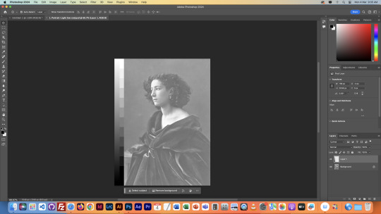

Below is the stock image, it came with a gradient beside it to assist us in correcting the colours. As you can see, the image is very overexposed. There is no black in the image, only light greys and whites. So we open a tool in the properties menu called curves, which allows us to control the line on the graph in the second image.
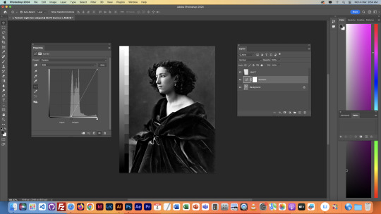

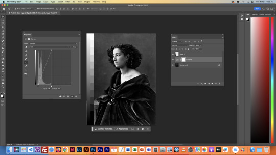
We used the curves tool to make the shadows in the image darker, defining the whole image better. We use the curve tool instead of brightness and contrast sliders, as it allows for more precise control, rather than the image as a whole, which prevents solid areas of colour from blowing out, ruining the image.
We also corrected an underexposed version of this image, shown below. So rather than darkening the shadows, we had to brighten the highlights.
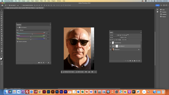
We next moved to an image of a cat, with very faint colour.
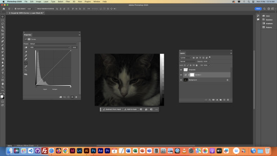

Using the same techniques as before, we were able to expose the light levels in the image better, as the stock image was very underexposed. This showed the details of the image better, like the features on the cat's face, and even a little of the background. Unlike the previous images, this image has colour, so we had to use a new tool to enhance the colours of the image.

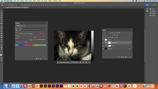
The difference isn't major in this image, but we used the Hue/Saturation tool to enhance the colours using the saturation slider. Saturation is the intensity of a colour, so increasing it can make an image more vibrant and colourful, but over-saturating it will ruin the image by distorting it into a sort of psychedelic looking picture.
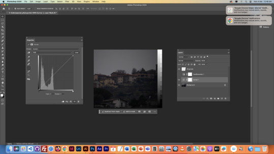

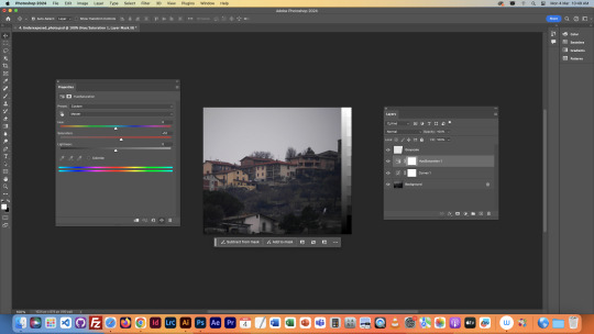
We then used what we had learned on this next image of buildings on a hillside. The image wasn't too in the beginning, but the colour correction made it a little easier to look at, and to see the details in the image.

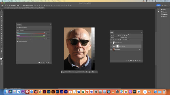
This next image was not really a colour correction. The image was already fine by itself, but we used it to learn what the Colour Balance tool is for. This allows us to control the colours of different parts of the image (Highlight, Midtones, and Shadows) splitting them between Red-Cyan, Green-Magenta, and Blue-Yellow. This allowed for even more specific control of colour, and the RGB used to create the image.
This image was cool looking, but very bluey/green. This meant we had to balance the colours with the colour correcting tool. I added a lot of red to the different parts of the image, and a lot of magenta. I had to add a lot to balance out the green I added to the Midtones to make the trees and greenery pop a bit more. I left some blue in the Highlights to make sure the fog in the distance wasn't too different, as I think the Blue looked good on it.
I then brought out the curves tool again, just as some areas in the trees were a bit too dark, so I brightened them a bit to make the whole image a bit clearer.


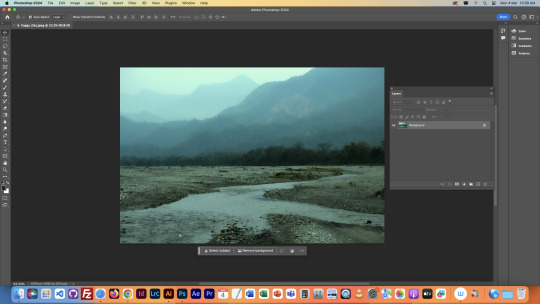
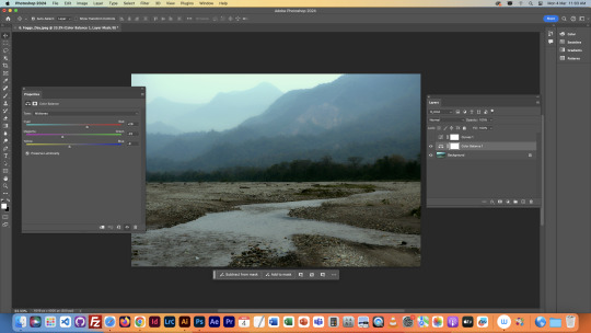
This image was probably the toughest one, especially as the clouds in the background were already blown out, so there was no saving them. The image was very red tinted, so we added some cooler colours and tinkered with the brightness in the curves menu to make the image look more natural. We then decided that the image had too much of a white border, so we wanted to add a vignette to the image. We did this by filling the image in black, and then cutting a hole in the middle with the ellipse tool.


Though obviously, this is way too solid for a proper vignette, so we needed to soften in a lot. We did this by controlling the opacity of the black border, and having it as the top layer.
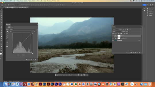
The next image was an interesting one, as it required another new technique.

The final image had an annoying imbalance in light levels, the lower part was too dark, and the upper part was too light. Therefore, when we brightened it to see the lower part, the upper part would blow out, and when we darkened it to see the upper part, the lower part became invisible, We solved this by adding a gradient to the mask in the curve tool, which you can see highlighted in the layers tab. The gradient went from the bottom of the image to the top, from white to black. This evened out the light levels, and allowed us to see both parts of the image clearly by using the curves tool.
NOTES

0 notes
Text
Third Class
We firstly started off by recapping what we had learned by practicing examples of all four of the point types. Just a quick refresher on what we had previously learned.


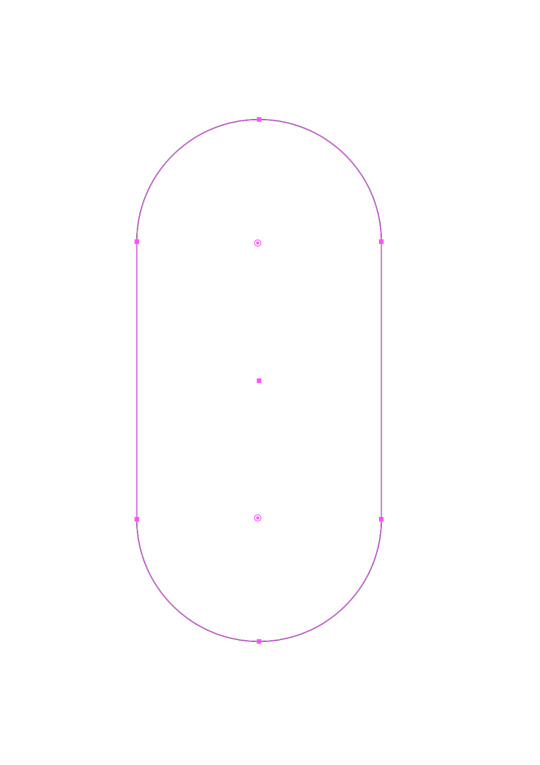
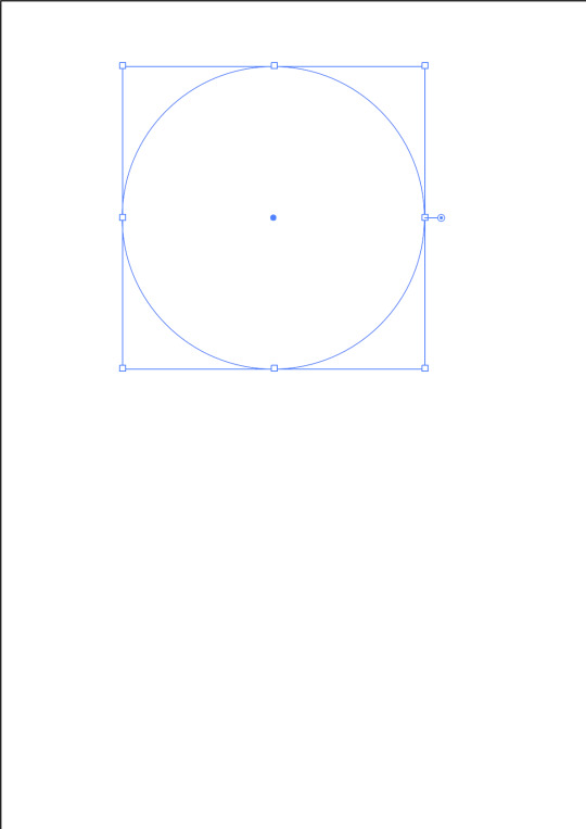
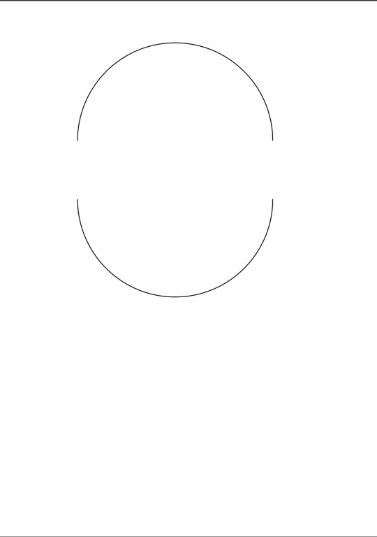
We then started to create a penguin. Firstly by using the Ellipse tool to create a circle, then separating it into two halves, and then connecting them with the Join command (which is in the notes at the bottom of this post) to create a pill shaped object. This was to be the main body for the penguin.

We then added a tail, and a little feather on the top of its head. This was achieved with another tool that created anchor points wherever you click. We used this tool to create extra anchor points that we would then drag outward to create the shapes necessary.


After this, we added some more features to the penguin, this included creating a wing, a beak, and the eyes. The beak was made from a rectangle, with the corners being rounded off with some adjustments to create a more beak-like shape. The wing was created simply with some curve and broken anchor points. The eyes were more complicated, using the Ellipse tool again to create a circle, then adding a gradient to it, changing the colour to blue and black, then adding another white circle to act as a highlight/glint in the eye. We also thickened the line around the shape. Then we grouped the glint with the eyeball so they would move together, and then duplicated it to create two eyeballs.


We then created the feet, this was done by creating half the initial shape, then using commands to symmetrically match the other side. Once the shape was created, we then duplicated it, and removed some segments from the duplicate to create a depth effect for the foot, which is the darker orange section. We then grouped the 2 pieces of the foot and created a duplicate of the whole object, then using Pathfinder we created an outline. We then grouped everything together and the foot was finished.

After the feet, we made some simple legs by making this cylindrical shape shown above. It just involved the bottom halves of some Ellipses being connected, then coloured in with orange.
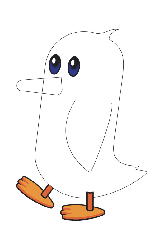


After the legs were made, we were finally able to put everything together and colour it in. The beak colour was matched with the darker areas of the feet, and the other colours were free choice. Now, the next part was quite confusing for me, but I got it done. It involved separating the parts of the penguin into different layers, as shown above. We then created a shape for the penguins lighter body part, after colouring the whole body a darker colour, and making a duplicate layer. Then using pathfinder, matched it to the outline of the penguin. This was as far as we got, there was still a little more that is covered in some online tutorials which I'll be watching. It covers pretty much adding shadows and more details to the body.
This was a lot tougher than previous classes, but I think I did alright.
NOTES

0 notes
Text
Second Class
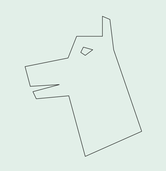
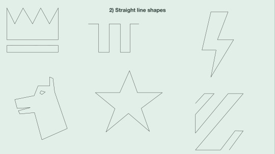
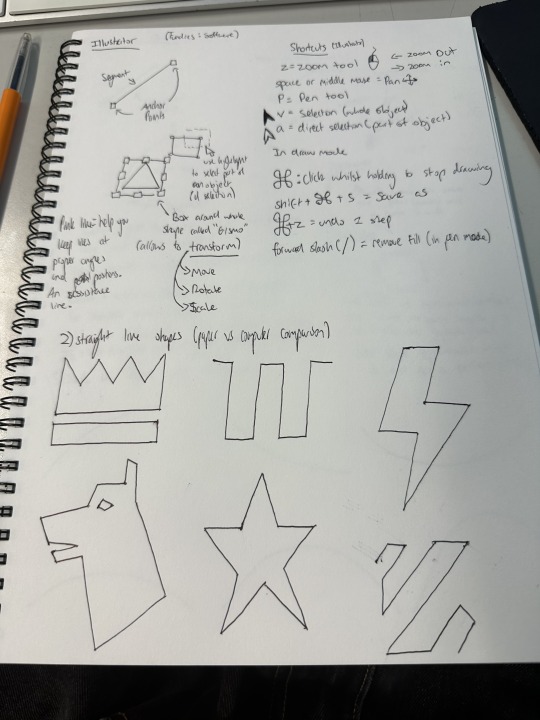
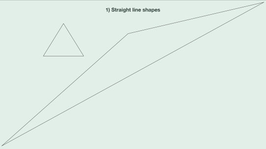
Firstly, we did some more straight line shapes, learning about how complex they can actually be, and compared them to drawing them on paper like the previous class. There is more on this in my notes from this class which are at the bottom of this post (Along with notes on every other section of this post). I found the Dog shape particularly complicated, which is why I highlighted it. It was interesting actually making a more complex shape with the new techniques I had learned.
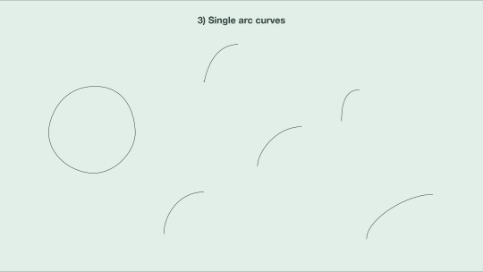
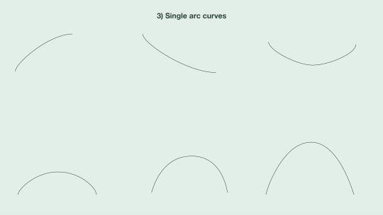
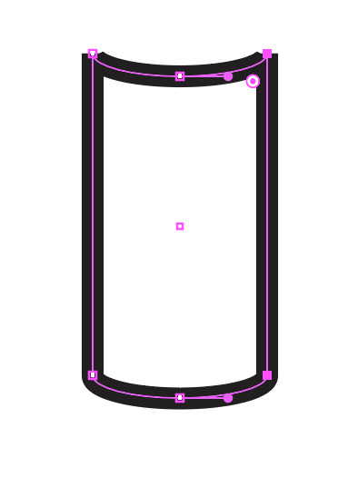
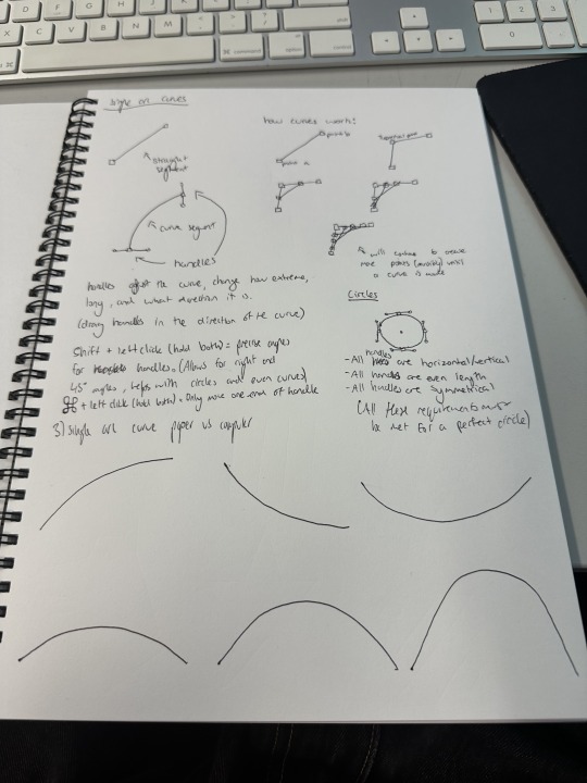
We then moved to learning about curved lines, starting with single arc curves (Although I did try making a circle). They're much more complicated than straight lines, as rather than just clicking two points, you need to create handles to control the angle of the curve, and adjust them accordingly. This was pretty simple to get the hang of though once you mess around with it a bit.
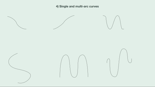
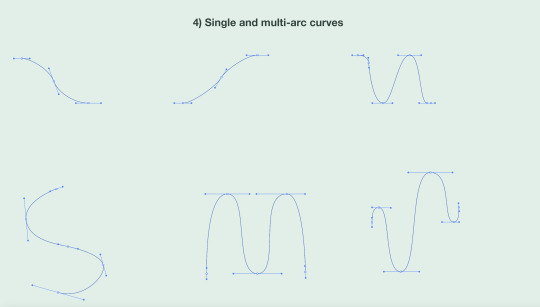
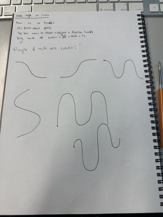
Next we added more points into the curves, turning them into multi-arc curves. This allowed for more complex curved shapes as shown. In the second picture is an example of all the handles in the shapes we drew, which are the lines with the dots on each end sticking out from each point in the shape. We had to learn in this section that the best way to make a symmetrical curved shape is to have even handles, though I am pretty bad at doing that as you can see.
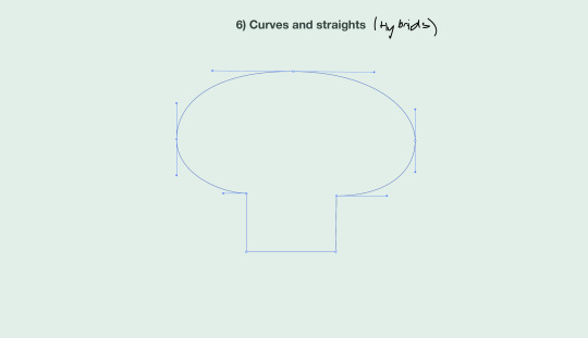
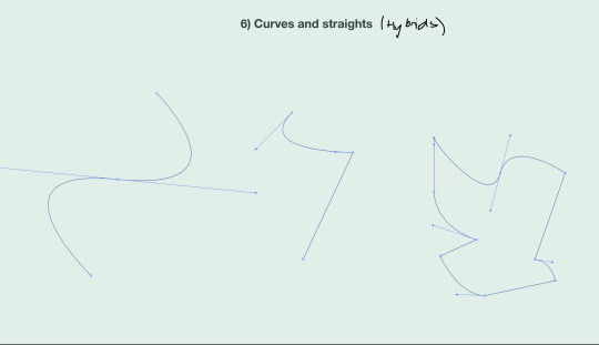
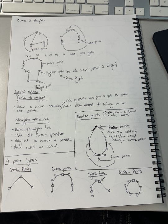
After that, we learnt about Hybrid points. Hybrid points have a straight line on one end, and a curved line on the other. These are much more complicated than the other two points from earlier, as they take certain keys to create depending on what order you put the types of lines in. The key is listed in the notes below. By this point, we had nearly learnt all of the types of points, but there was still one more.
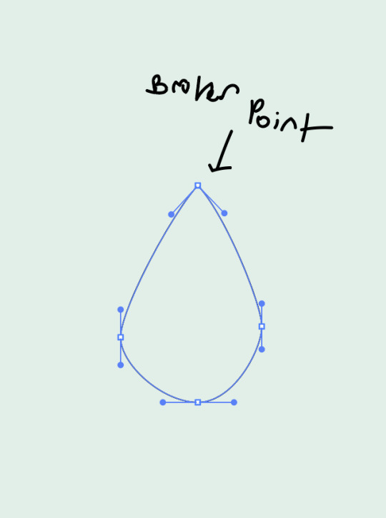
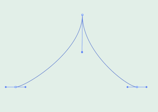
The final type of point is known as a broken point, as it is literally a break in a curve. It was just about as complicated as the hybrid point, also taking a button to create. It is achieved by separating the two ends of the handle on the point, and pointing them at different angles. As you can see at the top of the teardrop shape the handles on the joint are both pointing at a downwards angle in opposite directions, literally bending the handle and creating a break in the curve.
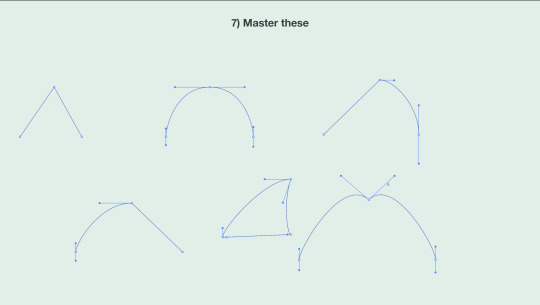
So to recap, there are 4 types of points:
-Corner Points: Used to create straight lines and corners -Curve Points: Used to create curves, achieved with handles -Hybrid Points: Used to connect a straight segment with a curved segment -Broken Points: Used to create a break/corner in a curve, allowing for more complex shapes.
We learnt how to utilise these 4 joints, and are now able to create any shape we want with Adobe Illustrator.
Notes from this class Page 1 - Straight Line notes Page 2 - Single arc curve notes Page 3 - Multi arc curve notes Page 4 - Hybrid & Broken Point notes
0 notes
Text
First class
First time using Illustrator. Learnt about the tools and their shortcuts, why the shortcuts are convenient etc. It's my first time using this software so it's unfamiliar but seems like I'll be alright.


Wrote notes to remember all of the commands and handy tips. Also compared drawing on paper with straight lines with drawing on computers with straight lines to see the difference. I feel more comfortable on paper but that'll probably change in the future.
1 note
·
View note