
Don't wanna be here? Send us removal request.
Statistics
We looked inside some of the posts by trevorjensen and here's what we found interesting.
Average Info
Notes Per Post
1
Likes Per Post
1
Reblog Per Post
0
Reply Per Post
0
Time Between Posts
7 days
Number of Posts By Type
Text
13
Last Seen Tumblr Blogs


Fun Fact
Celebrities use Tumblr as well.
Text
ARTGR 5200 - Journal 14
One thing that I discovered over the course of this course is the overlap between media and fashion. The way that we have discussed analyzing media in this course, including through hot and cold lenses and the various visual methodologies discussed in Rose’s writings also apply to fashion. At the end of the day, many, if not all, forms of media can also be forms of art. This connects to fashion, which can also be a form of art. The ways that we both critique and analyze media are, in many cases, the same methods we use to analyze art. When viewing from this perspective it’s easy to see that the ways that we learned how to analyze media in this class can largely be applied to fashion creation and critique. In the future, I would love to explore fashion design and I hope to do so while viewing through the lenses that I have learned to look through in this class, with the hope that it will make me a more insightful creator.
This line of thought can also bring up a question that I have thought about. Where is the line drawn between art and media? Media is understood to be anything that is used to communicate on a mass scale. In many ways, art can be understood to serve the same purpose. Art is the artist’s means of communicating their view of the world, or communicating what they perceive to the masses. When discussed like this, there seems to be little to no distinction between art and media. Perhaps this is the point of the course. If we learn to analyze media, it can give us a better understanding of analyzing art, and therefore whatever we decide to create as a designer.
Finally, one more thing that I have further curiosities about is the future of the study of visual culture and semiotics. Some of the main studies and philosophies that we looked at were many years old, and while they are still very relevant, it’d be interesting to look at some modern philosophies regarding the study of media. This desire to study modern material is pushed further by the rise of Artificial Intelligence in artistic spaces. Although I personally believe that any art created by AI is not art at all, it’d be interesting to study philosophies that both support and refute this point. Additionally, it’d be interesting to see if there are ways that AI is not being used to create art, but instead aid artists in their creation of art, in a way that doesn’t diminish the medium or the final piece.
0 notes
Text
ARTGR 5200 - Journal 13
This is not part of my journal, merely a disclaimer. -
For the analysis project, I originally planned on exploring how love is depicted visually in film. After beginning to explore how I would complete this analysis, it became clear that this topic is not only something that would be extremely difficult to complete a project about, but I also completely lost my passion for the subject. I no longer had any drive to complete the project using this prompt. For the last week, I have tried to find any direction that I felt I could make a quality analysis over, and that I would find a natural curiosity to explore. My search led me to many places, but ultimately, I knew I wanted to explore depictions of fashion. So, for my project, I have finally decided to explore how sexualization is depicted in men vs. women in fashion editorials. My final driving question is this -
How do fashion editorials sexualize men and women differently through pose, gaze, and styling?
Other questions include -
Does contemporary fashion move toward more equal, ethical, and diverse depictions of sexualization, or are traditional gender and sex norms continuing to thrive?
Are depictions of sexualization only for the heteronormative gaze or is there is there a gaze targeted towards homosexual individuals also?
Are editorials that focus on LGBTQ+ fashion more or less likely to depict sexualization in a dangerous way?
What visual strategies do companies use to eroticize the human body, and how do these reinforce traditional gender stereotypes?
Now, the journal -
The question that I answered is what visual strategies do companies use to eroticize the human body, and how do these reinforce traditional gender stereotypes? After looking at many pictures depicting male and female models in different publications, some things became clear regarding the difference in their depictions. No matter how they are posed or shown specifically, men more often than not appear in a power position, their clothes, and overall visual appearance is supposed to convey a sense of power. When shown nude, the male figure is supposed to show a sense of musculature not in terms of beauty but strength, power, and dominance. Conversely, the female figure is usually shown in a much more submissive and passive state. Female nudity is significantly more common, and as opposed to men who are shown nude because of strength and athleticism, women are shown nude almost exclusively for “beauty” purposes. Women depicted nude, or almost nude, are almost entirely shown this way to sexualize them. Sometimes, women are shown extremely revealing, and the ad has no relevance to nudity, like in perfume ads.

This Gucci fragrance ad is one of the images that I chose to analyze. The woman in the ad is shown in an extremely submissive position, with her eyes closed, pressed against the man, facing away from the camera, and no clothes on. Conversely, the man is shown in the dominant position in the ad. He is facing forward, looking at the camera, and has a calm and collected expression. This ad is just one example of a reinforcement of the male gaze in the fashion industry. Additionally, when searching for an ad to analyze, this was not even close to one of the most sexualized ones. In fact, this one is relatively tame. This shows that this practice of sexualizing women and reinforcing gender stereotypes is extremely normalized and dangerous to society.
0 notes
Text
ARTGR 5200 - Journal 12
In my analysis project, I am exploring the depiction of love in cinema and how directors and writers of cinema have portrayed it correctly or wrongly. Because of the nature of my project, I suspect that obtaining research for my final product will be relatively easy. The primary source of my research will obviously be the movies themselves. Using movies, I can get the primary gist of my argument, but I may need other sources too. I have some books from the library that contain anecdotes from movie directors and critics that I can also use. If I need more books about cinema, there are definitely more at the library that I can go check out if required. Finally, one of the things that inspired me to choose this topic in the first place was YouTube video essays that I have been watching recently. Using these videos to inspire my thinking, I can refine my topic, find precisely what I’m looking for, and grow from there. I can also use these YouTube videos to find more sources that could be helpful when writing my final product. I think that these are the most appropriate methods for researching my project because it is not only where you will find the most opinions, but also the most passionate opinions. When researching movies, I find that the opinions of true fans of cinema are often more valuable than critics because they have a much more passionate and rich love of cinema. Look at the Oscars and the Emmy’s for example. Many, if not all, years the critics and voters get the choices wrong and enrage fans, including myself. This is because the opinions of critics are extremely biased towards a privileged worldview. Some critics even admitted they don’t watch all the films in specific categories. Looking towards the opinions of more passionate fans will ensure that you find more quality results.
0 notes
Text
ARTGR 5200 - Journal 11
For my pilot project, I am doing “How film directors depict love and how to do it right.”
What are some movies that depict love well?
What techniques does the director use to ensure the audience gets the idea?
Where do films go wrong?
Has the depiction of love in film changed? When? How?
I am interested because some of my favorite films are stories about love. Two of my favorite movies of all time, Before Sunset and Chungking Express, have love as a central theme in the movie. I also love it when directors show that characters can love things in an unromantic way.
0 notes
Text
ARTGR 5200 - Journal 10


For my journal, I chose the in-game usable map from the video game Pokemon: Legends Arceus. At the beginning of the game, I found the map actually fairly difficult to use and navigate. After playing the game for many, many hours though, I began to get the hang of it, although I still think it could’ve been presented better.
When creating maps for navigation in real life, the map maker’s goal is very clear, to make a map that makes navigating an area as easy and accessible as possible. However, in video games, developers do not have this same goal in mind, which makes grading maps in video games much more challenging. In some games, the map provided by you will have the same goal which is to help you navigate the area as easy as possible, but in most video games this isn’t the case. Video games are supposed to give the player a sense of adventure and many times mystery. This makes making video game maps a hard challenge to navigate. How much information should the map give you before it takes away from the sense of adventure and the player’s natural curiosity? Some games take this notion even further, not even providing the player a map and forcing them to navigate purely off wits. With this being said, it should be clear that if you grade video game maps and find they are missing stuff, it might be on purpose and actually for the benefit of the player experience.
The map in Pokemon: Legends Arceus has three toggleable zoom features. The first shows the entire region of the game, or all of the playable areas. Toggling the first zoom throws the player into the region of their choosing. The game then highlights some collectible items that are available for the player to pick up, along with some topographical features, and some names of minor geological features. There is a third and final zoom too. This zoom doesn’t do very much though. It doesn’t add anything new to the map, but instead just makes the second zoom larger on the screen. However, the map doesn’t reveal everything. It conveniently leaves out the main part of the game; where pokemon are available to catch and battle. This is because the player is supposed to seek these out for themselves, which is the main part of the fun and adventure of the game. Leaving these out is a good decision by the map maker because revealing these locations would damage the player experience greatly.
Finally; I graded the map based on Wood’s ten codes.
1 - Iconic
The map has some iconic features. These features include symbols for caves, base camps, mass outbreaks, lost satchels, and if the player chooses to place one; waypoints.
2 - Linguistic
The map has very little linguistic features, although it does have some. If you hover over an icon, it will tell you the name of it. Additionally, some minor geographical landmarks are named on the map.
3 - Tectonic
Some tectonic features are on the map but not many. Mountains, valleys, and certain other biomes are highlighted in different colors. There are also topographical lines indicating elevation changes and some dots for trees.
4 - Temporal
There are virtually no temporal features on the map. Without prior knowledge of the game, you would not be able to tell that it is set in feudal Japan. The only slight temporal feature is the inclusion of the time of day in the top right with a small icon alluding to what time it is.
5 - Presentational
Many of the before mentioned features also fit under the presentational umbrella as well. Things like icons, typography, and the use of color all play a part in the presentational ability of the map.
6 - Thematic
The map is about navigating the fictional region of Hisui, set in the Pokemon universe. It is important for the player to be able to find their way around this new world they have begun playing in.
7 - Topical
This map is about the region Hisui, and the five sub-regions that is divided into. In each of these regions there are some landmarks, with most having distinct names placed with them.
8 - Historical
If you were an outsider looking at the map, you would basically have no idea what time period this map is from. There are no years or dates associated with the map at all.
9 - Rhetorical
As I’ve mentioned before, the map is the developer's way of telling where the player should, and should not go. Some features of the game are deliberately left off the map so the player’s natural curiosity will take them there.
10 - Utilitarian
The point of the map is to make the region in this game easier to navigate for the player, without taking all of the fun out of their adventure by giving them all of the information, hoping that the player’s curiosity will take them to the parts of the region they need to go.
0 notes
Text
ARTGR 5200 - Journal 9
During the presentation regarding the Staff of Hermes and the various other medical emergency symbols, I thought a lot about how compared to some of the other presentations, my presentation about the recycling symbol and this presentation were actually pretty similar. Both of these symbols must be immediately identifiable for people because of their importance. Although there were other symbols that were also important, many of them aren’t as essential as a medical emergency or recycling symbol. During the presentation about the various medical symbols, a few different ones were brought up. When discussing all of these symbols, it was evident that if you were to create a new symbol, it needs to borrow from old symbols so people don’t get confused with another new symbol, but also needs to be changed because something isn’t working or else they’d have a clear symbol already. This is similar to the process I went through to make my new recycling symbol. I wanted to borrow from the old logo so people could follow along, but also wanted to change it because I didn’t believe it worked right the first time. Seeing how he used the past imagery of the wings of the Staff of Hermes along with the six pointed star from the new blue symbol, confirmed my belief that I was headed in the right direction when I created my new symbol. I do believe that my symbol could go through some refinements to make it better, but using these same reasons, I think I was headed in the right direction. In mine, similarly, I incorporated old elements like the chasing arrows in an orbit, but also new original elements. I decided to go with a standard accessible symbol of someone throwing trash away to show this. I’m glad that I borrowed some of the old logo, but using what I learned from the Staff of Hermes presentation, maybe I would’ve incorporated more old elements to make it look even more recognizable. One way I could do this would be if I didn’t change from three arrows to six and instead just left it at three. Also there was a criticism I received that putting the arrows in a triangle as opposed to my circle would’ve made it more recognizable, and I agree with this and totally could’ve done that. Overall, the Staff of Hermes presentation helped me realize that I was on the right track using classic elements in my symbol, but perhaps I should’ve explored some logos where I do that even more.
0 notes
Text
ARTGR 5200 - Journal 8
For this journal, I read the article “Colour and Gender”. In this short article, the author tells the story about how specifically blue and pink became associated with boys and girls respectively. At the start of the 20th century, most people dressed both boys and girls in white clothes because they were easier to clean. At the end of World War I, many companies started selling gendered baby clothes because they realized they could make more money. Although originally pink was associated with boys and blue with girls, after WWII, these were flipped around to what we know today. Today, you can still see color’s association with gender. Many people will gift certain colored baby clothes based on what they know the gender will be. Some of these associations carry on to adults too. Men are less likely to wear pink or purple because of fears of masculinity. Although personally, I don’t really care what color I wear, I’d be lying if it hasn’t affected me before. Many times I like to wear clothes that appear androgynous because I don’t agree with many gender roles and norms. Because of this, I find that a lot of times I wear very neutral colors like blue denim, white, brown, and most of the time, black. Whether I like it or not, society’s associations of color and gender have forced me to change the way that I dress, for the better or worse.
0 notes
Text
ARTGR 5200 - Journal 7
choose the topic he covered that surprised you the most, that raised questions you really hadn't ever considered, and explain what it is and why you think it had never occurred to you to question it; and
One of the discussed topics that surprised me the most was “Color Psychology”. Although I am familiar with the topic of color psychology, there were a few different color applications that I wasn’t familiar with that surprised me. Obviously, I knew most, if not all, of the Western color associations, but some of the Eastern ones were new to me. Some of the applications of white surprise me the most because when I think of white, I think of a color that is untainted and pure, the absence of color is white. It’s hard for me to think of a reason that white would be anything other than this, but alas, this article has proven my ignorance. This happened for multiple colors in this article. I try to make sure I am educated as a designer, but there is always more to learn, including about color.
choose a topic he covered you were already familiar with, and explain why/where/how/in what context you became so.
One of the articles that I found interesting and expanded on topics that I had never considered before was the article “To Color or Not to Color”. I think that before, I had considered how color can impact how view the world around us and can change our reality, but hearing the example that he gave in the article was a welcome reminder. Coloring Palestinian camps that have been leveled with destruction is a good way to make people think twice about the destruction they see. So many times we see war-torn cities as just these gray piles of rubble but increasing the color saturation makes us create associations with them and view them differently, increasing feelings of sympathy and empathy. Although this specific example was new to me, it reminded me of what the CIA did to photos during civil rights movements in the 1960s. Even though pictures would be taken with the full capability to be seen in color, the government, including the CIA, would remove color from pictures to make them seem like they were taken long ago. As a result, people would forget about these movements because they thought they had happened long ago, but in reality, there are people who are still alive today who participated in these movements.
0 notes
Text
ARTGR 5200 - Journal 6
subject matter/choice of medium - For Journal 6 I was paired with Gretchen Schmid, and her media of choice was TikTok. TikTok and my media of choice; music, are actually closely related. Since TikTok’s emergence, music and it have had a tumultuous relationship. TikTok has a reputation for stealing music and giving basically no compensation to artists except for recognition, along with other problems. However, many artists have found that TikTok has given them a platform to find new fans. Regardless if good or not, since TikTok’s inception, the relationship between it and music has been undeniable. They also share some similarities though. TikTok and music can be argued to be both hot and cold mediums. Videos on TikTok or songs can have varying levels of audience interaction required making them both hot and cold.
analytical approach/method - Both Gretchen and I argue how our forms of media shape popular culture today. I do it by arguing if music is a hot or cold medium. A difference in our arguments though is that mine is deeply rooted in music’s history and how it has changed greatly over time. Although Gretchen also brings up not just TikTok’s history but the history of video formats in general, music’s history is more linear and easier to apply to the hot or cold debate. This means that I use history a lot more in my argument.
image choices - In both of our presentations, Gretchen and I used our presentations to accentuate our argument, but not tell the story for us. Our slides are there so there is a visual for our speeches, but our arguments don’t require you to look at the screen to understand what we’re saying.
0 notes


Text
Is music hot or cold? Can it be both?
For my encoding project, I am choosing to discuss the medium of music. When I began to research if music was a hot or old medium, I got conflicting answers. Many places described it as a cold medium, including Marshall McLuhan himself long ago. I can understand why he would’ve said this at the time. During the era that Marshall McLuhan was publishing his theories, many genres of music were just being conceived. The primary genre that McLuhan likely would’ve been alluding to being cold would be jazz. This makes a lot of sense. Jazz is highly improvisational and, most of the time, has no lyrics or vocals. This means that the listener must take an active role in the composition and try to interpret the piece themselves. These are key characteristics of cold media. However, this was long ago, and since then, many other genres of music have been born. It can be argued that among them are both hot and cold genres. Genres that require a vast amount of audience interpretation, such as jazz, are cold, such as blues, lo-fi, and ambient. However, since McLuhan’s initial theories, there have been genres that have popped up that are warm. These include metal, pop, EDM, and classical. All of these genres have clear start and end points with little to no audience participation for interpretation. There are also, however, some genres that align in a gray area. These genres can vary from artist to artist, song to song, verse to verse, or even word to word. Some of these include rap, rock, and electronic. Although electronic music overlaps a lot with EDM, making it seem like a hot medium, some electronic songs rely on ambient or psychedelic music, which makes them colder. Rock can be cool because, many times it relies on audience participation, like in raw recordings of punk or garage rock. More mainstream rock, like stadium anthems, have a more central focus and message, which makes them pretty warm. The one genre that I believe to be the most ambiguous, however, is rap and hip hop. Rap and hip hop descend from many different genres but probably most notably, jazz and blues, a warm genre and cool genre. You’ll find that rap music’s medium warmth or coolness depends a lot on the listener. Many people listen to trap music which is a more commercialized rap meant for the purpose of entertainment. Its job is to tell a complete story on a song with little need for participation from the audience. Trap music is definitely a type of warm media. However, there are also artists who use rap as a very cool medium. Many artists tell their life experiences in their songs with double and triple entendre with hidden meanings behind every verse. Rappers like Kendrick Lamar, MF Doom, and early Kanye West use rap music as a means to tell a story. This means that the audience must participate in the song, making it cold. However, many of these artists have songs on albums that have cold and hot songs back to back with no warning. Making hip hop and rap arguably the toughest genre to decide if it is hot or cold. Overall though, in my research, I found that as music has been commercialized, it has begun to stray away from creating to tell a story or just to create art. Instead, most music created now is for commercial or entertainment use, moving towards music as a hot form of media. It is important to note, however, that almost all music is entirely up to the listener. The listener has sole discretion over what songs or artists they decide to be hot or cold, depending on how much they decide to participate.
0 notes
Text
ARTGR 5200 - Journal 3
The McLuhan reading about roads discusses how the invention of roads during the time of the Roman Empire eventually led to its collapse. Similarly, they also talk about how the American colonies grew beyond the British’s control, which led to the American Revolution. Today, I believe this same principle can be applied to the boom of fast communication. In the last few decades, we have suddenly been able to have instantaneous communication with virtually any part of the world. This new mode of communication means that we can see how the outside world reacts to us and how we react to them virtually instantly. It has become apparent very recently that the American government is afraid of this. Take the TikTok ban, for example. In decades past, Americans had little to no knowledge about how our government was funding wars around the world. Although we might’ve known it was happening, it was hard for the average American to see exactly what hospitals our tax dollars were blowing up. Today, however, through mainstream social media, the most widespread being TikTok, we can see entire cities in the Middle East flattened by American bombs hours after it happens. The government never wanted us to see this. This is proven by their swift movement to ban TikTok shortly after public opposition to the funding of the Israeli genocide machine hit new highs. The American government is well aware that unless they can control or ban social media apps that promote global communication, the people will realize what the government is doing and oppose it. If we can see where our government is going wrong around the world, and examples of governments that don’t have this problem, citizens can begin hoping for a restructured government for themselves. If enough people can sympathize and agree with this, it will start to become a movement that could threaten the hierarchy of power in the government.
0 notes
Text
ARTGR 5200 -Journal 1
In the first couple episodes of The Ways of Seeing show, John Berger references the concept of the male gaze a lot. Even in art that dates back long ago, the perspective of art is through the eyes of men. With the modernization of technology and the internet, this because painfully more evident. Even with all the advancements in women’s rights, they are still marginalized in art today. Most art created today is still made for the male gaze unfortunately. Additionally, we are so attuned to creating for the male gaze, that a lot of people don’t even realize they do it. Discussed in The Ways of Seeing, creating for the male gaze opens the door for objectification. Nearly every time we create for the male gaze we, reduce women to objects, dehumanizing them in the process. Consuming enough media like this can lead to people to treating women like they are objects in real life as well, leading to prejudice and misogyny. Because of this, women often adjust themselves to fit more into the male gaze. They are forced to appease to certain western beauty standards which causes low self esteem and body dysmorphia. This along with constant threat of gender violence, and other looming threats has lead the male gaze to cause detrimental damage to women forever. Obviously, women have been the main target of the damages of the male gaze, but men also must deal with the consequences.
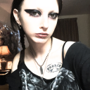
Some of the items I cherish most out of everything I have ever owned is my wardrobe. Although many people don’t think of it as such, what clothes you put on your body is not only one of the most important decisions you make every day but also one of the most political decisions you make. What clothes you wear indicates to others what outgroup you are a part of. Wearing even more specific clothing item can tell others your gender identity, sexuality, who you voted for, or even something as small as who you rooted for in last night’s football game. Your clothes aren’t just what you put on your body, it’s one of the most important forms of communication. Not only are clothes important to me for these reasons, they are also important because they’re a long time in the making. When I was in high school, I was too worried about what in group I fell in with so I wanted to appeal to people as much as possible. My clothing choices along with my appearance in general reflected this. I looked how I thought everyone wanted me to look; boring, bland, ordinary. Although it began towards the end of high school, once I got to college I realized I didn’t have to be that person anymore. I started dressing the way I wanted to and no longer cared about fitting in with people I didn’t even like. I started experimenting, got piercings and tattoos, I painted my nails and wore makeup. I felt more like myself than ever before, and it was liberating. This is a peerless example of how the male gaze is detrimental everyone, not just women. I was trying so hard to fit in with society’s perception of masculinity that I lost myself. Thankfully, I finally eventually found myself, but there are others out there that will unfortunately, never have that opportunity.
1 note
·
View note