
Last Seen Blogs

incorrect-7kpp-quotes
That's What She Said!

bul-bo
Bulbo
vartg-fasolkahord
V)ART(G
graveincarnate
cat dead, details later.

modernstonecare
Modern Stone Care
Text
Conclusion: Evaluating and Understanding
I have come to the end of this project, and I reach it happy in my conclusion. The last project had striked me with anxiety and fear, I wondered if I had any artistic future left to advance through, every project, no matter how good or unique would be dashed and strained by any other artistic work I would even take a moment's glance at, thankfully, by the end of this project I am pleased with the work I have produced and its quality and quantity. While not the most plentiful harvest, it was quite the achievement with only 4 weeks work put into them.
Obvious improvements could be made now, with the aid of hindsight, like improving my first work that now looks flat compared to the next two works, but I am appreciative with their outcomes.
I was quite annoyed with the band I chose to work with, little to now feedback was given, and when it was, only one member was replying. Apparently this was due to issues coming from within the band and overall lack of consistency that they upheld, such as some not being in on the same day as others and a serious case of in house conflicts that I had no part in. Thankfully, they seem happy with the outcomes, from what little I can infer. In this project I am expecting to be compensated for my commissioned work as this project has been in part a warmup test for continuing commission work outside of school after our FMP is wrapped up due to my current goals and expectations.
My biggest fear when this project came to an end was if my work would be good for a commission. Commission work is a weird can of worms, as the prices vary depending where you go, and I wondered if my works and those in which to come would survive the landscape, but after looking at a sleuth Of album and single works, and others in different artistic mediums, it seems that anything can be art in the eyes of media. Your art is to catch one’s attention, to grasp at their thoughts, your art, while having to be good, does not need to be a work of prestigious art. Look at Dark SIde of the Moon, the art itself is minimalist, compact, vacant, yet it has become one of the most prestigious album covers of all time in part to the music itself that has made the cover a household name. That's not to give the cover any credit, you probably wouldn’t know the album cover of the songs Take On Me or YMCA, because they were generally one hit wonders that overshined their own creators to the point they became overbared by it, even if they were to continue to make music later on that was just as good or better.Anyhow, I will never be certain if any art I produce gets any major recognition, if any at all, and I have come to terms with that. While I would be happy for my work to be recognized, many who are more talented than I never will, what is the morbid truth. But if I do, I hope it's something good rather than my work being degraded beyond belief.If I had to redo this project I, at this time, could not think of much to change. I think all the work is to the highest standard that I can produce as of now. Of course later I could improve my skills and therefore the work, but I would hazard a guess that it would practically stay the exact same as it is now. It has been fun to produce these works and I have learnt more about my probable eventual future job if all goes according to plan in the future.
0 notes
Text
Research: ALBUM and SINGLE covers and other forms of musical media
Album art is unique in the idea that it needs minor to no changes when moved into other musical mediums, unlike other forms of media like games. Vinyl album and Single sleeves and even CD and phone displays all adhere to the same sizes, the same ration all the way up and down. This means that a publisher who prints the product can make one one design and copy and paste it onto another product saving time and resources.
Most digital covers can fit a 3000x3000px measured square, as all album art, except a few outsiders, is square in nature, but it can easily be changed to any equal variable of height and length as the product can be downsized to a smaller size later on, and by working on a larger canvas you are able to include more details even if they could become blurred when made to fit. Other measurements are 8x8, 4.7x4.7In, 10x10, 12x12 and even 4000x4000px, anything is allowed if it is to a 1:1 ratio In real life though, the standard size of a vinyl cover ranges around 12.375x12.375 inches. In my project I have worked on a 3000x3000px canvas that can be fitted into this size, but I picked this size as their art is not going to be printed due to their garageband nature.
As you may be aware, Vinyls are now a form of collectable media, they are rarely kept for the sole reason of playing music due to the decline of physical media that is being seen in nearly all forms of art as we move towards a far more technologically advanced future. Vinyl was overcome by the CD, as much smaller, one could say, compact disc, that could hold tenfold what any vinyl could keep, and to boot they were cheaper to produce, took less space and were portable ulike a record player. The writing was on the wall at that point, and this was a Huge blow to vinyl sales, and eventually the were basically put out of production around 1989 when they were no longer mass produced, being overtook by CD around 1988, only a year prior. But even now, CD’s have also suffered a similar fate to their bigger brothers as streaming music became the next big thing with their digital predecessor, the MP3 players, being released during 2001.
Welcomingly, Vinyls had made a resurgence in recent years, with people becoming sentimental with the past and trying to retrieve what they sold off. Not only are vinyls being sold again, with some stores opening specifically top sell them and other having them in stock, such as His Masters Voice and record stands down back alley streets, but new vinyls are also getting printed, and not only be larger companies but also by indie labels due to the profitability. Records are being reprinted while others are being printed for the first time, like Jamiroquai’s discography that came out after the first vinyl release of his most influential album, Travelling Without Moving, for its 25th anniversary in 2021, a personal favorite of mine.
This uprising began all the way back in 2007 and has been steadily increasing ever since, just this year, Taylor Swift's most recent album, Midnight, had reached over one million presses on vinyl in the U.S, outpacing it’s CD brethren in sales. In the UK, it was determined that at a time ¼ albums brought where in the vinyl format, an oddly frightening scale.
It is clear to see that the vinyl has returned to a nice position of relevance, while the format is not the best way to indulge in the music it plays, its size allowing for a nice sized art piece, it slight, homely imperfections, and the bonuses that are usually found with them make them a great buy for nostalgia and to support artists work, what with streaming has become a cause of concern for smaller indie artists that could have been harmed in the transition.
0 notes
Text
Google Forum about art produced during the topic


The first cover was well received by those who viewed it, averaging around a 9, a near perfect score for me as 10 is an impossible goal as it means to be without flaw, and while one did tick 10, that is more likely due to our views on scores differing majorly. I threw another variant of the cover, one removing colour other than the eerie purple shadows, I asked if they liked it more or not, half saying no, while the rest didn't put it above or below, I liked the colourless version, but it’s apparent that might be a personal bias. Mostly, people favoured the detailing and look, there were points about readability and the area, but others said there was nothing to quote on. I also prompted if the art would make them curious about the album, where some said they would look into the project if they saw it in the wild, what is a good quality to have. Overall, most agreed that I had finished what was stated of me, except for one of the 6 who viewed it.
-----------------------------------------


The second cover was also well received by the audience that saw it and seems to be the more preferred cover as seen at the end of the form even if it does have a few stranglers in the middling community, but this could just be due to them not seeing it as, “Galaxy” enough, what makes later questions weirder later on. Averaging around a ten, what is impossible in my eyes due to my personal views on the 1/10 structure of reviewing media, It seems the most liked aspect is controversial, all of the reviewers gave different choices, such as the text and solar flares and the cracks, what isn't bad at all, but could lead to the piece being very all over and that its hard to concentrate, but that’s just an assumption. The most hated aspect followed the same trend, one hated the bottom right of the picture, saying it looked out of place, another referred to the red outlining of, “Lies” what I agree with, but was a personal change made by the commissioners, so I have nothing to explain further. However, while it had higher scores than the first cover, less people seemingly would be interested in buying it, at least two of the 6 wouldn't go further into looking into the product, what is weird but fair. Only one participant thought it did not follow the brief correctly, but this question was copy and pasted as I had no further info on what to make other than being told to make it, so I had no way to change to prompt I was given other than adhering to the original idea given.
-----------------------------------------


This piece is probably one of the more controversial and weird of the pieces that were reviewed. I actually has a high score of 8.5, but many thought it did not follow the original prompt, which makes fair as the piece is more abstract and it could have been cause that they did’t understand the background which was supposed to imitate a planet and sun. I also had a second cover in this slide, one without shadow, I added this as I wonder if the would preferred it over the shaded version as it gives it a far more cartoon and vibrant feeling, however it was not as well received as the original. The most liked part was the details, and the overall loom portrayed. The most hated aspect was that it wasn't space themed enough even though I based it on cosmic horror, what either wasn’t clear or not picked up on by the reviewers. Overall, some would look into it and some would even buy it if they saw it was good. Two also though it didn’t adhere to the prompt, but yet again I was told to make this one so I have no quarrys.
-----------------------------------------

By the end, art piece 2 was the overall victor, followed by art piece 3 then 1. This was not my overall expectation, I did think the second one would be liked but I would have never thought it would be over the other two as it is the most simple one of the bunch as the most generic, but I was proven wrong. It is quite annoying, as it was also the quickest to produce and make the other two feel like I should have finished them quicker. Overall, from this form I have learnt that it is good to get reviews and feedback from others that sadly was not that prevalent in my work due, once again, to their poor communication overall, but by the end of the day, at least it all came out well and that they’re happy.
0 notes


Photo

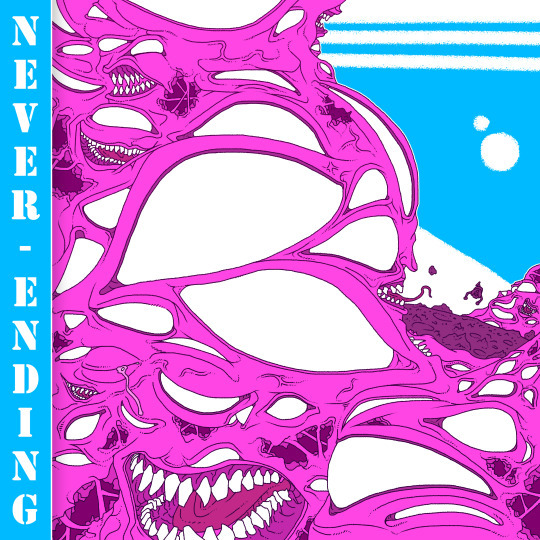
This is the final piece I should be making during this project, being the second single cover, Never Ending. This one, like my previous work, only took one day (6/7 hours) to produce and is, probably, my favourite of my 3 pieces done for my commissioners. The piece focuses on a wall of bubble gum flesh, its surface decorated by an army of blistering eyes and gnawing maws, most shaded by the monstrosity heaving mass. In the distance, a planets surface is seen, and another of these creatures can be seen in the distance. In the background, we can see a minimalist sky box representing a far more clear blue space, a neighbouring planet circling the same sun they are. This piece was inspired by the middle left concept cover from my original plan, and it is the most changed from its original vision.
Originally, the creature was going to be representative of a galaxy, a swirling mess of eyes all encircling the middle of the frame, however, due to the first two projects already encompassing this theme, with the first being a centralised work and the second being a sun with its orbit restrained in an eye, I thought it would be too repetitive and so moved its direction to be more monstrous and alien. Thankfully, this cover is for another single, and so I wasn't restricted to the Gemini themeing and could make it its own thing. I wanted to make a piece that was more complex than the original two, and by adding a background, no matter how simple it was, gave it more death and portrayed their size, I also made it the most colourful piece so It could stand out from its darker and more detailed siblings.
I was going to have the background be more detailed, with a sun burning in the distance, however I couldn't make it look right, and due to time constraints I just forfeited it and left it simple and bright to compliment the main view. I was also going to have the tile bar on the left take up more of the screen by making the shadow fade into it, creating this cool look and saving me time, but as I tried to manufacture this look, it became more and more apparent that the simple border that the title already had fitted it and it was simpler to add more parts to the monster than trying to make it work, it also gives the piece a more rectangular feel, making it feel taller naturally, what is pretty nice.
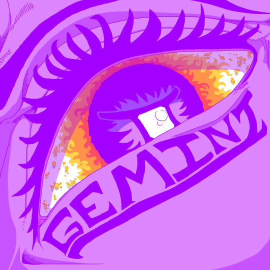
I also found out that I liked the piece without shadows. Usually I think that my matte flat art looks off, with shadows adding needed depth that makes it fell alive, however, this piece is naturally dimensional, and I think due to that nature it works just as well without it, adding a new view of the piece. In this look the colours hold the piece up instead of the shadows, making it pop far more. I actually can decide with variant is my favourite as they both have their own charms to them, but that is not my decision to make.
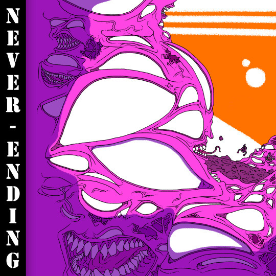
No shadows:
Older colours when attempting to make a bigger Title border:
0 notes


Text
Research and Inspiration, Don Ivan Punchatz


Don Ivan Punchatz was a name I never knew till I wanted to do my first single cover, who’s main look was derived from the Doom original logo, where it took its angular and detailed inspiration from. He is well known for his surreal, weird and galactic pieces, doing work for book covers and, his weirdest piece in his portfolio, a game cover for ID software, the makers of DOOM. This might be his most know piece, with DOOM being the big granddaddy of first person shooters, revolutionising the genre, because of this, it has cultural significance in the hearts of many, helped by how well the piece has aged over the years. Nowadays, most artwork for games is rendered in the game, being pretty bland or generic, but back way when, it was done by hand usually, creating this surreal work what is more in line with its close media relatives.
Doom is not an exception to his amazing hyper realistic works, but it is in terms on what it is, as its his only game credit. He made covers usually for books such as A Barnstormer in OZ, based on the Wonderful World of OZ and Gods of Riverworld.
0 notes
Photo
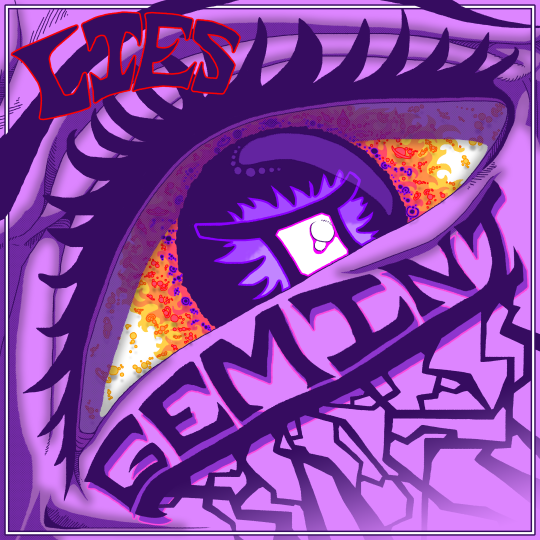
This is the second finished single cover from Gemini, being taken from the top right prototype single cover. This piece is nearly unchanged from it’s original pitch, having minor changes applied to fill space and such. I went with an abstract, paste look, which can be seen more presently in its earliest look. The work focuses on an eye, slightly turned to the left, no other details like the nose or mouth as present, leaving the emotion, conveyed solely through the eye and brow, to be taken into interpretation. I saw it as a sort of cocky, unbeatable stare, emotionless in it’s certainty of success, helped by the ye looking down at someone or something that we have no grasp of. Planets and stars swirls around the cornea and elsewhere as if the pupil is its own galaxy, a black-hole taking all that comes in it’s way. While its human, it also feels off, unnatural and confusing. The title track lays under its eyelid, streaks spreading down into nothingness at the edge of the piece.
The biggest problem of this piece isn’t that large in my view, as I think the piece is conceptually and visually sound, while it has a main colour it has enough variety that its not overpowering, your eye is drawn to the eye that leads you to the title and so on. The only thing I could see being a criticism is its biology. I didn’t reference a face while making it, because I just wanted to get into it and try, I believe that realism is second to understand-ability, if you see and eye, you see an eye, even if it looks off or unnatural, but that is my only true critique.
In my view, I think this is one of my strongest works to date, Its visually interesting and it feels larger than life through its posing, which I was inspired from my previous try at the cover as I wanted to make it feel larger through perspective, which I believe I achieved through this. It’s simplistic yet detailed and looks human enough to be understandable and to pass across its intent. The only other problem I had was no problem at all, that being its early colours. Originally, the dark purple used in its line work was far lighter. I wanted to go for a more colourful and bright piece, but the band preferred me to make it darker, which is fine as, after all, its for them and I do wish to please in my final products. This was quickly fixed with a colour overlay of a darker purple, and it was done.
And, the final problem was the band logo. They still have yet asked me to make them one, but for this I made a hypothetical logo for Asylum, which was quickly shot down, they didn’t say if it was bad of if they even liked it, they just told me to change it to “Lies,” which, due to poor communication, I had no idea why, but I am not one to judge what people want and did another piece of text for them saying lies.
Asylum logo variant and frame added around piece:
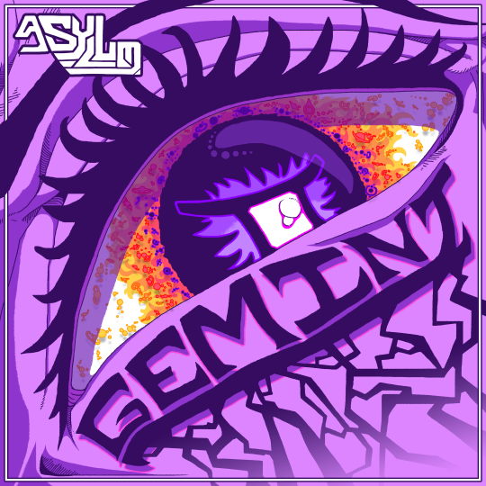
Streaks added:

Darkened colours and original Asylum logo:

Original colouring and shadows (far Brighter and pastel like):
0 notes

Text
Research and Inspiration, H.R Giger


In my first work I have taken inspiration from renowned artist H.R Giger, commonly known for his organic, alien and mechanical like works that he splurge together in his pieces. Due to the leniency I was given in the terms of what my works could exhibit, I thought that making a simple alien construct out of the Gemini symbol would be a fun change of pace in my work.
Giger Is a world famous name in the art industry, the second your work even looks slightly organic yet mechanical it would quickly be assumed that he was your inspiration due to how far his art has reached. His creepy yet beautiful and alien pieces have captured the aw of many. While it is sad that such a talent and inspiration has passed, he had a prosperous career and an undying legacy.
In earlier works, he used Ink and oil paints to produce his works but later would switch to using airbrushes in his works, what, from how much I see them used, is quite common in professional art, or at least a large subsection.
One of his most famous creations is the Xenomorph, the star of Ridley Scott’s and Dan O’Bannon’s movie Alien, where they play the main antagonist throughout the setting. This creature is actually recycled from one of his works that Ridley Scott saw, the piece would lead to the reuse of the pieces head which would become the ominous eggplant shaped head of the monstrosity.

I had never really looked too deep into his work, I never really could ever fully respect his work, but through my revision of his works, I’ve realised that many of them are eerily provocative in the most disgusting way possible, which I didn't interoperate into my work, not due to it worsening the art, but because I wanted a far simpler but still complex look, which I believe I achieved.
0 notes
Photo

This is the first finished project for the Gemini single cover and is a finalised variant of one of the original 6 prototype covers (Bottom left.) I am very happy with the eventual outcome of the piece as it envelops what I wanted it to. I was inspired by H.R. Giger and other artists like Don Ivan Punchatz, as I wished to create a sense of alien and cosmic horror into the work, which I think I have achieved. The piece focuses on a bio-mechanical monstrosity at its centre, a gaping maw visible with un-rudimentary mechanisms for feasting. Its shell takes the form of the Gemini symbol in reference to the single’s name, what blots out the blue star at the centre of the piece. In the background, stars and their planets revolve, all in their unique forms and looks, with even some other alien life flying about in the dark pockets in the void of space.
The only part of the piece that I think could and should be improved is perspective, now, a flat insignia with little depth is no new to album art, lots go for a simple to grasp perspective, but the art does still look a bit flat, I did try to add ridges and shadows to break it up, and while it did help it didn't entirely fix the problem. If I was to come back to this “Character,” I would like to draw them at an angle to show their true scale, perhaps also put them into a situation where their size is more understandable, as I wanted to make them feel gigantic, but by putting them alongside more everyday things, such as a city or mountain would help, or even making them go off the canvas to make them truly feel imposing and alien. I tried to add this with the sun, with its front, (facing us,) having latger flames while the edge they started to recede and become smaller, as they would, but due to the lack of the suns shadows, due to it being a star, it is hard to visualise.
Yet, I am happy with the final look of the art, part way through i thought it was going to come out terribly, looking too flat and scribbled, but by the end it had turned out better than expect, far more detailed than the original pitch I presented to the band. I had added the space theme and stars at the behest of the band and added the more organic nature of the monster instead of leaving it more abstract and detached, what perhaps is another thing I could return to later.
The biggest problem the piece faced was the size. While large, lots of my etching were extremely small, and when viewed at a distance, while not horrendously unpleasing, looked a bit too busy, which was fair. To counteract this, I added shadows unnaturally into them as if they were seams, this allowed the details to remain and not be redone while also allowing the piece to be happily viewed from a distance as if two pieces of different detailing gradients had been mashed together.
A smaller problem faced was readability and the size of the canvas. Originally, the monster had a slick tongue, but I thought better and removed it as it obscured the single title, at a close range you could read it, and even at a distance, but it did obscure it a bit too much to my liking. Also, the piece was too close to the edge of the canvas, and due to facts in production, this could lead to it being cut too close, removing details, so I just increased the canvas size so my work wouldn't change size but would still receive more room.
Adding stars and extra details to the background:

Detailing Sun:

Near Finished Gemini Monster:

Early stages of shading and rendering:

Colouring:

Line working:

0 notes
Photo
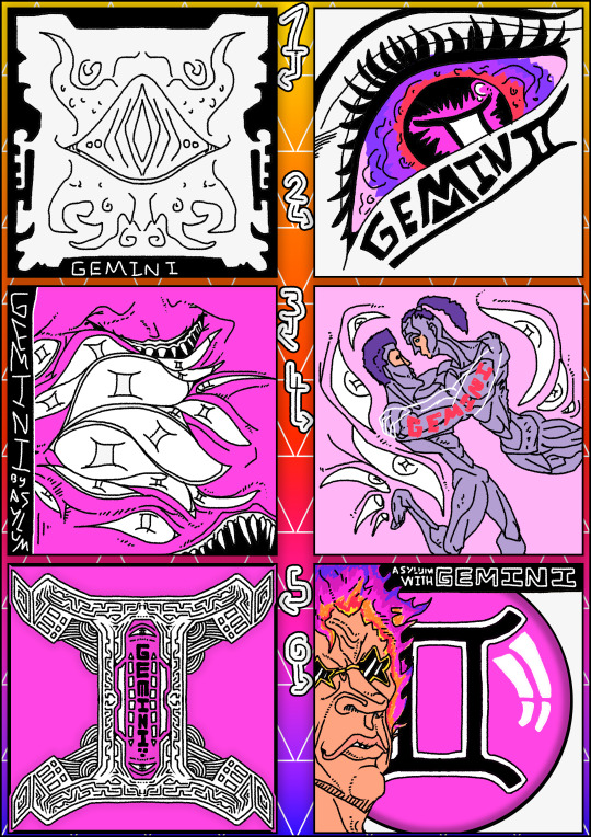
This is a sheet of pot entail choices for the single cover for Gemini. I thought that 6 would be a good round number for this small of a project and is more intent than I put into previous commissions that were done solely for friends who needed art done. I went with a wide variety of looks for the simple and, all be it quite lacking, suggestion of, “So kind of a galaxy With an eye or something your free to do it how you want bit something to do with the Gemini galaxy would be good.” Now, while it is quite annoying not knowing a more refined and detailed approach, it is a joy to not be restricted, and it seemed they wanted me to do the brunt of the work for myself seeing it better to leave the artistic vision to the artist, which is quite nice.
The top two were the most close to what they asked but in two respects. The left one is an eye in the middle of a crudely drawn galaxy, as I didn’t want to was an exuberant amount of time of these hypotheticals. The right one has an eye with a galaxy within it, this one was far better made, with me wanting to exude a sense of grace and power with it, physically looking down on the stars themselves, with the name wandering in from underneath.
The second row were far more experimental, starting with the left, I made the eyes a cosmic entity in a similar feel to a far off galaxy composed entirely of eyes and maws, like a lovecraftian monstrosity slogging through reality. The one to the right of it is a set of two people based on the Gemini constellation being the Twins, so I drew it with them bringing one another in while surrounded by gazing eyes who peer at them, just as we do.
And, Finally, on the bottom most row are the most deterrent from the original basis. The bottom left is of an organic structure, I wanted to make it due to the alien nature it exhumes, its mechanical and stones appearance, well detailed by unknown hands and tendon like attachments outside that give it an uncanny organic look, blurring the line of if it is alive, with two eyes inside accompanying the title track. It is also in the appearance of the Gemini symbol that is used excessively in the previous works being used in the eyes. and to its right is a bizarre piece, ill be frank and say that I didn’t have a clue what it was going to be, but it turned out alright, depicting a weird older fellow accompanied by a Gemini orb. this one is probably my least liked.
I sent them through, but, annoyingly, they are out of class at the moment, meaning I will have to wait for them to group up to discuss, however the member I am in communications with had this to say. “with the bottom middle i like a lot of the more subtle complexities and patters within the shape as i felt like it gives it a texture to the piece and i think the use of shapes and depth is also good with that one. with the middle left i just like the monstrous them and it provides a david bowie esc thing to my mind and the top right i like the simplicity of the object but the complexities within the eye itself i also like the colours used within.
0 notes
Photo


A massive change of plans has become apparent. on the first day I had set out to do research on cooperative games for my project what would be sets of works based on game marketing with cooporation included. Surprisingly, by the end of the day, my plans got put on their head as I was reached out to by another branch of the collage, a band in search of art for their bands identity called WSC Asylum. At this point I was ready to throw away the entirety of my previous idea, due to it being so undeveloped that it was in its most ideal place to be scrapped and I instead set my cooperation idea on working with others to produce a set of work that they can use to publish their works in and outside of school. Sadly, due to the rush of this new venue, they had still had to find out what their ideal set of qualities they wanted the piece to inhibit, so I started a piece that took inspiration from Guns N’ Roses album Use Your Illusion.

I started out be outlining what the character would look like, and due to the original theming of the project, went with an angelic character. The band had yet sent me their specifications and I had to go off of expectation, and even if they didn’t want the character for anything, it could still be used later in my portfolio of work.I was happy with their look, a mix of human and otherworldly.

Alas, I thought that they looked too old. I wanted them to keep a middle aged visage, young but wise, but I had made them look too old by incorporating harsh wrinkles onto them to add depth. I resolved to remove them and add depth later through other means. I also reignited my hate for colouring, my grasp of colour theory shining through. Now, it didn’t look horrendous, but it wasn't pleasant. So, to make it stand out more than if it all looked ill, I left only their flower crown in colour, as I thought that I did a good job with it and I liked how it stood out, as if they had taken it from the earth itself and that it contrasted their angelic skin.

I then finished off my line work in black and white, and I am quite happy with how it came out. while I did use the mirror tool to make my life easier, it was also done to cut down on production time for when they came to me with what they wanted. I added hatching to add detailed depth and later applied a shadow to them using blue to give them a ghostly and holy appeal. I then finished it off with a border to make them stand out from the new background i made, a simplistic blue backdrop with triangles embedded in to break it up than leaving it a matte blue instead.
Sadly, but expected, they didn't want this piece to be used even when they liked it, as they finally complimented me with their plan. The name of the single was Gemini and they wanted something incorporating it and eyes with a galaxy / space motif. “So kind of a galaxy With an eye or something your free to do it how you want bit something to do with the Gemini galaxy would be good”
0 notes


