
Don't wanna be here? Send us removal request.
Statistics
We looked inside some of the posts by typocollections-blog and here's what we found interesting.
Average Info
Notes Per Post
0
Likes Per Post
0
Reblog Per Post
0
Reply Per Post
0
Time Between Posts
15 days
Number of Posts By Type
Text
4
Last Seen Tumblr Blogs


Fun Fact
Tumblr Inc. is using 66 technologies for its website.
Text
Type Collection #4
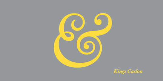
https://www.myfonts.com/fonts/daltonmaag/kings-caslon/
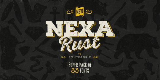
https://www.myfonts.com/fonts/font-fabric/nexa-rust/
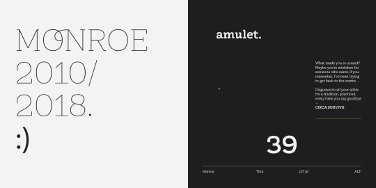
https://www.myfonts.com/fonts/latinotype/monroe/
These three were chosen as examples of slab serifs. My interest in these fonts is how they can be ornate while also appearing clear and modern.
Any serif font I see immediately imparts an olden times vibe to me. These ones in particular, when the ornate loops are taken away, have that old European feel to me, but with the way they were designed and displayed, the serif fonts have been given a modern update. They are presented as clean and sort of minimal fashion. What resonates is just how simple but elegant these fonts look.
0 notes
Text
Type Collection #3
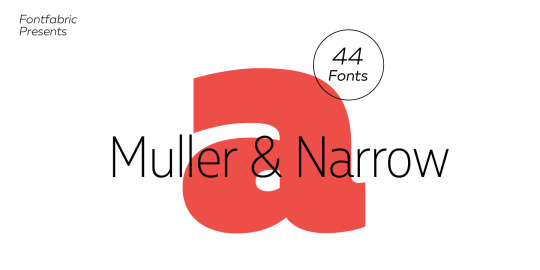
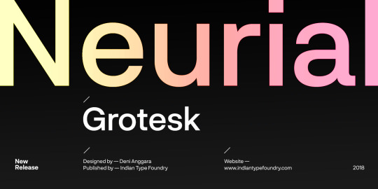
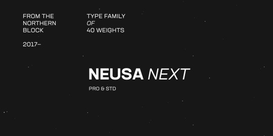
With these three typefaces are all San-serif fonts under the category of “display”. These fonts resonated with me because when something is under the label of “display”, I really am looking for something that is easy to read and understand and I think these three typefaces do that really well. They are clean and concise, and can communicate very easily to the audience. I also find that with such clean lines and letter forms, everything is really pleasing to look at.
All photos are found from https://www.myfonts.com
0 notes
Text
Type Collection #2
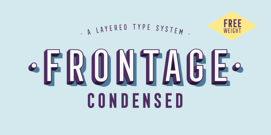
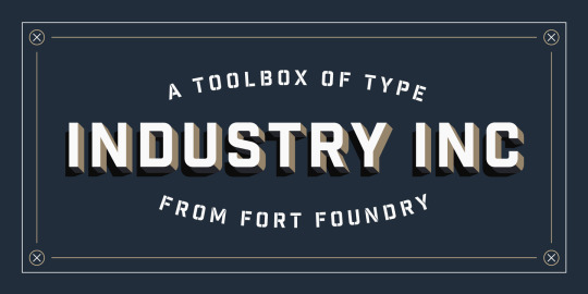
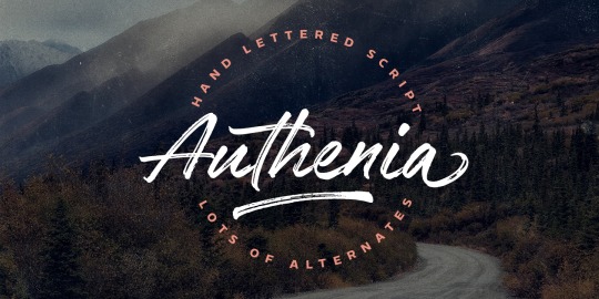
For these three fonts, they were all under the category of posters. Something that caught my eye was how stylized they are compared to the usual san-serif typefaces.
Compared to the last collection, these ones have a more formal feel to them. When placed on a poster there is more of a professional appearance for industry or commercial use. Personally, what I really like about these fonts are how they have the illusion of lifting off the page.
0 notes
Text
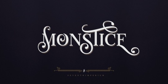
Typo Collections #1
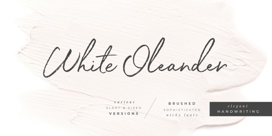
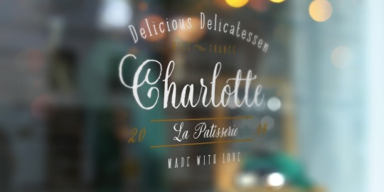

All three of these fonts that I have chosen are examples of handwritten/calligraphy style work. The interest here is the ability to be consistent and at the same time imitate asymmetry through digital font.
The modern phenomenon of our fascination with bespoke items and methods extends even to our desire for an old-style font in our digital identity. People tend to use fonts such as these to promote a sense of authenticity in whatever they are trying to sell consumers. The feeling that we experience from seeing something handwritten generates a definite sense of nostalgia since it is increasingly missing from everyday life.
0 notes